Win-It Wednesday: Commerical Breaks by P.G. Kain

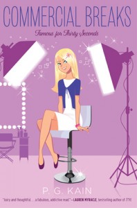
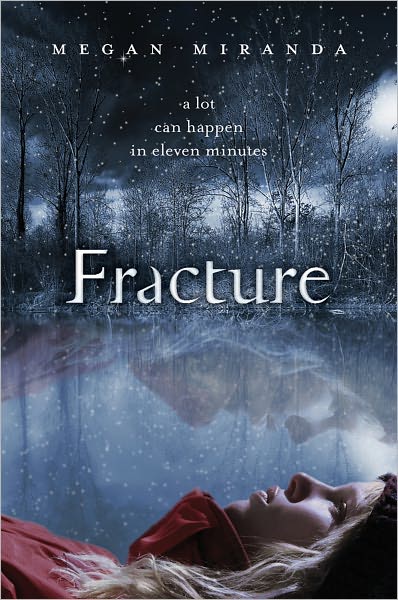
The winner of the stuffed Figment tote bag is... Travis! Remind me of your address, T. (Also, I've been meaning to tell you that I sometimes go back and watch your "Blue Eyes" video just to make me smile, and I play that song for Baby June all the time! So I'm telling you publicly.) This week, P.G. Kain is generously donating a signed copy of his latest, Commercial Breaks. You may have seen the Cover Story on Monday, in all its hilarious glory. So, just leave a comment--there or here--about the cover, and you're entered!

You might talk about illustrated vs. photographic covers, or whether you've ever seen "Bewitched" or "I Dream of Jeannie" (because this cover has a total Samantha/Jeannie vibe), or just where you stand on very pink covers these days. (While remembering that my May cover is pink! Haha.)

So... go! I'll pick a winner next week. Happy We-Thursday.

Cover Stories: Commercial Breaks

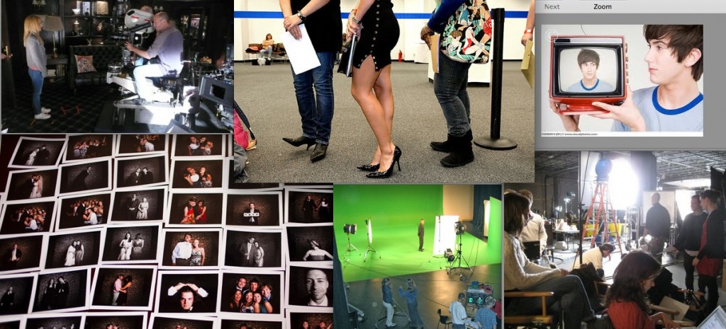
P.G. Kain is hilarious and very good at Words With Friends, I'll have you know. He also has a great website. His latest middle grade novel is out this week, and he's here to share the story behind that bubbly cover:"I really wanted the cover to convey the fact that this series is about the world of commercial castings. This is a very specific world. It's not exactly modeling, where you need to be beautiful and it's not exactly acting, where you need to be talented. Someone once told me that to be in commercials all you need is a face. That's true as you see very few amoeba or protozoa selling soft drinks on TV. "I first imagined a cover that showed a photo of the pristine perfect world of the commercial in the center with a sun-drenched set and a tween model with an even sunnier smile.  But then the edges of the cover would be hand drawn in pencil and extend beyond the frame of photo to reveal  all of the people, cameras, riggings, etc. that were focused on making the on-set scene look 'natural.'

"[As far as involvement with the design], I was never asked to fill out one of those forms I know other authors get but I sent over many images and talked with my first editor about some ideas. The concept of using a type of collage with Polaroids was developed in house and I sent over images to expand on that idea (below):

"My editor was very generous in showing me drafts. I really scrutinized the cover. It's not about being a diva or making demands it's about being serious about your brand and your business. I ghosted for a best-selling women's fiction author for a very long time and I learned a lot about covers and sales. Often a writer can't recover from a bad cover. Of course, with books for young readers you are always playing a guessing game and working on hunches and experience since no one in the room is really part of the demographic toward which you are marketing. I think that balance of opinion, instinct and experience makes it very difficult to navigate. I don't always do it well. If I did, I would be making a lot more money working at the UN. I always try to watch a clip of Barbra Streisand talking about the making of Yentl and that seems to help as much as I imagine any prescription medication would.

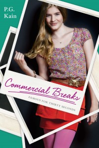
"When I saw the original cover (right) I thought it was unique. They had gone through many changes and two photo shoots for the cover so I know there was a lot of effort involved. My editor assured me that everyone was in agreement that it was a wonderful cover. As an author, when you see the final image you have to get 100% behind it. Writers have to spend so much of their time marketing and selling their book. It just won't work if you don't have complete confidence in your cover. If you are struggling you can either print out stickers to go over the design and risk the threat of being arrested at a  BN or work with a good therapist. I didn't need to do either of these options. I admit I wasn't crazy about the first cover but I was able to get 100% behind it.

"Then I got an email saying they were making some changes and going with an illustrated cover. In tween books we live in a world where the illustrated and photographic compete like Louella Parsons and Hedda Hopper. (Am I dating myself here?) The change to illustrative was a surprise but in many ways it created more possibilities. This happened pretty close to the pub date. I sent over some ideas for illustrators and they chose someone who has a style very similar to some of the artists I suggested. My editor sent me a sketch and I suggested adding a few more 'on set' details and the result was the makeup mirror on the left of the final cover which I think really gives visual context to the iconography.

"When I saw the new cover (full jacket below) I thought it was cute and that it would totally appeal to my audience. I know this is called Cover Stories but perhaps there should be a spin-off called Spinal Tales; because as much as we talk about covers, spines do a lot of the actual work of getting a reader to pluck you off the shelf. I love the spine of this book. I think it totally catches your eye and looks like the character is peeking around the corner. It reminds me Conrad Hall discussing Rosemary's Baby in Visions of Light where he talks about setting up a shot so that the audience needs to peer into the frame. I think this spine does that and it's a clever, well-executed but very simple design. My three greatest fears are swans, kosher gefilte fish and fonts. The designer did a wonderful job with the fonts mixing two seemingly disparate ones into a composition that is completely cohesive. It's like working with prints. Some people can mix them together beautifully others can't. She can. I can't.

"As much as spines are important so is the idea of scalability. So much of our sales effort happens online where the cover is represented in postage stamp size. I think this cover really works well any size as the two very large white studio lights create an eye-catching element at any size. I have not seen it in the opposite direction but when the cover is blown up on a Times Square billboard I'll be sure to write an addendum.

"I also love the illustration. It's very current but also has a vintage feel. It reminds me of the opening sequences of 'Bewitched' and 'I Dream of Jeannie.' At the end of the day, I love the cover. Early in the morning and in the middle afternoon I love the cover. From about 2:35 pm to 2:37 pm I am in very strong like with the cover but then by 2:38 I am back in love."

Thanks, P.G.! I am fascinated by the stages of this cover--photo shoots to illustrations. I actually think the photo looks a little dated, and I'm glad the final illo has such charm and cheek to it. I have to admit to not always loving illustrated covers, but I think it works really well for middle grade novels, and you're right, this one is totally Bewitched/Jeannie! Also, spine: YES. Her face will totally stand out.

What do you guys think?

Win-It Wednesday: Figment Gift Bag

Last week's giveaway of Freshman Year and Other Natural Disasters by Meredith Zeitlin made me feel slightly insecure about my coffee consumption, to be honest. Who are all you caffeine-less people?! But okay, I'll move on. The winner, randomly chosen, is... Gaby the juice drinker! G, send me your address. Today I'm giving away a super cute Figment tote bag (in honor of Figment and Inkpop combining--two writing communities become one. Win-Win!). The photo at left is of author John Corey Whaley holding said bag. But this giveaway does not involve JCW, but isn't he cute? Anyway, inside the winnable tote is Blake Nelson's latest, Dream School (which is awesome) as well as Lauren Oliver's new ones, Pandemonium! (And no, I haven't had a chance to read that one yet, but YA Reads liked it... and heck, I'll throw in Delirium, its predecessor, in case you don't have it.)

To enter to win this LOADED DOWN TOTE, just comment below and tell me what you would carry in your delightful new Figment bag. Me? I'm normally hauling a wallet, sunglasses, lip gloss, phone, my read of the moment and perhaps some baby stuff these days.

Your turn: Go. I'll choose a winner at random next week.


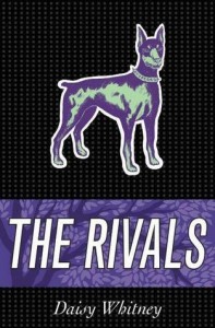
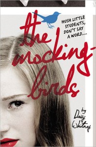
Cover Stories: The Mockingbirds and The Rivals

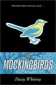
The amazing Daisy Whitney's here with a new Cover Story! "I only vaguely had a cover idea in mind for The Rivals, and it was similar to what I had originally envisioned for The Mockingbirds (read that Cover Story) -- something akin to the hardback cover of The Disreputable History of Frankie Landau-Banks, i.e. something that just screamed "girl at boarding school." And what I've learned as a reader is that I very much prefer books with strong girls on the cover -- like Frankie, or like the cover of Where She Went (read that Cover Story), or What I Saw and How I Lied.

"The cover change (from the Mockingbirds hardback and The Rivals arc, below) came about through a conversation I had with my editor about a year ago about the type of covers I like and so on. She really wants her authors to love their covers, so when she learned that I had liked the hardcover, but would have preferred a photographic cover, she asked me to send her my favorite covers and that they would consider a redo for the paperback and the hardcover of The Rivals.


"Fortunately, my editor shepherded many many versions of changes to get to the current design, and wisely waited til she had these versions to show me. She did tell me they had tried for a photographic look with a girl in front and perhaps some other people behind her to convey the sense of the group aspect of the secret society, but they didn't look right.

"[When I first saw my cover, I felt] total happiness!! I swear! These covers are exactly what I had envisioned all along -- strong (and, let's be honest, good-looking) faces on both books looking straight at the reader. For The Mockingbirds, I love that the girl is looking right at the reader, that she isn't hidden or ashamed, and I have to say I think the red lipstick is a fantastic, subtle, feminist statement about the book's underlying 'message' -- that speaking up is worth it. I also loved the type for the title, and I think the birds -- right-side up on The Mockingbirds, and upside-down on The Rivals -- are great! I love too that the birds are cartoonish, because that's how they're described in the book. I sound like a broken record, but I truly love the redesign so much. I keep telling my editor. I am sure she is tired of hearing it! But these covers make me happy!


"I just received my author's copies of the hardcover of The Rivals and I noticed the boy has stubble! (Which doesn't mean anything in the book, it was just an observation). But seriously, what I love most about The Mockingbirds redo is that the girl is strong and bold. What I love most about The Rivals is that the cover is the 'opposite' of The Mockingbirds, because the story in The Rivals is about the other side of the secret society. The reverse symmetry between the covers captures the stories to me and I like that they have a hip, retro feel in the yearbook look of them."

Thanks, Daisy! I actually really like the original designs when I look at them, but I think the new ones are more eyecatching. Love the immediacy of the scribbled titles, red lips, blue eyes--those details really draw me in.

What do you guys think?

Win-It Wednesday: Freshman Year and Other Natural Disasters

Guys, have I told you about how I like to doodle umbrellas with heart raindrops falling on them? I do. It's kind of my thing. I do this whenever a restaurant has paper and crayons available at the table (which I love). The cover of Meredith Zeitlin's Freshman Year and Other Natural Disasters reminds me of my doodles, and it sounds good. For one, the main character lives in Park Slope, Brooklyn (and I do too). For two, it's Meredith's debut and I have a soft spot for first novels. For three, the main character auditions for Fiddler on the Roof, which I also did in high school (and did not make it--our high school was filled with drama kids and super competitive! I swear! Plus, I can't dance). So I guess I'm confessing that I often am drawn to books that seem like they could be about me...

Anyway, all this is to say that I'm giving away a copy of this book this week, and you should want it for all of the reasons listed above and more. More being that I found these photos of Meredith Z. (right) and isn't she cool? Yay, Manic Panic. And also, the trailer is great.

So, to enter to win this lovely book, tell me this: How many cups of coffee do you drink per day? I was sticking to one, but with a baby, it's up to two. Or three. I'm tired, people. I want to hear what your habit is like. Tea drinkers: I wish I could be as virtuous as you.

Cover Stories: Fracture

Megan Miranda's Fracture cover is wintry and haunting (oh, and the book inside got a starred PW review, too!). Here she is to talk about how her debut cover came to be: "I had a very vague idea for the cover: a girl on the other side of the ice, looking out. But I am also, admittedly, not gifted in the art department. We discussed the idea I had, and they gave another idea as well: a girl, in a red coat, standing on the ice—with maybe a crack running through the surface. I loved that one, as well. I believe they toyed with both these ideas, but found that such a literal interpretation, while accurate to the scene and very relevant to the plot, didn’t quite represent the feel of the story inside. So they went in a different direction to capture the mood. And did they ever.

"Honest truth? When I first saw my cover, I jumped out of my chair. Then I unplugged my laptop and ran down the street to my friend’s house to show her. I adored it. It’s a concept I never would’ve come up with—but I can’t imagine a cover more perfect for the book.

"My editor asked for my thoughts, and I sent back a rather incoherent email, basically saying HOLY CRAP, YES, or, you know, something along those lines. I feel very, very fortunate. Even though they were trying to capture a mood, there are many things that are literal on the cover: the tag-line is taken directly from the book; the girl on the front looks shockingly like I pictured Delaney; and she’s wearing that red coat, which essentially saves her life. I had zero suggestions.

"I didn’t see any of the earlier concepts, and I’m glad. I’m not the most visual person (other than being able to say yes, I like it, or no, I don’t). There were some tweaks to the cover after I saw the concept, and there were a few final tweaks after the cover reveal as well (removing some of the ice from the lake).

"In the end: I love it. I find it haunting and beautiful at the same time, and I think it’s a little different than a lot of covers in the genre out there. I love the way they set up Delaney and her reflection. There’s something off about it, and I think that really captures the feel of the book: that she is back, but something is a little off. There was the Delaney that used to be, and the Delaney that remains. Which Delaney do her friends and family want to see? Which one does she want to be? What happened to the old one?

"Falcon Lake plays such a key role in the story, not only in the initial scenes when she’s trapped under the ice for 11 minutes, but in many scenes that follow. I always thought the girl on the cover was being pensive, which feels right. But some people thought she was dead, which was interesting to me since I didn’t pick up on that. But….that’s very relevant to the book as well: what makes someone alive?

"I’m really thrilled with how everything turned out."

Thanks, Megan! I love the detail in the cover--each time I look I notice something more. It reminds me a little bit of the If I Stay paperback (I guess that's the girl-at-bottom thing) but also feels wholly unique and lovely.

What do you guys think?
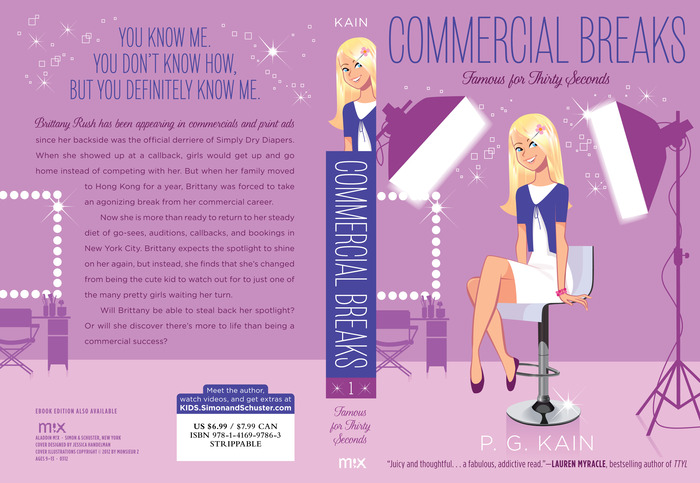
Photo Friday: Foods I Have Loved (This Week)

After interviewing Tamar Adler for a Cover Story, I bought her book, An Everlasting Meal, and totally loved it. There's a moment where she talks about saving the scraps--stalks and leaves--from cauliflower and making a paste for bread out of it. I did that. It was delicious!

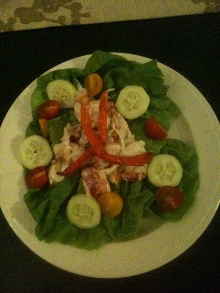
Dave made our traditional lobster salad for Valentine's Day. (I love this meal, even though it's very 80s, I think.)

For dessert: blueberries + ricotta + maple syrup. Delish.

And my other favorite dessert this week: The Nutella Calzone from Toby's. This one is insane.

Win-It Wednesday: Book Soundtracks + an iPod

So, in case you haven't heard, Figment and I Heart Daily are hosting a contest where you could win an iPod shuffle loaded with playlists from your favorite authors. Each playlist is inspired by their latest novel, and the list is grand. Check it out: Madeleine George, The Difference Between You and Me

Nina LaCour, The Disenchantments

Lisa McMann, Dead to You

Sarah Ockler, Bittersweet

Matthew Quick, Boy21

Robin Wasserman, The Book of Blood and Shadow

Alecia Whitaker, The Queen of Kentucky

Michelle Zink, A Temptation of Angels

Figment has set up all of these playlists on Spotify (follow each link to find those), so if you're reading these books, it's time to crank up the stereo too.

Read the official rules and get full details here (you have to create a playlist for your favorite book). I mean, this is a fun contest. Wouldn't it be the most amazing thing ever to be the Music Coordinator for a great show? Choosing the songs that go with each moment? Thrills. And yes, I did create a playlist for Unbreak My Heart (and there's no Toni Braxton on it!). :)

Get cracking on your novel-inspired playlist!

Happy, uh, Thursday.