](http://static.squarespace.com/static/53482f88e4b0b891fcd5a71e/5350081be4b048f0b406808a/53501349e4b048f0b408cfe3/1397756745975/whitney_therivals_hc21-198x300.jpg?format=original) The amazing Daisy Whitney's here with a new Cover Story!
"I only vaguely had a cover idea in mind for The Rivals, and it was similar to what I had originally envisioned for The Mockingbirds (read that Cover Story) -- something akin to the hardback cover of The Disreputable History of Frankie Landau-Banks, i.e. something that just screamed "girl at boarding school." And what I've learned as a reader is that I very much prefer books with strong girls on the cover -- like Frankie, or like the cover of Where She Went (read that Cover Story), or What I Saw and How I Lied.
The amazing Daisy Whitney's here with a new Cover Story!
"I only vaguely had a cover idea in mind for The Rivals, and it was similar to what I had originally envisioned for The Mockingbirds (read that Cover Story) -- something akin to the hardback cover of The Disreputable History of Frankie Landau-Banks, i.e. something that just screamed "girl at boarding school." And what I've learned as a reader is that I very much prefer books with strong girls on the cover -- like Frankie, or like the cover of Where She Went (read that Cover Story), or What I Saw and How I Lied.
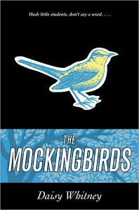
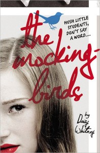
"The cover change (from the Mockingbirds hardback and The Rivals arc, below) came about through a conversation I had with my editor about a year ago about the type of covers I like and so on. She really wants her authors to love their covers, so when she learned that I had liked the hardcover, but would have preferred a photographic cover, she asked me to send her my favorite covers and that they would consider a redo for the paperback and the hardcover of The Rivals.
"Fortunately, my editor shepherded many many versions of changes to get to the current design, and wisely waited til she had these versions to show me. She did tell me they had tried for a photographic look with a girl in front and perhaps some other people behind her to convey the sense of the group aspect of the secret society, but they didn't look right.
"[When I first saw my cover, I felt] total happiness!! I swear! These covers are exactly what I had envisioned all along -- strong (and, let's be honest, good-looking) faces on both books looking straight at the reader. For The Mockingbirds, I love that the girl is looking right at the reader, that she isn't hidden or ashamed, and I have to say I think the red lipstick is a fantastic, subtle, feminist statement about the book's underlying 'message' -- that speaking up is worth it. I also loved the type for the title, and I think the birds -- right-side up on The Mockingbirds, and upside-down on The Rivals -- are great! I love too that the birds are cartoonish, because that's how they're described in the book. I sound like a broken record, but I truly love the redesign so much. I keep telling my editor. I am sure she is tired of hearing it! But these covers make me happy!
"I just received my author's copies of the hardcover of The Rivals and I noticed the boy has stubble! (Which doesn't mean anything in the book, it was just an observation). But seriously, what I love most about The Mockingbirds redo is that the girl is strong and bold. What I love most about The Rivals is that the cover is the 'opposite' of The Mockingbirds, because the story in The Rivals is about the other side of the secret society. The reverse symmetry between the covers captures the stories to me and I like that they have a hip, retro feel in the yearbook look of them."
Thanks, Daisy! I actually really like the original designs when I look at them, but I think the new ones are more eyecatching. Love the immediacy of the scribbled titles, red lips, blue eyes--those details really draw me in.
What do you guys think?


