 P.G. Kain is hilarious and very good at Words With Friends, I'll have you know. He also has a great website. His latest middle grade novel is out this week, and he's here to share the story behind that bubbly cover:"I really wanted the cover to convey the fact that this series is about the world of commercial castings. This is a very specific world. It's not exactly modeling, where you need to be beautiful and it's not exactly acting, where you need to be talented. Someone once told me that to be in commercials all you need is a face. That's true as you see very few amoeba or protozoa selling soft drinks on TV.
"I first imagined a cover that showed a photo of the pristine perfect world of the commercial in the center with a sun-drenched set and a tween model with an even sunnier smile. But then the edges of the cover would be hand drawn in pencil and extend beyond the frame of photo to reveal all of the people, cameras, riggings, etc. that were focused on making the on-set scene look 'natural.'
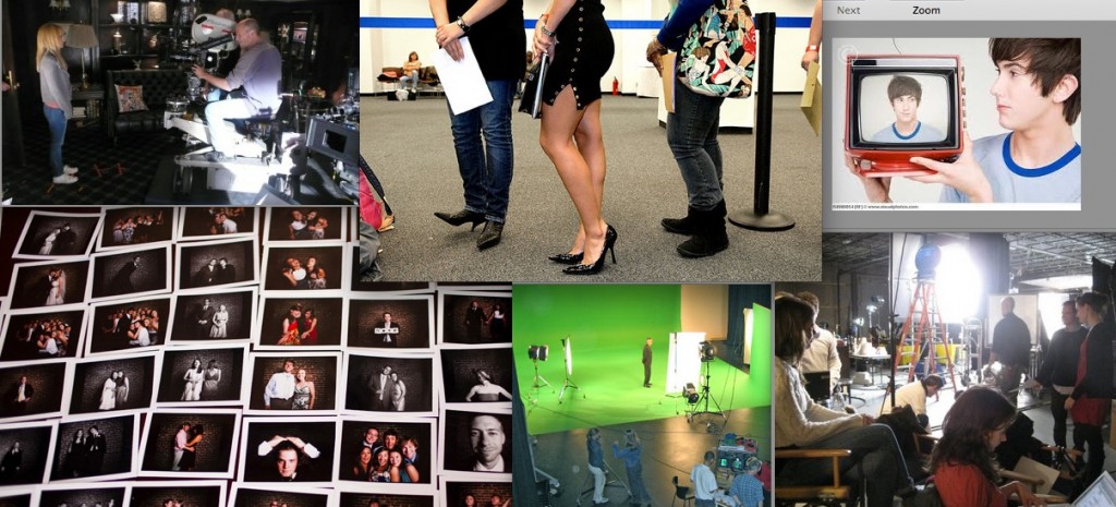
"[As far as involvement with the design], I was never asked to fill out one of those forms I know other authors get but I sent over many images and talked with my first editor about some ideas. The concept of using a type of collage with Polaroids was developed in house and I sent over images to expand on that idea (below):
"My editor was very generous in showing me drafts. I really scrutinized the cover. It's not about being a diva or making demands it's about being serious about your brand and your business. I ghosted for a best-selling women's fiction author for a very long time and I learned a lot about covers and sales. Often a writer can't recover from a bad cover. Of course, with books for young readers you are always playing a guessing game and working on hunches and experience since no one in the room is really part of the demographic toward which you are marketing. I think that balance of opinion, instinct and experience makes it very difficult to navigate. I don't always do it well. If I did, I would be making a lot more money working at the UN. I always try to watch a clip of Barbra Streisand talking about the making of Yentl and that seems to help as much as I imagine any prescription medication would.
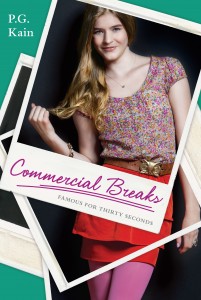
 "When I saw the original cover (right) I thought it was unique. They had gone through many changes and two photo shoots for the cover so I know there was a lot of effort involved. My editor assured me that everyone was in agreement that it was a wonderful cover. As an author, when you see the final image you have to get 100% behind it. Writers have to spend so much of their time marketing and selling their book. It just won't work if you don't have complete confidence in your cover. If you are struggling you can either print out stickers to go over the design and risk the threat of being arrested at a BN or work with a good therapist. I didn't need to do either of these options. I admit I wasn't crazy about the first cover but I was able to get 100% behind it.
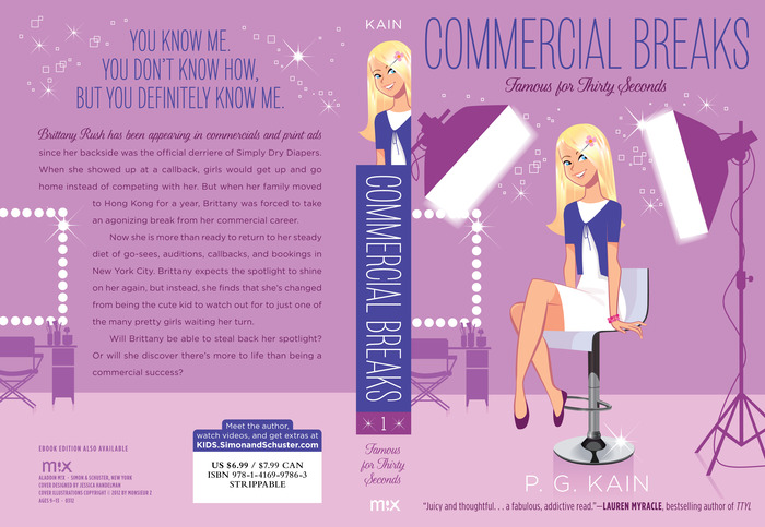
"Then I got an email saying they were making some changes and going with an illustrated cover. In tween books we live in a world where the illustrated and photographic compete like Louella Parsons and Hedda Hopper. (Am I dating myself here?) The change to illustrative was a surprise but in many ways it created more possibilities. This happened pretty close to the pub date. I sent over some ideas for illustrators and they chose someone who has a style very similar to some of the artists I suggested. My editor sent me a sketch and I suggested adding a few more 'on set' details and the result was the makeup mirror on the left of the final cover which I think really gives visual context to the iconography.
"When I saw the new cover (full jacket below) I thought it was cute and that it would totally appeal to my audience. I know this is called Cover Stories but perhaps there should be a spin-off called Spinal Tales; because as much as we talk about covers, spines do a lot of the actual work of getting a reader to pluck you off the shelf. I love the spine of this book. I think it totally catches your eye and looks like the character is peeking around the corner. It reminds me Conrad Hall discussing Rosemary's Baby in Visions of Light where he talks about setting up a shot so that the audience needs to peer into the frame. I think this spine does that and it's a clever, well-executed but very simple design. My three greatest fears are swans, kosher gefilte fish and fonts. The designer did a wonderful job with the fonts mixing two seemingly disparate ones into a composition that is completely cohesive. It's like working with prints. Some people can mix them together beautifully others can't. She can. I can't.
"As much as spines are important so is the idea of scalability. So much of our sales effort happens online where the cover is represented in postage stamp size. I think this cover really works well any size as the two very large white studio lights create an eye-catching element at any size. I have not seen it in the opposite direction but when the cover is blown up on a Times Square billboard I'll be sure to write an addendum.
"I also love the illustration. It's very current but also has a vintage feel. It reminds me of the opening sequences of 'Bewitched' and 'I Dream of Jeannie.' At the end of the day, I love the cover. Early in the morning and in the middle afternoon I love the cover. From about 2:35 pm to 2:37 pm I am in very strong like with the cover but then by 2:38 I am back in love."
Thanks, P.G.! I am fascinated by the stages of this cover--photo shoots to illustrations. I actually think the photo looks a little dated, and I'm glad the final illo has such charm and cheek to it. I have to admit to not always loving illustrated covers, but I think it works really well for middle grade novels, and you're right, this one is totally Bewitched/Jeannie! Also, spine: YES. Her face will totally stand out.
What do you guys think?

