Cover Stories: Deadly Little Lessons

dllessons2
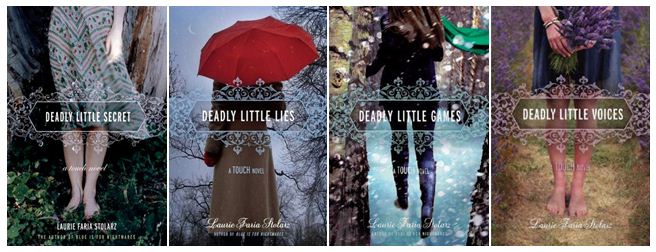
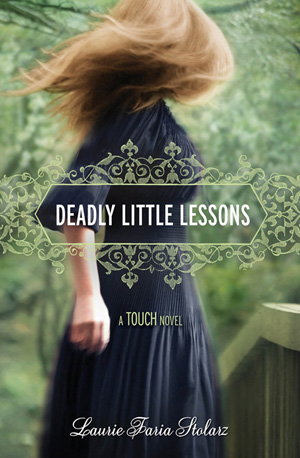
Laurie Faria Stolarz has been here to tell the stories behind three of her previous books in the Touch series, and now book 5 is here! The covers all tie together so beautifully, I think. Here's Laurie: "DEADLY LITTLE LESSONS is the fifth book in the TOUCH series, so I already knew the cover would look similar in some way to the others in the series. All of the books feature a young girl, turned away so you can't see her face. They're all dark and mysterious, eluding to the genre of the novel. And there's a romantic quality to the artwork, too. The girl is always dressed in long dresses with wind blowing. Her hair is always tousled. The books are paranormal romance, so I think the covers work really well conveying that."

[See the first four books below]:

the deadlies

"From the first, I loved this cover. As I mentioned, I sort of knew what to expect with the girl featured on the cover, but the colors in this one - the striking emerald green - is just so beautiful to me. I have a feeling it's a stock photo, because I've seen it used on the cover of another book. This is my favorite cover in the series, for sure."

Thanks, Laurie! I love the wispy, faded tones of these covers, and the consistent title treatment is lovely too! What do you guys think?

PS-Contest alert! Enter the Karma Chameleon contest for a chance to win autographed copies of Laurie's books.

Cover Stories: Vessel by Sarah Beth Durst

Sarah Beth Durst seems to luck out with her covers. (See the Cover Stories for Drink, Slay, Love and Ice as proof.) Her latest novel, Vessel, is no exception. Here's Sarah: "I was in the parking lot at Dunkin' Donuts when the email with the cover art came in. My husband was fetching Munchkins, and I waited for three extremely long minutes for him to return to the car. As soon as he opened the car door, I shouted, 'It's here! It's here! It's really here!'

"'Wow, you must really like Munchkins,' he said.

"I shoved my phone at him. 'The cover art!!!'

"Great! What does it look like?"

"'I don't know,' I said. 'I can't look. You look.'

"He opened the jpg attachment while I scarfed down Munchkins. Then he said, 'You can look,' and handed the phone back to me.

"I looked and said, 'Eeeeeeeeeeeeeeeeeeeeeeeee!!! I love it!'

"And that sums up the extent of my involvement in the gorgeousness that is the cover art for my new novel VESSEL. The cover was designed by photographer Jaime Ibarra and the Simon & Schuster art department, and I am in awe of their awesomeness.

"I actually had a hint of the awesomeness that was coming when I ran across a journal entry on Deviant Art about the cover shoot. There's one photo of the model practicing whooshing the fabric and another of the makeup artist painting on Liyana's tattoos. (The tattoos identify her as her clan's vessel. You really, really don't want a deity to possess the wrong person.)

"VESSEL is a sweeping epic adventure set in a harsh desert land where serpents made of unbreakable glass fly through the sky and wolves made of only sand hunt within storms. Liyana is destined to be a vessel, to sacrifice herself so her clan's goddess can inhabit her body... but her goddess never comes. I think the cover art captures the novel perfectly. Thanks so much for inviting me to share it!"

Thanks, Sarah! Definitely click on the behind-the-scenes link, you guys. It's crazy how a photo shoot can translate into such an ethereal cover.

What do you think?

PS-This book is racking up the starred reviews, and you can read the first two chapters here.

Cover Stories: The Twisted Tragedy of Miss Natalie Stewart

Leanna Renee Hieber has some amazing titles, like her latest: The Twisted Tragedy of Miss Natalie Stewart, and the covers have to match those intriguing introductions to her stories. Here's Leanna to talk about her most recent cover concept: "I didn't have a cover in mind, because the cover for the first book, Darker Still [read that Cover Story], went through SO many changes that I just figured I'd sit back and see what the marketing team came up with. In my heart I wanted something Gothic and something that portrayed a historical novel, whatever that might be.

"When I saw the cover, I loved it from the first. It's beautiful, classy and Gothic. It's my favourite cover I've ever had. I suggested the hair be toned down a bit as Natalie is auburn, not red, but I think the red ended up staying as it matched the red in the other parts of the cover.

"There was just a font change, and I couldn't have known about the beautiful sheen on the cover, or the beautiful wallpaper interior. Those are wonderful touches.

"I really adore this cover. The subtle wall-papering across the whole book is so lovely. Even the spine is gorgeous, all the details on the inside and outside make it really special and I think it truly stands out. It really fits my Gothic voice as an author. (And as someone who owns 10 black corsets. I'm not kidding). Lots of folks have asked if it was me posing on the cover, which made me laugh. While I do have several corsets just like that, it's not me. :)"

Thanks, Leanna! I love the wallpapering and the title treatment on this one the most. They feel like very thoughtful parts of the package.

What do you guys think?

PS-Trailer!

Cover Stories: The Almost Truth

Eileen Cook shared her new paperback cover for Unraveling Isobel last week, and now she's on tour with the GCC, here to share the cover of her latest novel, The Almost Truth! "I am so fortunate to work with the team at Simon Pulse. They’ve given me the best covers. For my most recent paperback release, Unraveling Isobel, they’d redesigned the cover to reflect the romance angle of the book (read that Cover Story). I knew with The Almost Truth they would want to have something that has a similar feel.

"When I saw a draft of the cover I was thrilled. I loved the fingers crossed behind her back. I thought that hinted at how Sadie, the main character, has a very 'flexible' relationship with the truth. She’s a bit of a con artist and not beneath telling a story to get what she wants. The problem comes when she’s told some many stories she’s not sure how to get back to the truth.

"The models were live (my editor even sent me some behind the scenes photos on my phone), then they were put onto a stock backdrop. It’s a small detail--but I love how her nail polish exactly matches the word 'almost' in the title."

Thanks, Eileen! 1. I love tiny details like the matching polish! 2. I think it's really cool that Simon Pulse is repackaging the books to give them a new shot at a different audience. 3. They also repackaged two of Eileen's books, The Education of Hailey Kendrick and Getting Revenge on Lauren Wood, into a single volume called Used to Be, with a cover like these new ones! Here are those two covers, and the new package:


Some readers commented that the new covers are a little less unique, and I agree, but I also think they can reach more people who are looking for the love stories that Eileen writes. Plus, they're pretty! And I love a coherent feel for covers -- it makes them so great on a shelf.

What do you guys think?

Cover Stories: Unraveling Isobel paperback

Eileen Cook is here because she recently got a cover redesign that I really love! She shared its hardcover Cover Story last year, and she's (paper)back, haha: "The paperback version of UNRAVELING ISOBEL came out the end of October and has a shiny new cover.  When I was shown the original hardcover design (below right) I was thrilled. Isobel, the main character, is an artist and the artwork on the cover matched how I imagined her style. I liked that the model's art was slowly encircling her wrists- it hinted at the feelings she has of being trapped. Feedback on the cover from readers was mixed. Some loved it, but others didn't feel that it matched the book.  When we began to discuss the book coming out in paperback my editor and I discussed the idea of having a different cover. "The team at Simon Pulse is great at including authors in the design process. We talked about what were some of the strong elements in the book that we could highlight with the new cover. We wanted to make sure readers knew the book was contemporary and had a romance. The art department also wanted to create a consistent look with some of my other covers including USED TO BE and my upcoming book, THE ALMOST TRUTH.

"My input was that I prefer when the models faces aren't shown as I like readers to have their own idea of what the characters look like and not have it decided for them in the cover art.  I was also interested in having something that hinted that the story took place on an island. The setting in this book was important to me. I set it on a remote island off of Seattle. I live in the Pacific Northwest where we have all sorts of small islands and they have a unique feel.  There's something about being on an island that is isolating, but also special. Like a time out from regular life.

"When they sent the proposed cover I fell in love. It highlighted the romance element and also the design elements I wanted to include. It's hard to decide between the hardcover and paperback covers,  I'll be really interested to hear what readers have to say."

You heard Eileen! Okay, I like both covers, and I love the artsy indications of the hardcover, but I give the edge to the paperback because it's more romantic, and because I LOVE her dress on that cover. Too shallow? Oh, whatever, covers are looks-based!

What do you guys think?

Cover Stories: All You Never Wanted

Today, a special treat! Adele Griffin is here to talk about the cover for her new novel, All You Never Wanted, and she's joined by her cover designer, Sarah Hokanson, in a Q&A. Here we go: Did you picture your cover while you were writing? AG: I had a really weird bad idea of two girls sitting in a chair and the girls are almost joined. SH: After reading the initial first draft of the story I knew the jacket needed to be really dramatic and rich in feeling. I had been told by the editor that she and Adele both felt that the sisters should be featured together on the front cover. I found an image of two girls that seemed perfect at first but, then anyone who saw the image asked if the girls were lovers?! An image of sisters being sisterly in a dramatic way was going to be harder to find then I thought!

Did your publisher ask for your input on the cover design before the art dept started working? AG: Yes, I think in early days I scrawled my bad joined-girls idea on a napkin and I can only hope my editor just threw it away before showing the designer. Ack, embarrassing. SH: I do remember the editor showing me Adele's little napkin drawing! I have to admit I did get a little nervous when I saw it and thought "Oh no this author is going to be hard!" But—to my relief she was a dream author to work with—and ultimately we had the same vision for the cover.

What did you think the first time you saw your cover? AG: I've never seen such a beautiful cover. It was perfect the first time. I don't think that had ever been my thought since I saw the cover of the hardcover of a book I wrote called Amandine, all the way back in 2000. SH: Wow! Thanks Adele.

Did the cover change much from the original version you saw? AG: When we got the beautiful blurb from Sara Zarr, and we figured out a tagline for the back, I saw a few different versions of how Sarah was working with it. SH: Initially we wanted to put the quote from Sara Zarr and the great tagline "One Sister Has It All, The Other Sister Wants It All" on the front cover. But, I had a really hard time making all that copy work together on the front. In the end I do think we all came up with a great solution by putting the tagline and quote on the back cover. [See the full wrap, below]:

How did you find the cover image? SH: I was hoping not to have to do a photo shoot so, I kept searching for two girls together until I found this great image of one girl alone that I thought perfectly captured the character Thea. She was pretty but, distraught and kind of insane in a rich girl kind of way. I then started searching for a photo of the other sister, Alex, which I thought would be impossible because her hair is talked about so specifically but, it was a Christmas miracle—I found the perfect photo of Alex! It was at this point I really started to think about the jacket as a whole package. I was lucky enough to find two beautiful photos to capture the essence of the story's characters so well. I didn't want to give up either photo. So, why not make two great photos—one great jacket!?

How do you feel about the cover, in the end? AG: While at first I loved the differences in each image, I think the beauty of these dueling images is that they are both projecting the same themes of rivalry and seduction and power and empowerment, through two very different voices. It's a really smart, thoughtful cover on so many levels. Oh and I love the chandelier flaps. Such a brilliant touch-- especially if you've read the book. SH: All You Never Wanted was definitely one of my favorite books to work on this year. A great story always makes my job a lot easier and definitely more inspiring! AG: Smiling!

Thanks, Adele and Sarah! Such fun to hear from both sides, and this cover? Chillingly awesome, especially the full wrap.

What do you guys think?

PS-Don't miss Adele's Cover Story for The Julian Game.

Win-It Wednesday: Your Choice of Tara Altebrando e-Books

The winner of Dear Teen Me is... Macy! She stacked the comments, which was totally legit, and it worked! Yay! Send me your address, M.

Now, the only thing I can say about how inconsistent Win-It Wednesday has been late is: Sorry! I'm working on a ton of stuff (and a new book!) so I'm just... behind.

But here's a good one: Yesterday I posted about how Tara Altebrando's first two novels are now e-books with new (amazing) covers, and how proceeds from these e-books through the end of the year are going to Hurricane Sandy relief. Well, I'll buy a copy of either book (What Happens Here or The Pursuit of Happiness) for one winner this week. Yes, that does mean you have to have an e-reader (or a plan to get one).

To enter to win, just leave a comment telling me which new TV show of the fall is your favorite. (Mine is NASHVILLE--swoonsville all around and baby June loves the country music!) Oh, also tell me which book you'd choose (read about them here).

Good luck! I'll choose a winner next week, or thereabouts.