Cover Stories: Tara Altebrando's New e-Books

You guys! Tara Altebrando has done something awesome: She's releasing 2 of her early titles on e-book, indie style, and I could not be more exited, for 2 reasons:

1. I've only read Tara's later books, and they are SO GOOD that I can't wait to read these.

2. The Pursuit of Happiness is set on the Jersey Shore and Tara herself grew up on Staten Island -- both ravaged by Hurricane Sandy -- so through the end of the year, all proceeds earned on her books will go to Sandy relief.

How great is that? Tara is here to share the Cover Stories for the new e-books of The Pursuit of Happiness and What Happens Here. (I'm buying my copies TODAY.)

"I think that enough time has passed that I can finally admit that I liked the original covers for these books okay. But really just okay. [See original, left, vs. new covers, right, below.]

"The Pursuit of Happiness was one of the first four young adult novels that MTV Books published back in 2006 and they were all given the same 'look' in terms of font treatment and also a summery sort of vibe. I always felt like there was a different/better cover involving the silhouette art that plays such a big role in the story. The main character, Betsy, is having this horrible summer because of a family tragedy but her summer job is at a colonial re-enactment village and she discovers a passion for cutting old-fashioned paper silhouettes.

"A lot of the reviews of Pursuit back in the day talked about how the book was surprisingly moving and powerful and well written...and how you never would have known that from the cover/packaging. That always irritated me! But yes, of course people really do judge books by their covers.

"This ebook repackage was my chance to give Pursuit the cover I think it should have had the first time around. There! I said it! I am officially in love with this cover. I have half a mind to get a hard copy of this version of the book printed up on demand just so I can hold a copy of the book bearing this cover in my hands. (Oh! And I should mention that the covers are embedded in these ebooks; not all ebooks include cover art but these do.)


"As for What Happens Here, I think the original cover was cool and dark and true to the book, but I am not sure it was accessible enough? No matter. I'd originally wanted to call that book Exploding Hearts because which makes sense if you read the book—which is about a devastating event that breaks open the main character's heart in many ways—but I couldn't get that title through editorial approval. I didn't want to change the title in this repackage because I always thinks that's confusing, but I was excited that my designer friend (Peter Lutjen) and I found a way to bring that exploding heart imagery into the new cover.

"As you can tell, we set out to give the two covers a shared look, which I thought might be tricky since the tone of the books are so different, but Peter nailed it. I love that the two covers are technically quite similar but emotionally very different.

"I've joked often that when you see your book cover (handed down from the publisher) for the first time, it's like seeing a baby you have given birth to for the first time. You're like, 'Really? That's what it looks like?' So this time around, it was really fun to have these covers designed to my own specifications. I loved these babies the second I laid eyes on them. :)"

I love this idea, and I just may do the same with some of my early books, if I'm able. And the new covers are head and shoulders above the original ones, I think -- I love simple silhouettes with a pop of color. You guys?

PS-You can read the original Cover Story for What Happens Here here.

Photo Friday: Stormy Halloween

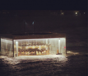
So much destruction hit near us in this terrible hurricane week, and we're lucky to be safe and sound, with lights even! This one image caught me on twitter on Monday night--the historic carousel on the Brooklyn waterfront, meticulously restored just last year:

And then, on Wednesday, I got to have the image of people on my block, standing outside with candy and costumes and a sense of togetherness. New York always rises to the occasion. Baby June the strawberry enjoyed herself quite a bit too:

Happy weekend, guys. Here are some ways to help Sandy victims from anywhere in the world.

Cover Stories: Something Wicked

The cover for the anthology of nightmares, Something Wicked, makes me wish I had a Halloween costume just like this. Kelly Parra has a short story within its pages, and she's here to talk about the cover: "When I first saw the cover for Something Wicked I thought, 'Wow, eye-catching!'And that’s what I really like about covers. I want them to be unique and give you a little punch at first glimpse.

"Buzz Books's first young adult anthology Prom Dates to Die For was shot with a model (right). My first story with teen supernatural hunters Jaz and Blake were introduced in my story 'Darkness Becomes Him.' They did an entire behind-the-scenes video with a teen model. I really enjoyed that. This time I believe the girl with the painted face may be a stock photo. But I can tell the choice really gave the spooky vibe the publisher was going for.

"I'm very pleased with the Something Wicked cover. The model gives a paranormal creepy feel with the death mask, yet the pink flowers and dress make it just a bit feminine. We do have one male author in the collection, however, you can tell this anthology wants to entice female readers of YA paranormal."

Thanks, Kelly! I have to say that I think the cover is stunning -- I seriously want that look in my closet for Wednesday. It's very Day of the Dead, right?

What do you guys think?

Cover Stories: Through To You

Emily Hainsworth's debut novel, Through To You, is out this month, and Kelly at Stacked called it "fresh, inventive and engaging" in a great review (also: Star from Voya!). It always pleases me when books get a cover worthy of their interiors, and this one makes me stop and stare, lingering on the reflection and trying to figure out what exactly it is I'm seeing. It's lovely.

Here's Emily to talk about the cover:

"Initially, I had NO idea where to even begin envisioning a cover for THROUGH TO YOU. I thought about it many times during the writing and revising process, then even more once the book actually sold and was going to be published. Every time I tried to conceive of a cover image I just had this vague idea of some kind of green light on a black background or maybe some kind of silhouette (for reasons you'll understand if you read the book).

"My main character, Camden, is a boy and I knew there was little to no chance he'd end up on the cover of the book since boys are rare on YA covers. I thought maybe the final image would end up more graphical because of this (like PLEASE IGNORE VERA DIETZ by A.S. King or the original cover of IF I STAY by Gayle Forman--read A.S. King and Gayle Forman's Cover Stories), but I was truly happy to leave it up to the designers at HarperCollins.

"I was surprised one day to receive an email from my editor with a cover comp attached. We actually hadn't discussed ideas for the cover at all and I didn't even realize the design process had started. The cover she sent did not end up being the final version, and I can honestly say now that I'm glad.

"It was a beautiful image of a girl staring at her reflection in a window--but her face was just about all you could see. I may not have known what I wanted THROUGH TO YOU's cover to look like, but I was pretty sure a close-up of a girl's face wasn't it. The model did look a lot like Camden's girlfriend, Viv, in the book, but the closeness of the image felt too much like the story should be hers. I was afraid readers would be confused when they started reading about Camden instead. As it turned out, that photo was already being used on another book, so it was back to the drawing board anyway.

"This time, I was able to make a few suggestions. I think everyone agreed the concept of the reflection was ideal since THROUGH TO YOU is a story of parallel worlds, and I chimed in the one and only consistent thought I'd had from the beginning--that the green visual was important to me. The amazing design team at Balzer+Bray tried a few different concepts, but the one they came up with (the final hardcover jacket image) was truly stunning from the moment I first saw it. The image is by French photographer, Alexandra Sophie, who also took the photo for BORN WICKED by Jessica Spotswood (right).

"The first thing that struck me, unsurprisingly, was the green color. The brightness of it in the trees, in the water, and most importantly, the way it fades away in the title letters. It's perfect, and I can't wait for people to see the final jacket because the embossing and treatment on those letters seems to make the book pop off the shelf. The next thing I noticed was the girl, obviously. Again, she could be Camden's girlfriend, Viv, but her emotion in the image is what truly grabbed me. You can't really see her face, but her position seems so desperate, it's like she's trying to reach through, but there's a darkness to the whole image which is true to the story. I will tell you right now there is no swamp or body of water that's important in the book, but the mood of THROUGH TO YOU is caught perfectly by this cover, and I'm thrilled with the final result."

Thanks, Emily! I believe I've already expressed my love for this cover--so what do you guys think?

Photo Friday: Southern Festival of Books

So in addition to being an amazing town (Nashville) and being super awesome in and of itself, The Southern Festival of Books introduced me to two new favorite things: 1. Kathryn Williams! We did a panel together about writing romance in YA and it was like we were separated at birth! One of her friends even thought we were old pals from the way we kept talking when we went to a Honky Tonk after the panel. Loved her! Excited to read her full back list. That's us (signing next to Junot Diaz, *faint!*)

2. Fried bologna sandwiches. Let's be honest--I am from the South so this was a reintroduction, but I hadn't had one since childhood!


HAPPY FRIDAY!

Win-It Wednesday: Dear Teen Me

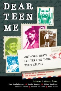
Based on the amazing website, this anthology of over 70 letters features authors writing to their teen selves, edited by E. Kristin Anderson and Miranda Keanneally. (Some of those authors include yours truly, Robin Benway, Carrie Jones, Sara Zarr... the list is good!) Want to preview the types of stories you're getting? Check out the Dear Teen Me website for letters that aren't in the book (new ones still coming all the time). I like to think of Dear Teen Me as the more articulate and insightful version of a site I work on, Before You Were Hot.

In any case, this week you have a chance to win a copy of this brand spanking new book (it's out at this month!). Just comment below and tell me what your "Dear Teen Me" letter would be about. You can be as brief or as lengthy as you like. Each comment is an entry, and you can leave more than one if you have multiple things to tell your teen self.

I'll pick a winner at random next week. Happy Wednesday!

Cover Stories: What the Spell?

Brittany Geragotelis shared her Cover Story for Life's a Witch last year, and she's back now that her books are with Simon & Schuster (and getting royal cover treatment). Here's the tale: "I think I always imagined a girl being on the cover, though I've always been partial to covers that only showcase part of a character's features. I think this jump-starts the imagination and allows the reader to picture the rest on their own."I wanted something that stood out, that was magical, that showed the essence of the book and drew the reader's eye. A cover's so important to whether someone picks up a book or not. I wanted a cover that someone walking by in the book store had to stop in their tracks and look at.

"I have to say that Simon & Schuster was really great about coming to me for my ideas before they designed the cover for my book What the Spell? They asked me who I pictured as my main character, Brooklyn (I loved Chloe Grace Moretz and Leven Rambin). They asked me if there were any objects or artistic ways to showcase things that happen in the book.

"Past that, it was the genius of my art director who conceptualized the cover, chose the model, ran the shoot and chose the images that we ended up going with. Once they had a rough draft of what they were thinking of, I was able to see it and give my input. The sales team took a look and asked for some changes and after a few more rounds, we had our cover!

"The first time I saw my cover  I was impressed with how closely the model resembled who I pictured as my main character. The model was gorgeous, and actually ended up wearing an outfit on the cover that I had the character wear in the book. Her mannerisms were even spot-on.

"But I have to admit, at first, I was like...hmmm, a white cover? But then my editor explained that it was going to be an opaque-white that faded into silver. And everything would be foil, so it would literally pop! That was the HOT factor that I'd always been dreaming of for my cover. Once I heard that, I was totally psyched."My editor did ask for my opinion and I think they listened to me and took how I felt into consideration. But ultimately, there are dozens of hands that are involved in creating a book. So my opinion wasn't the only valid one of the bunch. I was pretty happy with the cover from the beginning, but when everyone else put their feelings in the mix, I think we ended up with a much more fantastic product in the end."I always felt like I was in good hands with the art department. I had the luxury of meeting my art director beforehand (the awesome part of living in NYC and being able to visit the S&S office whenever I need to) and I think we established a great rapport before she got started. She also read some of the book before starting, so I think she really GOT who Brooklyn was, as well as the feel of the story. There were only a few notes I had, but I think, even with those, we were all on the same page.

"The design changed a bit, but the concept was always the same. Fonts were switched, placement of the title and my byline changed, as well as the color for the words. Also, in the first version, Brooklyn was more close-up than the full-length shot we ended up going with. And of course....there was the addition of the foil that brought it all home!

"It was shot with models. And the thing that I thought was REALLY cool, was that they shot the covers for all three of my books at the same time. So, they had two models there: one for Brooklyn and one for Hadley, who's the main character for my first book in the series, Life's a Witch (What the Spell? is the prequel to Life's a Witch). So, even though the other two covers haven't been finalized, I've seen how the books will look as a series, and I've got to say, it's something really special. I think the model for What the Spell? was gorgeous (don't you agree?) and did a great job capturing the vibe of Brooklyn.

"In the end, I love it. I love the look of the series as a whole. I think the model was perfect and I'm really looking forward to seeing how the book pops on bookshelves. I was at a bookstore the other day and took a picture of the paranormal romance section. And you know what I noticed? There wasn't a single white or light-colored cover among the bunch. Everything was dark--blacks and reds and blues. My covers are going to be brighter, they'll stand out and even though there's no lack of darkness in my stories (What the Spell? is about a girl who comes into her witchy powers and decides to use her newfound magical skills to infiltrate the popular group at school, bewitch the guy of her dreams and try to avoid the trouble that seems to follow her everywhere she goes), it's actually really very funny and light at times. My editor describes it as Buffy the Vampire Slayer meets Bring it On and I think this cover captures that."

Thanks, Brittany! I think there's something very cheeky about this cover--it definitely speaks to the humor in the book--and I can't wait to see a hard copy with the silver fade and foil. Love those details.

AND, I should mention that the book is coming out in 3 e-book installments (beginning last week, check out the first one!), and then will hit bookstores in hardback nationwide on January 15, 2013.

PS-Hold the phone! Stop the presses! This cover has CHANGED. The new one is the one you see at right, and here's what Brittany has to say about it: "The truth is, the original cover we had was beautiful. The model was gorgeous and I loved the simplicity of it. BUT we knew we could kick things up a notch and make WTS? something truly magical." Read her full blog post about the changes.

Photo Friday: Martha's Vineyard

We went to Martha's Vineyard with Dave's family in September and it was like, "Oh yeah, THIS is what everyone talks about." What a seriously amazing spot--bikes, ocean, farmland, forest, lighthouses! Gorgeous.

Pop culture aside: Lots of Jaws paraphernalia around, since they filmed most of it there. That movie, man, I can watch it whenever it's on.

AND, both of these bookstores rocked my world (Bunch of Grapes and Edgartown Books).

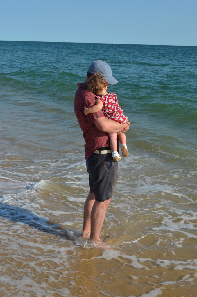
This photo of June with her dad by the ocean makes me miss my own father in a bittersweet way (but mostly sweet). Yay for daddys' girls.

Happy Friday!


Cover Stories: Live Through This by Mindi Scott

Mindi Scott's second novel, Live Through This, received a starred review from Kirkus that says, "What makes this more than another ‘problem’ novel is the author’s steadfast refusal to deal in stereotypes and easy answers." Also, you should absolutely read Mindi's brave and compassionate "Why I Wrote This Book" post. She's touring with the GCC, so she's here to talk about her brand new cover (check out her Cover Story for Freefall too):

"The first time I saw the cover art  it was accompanied by this note from my editor, Liesa Abrams:

I had no clue, to be perfectly honest, how this cover should look. I wanted it to convey the depth to the story but not feel so serious as to not also show that it's accessible, something you want to pick up.

Luckily even when we editors are like "uh . . . I dunno . . ." there are these people called "designers" at publishing houses who translate story and tone into visuals, ha.

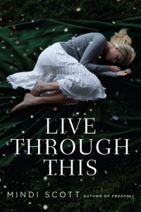
So Jess Handelman had this stock photo that felt right to her of a girl curled up on this background. Only, originally the girl was a brunette and I was like nope, Coley HAS to be blonde. It's key for her to be blonde! :) So she shot another model and layered it on this background and today shared this final version with everyone.

"It was very gratifying for me that my editor was insistent that the girl on the cover look the same as the one I described in the book. I know that it doesn’t always happen that way.

"The thing I love most about this cover is that there are three (maybe even four!) scenes within the story that this image could represent.

"Now, the book takes place in the winter, and there is never a situation where she’s lying around outside barefoot, but I tend to think of the background, confetti, and clothing all as metaphor. (By the way, Coley would never wear that skirt. Not ever. In dressing the model this way, the photographer covered Coley’s legs much more than she ever would have done on her own.)

"The parts of this image that are literal are the girl’s appearance and her body’s positioning. To me, she looks totally overwhelmed. And that’s what this story is about: A girl who pretends that she has it all together, but who is keeping a secret that is breaking her down."

Thanks, Mindi! I like the idea of the cover as a metaphor. While I'm a stickler for details, like the blonde hair, I'm also fully into the feeling of a book's cover, and this one conveys an emotion that seems to fit the story's tone.

Also, I love the sound of this book! In addition to the Kirkus star (!), there's this incredible blurb: “Harrowing, sad, funny, and romantic. I couldn’t put it down.” –Stephanie Perkins, author of Anna and the French Kiss

Yay! What do you guys think?

Check out the trailer too:

Win-It Wednesday: The Dogs of Winter by Bobbie Pyron

This one's for an ARC of the middle grade novel The Dogs of Winter, which is out this month and already has a starred review from Kirkus.  An excerpt: "[Pyron] presents Ivan’s story as a first-person narrative in beautifully composed writing enhanced by Ivan’s visual acuity and depth of emotion." Ooh... good luck!

a Rafflecopter giveaway