eileen cook

Cover Stories: The Almost Truth

Eileen Cook shared her new paperback cover for Unraveling Isobel last week, and now she's on tour with the GCC, here to share the cover of her latest novel, The Almost Truth! "I am so fortunate to work with the team at Simon Pulse. They’ve given me the best covers. For my most recent paperback release, Unraveling Isobel, they’d redesigned the cover to reflect the romance angle of the book (read that Cover Story). I knew with The Almost Truth they would want to have something that has a similar feel.

"When I saw a draft of the cover I was thrilled. I loved the fingers crossed behind her back. I thought that hinted at how Sadie, the main character, has a very 'flexible' relationship with the truth. She’s a bit of a con artist and not beneath telling a story to get what she wants. The problem comes when she’s told some many stories she’s not sure how to get back to the truth.

"The models were live (my editor even sent me some behind the scenes photos on my phone), then they were put onto a stock backdrop. It’s a small detail--but I love how her nail polish exactly matches the word 'almost' in the title."

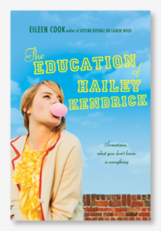
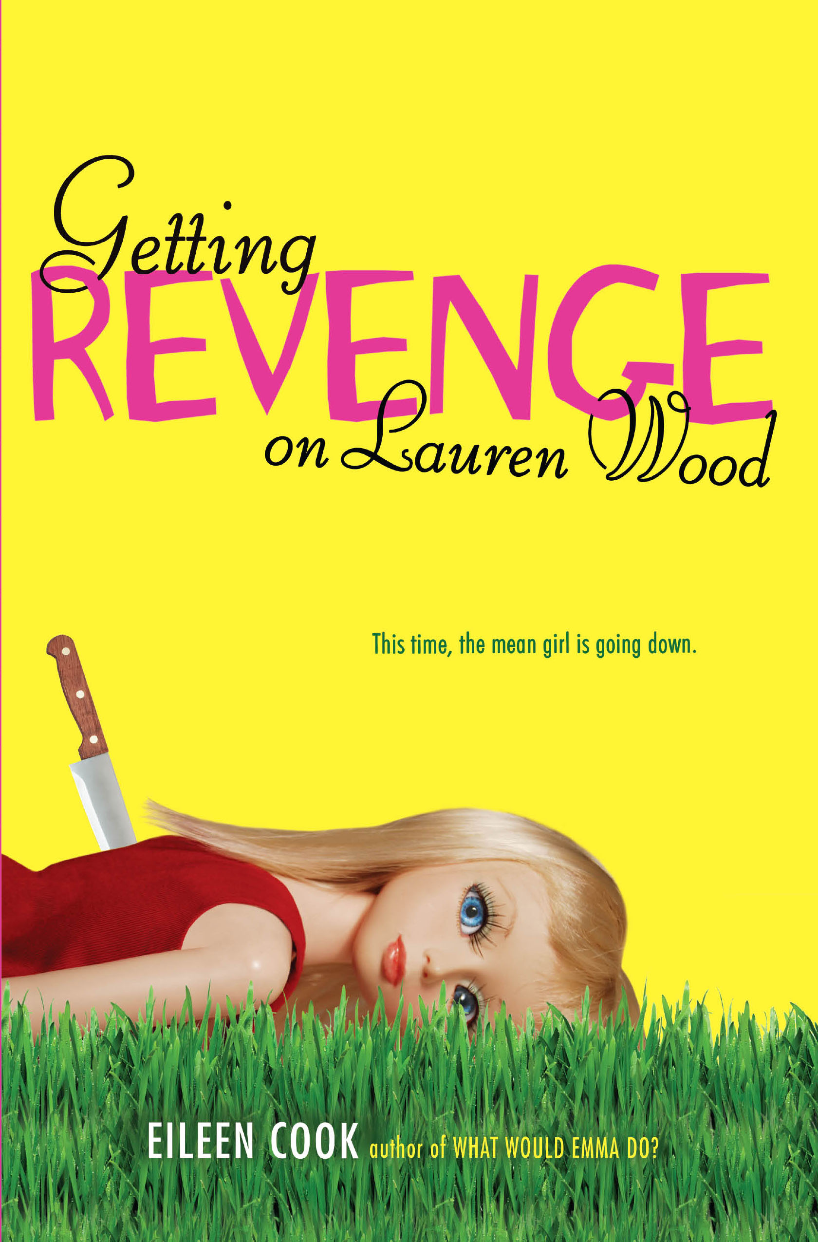
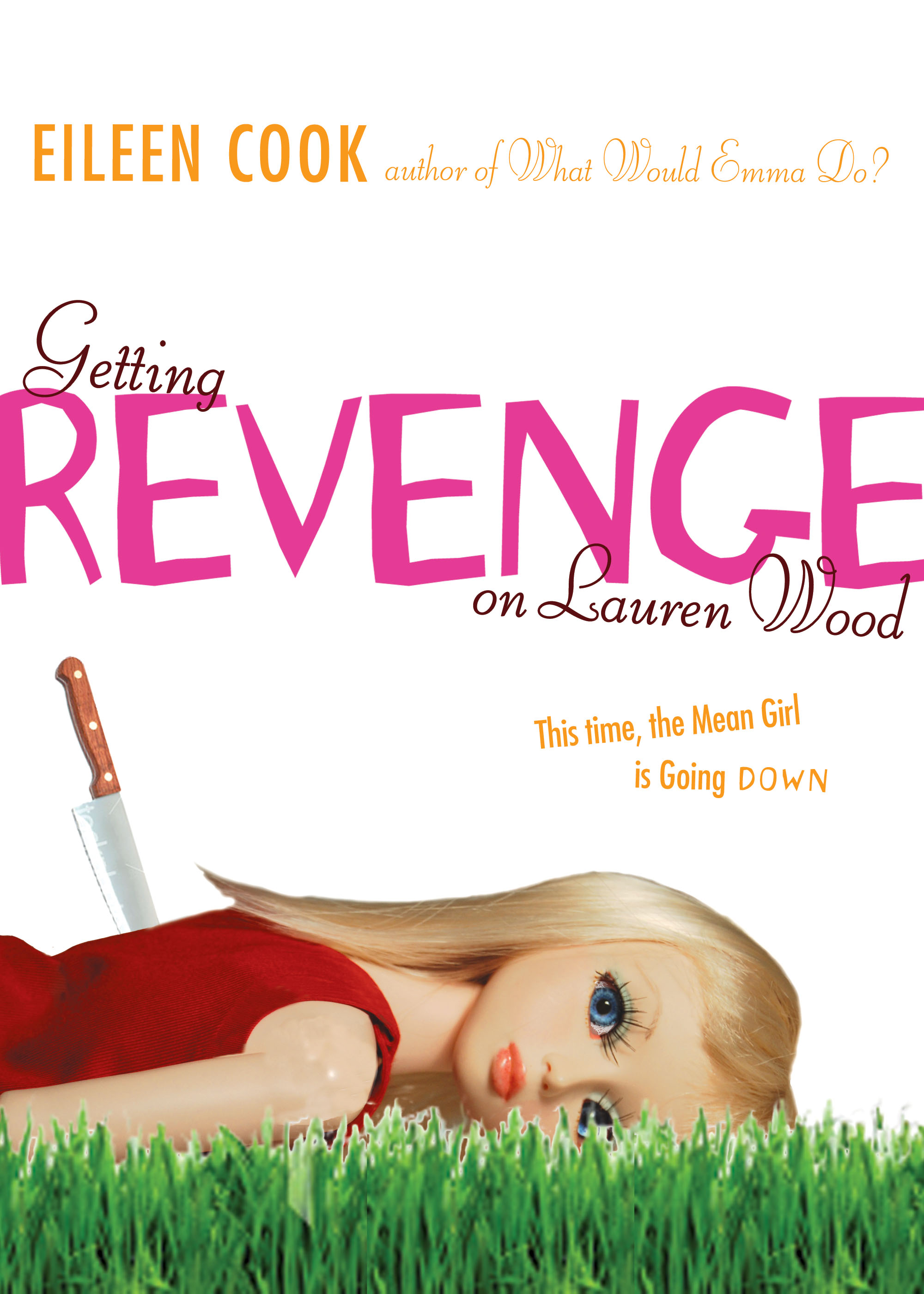
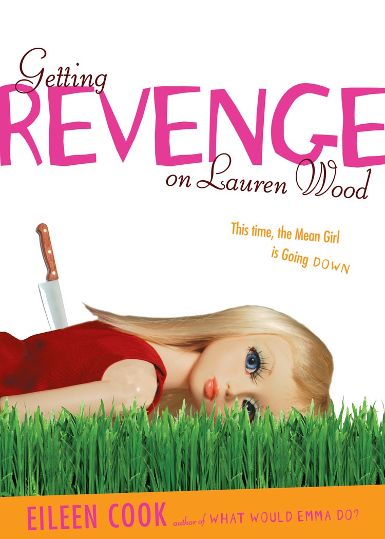
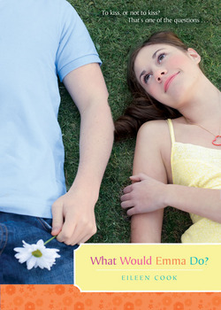
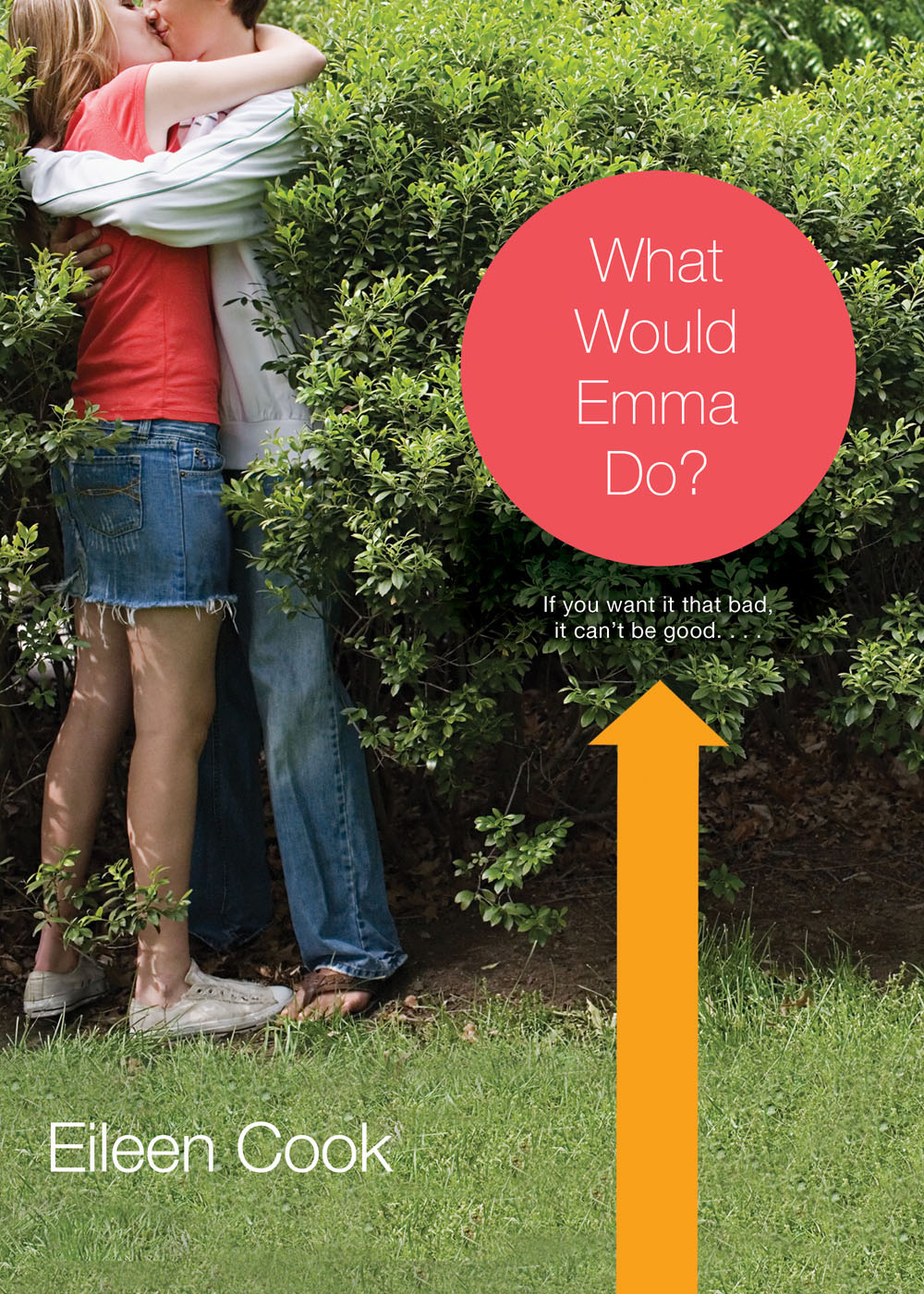
Thanks, Eileen! 1. I love tiny details like the matching polish! 2. I think it's really cool that Simon Pulse is repackaging the books to give them a new shot at a different audience. 3. They also repackaged two of Eileen's books, The Education of Hailey Kendrick and Getting Revenge on Lauren Wood, into a single volume called Used to Be, with a cover like these new ones! Here are those two covers, and the new package:


Some readers commented that the new covers are a little less unique, and I agree, but I also think they can reach more people who are looking for the love stories that Eileen writes. Plus, they're pretty! And I love a coherent feel for covers -- it makes them so great on a shelf.

What do you guys think?

Cover Stories: Unraveling Isobel paperback

Eileen Cook is here because she recently got a cover redesign that I really love! She shared its hardcover Cover Story last year, and she's (paper)back, haha: "The paperback version of UNRAVELING ISOBEL came out the end of October and has a shiny new cover.  When I was shown the original hardcover design (below right) I was thrilled. Isobel, the main character, is an artist and the artwork on the cover matched how I imagined her style. I liked that the model's art was slowly encircling her wrists- it hinted at the feelings she has of being trapped. Feedback on the cover from readers was mixed. Some loved it, but others didn't feel that it matched the book.  When we began to discuss the book coming out in paperback my editor and I discussed the idea of having a different cover. "The team at Simon Pulse is great at including authors in the design process. We talked about what were some of the strong elements in the book that we could highlight with the new cover. We wanted to make sure readers knew the book was contemporary and had a romance. The art department also wanted to create a consistent look with some of my other covers including USED TO BE and my upcoming book, THE ALMOST TRUTH.

"My input was that I prefer when the models faces aren't shown as I like readers to have their own idea of what the characters look like and not have it decided for them in the cover art.  I was also interested in having something that hinted that the story took place on an island. The setting in this book was important to me. I set it on a remote island off of Seattle. I live in the Pacific Northwest where we have all sorts of small islands and they have a unique feel.  There's something about being on an island that is isolating, but also special. Like a time out from regular life.

"When they sent the proposed cover I fell in love. It highlighted the romance element and also the design elements I wanted to include. It's hard to decide between the hardcover and paperback covers,  I'll be really interested to hear what readers have to say."

You heard Eileen! Okay, I like both covers, and I love the artsy indications of the hardcover, but I give the edge to the paperback because it's more romantic, and because I LOVE her dress on that cover. Too shallow? Oh, whatever, covers are looks-based!

What do you guys think?

Cover Stories: Unraveling Isobel

Eileen Cook has been here before, sharing Cover Stories for What Would Emma Do?The Education of Hailey Kendrick and Getting Revenge on Lauren Wood (all awesome tales, btw). Her new release is Unraveling Isobel, and there's a rainbow Cover Story to tell: "When I finished this book I was certain I knew what should be on the cover.  I pictured a creepy gothic house perched on top of a cliff overlooking the ocean.  I’d been imagining the house in the book for so long I could imagine it perfectly.  I’d even drawn floor plans of the house when writing the book.  Of course the problem with having this type of clear vision, it’s really hard to find something in the real world that matches.

"I’m incredibly lucky to work with the team at Simon Pulse. They always invite me to participate in the cover design process. They talk to me not only about what I imagine the cover looking at, but also the feeling I want the cover to impart. My cover designer, Cara Petrus, wanted to make sure that the cover had some of the creepy gothic feel, but also wasn’t too dark as the book has humor too.  Cara picked up on Isobel’s interest in art and also her feeling of being trapped. The concept of her hands being held by her own art work was perfect. Part of what Isobel struggles with in the book is that she isn’t sure if she is seeing ghosts, if she’s going crazy, or if someone is trying to get rid of her by having everyone believe she’s crazy. For me the cover hints at all of this.

"They tried out different color backgrounds, the final image is the official cover."
Thanks, Eileen! Check out a couple of the other color scheme ideas they had:
Ooh, look how there are two Ls in "Unraveling" on the earlier versions. I believe that's the British spelling, actually. Anyway, I like the blue final. These two are pretty in their own way, but the blue tone fits with the book's description, imho. From Goodreads:Isobel’s life is falling apart. Her mom just married some guy she met on the internet only three months before, and is moving them to his sprawling, gothic mansion off the coast of nowhere. Goodbye, best friend. Goodbye, social life. Hello, icky new stepfather, crunchy granola town, and unbelievably good-looking, officially off-limits stepbrother.

But on her first night in her new home, Isobel starts to fear that it isn’t only her life that’s unraveling—her sanity might be giving way too. Because either Isobel is losing her mind, just like her artist father did before her, or she’s seeing ghosts. Either way, Isobel’s fast on her way to being the talk of the town for all the wrong reasons.

What do you guys think?

Cover Stories: The Education of Hailey Kendrick by Eileen Cook

Last year, Eileen Cook stopped by to share the story behind her bright, doll-starring cover for Getting Revenge on Lauren Wood. She's back with a new release, The Education of Hailey Kendrick, which Kirkus calls "the highest quality--like a gourmet truffle" in a starred review! This new cover is just as bright as the last (with less doll), and here's Eileen to tell its tale: hailey_frontpg.jpg"I have two (or at least two) great weaknesses as a writer. I'm lousy at titles and terrible at imagining covers. I'm so lucky to have the team at Simon Pulse behind me. My editor somehow manages to avoid laughing out loud at my titles ideas and the cover designer, Cara can be counted on to come up with some great ideas.

"The book takes place in an exclusive boarding school so my first idea was having a scene where you see Hailey climbing over the wall to sneak off campus. However, we didn't want it to look like she was breaking out of jail...

hailey kendrick 1.jpg"Cara then had an idea that she quickly sketched out with photoshop where it was the main character in her school uniform with a lollipop (right). The problem was that it looked a bit 'porny.' You have to watch out for those school uniforms -- who knew a blazer and knee highs could be so racy.

"The third time was the charm. When I opened the email with the cover the bright colors and typeface really jumped out at me. It felt like a great fit for the book."

Thanks, Eileen! I agree that the lollipop is a bit much -- it takes over the cover. The final image is just as bright and bubbly, so I think it's a great pick! Also, for some reason I love the look of that brick wall, which grounds the whole image somehow.

What do you guys think?

PS-Enter to win a copy of this book (and watch a great Happy New Year video by Eileen) at Wattpad!

Bonus Cover Stories: Getting Revenge on Lauren Wood

GettingRevenge.jpgThe lovely Eileen Cook is here to share the story of her new release, Getting Revenge on Lauren Wood. "There is a scene in the book where the main character dresses up a Barbie doll in a cheerleader outfit and then chucks it into a wood chipper. I thought it would be fun to show someone holding a Barbie doll by it's hair and sticking a pin into it- voodoo style.

"I shared my idea, but the art department warned me that Barbie is trademarked so they frown on people sticking pins in her on book covers. dollwithbook.jpgThe designer did like the concept so she ordered a custom made doll from China and created the cover we ended up with (left).

"I believe I may have actually squealed out loud when I saw the final cover (above). I was THRILLED. I think it's super eye catching and captures the book perfectly.

"I really lucked out in that my editor and the art department have always been open to my making comments and feedback. There was a very early version of the cover that showed a girl staring out looking snarky and while I didn't hate it- I thought the picture could have been on a thousand different books. It didn't feel unique. The art director also wasn't thrilled with her first version so it was back to the drawing board. Revenge1.jpg Revenge2.jpg "We went through about three versions. The first was the most different as it was a photo of a girl, then the cover we have now but with a plain white background and then the cover as it currently exists.

"The cover is a photo shoot of the doll they ordered. The doll came wearing a pair of lacy panties. Makes you sort of wonder about who typically orders these dolls. Her panties didn't make the shoot.

"This is my favorite cover. I love pretty much everything about it from the picture to the color and the font."

I'm always kind of mesmerized by doll covers, and this one is especially intriguing with the knife (and also the back story of how she arrived in just panties--yikes). I also think they got the colors/fonts right. What do you guys think?

Cover Stories: What Would Emma Do? by Eileen Cook

Eileen Cook is here to chat about her new release, What Would Emma Do? Yay! I happen to be incredibly interested in this book because Emma's escapades--kissing a friend's boyfriend and getting all confused and heading for major social disaster--mirrors an episode in my own life. I can't wait to dive in. In the meantime, this cover story is a great one. Here's Eileen:

"I believe there are few things more scarier than the first time you open the jpeg of your cover. While the saying might be 'don't judge a book by its cover,' I am well aware that is exactly what we tend to do. I wasn't sure what I wanted the cover to look like, but I was certain that I wanted to grab the reader's interest by raising some questions in their mind. If it could raise a question then hopefully the reader would pick up the book.

Emma%20first%20cover "My editor and the cover designer involved me in the discussion for the cover and even sent some candid photos from the day they did the photo shoot. It was a freezing cold day and they used a hair dryer to heat up the model between shots. There were concerns that because the model was so cold it came across in her expression. When I saw the first draft overall (left) I was fairly happy. I didn't love it, but I also didn't hate it. I've known a lot of writers who had covers that they detested so I felt like the situation was a win. A few weeks later they emailed me again saying they had decided the cover wasn't bang on and they were doing a different version. I chewed down a few fingernails until it arrived.

"As soon as I saw the final cover it was love. I love the awkwardness of her sneaking a kiss in the bushes and that she's stepping on his foot. I was thrilled that they went from what was a good cover to one that felt like a great cover."

WWEDfront.jpg

Thanks, Eileen! I love the final cover because I think it conveys the "being bad" side of the story more. What do you guys think?