Cover Stories: Tantalize, Kieren's Story

Cynthia Leitich Smith is a huge supporter of the YA writing community who truly rocks. I recently wrote a guest post for her awesome blog, Cynsations, about writing "true" vs. "likeable" characters. She also happens to be the New York Times and Publishers Weekly best-selling author of the Tantalize series: ETERNAL, TANTALIZE, and BLESSED, Gothic fantasies from Candlewick. TANTALIZE: KIEREN’S STORY, illustrated by Ming Doyle, is a graphic edition in which Cynthia re-envisions her dark fantasy through Wolfish eyes. How cool is that? Here's Cynthia with the Cover Story for  TANTALIZE: KIEREN’S STORY:

"I anticipated that the cover would nod overtly to Kieren’s identity as a human werewolf-hybrid. We often see this with books that involve a shape-shifter protagonist. I tend to prefer those in which it’s more subtle, like Vivian’s wolf shadow on the original cover of Annette Curtis Klause’s Blood and Chocolate (right).

"Usually in shifter books, the transformation is a powerful moment in the story, and as a reader I prefer to experience that in my imagination rather than to be offered a visual up front. However, in my story, because Kieren is a hybrid (and has some issues with that), he doesn’t shapeshift as easily or completely as, say, his mother who has no known homo sapiens heritage.

"I was wary of the idea that the cover might suggest that Kieren would go full Wolf and managing that more delineated duality would be the book’s focus. The story is more of a murder mystery with strong romantic elements than a straight-up creature feature, though certainly creatures abound.

"My first thought when I saw the cover was, He’s a boy. Definitely a boy.

"The cover illustration of Kieren is very masculine at a time when depictions of boys in YA cover art tend to skew pretty. This feels authentic to Kieren, who’s determined not to be a danger to others but is still willing to go dominant when interacting with other shifters.

"He has a full head of hair and generous nose, both befitting a Wolf, but he’s still firmly human, too. This is important because it’s Kieren’s intelligence-- rather than his instincts—that he relies on most.

"I was somewhat surprised by the sensuality with which Quincie is depicted, especially since the story (while it definitely has a strong romantic subplot) is more driven by the mystery/suspense aspect. I think you can see the tip of her tongue there.

"At the same time, the juxtaposition is a strong image, and it certainly evokes her sensual nature. After that initial moment of surprise, I fell quickly in love with it, and reactions from YA readers have been overwhelming positive.

"We get that Kieren is a shifter from his transformed hands and forearms, and in my mythology, that’s where the change starts. It’s also the most significant area because—when startled by an oncoming train—his shift kicks in and his claws accidentally skewer the hand of his best friend and true love, Quincie. Though Kieren manages to pull himself together enough to save Quincie’s life, his guilt over that accident haunts him throughout the book and causes him, in part, to withdraw somewhat from that precious relationship.

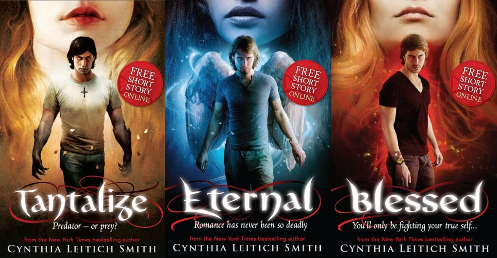
"When this Candlewick graphic novel cover was presented to my U.K. publisher, Walker, the team liked it so much that they adopted the concept in repackaging the first three prose novels in the series (below)."
Thanks, Cynthia! It's definitely interesting that the cover combines the pretty of feminine lips iwth the masculinity of Kieran's form. I am also just so excited that your novel went graphic--such a fantastic shape shift in itself.

What do you guys think?

PS-Read the original Cover Stories for Eternal and Blessed.

Win-It Wednesday: Dear Bully

I'm just halfway through Dear Bully, out this week, which has essays by 70 authors (including yours truly) around the topic of bullying, and I am having to take breaks because the stories are so raw and real. This is a fantastic anthology, and I'm honored to be included. (Thanks especially to amazing editors Megan Kelley Hall and Carrie Jones.) Last night I cried before bed as I read this. I mean, I do have a new baby and sleep deprivation is real, but I think it was more this book that put me over the edge in a good way--this is emotional stuff!

I have two ARCs that will go to two winners. To enter, comment below and just tell me how bullying has touched your life. Tell a story or just say, "I was bullied" or "My best friend was bullied" (or, if you're like me, "I was a bully, too"). I won't pry, I just find some comfort in knowing we all experience this. If more kids knew that, maybe more of us would be able to stand up to bullying, help out, not participate ourselves.

Here are two great ways to stem the bully tide: Just Hit Delete and The Bully Project.

I'll pick winners next week. Happy Wednesday!

PS-Like the book on Facebook for updates and events. 70 authors, man. That's a lot of event possibilities!

Cover Stories: Extraordinary by Nancy Werlin

Nancy Werlin has some decidedly gorgeous covers. Her hardcover for Extraordinary enchanted me at first glance, and the paperback is striking, too. Nancy's here to tell the tale of these two covers:

"Previously, on the hardcover of Extraordinary . . .

"The cover story for the paperback U.S. edition of Extraordinary begins with a quick look back at the book’s hardback cover story.

"The final cover (left) depicted a scene from the book: a red-haired girl – my main character, Phoebe – running in high heels into a lushly green wood. There were many exclamations about how pretty it was. It also matched the cover for my previous novel, Impossible. I liked it!

"But I concluded that cover story by saying, “No matter how beautiful and loved a cover may be, the jury on it remains uncommitted until the book has been in the world for a while … the author hopes that the cover will be magical, attracting all the right readers, and as few as possible of the wrong ones, to what really matters: what’s inside the cover.

"Suddenly, totally different paperback cover(s)!

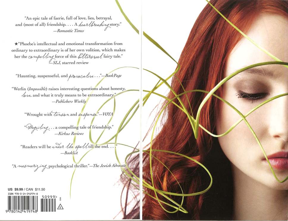
"Months later, my publisher, Penguin/Puffin, sent me an email with their new concept for the paperback covers. Yes, covers, plural. When you open the front cover, you see a two-page spread called the 'step-back cover.” Look at the right side of the front cover and you’ll see the hint of a second set of lips, and another nose.

"I was surprised. The folks at Puffin hadn’t told me they were rethinking things for the paperback. The email said: 'We all think that these images really capture the two girls (and the dynamic between them) perfectly.'

"I opened the attachments in terror.

“'There is no beauty without strangeness.'

"Let me be the first to say this: in designing the paperback Extraordinary cover, Puffin made two seemingly strange decisions. It makes me think of something the fashion designer Karl Lagerfeld said: “There is no beauty without strangeness.”

"1) That’s Mallory, the antagonist, on the front cover. Phoebe, the main character, is on the secondary, step-back cover (below).

"2) Mallory is shown with dark hair, though she’s blond.

"Decisions were made here. Decisions, not mistakes. The proof of this is that I literally didn’t notice them for weeks.

"Indeed, as I stare into Mallory’s challenging eyes, and look at the darkness around her, I am convinced that if anyone made a mistake with her hair color, it was me. As to Phoebe, she herself would say, 'Oh, no, please, don’t put me on the front!' That is, in fact, the very core of her issues.

"Authenticity

"In the hardback cover story, I said there were three things that the Extraordinary cover had to achieve. The third was: 'Represent the book’s contents authentically enough.'

"The Extraordinary hardback cover was 'authentic enough.' But the paperback cover is just plain authentic. It does not let the reader assume that the novel is a romance like Impossible, which it is not. Instead, it sets the reader’s expectations accurately.

"Extraordinary is the story of a complicated, passionate female friendship filled with love and hate, misunderstanding and betrayal, estrangement and reconciliation, set against the backdrop of Faerie.

"From the use of two strong faces (carefully chosen to reflect their personalities, from Mallory’s dangerous outward gaze to the frustration of Phoebe’s gently closed eyes), to the tag line on the cover ('Can their friendship survive the ultimate betrayal?'), to the strong, sinister curl of green vine across both girls’ faces, everything about this cover describes the book I wrote.

"I have had book covers that I liked, and book covers that I loved. The paperback cover of Extraordinary is the only one about which I can conduct a lengthy literary analysis. In the end, though, that analysis boils down to two words:

"Strangely perfect."

Thank you, Nancy! I agree, and I loved the book, as you can see from this review (third one down).

I'd love to hear what you guys think of these covers (and that step-back cover)!

Photo Friday: The Cat Nursery

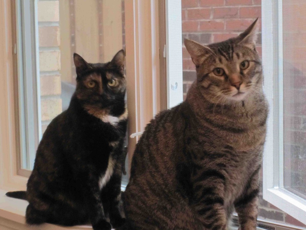
Swayze is taking over the nursery. That's his weird little duck toy that he's had since Christmas lying on the ground in front of him. He is OBSESSED.

Happy Friday!

PS-For some reason I'm wary of posting too many June pics. Maybe later in life she'll be mad that I did that without her permission? Is that nuts? I like how I'm already thinking about reasons she'll get mad at me later. But right now, she totally loves me.

Cover Stories: Wintering Well

When I went up to the Albany Children's Book Festival in the spring, I sat next to Lea Wait (yay for alphabetical order!) and we got to talking about one of the books she had on her table, Wintering Well. Of course, we got into Cover talk, and I heard the amazing story behind this book's two covers. And now Lea's here to share it:

"I’ve usually had a good relationship with my editors at McElderry Books (Simon & Schuster) regarding covers. Discussion for the cover of Wintering Well started innocently enough, when I asked whether the artist who had done the artwork for my previous two historical for McElderry would also be doing the cover of Wintering Well. I was told that, no, a digital photograph would be used this time instead of original art. When I pressed the issue (I really liked the artist’s work, and thought all my covers should have the same look) I was told Barnes & Noble wanted all middle reader books to have digital photo covers, so if I wanted my book to be in B&N, that’s the way it would be.

"O – KAY! My editor then asked what the main character in my book, Will, looked like. I described him as I did in the book. It was 1819; he worked on a Maine farm; he wore a smock over long trousers, had sun-bleached hair and blue eyes. She hired a young model, clothed him appropriately, and I thought the result was a great cover (above left), even if it was a photo and not a painting.

"Shortly after the book was published I got an email from the mother of the model. She wanted to tell me that her son, Sasha, was modeling to save for college. She also thought I’d like to know he’d been adopted from Russia as an older child, since she’d read in my bio that I’d adopted four older children. I was delighted to know, and added Sasha’s story when I was asked about the boy on the cover – as I frequently was.

"Eighteen months later, Wintering Well was published again, this time in paperback. My other books had made this journey before, and their covers had traveled with them: the same cover appeared on the paperback as on hardcover.

"So I took a very deep breath when I opened an envelope with an advance copy of the paperback edition of Wintering Well and came face-to-face, not with Sasha, but with a boy I’d never seen before (right).

"Not only had I never seen him, but no one in 1819 Maine would ever have seen anyone like him. This boy’s hair was cut short, in a way no boy or man in 1819 would have worn it. He was standing in front of a mid-western cornfield. And he was wearing a pair of overalls with metal machine-made strap clips – clothing not manufactured until well after the Civil War.

"Where did he come from?

"Of course, I asked. And was told that the paperback editor felt Will’s long hair made him look 'too girlish,' and that this 'more macho' boy would sell more copies. She didn’t think anyone would notice that the cover wasn’t 'exactly' historically correct.

"Wintering Well is my best-selling book for young people to date. Today the hard cover edition is out of print; readers now have to buy it in the paperback version (or in an e-book.)

"When I speak to schools, students often ask me why there are two covers, and I tell them. And then I ask them which cover they like best.

"No class has ever preferred the paperback version.

"And no class has ever thought the hardcover version, the picture of Sasha, makes Will look 'girlish.' (Girls do think he’s cute though.)

"Has the second boy sold more copies than Sasha would have? There’s no way of knowing.

"But I do know he has raised a lot of questions, and given me the opportunity to talk about the author’s role in creating cover art."

Thanks, Lea! I find this story simply fascinating. I love the back story about Sasha, the justification for the change, and Lea's feelings about the covers (thanks for being so honest). I actually like both covers quite a bit, and I think the second one looks more "polished" somehow, but it's not because of the model. I think they could have kept Sasha with that new background and font and had a win-win. The historical inaccuracy isn't something I noticed, though I do think it would bug me as the author!

What do you guys think of this one?

Win-It Wednesday: First Day on Earth

I loved hearing about cover colors that you guys are into. The winner of last week's giveaway of Undercurrent is... Andrea H.! Send me your address, A. This week, I'm giving away an ARC of Cecil Castellucci's First Day on Earth. It comes out in November, and it's so lovely. It has all the dark spots and all the brightness of a starry night sky. I felt completely transported as I read it. And I really want to take a road trip out west now. (Yes, I know that gives you no kind of summary; that's what goodreads is for.)

So, to win this book, tell me: What's the best thing you did this summer?

Yes, I'm totally sounding like an English teacher who wants the generic "summer" essay, but hey, I'm curious.

Me: Well, the Small Town Sinners release was pretty cool. But really, I guess having a baby takes the cake. Big season in the Walker house!

Happy Wednesday.

Cover Stories: The Dark Days of Hamburger Halpin (Paperback)

I noticed that Josh Berk's novel, The Dark Days of Hamburger Halpin, got a completely revised paperback cover this summer, so I asked Josh to come back and share the new Cover Story. Because his original one? Highly entertaining. Here's Josh:

"As mentioned in my previous Cover Story, Will Halpin (the star of THE DARK DAYS OF HAMBURGER HALPIN) was once a cartoon and is now a real boy! On the cover of the hardcover, Will (along with his co-stars Ebony and Devon) was rendered cartoon-style by French artist Philippe Petit-Roulet. It was a very cool cover (right), but for the paperback I was informed that my publisher was going to 'go in a different direction.' (I'm not sure why I put that in quotes because it may not be a direct quote.)

"Various other directions were suggested. For example, one had as its central image an old diagram of the lobes of the human brain. It looked a lot like this:

"The title was zooming out of the guy's ear. It looked really awesome to me, but it was decided that it didn't exactly say 'teen friendly.' There was also a version of the cover pitched which had a bunch of crows spelling the title in yarn. I thought this was great too! (I'm not hard to please I guess...) It's hard to explain, but it looked awesome. Alas, it was deemed as not exactly the 'teen vibe.' (Note: Teens don't love crows? They should. Crows are awesome. Maybe teens hate yarn.)

"So the next cover pitched was this black and white image of a dude walking in the woods. I loved how dark and moody it was and the dude was a teen so huzzah! This was the chosen image. My only issue was that the guy was a bit too lanky and thus not a perfect depiction of Will who is 'big-boned' or, in his words, 'a fat kid.' I asked if they could make the dude less lanky and through the magic of Photoshop, Will put on a few pounds. 'Gee, thanks, Berk,' says Will, who continues to speak to me because I am insane.

"Now I'm not 100% sure if the cover artists were thinking of the following passage when they chose this image, but the photo makes me immediately think of the scene in the book where Will plays hooky and walks home through the woods behind school. Can I quote myself? Yes? Thanks. Ahem:

The walk home is bleak and strange. Most of our city is as bland and modern as anywhere else in America, filled with Taco Bells and chemical plants (note: co-incidence?), but the walking route I take from school to home shows slices of the past. Half-falling-down buildings -- relics of the coal mining era -- are still visible. They hang incongruously in the shadows above the shining new construction, receding into the background. Like ghosts. I walk past a rusty bridge that retreats into the woods for a few hundred yards, then gets swallowed up by trees and the side of the mountain. A bridge to nowhere is probably symbolic of something in this town, of my life maybe.

"So to me this new cover totally is Will, wandering through the woods, thinking about life. Perfect! Then they added a really great font (man, I love fonts!) and it was done! The black and white motif continues on the back cover, which also has some red text that looks pretty bad-assed. Can I also mention that the red text quotes some of the book's starred reviews? No? Yeah, that would be a bit much. Anyway, thanks for having me (and Will) back!"

Thanks, Josh! These two covers are so different that I had to find out more about them. I like both, but for completely different reasons. First, I'm into a cartoon cover, and I think this hardcover is fun without being "too young" or cheesy. The paperback cover I like for its mystery, and the font is playful, so that kind of keeps the fun element of the first cover.

What do you guys think?

Photo Friday: L&D

L&D is hospital speak for "Labor & Delivery." One more baby-related week! First, the final photo of me, 9 months pregnant!

And an in-labor shot at home (early on, while I could still smile). Note my Tim Riggins-worn Friday Night Lights tee. It helped me be strong! And so did Dave, of course.

(Here is Tim Riggins in this very shirt on TV! It looks better on him. Am I getting off subject?)

And now, fully on the other side of things, I master the Moby Wrap and can go for Happy Hour again.

I love a happy ending! Have a great weekend!

PS-Can I mention again how much I love my FNL shirt? I bid way too much for it on ebay. It was my baby gift to myself. It came with a certificate of authenticity. It might be my FAVORITE (inanimate) thing this summer.