Win-It Wednesday: Undercurrent

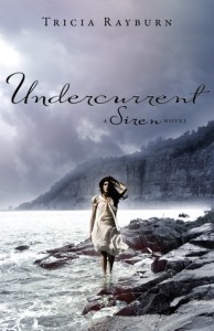
Phew! I'm back with a new giveaway, finally. This week's prize is Undercurrent by Tricia Rayburn -- the second novel in the Siren trilogy, a gorgeous hardcover. What is it about gray? Maybe I'm almost ready for fall, and this gray-blue oceanic cover makes me moody in a good way. A Pacific Northwest way. To enter to win this book, tell me what colors stand out for you on a book cover. I know we're all awash in dark paranormal shades, so do you like a pop of red (like on, ahem, Small Town Sinners)? A bright sunny yellow? A blank white background? Name a color or a specific cover that has really pleased you lately. I'm curious.

I'll pick a winner from the comments at random next week. Happy Wednesday!


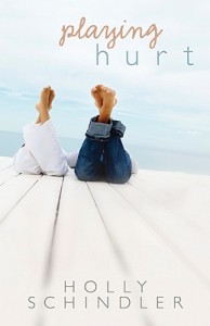
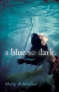
Cover Stories: Playing Hurt & A Blue So Dark

Holly Schindler is here to talk about two of her novels, A Blue So Dark and Playing Hurt. They have really different feels (Playing Hurt makes me want August to last forever--so summery!--and A Blue So Dark has a much eerier feel--I love underwater covers lately). Here's Holly to talk about each cover:

"While the covers of my YA novels—A BLUE SO DARK and PLAYING HURT—are both stock images, the end result is pretty night-and-day different, as is the content of the books (A BLUE SO DARK explores the possible link between mental illness and creativity, and PLAYING HURT features a romance between two former athletes.)

"The covers have two completely different functions. A BLUE SO DARK is a metaphorical cover; it speaks to the emotional content of the book. It’s a poetic representation of what happens in the book. PLAYING HURT is a literal interpretation.

"I love both covers—but of the two, PLAYING HURT’s my favorite, because I think it better steers the book toward the right readership.

"When A BLUE SO DARK was released, it was frequently purchased on Amazon by readers who also purchased paranormal titles. I think some of those readers were a little off-put, in the beginning. After a while, though, my incredible bloggers started shouting from the rooftops about BLUE—and the book found its way into the right hands.

"PLAYING HURT seems to be getting into the right hands from the get-go—early purchasers anticipated a romantic read, and that’s exactly what they’re getting: a steamy summer romance meant for the older teen readership!

"…One of my favorite aspects of both novels, though, is the finish of the covers. Both books feature a finish that feels a bit like raw silk—I swear, you really want to pet these novels!"

Thanks, Holly! I've been known to pet a book in my day. I also love the distinction Holly makes between a literal interpretation of a scene in the book and a metaphorical exploration of the book's content--this is a great juxtaposition of these two approaches.

What do you guys think? Do you prefer literal or metaphorical covers?

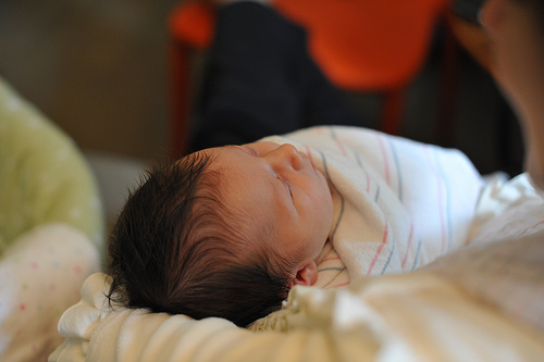
Photo Friday: More June

I won't make Photo Friday into Baby Friday, I promise. But this? It's really what's going on in my life right now. You know, living in a bathrobe, making sure she eats 8-12 times a day (not kidding!), and watching her sleep and gurgle. So here's one more shot, courtesy of my friend Tom, who has a much better camera than I do:

Is that a head of hair or what?

Happy Friday!

Cover Stories: Like Mandarin

Kirsten Hubbard's Like Mandarin came out in the spring to great buzz. Read bibliophile brouhaha's review for taste of that. The cover always intrigued me for its use of white space and pastels. I think it's lovely. Here's Kirsten to talk about how it came to be:

"I've always felt like the most iconic images in Like Mandarin are wild girl Mandarin Ramey's long black hair, and the Wyoming badlands where the book takes place. My publisher did offer me input, and I made note of a few covers I really liked, and described the sort of black hair, badlands scene I'd always imagined on the cover of Like Mandarin.

"There's a part in Like Mandarin where Grace's thoughts blank out, then come back as a series of exclamation points instead of words. That's pretty much what happened when I saw my cover. It was taped to the bookshelf in my editor's office the first time I met her. I didn't expect to see it -- nor what I saw! It contained none of the elements I'd suggested, but it was so strong, and simple, and beautiful.

"Interestingly, my editor pulled out the image of another cover they'd been working on: a dark-haired girl from behind, against a backdrop of badlands. If I remember correctly, it was in black and white, and the font (a different one) was some bright color, like pink. It looked like an album cover, while the cover we went with looks almost like a movie poster -- just stronger overall.

"Although my first reaction was surprise, I adored my cover -- the white space, the moodiness, offset by the quirkiness of the title font and colors. However, I had one problem with it: who was the cover girl supposed to be? You'd assume she was Mandarin, right? But like I mentioned above, the most iconic part of Mandarin, to me, has always been her long black hair. And the cover girl's hair isn't black. It's more the color of Grace's hair -- but then, she looks a little old to be 14-year-old Grace.

"When I voiced my concerns, the designer tried to darken the girl's hair, but it took away the beautiful brightness of the photo. We all agreed it looked better the way it was before.

"I came to terms with the cover girl by thinking her of Grace, trying to be like Mandarin -- which is what the story is about. Grace, the way she wants to be seen. And you know what? Nobody has ever asked me who the girl is supposed to be. It goes to show the beauty of a cover is more important than the tiny details.

"Bonus story: there wasn't a photo shoot for my cover image, but it's not stock either. Random House found the image on an art-sharing site, and bought the rights to it. A few months ago, the girl who photographed the cover found me on Facebook, and informed me the girl in the picture is her twin sister. As a twin myself, I just loved every part of that."

Thanks, Kirsten! I love that too. And I do think the cover suggests a strongly character-driven book, which I adore.

What do you guys think of this one?
Win-It Wednesday: Apple Winners!

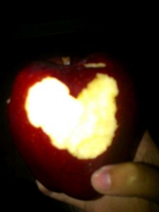
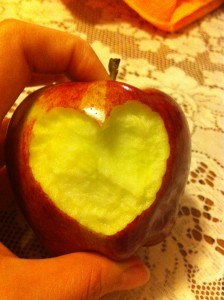
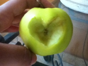
Guys, I loved this contest. Thanks to everyone who took a heart bite out of an apple for me in the past month. Below, the five winners: ♥ Alison (best shaping):

♥ Katie (best setting):

♥ Alexis (best lighting):

♥ Alejandra (precision points):

♥ MaryNellie (best photoshopping creativity):


Thanks to everyone who entered! If you've won, email me your address and I'll get your copy of Small Town Sinners in the mail!

And just in case you didn't win this one, here are a few other places where you can win a copy of the book...

Via the sidebar in this News & Observer story (ends Friday!)

Confessions of a Bookaholic

Stephanie Kuehnert's blog

Sydney Salter's blog

Happy Wednesday!

Cover Stories: Wolfsbane

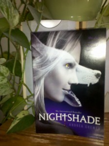
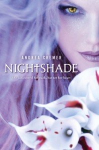
Andrea Cremer shared the Cover Story for the hardcover of Nightshade last year, and since then I have eaten pizza with her and can confirm that she's as awesome as the books she writes. Seriously. And now she has a newly redesigned paperback! Plus, the second novel in the Nightshade trilogy, Wolfsbane, was just released. Here's Andrea to talk covers:

"I didn't have a specific idea for the cover, but it always involved wolves and blood.

"When I first saw the new covers, I was thrilled. To me the new covers depict Calla perfectly. The new Nightshade cover (right) drew on the poem that inspired Calla's character. The poem is one of Margaret Atwood's and its first stanza is 'Not you I fear but that other/she who walks through flesh/queen of the two dimensions.'

"The Wolfsbane cover: First of all it's green! My favorite color! I think it continues the theme of depicting Calla's strength. The concept is that she is crouched under the moon about to shift into wolf form. I love it!

"There were some small tweaks - usually about getting the color of Calla's eyes just right.

"The covers (both the originals, shown below, and the new designs) all feature the same model. Her name is Amber and she is the perfect Calla. Penguin had photo shoots for both designs.


"I love all the covers and I feel so lucky to have such a talented design department handling my books. Calla anchors the Nightshade trilogy so getting her right is essential - that has always happened and I couldn't be more thrilled!!!"

Thanks, Andrea! These books have been international bestsellers, and I think the cover change is really interesting. I actually adore the original covers, but maybe the new ones are more appealing to guys, too? Less girl-face-on-cover with bright colors?

In any case, this series is really great--smart, full of action and with lovely literary and historical nods.

What do you guys think of these covers?

Cover Stories: Amy & Roger's Epic Detour

I have gushed about Morgan Matson's fantastic road trip book in the past, and requests for the Cover Story kept coming in, so here she is! Morgan... "I really didn’t have a specific image of the cover as I was writing the book. It’s funny, but I was so focused on getting the story down I didn’t think about the other aspects of the book – like what form the cover might take – until I’d finished the first draft.

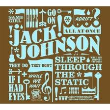
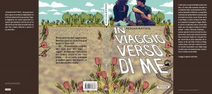
"My editor asked me what I was thinking, cover-wise, and I brought her a few images, including a Jack Johnson album (right) – I was thinking in a much more graphic format, and less of a photographic direction. Some early cover versions took this approach – I think a very early cover idea was a map of the country, looking like a postcard. But as soon as I saw the picture of the two people, holding hands, on the highway, I knew that we’d gotten it. I was SO thrilled with the cover, especially the blurry mountains in the background.

"It’s funny, but the Swedish cover used the same picture, but didn’t crop it. But I prefer not seeing the faces on the models (it’s a stock image). I just think the cover works so well, and captures the feeling of the book so perfectly. A lot of similar aspects – the road, the dotted line – cropped up in the Italian version (left), which was nice to see.

"I was actually in London last winter, so was able to stop by S&S UK and see the early version of the British cover in person. I also love the British cover (right) – and it’s funny, because this was what I’d had first had in mind for the US cover! I like how different the two covers are, but how they both work SO well for the story. The artist, Mary-Anne Hampton, read the book, and you can tell because of all the tiny details in the drawing that come directly from the book. What’s fun to me about the British cover is that since Roger draws in the book, it almost seems like he could have done the cover, as the style matches some of his drawings. Also, there are tiny hearts ALL over the cover, and I’m still finding some. :)

"It’s been fun to see UK readers debating the merits of the two covers. I’m thrilled with both of them, and feel so lucky to have such talented designers and artists working on them!"

Thanks, Morgan! I am so into everything about this book (mainly the story, which is always a good thing), but also all of these various covers. I'm impressed that each one has a feel that seems right for the book! I love the original cover, but I also adore the illustrated UK version--it reminds me of this awesome illustration for my own Lovestruck Summer cover. I have to admit that the Italian design is my least favorite (maybe the combo of photo and illo don't quite work for me), but the other two ROCK.

What do you guys think?

Photo Friday: New Apartment Moments

Just a few scenes from the new 'hood (a mere seven-block move can change the micro-neighborhood feel, I swear). These include: flowers down the block, the farmer's market, Swayze supervising cable set up, cats loving big windows, dappled nursery light, flowers in the new kitchen, an odd knight outside a store nearby and the ever-constant Brooklyn Bridge.

We're moved!

PS-Our gargoyle watches over us still (found this guy on the street like 8 years ago; still love him!)

Happy Friday!


Win-It Wednesday: APPLE BITES

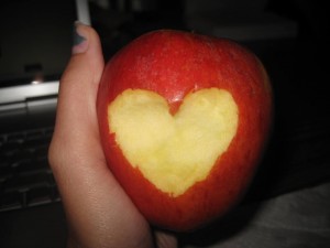
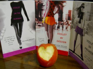
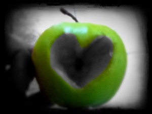
Okay, so it was brought to my attention that I said this contest would last "through the end of July." Which means I'll announce 5 winners of signed Small Town Sinners ARCs next week. You still have time to enter. How 'bout them apples? (Sorry). I have to admit to being inspired by Kelly and Abby's ALA post back in January, where they posted this photo:

Not bad, right? Your turn. All the details are here.

Happy Wednesday! Winners will be announced next week, same time, same place.