Cover Stories: Nara Gazing and Shattering Gigi

MirrorMirror_Cover
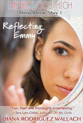
Diana Rodriguez Wallach was here to show off the cover for Reflecting Emmy, part one of her Mirror, Mirror trilogy (overall cover at left), and she's back today with the covers for parts two and three! Take it away, D: "I have two covers to share with you from my YA short-story trilogy, Mirror, Mirror. Part two in the series, Nara Gazing, is on sale now. And part three, Shattering Gigi, debuts in November 2013.

"The cover for Reflecting Emmythe first story in the trilogy that came out in September 2013, included a mirror and I really wanted to continue that theme. The entire series revolves around reflections. It’s a re-imagining of the myths of Narcissus and Nemesis, and as many people know, Narcissus famously died while gazing at his own reflection. So mirrors are a huge theme in my modern twist on this tale. Emmy is a paranormal secret agent who’s tasked with ridding the world of Narcissistic people by using a compact mirror to judge their reflections. So for Nara Gazing and Shattering GiGi, it was very important for me to continue the mirror theme.

"I know a lot of art departments don’t care about cover models looking exactly like the characters as they’re described within the book, but I feel otherwise. The character of Nara is being targeted by Emmy because she’s beautiful, vain and narcissistic. So Nara’s beauty is a key point in the story, and I felt strongly that it should be represented accurately. I pushed hard for a redheaded model. Nara is a strawberry blond goddess with pale skin and blue eyes and I’m glad we were able to find a cover image that reflected how I imagined her.

ShatteringGiGi_Cover
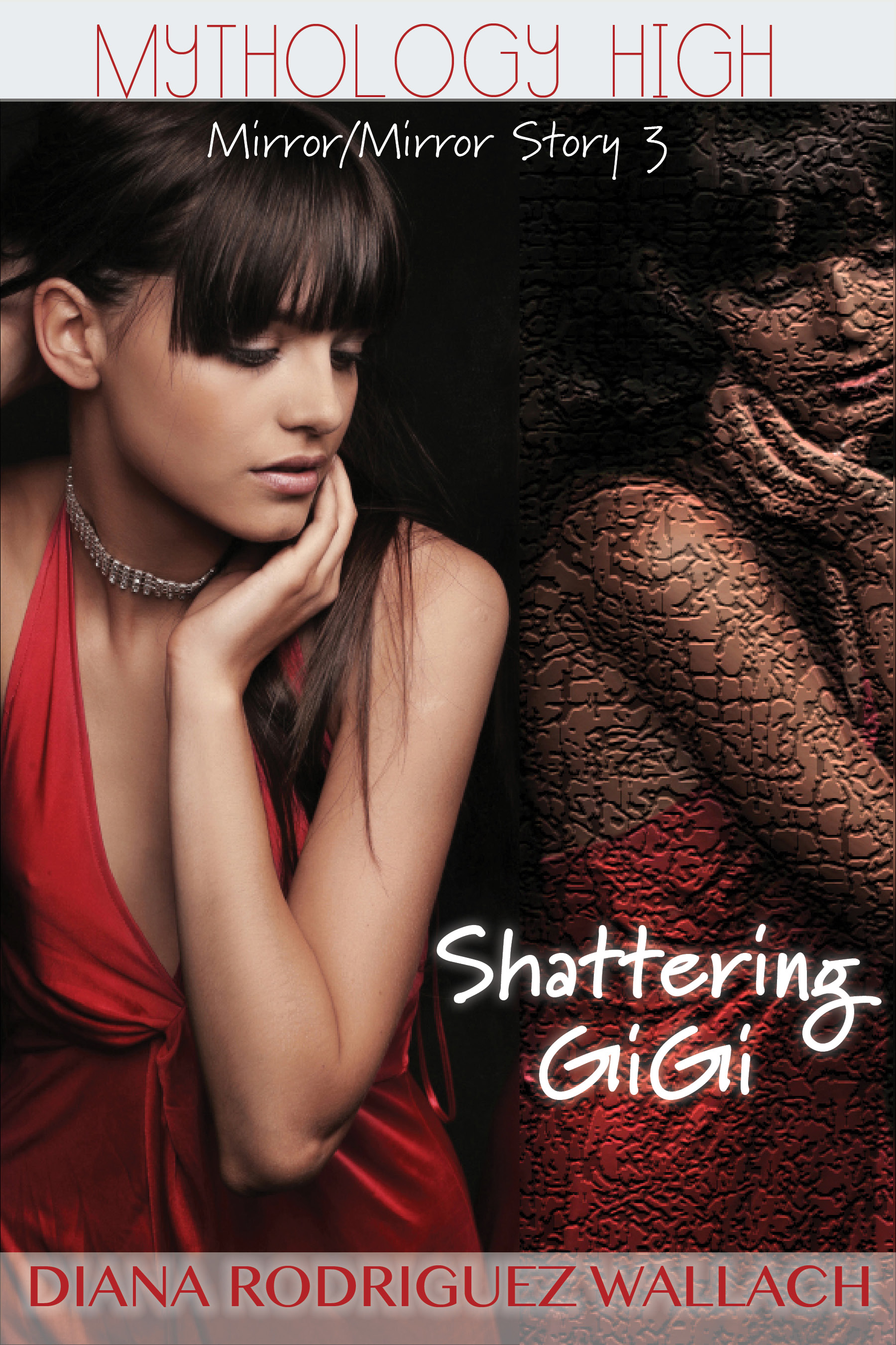
"The first time I saw Shattering GiGi, I loved it! I had absolutely no changes. I loved that they gave the mirrored-image a 'shatter' effect, and I loved how the model reflected the overall look of both Emmy and her ageless grandmother, GiGi. I also loved the red dress. GiGi is a re-imagining the supreme Greek Goddess, Nyx, a powerful being believed to have been at the dawn of creation and to have given birth to many of the Gods (including Nemesis). Nyx is a bit mysterious and definitely dangerous, and I think the color red gives off that dangerous vibe.

"The first time I saw the cover options for Nara Gazing, however, I had a different reaction and thankfully my publisher took my opinions into account. Below are a couple photos that were initially suggested for the cover.

SpikyBlond WoodlandRedhead

"My publisher really liked the first image, featuring a model with the short spiky hair, but I had a number of concerns. While the photo itself is striking, as is the model’s expression, she looks nothing like any of the characters in my book. There isn’t a blond girl within this series, and there definitely isn’t anyone with a trendy pixy cut. Ultimately, I felt like the model looked too 'punk rock' for the characters in these stories, and thankfully, my publisher agreed to consider some more options.

"The second photo they sent was of a redhead, which for me was moving in the right direction, and it showed how generous the art department was being to accept my feedback. However, there was no mirror or mirrored-reflection in this image and that felt like too much of a departure from the other covers. I really wanted to the mirrored element to tie the series together. Additionally, I felt the flowers and butterflies in the model’s hair gave a woodland vibe that would have been more appropriate for a fairy character, and not really representative of my edgy Greek goddess tone.

NaraGazing"So we landed on the final cover, left. When they sent the image we ultimately chose for Nara Gazing, I loved it right away. She had red hair, she was gazing at her own reflection, she looked vain and popular, and it had a great high-school feel. It’s perfect.

"I’m thrilled with all of my covers, Reflecting Emmy, Nara Gazing, Shattering GiGi and the trilogy as a whole, Mirror, Mirror, I think if you look at them lined up, you can see how they tie together and I think each is striking in its own right. I also think they really reflect what’s within the pages, which is the ultimate goal, right? Thanks so much for letting me share my cover stories!"

Thank you, Diana! See all three covers together, below:

ReflectingEmmy_LowResNaraGazingShatteringGiGi_Cover

Cover Stories: Coming Clean

coming clean_compressed Kimberly Rae Miller is here to share the story behind her simple, beautiful cover for Coming Clean, a memoir about growing up with parents who were a compulsive shopper (mom) and an intense hoarder (her dad). Their house was so cluttered that a squatter lived undetected in their attic for years. Here's Kimberly to tell the story of her crisp, sparse cover: "Waiting for the cover was perhaps the petrifying part of the process for me. My memoir is about hoarding, and I know what people think of when they think of hoarding. But, at its heart, it’s also a story of unconditional love. I was so afraid that I’d end up with the book cover equivalent to an episode of Hoarders; I had imagined all sorts of dark, dirty, ugly covers with little girls covered in garbage.

care of wooden floors"My editor asked me for input, and I was completely useless. The only suggestion I had was something similar to the cover of Care of Wooden Floors by Will Wiles (right), only instead of wood, the profile on the cover being comprised of random stuff. Ironically, I had the same cover artist, the amazing Lynn Buckley.

"When I first saw my cover, I started laughing, and then I started crying. Which is kind of embarrassing because I was at the gym at the time. It was just such a relief, I had been expecting the worst—dank, disorderly squalor. Pink paper hearts in various stages of unfurling—it was so perfect and so light and beautiful, but really encompassed everything I hoped to convey while writing the book. I couldn’t have asked for a more perfect cover.

"The only thing that has changed from inception to printing was the shading of the hearts. The digital book has a slightly lighter pink hue than the hardcover.

"From what I’ve heard, secondhand so I can’t attest to the accuracy, the artist, Lynn Buckley, was totally stumped. She called my editor and was like, I only have one idea…I have these pink hearts. The rest is history.

"I absolutely adore my cover art. It so subtly sums up the entirety of my story; paper, love, opening up, acceptance. I won’t give away the plot…err, my life…but, it’s all there in these nine little hearts.

"Also, the digital version has a three-dimensional quality, which is kind of awesome."

Thanks, Kimberly! This cover drew me in from the first--and I think a clean cover is the way to go, but the crumpled hearts convey so much. See the full jacket below:

Screen Shot 2013-09-30 at 11.39.43 AM

Cover Stories: All I Need by Susane Colasanti

cover1Susane Colasanti posted about her cover shoot over on her blog, and she told me I could snag an outtake and a quote, so I did! "Authors usually have zero input in the planning process when it comes to cover design. Fortunately, my editor asked for input before this photo shoot took place. I told her I’d love to see the models in Vans and flip-flops. Just like Seth and Skye wear in the book. After trying them out, the photo shoot art director decided that barefoot was a better look. Which totally worked out for the best. I love the heart as a tool for hiding their faces. Faces are always hidden on my book covers so you can imagine what the characters look like yourself. The endless possibilities for hiding models’ faces is astounding."

Check out her full story here. So cute.

The final cover:

Colasanti_AllINeed_PreSales.indd

Cover Stories: Believe by Sarah Aronson

cover believeSarah Aronson's Believe is out this month, and it has a simple, intriguing cover (with secret inside design). Here's her Cover Story: "In the beginning, I envisioned the word, BELIEVE, written across the palm of a disfigured hand. Now, when I think about that image, I am so glad they didn't go with it. Once the sewing subplot found its way into the story, I hoped that it would find its way to the cover.

"When I saw the cover, I was on the El Train after having lunch with Esther Herschenhorn and I had just found a vintage Valentino dress on drastic markdown. So I was in a really great mood!  Once we were above ground, I checked my phone and saw the message. Of course, my phone is slow. We were passing Wrigley Field when I was finally able to download the image. The second I saw it, I started squealing. The only other people in the car were: two 20-somethings (making out) and a guy who had just asked me for spare change. So I asked him, 'If you had spare change, would you buy this book??' It was really funny! The others stopped kissing and we all looked at the cover and predicted great things!

"I love that the cover is gender neutral. And that it doesn't overly reference the religious themes in the book. (Once in a bad dream, I pictured a pile of rubble with a hand reaching out of it.) The best part of the cover: the mood. It's interesting. It doesn't give away anything. It just creates a tone. (And I know this is silly, but I was happy that they chose the color red. Not just for what red symbolizes. It matches my other YA novel, Head Case. They look GREAT on the shelf next to each other!)

"I love the cover. And I love the secret cool design on the inside jacket (see below). Love that there's a perk to buying the book!!! You can look on my Pinterest page for inspirational images: the hamsa. The hand. And images of Baby Jessica, who was the original inspiration for this book. (She was the baby who fell into the well.)

believe inside jacket

"Here's a link to the story behind the story!"

Thanks, Sarah! Love all the layers to this tale!

Cover Stories: Where the Stars Still Shine

wherethestars_comp_003Trish Doller has a new book out this month with a gorgeous  cover. I loved her debut, Something Like Normal, and this one is on my fall must list. So, naturally, we talked: the-sharp-time"While I was still working on the book, I fell in love with the image on the cover of The Sharp Time by Mary O'Connell (right), which was taken by a photographer named Metin Demiralay. I was browsing his gallery when I found an image of a girl standing against a barbed wire fence. Demiralay's work is very color-saturated and edgy and I loved the symbolism of a girl being held back from a normal life by a painful past.

"Once I turned in the manuscript, one of the first emails I received from my editor had a photo attachment of an image she thought would be perfect for the book. We hadn't talked cover and I hadn't shown her the Demiralay yet, so I wasn't sure what to expect. The image was of a couple draped in fairy lights...and one I recognized as the cover for Uses for Boys by Erica Lorraine Scheidt (below, left). Obviously we couldn't use it, but it was clear that the tone Bloomsbury was going for was much softer than a girl behind a barbed wire fence. So instead of showing my editor the Demiralay image, did a search for fairy lights, and discovered a UK-based photographer named Beth Retro who shot a whole set (Preview) of fairy lights. When I saw the green dress image, I promptly fell in love and sent it to my editor who had the same kind of 'ooh!' reaction that I did.

usesforboys"Having gone through a LOT of different cover comps with Something Like Normal, I didn't want to get my hopes up, but every time I sent my editor a different idea--just in case--she'd say, 'No, I think I like the first one better.' So when I saw the cover treatment for the first time, I wasn't exactly surprised by the image, but the font was more beautiful than I could have imagined. Being a bit of a design geek, I learned that the name of the font is Aphrodite. Even though designer Regina Flath didn't choose the font because of the name, the fact that Aphrodite is the Greek goddess of love and the characters in STARS are Greek-American made the font feel really special to me. Additionally, fairy lights play a small but significant role in Callie's story, so I love that the cover is not only beautiful but representational.

"There has only been one minor change--the addition of the purple stripe near the bottom of the cover--so what readers will see on shelves is almost exactly what I saw that first day. I've spent a lot of time with this cover but I'm still head over heels for it. I love everything about it. It feels mature, yet still young adult, and I'm happy that it's romantic without featuring a couple or kissing. It's pretty rare that everyone--from the author to editorial to sales--shares the same vision when it comes to a book's cover, so I'm thrilled it happened like this."

Thanks, Trish! I love the blurry romance of this cover. What do you guys think?

PS-See below for first design vs. final (the byline stripe change Trish mentions). Subtle but important.

wherethestars_comp_002 (1)  wherethestars_comp_003 (1)

Cover Stories: Personal Statement

odell finalJason Odell Williams is an Emmy-nominated producer, and his first novel was just optioned for a three-picture deal. Whee! Plus, Jason tells a good Cover Story. Here he is: "I never had a cover in mind while writing Personal Statement. I never really picture a cover or poster for any of my work (books, plays, films) until the writing is at least mostly finished. So with Personal Statement, I never had a preconceived idea; I was so focused on just finishing the manuscript.

"So once I had a solid first draft, I sat around over dinner and drinks with my publishers Carey Albertine and Saira Rao and we started brainstorming cover ideas. We thought about something hurricane-related, like a trashed backyard that could look like either the morning after a storm or a wild party. But that didn’t really say enough about the 'Personal Statement'-college application part of the book. Another idea we floated around was having a shot of the major players in some sort of pose like an album cover or action shot during the Hurricane prep, but again that felt too linear and only dealt with the volunteer aspect of the story.

odell 2"So we came up with the idea of crumpled up paper, all of these false starts when trying to write a personal statement and succinctly tell strangers at college 'who you are.' The one we had sort of settled on was the one with the can of Red Bull and the 'cover' page of a personal statement with a boot print and coffee stains on it (right). And we were pretty happy with it and were going to go with that. But Carey & Saira wanted to punch it up a little, so they asked Nick Guarracino, who had recently been brought on to do the illustrations for another book they were doing, to take a look at the cover and make it pop more.

"He read some of the book, looked at our cover, and instead of punching up the old one, he came up with 6 completely different options. My publishers looked at them all and knew right away it was the hand thrusting up from the pile of pages. They texted me the image and I took one look and was blown away. The last I knew, our cover was going to b the page with the coffee stain on it, so to then suddenly see this amazing, bright, dynamic, bold arresting cover, I was so excited and thrilled. I immediately texted back and said 'YES that’s the one.' (I may have used some profanity in my excitement... as in 'Holy SH*TBALLS that's amazing! I love it! Yes!')

Screen Shot 2013-09-05 at 12.08.39 PM"And I actually never saw these other options (left) until this week. And while the girl’s face was a close contender, there is something sad and melancholy about it that’s not quite right for the book. Also, it’s hard to put a real face (even half of a face) on a book cover. And I never liked the idea of 'casting' a character before someone reads the book. (What if the Rani on the cover doesn’t match the Rani in your head?) So in the end, I know we made the right call with the hand thrusting up from the pile of balled up pages.

"Nick told me the photo was made by taking a picture of a friend’s hand and then using photo shop to add the balled up pages and the color in the background. Then he made the hand look more feminine and ethnically ambiguous. What I like about that is then the hand becomes like a mirror… you see what you want to see. When I first saw it, I thought it was a white guy’s hand. Others see a white girl or an Asian or Indian-American girl. And now when I look at it I can't decide if it's Emily Kim's hand or Rani's. So it’s cool that the hand has that 'every-person' quality to it.

"And now, the more I look at the cover, the more I see how right it is for this book. The hand at first seemed to be simply frustrated to me, but now I also see defiance and breaking free and standing out from the crowd. The hand is coming up for air after drowning in expectation for so long. Of course, I’m reading a lot into it and people looking at the cover for the first time might never see any of that, but I think what the cover does convey, even at first glance, is a sense of being bold and explosive and exciting. It would make me stop twice if I saw it on a shelf (even a 'digital' shelf!) And for all of those reasons, I love this cover couldn't be happier!"

Thanks, Jason!

I I

Strange but comforting that there's a downtown landmark that rises again to orient the city. I took this photo this morning along 6th Avenue. My heart will always be open and full of tears on this anniversary. Here's to love winning. Screen Shot 2013-09-11 at 12.21.15 PM

Cover Stories: The Waking Dark

The-Waking-DarkIn a starred review, Booklist called Robin Wasserman's latest novel "a horror story worthy of Stephen King... violent, edgy, well-written, and foreboding." Eek! Might be too scary for me because I am a total 'fraidy cat. But I love Robin's writing, so... I'll chance it. Robin's also has a great Cover Story for The Waking Dark. (Read on for how you can win a paperback copy of her previous novel, The Book of Blood and Shadow!)

Here's Robin:

"There are some books—like my last novel, The Book of Blood and Shadow, that do their best to defy all attempts to match them with the perfect cover. Random House went through about a million concepts before settling on one we all loved, and then, when it came time for the paperback, went in a radically different direction all over again. (Which, for the record, I love even more.)

"There are, inevitably, other books (and I’m not linking to anything here, so you’ll have to use your imagination) that end up with covers that never feel quite right, at least to those of us who wrote them. (Insert caveat here about how it’s probably a good thing that authors don’t get to choose their own covers, especially when they’re authors like me, who are artistically challenged and have no idea what makes for a pretty, much less commercially viable design.)

"But every once in a while, if you’re lucky, there comes a book—or rather, some magical moment of alchemy between a book, a designer, an editor, and a marketing team—that hits it out of the park on the first try, seemingly without even trying. (Easy for me to say there’s no trying involved, when I’m not actually the one who has to glare at my computer until a cover design materializes.)

"I think The Waking Dark is my best book, but more than that, I love it more than anything I’ve ever written. This book feels like a piece of me in a way that no other novel has. On top of that, it’s a dark, prickly, scary story that hopefully has the potential to appeal to a bunch of different kinds of readers, all of whom (I feared) could be easily alienated by the wrong cover.

"All of which is to say that I was really nervous about what my publisher would decide to put on the front of this book.

"As usual, my very kind editor welcomed me to send along any design thoughts I might have, even when we both know I’m hopelessly useless at this kind of thing. And, as usual, I swallowed my incompetence and sent along some images I’d collected that captured the feel I was hoping for:

american_godsonHBO1 00048189-2 tumblr_inline_mhg5hoJCqx1qz4rgp-3

"I also offered this very helpful and specific advice:

"I would really love this cover to scream, 'This book is not like all the others!'...in a completely non-alienating way. No tall order, right? :)

"It was actually a very tall order, and I don’t know how they did it. But they did. (I figure it’s okay to brag about this cover, since I had not a single thing to do with the making of it.) This cover is, with a few design tweaks, the very first thing the designer came up with, which as far as I’m concerned means she’s a certifiable genius who should be given all the awards from now til perpetuity.

"I’ve loved a lot of my book covers, but never before have I gotten a cover where I fell in love at very first sight, where I thought: YES. This is the cover this book was always destined to have. (Sort of like how we all felt when Alan Rickman showed up as Severus Snape.)

"Then I opened an email from my editor, and found this:

The-Waking-Dark

"This cover is the book. Everything that I hope The Waking Dark will be is encapsulated in this image. Or, as I wrote to my editor thirty seconds later,

"Immediate, knee jerk reaction? I LOVE #1. LOVE IT!!!!! That is so in keeping with what I was hoping for that I can't quite believe it. Beautiful, sophisticated, creepy.

"I can’t help but notice what I neglected to say in that email: thank you. So let me say it now, for all the world to see. THANK YOU, to everyone at Random House, but especially the brilliant designer Kate Gartner, for somehow managing to translate my amorphous imagination into something beautiful."

Thank you, Robin! I'm already creeped out. If I get a hard copy I'm going to have to turn it over... wonder what the back looks like. Ack. So yes, it does what it's supposed to!

Now, to enter to win a copy of The Book of Blood and Shadow, just tweet about this new release, or comment on the Cover Story. Good luck! I'll announce a winner next week.

a Rafflecopter giveaway

Cover Stories: Mirror, Mirror by Diana Rodriguez Wallach

ReflectingEmmy_LowResDiana Rodriguez Wallach has a fast-releasing trilogy of stories coming out this fall, and each has a different cover. Here's the story of #1, and the full-series cover: "I told my publisher that I really wanted a mirror in all of my covers. I wanted that to be the element that tied the series together visually.

"My release is a little different from your average book. Reflecting Emmy is the first short story in my Mirror, Mirror trilogy. Each of my short stories—Reflecting Emmy, Nara Gazing, and Shattering GiGi—will be released individually as ebooks in September, October, and November, respectively. Then they will be compiled together to create the Mirror, Mirror trilogy, with an additional short story prequel and bonus material, to be released in December.

"So if you add it all together, that’s a whopping FOUR differenMirrorMirror_Covert covers for this series. I’ve included the covers for the first story, Reflecting Emmy (left), and for the trilogy as a whole, Mirror, Mirror (right). You can see both include reflections in mirrors, which I love. And the reason for the element is simple. Emmy is a secret agent who judges her targets by their reflections in her magical mirror. If a target has no reflection, then she’s deemed a vapid, narcissistic soul and she’ll get sucked into the mirror for all eternity. So, the mirror is key.

"In addition to my suggesting the visual mirror element, my publisher asked for a physical description of my characters. Rather than type out the details—long brown hair, brown eyes, olive skin, etc.—I imagined myself a casting director and selected the cast for my movie. I sent my publisher images of Vanessa Hudgens and Molly Quinn (the daughter on Castle):

VanessaHudgens MollyQuinn

"I think visually, Vanessa Hudgens is the perfect for Emmy. She’s olive skinned with wild dark hair that gives off a Mediterranean look. In my stories, Emmy is Greek and a decedent of the Greek goddess Nemesis, so the look fits her perfectly. Additionally, Nara, the shallow, narcissistic girl whom Emmy is targeting, is a strawberry blond beauty just like the actress Molly Quinn. If you look at the covers for Reflecting Emmy and Mirror, Mirror, you can really see how the art department applied those descriptions. I think they nailed it.

"For me, the most exciting part of seeing a new cover is just seeing my name on the book. Part of me still can’t believe it’s real, that I wrote this, and that someone is going to publish it. So once I got over that giddy spell, I have to admit I was thrilled with both covers.

"My only concern for Mirror, Mirror was that I thought the model might look a bit old to be a teenager, but then when I considered the lipstick element, I thought that gave it good high-school vibe.

"The only change I made after seeing the finished product, was adding YA Author Tera Lynn Child’s blurb to the cover of Reflecting Emmy. I thought that she gave a great quote and that it might attract the eye of some readers or reviewers, which is what we’re all hoping for in the end.

"I like that in the Reflecting Emmy cover, the mirror looks small and rounded, like it could be a compact mirror. This ties in perfectly with the book. Emmy’s weapon of choice is a tiny antique silver mirror she keeps in her purse to trap Narcissistic souls; and the mirror in this cover almost looks like it could be a silver compact. Perfect."

Thanks, Diana! Love the celebrity image inspirations.