New article for Scholastic's CHOICES magazine. Yay!
Full PDF here: CHO-090113-Bullying
New article for Scholastic's CHOICES magazine. Yay!
Full PDF here: CHO-090113-Bullying
 Amanda Ashby has shared a few cover stories over the years, and School Library Journal calls her latest book a "frothy romp" that "percolates with lighthearted humor and droll dialogue, while an involving plot and themes exploring friendship and self-reliance add satisfying substance." Yay!
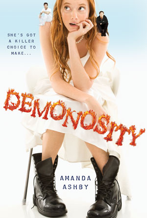
Here's the cover story for Demonosity (out this week!):
Amanda Ashby has shared a few cover stories over the years, and School Library Journal calls her latest book a "frothy romp" that "percolates with lighthearted humor and droll dialogue, while an involving plot and themes exploring friendship and self-reliance add satisfying substance." Yay!
Here's the cover story for Demonosity (out this week!):
"Sometimes I get asked by my editor if I have any thoughts on the book cover but I didn’t have any input on this one. Mind you, I’m not great at visualizing things so perhaps after my previous suggestions they decided to skip me out of the process—though I still maintain that a flesh eating zombie would make a great cover because gore rules!
"Anyway, when I first saw my cover for Demonosity, I was really thrilled, especially when I learned that it had been designed by Jeanine Henderson, who has now done covers for six of my books! I’ve always felt that she’s been able to capture the spirit of the stories and bring them to life and she definitely did that with Demonosity.
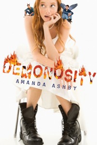
"However, one thing in the draft cover (right) that I didn’t like was the two guys who are sitting on Cassidy’s shoulders. They are meant to reflect that she has to choose between them (and either save the world or destroy it) and I wasn’t really a fan. Especially because originally one of them had wings and one had horns, which made them look like angels/devils whereas the two guys are really thirteenth century demon knights! I did discuss this with my editor and while the guys stayed, we did lose the horns and wings, which was a big relief (not least because there are so many angel books around I would hate for a reader to think that they were buying one and then discover it wasn't the case).
"I’m pretty sure the cover was done from stock photos, mainly because when my middle-grade series got a photo shoot, they told me about it! Anyway, I think they did a great job of getting someone who looked so much like my heroine, Cassidy. And while she probably wouldn’t wear that white dress (she's a vintage girl and never spends more than twenty bucks on an outfit) she would definitely wear those boots and in fact she spends most of the book in Doc Martens and army boots, so I was really pleased to see them there.
"Anyway, overall, I really adore this cover. It reflects the tone of the book and I love that it’s white. Plus, I recently discovered that title font is embossed and so the flames really pop, which is of course the ultimate in rock star coolness!"
Thanks, Amanda! I agree that the guys on the final cover look much better, and the font change is good too.
What do you guys think?
 Amy Reed has shared her Cover Stories with me before, and her latest novel's face again uses white space and arresting fonts. Plus a show-stopping girl. Here's Amy with her latest Cover Story for Over You:
"I loved how the designer used simple black line drawings in addition to photos on Clean and Crazy, so I was thinking he’d do something like that to portray the location. I pictured a photo of Max and Sadie (the two main characters) standing next to a hand-drawn ear of corn or barn or something. Luckily the designer had better ideas.
Amy Reed has shared her Cover Stories with me before, and her latest novel's face again uses white space and arresting fonts. Plus a show-stopping girl. Here's Amy with her latest Cover Story for Over You:
"I loved how the designer used simple black line drawings in addition to photos on Clean and Crazy, so I was thinking he’d do something like that to portray the location. I pictured a photo of Max and Sadie (the two main characters) standing next to a hand-drawn ear of corn or barn or something. Luckily the designer had better ideas.
"My editor always asks me to describe the main characters before they start looking for models. I found this email I sent my editor:
Sadie: pink bob. I picture it a bit messy at all times, not like one of those wigs where everything's perfectly straight. There's something naturally sexy and playful about her. I picture her with a constant smirk on her face.
Max: long straight or slightly wavy hair, enough for a pony tail. Blondish-brown--the kind of hair girls complain about having who really want to be blonde. I don't think I specified bangs, but I think she could have longish bangs. Somewhat plain and girl-next-door-ish, but something definitely pretty and intriguing. Usually has a serious look on her face. (like a young, lighter-haired Jennifer Garner?)
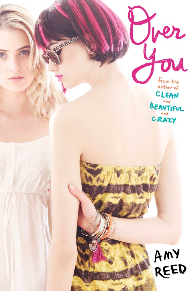 "When I first saw my cover, I thought it was eye-catching and intriguing for sure. But honestly, I kind of wished it was Max on the cover instead of Sadie, since the book is really about Max finding herself. But I guess it’s the same for the cover as the story—Sadie’s the flashy one who gets all the attention, while Max is more quiet and stays in the background.
"The publisher is always open to my feedback, but I don’t think I had much to say about this one. One thing I’ve learned from both having my books published and working at a publishing company is that authors need to let designers do their jobs. Cover design is a combination of art and marketing, neither of which I know much about.
"The original idea was to put both Sadie and Max on the front, but that version was too busy and colorful (above right). They ended up putting Sadie on the front and Max on the back, which I think works well because it’s simpler and matches the covers of my other books with the use of white space.
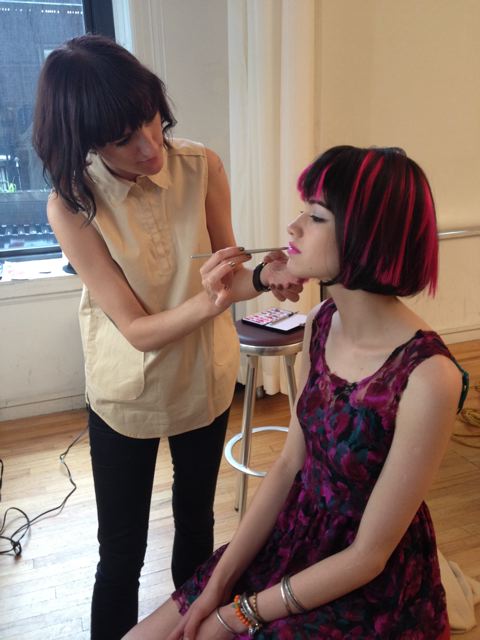 "I am so lucky that Simon Pulse chooses to invest so much in my covers by casting and shooting live models [see a shot from the shoot where 'Sadie' is getting her makeup done, right]. The best part is when my editor sends me behind-the-scenes photos from the photo shoots, like the lighting set ups and the models getting their hair and make-up done. My editor also told me a little about the models themselves—'Sadie' (on the front) had moved to New York from Lithuania three weeks before the photo shoot; 'Max' (on the back) had been living in New York on her own since fifteen to pursue modeling and acting."
Thanks, Amy! I love behind-the-scenes moments, and photo shoots that result in covers like this inspire me. I also think that the continuity between Amy's covers is very cool and recognizable.
What do you guys think of this cover?
 The cover of Elana K. Arnold's Burning arrested me instantly. I love sunlight play like this, and the dusty, western feel of it just threw me straight into dreamland. So I asked Elana how it came about. Here she is to share the story:
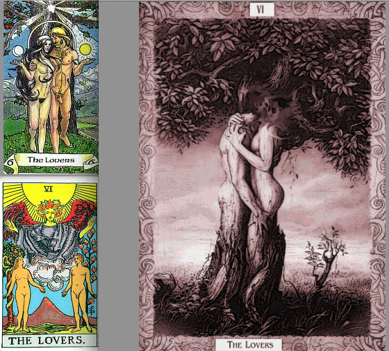
"The Lovers card in Tarot plays an important role in the book, and I thought a piece of art inspired by it would be lovely. In my vision, the cover would feature a large tree, and underneath would be a dark-haired young woman with a blond young man, both naked, holding hands. But my editor told me we couldn't have naked people on the front of a young adult novel. Go figure! Here are a few Lovers cards I like:
The cover of Elana K. Arnold's Burning arrested me instantly. I love sunlight play like this, and the dusty, western feel of it just threw me straight into dreamland. So I asked Elana how it came about. Here she is to share the story:
"The Lovers card in Tarot plays an important role in the book, and I thought a piece of art inspired by it would be lovely. In my vision, the cover would feature a large tree, and underneath would be a dark-haired young woman with a blond young man, both naked, holding hands. But my editor told me we couldn't have naked people on the front of a young adult novel. Go figure! Here are a few Lovers cards I like:
"When I saw the cover of BURNING, my first thought was, 'That girl is WAY skinnier than Lala White.' Lala is dark haired, and voluptuous, and the girl on the cover is thin-hipped and kind of a blondish brunette. But I loved everything about the composition of the photograph--the sunspot obscuring the model's face, the colors, the washed-out road, the girl's foot front and center. She's on her way, that one. And I love what the book's designer, Stephanie Moss, did with the fonts and color choices. Really, the whole thing is so lovely.
"I was so excited when I found out that Random House hired a photographer to take the picture that became BURNING's cover. I immediately found the artist's page online and flipped excitedly through her shots. Her name is Eva Kolenko. I also friended her on Facebook and have enjoyed watching her posts about other projects she's involved with--photo shoots and her baby girl!
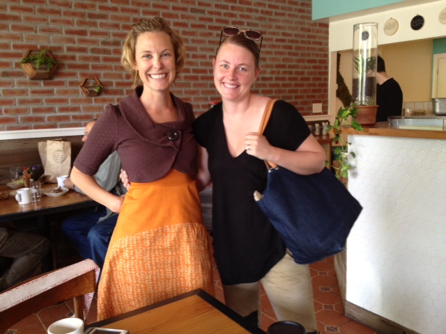 "Also, a very strange thing happened a couple of weeks ago. I was visiting Berkeley to help out with their Teen Writer's Camp, and my friend Erica and I stopped in at a bagel shop for breakfast. There, I saw a baby who looked familiar. I asked the baby's mother what the little girl's name was. She said, 'Parker.' Suddenly, I felt like I'd fallen into a parallel dimension. I said, 'Are you Eva?' Yes, she was. I said, 'You're the photographer who shot the cover for my novel BURNING.' Such a strange, small world, full of coincidences, made even smaller by modern social media. Here's a picture of me and Eva (right).
"I love the photo and the fonts of the cover. The letters in the title--BURNING--remind me of sticks ready to be set on fire. The girl, though considerably thinner than Lala, embodies the essence of her spirt, and the sprit of the book--a desire to break free, to hit the road."
Thanks, Elana! What do you guys think of this cover?
 Kari Luna's The Theory of Everything is quirky, sweet and tear-jerking. It's also funny and whimsical. So many adjectives I like! Here she is to share the story of her unique and apt cover:
"Most authors don't have a say in what's on the cover. I knew that, but I'm a visual thinker. So visual, I had Will Bryant, a friend and amazing illustrator, do illustrations for THE THEORY OF EVERYTHING website before we even sold the book. Once the book was sold I knew all bets were off but his style – 80's, whimsical and offbeat – was always on my mind for the cover.
Kari Luna's The Theory of Everything is quirky, sweet and tear-jerking. It's also funny and whimsical. So many adjectives I like! Here she is to share the story of her unique and apt cover:
"Most authors don't have a say in what's on the cover. I knew that, but I'm a visual thinker. So visual, I had Will Bryant, a friend and amazing illustrator, do illustrations for THE THEORY OF EVERYTHING website before we even sold the book. Once the book was sold I knew all bets were off but his style – 80's, whimsical and offbeat – was always on my mind for the cover.
"Then one day the cover appeared in my Inbox. I was surprised! I loved the colors, total 80s. And the handwritten font, my name in yellow, all of it was delicious. But the photo bugged me. Who was that girl? What was she wearing? And what was the deal with the pandas? It sounds strange when I say it now, because that photo totally captures the spirit of the book. It's happy. Bright. Like a little love bomb, which is exactly what I wanted. (Thanks, Natalie Sousa!) But at the time I was fixated on the fact that my main character, Sophie Sophia, would never wear that dress. It was too adorable. And she was, well, adorably funky.
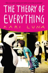
"So we added tights. Pink ones. Then orange ones. Eventually striped ones. We added a colored belt and bracelets and necklaces. I think they even made her hair darker and messed it up, a bit. With those few changes she had more edge, and I was happy. Sophie Sophia, I thought, would approve. [See original cover, left, vs final, right, below]:
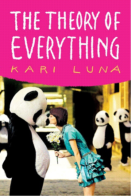
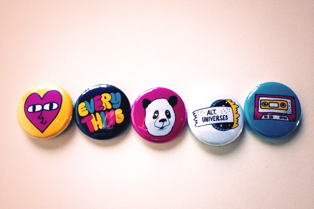 "And now? I love the cover. I've been looking at it for a year and can't imagine it as anything else. I adore the pandas, so much that I put one in the book trailer I made. And the shot was from Getty Creative, but the photographer, Ibai Iacevedo, did an entire series in Barcelona. So. Amazing. As for Will? He made posters and buttons in the same colors as they cover (see right), and I think they all look fabulous together. One big, happy panda family."
Curious? Check out this review from The Flyleaf Review and see if it sounds right for you!
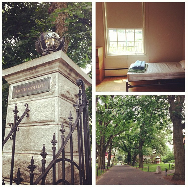
I'm teaching at Summer at Smith for two weeks, but I'm taking a little blog hiatus, so I'll be back later in July with Cover Stories and giveaways! I'll be wading through college nostalgia for a while... damn, these beds are skinny!
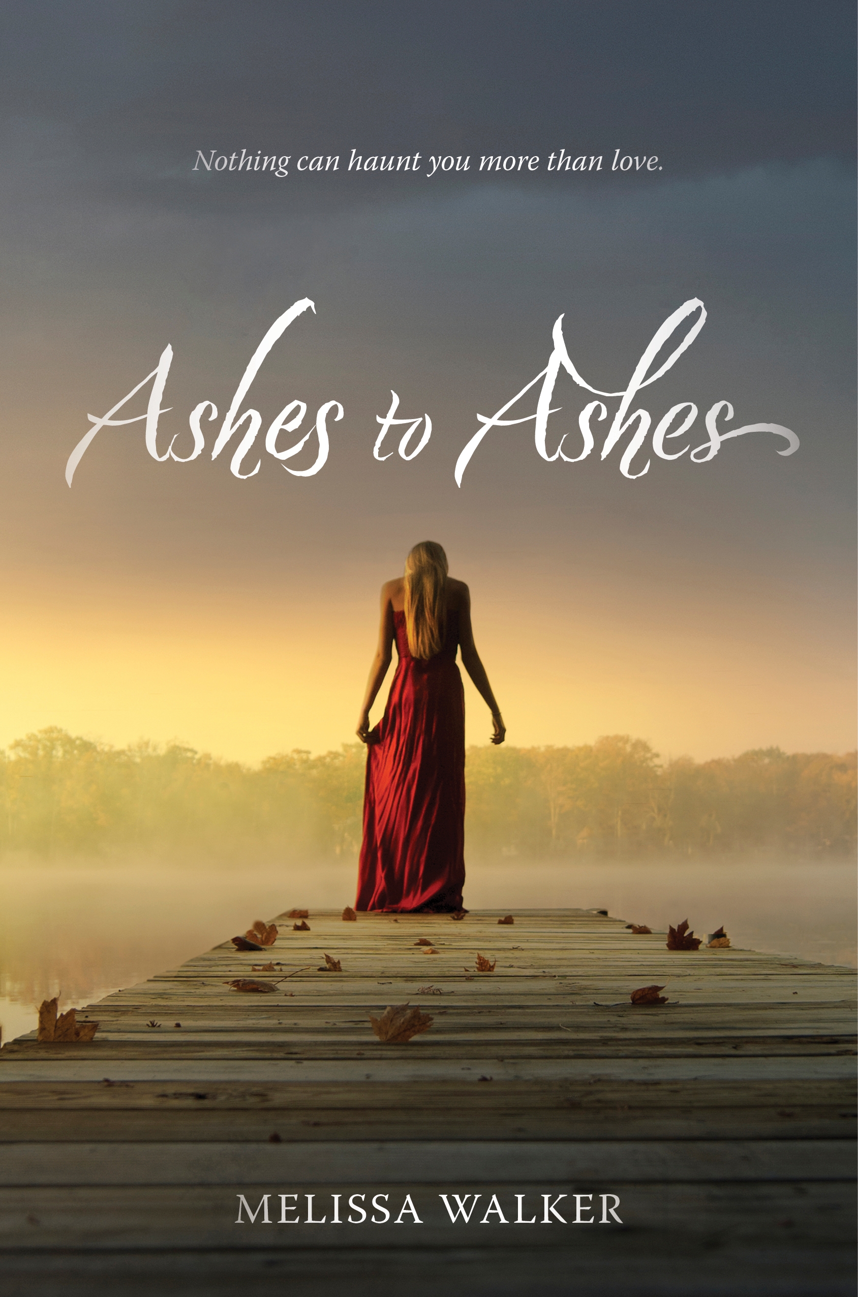 Hi, guys! I did a Cover Reveal for my upcoming book, Ashes to Ashes, with bookish.com! Here's a teaser...
"The movie Ghost was a point of inspiration for me, so as I thought about what the cover for "Ashes to Ashes" might look like, I flashed back to the poster for Ghost--it's pretty steamy! I usually send over a few images and ideas for tonal reference before my book gets a cover, but this time, the team at HarperCollins worked so quickly that I didn’t even know that my cover was in development. It was just suddenly… in my inbox...
Hi, guys! I did a Cover Reveal for my upcoming book, Ashes to Ashes, with bookish.com! Here's a teaser...
"The movie Ghost was a point of inspiration for me, so as I thought about what the cover for "Ashes to Ashes" might look like, I flashed back to the poster for Ghost--it's pretty steamy! I usually send over a few images and ideas for tonal reference before my book gets a cover, but this time, the team at HarperCollins worked so quickly that I didn’t even know that my cover was in development. It was just suddenly… in my inbox...
Read the rest of the Cover Story on bookish.com! I'll give some more cover design details closer to release date (12/23!).
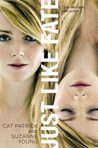 The lovely Cat Patrick and the glowing Suzanne Young have signed a copy of their collaborative novel, Just Like Fate, for one lucky blog reader! Yay!
Here's the summary:
The lovely Cat Patrick and the glowing Suzanne Young have signed a copy of their collaborative novel, Just Like Fate, for one lucky blog reader! Yay!
Here's the summary:
Caroline is at a crossroads.
Her grandmother is sick, maybe dying. Like the rest of her family, Caroline’s been at Gram’s bedside since the stroke. With the pressure building, all Caroline wants to do is escape—both her family and the reality of Gram’s failing health. So when Caroline’s best friend offers to take her to a party one fateful Friday night, she must choose: Stay by Gram’s side for what might be her final hours, or go to the party and live her life.
The consequences of this one decision will split Caroline’s fate into two separate paths—and she is about to live them both. And though there are two distinct ways for her fate to unfold, there is only one happy ending…
I for one love the idea of certain events in our lives being fated... unchangeable and meant to be. To enter to win the book, just do the various tasks I've put forward below. I'll choose a winner at random next week!
 Lyn Miller-Lachmann has been the Editor-in-Chief of MultiCultural Review; the author of the award-winning multicultural bibliography Our Family, Our Friends, Our World; the editor of Once Upon a Cuento, a collection of short stories by Latino authors; and the author of Gringolandia, a young adult novel about a refugee family living with the aftermath of the Pinochet dictatorship in Chile. Her most recent novel, Rogue, features a main character with a mild form of autism, which Lyn also has. In an interview with the Times-Union, she says that she, like her character, "got into a lot of fights. I beat up boys. I literally cried every day at school. The stress was overwhelming. I made really good grades, and I hated school."
Rogue also has a very cool Cover Story, and she's here to share it:
Lyn Miller-Lachmann has been the Editor-in-Chief of MultiCultural Review; the author of the award-winning multicultural bibliography Our Family, Our Friends, Our World; the editor of Once Upon a Cuento, a collection of short stories by Latino authors; and the author of Gringolandia, a young adult novel about a refugee family living with the aftermath of the Pinochet dictatorship in Chile. Her most recent novel, Rogue, features a main character with a mild form of autism, which Lyn also has. In an interview with the Times-Union, she says that she, like her character, "got into a lot of fights. I beat up boys. I literally cried every day at school. The stress was overwhelming. I made really good grades, and I hated school."
Rogue also has a very cool Cover Story, and she's here to share it:
"My YA novel, Gringolandia, had an unusual and powerful cover closely connected to the story, and I was heavily involved in the design process. A small press published the novel, and in general, small presses do give authors far greater input than large corporate publishers. Thus, when I signed the contract for Rogue, I knew I’d get a chance to see the cover beforehand but I’d have little or no role in the ultimate decision-making.
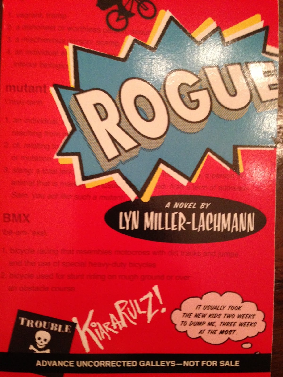 "That said, the result exceeded my wildest expectations. My wonderful editor, Nancy Paulsen at Penguin, commissioned Marikka Tamura, whose work has appeared in The New Yorker and other prestigious venues. We all agreed that the cover of Rogue needed a bicycle, because bicycles of all kinds play an important role in the story. Once we decided on the title of 'Rogue,' after the X-Men superhero with whom my main character, Kiara, is obsessed, we all knew the cover needed a comic-book superhero motif.
"When I first saw the cover design, the only thing that concerned me was the thought bubble that contained the novel’s first line: 'It usually took the new kids two weeks to dump me, three weeks at the most.' The reason is that when I was in school, I used to descend on the new kids, to make them my friends before the more popular kids stole them away. It never worked, and my own friendships never lasted more than a few weeks. So I was nervous about advertising unpopularity—Kiara’s and mine—on the cover.
"My editor did not agree with me. The one change that the publisher made from the galley to the finished copy was to change the thought bubble from pink to blue (see galley cover on the right). And here’s where we did have outside input—not mine, but my seventh grade student’s recommendation.
"When I told my seventh graders that my novel had been accepted, under the title KIARA RULES, and read them the first chapter, a student named Dan said, 'This is the kind of book I’d read, but not if it has a girl’s name in the title and pink on the cover.' So KIARA RULES became ROGUE, but the graffiti 'Kiara Rulz' on the cover recognizes the earlier title and Kiara’s generally fruitless efforts to be 'cool' and in control. And, of course, the pink thought bubble became a blue thought bubble. That was a good move because it turns out that boys do enjoy reading Rogue. It’s rare to have boys pick up a novel with a girl protagonist—The Hunger Games is a notable exception—so I’m thrilled that Rogue is in that company. At the same time, Kiara, like Katniss, doesn’t take on traditional gender roles, and every other character is a boy. Like many girls with Asperger’s syndrome, myself included, Kiara’s first real friends turn out to be boys rather than girls.
"The gender-neutral cover captures perfectly my main character, her tendency to get in trouble even though she wants to be good, her sense of being an outsider, and her superhero obsession as she struggles to find her own special power. It’s also an lively cover that hints at the outdoors setting and the action and suspense that should keep the pages turning."
Thanks, Lyn! I love the idea that seventh graders weighed in here and got a voice at the table! Can't wait to read it!