Cover Stories

Bonus Cover Stories: Slept Away by Julie Kraut

The lovely Julie Kraut has a fabulously titled summer camp novel, Slept Away, that I cannot wait to read (the to-read pile is so, so big, but I'm determined to get to this one in the summer, so it'll be seasonally relevant). Until then, I'm tided over with Julie's Cover Story, which made me laugh out loud exactly four times: sleptaway.jpg"While I love the cover of Slept Away, I didn't have much to do with it aside from coo-ing 'Awesome,' when I first saw it. And that is definitely for the best. I'm not artistic at all. When I attempt to craft, it looks like a glitter monster farted. My concepts of design are nonexistent. Even when I try to arrange the pillows on my bed in any way other than the picture on the bed set package, it never looks not quite right. So, I was happy that my editor, designer, and a very talented photographer took the cover into their own hands.

"I'm really pleased with the results. I like that the cover says camp and summer without hitting the reader over the head with some literal picture of a campground or sleeping bag. The burnt marshmallow, spilled nail polish, and general messiness of it all, hint to the summer going awry without being all that obvious either. Another biggie that makes me heart this cover hard is that Laney, Slept Away's main character, isn't on it. She's still left up to the reader to visualize. I think that not having an image of the main character makes it easier for the reader to relate to the character and the story. hotmess.jpgSlept Away's cover plays off of the cover of my first book, Hot Mess, with that foot and food combination. (That sounds way grosser than it actually is.) They're both stand-alones, but for a similar reader, so I dig that they're tied together in this way and how they look side by side.

"I'm sure I'll get this with Slept Away because I did for Hot Mess...A lot of people assume that it's my foot on the cover of the book. The disappointment and shock I get when I explain that it isn't me makes me feel like I'm telling a kid there's no tooth fairy sometimes.

"My only complaint is that the chocolate bar has nuts in it. A perfectly good Hershey Bar ruined with nuts! Yuck. All in all, though, I'm thrilled with Slept Away's cover."

I love all the little details on the cover when you really stop to look at it; it kinda makes me want to paint marshmallows with nail polish, but I guess that's silly. In all seriousness, though, I would like to meet a glitter farter! Thanks, Julie, for sharing the Cover Story! What do you guys think?

Shop Indie Bookstores

Cover Stories: Prada & Prejudice by Mandy Hubbard

Since I heard about Prada & Prejudice (which is a great title), I've wanted to see the cover. I knew I'd beg Mandy Hubbard to do a Cover Story, and luckily, she said yes. So here she is:13little.jpg"I have to admit, I'm kind of obsessed with covers. If you read my blog, I'm always talking about my favorite covers, or comparing two covers when the publisher changes it. Suffice to say, I thought a lot about what I'd want mine to look like. I definitely pictured a headless model--like a Maureen Johnson or an Ally Carter cover. (Irony: I guess I did sort of get the headless model, she's just upside down and missing the torso, too). I figured it would have to have some kind of old-meets-new, so I idtellyou.jpgwas picturing either my main character (Callie) dressed in a ball gown but with ultra-modern high heels poking out, or perhaps she'd be wearing her jeans and hoodie, leaning against a guy dressed in typical 19th century garb. "My publisher didn't ask for my ideas, so when they sent over the first cover, I had no idea what to expect. She called it a 'cover comp,' which to me was meaningless. (Lesson: A cover comp means that its a very rough, early idea of the direction they're going. Sort of like if you were making a scrap book page, it would be when you just lay down all the photos to see what it looks like, before trimming anything or refining it.) Since I didn't understand that it was sort of a rough-draft, I totally freaked out. The first set of legs were scary-skinny and all crumpled looking, like they'd been run over by a bus. I talked to my editor, who reassured me that there would be a lot of modification. prada_comps-1.jpg"A few weeks later, they had a photo shoot, and they sent me the three best options--and they let me pick (my choice at left)! There were two styles of jeans and two types of red high heels. It was super exciting to be able to have some input at that point, and I'm grateful that the folks at Razorbill shared it with me. True story: the legs don't belong to a model, but to another editor at Razorbill. "At that point, I thought my cover was pretty well done, and it appeared in the catalog exactly the same as the cover I had picked out of the three, Prada&Prejudice.jpgwith a wallpaper-esque background, and my name in a cute little banner at the top. However, my editor emailed me saying she had given some more thought to the background, and they were going to change it. After a couple weeks of wondering exactly what was going to change, I received a new cover (right)--this one with adorable little swirls to replace the wallpaper, and my name became bigger and moved to the bottom. I'm glad they went the extra mile, because I much prefer the swirls! It makes it look more like she's actually falling. prada.jpg "Finally, after the ARCs were printed, they ended up darkening some spots on the bottom of the cover and on the spine, which I think was a nice adjustment (left, final cover). The fact that they were constantly thinking of ways to improve the cover was really impressive, and I can't thank them enough for going the extra mile. In the end, I really love my cover, and I think it conveys the right tone." Ooh, I love knowing that those are an editor's legs! That photo shoot must have been hilarious. Also, I think the yellow teacup adds a nice touch, and the quote from Kieran Scott is great--I like that they replaced the tagline with that. What do you guys think?

YA Book Carnival Win-It Wednesday + Cover Stories: Twenty Boy Summer by Sarah Ockler

bkcarn.jpgPhew! That's a mouthful of a title. But I wanted to say that this post is part of Shooting Stars Mag's YA Book Carnival. Yay! Go check out all the contest links over there (after you read this post, of course). :)The winner of last week's Win-It Wednesday for Serena Robar's Giving Up the V is... Tammy! Send me your address, T. Today I'm hosting the awesome Sarah Ockler for another combo Win-It Wednesday + Cover Story. Take it away, Sarah! Thumbnail image for TwentyBoySummer_CVR2.jpg"I love sea glass. I've always been fascinated with the idea that something whole and purposeful could be shattered and then utterly transformed by the magic of the sea into beautiful little gems, and that these gems could then wash up on shore somewhere else, years or even decades later. Think about that. Really. Isn't it amazing?! "My own sea glass collection has been growing for more than twenty years, treasure-hunted from beaches along both coasts of the United States, Canada, Mexico, Puerto Rico, and the shores of Lake Erie here in Buffalo, NY. Like Anna in Twenty Boy Summer, I keep the glass in mason jars -- a colorful reminder of the waves shushing against the sand. "For me, sea glass is highly symbolic of life's transformations. It's featured throughout Twenty Boy Summer to represent the beauty and rarity of true love and the cycle of loss, healing, and change that we endure when someone close to us dies. Because of the symbolism in the story and my own love of sea glass, I'd always secretly hoped that it would appear on the Twenty Boy Summer cover. "When Little, Brown began the jacket design, my editor sent me several rounds of concept photos used to generate ideas -- beach landscapes, girls walking along the shore, summer-themed objects, boardwalk scenes -- all sorts of summer vacation-y goodness. I was grateful for the opportunity to share my thoughts on the ideas and watch them evolve. My editor is amazing, and she was diligent in her efforts with the designer and marketing team to find the best imagery to convey the story. "Over the next several weeks, we saw almost 20 different concepts before reaching the final choice between two images with equal support from the Little, Brown team: a girl in the water and a still-life concept that would require a photo shoot with sea glass (OMG, sea glass!). My agent and I shared our thoughts and later that week, the jacket committee convened to consider the options and seal my cover fate. "The final decision? Sea glass photo shoot! Sea glass photo shoot! Yay! There was cheering! There was clapping! There was... thankfully no video evidence of my celebratory dancing! ;-) "A few weeks passed before we received the email with the cover. Since the initial idea was based only on a concept, I didn't know exactly how the final image would appear. I had butterflies in my stomach as I waited for the file to open and ultimately reveal... a lovely sea glass heart on the boardwalk. <3 "*Insert more celebratory dancing!* "Well, it turns out the photo shoot was quite an adventure. Who knew that sea glass would be such a challenging model? :-) One of the assistant editors brought sea glass from home, which didn't work, and then had to run out and buy a new batch. Once they had the right glass, they went through dozens of different shots and setups and ideas and backdrops, looking for a perfect shot that just wasn't happening. Finally, at the very end of an all-day photo shoot, the cover designer suggested arranging the glass into a heart shape on a boardwalk prop, just to try something completely different and spontaneous. "Sea glass. Heart. Boardwalk. "The rest is cover history. ;-) seaglass3.jpg"I love love LOVE my cover. It so perfectly captures the symbolism of Anna and Frankie's journey in Twenty Boy Summer. And the coolest part? They sent me some of the glass from the photo shoot, so now I have an awesome memento from my first novel, and a few more special pieces of sea glass for my collection. "Thank you, Melissa, for asking about the story behind the cover of Twenty Boy Summer!" I think I need to start a sea glass collection (that's Sarah holding hers next to her bookshelf)! This is such a great story and I love that there was a sea glass photo shoot! What do you guys think? One lucky commenter (in the US or Canada only) will win a signed copy of the book, courtesy of Sarah herself. Also, what books can you spot on Sarah's shelf? I see Wherever Nina Lies by Lynn Weingarten, which I loved, and I can also spot the gorgeous spine ofIf I Stay by Gail Forman... I love seeing people's shelves! Oh, and I see What I Saw and How I Lied by Judy Blundell at the very left corner.

Librarian Deena Lipomi Talks Covers, Part 1

I did a fun interview with Deena Lipomi, a YA Librarian at Brighton Memorial Library in Rochester, NY. I asked her about book covers, in relation to the Cover Stories series, and she gave me all kinds of fun tidbits. Here's part 1 of her interview. I'll roll it out in small bites because what she says is such fun!"The types of covers that get checked out most often tend to be: a) Iconic. WAKE & FADE by Lisa McMann, THIRSTY by M. T. Anderson, EVERMORE by Alyson Noel. I think this is spillover from the Twilight covers. wakeandfade.png

thirsty.jpgEvermore2.jpg b) Bright and fun, definitely illustrating a chick lit YA. SOMETHING TO BLOG ABOUT by Shana Norris, GERT GARIBALDI'S RANTS AND RAVES: ONE BUTT CHEEK AT A TIME by Amber Kizer. somethingtoblog.jpggertgaribaldi.jpg c) Hinting at an urban fantasy story. FRAGILE ETERNITY by Melissa Marr, The Faerie Path series by Frewin Jones. fragile-eternity-melissa-marr.jpgfaeriepath.jpg d) Single word titles. See (a) above." Interesting, right? What makes you pick up a library book? Any of the things above? I think I'm most drawn to those "iconic" covers above, honestly. More from Deena soon! And in the meantime, here are a few places to visit if you want to try to win Lovestruck Summer: 1. Talk about unicorns and bunnies with Khy, and you may just win a copy of Lovestruck Summer. 2. Go to Cynsations for yet another chance to win a copy of LS! 3. Enter to win a ton of books (yes, including LS) from the Green Bean Teen Queen in her birthday contest.

Cover Stories: The Chosen One by Carol Lynch Williams

I've been wanting to read The Chosen One by Carol Lynch Williams for a long time. And I will! Soon! The story is about a girl who is coming of age--finding herself, falling in love--within a polygamist cult. I asked Carol to stop over and tell her Cover Story, because I think this cover is just gorgeous. Here she is:chosenone.jpg"I was working so hard on the novel that I didn't really even think of cover art. As a writer, I knew I wouldn't have a lot of say. My publisher didn't ask for input. They were busy experimenting, I think. And listening to the news. The book sold two days before the Texas stuff came to light and I think they were listening to that news, watching that unwind, and pondering what to do with the cover. "I was in New York, visiting everyone at St Martin's Press, when my editor and Michael brought what they thought might be the cover for me to see. I was sitting at a table and I remember they set the piece before me and I actually couldn't believe what I was seeing. I remember it had the beautiful picture (that may have been in more grays--I'm not sure). And there was the pink lettering. I fell in love right that minute. I was blown away. My agent, Steve Fraser, was in the room and he and I just kept saying, 'Oh the cover is beautiful. It's just beautiful.' Everyone was relieved that I loved it--including me. But how could I not? "I know there was talk at SMP about what the model should be wearing, that she would be in a to-the-neck nightgown in real life. You know, something less revealing. But when I saw the cover, I thought, 'This is Kyra, free. This is Kyra on the inside.' I've never really had any say on my covers before. And maybe if I hated the cover SMP would have changed it. But I loved it so much (I know my editor Hope Dellon was worried I might not like it) that I very nearly cried sitting at that table. I'm still taken aback at the beauty of it. I don't really love many of the live-model covers we see now-a-days, but mine feels timeless. Three cheers for the creative geniuses at St Martin's Press! I lucked out, didn't I?" Well, I think so. I'm so intrigued by this story, and I love the idea that the cover shows Kyra's freedom, the way her back is mostly bare, and her braid is loosening. What do you guys think?

Win-It Wednesday + Cover Stories: Giving Up the V by Serena Robar

Last week's winner of the signed ARC of Aimee Friedman's Sea Change is... Sophie Brookover! Congrats, SB! Send me your address.Today, Serena Robar is here to share a Cover Story and give away a book! Bonus. Read on: GIVINGupVweb.JPG"Every publisher is different. With my last publisher, they asked me what I thought the covers should look like and I would write a detailed email and send it to them, which they promptly disregarded and then did their own thing. Since I'm a writer and not a cover artist, maybe my cover ideas would not have sold the books as well as what they chose. It's always a concern that you will get a cover that doesn't portray the tone of your book accurately and have a negative impact on sales. fans4freaks.jpg"I've only asked for a change once in my book-writing history. In Fangs4Freaks I asked that the girl on the front not have black nail polish, since the heroine vampire was a cheerleader and loved pink. They switched it to a deep, hot pink. In my opinion, she should have had a pink French manicure but in the end it wasn't a issue I was willing to raise a stink over. And to be honest, they would have ignored me if I had. Writers have literally no say over what their covers look like. "With Giving Up the V, I really had no idea what the cover would look like and they didn't ask me. I found out they were doing a model shoot for the cover when my editor told me it was about to happen. I was pretty excited to learn they actually set up a traditional photography shoot. "One of the things I hear about my cover is how wonderful that they used a realistic model on the cover. She isn't anorexic, she looks healthy. This makes me laugh because my heroine is supposed to be a 'bigger' girl. The model on the cover is New York's idea of a chunky teen. "I loved the cover when I first saw it! Since I had no expectation and was up for anything, I was well and truly delighted. I thought the font and doodles on the cover really evoked the tone of a light, fun read. I suppose my only beef would be that my name is so small. When you view the cover online, you can't even see my name since they use a very thin, crayon font. With every book my name seems to get smaller and smaller on the front cover, but traditionally it should be getting bigger! Guess I never do anything the 'right' way. "I asked them to darken the font and make my name bigger. They did darken the font but my name stayed the same. Overall, I was really very pleased with the cover so I am tickled with the end result. "At my house, my books are all referred to as the 'midriff books' since almost all of them feature the middle section of a girl's body. This is a popular trend in cover art today. Just the body of the model with little or no facial features present. Sometimes I put my books face-out on my bookshelf and put Scott Westerfeld's Uglies series face-out on the bookshelf above mine just to see what my covers would look like with a complete person on the front, lol." I love book cover play like that! And yay for a healthy-body cover model (who has kind of a bangin' body, right?)! I also really like the playful crayon font. What do you guys think? Comment below for a chance to win a signed copy of Giving Up the V, courtesy of Serena! PS-Serena Robar is giving away book a day, every day, in honor of her latest book release. All you have to do to is sign up for her newsletter and you are entered to win. Enter once and you are in the running to win a book every day in the month of June. Whoa! (Today she's giving away Lovestruck Summer, yay!)

Bonus Cover Stories + Contest: The Geek Girl's Guide to Cheerleading

GEEKGIRLcover.jpgCharity Tahmaseb and Darcy Vance are the co-authors of a book called The Geek Girl's Guide to Cheerleading, which is a totally intriguing title if I've ever heard one. Plus, the cover really pops. They're here to share their Cover Story as a twosome, and give away major prizes (more on that later):Charity: We had absolutely no idea about the cover, which is probably weird. My son thought the cover model should be wearing a lab coat over her cheerleading outfit along with a pocket protector--and maybe nerd glasses. Darcy: You did have that dream where we had a blue cover. C: And as it turns out we have ... a blue cover! D: No one asked for our input and, really, it was a surprise when the cover design landed in our inboxes. I didn't realize that happened so early in the process. C: The story to our cover is a bit of a saga. We started out with a stock photo of a jumping cheerleader. The cover was cute, but it also had a football scoreboard and lots of lush green grass. The story takes place during basketball season, in Minnesota (think snow and lots of it). I was a little shocked. I was afraid if we went with that cover, we'd forever be explaining the football/basketball discrepancy. D: Exactly. I could hear my mother's voice in my head saying, "But isn't it a basketball book?" But we were still in disbelief that our book was actually going to be published. We worried that if we asked for changes, our editor might change her mind and cancel the book. Lucky for us, our agent wasn't as timid as we were. C: She felt that the cover needed to attract the sort of teen reader who normally wouldn't pick up a cheerleading book. She negotiated for a new cover. Our publisher did a special shoot and we ended up with three great shots: the model "jumping" over the title, the pigeon-toed shot on the spine, and the one with the glasses on the back. GEEKGIRLcover-2.jpg D: Otherwise known as "Jumping Girl," "Foot Girl," and "Back Girl." C: In the end, the concept itself didn't change: we still have the cheerleader with her quirky jump over the title. Everyone felt that was the shot that conveyed the most energy while still being quirky and fun. I love it. The whole package is wonderful, from front cover, to back, to the spine. D: I love it too. It's the kind of cover I wouldn't be able to resist if I saw it in a book store. Thanks, ladies! I like the energy of the cover, too, and I'm glad you pointed out that we get three poses in one with this book. Now, what do you guys think? Comment below and you'll be entered to win a gift basket filled with surprise goodies (a book, of course, and then various "geek" stuff that Charity and Darcy are picking out). They'll announce the winners on their blog later this month. Good luck!

Cover Stories: Shrinking Violet by Danielle Joseph

Shrinking.jpgA little bit of trivia: My original working title for Violet on the Runway was Shrinking Violet! So this book has been on my radar for a while. I love the cover, and I invited Danielle to come talk about it. Here she is:"When I imagined my cover, I thought there might be a girl speaking into the microphone and maybe her face would be obscured. My publisher did not ask for my input, so I was definitely on pins and needles waiting to see what they would come up with. "When I saw the cover, I was like, wow, this is my cover? MY COVER? Then I thought, wait a minute, Tere has curly hair and brown eyes! Then I thought about it some more for awhile and decided to make those changes to her character to reflect the cover and was happy that I did. I never would compromise who she was but I have always secretly wanted green eyes so I thought they would definitely add to Tere's character, being a more unique eye color. The cover is a stock photo. I think they just changed the color of her sweater from blue to violet. "We talked about the changes in hair and eye color and decided together that I would make the changes to the manuscript instead of her going back to MTV for a cover change. The only thing that really changed about the cover was that they decided to put the blurb from Ellen Hopkins on the front cover of the book. I also had input in the back copy when we had to shorten it because the text was too crowded. "I am really happy with my cover. I truly like everything about it. And now I am a total purple fiend! "My favorite question about the cover is when people ask is that you on the cover? My answer: 'I wish!'" Yes, I totally feel that way about the Violet series covers too! Haha. I love the sly shyness of this cover. And I'm so glad the cover matches the character's traits because it drives me crazy when that doesn't happen. What do you guys think? PS-Alea posted a Lookalike story about this cover on her blog, and it's really fascinating! PPS-Michael Northrop's Gentlemen (remember his great Cover Story?) got a review in the New York Times this weekend! Woohoo! Go enter his fun, related, Mad-Libbian contest to help celebrate.

Win-It Wednesday + Cover Stories: Sea Change by Aimee Friedman

I love you guys for all those TV suggestions and I'll try lots of those shows out--thank you! But, I'm not sure I can watch So You Think You Can Dance, which was the most-recommended show! Okay, maybe I'll try it... Anyway, the winner of Lisa Ann Sandell's A Map of the Known World is... Mya! (Who just compiled an AWESOME summer playlist that you must check out). Send me your address, M!SeachangeCVR.JPGToday as a double-feature Win-It Wednesday + Cover Story Aimee Friedman is talking about her achingly lovely cover for Sea Change (which is a fantastic summer love story): "I got the idea for Sea Change one summer when I was riding the ferry to Governor's Island--a small, little-known island right off the coast of lower Manhattan. As I was standing on the deck and looking into the deep blue, mysterious depths of the water, I remembered how much I had always loved mermaid stories--everything from the movie Splash to the beloved Hans Christian Andersen fairy tale. Then I took it one step further, and wondered: what if the gender roles were reversed? What if it was a human girl, falling in love with a boy who came from the sea? My heart fluttered at this notion, and when I got home that evening, I sat down in front of my laptop and, well, dove in. in the pool at jons.jpg"So, right away, before Sea Change even had a title, I envisioned the cover as being very sea-like in nature. I had the color blue in mind, of course (it has always been my favorite color), and I liked the idea of showing a girl underwater. It's funny, because even though I never learned to swim (call it the curse of being a city child), I am very happy when in water. Plunk me in the shallow end of a pool and I can bob there for hours, like a sea horse (see left). Kate Winslet_sm.jpg"I wanted the cover to capture this feeling of freedom and peace I--and the main character Miranda--feel in the water. For a long time, as I was writing, I pictured this amazing shot the photographer Annie Liebowitz took of Kate Winslet right after Titanic came out. "I knew we couldn't use Kate on the cover (as much as I love her!), but I was drawn to that kind of mermaid-like look. "And then I found The Photo. "At this point, I should probably explain my somewhat unique situation as an author. In addition to writing, I work full-time as a book editor, a job I absolutely love (although I wouldn't recommend juggling two full-time jobs to people who DON'T already have insomnia). One day, I was searching for an image for ANOTHER cover--for a book I was editing. Typically the design department is in charge of searching for stock photos on sites like Corbis and Getty, but we'd been having so much trouble with this particular cover, that I volunteered to pitch in. I was browsing through various images when my eye landed on this one: sc.JPG "It was love at first sight. To me, the couple looked as if they were underwater, and the composition was so dreamy and romantic that it captured the mood I was creating in the book. I immediately sent the photo to my editor and she said, 'YES!' "And so the Sea Change cover was born. It's usually never that smooth a process to get a cover just right--there's usually a lot of back and forth and several different attempts. But even the designer took one look at the photo and instantly knew how to crop it, and how to flow in the perfect kind of type. Somehow, in a way miraculous as mermaids, all the elements that make up the cover of Sea Change just came together, fluid as water. I couldn't be more grateful." Ooh, great story! And yes, the final cover is just divine--love the swirlies around it, too (swirlies is not an official term, but you know what I mean). I can't believe Aimee just stumbled upon the photo. What do you guys think? Comment below for a chance to win Aimee's dreamy book--signed! Happy Wednesday!

Cover Stories: If I Stay by Gayle Forman

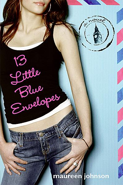
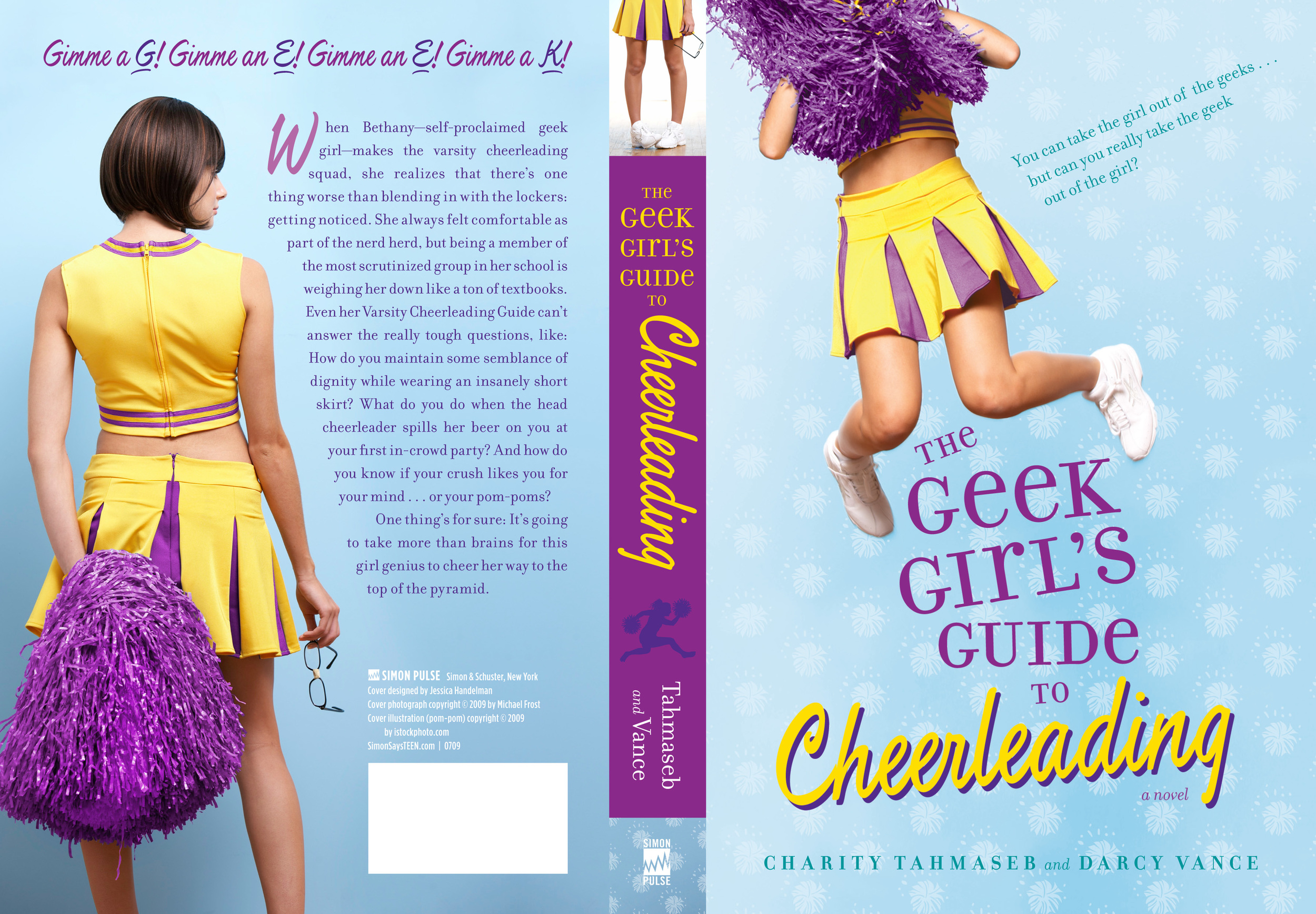
Gayle Forman is a great person with whom to get a mani-pedi, she's a former magazine staffer like me, and she's written one of the biggest books of 2009: If I Stay. Also, she has one killer cover. Here's Gayle with the story behind that: ifistay.jpg"The only image that kept coming to me was one of hands. Not to give any spoilers or anything, but at the very end of the book, Mia fixates on her own hands and she visualizes a lot of things happening around her hands. So I had this cover image of two hands grasping for each other, almost touching, but not quite. I told Penguin about that, but I knew that it was a pretty prosaic, kinda boring image. Still, right off the bat I think we all knew that we didn't want a person cover, no girl-on-stretcher, girl-in-snow type thing.

"First, my editor and her assistant went through the manuscript looking for images that might stand out as cover possibilities. There were the obvious ones, like the cello. But I was against using the cello or a bow or musical notes on the cover. Though Mia is a cellist, I didn't think a classical instrument characterizes the book and frankly before I wrote this, I probably would never have picked up a book with a cello on the cover. Cello seemed boring. Believe me, I was as surprised as anyone when this character popped into my head as a cellist and though I love Mia and fell in love with the cello through her, I get why a cello or a bow would be a turn off. They seem heavy, baroque, boring, not exactly screaming interesting story or YA or love story.

belcantohardcover.jpg
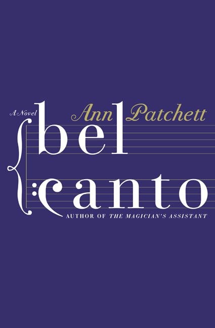
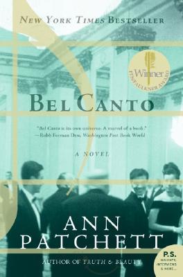
"Also, I thought it was interesting that the book Bel Canto by Ann Patchett (which I adore) had belcantopaper.jpg
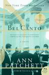
musical notes on the hardcover, which did okay, and a party scene on the paperback, which is when the book became this huge bestseller, and that seemed to further my misgivings about musical stuff on covers.

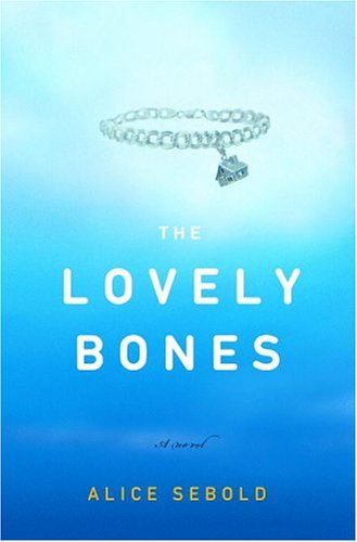
"At one point someone mentioned a charm bracelet, because Mia wears one in the beginning and it plays a pivotal role but then we remembered that a charm bracelet was lovelybones.jpg
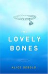
the cover of The Lovely Bones and given the comparisons the books were getting, that was nixed. Anyhow, none of the obvious images were really jumping out. We had a really short time to get ARCs out, so Penguin wound up getting a bunch of different designers to come up with concepts and they showed them to me once they had about five or six contenders.

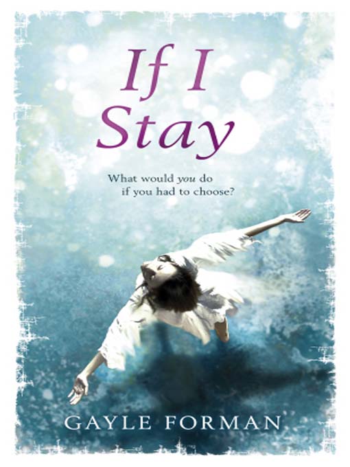
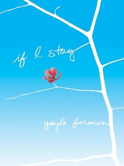
"Out of those, only one was a photograph and I think that was a stock photo. The rest were more illustrations. When I finally came in to look at the finalists, Penguin was really excited because they had decided that they were going to do the jacket out of vellum (white transparent parchment-like paper) and have the image go on top of the vellum and have part of the image be on the book casing underneath. My editor was really pleased because the vellum was so special looking, but when she showed me the image they were thinking of putting on the vellum (sort of like an iconic bird) I was actually much more into this other image.

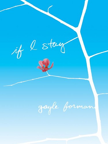
"It was dark blue and had these black branches and a flower. But I didn't say anything one way or another because all of these covers were going to go into a sales/marketing/art meeting and so I figured because everything was in such preliminary stages, I'd wait and hear what everyone else had to say before I chimed in. And the sales department came back and gave the thumbs up to the vellum idea, but chose to put the cover of the branches and the flower on the vellum with the fading blue background and white branches the title and my name in the branches. And that was the cover I'd loved all along.

"Penguin went all out for the ARC, so that it had embossed type on it. And when I first got it, I think I might have cried. I know I could not stop petting the flower. I went on a pre-publication tour and everyone raved about the cover. It was just so beautiful. At one point on the tour, we were at this very old-school hotel restaurant in San Diego and there was this waiter--40 something, in a tux, not exactly the book's demographic. He looked at the cover for like two minutes and said how it was about loss but also evoked hope. I was blown away. We hadn't told him anything about the book. But he got all that from looking at the cover!

"The only thing that changed was that the vellum didn't work out. Once they started looking into the production, it turned out there were all these complications. Like if we had to order reprints, it could only be done in certain months that were very humid (or were not humid, I don't remember which). Anyhow, it was very difficult and very limiting, so instead of the vellum they just wound up using this very nice quality, almost stationary-like paper. When my editor told me about the vellum, she seemed nervous, like she thought I was going to be upset, but I didn't care. In fact, I was sort of relieved. I was a little worried about the vellum's readability and I'd heard that booksellers didn't like it because it got dirty and tore. And it was really the image that I cared about, not the paper.

"The right cover fell into place. With every other book I've published, I have had to fight my publisher on the cover to varying degrees of success. I've never been fully in love with any cover before. But in this case, the cover I loved wound up being the cover they chose. I don't know what it was about the branches. Initially, it was just a visceral reaction. It just felt right. Later, when I tried to think about it analytically, I thought about how the flower amid the barren branches represented Mia holding on, the living thing amid all the death. But also how those branches represented the roots of her extended family that could sustain her if she chose to stay. "I think it is a work of art. Truly."

ifistaycover.jpg
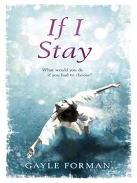
I completely agree with Gayle! I love the simplicity and symbolism of this cover, not to mention the color contrast and the delicate balance between hanging on and letting go that it indicates. What do you guys think? Oh, and that's the UK cover at right, just for fun. I'm partial to the US cover, but this one is beautiful in its own way, too.

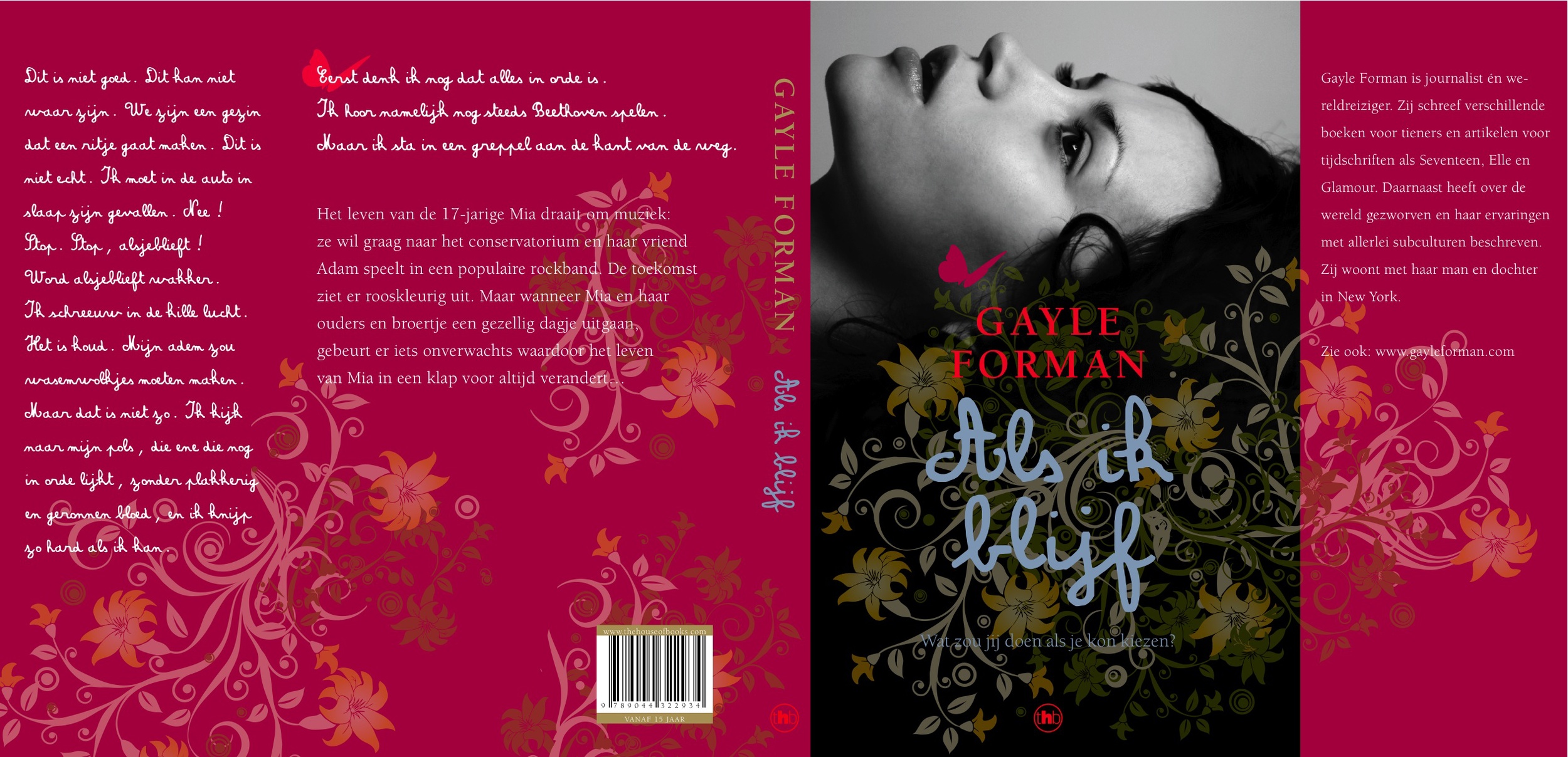
UPDATE: Gayle just sent the Dutch cover, below, and she calls it "arrestingly beautiful." How did she get so lucky? I love them all!
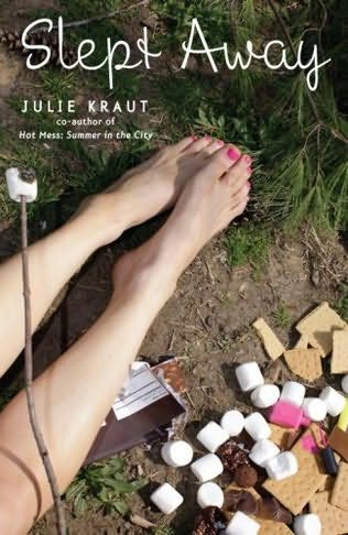
Forman_Als ik blijf-1.jpg