Since I heard about Prada & Prejudice (which is a great title), I've wanted to see the cover. I knew I'd beg Mandy Hubbard to do a Cover Story, and luckily, she said yes. So here she is: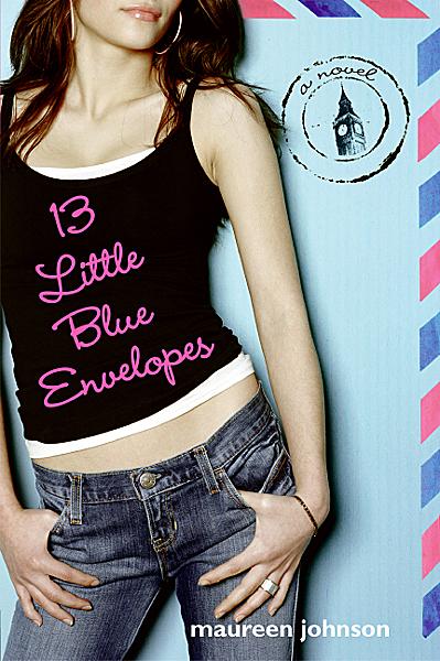 "I have to admit, I'm kind of obsessed with covers. If you read my blog, I'm always talking about my favorite covers, or comparing two covers when the publisher changes it. Suffice to say, I thought a lot about what I'd want mine to look like. I definitely pictured a headless model--like a Maureen Johnson or an Ally Carter cover. (Irony: I guess I did sort of get the headless model, she's just upside down and missing the torso, too). I figured it would have to have some kind of old-meets-new, so I
 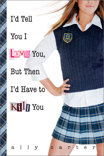 was picturing either my main character (Callie) dressed in a ball gown but with ultra-modern high heels poking out, or perhaps she'd be wearing her jeans and hoodie, leaning against a guy dressed in typical 19th century garb.
"My publisher didn't ask for my ideas, so when they sent over the first cover, I had no idea what to expect. She called it a 'cover comp,' which to me was meaningless. (Lesson: A cover comp means that its a very rough, early idea of the direction they're going. Sort of like if you were making a scrap book page, it would be when you just lay down all the photos to see what it looks like, before trimming anything or refining it.) Since I didn't understand that it was sort of a rough-draft, I totally freaked out. The first set of legs were scary-skinny and all crumpled looking, like they'd been run over by a bus. I talked to my editor, who reassured me that there would be a lot of modification.
was picturing either my main character (Callie) dressed in a ball gown but with ultra-modern high heels poking out, or perhaps she'd be wearing her jeans and hoodie, leaning against a guy dressed in typical 19th century garb.
"My publisher didn't ask for my ideas, so when they sent over the first cover, I had no idea what to expect. She called it a 'cover comp,' which to me was meaningless. (Lesson: A cover comp means that its a very rough, early idea of the direction they're going. Sort of like if you were making a scrap book page, it would be when you just lay down all the photos to see what it looks like, before trimming anything or refining it.) Since I didn't understand that it was sort of a rough-draft, I totally freaked out. The first set of legs were scary-skinny and all crumpled looking, like they'd been run over by a bus. I talked to my editor, who reassured me that there would be a lot of modification.
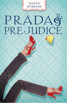 "A few weeks later, they had a photo shoot, and they sent me the three best options--and they let me pick (my choice at left)! There were two styles of jeans and two types of red high heels. It was super exciting to be able to have some input at that point, and I'm grateful that the folks at Razorbill shared it with me. True story: the legs don't belong to a model, but to another editor at Razorbill.
"At that point, I thought my cover was pretty well done, and it appeared in the catalog exactly the same as the cover I had picked out of the three,
"A few weeks later, they had a photo shoot, and they sent me the three best options--and they let me pick (my choice at left)! There were two styles of jeans and two types of red high heels. It was super exciting to be able to have some input at that point, and I'm grateful that the folks at Razorbill shared it with me. True story: the legs don't belong to a model, but to another editor at Razorbill.
"At that point, I thought my cover was pretty well done, and it appeared in the catalog exactly the same as the cover I had picked out of the three,  with a wallpaper-esque background, and my name in a cute little banner at the top. However, my editor emailed me saying she had given some more thought to the background, and they were going to change it. After a couple weeks of wondering exactly what was going to change, I received a new cover (right)--this one with adorable little swirls to replace the wallpaper, and my name became bigger and moved to the bottom. I'm glad they went the extra mile, because I much prefer the swirls! It makes it look more like she's actually falling.
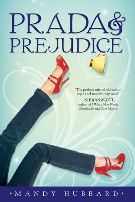 "Finally, after the ARCs were printed, they ended up darkening some spots on the bottom of the cover and on the spine, which I think was a nice adjustment (left, final cover). The fact that they were constantly thinking of ways to improve the cover was really impressive, and I can't thank them enough for going the extra mile. In the end, I really love my cover, and I think it conveys the right tone."
Ooh, I love knowing that those are an editor's legs! That photo shoot must have been hilarious. Also, I think the yellow teacup adds a nice touch, and the quote from Kieran Scott is great--I like that they replaced the tagline with that. What do you guys think?
"Finally, after the ARCs were printed, they ended up darkening some spots on the bottom of the cover and on the spine, which I think was a nice adjustment (left, final cover). The fact that they were constantly thinking of ways to improve the cover was really impressive, and I can't thank them enough for going the extra mile. In the end, I really love my cover, and I think it conveys the right tone."
Ooh, I love knowing that those are an editor's legs! That photo shoot must have been hilarious. Also, I think the yellow teacup adds a nice touch, and the quote from Kieran Scott is great--I like that they replaced the tagline with that. What do you guys think?