gayle forman

Cover Stories: Just One Day by Gayle Forman

just one dayGayle Forman has shared Cover Stories for her lovely novels If I Stay and Where She Went -- these were epic tales of covers tried and tweaked. Her new novel, Just One Day, has a lovely, reflective cover. And this one? It's got a pretty straightforward Cover Story: "Penguin sent me a cover.  I liked it."

Sometimes it's that simple! Yay! And I think this cover is great. For me, it captures the introspective nature of traveling, and how going on a journey can point your  mind inward and help you figure out things about yourself. Can't wait to read!

What do you guys think?

Win-It Wednesday (& Help Me Pick an Author Photo!): Where She Went by Gayle Forman

whereshewent.jpgYou guys know about this book, and you want to win it. That's all I really need to say, right? It's Gayle Forman's latest! Read the Cover Story to find out more about its aesthetic.To enter to win this gleaming new hardcover, you've gotta help me out. Small Town Sinners is ready to go to press, and I can't pick an author photo! I had decided on one, but it's starting to look too serious to me or something. So below are three options, and I'd really love it if you could weigh in with your favorite (vote in the poll, definitely, but leave a comment too because I'll choose a winner from the comments -- you can just say "I voted!" if you don't have more to add). One commenter will win Gayle's book. Merci! Option 1: Formal-ish. Melissa Walker headshot.jpg Option 2: Is the tiara too much? MelissaWalker.jpg Option 3: Casual stoop shot. melissa.jpg

Which author photo do you like best?

View Results
Create a Poll

Thank you for your help! Seriously, so much. PS-Remember this boat name contest from last year? It's almost decided! I'm handing in revisions on this book very soon. (See how long this book-writing thing takes? Forever!)

Cover Stories: Where She Went

Where She Went, the sequel to Gayle Forman's lovely If I Stay (remember that Cover Story?), comes out tomorrow! Though it's told from Adam's point of view, that's Mia on the cover, obvs. Here's Gayle to share the story of how this book's cover came to be: "The image that kept coming to mind as I wrote was the Brooklyn Bridge. It plays a pivotal role in the story and for some reason it just stuck because it's so strong both from both a visual and literary standpoint. I believe that Penguin did experiment with using the bridge initially but decided that it didn't work.

ifistaypb.jpg
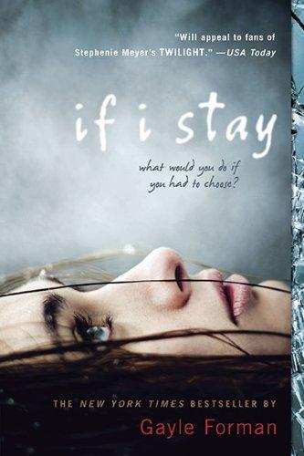
"The challenge for the US publication was marrying the US If I Stay paperback cover--the eerily half-dead-looking girl, right--with a new hardcover look. But I had to make it extra tricky because, unlike If I Stay, which is from Mia's perspective, Where She Went is in Adam's voice. So how to create a cover that seemed like a package with the paperback but was from a guy's perspective?

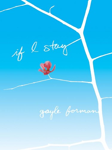
"We were obviously departing from the quieter US hardcover look, with the flower, tree and branches (below left), which I loved but would not work at all in terms of a new book about a rock and roll guy, so I'm so glad we had the paperback cover to use as a jumping-off point. ifistay.jpg

"In the end, in sort of a duh, why didn't we think of it sooner epiphany, we all realized that the US cover had to have another Mia. Because even though the book is from Adam's POV, it's still about Mia. It's about where she went. So the covers are meant to be bookends. One horizontal, one vertical, one passive, one more active. There's no Brooklyn Bridge, and yet the covers are, in my opinion, such a perfect bridge.

"My publisher asked for ideas, but honestly, I knew that I had thrown them such a huge challenge in finding a cover for Where She Went that would be both striking, true to the book, and of a piece with If I Stay that I kept my mouth shut. Because really, truly, I had no clue what to do. I was relieved that I was not in the design department. Had Where She Went been a stand-alone, I think there would've been so many directions to go in. But in a way, the design was limited by the If I Stay cover. So I just sat back and wondered what they were going to do and felt grateful that coming up with a cover concept was not my job.

"When I saw the first version of the cover, my response was: Everything but the girl. Because I loved the general concept, and the idea of having a girl--Mia--on the cover, seemed so right. But the original girl looked nothing like the Mia from the first cover. And the model from the first cover was no longer available, and, oddly, other photos we'd found of her, looked nothing like the girl from the If I Stay cover. Also, the girl in the Where She Went cover try, aside from not resembling the original Mia, looked rather sad and wistful. Mia needed to look more fierce.

"My editor was in total agreement with me, both about the Mia needing to look like the If I Stay Mia and about the wrongness of her expression--actually, she was the one who first raised the second point. So she took our case to the art department.

"I am sure the art department went through a period of not loving my editor or me. I think they thought we were asking for the moon: a twin of the initial Mia with a fierce expression on her face? They must've been like: How the hell are we going to find that? And then they went and pulled a rabbit out of a hat. Found the perfect image. The girl on Where She Went totally looks like the girl on the If I Stay cover. And what I love most is the look on her face. On If I Stay, the girl's look is haunting; it draws you in. On Where She Went, it's determined, which is fitting for who Mia has become, and also draws you in. Which is what a cover must do.

"Aside from the model swap, the background went from this sort of bright colored spots reminiscent of city lights--now on the inside flaps--to the smoky gray, which tied it more to the If I Stay cover. When you see the two covers together, they really are of a set. A lovely, striking set.

"The cover is a stock photo. I believe that they did do a photo shoot on the Brooklyn Bridge, but it just didn't capture the right feeling as well as this existing image did. Funnily enough, the bridge wound up becoming an element for some of the foreign covers, like the French and UK jackets (below). New York City is a strong selling point abroad, apparently. But it didn't work for the US cover.

"It's funny because back when I was trying to imagine how they would jacket Where She Went, I wouldn't have imagined this direction. And it was a bit of an evolution to get it totally right, so it wasn't that initial visceral YES! But when I saw the jacket on the ARC, it just felt so absolutely right, as though that were the way it was meant to be all along.

'There are two things that make the cover perfect to me: One is the look on the girl's face. It beckons you, or at least it beckons me. So yes, this is Adam's book, but if you read it, it will make sense to you that Mia is on the cover and this girl will make sense as Mia. And second, when I hold this book up against the paperback of If I Stay--which has become the dominant image now--they look stunning together. Yin and Yang. They complete each other."

ifistaypb.jpg

Thanks, Gayle! I love the cloudy blue-gray ethereal feel that the covers have, and though I'm a fan of the original If I Stay cover, and I even like the way the Brooklyn Bridge looks on the UK version, I agree that this matched set is really lovely.

What do you guys think?

If You Like Sarah Dessen...

How cool is it that the lovely and amazing Ms. Dessen recommended Violet on the Runway, officially, to readers? I feel like I just won a major award. Check out all these fantastic books by Gayle Forman, Elizabeth Scott, John Green, Laurie Halse Anderson and Susane Colasanti -- I've actually read all of these titles, and I can assure you that Sarah D. has good taste! (In books and TV and hometowns, naturally.)sarahdessenrecommends.jpg Happy Thursday!

Win-it Wednesday: If I Stay by Gayle Forman

ifistaypb.jpg I loved hearing all the swooning stories last week -- so. much. fun. I enjoy prying into your personal lives, you know. The winner of the paperback of Swoon by Nina Malkin is... Alison! Send me your address, A.This week, I'm giving away a paperback copy of Gayle Forman's If I Stay. You guys must have heard how beautiful and amazing and incredible this book is. If you haven't read it yet, NOW IS THE TIME. There's a sequel in the works. (YES!) I sometimes hang out with Gayle and dig for information about said sequel, but she's a good secret-keeper. Bummer. I cannot wait to continue Mia's story! To enter, just tell me which cover you like more -- US hardcover (below left) or paperback. I'm curious. ifistay.jpg ifistaypb.jpg I actually like them both for very different reasons. I love a non-person cover that so aptly displays the feeling of the story, like this one does (delicate flower, hanging on tenuously; winter feel with the hope of spring). But I'm also really into frosty covers like the paperback -- something about ice on a cover makes me happy. Anyway, thoughts? I'll choose one winner next week. Happy Wednesday! PS-Read Gayle's Cover Story for the hardback here.

Cover Stories: If I Stay by Gayle Forman

Gayle Forman is a great person with whom to get a mani-pedi, she's a former magazine staffer like me, and she's written one of the biggest books of 2009: If I Stay. Also, she has one killer cover. Here's Gayle with the story behind that: ifistay.jpg"The only image that kept coming to me was one of hands. Not to give any spoilers or anything, but at the very end of the book, Mia fixates on her own hands and she visualizes a lot of things happening around her hands. So I had this cover image of two hands grasping for each other, almost touching, but not quite. I told Penguin about that, but I knew that it was a pretty prosaic, kinda boring image. Still, right off the bat I think we all knew that we didn't want a person cover, no girl-on-stretcher, girl-in-snow type thing.

"First, my editor and her assistant went through the manuscript looking for images that might stand out as cover possibilities. There were the obvious ones, like the cello. But I was against using the cello or a bow or musical notes on the cover. Though Mia is a cellist, I didn't think a classical instrument characterizes the book and frankly before I wrote this, I probably would never have picked up a book with a cello on the cover. Cello seemed boring. Believe me, I was as surprised as anyone when this character popped into my head as a cellist and though I love Mia and fell in love with the cello through her, I get why a cello or a bow would be a turn off. They seem heavy, baroque, boring, not exactly screaming interesting story or YA or love story.

belcantohardcover.jpg"Also, I thought it was interesting that the book Bel Canto by Ann Patchett (which I adore) had belcantopaper.jpgmusical notes on the hardcover, which did okay, and a party scene on the paperback, which is when the book became this huge bestseller, and that seemed to further my misgivings about musical stuff on covers.

"At one point someone mentioned a charm bracelet, because Mia wears one in the beginning and it plays a pivotal role but then we remembered that a charm bracelet was lovelybones.jpgthe cover of The Lovely Bones and given the comparisons the books were getting, that was nixed. Anyhow, none of the obvious images were really jumping out. We had a really short time to get ARCs out, so Penguin wound up getting a bunch of different designers to come up with concepts and they showed them to me once they had about five or six contenders.

"Out of those, only one was a photograph and I think that was a stock photo. The rest were more illustrations. When I finally came in to look at the finalists, Penguin was really excited because they had decided that they were going to do the jacket out of vellum (white transparent parchment-like paper) and have the image go on top of the vellum and have part of the image be on the book casing underneath. My editor was really pleased because the vellum was so special looking, but when she showed me the image they were thinking of putting on the vellum (sort of like an iconic bird) I was actually much more into this other image.

"It was dark blue and had these black branches and a flower. But I didn't say anything one way or another because all of these covers were going to go into a sales/marketing/art meeting and so I figured because everything was in such preliminary stages, I'd wait and hear what everyone else had to say before I chimed in. And the sales department came back and gave the thumbs up to the vellum idea, but chose to put the cover of the branches and the flower on the vellum with the fading blue background and white branches the title and my name in the branches. And that was the cover I'd loved all along.

"Penguin went all out for the ARC, so that it had embossed type on it. And when I first got it, I think I might have cried. I know I could not stop petting the flower. I went on a pre-publication tour and everyone raved about the cover. It was just so beautiful. At one point on the tour, we were at this very old-school hotel restaurant in San Diego and there was this waiter--40 something, in a tux, not exactly the book's demographic. He looked at the cover for like two minutes and said how it was about loss but also evoked hope. I was blown away. We hadn't told him anything about the book. But he got all that from looking at the cover!

"The only thing that changed was that the vellum didn't work out. Once they started looking into the production, it turned out there were all these complications. Like if we had to order reprints, it could only be done in certain months that were very humid (or were not humid, I don't remember which). Anyhow, it was very difficult and very limiting, so instead of the vellum they just wound up using this very nice quality, almost stationary-like paper. When my editor told me about the vellum, she seemed nervous, like she thought I was going to be upset, but I didn't care. In fact, I was sort of relieved. I was a little worried about the vellum's readability and I'd heard that booksellers didn't like it because it got dirty and tore. And it was really the image that I cared about, not the paper.

"The right cover fell into place. With every other book I've published, I have had to fight my publisher on the cover to varying degrees of success. I've never been fully in love with any cover before. But in this case, the cover I loved wound up being the cover they chose. I don't know what it was about the branches. Initially, it was just a visceral reaction. It just felt right. Later, when I tried to think about it analytically, I thought about how the flower amid the barren branches represented Mia holding on, the living thing amid all the death. But also how those branches represented the roots of her extended family that could sustain her if she chose to stay. "I think it is a work of art. Truly."

ifistaycover.jpgI completely agree with Gayle! I love the simplicity and symbolism of this cover, not to mention the color contrast and the delicate balance between hanging on and letting go that it indicates. What do you guys think? Oh, and that's the UK cover at right, just for fun. I'm partial to the US cover, but this one is beautiful in its own way, too.

UPDATE: Gayle just sent the Dutch cover, below, and she calls it "arrestingly beautiful." How did she get so lucky? I love them all!

Forman_Als ik blijf-1.jpg