 Jeri Smith-Ready stopped by on her Girlfriends Cyber Circuit tour to talk Covers. Her latest book, SHADE, is the first in a young adult urban fantasy series about a world of ghosts only the young can see. When Aura's boyfriend meets a most untimely end, she is forced to reconsider her relationship with the living and the dead.
Ooh! Here's the deal with that dark and stormy cover:
Jeri Smith-Ready stopped by on her Girlfriends Cyber Circuit tour to talk Covers. Her latest book, SHADE, is the first in a young adult urban fantasy series about a world of ghosts only the young can see. When Aura's boyfriend meets a most untimely end, she is forced to reconsider her relationship with the living and the dead.
Ooh! Here's the deal with that dark and stormy cover:
"I imagined your typical young adult urban fantasy cover for SHADE--girl's face, maybe half cut off. I've always loved Simon Pulse's covers. They're so sophisticated and evocative, so my expectations were pretty high. Since violet and red are important elements in the story, I assumed they would be used on the cover.
"My editor sent me their ideas for the cover concept, but it was more of a, 'Here's what we're thinking' rather than a 'What would you like to see?' e-mail. Which is fine, because I'm so not a visual person. I would've been like, 'Um, how about a girl's face, half cut off? Maybe some swirlies? Oh, and definitely use black.' So helpful.
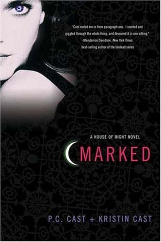 "The first time I saw my cover, I was Blown. Away. Seriously. I've been super lucky with all my covers, but when I saw the SHADE cover and jacket wrap-around, I cried. I felt like I was in the presence of genius--the designer was Cara Petrus, who designed the House of Night cover series (see book 1, Marked, right) when she was at St. Martin's. She's a goddess.
"My only comments were a series of incoherent noises of glee, so my agent was the one to respond with, 'We unequivocally LOVE THIS SO MUCH. We love EVERYTHING. Really. Home run...THANK YOU THANK YOU THANK YOU!!' "Oh, and when I met Cara in November, I had a doughnut in my mouth, so all I could do was bow to her, Wayne's World 'We're Not Worthy' style. I'm pretty sure she thinks I'm a dork, and I'm also pretty sure she's right.
"There were no changes, other than to add a tagline and cover quote, plus a short scene on the back cover. They also changed the font on my name (see the full jacket wrap photo for the original font, below). It probably changed before I saw it, though.
 "It was shot with a model one night on a Brooklyn rooftop. I need to find out which building so I can visit it and take a picture.
"I adore it even more in its final version. The cover is a soft, luxurious matte, which I cannot stop touching (it's really pathetic how in love I am). The title is debossed on the front and spine, so I keep touching that, too. It's a total sensory experience (except it doesn't smell, and I've never tasted it--I'm not THAT in love).
"One thing I didn't notice at first glance was the clouds in the background, depicting the night sky, which is an important element in the book that Aura shares with the 'other boy' in her life. I loved that Zachary was honored in the cover a little, too, because Aura did star-gazing with him for a school project. I like that the cover manages to tie in so many different elements of the book so gracefully."
Thanks, Jeri! I love a multi-faceted cover. This one reminds me a little of Bleeding Violet and The Soul Screamers series (click for those Cover Stories). It's definitely gorgeous, and the book itself is getting great buzz. A starred review in Publishers Weekly says, "Smith-Ready changes the world completely by simply changing our ability to see."
Nice! I am all for world-changing books.
What do you guys think?