Cover Stories: Personal Statement

odell finalJason Odell Williams is an Emmy-nominated producer, and his first novel was just optioned for a three-picture deal. Whee! Plus, Jason tells a good Cover Story. Here he is: "I never had a cover in mind while writing Personal Statement. I never really picture a cover or poster for any of my work (books, plays, films) until the writing is at least mostly finished. So with Personal Statement, I never had a preconceived idea; I was so focused on just finishing the manuscript.

"So once I had a solid first draft, I sat around over dinner and drinks with my publishers Carey Albertine and Saira Rao and we started brainstorming cover ideas. We thought about something hurricane-related, like a trashed backyard that could look like either the morning after a storm or a wild party. But that didn’t really say enough about the 'Personal Statement'-college application part of the book. Another idea we floated around was having a shot of the major players in some sort of pose like an album cover or action shot during the Hurricane prep, but again that felt too linear and only dealt with the volunteer aspect of the story.

odell 2
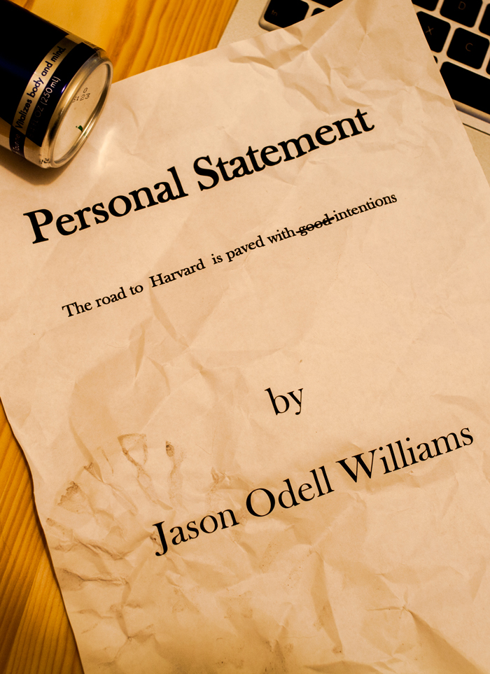
"So we came up with the idea of crumpled up paper, all of these false starts when trying to write a personal statement and succinctly tell strangers at college 'who you are.' The one we had sort of settled on was the one with the can of Red Bull and the 'cover' page of a personal statement with a boot print and coffee stains on it (right). And we were pretty happy with it and were going to go with that. But Carey & Saira wanted to punch it up a little, so they asked Nick Guarracino, who had recently been brought on to do the illustrations for another book they were doing, to take a look at the cover and make it pop more.

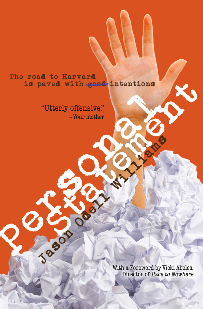
"He read some of the book, looked at our cover, and instead of punching up the old one, he came up with 6 completely different options. My publishers looked at them all and knew right away it was the hand thrusting up from the pile of pages. They texted me the image and I took one look and was blown away. The last I knew, our cover was going to b the page with the coffee stain on it, so to then suddenly see this amazing, bright, dynamic, bold arresting cover, I was so excited and thrilled. I immediately texted back and said 'YES that’s the one.' (I may have used some profanity in my excitement... as in 'Holy SH*TBALLS that's amazing! I love it! Yes!')

Screen Shot 2013-09-05 at 12.08.39 PM
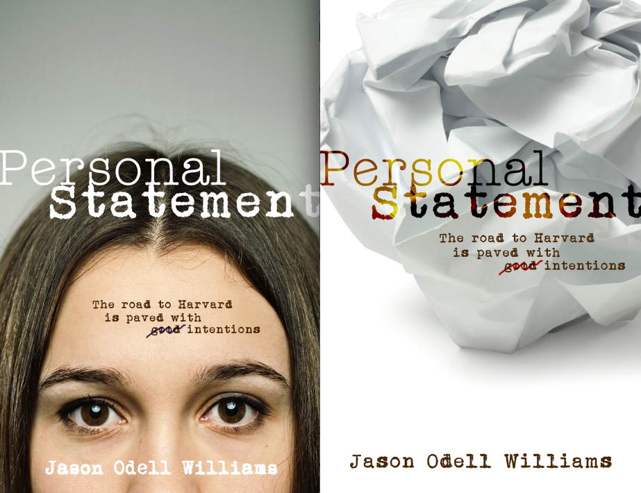
"And I actually never saw these other options (left) until this week. And while the girl’s face was a close contender, there is something sad and melancholy about it that’s not quite right for the book. Also, it’s hard to put a real face (even half of a face) on a book cover. And I never liked the idea of 'casting' a character before someone reads the book. (What if the Rani on the cover doesn’t match the Rani in your head?) So in the end, I know we made the right call with the hand thrusting up from the pile of balled up pages.

"Nick told me the photo was made by taking a picture of a friend’s hand and then using photo shop to add the balled up pages and the color in the background. Then he made the hand look more feminine and ethnically ambiguous. What I like about that is then the hand becomes like a mirror… you see what you want to see. When I first saw it, I thought it was a white guy’s hand. Others see a white girl or an Asian or Indian-American girl. And now when I look at it I can't decide if it's Emily Kim's hand or Rani's. So it’s cool that the hand has that 'every-person' quality to it.

"And now, the more I look at the cover, the more I see how right it is for this book. The hand at first seemed to be simply frustrated to me, but now I also see defiance and breaking free and standing out from the crowd. The hand is coming up for air after drowning in expectation for so long. Of course, I’m reading a lot into it and people looking at the cover for the first time might never see any of that, but I think what the cover does convey, even at first glance, is a sense of being bold and explosive and exciting. It would make me stop twice if I saw it on a shelf (even a 'digital' shelf!) And for all of those reasons, I love this cover couldn't be happier!"

Thanks, Jason!

I I

Strange but comforting that there's a downtown landmark that rises again to orient the city. I took this photo this morning along 6th Avenue. My heart will always be open and full of tears on this anniversary. Here's to love winning. Screen Shot 2013-09-11 at 12.21.15 PM

Cover Stories: The Waking Dark

The-Waking-DarkIn a starred review, Booklist called Robin Wasserman's latest novel "a horror story worthy of Stephen King... violent, edgy, well-written, and foreboding." Eek! Might be too scary for me because I am a total 'fraidy cat. But I love Robin's writing, so... I'll chance it. Robin's also has a great Cover Story for The Waking Dark. (Read on for how you can win a paperback copy of her previous novel, The Book of Blood and Shadow!)

Here's Robin:

"There are some books—like my last novel, The Book of Blood and Shadow, that do their best to defy all attempts to match them with the perfect cover. Random House went through about a million concepts before settling on one we all loved, and then, when it came time for the paperback, went in a radically different direction all over again. (Which, for the record, I love even more.)

"There are, inevitably, other books (and I’m not linking to anything here, so you’ll have to use your imagination) that end up with covers that never feel quite right, at least to those of us who wrote them. (Insert caveat here about how it’s probably a good thing that authors don’t get to choose their own covers, especially when they’re authors like me, who are artistically challenged and have no idea what makes for a pretty, much less commercially viable design.)

"But every once in a while, if you’re lucky, there comes a book—or rather, some magical moment of alchemy between a book, a designer, an editor, and a marketing team—that hits it out of the park on the first try, seemingly without even trying. (Easy for me to say there’s no trying involved, when I’m not actually the one who has to glare at my computer until a cover design materializes.)

"I think The Waking Dark is my best book, but more than that, I love it more than anything I’ve ever written. This book feels like a piece of me in a way that no other novel has. On top of that, it’s a dark, prickly, scary story that hopefully has the potential to appeal to a bunch of different kinds of readers, all of whom (I feared) could be easily alienated by the wrong cover.

"All of which is to say that I was really nervous about what my publisher would decide to put on the front of this book.

"As usual, my very kind editor welcomed me to send along any design thoughts I might have, even when we both know I’m hopelessly useless at this kind of thing. And, as usual, I swallowed my incompetence and sent along some images I’d collected that captured the feel I was hoping for:

american_godsonHBO1 00048189-2 tumblr_inline_mhg5hoJCqx1qz4rgp-3

"I also offered this very helpful and specific advice:

"I would really love this cover to scream, 'This book is not like all the others!'...in a completely non-alienating way. No tall order, right? :)

"It was actually a very tall order, and I don’t know how they did it. But they did. (I figure it’s okay to brag about this cover, since I had not a single thing to do with the making of it.) This cover is, with a few design tweaks, the very first thing the designer came up with, which as far as I’m concerned means she’s a certifiable genius who should be given all the awards from now til perpetuity.

"I’ve loved a lot of my book covers, but never before have I gotten a cover where I fell in love at very first sight, where I thought: YES. This is the cover this book was always destined to have. (Sort of like how we all felt when Alan Rickman showed up as Severus Snape.)

"Then I opened an email from my editor, and found this:

The-Waking-Dark

"This cover is the book. Everything that I hope The Waking Dark will be is encapsulated in this image. Or, as I wrote to my editor thirty seconds later,

"Immediate, knee jerk reaction? I LOVE #1. LOVE IT!!!!! That is so in keeping with what I was hoping for that I can't quite believe it. Beautiful, sophisticated, creepy.

"I can’t help but notice what I neglected to say in that email: thank you. So let me say it now, for all the world to see. THANK YOU, to everyone at Random House, but especially the brilliant designer Kate Gartner, for somehow managing to translate my amorphous imagination into something beautiful."

Thank you, Robin! I'm already creeped out. If I get a hard copy I'm going to have to turn it over... wonder what the back looks like. Ack. So yes, it does what it's supposed to!

Now, to enter to win a copy of The Book of Blood and Shadow, just tweet about this new release, or comment on the Cover Story. Good luck! I'll announce a winner next week.

a Rafflecopter giveaway

Cover Stories: Mirror, Mirror by Diana Rodriguez Wallach

ReflectingEmmy_LowResDiana Rodriguez Wallach has a fast-releasing trilogy of stories coming out this fall, and each has a different cover. Here's the story of #1, and the full-series cover: "I told my publisher that I really wanted a mirror in all of my covers. I wanted that to be the element that tied the series together visually.

"My release is a little different from your average book. Reflecting Emmy is the first short story in my Mirror, Mirror trilogy. Each of my short stories—Reflecting Emmy, Nara Gazing, and Shattering GiGi—will be released individually as ebooks in September, October, and November, respectively. Then they will be compiled together to create the Mirror, Mirror trilogy, with an additional short story prequel and bonus material, to be released in December.

"So if you add it all together, that’s a whopping FOUR differenMirrorMirror_Covert covers for this series. I’ve included the covers for the first story, Reflecting Emmy (left), and for the trilogy as a whole, Mirror, Mirror (right). You can see both include reflections in mirrors, which I love. And the reason for the element is simple. Emmy is a secret agent who judges her targets by their reflections in her magical mirror. If a target has no reflection, then she’s deemed a vapid, narcissistic soul and she’ll get sucked into the mirror for all eternity. So, the mirror is key.

"In addition to my suggesting the visual mirror element, my publisher asked for a physical description of my characters. Rather than type out the details—long brown hair, brown eyes, olive skin, etc.—I imagined myself a casting director and selected the cast for my movie. I sent my publisher images of Vanessa Hudgens and Molly Quinn (the daughter on Castle):

VanessaHudgens MollyQuinn

"I think visually, Vanessa Hudgens is the perfect for Emmy. She’s olive skinned with wild dark hair that gives off a Mediterranean look. In my stories, Emmy is Greek and a decedent of the Greek goddess Nemesis, so the look fits her perfectly. Additionally, Nara, the shallow, narcissistic girl whom Emmy is targeting, is a strawberry blond beauty just like the actress Molly Quinn. If you look at the covers for Reflecting Emmy and Mirror, Mirror, you can really see how the art department applied those descriptions. I think they nailed it.

"For me, the most exciting part of seeing a new cover is just seeing my name on the book. Part of me still can’t believe it’s real, that I wrote this, and that someone is going to publish it. So once I got over that giddy spell, I have to admit I was thrilled with both covers.

"My only concern for Mirror, Mirror was that I thought the model might look a bit old to be a teenager, but then when I considered the lipstick element, I thought that gave it good high-school vibe.

"The only change I made after seeing the finished product, was adding YA Author Tera Lynn Child’s blurb to the cover of Reflecting Emmy. I thought that she gave a great quote and that it might attract the eye of some readers or reviewers, which is what we’re all hoping for in the end.

"I like that in the Reflecting Emmy cover, the mirror looks small and rounded, like it could be a compact mirror. This ties in perfectly with the book. Emmy’s weapon of choice is a tiny antique silver mirror she keeps in her purse to trap Narcissistic souls; and the mirror in this cover almost looks like it could be a silver compact. Perfect."

Thanks, Diana! Love the celebrity image inspirations.

Cover Stories: Demonosity by Amanda Ashby

Demonosity.smallAmanda Ashby has shared a few cover stories over the years, and School Library Journal calls her latest book a "frothy romp" that "percolates with lighthearted humor and droll dialogue, while an involving plot and themes exploring friendship and self-reliance add satisfying substance." Yay! Here's the cover story for Demonosity (out this week!):

"Sometimes I get asked by my editor if I have any thoughts on the book cover but I didn’t have any input on this one. Mind you, I’m not great at visualizing things so perhaps after my previous suggestions they decided to skip me out of the process—though I still maintain that a flesh eating zombie would make a great cover because gore rules!

"Anyway, when I first saw my cover for Demonosity, I was really thrilled, especially when I learned that it had been designed by Jeanine Henderson, who has now done covers for six of my books! I’ve always felt that she’s been able to capture the spirit of the stories and bring them to life and she definitely did that with Demonosity.

Demonocity_COMP_A

"However, one thing in the draft cover (right) that I didn’t like was the two guys who are sitting on Cassidy’s shoulders. They are meant to reflect that she has to choose between them (and either save the world or destroy it) and I wasn’t really a fan. Especially because originally one of them had wings and one had horns, which made them look like angels/devils whereas the two guys are really thirteenth century demon knights! I did discuss this with my editor and while the guys stayed, we did lose the horns and wings, which was a big relief (not least because there are so many angel books around I would hate for a reader to think that they were buying one and then discover it wasn't the case).

"I’m pretty sure the cover was done from stock photos, mainly because when my middle-grade series got a photo shoot, they told me about it! Anyway, I think they did a great job of getting someone who looked so much like my heroine, Cassidy. And while she probably wouldn’t wear that white dress (she's a vintage girl and never spends more than twenty bucks on an outfit) she would definitely wear those boots and in fact she spends most of the book in Doc Martens and army boots, so I was really pleased to see them there.

"Anyway, overall, I really adore this cover. It reflects the tone of the book and I love that it’s white. Plus, I recently discovered that title font is embossed and so the flames really pop, which is of course the ultimate in rock star coolness!"

Thanks, Amanda! I agree that the guys on the final cover look much better, and the font change is good too.

What do you guys think?

Cover Stories: Over You by Amy Reed

Style: "Porcelain vivid"Amy Reed has shared her Cover Stories with me before, and her latest novel's face again uses white space and arresting fonts. Plus a show-stopping girl. Here's Amy with her latest Cover Story for Over You: "I loved how the designer used simple black line drawings in addition to photos on Clean and Crazy, so I was thinking he’d do something like that to portray the location. I pictured a photo of Max and Sadie (the two main characters) standing next to a hand-drawn ear of corn or barn or something. Luckily the designer had better ideas.

"My editor always asks me to describe the main characters before they start looking for models. I found this email I sent my editor:

Sadie: pink bob. I picture it a bit messy at all times, not like one of those wigs where everything's perfectly straight. There's something naturally sexy and playful about her. I picture her with a constant smirk on her face.

Max: long straight or slightly wavy hair, enough for a pony tail. Blondish-brown--the kind of hair girls complain about having who really want to be blonde. I don't think I specified bangs, but I think she could have longish bangs. Somewhat plain and girl-next-door-ish, but something definitely pretty and intriguing. Usually has a serious look on her face. (like a young, lighter-haired Jennifer Garner?)

Style: "Porcelain vivid""When I first saw my cover, I thought it was eye-catching and intriguing for sure. But honestly, I kind of wished it was Max on the cover instead of Sadie, since the book is really about Max finding herself. But I guess it’s the same for the cover as the story—Sadie’s the flashy one who gets all the attention, while Max is more quiet and stays in the background.

"The publisher is always open to my feedback, but I don’t think I had much to say about this one. One thing I’ve learned from both having my books published and working at a publishing company is that authors need to let designers do their jobs. Cover design is a combination of art and marketing, neither of which I know much about.

"The original idea was to put both Sadie and Max on the front, but that version was too busy and colorful (above right). They ended up putting Sadie on the front and Max on the back, which I think works well because it’s simpler and matches the covers of my other books with the use of white space.

Sadie make up"I am so lucky that Simon Pulse chooses to invest so much in my covers by casting and shooting live models [see a shot from the shoot where 'Sadie' is getting her makeup done, right]. The best part is when my editor sends me behind-the-scenes photos from the photo shoots, like the lighting set ups and the models getting their hair and make-up done. My editor also told me a little about the models themselves—'Sadie' (on the front) had moved to New York from Lithuania three weeks before the photo shoot; 'Max' (on the back) had been living in New York on her own since fifteen to pursue modeling and acting."

Thanks, Amy! I love behind-the-scenes moments, and photo shoots that result in covers like this inspire me. I also think that the continuity between Amy's covers is very cool and recognizable.

What do you guys think of this cover?

Cover Stories: Burning

burning The cover of Elana K. Arnold's Burning arrested me instantly. I love sunlight play like this, and the dusty, western feel of it just threw me straight into dreamland. So I asked Elana how it came about. Here she is to share the story: "The Lovers card in Tarot plays an important role in the book, and I thought a piece of art inspired by it would be lovely. In my vision, the cover would feature a large tree, and underneath would be a dark-haired young woman with a blond young man, both naked, holding hands. But my editor told me we couldn't have naked people on the front of a young adult novel. Go figure! Here are a few Lovers cards I like:

Screen Shot 2013-07-22 at 3.04.28 PM


"When I  saw the cover of BURNING, my first thought was, 'That girl is WAY skinnier than Lala White.' Lala is dark haired, and voluptuous, and the girl on the cover is thin-hipped and kind of a blondish brunette. But I loved everything about the composition of the photograph--the sunspot obscuring the model's face, the colors, the washed-out road, the girl's foot front and center. She's on her way, that one. And I love what the book's designer, Stephanie Moss, did with the fonts and color choices. Really, the whole thing is so lovely.

"I was so excited when I found out that Random House hired a photographer to take the picture that became BURNING's cover. I immediately found the artist's page online and flipped excitedly through her shots. Her name is Eva Kolenko. I also friended her on Facebook and have enjoyed watching her posts about other projects she's involved with--photo shoots and her baby girl!

Eva Photo"Also, a very strange thing happened a couple of weeks ago. I was visiting Berkeley to help out with their Teen Writer's Camp, and my friend Erica and I stopped in at a bagel shop for breakfast. There, I saw a baby who looked familiar. I asked the baby's mother what the little girl's name was. She said, 'Parker.' Suddenly, I felt like I'd fallen into a parallel dimension. I said, 'Are you Eva?' Yes, she was. I said, 'You're the photographer who shot the cover for my novel BURNING.' Such a strange, small world, full of coincidences, made even smaller by modern social media. Here's a picture of me and Eva (right).

"I love the photo and the fonts of the cover. The letters in the title--BURNING--remind me of sticks ready to be set on fire. The girl, though considerably thinner than Lala, embodies the essence of her spirt, and the sprit of the book--a desire to break free, to hit the road."

Thanks, Elana! What do you guys think of this cover?