Cover Stories: The Theory of Everything

9780399256264_medium_The_Theory_of_Everything Kari Luna's The Theory of Everything is quirky, sweet and tear-jerking. It's also funny and whimsical. So many adjectives I like! Here she is to share the story of her unique and apt cover: "Most authors don't have a say in what's on the cover. I knew that, but I'm a visual thinker. So visual, I had Will Bryant, a friend and amazing illustrator, do illustrations for THE THEORY OF EVERYTHING website before we even sold the book. Once the book was sold I knew all bets were off but his style – 80's, whimsical and offbeat – was always on my mind for the cover.

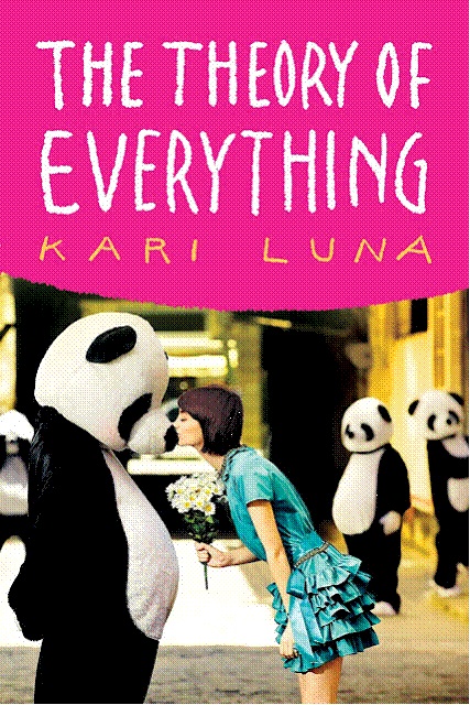
"Then one day the cover appeared in my Inbox. I was surprised! I loved the colors, total 80s. And the handwritten font, my name in yellow, all of it was delicious. But the photo bugged me. Who was that girl? What was she wearing? And what was the deal with the pandas? It sounds strange when I say it now, because that photo totally captures the spirit of the book. It's happy. Bright. Like a little love bomb, which is exactly what I wanted. (Thanks, Natalie Sousa!) But at the time I was fixated on the fact that my main character, Sophie Sophia, would never wear that dress. It was too adorable. And she was, well, adorably funky.

"So we added tights. Pink ones. Then orange ones. Eventually striped ones. We added a colored belt and bracelets and necklaces. I think they even made her hair darker and messed it up, a bit. With those few changes she had more edge, and I was happy. Sophie Sophia, I thought, would approve. [See original cover, left, vs final, right, below]:

OriginalTTOECover9780399256264_medium_The_Theory_of_Everything

WillButtons
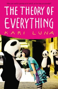
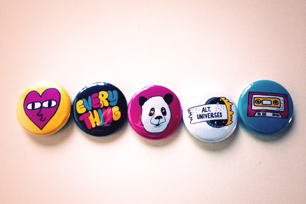
"And now? I love the cover. I've been looking at it for a year and can't imagine it as anything else. I adore the pandas, so much that I put one in the book trailer I made. And the shot was from Getty Creative, but the photographer, Ibai Iacevedo, did an entire series in Barcelona. So. Amazing. As for Will? He made posters and buttons in the same colors as they cover (see right), and I think they all look fabulous together. One big, happy panda family."

Curious? Check out this review from The Flyleaf Review and see if it sounds right for you!

Back to College...

I'm teaching at Summer at Smith for two weeks, but I'm taking a little blog hiatus, so I'll be back later in July with Cover Stories and giveaways! I'll be wading through college nostalgia for a while... damn, these beds are skinny! Screen Shot 2013-06-30 at 10.45.16 PM


Cover Stories: Ashes to Ashes

Ashes to Ashes_new coverHi, guys! I did a Cover Reveal for my upcoming book, Ashes to Ashes, with bookish.com! Here's a teaser... "The movie Ghost was a point of inspiration for me, so as I thought about what the cover for "Ashes to Ashes" might look like, I flashed back to the poster for Ghost--it's pretty steamy! I usually send over a few images and ideas for tonal reference before my book gets a cover, but this time, the team at HarperCollins worked so quickly that I didn’t even know that my cover was in development. It was just suddenly… in my inbox...

Read the rest of the Cover Story on bookish.com! I'll give some more cover design details closer to release date (12/23!).


Win-It Wednesday: Just Like Fate (signed!)

just like fateThe lovely Cat Patrick and the glowing Suzanne Young have signed a copy of their collaborative novel, Just Like Fate, for one lucky blog reader! Yay! Here's the summary:

Caroline is at a crossroads.

Her grandmother is sick, maybe dying. Like the rest of her family, Caroline’s been at Gram’s bedside since the stroke. With the pressure building, all Caroline wants to do is escape—both her family and the reality of Gram’s failing health. So when Caroline’s best friend offers to take her to a party one fateful Friday night, she must choose: Stay by Gram’s side for what might be her final hours, or go to the party and live her life.

The consequences of this one decision will split Caroline’s fate into two separate paths—and she is about to live them both. And though there are two distinct ways for her fate to unfold, there is only one happy ending…

I for one love the idea of certain events in our lives being fated... unchangeable and meant to be. To enter to win the book, just do the various tasks I've put forward below. I'll choose a winner at random next week!

a Rafflecopter giveaway

Cover Stories: Rogue by Lyn Miller-Lachmann

rogueLyn Miller-Lachmann has been the Editor-in-Chief of MultiCultural Review; the author of the award-winning multicultural bibliography Our Family, Our Friends, Our World; the editor of Once Upon a Cuento, a collection of short stories by Latino authors; and the author of Gringolandia, a young adult novel about a refugee family living with the aftermath of the Pinochet dictatorship in Chile. Her most recent novel, Rogue, features a main character with a mild form of autism, which Lyn also has. In an interview with the Times-Union, she says that she, like her character, "got into a lot of fights. I beat up boys. I literally cried every day at school. The stress was overwhelming. I made really good grades, and I hated school." Rogue also has a very cool Cover Story, and she's here to share it:

"My YA novel, Gringolandia, had an unusual and powerful cover closely connected to the story, and I was heavily involved in the design process. A small press published the novel, and in general, small presses do give authors far greater input than large corporate publishers. Thus, when I signed the contract for Rogue, I knew I’d get a chance to see the cover beforehand but I’d have little or no role in the ultimate decision-making. "That said, the result exceeded my wildest expectations. My wonderful editor, Nancy Paulsen at Penguin, commissioned Marikka Tamura, whose work has appeared in The New Yorker and other prestigious venues. We all agreed that the cover of Rogue needed a bicycle, because bicycles of all kinds play an important role in the story. Once we decided on the title of 'Rogue,' after the X-Men superhero with whom my main character, Kiara, is obsessed, we all knew the cover needed a comic-book superhero motif.

"When I first saw the cover design, the only thing that concerned me was the thought bubble that contained the novel’s first line: 'It usually took the new kids two weeks to dump me, three weeks at the most.' The reason is that when I was in school, I used to descend on the new kids, to make them my friends before the more popular kids stole them away. It never worked, and my own friendships never lasted more than a few weeks. So I was nervous about advertising unpopularity—Kiara’s and mine—on the cover.

"My editor did not agree with me. The one change that the publisher made from the galley to the finished copy was to change the thought bubble from pink to blue (see galley cover on the right). And here’s where we did have outside input—not mine, but my seventh grade student’s recommendation.

"When I told my seventh graders that my novel had been accepted, under the title KIARA RULES, and read them the first chapter, a student named Dan said, 'This is the kind of book I’d read, but not if it has a girl’s name in the title and pink on the cover.' So KIARA RULES became ROGUE, but the graffiti 'Kiara Rulz' on the cover recognizes the earlier title and Kiara’s generally fruitless efforts to be 'cool' and in control. And, of course, the pink thought bubble became a blue thought bubble. That was a good move because it turns out that boys do enjoy reading Rogue. It’s rare to have boys pick up a novel with a girl protagonist—The Hunger Games is a notable exception—so I’m thrilled that Rogue is in that company. At the same time, Kiara, like Katniss, doesn’t take on traditional gender roles, and every other character is a boy. Like many girls with Asperger’s syndrome, myself included, Kiara’s first real friends turn out to be boys rather than girls.

"The gender-neutral cover captures perfectly my main character, her tendency to get in trouble even though she wants to be good, her sense of being an outsider, and her superhero obsession as she struggles to find her own special power. It’s also an lively cover that hints at the outdoors setting and the action and suspense that should keep the pages turning."

Thanks, Lyn! I love the idea that seventh graders weighed in here and got a voice at the table! Can't wait to read it!

Cover Stories: Born of Illusion

born of illusion Guys, Teri Brown's latest novel, Born of Illusion, has 1920s NYC ambience in spades! It is so, so cool and creepy and lovely. Plus it's full of magic. The magician kind. I enjoyed it so much!

Here's Teri to tell the story of her cover (which also inspired an eyeshadow palette!):

"I had a sketchy cover idea of a trunk with a variety of magic items in it along with handcuffs and maybe a few old newspaper clippings of Harry Houdini's stunts. But, honestly, these were only half-hatched ideas and I couldn't quite make it come together in my head. When I told my publisher about those ideas, I got crickets back…

"And then when I first saw the cover, I gasped. It was so gorgeous. I was afraid, though, that the young woman looked a bit old for a YA. They were very interested in my input and l did tell them that the young woman looked a bit mature. I felt silly bringing it up because the cover was so stunning. It was such a small nitpick! But they were great--they tried to soften her jaw line just a bit to make her look a little younger.

"My editor and her assistant were actually looking through the stock art for a cover for a completely different book when they stumbled across this one. They knew immediately that this was the one. They just shot the cover for Born of Deception with the same model… I have seen some mock-ups and I don't know how they did it, but the second one is equally as stunning!

"A couple of interesting things about this cover… they actually employed a font artist to come up with the font for the book. They wanted it to have an old timey look, as the book does take place in the twenties. The artist took his inspiration from period magic posters, so it has a vaudeville show feel that I think is fabulous.

"The second interesting thing about this cover is that it actually changed the content of the story! After the cover reveal, everyone was talking about the pop of color from her blue eye… but in the story, Anna's eyes were brown like her mother's! My editor and I talked it over and agreed that readers would be horribly disappointed if Anna's eyes weren't blue. As it turns out, Harry Houdini's eyes were reportedly blue, so it worked out really well and added a layer to the story."

Thanks, Teri! I love this cover -- it's beautiful. And the same thing happened with the original Unbreak My Heart cover, except they had to age up the girl on the cover (see that story here). Also, I'm so glad the blue eye change fit well with the story -- kismet!

What do you guys think of this cover?

Cover Stories: When You Were Here by Daisy Whitney

Daisy Whitney shared the Cover Story for The Mockingbirds last year, and she's back with a new tale for her latest novel, When You Were Here (out in June!). By the way, Kelly J. at Stacked says this book is "so good it hurts to think about." Here's Daisy:

"When You Were Here has always been a tough book for me to imagine a cover for. That's because most of the book takes place in Tokyo, but the main character is very much an American teenager. It's also because the novel is about love, and loss, and grief, and joy and finding a sort of peace and happiness when you've been the one left behind, but it's also a romance between a boy and a girl. Given all that, I pictured cityscapes and neon lights and maybe a boy walking away from the reader...But that's sort of as far as I could picture a possible cover.

"I did share those thoughts with my editor and I also told her I wasn't fond of gray covers, that I didn't want a Tokyo vibe on the cover, and that I didn't want a sad or depressed looking boy on the cover. To be sure, my main character is sad at the start of the novel, but he's very much questing and yearning for happiness so I wanted the cover to convey some of the hopefulness of his journey.

"The cover here is the second version. The first version I wasn't wild about and I told my editor so. Without getting into the specifics, the first attempt felt too much like an adult novel for my tastes, and it also didn't have a person on the cover. I love photographic covers and faces, so when I offered some feedback on the first pass, I suggested a photographic cover, and sent along several stock photo options of teens that I felt came close to the vibe I wanted. My editor shared all the photos and my ideas with the design team, and they definitely took them to heart. So when I then saw this cover, I was happy! Because this cover says a lot now about the story - the boy is yearning, he's looking, he's not shying away from life or troubles. He seems a boy with a purpose, like my main character! I like the sun on his face, and the thoughtful, contemplative mood of the cover. And purple is my favorite color so I love the font.

"This cover is completely different from the first version, and this is much warmer and teen-centric and I think draws readers in, but also makes it clear that they'll be going on a complicated journey.

"I think it's a stock photo, and I'm really happy with this cover. Given that this isn't the easiest story to wrap up in a jacket, I think the design team did a great job. They are tireless and they tried many different directions, and I'm thrilled to be able to have an editor who values my input and who engages in an open dialogue about what's working and not working about covers. When I look at this cover now, I do feel as if this boy is my boy - as if he wants what my narrator wants, as if he's at that crucial crossroads in his life. This is a boy who's going to be a man of action, to seek answers, and who also is yearning and longing for so many things. And that's what the story is about. It's about a teenage boy and his journey through big love and big loss and his quest to find happiness in the here and now."

Thanks, Daisy! The emotions that this cover invokes are spot on for me. I love, love, love the sunlight behind him. So bittersweet. Can't wait to read.

What do you guys think?

Win-It Wednesday: Signed Unbreak My Heart Paperback!

UnbreakMyHeartPBThe winner of last week's giveaway of Spellcaster by Claudia Gray is... Jasmine V! For the next two weeks, I'm going to celebrate the paperback release of Unbreak My Heart! It's out on Tuesday of next week (YAY!) and I have three signed copies for three winners!

You may have noticed on Twitter and FB that people have changed their icon's to the "I Read YA" button, and everyone is talking about what YA book they're currently reading. SO, in honor of the "I Read YA" movement, here's how you enter the giveaway, via rafflecopter, below:

a Rafflecopter giveaway