 Amanda Ashby has shared a few cover stories over the years, and School Library Journal calls her latest book a "frothy romp" that "percolates with lighthearted humor and droll dialogue, while an involving plot and themes exploring friendship and self-reliance add satisfying substance." Yay!
Here's the cover story for Demonosity (out this week!):
Amanda Ashby has shared a few cover stories over the years, and School Library Journal calls her latest book a "frothy romp" that "percolates with lighthearted humor and droll dialogue, while an involving plot and themes exploring friendship and self-reliance add satisfying substance." Yay!
Here's the cover story for Demonosity (out this week!):
"Sometimes I get asked by my editor if I have any thoughts on the book cover but I didn’t have any input on this one. Mind you, I’m not great at visualizing things so perhaps after my previous suggestions they decided to skip me out of the process—though I still maintain that a flesh eating zombie would make a great cover because gore rules!
"Anyway, when I first saw my cover for Demonosity, I was really thrilled, especially when I learned that it had been designed by Jeanine Henderson, who has now done covers for six of my books! I’ve always felt that she’s been able to capture the spirit of the stories and bring them to life and she definitely did that with Demonosity.
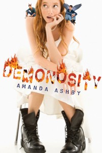
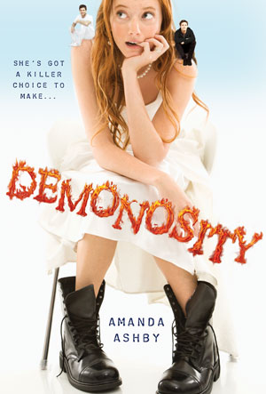
"However, one thing in the draft cover (right) that I didn’t like was the two guys who are sitting on Cassidy’s shoulders. They are meant to reflect that she has to choose between them (and either save the world or destroy it) and I wasn’t really a fan. Especially because originally one of them had wings and one had horns, which made them look like angels/devils whereas the two guys are really thirteenth century demon knights! I did discuss this with my editor and while the guys stayed, we did lose the horns and wings, which was a big relief (not least because there are so many angel books around I would hate for a reader to think that they were buying one and then discover it wasn't the case).
"I’m pretty sure the cover was done from stock photos, mainly because when my middle-grade series got a photo shoot, they told me about it! Anyway, I think they did a great job of getting someone who looked so much like my heroine, Cassidy. And while she probably wouldn’t wear that white dress (she's a vintage girl and never spends more than twenty bucks on an outfit) she would definitely wear those boots and in fact she spends most of the book in Doc Martens and army boots, so I was really pleased to see them there.
"Anyway, overall, I really adore this cover. It reflects the tone of the book and I love that it’s white. Plus, I recently discovered that title font is embossed and so the flames really pop, which is of course the ultimate in rock star coolness!"
Thanks, Amanda! I agree that the guys on the final cover look much better, and the font change is good too.
What do you guys think?