 Guys, Teri Brown's latest novel, Born of Illusion, has 1920s NYC ambience in spades! It is so, so cool and creepy and lovely. Plus it's full of magic. The magician kind. I enjoyed it so much!
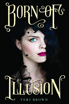
Here's Teri to tell the story of her cover (which also inspired an eyeshadow palette!):
"I had a sketchy cover idea of a trunk with a variety of magic items in it along with handcuffs and maybe a few old newspaper clippings of Harry Houdini's stunts. But, honestly, these were only half-hatched ideas and I couldn't quite make it come together in my head. When I told my publisher about those ideas, I got crickets back…
"And then when I first saw the cover, I gasped. It was so gorgeous. I was afraid, though, that the young woman looked a bit old for a YA. They were very interested in my input and l did tell them that the young woman looked a bit mature. I felt silly bringing it up because the cover was so stunning. It was such a small nitpick! But they were great--they tried to soften her jaw line just a bit to make her look a little younger.
"My editor and her assistant were actually looking through the stock art for a cover for a completely different book when they stumbled across this one. They knew immediately that this was the one. They just shot the cover for Born of Deception with the same model… I have seen some mock-ups and I don't know how they did it, but the second one is equally as stunning!
"A couple of interesting things about this cover… they actually employed a font artist to come up with the font for the book. They wanted it to have an old timey look, as the book does take place in the twenties. The artist took his inspiration from period magic posters, so it has a vaudeville show feel that I think is fabulous.
"The second interesting thing about this cover is that it actually changed the content of the story! After the cover reveal, everyone was talking about the pop of color from her blue eye… but in the story, Anna's eyes were brown like her mother's! My editor and I talked it over and agreed that readers would be horribly disappointed if Anna's eyes weren't blue. As it turns out, Harry Houdini's eyes were reportedly blue, so it worked out really well and added a layer to the story."
Thanks, Teri! I love this cover -- it's beautiful. And the same thing happened with the original Unbreak My Heart cover, except they had to age up the girl on the cover (see that story here). Also, I'm so glad the blue eye change fit well with the story -- kismet!
What do you guys think of this cover?