Cover Stories: The After Girls

after girls
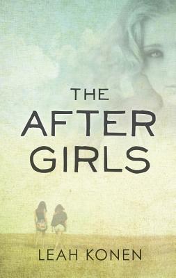
Leah Konen's debut novel, The After Girls, is out this month, and the cover is nothing like what she expected. Here she is to tell the tale: "I thought a lot about the cover for The After Girls once I knew it would be published. I know you're not supposed to judge a book by its cover, but truthfully, we all do. It sets the tone for the book, it puts an idea of the characters in your mind, and it's often what makes you want to pick up the book in the first place. The After Girls follows two teenage girls attempting to uncover the mystery of their best friend's suicide, and so I imagined a cover that was moody, dark and, most of all, about friends. I saw blue and purple hues, storm clouds, woods, friends hands tightly clasped together, maybe even an image of the skeleton key that figures so prominently in the story ...

"Needless to say, the cover was nothing like what I'd expected. I actually received an early image as I was packing up my whole apartment in preparation for a cross-country move from Brooklyn to San Francisco. I was already on edge (moving does that), and as I read the email I was both elated and completely nervous. My agent's words in the email: 'It's different than I imagined it would be, but in a good way.' I was terrified to download the image--I hadn't had any input on the cover, and I had no idea what to expect.

"After several minutes of freaking out, conceiving the worst covers I could possibly come up with (my agent did say it was 'different'), and coaxing from my boyfriend, I finally opened the file. I saw the colors before anything else. Subtle blue-greens and yellows, with just a hint of darkness, like something was off. A girl's image hovered at the top over two friends walking, their backs to us. It wasn't what I'd imagined--and I loved it. It did what my imagined covers hadn't: it portrayed the eeriness, the spookiness, the ethereal sense of loss, but it also showed healing and moving on. It showed what I had always felt, that even though The After Girls is dark and gothic, it is more about love and friendship than death and grief.

"Though I did have some tiny tweaks, which were taken into consideration, the cover changed only slightly from the initial version I saw--and I was fine with that. Even though I had little input, in the end, I think it's very me. It's youthful without being overly so, mysterious and hopeful. As a good friend (who doesn't read YA) said when I first showed it to her: 'It looks like a book I'd actually want to read!'"

Thanks, Leah! The trailer is lovely as well -- the watercolor atmosphere of the cover and the look in the trailer appeal to me a lot.

What do you guys think?

Win-It Wednesday: Spellcaster by Claudia Gray

SPELLCASTER-coverRuth Silver is the winner of The Boyfriend App! Hooray! Also, I believe there is a lot of money to be made in the teleportation field. Someone should get on that. This week I'm giving away a signed copy of Claudia Gray's latest, Spellcaster (read the Cover Story here). The lovely Ms. Gray fulfilled my Girl Scout cookie wishes this year, and included a book to boot!

To enter, just follow the rafflecopter lead below. Bonus if you leave a comment telling me what spell you'd cast if you could... I believe, at this moment in time, mine would be a spell that would make me an amazing cook who always had every ingredient she needed in her pantry, whenever the urge to make dinner struck. (As a non-spellcaster, tonight I ate leftovers again. Sigh.)

Good luck!

a Rafflecopter giveaway

Cover Stories: Criminal by Terra Elan McVoy

Cover w TaglineTerra Elan McVoy will be teaching with me at Smith College this summer (yay!) and she's back with a brand new book and a cover that somehow is both very in keeping with her past covers and also very different. Here she is to tell the tale: "I know I'm like a broken record at this point, but the case of Criminal's cover, as with all of my other books (save the paperback edition of Pure), I didn't have much to say when it came to the design, other than, 'BAM! This is awesome!'

"Since Criminal is in so many ways a very different book for me though (edgier and darker, with a much less confident protagonist), I was curious how the design team would work to set this book apart from the beautiful sweetness of the others, and yet keep it in line enough so that they would all look good together. I knew I didn't want anything that too strongly focused on the violence of the book (a gun, for example, or handcuffs or jail), though I did wonder about utilizing police CRIME SCENE tape or something like that.

"What makes the final cover so perfect to me, is that it is definitely different from the others (all black, notably different font), but it also blends with them. Like the rest (below), there's the title, and my name, a solid background, and one stand-out visual that makes it pop. (In this case, the golden bullet.) Even though there is a hint of the violence on the cover, it feels perfect because it is so simple, and so symbolic. That the bullet is tearing through the title, shattering it into little bits, is perfect not just because it looks cool, but because this violent act of Dee's completely shatters Nikki's life.

Screen Shot 2013-05-11 at 10.01.57 PM

"I will admit that when I saw that the cover was completely black, I did have a moment of, 'Oh no! How is this going to stand out now?' since my friends have had fun sending photos of Pure, especially, popping out on the shelf amidst a field of darkly-covered YA titles. I think the end result is so perfect and gorgeous, however, that I'll be able to handle it. All in all, I'm very pleased with the whole jacket, and I hope it entices readers to pick it up and read what's inside!"

Thanks, Terra! I really love your covers and the way that one symbol stands in as the full design. (See Terra's past Cover Stories for Being Friends With Boys, The Summer of Firsts and Lasts, After the Kiss and Pure.)

What do you guys think?

Win-It Wednesday: The Boyfriend App

boyfriend appI have been a very remiss Win-It Wednesday host. Sorry! The winner of The Chocolate War is Samantha Jo P!  (Your win is just in time for the Stacked Read & Blog Along with this book!) This week, I'm giving away a signed copy of The Boyfriend App, by Katie Sise. Here's a pic of Katie reading from her book at Thistle & Clover last week (she also makes really awesome jewelry, hence the table display -- such a fun book party!).

Screen Shot 2013-05-08 at 7.23.39 AM

Reviews so far have called this book "too cute for words" (Book Scoop) and "a unique story line and a spunky, nerdy protagonist that doesn't fall at the feet of others" (Book Jems). Yay!

To win a signed copy of Katie's book, enter below in various ways. I promise to pick a winner faster this time!

a Rafflecopter giveaway

Happy Wednesday!


Cover Stories: Shadowlands by Kate Brian

Shadowlands_CVR_500px-2 Kate Brian, aka Kieran Scott, is here to share her perspective on the cover for her latest novel, Shadowlands. "I’ve never had the privilege of being asked for input on my covers, so I’m always holding my breath a little bit, waiting to see what the designers come up with. Most of the time, when I see the final result, I breathe a sigh of relief, and that was definitely the case with Shadowlands. I love, love love this cover. Every time I look at it I think I love it a little bit more. I love the moodiness of the colors, the gold shimmer of the title, the way the clouds and the birds wrap around the letters. It seems to be in constant motion. But I especially love the reaction it inspires from readers when they first see it. At an event the other day, a girl picked up the novel and said, 'Oooooh! Spooky!' And then she gave it a little hug. You really can’t ask for more than that.

shadowlands original"All that being said, I think I loved the original cover even more (right). The proposal for Shadowlands was put together by the awesome folks at my packager, Alloy Entertainment, and then pitched to a couple of publishers. When they originally sent out the proposal, they included a mock-up of the cover so the first thing the editors at the publishing houses saw was a piece of art that set the mood. That cover included a stock photo of a girl, who faced away from the camera, and was looking up at a flock of hovering and diving crows. You couldn’t see her face, but you could tell she was running. She had this voluminous skirt she was holding up with both hands, and with her face tilted toward the sky, you got the feeling she was terrified of the crows, or of what they symbolized, and that she was running for her life. Once the trilogy pitch sold, the powers-that-be decided to hire models and have a shoot, which is great, but the girl on the cover of Shadowlands the novel, as opposed to Shadowlands the proposal, just doesn’t convey that fear. She looks almost like she’s daydreaming. She’s beautiful and I love the movement of her hair and that she’s still looking up at the dreary sky, but I do miss that fear I felt with the first cover. There’s definitely a terrifying element to the book (girl on the run from a serial killer), so it was nice to have that emotion conveyed. Still, I’m more than happy with the final product, and happier every time I hear that, 'Oooooh!'

BH_70-nCcAELfal.jpg-large"As for the question that seems to be on every reader’s lips, the girl on the cover is supposed to be Darcy, and the girl on the back cover is Rory. This always confuses people because the book is from Rory’s POV and she’s a blond tomboy, so the cover doesn’t meet with their expectations. I have to admit, this was not the designer’s fault. Originally, the novel was from both sister’s POVs, something that changed during the editing process, but by the time the change was made the cover was already done. It was too late to replace Darcy with Rory. They both appear on the cover of the second novel, Here After (right), which is this awesome dark purple color and possibly even spookier than the first. The great thing about both covers is I think they’re intriguing enough to catch a browser’s eye and make them pick up the books, which is really all I want out of a cover! Reel ‘em in so they’ll read the flap. Keeping them there is my job."

Thanks, Kieran! I got a Hitchcock vibe from this cover from the start, so I was spooked immediately. I like seeing the girl more on the final cover, but I do love the fear in that first cover. Tough call.

What do you guys think?

Cover Stories: A Song for Bijou

bijouJosh Farrar's latest novel, a Middle Grade called A Song for Bijouhas a lovely cover that conveys a lot in one image. Here's Josh to talk about how it came to be:

"A Song for Bijou is a multicultural middle-grade romance, so I knew I wanted Alex and Bijou, the protagonists who share narrator duties in the story, to each be featured prominently.

"I was consulted throughout the process. I didn't have super-specific images of the characters in mind - except for Bijou's hairstyle, which is described in detail in the opening paragraphs of Bijou, but I wanted them to likeable, approachable, and no more sophisticated than their tween selves would be in real life.

"It took us a couple of tries to get there - the designer tried a couple iterations of a collage concept, but we didn't get any traction with it - but I absolutely loved the final version!

"As with most writers, my contract grants what is called 'cover consultation,' which means that editorial and marketing are encouraged to seek my input and to hear me out. (This is opposed to the much rarer 'cover approval,' which means that the author has to approve of the final version 100%.) My editor at Bloomsbury, Mary Kate Castellani, went to great lengths to include me in the design process. I have no idea how I compare to other authors in terms of the amount of input I give, but I love illustration and design, and it's fun to be involved in making those decisions.

"I wouldn't say that every single one of my suggestions was implemented, but that I was definitely treated with respect as a collaborator throughout the process, and the fact that I was but one of several people offering input was absolutely a good thing for the cover design. Whereas I've written just two books, my editor and designer have worked on dozens. They know what works, and what doesn't.

bijou original"The cover began as a photo collage, and ended as an illustration somewhat influenced by the poster for the film, Moonrise Kingdom. When the second iteration of the photo collage failed to excite the overall team, we all kind of converged on the idea that an illustration was the next logical direction. My editor sent me examples of several illustrators whose work they thought was good, and I picked 2-3 of those as favorites.

"One of them, Erin McGuire, nailed the cover concept on the first try. In fact, the very first drawing she submitted (right) was quite close to final illustration. She understood instinctively what she needed to do.

"If a book has a plot of any originality, finding the perfect stock photo is like searching for the needle in the proverbial haystack. My first book, Rules to Rock Bywas about a 12-year-old, half-Dominican girl in Providence, RI who plays the bass and wants to start a band. Try finding a 12-year-old, half-Latina girl playing a bass! It's not easy, and the initial cover-design attempts weren't cutting it. I was thrilled when my editor gave me the go-ahead to find my own model and photographer. My wife, Tayef, and I were already involved in shooting a book trailer for Rules, so we had a photographer come in and shoot a bunch of stills of the actress who played Annabelle, the main character. The people at Bloomsbury loved the photos, reimbursed the photographer, and used their favorite for the final book design.

Screen Shot 2013-04-22 at 2.10.23 PM

"Not until I actually saw the cover on the final, bound book (above) did I realize how nicely the cover design complemented the novel. A Song for Bijou's narration is split between Alex and Bijou, the two characters depicted on the cover, and the designer did a very nice job of re-purposing the main illustration twice to reinforce the relationship between the cover art and the story told inside. On the back cover, the same illustration is shown, but only from the waist down. And below each character's feet is a sample of the prose written from each character's point of view. Finally, the spine of the cover shows only each character's face, virtually gazing at one another from across the divide of the title. I thought this was a sweet visual metaphor for the distance Alex and Bijou must travel in order to find one another."

Thanks, Josh! I love the colors on this jacket, and the emotion between the characters is spot-on. What do you guys think?

Cover Stories: The Runaway King by Jennifer A. Nielsen

RunawayKing- Jennifer A. Nielsen's bestselling series impressed me with its iconic cover style. Here's Jennifer to tell the story of how it was created: "We had the cover of Book 1 (The False Prince, below right), so I guessed that Scholastic would try to stick with the 'broken' theme, but since covers are the realm of the publisher, I don’t think much about them while I’m writing. Besides, I have the visual art abilities of a toothpick, so my instincts aren’t great for design.

false prince"I wasn’t asked about input for Book 1, but with Book 2 I got to see a rough draft and make suggestions to my editor. I know that one of Scholastic’s goals with this series is to create an image that was more iconic, something that didn’t look like any other book. And I think so far they’ve succeeded.

"I really love the emerald green with the silver text, and I think the sword on it is just wonderful. The sword reminds me of Narsil, the broken blade in Lord of the Rings. I think it’s going to look great next to that deep blue of Book 1.

"Book 1 went through several different versions – I think there was a lot of input throughout the company and they worked really hard to find a cover that met a wide approval. Book 2 has some slight variations from the original version, but nothing more than tweaking what was already really lovely art.

"The cover design was done by Chris Stengel, the same illustrator who also designed for Maggie Stiefvater’s Shiver trilogy [read the Shiver Cover Story], and Ken Choi did the sword art. I feel indescribably fortunate to have both of them for artists.

"I love, love, love both of my covers! I think Book 1 does exactly what it should, which is to define itself as a medieval fantasy in which something has gone very wrong for the royals. The shattered crown is a wonderful symbol, and I think readers will come to appreciate its meaning.

"For The Runaway King, I think it’s wonderful that the broken image has been carried forward. Readers will find in Book 2 that Sage’s problems only get worse, and the cover definitely reinforces that."

Cover Stories: Scorched by Mari Mancusi

9781402284588-PR Mari Mancusi has shared Cover Stories here before, including one of the most popular Cover Stories ever for Gamer Girl! She's back with a new cover, revealing this week for the first time, and a great story. Here's Mari: "With seventeen books under my belt, the Scorched cover consultation wasn’t exactly my first rodeo. But for some reason I was more nervous than ever about what they’d decide for the cover. I just felt a book like this really needed the right cover. But what would that right cover entail? For once I didn’t have a clear picture in mind.

"I knew I wanted a strong looking heroine. It was important to me that Trinity didn’t look like a damsel in distress in a pretty gown. I also knew I wanted the cover to appeal to both genders—as the book has points of view from both Trinity and the two boys—Connor and Caleb—sent from the future to stop the dragon apocalypse. And I liked the idea of an orange and red color palette—to really pop on bookstore shelves. I wanted it to be vivid. To be violent. To be on fire.

"And, you know, it couldn’t hurt to have an actual dragon on the cover…

"I was delighted when I found out they were hiring an artist to create the cover. Which, in hindsight, makes sense. I mean, casting call for dragons on Craigslist, anyone? I was even more delighted when I found out they chose Tony Sahara who did the beautiful Eon and Eona covers. This was an artist who knew his dragons.

"You can see some of the rough cover comps he sent as we tried to settle on an overall concept (below). The one with the dragon rampaging over the city feels very Godzilla-like to me. Which is kind of awesome, but perhaps not exactly right for this particular book. I also really liked the covers that showed the close-ups of Trinity and the dragon—with the title in the middle. They look a little softer—almost romancey.

scorched_011713a - Early Comp Cover 2 scorched_120612d - Early Comp Cover 1 scorched_010813c - Early Comp Cover 3

"But nothing could come close to the design that was finally chosen. A cover literally on fire. A girl standing with her dragon—eyes defiant, challenging—as if to say, 'You really want to mess with this?' And the dragon—though fierce and awesome—looks down at her with affection in its eyes. You look at this cover and wonder—what is their connection? Why is she so protective of this monster? Is there something about this dragon that we don’t know about? Something worth saving?

"I love this cover with the passion of a thousand burning suns. Now that I’ve seen it, I couldn’t imagine anything more perfect for the book. And I cannot wait to see it on bookstore shelves in September."

Thanks, Mari! Love this story. The cover screams DRAGON, and readers will know just what they're in for!

What do you guys think?

Cover Stories: Poison by Bridget Zinn

poisonBridget Zinn's first novel, Poison, was released in March, more than a year after she lost her battle with cancer at age 33. I've read a lot about her. I started here. Her last tweet was "Sunshine and a brand new book. Perfect." And with that, I wish I'd known her. I have learned so many wonderful things about Bridget, and about her much-loved debut. (Want John Green's thoughts? They're here.)

poison-cover-girl-headshotI wanted to do a Cover Story, about the fantastical image, about the peeking pig. I asked Bridget's husband if she ever saw her cover, and he told me she didn't. But he offered a link to Novel Novice, who has an interview with her cover model (right), and he said, "I think we were extremely lucky to have such a fantastic cover."

Turns out the costume involved stitching 12 pieces together. The dagger is real. And there's more fun stuff from behind the scenes at the shoot.

I'll leave you with some words from Kirkus about the book. As for me and the cover? I'm enchanted.

"A frothy confection of a fairy tale featuring poisoners, princesses, perfumers and pigs, none of whom are exactly what they appear." -Kirkus

PS-While lots the word-spreading was done in March, here's how you can help Bridget's novel reach more people. Go read her story--and then read her book.