 Kate Brian, aka Kieran Scott, is here to share her perspective on the cover for her latest novel, Shadowlands.
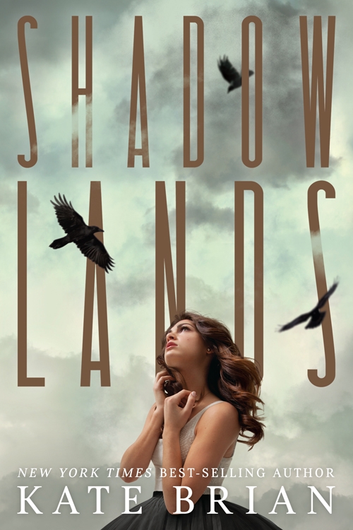
"I’ve never had the privilege of being asked for input on my covers, so I’m always holding my breath a little bit, waiting to see what the designers come up with. Most of the time, when I see the final result, I breathe a sigh of relief, and that was definitely the case with Shadowlands. I love, love love this cover. Every time I look at it I think I love it a little bit more. I love the moodiness of the colors, the gold shimmer of the title, the way the clouds and the birds wrap around the letters. It seems to be in constant motion. But I especially love the reaction it inspires from readers when they first see it. At an event the other day, a girl picked up the novel and said, 'Oooooh! Spooky!' And then she gave it a little hug. You really can’t ask for more than that.
Kate Brian, aka Kieran Scott, is here to share her perspective on the cover for her latest novel, Shadowlands.
"I’ve never had the privilege of being asked for input on my covers, so I’m always holding my breath a little bit, waiting to see what the designers come up with. Most of the time, when I see the final result, I breathe a sigh of relief, and that was definitely the case with Shadowlands. I love, love love this cover. Every time I look at it I think I love it a little bit more. I love the moodiness of the colors, the gold shimmer of the title, the way the clouds and the birds wrap around the letters. It seems to be in constant motion. But I especially love the reaction it inspires from readers when they first see it. At an event the other day, a girl picked up the novel and said, 'Oooooh! Spooky!' And then she gave it a little hug. You really can’t ask for more than that.
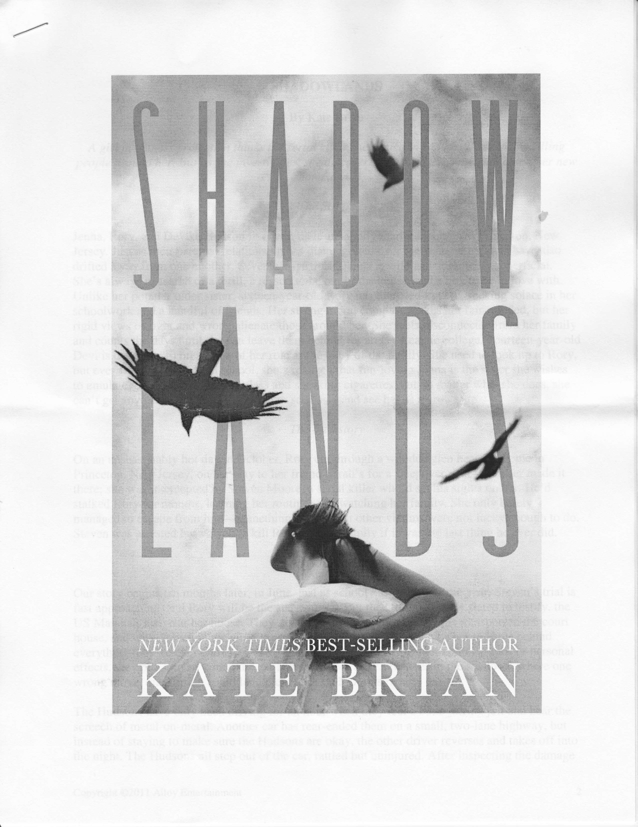 "All that being said, I think I loved the original cover even more (right). The proposal for Shadowlands was put together by the awesome folks at my packager, Alloy Entertainment, and then pitched to a couple of publishers. When they originally sent out the proposal, they included a mock-up of the cover so the first thing the editors at the publishing houses saw was a piece of art that set the mood. That cover included a stock photo of a girl, who faced away from the camera, and was looking up at a flock of hovering and diving crows. You couldn’t see her face, but you could tell she was running. She had this voluminous skirt she was holding up with both hands, and with her face tilted toward the sky, you got the feeling she was terrified of the crows, or of what they symbolized, and that she was running for her life. Once the trilogy pitch sold, the powers-that-be decided to hire models and have a shoot, which is great, but the girl on the cover of Shadowlands the novel, as opposed to Shadowlands the proposal, just doesn’t convey that fear. She looks almost like she’s daydreaming. She’s beautiful and I love the movement of her hair and that she’s still looking up at the dreary sky, but I do miss that fear I felt with the first cover. There’s definitely a terrifying element to the book (girl on the run from a serial killer), so it was nice to have that emotion conveyed. Still, I’m more than happy with the final product, and happier every time I hear that, 'Oooooh!'
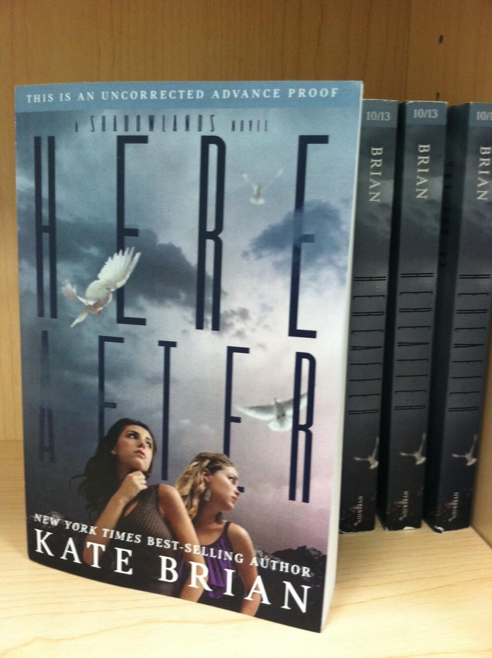 "As for the question that seems to be on every reader’s lips, the girl on the cover is supposed to be Darcy, and the girl on the back cover is Rory. This always confuses people because the book is from Rory’s POV and she’s a blond tomboy, so the cover doesn’t meet with their expectations. I have to admit, this was not the designer’s fault. Originally, the novel was from both sister’s POVs, something that changed during the editing process, but by the time the change was made the cover was already done. It was too late to replace Darcy with Rory. They both appear on the cover of the second novel, Here After (right), which is this awesome dark purple color and possibly even spookier than the first. The great thing about both covers is I think they’re intriguing enough to catch a browser’s eye and make them pick up the books, which is really all I want out of a cover! Reel ‘em in so they’ll read the flap. Keeping them there is my job."
Thanks, Kieran! I got a Hitchcock vibe from this cover from the start, so I was spooked immediately. I like seeing the girl more on the final cover, but I do love the fear in that first cover. Tough call.
What do you guys think?