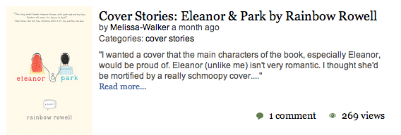
Cover Stories: Take a Bow, Paperback

The fantastic Take A Bow-PBcvr
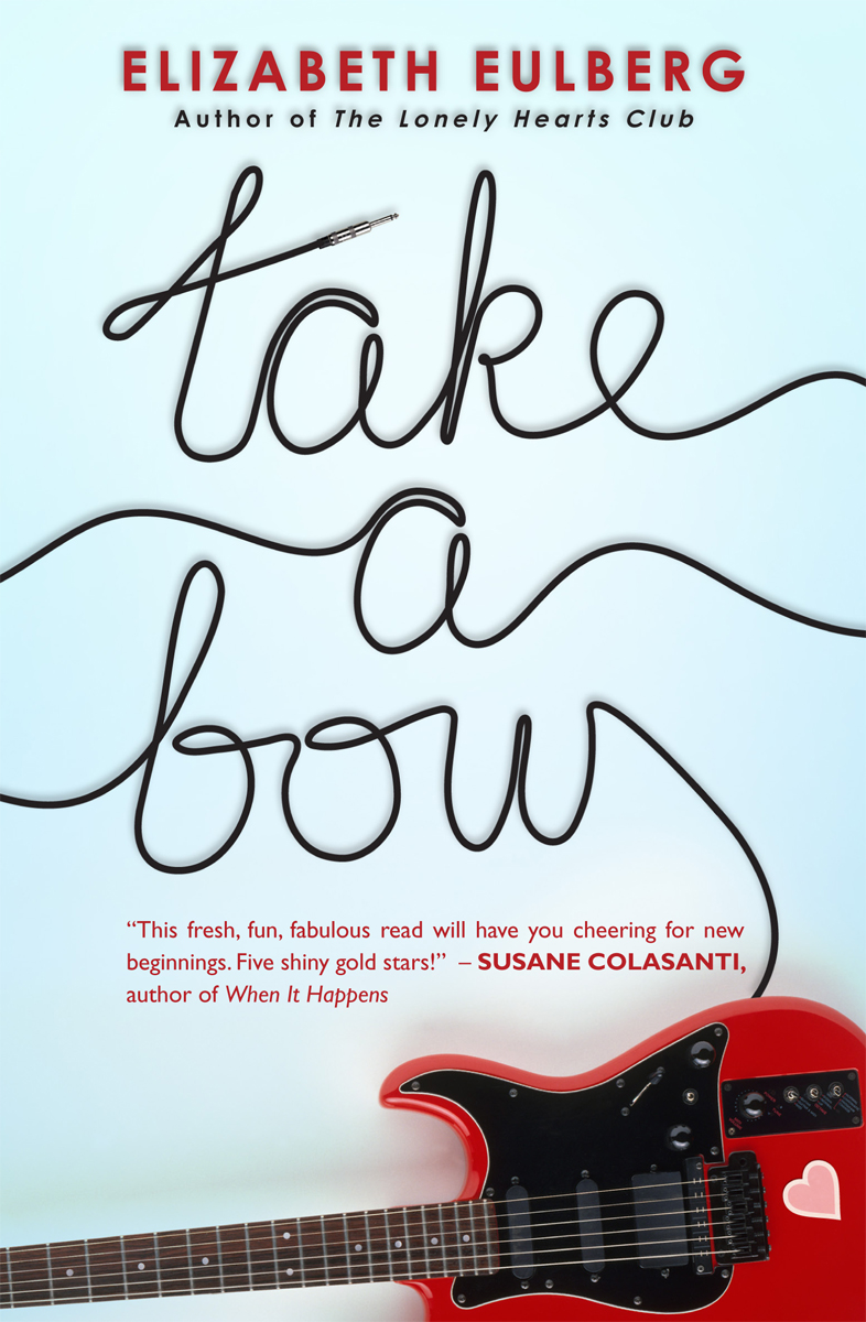
Elizabeth Eulberg shared the story for the hardcover of Take a Bow, and now the paperback is out this month with a brand new face! Here's Elizabeth to talk about the change: lonelyhearts"You'd think I would've learned my lesson by now. Back before my first book, The Lonely Hearts Club, was published three years ago, I got a call from my editor that the cover was changing. I got really nervous, but then I saw the new cover and was instantly relieved (mostly because I didn't realize they were using my idea!). It's still my favorite cover (right).

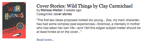
"So fast forward to a few months ago when my editor informed me that the cover was changing for the paperback release of my third novel, Take a Bow. But I love the cover (below right)! Why does it have to change? There was some sulking involved.

TakeABow

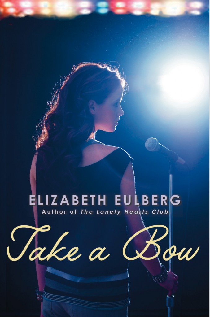
"Then the cover was sent to me and I was told that I could wait a few days to let them know what I thought. But I didn't need to. I LOVED this new cover the second I saw it. While I still adore the original, I think the new cover is perfect for the paperback: it's bright, it stands out, it has a guitar on it!

"Plus, I think boys might not be too embarrassed about picking it up. It's now my second favorite book cover of mine (behind The Lonely Hearts Club). So I promise going forward to not judge a cover until I see it!"

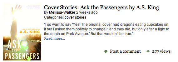
Thanks, Elizabeth! I like the new cover a lot too. I'm finding myself drawn to less people more object covers lately, and I love the little heart on the guitar. Adorable without being cloying.

What do you guys think of the cover redesign?

Cover Stories: Return To Me

return to meJustina Chen pours her heart into her novels, as all writers do in some way. But this latest one? It really is her heart. Read the back story about the novel here, and check out the Cover Story below. Thanks, Justina. "After toiling over RETURN TO ME for the better part of two years, mostly at four in the morning when the world was dark and dormant, I took myself off to Hawaii. There, in the high-sheen sunlight, I came across a red tropical flower that arrested my heart: the ohia lehua. It wasn't the color or the shape of the flower that enthralled me, but the tenacity of that flower, growing stubbornly in a field of hardened, black lava. So at one point, I could imagine that flower in the background of the book cover. Either that or a close-up of a fairy house, which my protagonist--an aspiring architect named Reb--crafted from found materials in the garden: twigs, leaves, pine needles.

north of beautiful"All that said, I have the utmost respect for Little, Brown's art department. Amazing designers, including RETURN TO ME's Tracy Shaw, have done outstanding jobs, translating my words into a singular image for every one of my book covers. I mean, isn't North of Beautiful gorgeous with the compass rose overlaid atop Terra's cheek? [Read the Cover Story.] And Girl Overboard--could there be any other cover but that one? So I knew that I should just stay mum when it was time for the art department to get involved and allow the creative geniuses free reign over their magic.

"Smart move! My editor showed me one concept and one concept only for RETURN TO ME. As soon as I saw the pdf, I knew the concept was The One, my story's soulmate. It's not just the cover I adore, but the entire designed book right down to the perfectly architected font, page layout, and interior pages. The interleaves separating the three sections of the book are so beautifully designed, I teared up when I viewed them the first time. So you can only imagine how I felt when I held the hardbound book in my two hands: it was as if my heart had returned to me, better than before."

Thank you, Justina! I love the faded and fuzzy parts of this cover, almost like a filter that makes it dreamlike in parts, sharp in others. I also really like the light play on the water and the pink translucent lettering of the title. What do you guys think?

Win-It Wednesday: A S%#t-Ton of Books!

sinners pbHey, guys. I have been so lax about Win-It Wednesday that I feel required to make amends. First, the winner of a Tara Altebrando e-book is... Kay! Kay, let me know which book you'd like and I will figure out how to e-deliver it to you!

Next: I haven't mentioned that the paperback of Small Town Sinners is coming out on 1/22, so let me just say this: THE PAPERBACK OF SMALL TOWN SINNERS IS COMING OUT ON TUESDAY! Ooh, there it is! Looking a lot like the hardcover with a zoom lens!

What thrills me most about a book release are sightings in the wild. Author friends can tell you that I often go into bookstores and snap phone shots of their books to send to them. Some may think I'm crazy, but I really do love that moment of: It's there! In a store!

Your challenge, if you choose to accept it, is to find Small Town Sinners, the paperback, in the wild for me. Snap a pic if you can, and email it to melissawalkerbooks AT gmail, or just tell me where you saw it in the comments. (If you buy it -- YAY! -- but not required.) Libraries also count, of course, though they're partial to hardcovers. I will randomly choose one person from the emails and comments to win a full box of books:

photo (44)

That's right. You will win a box full of these very books. Chock full of treasures, I tell you. Click to enlarge, but don't drool on your screen.

I'll keep this one going for a few weeks because you need time to find the book! And I will thrill every time you see it in the wild. Thank you!

PS-Yes I know it's Thursday. I'm behind.

PPS-Update: More ways to enter below, but +10 entries if you spot the book and let me know. That's the big one!

a Rafflecopter giveaway

Cover Stories: Just One Day by Gayle Forman

just one dayGayle Forman has shared Cover Stories for her lovely novels If I Stay and Where She Went -- these were epic tales of covers tried and tweaked. Her new novel, Just One Day, has a lovely, reflective cover. And this one? It's got a pretty straightforward Cover Story: "Penguin sent me a cover.  I liked it."

Sometimes it's that simple! Yay! And I think this cover is great. For me, it captures the introspective nature of traveling, and how going on a journey can point your  mind inward and help you figure out things about yourself. Can't wait to read!

What do you guys think?

Cover Stories: Fangtabulous by Lucienne Diver


Fangtabulous
Lucienne Diver has shared her Cover Stories before, most recently the story of Fangtastic. She's back with the story behind the cover of the follow-up to that book: Fangtabulous, of course. "I would never make it as a cover artist!  I see the book like a movie playing out in my head as I’m writing it, but never as a still shot with an iconic image that would perfectly represent the book.

"Flux has always been great about asking for input on my covers.  When asked about Fangtabulous, I said, 'Gina in a graveyard with something ghostly perhaps forming from one of the gravestones would be really wonderful.' I’m pleased to have gotten the little ghost girl that Gina befriends on the cover with her.

"In the first version of the cover, Gina looked more mean girl than mischievous. (Also vapid, which isn’t Gina at all. She may be a fashionista, but not to the exclusion of all else!) Luckily, Flux was great about finding another image with the same model and changing the eye color to suit the character.

"The final version of the Fangtabulous cover is head and shoulders above the previous incarnation! I believe it’s stock photography, though how they got the ghost girl to show on camera... ;-)

"In terms of how I feel about the cover, I’m torn. I was really so taken with the covers for Vamped and Revamped—the unique design, the very striking reds—that I was nervous when Flux took the covers for Fangtastic and Fangtabulous in a new direction. I understood the change—the Vamped and Revamped covers looked like chick-lit, and that wasn’t a big selling point, so they wanted to give the later two books an edgier feel.  I’d love to hear what readers/viewers think."

Read the Cover Stories for Vamped and ReVamped, and see those covers below:

Vamped-thumb-200x308-95 ReVamped-thumb-250x385-1897

What do you guys think of the original two covers and the new direction? I admit to loving those two first covers--the beauty aspect of lipstick and nails (hi, Lana del Rey!) feels so standout to me. The new ones, though, maybe are more accessible/relatable to readers? Thoughts?