The winner of an early copy of Lovestruck Summer from last week's contest is... Ellie! Send me your address, E. (Also, I totally agree with you about Sarah Dessen's The Truth About Forever--amazing book!)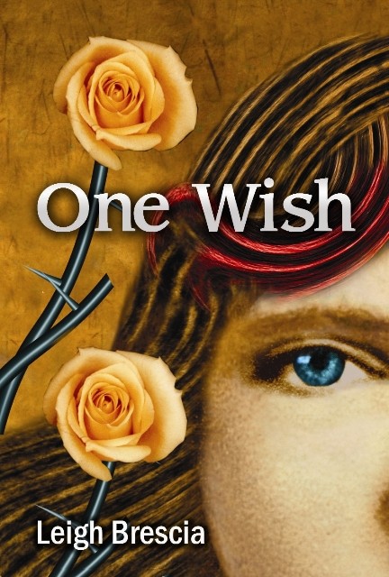 This week, I'm doing a combination Win-It Wednesday and Cover Story! Leigh Brescia's first novel, One Wish, is being released tomorrow! And it has such an arresting cover that I had to ask her about its tale. Luckily, she's into sharing.
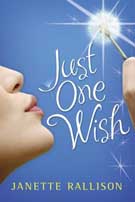 "When I pictured the cover during writing, I saw a dandelion being blown across the page. In fact, what I imagined is scarily similar to Janette Rallison's new novel: Just One Wish (MW note: Janette's cover story is here). I suppose it's a good thing they didn't hire me to design the cover: it would be like showing up at the Oscars wearing the same dress as Angelina Jolie, and she gets to walk the red carpet first! Yikes!
"WestSide hired an incredible designer, Michael Morgenstern, to do the image. His work has been featured in almost every major magazine and newspaper in America.
"When I pictured the cover during writing, I saw a dandelion being blown across the page. In fact, what I imagined is scarily similar to Janette Rallison's new novel: Just One Wish (MW note: Janette's cover story is here). I suppose it's a good thing they didn't hire me to design the cover: it would be like showing up at the Oscars wearing the same dress as Angelina Jolie, and she gets to walk the red carpet first! Yikes!
"WestSide hired an incredible designer, Michael Morgenstern, to do the image. His work has been featured in almost every major magazine and newspaper in America. 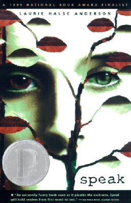 He also did the illustration for Speak, by Laurie Halse Anderson. I talked to him about what he used to create the image, and he said that he created it in Photoshop and used textures, photographs, and digital airbrush technique. He did an excellent job! I had to use Photoshop in a graphic design class in college, and I wasn't nearly as successful.
"When I first saw the image it took me a moment to really focus and take it all in. The design is so bold and fresh: it was like nothing I'd ever seen--especially not for a YA novel. Of course, I immediately decided that I loved it and made it my desktop background.
"It's different, and it makes you look twice. You're not supposed to judge a book by its cover, but in this case, the image is so intriguing. As a reader, I would want to pick it up to see what the story is about. I think it will make a lot of people curious.
"More than anything, though, I love how the image is metaphorical and mirrors the story. My editor sent the synopsis of One Wish to Michael, and he designed the cover from that information."
"Michael told me: 'I had given Wrenn a streak of reddish hair to symbolize the makeover her theatre friends had given her. It's the brightest color on the cover, calling attention to the change which brought with it new confidence, temptations and troubles. The roses with the steely thorns represent the allure of romance on its surface: dreamy and sweet in appearance but with its thorns that can be damaging as well. In the superficial world of surface appearances, it's easy to get lost. But Wrenn's clear blue eyes will steer her through all this and eventually find truth.'"
"Isn't he absolutely brilliant? He's such an incredible artist, and I'm excited that WestSide chose him to design the cover of One Wish."
I love that we got to hear from both author and cover designer in this one! And I agree that the image is unique--that red hair streak always catches my eye. I'm behind on my pile, but I can't wait to read One Wish.
To enter win a copy of this book, just share your thoughts on the cover below. I'll pick a victorious commenter at random next week!
Happy release week, Leigh!
He also did the illustration for Speak, by Laurie Halse Anderson. I talked to him about what he used to create the image, and he said that he created it in Photoshop and used textures, photographs, and digital airbrush technique. He did an excellent job! I had to use Photoshop in a graphic design class in college, and I wasn't nearly as successful.
"When I first saw the image it took me a moment to really focus and take it all in. The design is so bold and fresh: it was like nothing I'd ever seen--especially not for a YA novel. Of course, I immediately decided that I loved it and made it my desktop background.
"It's different, and it makes you look twice. You're not supposed to judge a book by its cover, but in this case, the image is so intriguing. As a reader, I would want to pick it up to see what the story is about. I think it will make a lot of people curious.
"More than anything, though, I love how the image is metaphorical and mirrors the story. My editor sent the synopsis of One Wish to Michael, and he designed the cover from that information."
"Michael told me: 'I had given Wrenn a streak of reddish hair to symbolize the makeover her theatre friends had given her. It's the brightest color on the cover, calling attention to the change which brought with it new confidence, temptations and troubles. The roses with the steely thorns represent the allure of romance on its surface: dreamy and sweet in appearance but with its thorns that can be damaging as well. In the superficial world of surface appearances, it's easy to get lost. But Wrenn's clear blue eyes will steer her through all this and eventually find truth.'"
"Isn't he absolutely brilliant? He's such an incredible artist, and I'm excited that WestSide chose him to design the cover of One Wish."
I love that we got to hear from both author and cover designer in this one! And I agree that the image is unique--that red hair streak always catches my eye. I'm behind on my pile, but I can't wait to read One Wish.
To enter win a copy of this book, just share your thoughts on the cover below. I'll pick a victorious commenter at random next week!
Happy release week, Leigh!
Cover Stories
Bonus Cover Stories: The Zombie Queen of Newbury High by Amanda Ashby
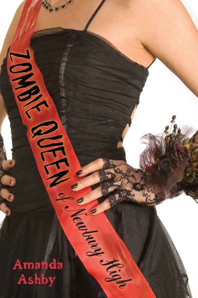 This is Amanda Ashby's second Cover Story (read the story behind You Had Me at Halo here), and I'm happy to have her talk about the striking cover for her latest release, The Zombie Queen of Newbury High:
"I didn't even think about the cover while I was writing this book--firstly because it wasn't contracted so my main concern was to get it finished (without getting eaten by zombies) and then hope that my agent might be able to sell it (and yay--she did!). The other reason is that I'm really not a very visual person so it's never been part of my process to think about what the finished product might look like.
"My editor told me that even though the book was quite light and humorous they wanted to go for a slightly darker cover, which I was totally up for! The only idea I had was a girl sitting in a frothy/tulle sort of prom dress, with loads of zombie arms trying to grab at her legs. I still think that might've been cute but I much prefer the way it turned it out.
"I don't know how they put the photo together though I did see that the designer, Jeanine Henderson is up on Jacketflap. Here are a few of her other cover designs:
This is Amanda Ashby's second Cover Story (read the story behind You Had Me at Halo here), and I'm happy to have her talk about the striking cover for her latest release, The Zombie Queen of Newbury High:
"I didn't even think about the cover while I was writing this book--firstly because it wasn't contracted so my main concern was to get it finished (without getting eaten by zombies) and then hope that my agent might be able to sell it (and yay--she did!). The other reason is that I'm really not a very visual person so it's never been part of my process to think about what the finished product might look like.
"My editor told me that even though the book was quite light and humorous they wanted to go for a slightly darker cover, which I was totally up for! The only idea I had was a girl sitting in a frothy/tulle sort of prom dress, with loads of zombie arms trying to grab at her legs. I still think that might've been cute but I much prefer the way it turned it out.
"I don't know how they put the photo together though I did see that the designer, Jeanine Henderson is up on Jacketflap. Here are a few of her other cover designs:
"When I first saw my cover, words failed me--that's how much I loved it. And every second I would look at a different part and decide that was my favorite bit. The wilted corsage. The lacy gloves. The black nail polish. The amazing dress (which by the way, I actually wrote into the story. At first Mia wasn't too happy at having to lose her gorgeous blue silk dress but as soon as she tried the new one, she was cool!).
"However, I think my absolute favorite part is the B-grade zombie movie font that was used on the sash. The whole reason I wanted to write a zombie movie was because every time I even said the word I thought of all the old zombie horror movies that my husband had made me watch. So to me that really captured the essence of the idea (not that the designer had any idea of this of course, but it's still cool!)"
I have to say, I LOVE the dark, goth style corsage that Mia has on. What do you guys think of this cover?
Bonus Cover Story: On Point by Lorie Ann Grover
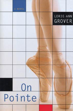 The worlds of modeling and ballet have always seemed connected to me. Wisps of girls with strong inner determination are the ones who survive the shark pools of both fashion and dance. I'm so happy to have the fantastic Lorie Ann Grover (readergirlz Diva extraordinaire) here to share her cover story for On Pointe. The book, written in verse, tells the story of Clare, a very tall girl who dreams of becoming one of 16 dancers chosen for the City Ballet Company. Here's Lorie Ann on the cover:
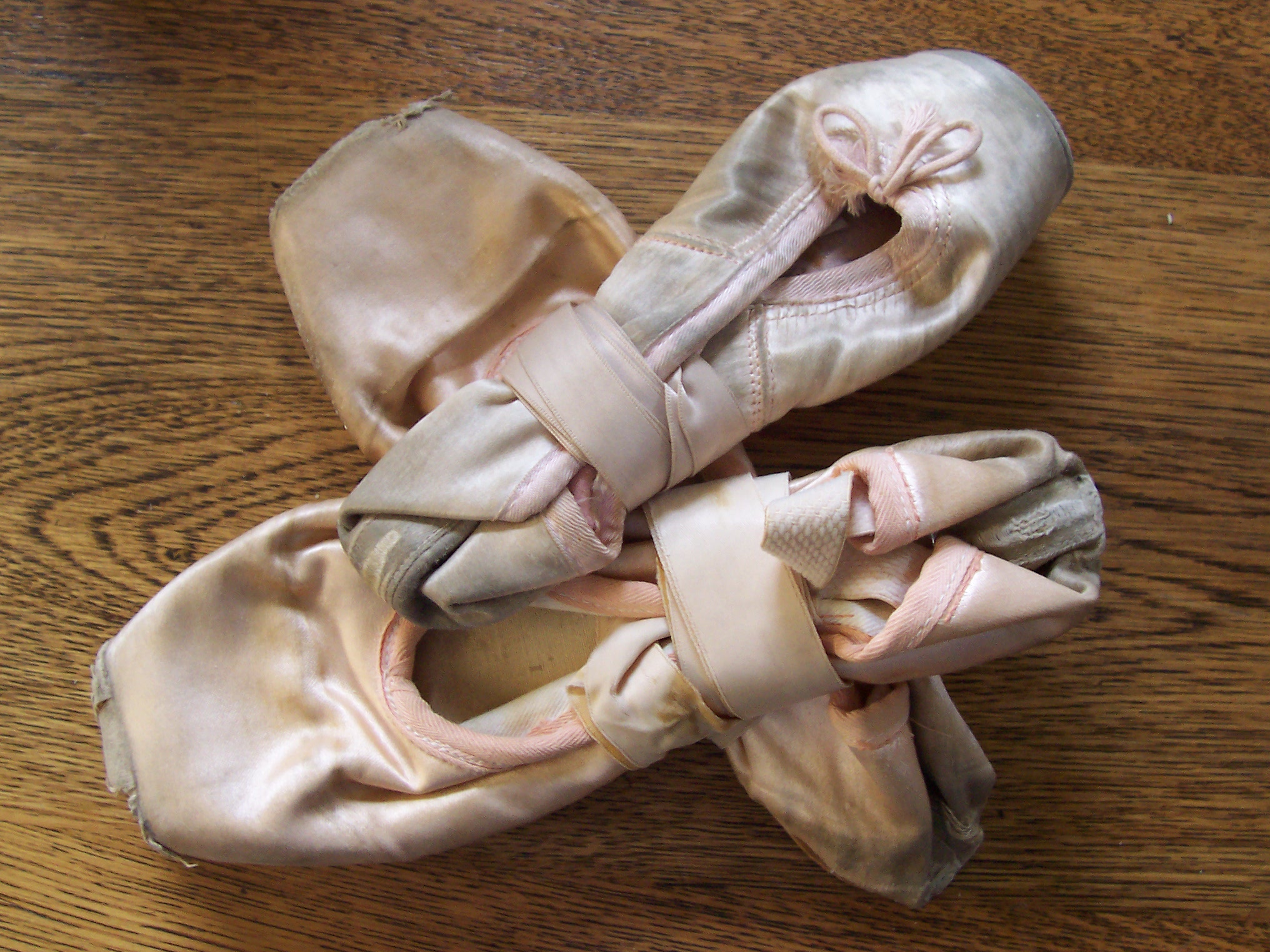
"Okay, I have to say, I sound like a picky pants in this Cover Story. So particular! But it is the world of ballet. Oh, my. Everyone was so patient with my requests! When I began to discuss the image for On Pointe with my editor Emma Dryden of Margaret K. McElderry Books, Simon & Schuster, I begged her to represent high quality toes shoes on the cover. In the ballet world, your shoes are everything. Seriously.
The worlds of modeling and ballet have always seemed connected to me. Wisps of girls with strong inner determination are the ones who survive the shark pools of both fashion and dance. I'm so happy to have the fantastic Lorie Ann Grover (readergirlz Diva extraordinaire) here to share her cover story for On Pointe. The book, written in verse, tells the story of Clare, a very tall girl who dreams of becoming one of 16 dancers chosen for the City Ballet Company. Here's Lorie Ann on the cover:
"Okay, I have to say, I sound like a picky pants in this Cover Story. So particular! But it is the world of ballet. Oh, my. Everyone was so patient with my requests! When I began to discuss the image for On Pointe with my editor Emma Dryden of Margaret K. McElderry Books, Simon & Schuster, I begged her to represent high quality toes shoes on the cover. In the ballet world, your shoes are everything. Seriously.
"Back when I danced with the Miami Ballet Company, I special ordered my shoes from Germany every month. The shoes were constructed according to an outline and diagram of my feet. Those were the kind of shoes I wanted on my cover. I knew that I'd lose the respect of dancers today if the publishers showed inferior shoes.
 "The art department asked for a photo of my old shoes to help them in their search for the perfect image.
"I pointed out the square toe and flatter boxing. I provided brand names to narrow down the possibilities. Just as important to me was the fact that the model be in good form or position. I couldn't bear her to be over extended with a weak arch or not fully up on pointe. And please, I asked, no new shoes! They needed to look worn and used to be in keeping with my story.
"When the final cover was presented to me, I was so pleased! Perfect form, perfect shoes, all the way down to the placement of the elastic and the knotted ribbons. They aren't brand new, but worn and broken in. It's a beautiful stock photo of a real dancer.
"In terms of the composition, I loved the placement of the feet close to the edge of the book. It creates so much good tension. The font is elongated and thin like a dancer. The added lines and blocks of color are reminiscent of Mondrian paintings. What could be stronger for a book titled, On Pointe?
 "As for the flap, I was told it's unusual to use an author photo. However, when I shared this image, the art department decided they did want to include it.
"So after all the fuss about the cover toe shoes being so exact, there I am at age seven, on pointe, in horrible shoes with ribbons hanging out. In bows! Ack! The cover designers were kind enough to remove the dangling ribbons from the final flap photo. Shew. And whenever I visit schools I take the opportunity to lecture on not going on pointe until you are done growing. Unlike me, who was put into toe shoes at seven because I was the size of a twelve year old. But that's another story..."
How fun is Lorie Ann?! I love how much her own life experience went into this story, and this cover. What do you guys think?
PS-If I had my way, I'd wear a tulle tutu as often as possible. With sparkly shoes.
Cover Stories: Fashion Week Interview with Molly (aka Violet!)
 Special Fashion Week post! Meet Molly H. She's the model on the cover of all three Violet books. She friended me on facebook one day, and we started talking. It was really cool to meet the books' cover model, and I thought you guys might be interested in her too. So I asked her a few questions:
How did you hear about the Violet books?
My booker told me about the job and asked if I was available to work for a "book cover." That was all I had heard about it until I received a phone call from photographer about a few things I should bring with me to the shoot (shoes, jeans, etc.)
Special Fashion Week post! Meet Molly H. She's the model on the cover of all three Violet books. She friended me on facebook one day, and we started talking. It was really cool to meet the books' cover model, and I thought you guys might be interested in her too. So I asked her a few questions:
How did you hear about the Violet books?
My booker told me about the job and asked if I was available to work for a "book cover." That was all I had heard about it until I received a phone call from photographer about a few things I should bring with me to the shoot (shoes, jeans, etc.)
 When you shot the cover, did you know what the books were about?
I heard a little about what the series would be about on the day that I shot the first cover. I was excited to hear that there'd be more than one so I could one day see the series all together.
When you shot the cover, did you know what the books were about?
I heard a little about what the series would be about on the day that I shot the first cover. I was excited to hear that there'd be more than one so I could one day see the series all together.
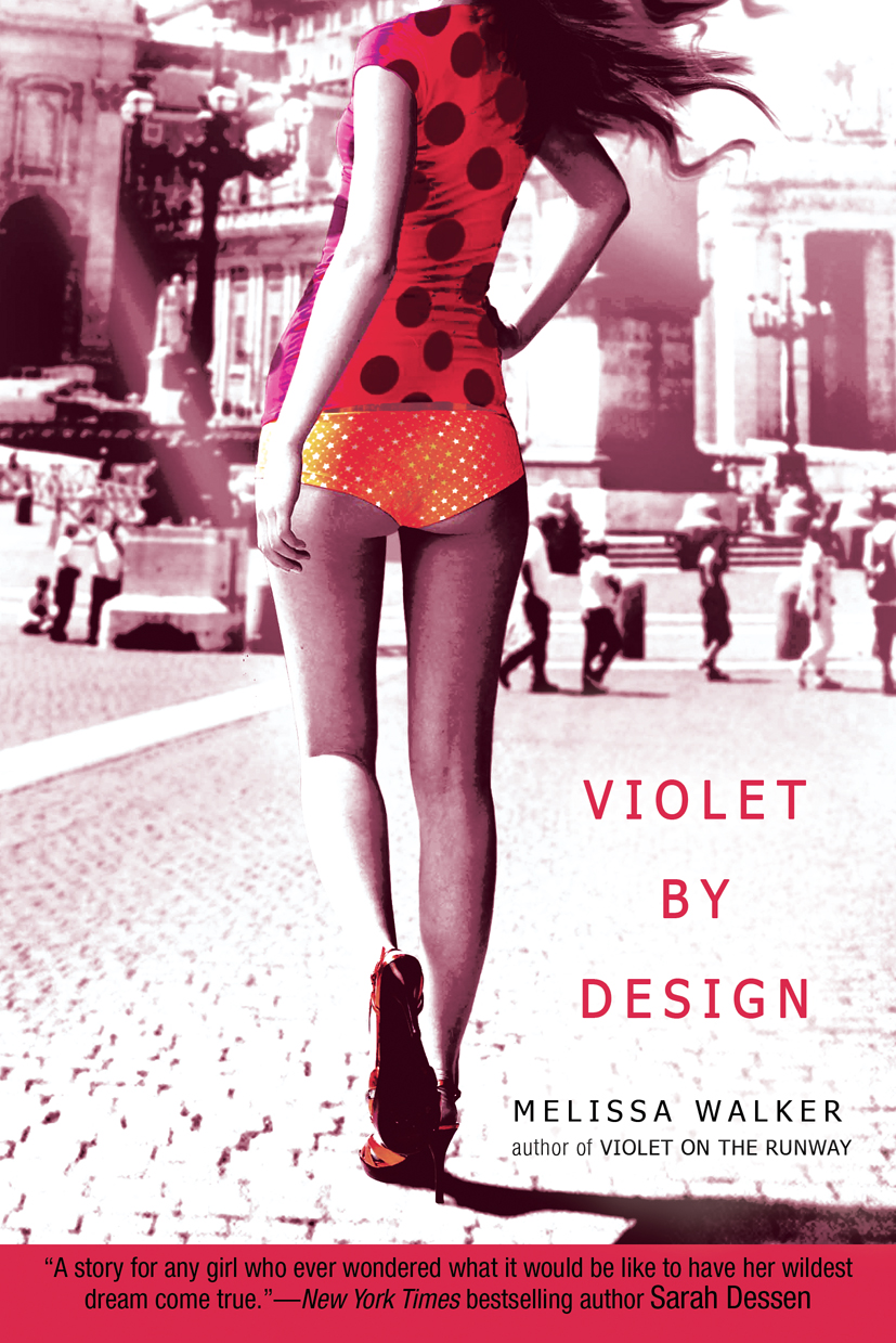
Did you have any input into the posing/clothing used on the covers? I was asked to bring some basic articles of clothing to each of the shoots like shoes, jeans and some plain shirts, but the photographer (Shirley Greene) had some specific requirements for the "look" so I basically wore what was required. They were all really cute which was great because it always helps to feel comfortable with what you're shooting in.
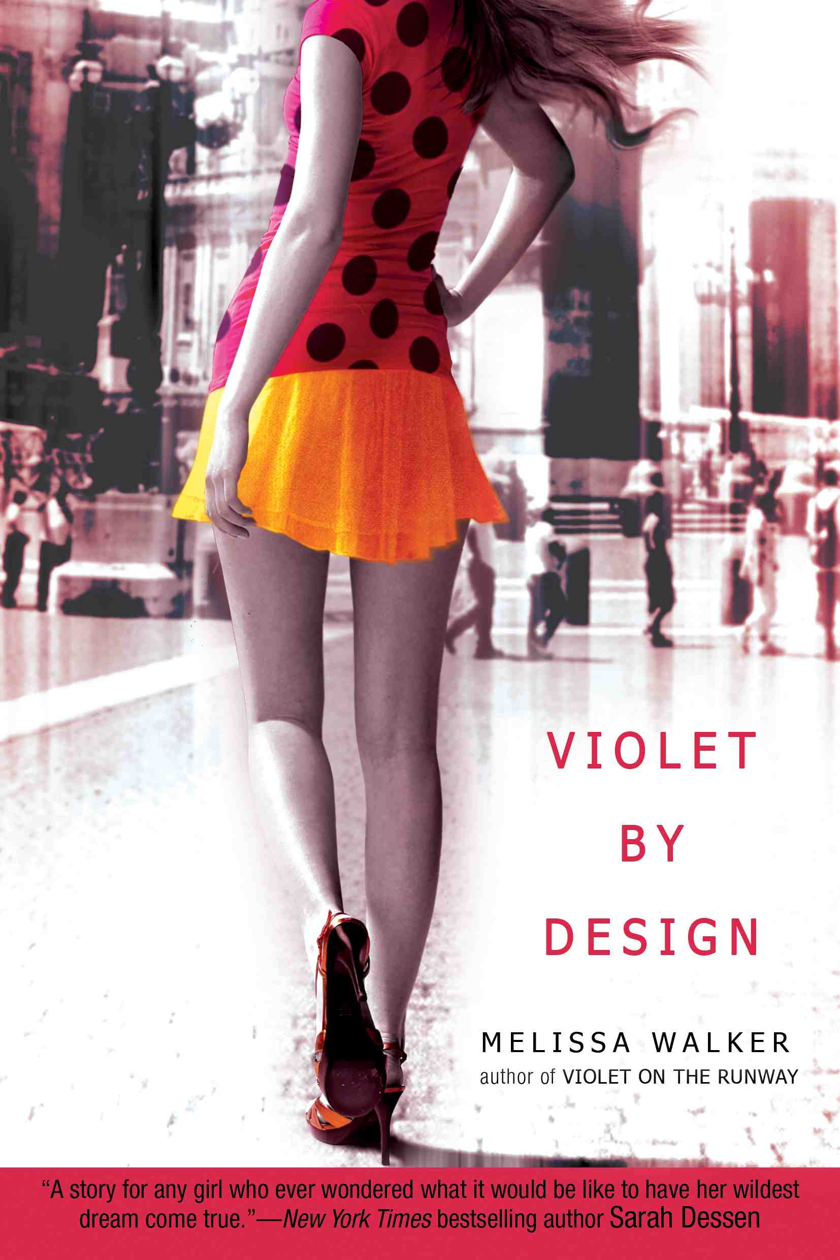 Anything fun/interesting about the shoots? They were in a studio, right?
The shoots were in the lower east side at Shirley Greene's studio. The first shoot was fun because it was my first book cover and I really didn't know what to expect. She also had a kitten and the kitten kept getting in the shot. Every time we would be getting close to getting the shot, the kitten would wonder into the frame, it was so funny. The second shoot was interesting because the picture called for a yellow bathing suit bottom and we couldn't find one so we just used solid yellow underwear. The actual picture turned out to be a little too revealing so the had to superimpose a skirt on me! It was so funny to see the two (the original and the final) next to each other on a blog I came across on the internet haha [MW Note: Um, that'd be mine].
Anything fun/interesting about the shoots? They were in a studio, right?
The shoots were in the lower east side at Shirley Greene's studio. The first shoot was fun because it was my first book cover and I really didn't know what to expect. She also had a kitten and the kitten kept getting in the shot. Every time we would be getting close to getting the shot, the kitten would wonder into the frame, it was so funny. The second shoot was interesting because the picture called for a yellow bathing suit bottom and we couldn't find one so we just used solid yellow underwear. The actual picture turned out to be a little too revealing so the had to superimpose a skirt on me! It was so funny to see the two (the original and the final) next to each other on a blog I came across on the internet haha [MW Note: Um, that'd be mine].
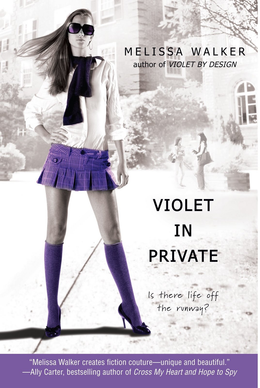 The last cover was the most fun to shoot by far because my face was in the shot and it was great to finally reveal Violet's face. The school girl outfit was adorable too, we had a lot of fun styling it all different ways.
What other book covers have you done?
Besides the Violet Series, I have done Cross My Heart and Hope to Spy by Ally Carter. It is the second of a series and is a New York Times Best Seller. I had a "similar chin" to the girl who shot 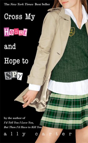 the first cover, and that is why I was selected to shoot it.
Did you read any of the books (it's ok if you didn't!)? I have not yet! My mom has and said they're really engaging and sweet. I plan on reading them! [MW Note: Molly's mom sent me the nicest email a few months ago about how much she liked the books--so cute!]
If you read them, do you relate to Violet at all? It's funny that you're posing as a model, since you are one. My mom told me a lot about Violet and from what I hear, we are very similar. I remember trying to balance high school ("normal life") and commuting to the city to work with FORD and trying to find who I was and what I wanted out of life, all at the same time. In the summertime, before and during modeling, I could be found waitressing at a small restaurant in my town, or working in a beach shop down the street from my house (I live in Sea Isle City, a little barrier island town off the coast of New Jersey.) I was and still am level-headed when it comes to having a work ethic. Fortunately modeling hasn't jaded that sense of normalcy for me. I'm actually working at a clothing store right now while I'm at college in Florida!
What's the most fun modeling job you've done? The most fun I've ever had on a job was working for Kira Plastinina's showroom. It was a two day job, and my best friend Mikel Ennis worked it as well. We basically got to the location, a trendy loft space in Chelsea. The furniture was all specially made and was pink. The clothes were all really cool and hip and Mikel and I had a great time posing for pictures and working with the other FORD girls. It didn't feel like work at all. Some of the pictures from those days were in the Kira stores around the city.
 Where are you now? School? About to move to NYC, right?
I am currently living in Florida and attending college at The University Of Tampa. I am going to be moving back to New York City to pick up with FORD where I left off. I am so excited to get back to modeling I missed it so much and am ready to get back just before fashion week. I may take some classes at Hunter college to continue my education.
Where are you now? School? About to move to NYC, right?
I am currently living in Florida and attending college at The University Of Tampa. I am going to be moving back to New York City to pick up with FORD where I left off. I am so excited to get back to modeling I missed it so much and am ready to get back just before fashion week. I may take some classes at Hunter college to continue my education.
What are you up to next? I hope to travel more with modeling and also broaden my horizons with the types of work I am doing. I hope to begin to shoot more print work as well as runway work. I am planning on speaking to the Lifestyle division at FORD in hopes of doing this. I'm ready to get back to the city!!! Thanks, Molly! It was so much fun to get to "meet" the girl who posed as Violet. (That's Molly dolled up for Fashion Week, above.)
Question for you guys who've read any of the books: Did you picture Violet the way she looked on the covers, or did you create your own character in your head? And everyone: Do you usually do that with books with character photos on the covers? Just curious.
Cover Stories: The Sisters 8 by Lauren Baratz-Logsted, Greg Logsted and Jackie Logstead
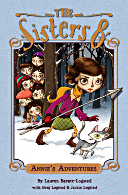 Lauren Baratz-Logsted has written a lot for adults and teens, but now she's writing for a younger audience--and her co-authors are husband Greg Logsted and daughter Jackie. My eight-year-old niece has devoured the first books in The Sisters 8 series, and is anxiously awaiting the next titles.
As for me? I love the illustrations by Lisa K. Weber. So here's Lauren telling her Cover Story:
Lauren Baratz-Logsted has written a lot for adults and teens, but now she's writing for a younger audience--and her co-authors are husband Greg Logsted and daughter Jackie. My eight-year-old niece has devoured the first books in The Sisters 8 series, and is anxiously awaiting the next titles.
As for me? I love the illustrations by Lisa K. Weber. So here's Lauren telling her Cover Story:
"I had no idea about a cover! This was the first time I'd done something for such a young audience.
"The publisher did ask our preference on a couple of ways to present THE SISTERS EIGHT, finally settling on the font they have now with it written THE SISTERS 8. They also sent us links to some of the artists they were considering, but the final decision to go with Lisa K. Weber was theirs. Since they were the ones paying the illustrator--not just for the cover but also for about 20 interior illustrations for the books--we had no problem with them having the final say. Besides, they know what they're doing.
"When I first saw the cover, I was in love! And this was a huge relief. Truthfully, before seeing it, I'd been very nervous. I've had a lot of books published before, and have had a lot of different covers, but this was different. How the cover of ANNIE'S ADVENTURES came out would define the life of the nine-book series just as much as our writing would. Short answer: We were thrilled. Longer answer: Lisa K. Weber's illustrations surpassed our hopes and dreams. All three of us are in love with our covers."

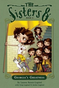
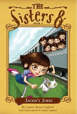
A short and sweet story that hinges on a very quirky/cool illustrator--yay! What do you guys think of these covers? Of these four, I like the first one best, maybe because of the snowy background and the gorgeously cold blue.
I'd love to hear what anyone thinks of illustrated covers vs. photographic covers. I'm a fan of both--either can be done well (or badly) so it just depends on the execution, I think. You guys?
Cover Stories: Dust of 100 Dogs by A.S. King
 The amazing A.S. King is here today to talk about her brand new debut, which has been touted on this blog before. Dust of 100 Dogs sounds like a wholly original novel, and I cannot wait to read it!
Here's the cover story:
The amazing A.S. King is here today to talk about her brand new debut, which has been touted on this blog before. Dust of 100 Dogs sounds like a wholly original novel, and I cannot wait to read it!
Here's the cover story:
"I never thought about my cover art. Even though I am a very visual person, and I pay attention to cover art quite a bit, I don't think about book covers while I'm writing the books.
"My editor asked me for input, and he suggested I search through images online for anything that might grab me. I did that and made a document with all of the images I liked, explaining what I liked about them. I also explained what I liked, generally, in books covers -- that I like black or dark colors, high contrast graphics, and simplicity. I believe I said that if I was to make the cover for the book, I would have an all black cover with a tiny skull & crossbones in the center and no title. (I'm obscure like that.)
"When I saw my cover for the first time, it was April Fool's Day and I was having email problems. I wrote to my editor about something completely unrelated and he wrote back and asked me what I thought of the cover art. I said, 'Huh?' because I hadn't got the email he sent. (In my mind, the cover wasn't due for months, as they'd only had the meeting like a week or two before.) So, then he called me and while we were talking on the phone, he sent the cover art again. He said, 'Now sit down and open that file. I want to hear your reaction.' It was a bit--oh no... what if I hate it? Then I opened it and my eyeballs popped out of my head. I think I kept saying, 'Wow.' He was feeling the same way about it. From what I could gather, this cover came out of the blue and knocked us all over! I was just gobsmacked. I still am. It's an AMAZING cover and I feel very fortunate. More than its visual effect, it has an additional pull for readers of the book though the placement of the subjects (the skull, the girl and the boat) and how they relate to the story. It's just incredible. Maximum respect to Gavin Duffy.
"I believe the cover was made up of several pieces of stock artwork, compiled to make the final image.
"Considering the front cover is so awesome, we didn't have to revise it. We did talk later about back covers, though, which was a great conversation, because Flux does some really amazing back covers for paperback originals. I love how they think out of the box like that, but I'd hoped for a mix for D100D--something arty but also some copy, because as a reader, I rely heavily on back cover copy when I'm buying a book.
"Keep in mind I came into this as a hard-to-please art school grad with a decent eye and a love of beautiful book covers. This cover couldn't be more spot on. I mean, down to the boat and girl sitting in an eye socket of a skull. I can't imagine a better cover for the story inside the cover. You'll know what I mean when you read it!
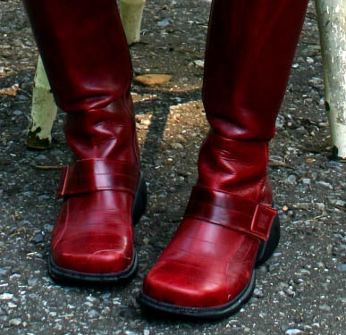
"Also, I have had, since 25 years ago, a weakness for red boots. Especially seriously cool red boots. (Like the big chunky ones with buckles and zippers and big metal-y bits.) Thing is--no one knew this. (Of course. It's not the kind of thing that comes up when talking to your editor, you know?) And here came this cover with Saffron in a pair of killer red boots. It was one of the first things I noticed."
Very cool! Here's a photo of A.S.'s favorite red boots:
Alea the Pop Culture Junkie did a Lookalikes post about this cover last fall, and The Book Nymph has another version of the cover story with different details (and a shark attack tale), so check those out.
AND, I'm participating in a D100D contest on Reviewer X's blog that You Don't Wanna Miss.
I just love this cover, and I can't wait to see how it represents the story! What do you guys think?
PS-So many people ask about the boots that I got an update from A.S. She says, "I bought them in 2004 in Ireland. They were made in Spain--a company called Destroy. The model number was 05128, but I can't find it anywhere online..." Good luck, boot seekers!
Cover Stories: What Would Emma Do? by Eileen Cook
Eileen Cook is here to chat about her new release, What Would Emma Do? Yay! I happen to be incredibly interested in this book because Emma's escapades--kissing a friend's boyfriend and getting all confused and heading for major social disaster--mirrors an episode in my own life. I can't wait to dive in. In the meantime, this cover story is a great one. Here's Eileen:
"I believe there are few things more scarier than the first time you open the jpeg of your cover. While the saying might be 'don't judge a book by its cover,' I am well aware that is exactly what we tend to do. I wasn't sure what I wanted the cover to look like, but I was certain that I wanted to grab the reader's interest by raising some questions in their mind. If it could raise a question then hopefully the reader would pick up the book.
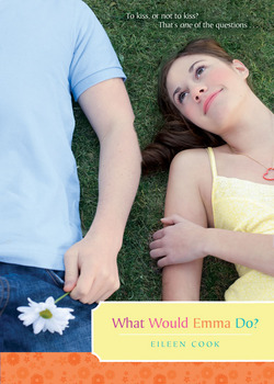
"As soon as I saw the final cover it was love. I love the awkwardness of her sneaking a kiss in the bushes and that she's stepping on his foot. I was thrilled that they went from what was a good cover to one that felt like a great cover."
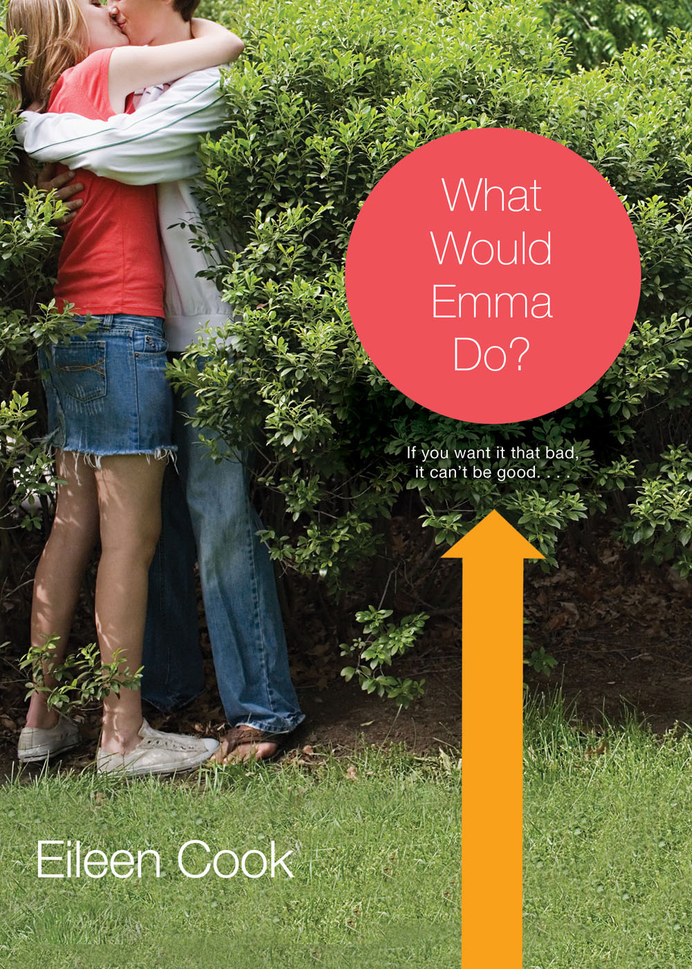
Thanks, Eileen! I love the final cover because I think it conveys the "being bad" side of the story more. What do you guys think?
Cover Stories: LOVESTRUCK SUMMER by Me!
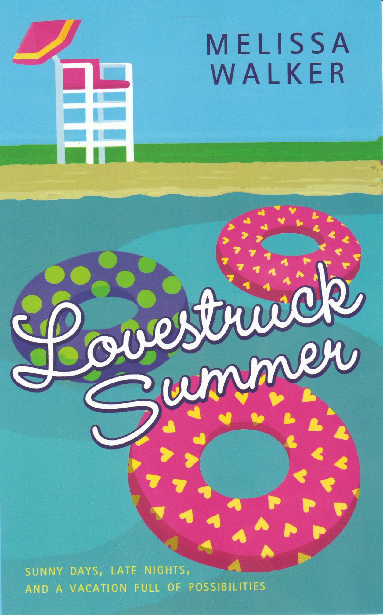 This cover is a real departure for me, obviously. It's a summer romance in the HarperTeen "Beach Reads" category, which includes fun titles like these:
So, you see the theme here? Colors, cartoons and general candy-coated-ness. I'm fully embracing my hot-pink-and-blue cover. Here's the back story:
Lovestruck Summer is the story of 18-year-old Quinn, an indie-rock girl spending the summer in Austin on a coveted music internship. While she hopes to find the perfect hipster boyfriend, she unexpectedly falls in love with a college cowboy who makes her challenge her own stereotypes, expand her musical tastes, and ultimately open up her world.
So, you'll notice that the cover isn't really "indie rock." At all. Haha. When my editor asked me for some cover ideas, and warned me that "music covers" are a harder sell (I have no idea why). She asked me to tell her about some scenes in the book (it wasn't quite done yet) and here's what I emailed her:
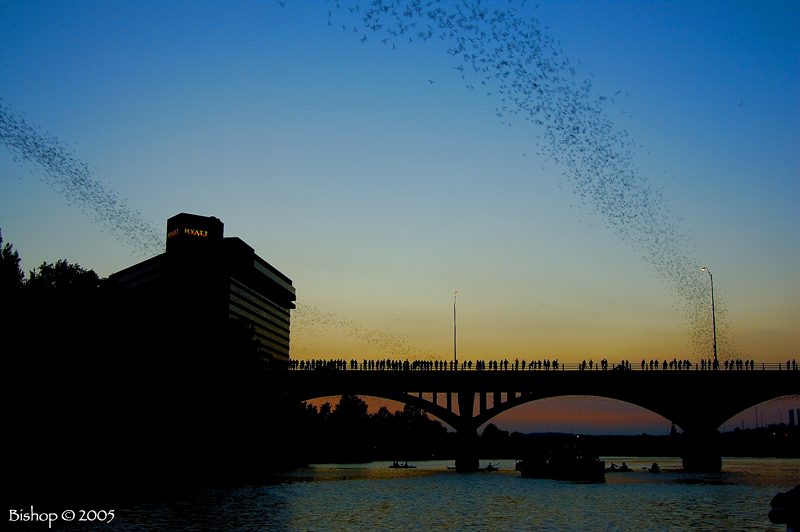
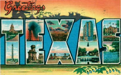
"Here are images that come to my mind: * guitar (can't help it, but feel free to ignore the music stuff... I'm just brainstorming) * little dog in a tiara (her cousin penny has this dog) * Tri-Pi greek letters (her cousin's sorority, although she hates it) * Barton Springs blanket-on-the-grass-under-trees moments (photo attached--she and Russ go here) * Bats over a bridge (flying in a heart formation?) (photo attached--i know it sounds crazy but they fly out from under bridges in the summer) * outdoor music festival scene (something sxsw-esque?) * the iconic shape of texas with a heart and music note? * something in the style of these old post cards (TEXAS postcard attached)"
And I sent these inspiration pictures (bats flying out from under a bridge are shown in the middle--how crazy is that?!):

Obviously, that first image made an impression. I think it's fun and beachy, which is just what its meant to be! And now I'm going to change my profile pics and twitter page and all that, so you'll see lots of this cover through May.
I'd love to know what you think!
PS-Remember this post where I asked for band names? I used a TON of them in the book--seriously, they were a HUGE help! THANK YOU!
PPS-Yes, preorder totally available here, sans cover so far. Amazon, why you so slow?!
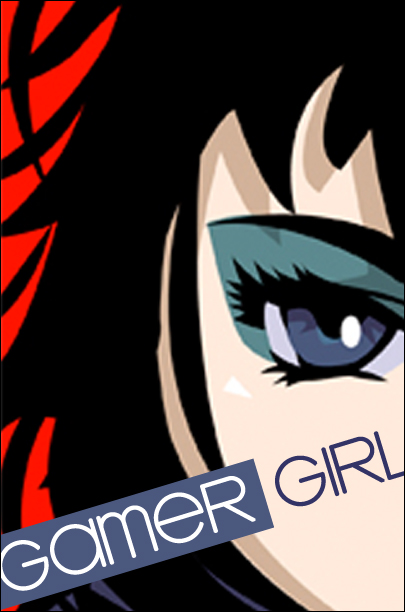
Cover Story: Gamer Girl by Mari Mancusi
The minute I saw Mari's amazing Gamer Girl cover, I knew I wanted the back story. Luckily, she's nice! And there's a good story to tell. Here's Mari:
"One of the things that originally sold Gamer Girl to my editor was the idea of creating a very visual package to wrap the story in. After all, the heroine of the story, Maddy Madison, is a budding manga artist herself, so she'd want it that way!
"During an initial conversation, my editor asked me to send along some examples of manga that I felt represented my heroine's personal style. I suggested she read the Dramacon, a really fun contemporary manga from Tokyo Pop. If you haven't read the series, I highly recommend it. My editor followed my suggestion and ended up falling in love with the series and it really gave her a better understanding of the anime/manga world. (The series takes place at a manga/anime convention.)
 "What especially fascinated her were the different faces the artist/author, Svetlana Chmakova would draw to illustrate the moods of her main characters. My editor wanted to do something similar for Gamer Girl. So she suggested we do internal emoticons of the heroine at the beginning of each chapter. This way the reader would get a hint when starting a chapter if the heroine were happy, sad, excited, or angry--just by looking at the drawings.
"As for the cover itself, they offered two different mock-ups to start.
"What especially fascinated her were the different faces the artist/author, Svetlana Chmakova would draw to illustrate the moods of her main characters. My editor wanted to do something similar for Gamer Girl. So she suggested we do internal emoticons of the heroine at the beginning of each chapter. This way the reader would get a hint when starting a chapter if the heroine were happy, sad, excited, or angry--just by looking at the drawings.
"As for the cover itself, they offered two different mock-ups to start.
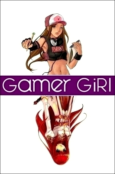
"While I liked both in different ways, my editor, agent and I unanimously liked the second style best--featuring my heroine Maddy on top and her alter-ego video game character Allora on the bottom. It just really captured the idea of the book--of having a whole other persona online that's almost a separate person from the real life you. The other cover was fine--it was just kind of generic.
"After we decided on style, the publisher had an artist (the talented Elise Trinh) draw the cover. She did an amazing job--really capturing my character and her alter-ego, just as I imagined them. Maddy even has her sketchpad to draw her manga.
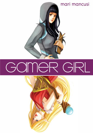 "I realize the cover is a lot different than most on the YA shelves today. Seems like a lot of publishers are going for a dark, mysterious, romantic, glamorous feel. But that's okay with me. After all, part of the message of the book is about celebrating our differences--and so having a different sort of cover really works! Not to mention all the white space really makes it stand out on the shelf, which is never a bad thing. All in all, I couldn't be happier with how it turned out and I hope readers feel the same."
Thanks, Mari! As I've said in the past, I love this cover. You guys?
PS-I posted about the new Twilight dolls over at readergirlz today.
Cover Stories: Dead Girl Walking by Linda Joy Singleton
The lovely Linda Joy Singleton is sharing the Cover Story for the first two books in her Dead Girl... series today! She did such a great job summarizing the stories within her interview that I'll just let her take it away! Here's Linda:
"I was asked for ideas for the cover and I said that I wanted a shadowy image of a girl with a bright light behind her as she walked away, to represent when my heroine Amber has a near-death experience where she sees her beloved grandmother and childhood dog, but then on the way back from the light she makes a wrong turn into the body of a popular, beautiful, troubled girl.
"Flux/Llewellyn often asks the author for cover suggestions. Then they let the art department and whoever is at their top secret meetings make the decisions (okay, the meetings probably aren't top secret, but as as author who would love to know what really goes on, they always sound mysterious to me).
 "They hired a professional photographer to design a silhouette cover and they also have an art department that works on it, too. When I saw the first version of the cover (left), I thought it was dramatic and I liked the skeleton-ponytail DEAD GIRL logo.
"To be honest, I had hoped for a beautiful cover like TANTALIZE or WICKED LOVELY. I was pleased, though, because this cover was dramatic and what I like to call a 'selling cover' -- meaning it would grab readers' attention in a bookstore. Still the first version was a little too quiet with a silhouette of a cut-out girl with her hands on her hips, looking sort of like a SuperGirl pose. I liked it--didn't love it.
 "Fortunately when they created the cover for DEAD GIRL DANCING, they came up with a different style with more action, showing a silhouette girl dancing with a fiery orange-red background. My (ex) editor Andrew liked this style better, so switched the first cover of the first book to make this design before it went to print (left).
"I'm very glad they came up with the more active design and I'm eager to see what they decide to do with the third book (tentatively titled DEAD GIRL IN LOVE).
 "DEAD GIRL WALKING did have two different versions but that's not normal. Usually I don't see covers until they're ready to go. DEAD GIRL WALKING was the only exception since they changed the cover from the original version -- which really pleased me.
"I like the cover a lot. I think it's mysterious, dramatic and hints at romance, too. But it's DEAD GIRL DANCING, the second book, that has the cover I really, really love. I can't wait for that book to come out in March 2009. It's more mysterious, too, with a stalker, an evil cute guy and spring break wildness."
I really like the final version for the DEAD GIRL WALKING cover, too--having the character look over her shoulder like that brings more energy, I think. Thoughts from you guys?