 The lovely Melissa Kantor's latest novel, The Darlings Are Forever, is out this month. She dropped by to talk about that oh-so-Central-Park cover:
"I'm not a very visual person, so it's rare for me to have a cover in mind for a book I'm writing. And I'm always amazed when my editor shows me a potential cover. It's like--wow, how'd you think of that? The only cover I ever came up with was the one for The Breakup Bible, right, and that's because it's kind of an inside joke.
The lovely Melissa Kantor's latest novel, The Darlings Are Forever, is out this month. She dropped by to talk about that oh-so-Central-Park cover:
"I'm not a very visual person, so it's rare for me to have a cover in mind for a book I'm writing. And I'm always amazed when my editor shows me a potential cover. It's like--wow, how'd you think of that? The only cover I ever came up with was the one for The Breakup Bible, right, and that's because it's kind of an inside joke. 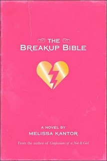 The book is named for a really unhelpful advice book that the main character gets, and my book has the same cover as the (imaginary) advice book.
"So I really had no idea what they should do for the cover of The Darlings Are Forever, and I was just as surprised when I saw it as I ever am!
"Hyperion is very nice about asking for input--and I never have any good ideas. I always say something like, 'What about a charm bracelet?' even though I've never written a book with a charm bracelet as an iconic item. And I often suggest a backpack spilling out its contents. Actually, that's my website, now that I think of it--a bag with everything being dumped out of it. I think because it's my worst fear (spilling out all my stuff in public). Hmm, maybe I'm over analyzing here.
"I always hate the covers the first time I see them. Really. Each time, I'm like, UGH! Why did you do that? Then it grows on me.
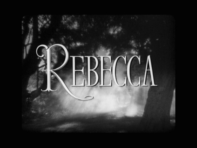
"I made a bunch of suggestions. I hated the first font for the title, and then I saw the movie Rebecca, and the title for that movie is in a really dramatic font that I absolutely loved. I actually googled a still of the title and then emailed it to my editor:
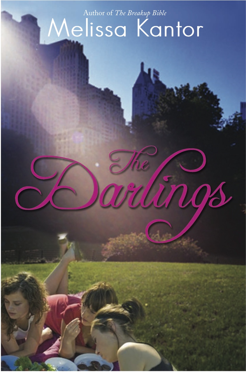
 "The basic concept remained what it was from the beginning, but I had a BUNCH of small changes I wanted made, everything from the girls' wardrobes to the way the light fell over the scene to Victoria's hair color. And they were really good about trying to integrate them. Everything big is pretty much the same, but everything small changed. I like the feel of it a lot better now. (See the initial cover, left, and the final cover, right, side by side, below):
 "They did a photo shoot, which I thought was really cool. They did one for my first book (Confessions of a Not It Girl, left) also. It's a picture of a girl's butt (the main character thinks her butt is way too big, and she kind of obsesses about it). The only problem was, at every event I did, someone always asked me if it was my butt on the cover (it's not).
"I've come to really like how the three girls are pictured. It's a moment that feels natural. They're having a picnic in Central Park, and it's such a New York City book and so much of their friendship is talking about their lives while they sit somewhere in Manhattan and eat. So the cover feels very true to the book and the Darlings."
Thanks, Melissa! I really appreciate the tweaks in the girls. You can see all of their faces now and they just look much more book-cover-worthy than the initial draft. Glad the Central Park setting didn't change -- it's gorgeous.
What do you guys think of this cover? PS-You can download Chapter 1 on Melissa's website!