 Super in the City, Daphne Uviller's debut novel, is an urban caper about a young woman who becomes the superintendent of her parents' Greenwich Village building. I've picked it up, and I am thoroughly enjoying Daphne's witty writing and zany sense of adventure (yes, sometimes I do read non-YA novels, when said novels are exceptional). So I asked Daphne to tell me about the cover... and there was some drama involving a large bookstore chain, which Daphne took in stride. Here she is:"I don't know if I'm allowed to be dishing on the behind-the-scenes workings of book cover design, but here goes. It turns out that Big Name Booksellers (far be it from me to name names, though I will be so bold as to intimate initials...) have what amounts to the final say in book cover design. I'm told I should be outraged, but I'm not. If that makes me a sellout, so be it. I want my books to sell and the big stores are the ones selling the most of them, and they know how to sell books, so I'm happy to listen to them.
"Here's what happened with Super in the City. As with my first book, an anthology I co-edited called Only Child, I dreaded the moment my editor would ask me for ideas about covers. I write, I wanted to plead again, I don't think in pictures. Maybe some writers do, but I don't. I'm about as good at coming up with ideas for cover art as I am at coming up with titles. (That's a whole other column: Title Stories. Super in the City was originally Supergirl, until the legal department at Random House gently informed me that DC Comics would be all over my derriere for copyright infringement should I keep that name.)
"My editor insisted and still insists that my book not be lumped into the chick lit category (though I like to think it bears some resemblance to that beloved genre). "No stilettos, martini glasses, or lipsticks on the cover!" she decreed. I was so happy my novel was being published by such a great press, I wouldn't have cared if they'd put an ape and a diesel truck on the cover.
"So they got a really talented designer to draw this adorable cover with a cute, mini-skirted, ponytailed woman sitting on the steps of what was a perfect Greenwich Village stoop, holding a tool belt. (My book is about a young woman who becomes the super of her parents' building.) [MW Note: Sorry we don't have that first cover to show--sounds cute!] There were little clues in the windows above her that referenced some of the subplots. This designer had really read the book and had thought hard. I loved it. It was better than anything I could have suggested. My editor humored me by asking my opinion on where the title should be placed, which font I preferred, and, though it tested the limits of my visualization abilities, I gave some coherent answers.
"The marketing folks took this fabulous cover to a sales conference where they were told by the Big Name Booksellers that this cover was too YA, meaning they thought the cover made it look like a young adult novel. 'Please go back to the drawing board,' they told us.
"I admit, at first I was surprised that they were essentially in charge. But mostly, I was glad that we were finding out sooner rather than later, say, after thousands of copies were sitting unsold on store shelves.
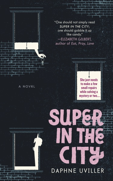
"The current cover, created by a different designer entirely, is equally fabulous (have I mentioned that I'm pretty easygoing when it comes to cover art?). It's black and eye-catching and indicates that the story is a bit of a mystery. There is still a woman with a ponytail, only now she's in silhouette, as are the keys being dropped out the window. I think the keys might be my favorite part. Either that or the fact that the title is in raised letters.
"Instead of feeling like The Man stuck its corporate hand into my aesthetics and sullied some virgin pureness, I feel grateful that my editor and marketing team were guided by real feedback from a major player. And my book is selling well at indie bookstores, too (which I link to on my website), so it's not like Big Name's influence hurt the small stores in this particular regard.
Super in the City, Daphne Uviller's debut novel, is an urban caper about a young woman who becomes the superintendent of her parents' Greenwich Village building. I've picked it up, and I am thoroughly enjoying Daphne's witty writing and zany sense of adventure (yes, sometimes I do read non-YA novels, when said novels are exceptional). So I asked Daphne to tell me about the cover... and there was some drama involving a large bookstore chain, which Daphne took in stride. Here she is:"I don't know if I'm allowed to be dishing on the behind-the-scenes workings of book cover design, but here goes. It turns out that Big Name Booksellers (far be it from me to name names, though I will be so bold as to intimate initials...) have what amounts to the final say in book cover design. I'm told I should be outraged, but I'm not. If that makes me a sellout, so be it. I want my books to sell and the big stores are the ones selling the most of them, and they know how to sell books, so I'm happy to listen to them.
"Here's what happened with Super in the City. As with my first book, an anthology I co-edited called Only Child, I dreaded the moment my editor would ask me for ideas about covers. I write, I wanted to plead again, I don't think in pictures. Maybe some writers do, but I don't. I'm about as good at coming up with ideas for cover art as I am at coming up with titles. (That's a whole other column: Title Stories. Super in the City was originally Supergirl, until the legal department at Random House gently informed me that DC Comics would be all over my derriere for copyright infringement should I keep that name.)
"My editor insisted and still insists that my book not be lumped into the chick lit category (though I like to think it bears some resemblance to that beloved genre). "No stilettos, martini glasses, or lipsticks on the cover!" she decreed. I was so happy my novel was being published by such a great press, I wouldn't have cared if they'd put an ape and a diesel truck on the cover.
"So they got a really talented designer to draw this adorable cover with a cute, mini-skirted, ponytailed woman sitting on the steps of what was a perfect Greenwich Village stoop, holding a tool belt. (My book is about a young woman who becomes the super of her parents' building.) [MW Note: Sorry we don't have that first cover to show--sounds cute!] There were little clues in the windows above her that referenced some of the subplots. This designer had really read the book and had thought hard. I loved it. It was better than anything I could have suggested. My editor humored me by asking my opinion on where the title should be placed, which font I preferred, and, though it tested the limits of my visualization abilities, I gave some coherent answers.
"The marketing folks took this fabulous cover to a sales conference where they were told by the Big Name Booksellers that this cover was too YA, meaning they thought the cover made it look like a young adult novel. 'Please go back to the drawing board,' they told us.
"I admit, at first I was surprised that they were essentially in charge. But mostly, I was glad that we were finding out sooner rather than later, say, after thousands of copies were sitting unsold on store shelves.
"The current cover, created by a different designer entirely, is equally fabulous (have I mentioned that I'm pretty easygoing when it comes to cover art?). It's black and eye-catching and indicates that the story is a bit of a mystery. There is still a woman with a ponytail, only now she's in silhouette, as are the keys being dropped out the window. I think the keys might be my favorite part. Either that or the fact that the title is in raised letters.
"Instead of feeling like The Man stuck its corporate hand into my aesthetics and sullied some virgin pureness, I feel grateful that my editor and marketing team were guided by real feedback from a major player. And my book is selling well at indie bookstores, too (which I link to on my website), so it's not like Big Name's influence hurt the small stores in this particular regard.
 "I think I'd know a bad cover if I saw it -- my co-editor and I rejected outright the grim cover suggested to us for Only Child's paperback release and instead, that book continues to be sold in the bright yellow design in which it debuted, left -- but I was lucky enough to watch my book enjoy two equally terrific designs. I'm just glad I didn't have to choose."
I think the final cover is dark and cute and I really like the purple touches! The first cover does sound kind of YA, which I suppose can be misleading on chain shelves. What do you guys think?
"I think I'd know a bad cover if I saw it -- my co-editor and I rejected outright the grim cover suggested to us for Only Child's paperback release and instead, that book continues to be sold in the bright yellow design in which it debuted, left -- but I was lucky enough to watch my book enjoy two equally terrific designs. I'm just glad I didn't have to choose."
I think the final cover is dark and cute and I really like the purple touches! The first cover does sound kind of YA, which I suppose can be misleading on chain shelves. What do you guys think?
Cover Stories: Super in the City by Daphne Uviller
in Other Stuff