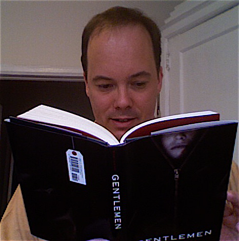
 Today's Cover Story is a really fun one from my friend Michael Northrop (his blog is hilarious--go there). Gentlemen is his debut novel and--not to be braggy--I read it before he even sold it to Scholastic. I loved it back then, and I can't wait to read the official, final version when it comes out this week. Michael really captures the way that certain types of guys think, speak and act--every thought and action rings true. Don't you love it when books are like that?Plus, there's a mystery. Bonus. Here's Michael (and there's a photo of him reading the book that I totally stole from his blog without permission, left):
"Gentlemen is my first published novel, but it is the fourth book I've written. (The fourth book-like thing, anyway, as the first was barely 30K words, and the second was a plotless mess.) Of the four, I only had a real cover idea for one: the plotless mess. It was called Connecticut Penal League and the hypothetical cover involved a sleek, predatory looking state police cruiser and would have been the coolest thing about an awful book.
"I don't know why I don't think of covers as I'm writing. Part of it is that the books seem so complex and shifting as I'm working on them that trying to distill all that into a single image seems daunting and maybe a little counterproductive.
"I knew that I should think about the cover once Scholastic bought Gentlemen, but all I could think of were my all-time favorite covers and none of them seemed to pertain at all.
Today's Cover Story is a really fun one from my friend Michael Northrop (his blog is hilarious--go there). Gentlemen is his debut novel and--not to be braggy--I read it before he even sold it to Scholastic. I loved it back then, and I can't wait to read the official, final version when it comes out this week. Michael really captures the way that certain types of guys think, speak and act--every thought and action rings true. Don't you love it when books are like that?Plus, there's a mystery. Bonus. Here's Michael (and there's a photo of him reading the book that I totally stole from his blog without permission, left):
"Gentlemen is my first published novel, but it is the fourth book I've written. (The fourth book-like thing, anyway, as the first was barely 30K words, and the second was a plotless mess.) Of the four, I only had a real cover idea for one: the plotless mess. It was called Connecticut Penal League and the hypothetical cover involved a sleek, predatory looking state police cruiser and would have been the coolest thing about an awful book.
"I don't know why I don't think of covers as I'm writing. Part of it is that the books seem so complex and shifting as I'm working on them that trying to distill all that into a single image seems daunting and maybe a little counterproductive.
"I knew that I should think about the cover once Scholastic bought Gentlemen, but all I could think of were my all-time favorite covers and none of them seemed to pertain at all. 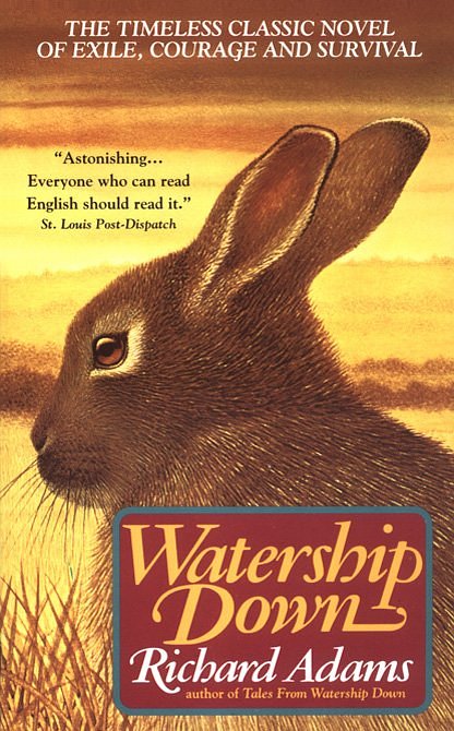 I mean, I've always loved the cover of Watership Down, but a silhouette of a rabbit has absolutely nothing to do with a gritty mystery about a missing boy.
"So, like a rabbit, I was all ears when my editor called and said, 'We have an idea for the cover.' It seemed like a good one: three boys, representing the main characters, standing in a mock police lineup and holding up a signboard with the title of the book on it.
"My initial input on the cover wasn't a suggestion or a probing question, which makes me feel like a bit of a slacker compared to many of the Cover Stories I've read on here. It was just me agreeing, and it included an exclamation point or two, 'That sounds great! Yeah!' Something like that.
I mean, I've always loved the cover of Watership Down, but a silhouette of a rabbit has absolutely nothing to do with a gritty mystery about a missing boy.
"So, like a rabbit, I was all ears when my editor called and said, 'We have an idea for the cover.' It seemed like a good one: three boys, representing the main characters, standing in a mock police lineup and holding up a signboard with the title of the book on it.
"My initial input on the cover wasn't a suggestion or a probing question, which makes me feel like a bit of a slacker compared to many of the Cover Stories I've read on here. It was just me agreeing, and it included an exclamation point or two, 'That sounds great! Yeah!' Something like that.
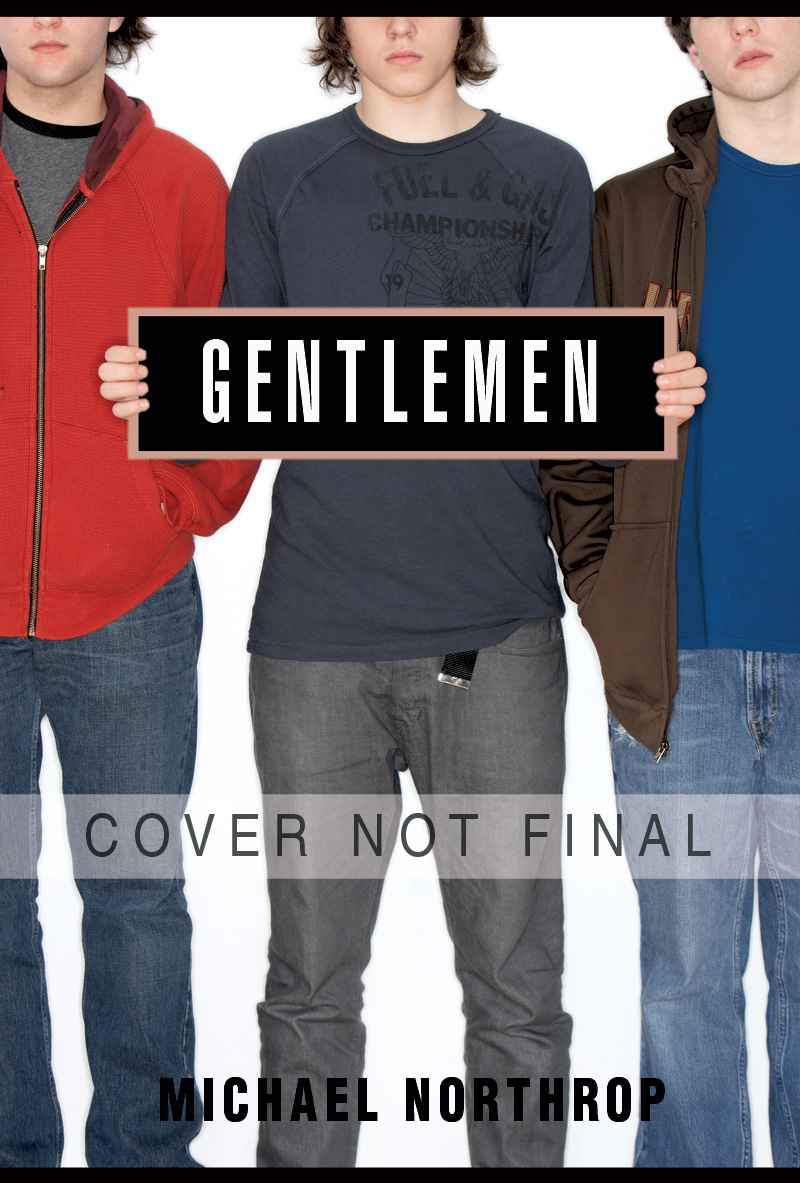 The process began. Models were cast and put in appropriately distressed jeans and hoodies. Everyone loved the first mockup, myself included.
"And for a long time, that was going to be the cover. Some tinkering would be done with the fonts and such, but basically, it was good to go. And then it wasn't. There'd been a meeting: People had fallen out of love with it. It was too 'pretty' for a gritty 'boy book,' too soft, not tough enough.
"I looked at it on the screen as my editor relayed this by phone. Now that she mentioned it, it did kind of look like a GAP ad. I figured we'd discuss new ideas, but she told me they already had one. And not only that, they'd already made a new mockup, something tougher, something darker.
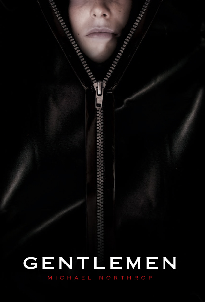
"They weren't kidding:
The process began. Models were cast and put in appropriately distressed jeans and hoodies. Everyone loved the first mockup, myself included.
"And for a long time, that was going to be the cover. Some tinkering would be done with the fonts and such, but basically, it was good to go. And then it wasn't. There'd been a meeting: People had fallen out of love with it. It was too 'pretty' for a gritty 'boy book,' too soft, not tough enough.
"I looked at it on the screen as my editor relayed this by phone. Now that she mentioned it, it did kind of look like a GAP ad. I figured we'd discuss new ideas, but she told me they already had one. And not only that, they'd already made a new mockup, something tougher, something darker.
"They weren't kidding:
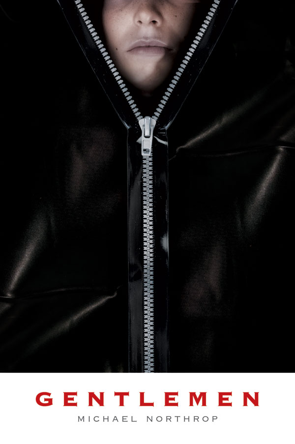 When I clicked on the image for the first time, I literally gasped. Look what they've done to my beautiful cover! And then I thought about it. I thought about what the characters in my book would have thought of the first version ('gay') and what they'd think of this new version ('cool'). (MW note: That is how his characters think.)
"The new cover matched what I was trying to do with the text: to create a book that boys and reluctant readers could read and pass around without being embarrassed, like the Hinton and Cormier books I read at that age. I began to think about how this macabre black cover would stand out in the forest of pastel and glitter of the YA section.
"The more I thought about it, the more I liked this cover. Pretty soon, I was raving about it. I still am. The overall effect is really striking, and if you look closely, there are a lot of clever little touches, like the dull plastic color of the zipper and the fake toe tag on the back for the barcode (MW note: see top photo of Michael reading).
"Here is the final version:
When I clicked on the image for the first time, I literally gasped. Look what they've done to my beautiful cover! And then I thought about it. I thought about what the characters in my book would have thought of the first version ('gay') and what they'd think of this new version ('cool'). (MW note: That is how his characters think.)
"The new cover matched what I was trying to do with the text: to create a book that boys and reluctant readers could read and pass around without being embarrassed, like the Hinton and Cormier books I read at that age. I began to think about how this macabre black cover would stand out in the forest of pastel and glitter of the YA section.
"The more I thought about it, the more I liked this cover. Pretty soon, I was raving about it. I still am. The overall effect is really striking, and if you look closely, there are a lot of clever little touches, like the dull plastic color of the zipper and the fake toe tag on the back for the barcode (MW note: see top photo of Michael reading).
"Here is the final version:
 "So that's my cover story. I wasn't exactly driving the process. I was in the backseat pretty much the entire time, but I love where we wound up."
I agree! I liked that first cover when I saw it, but the second cover is way more arresting. All that black? Very cool. What do you guys think?
"So that's my cover story. I wasn't exactly driving the process. I was in the backseat pretty much the entire time, but I love where we wound up."
I agree! I liked that first cover when I saw it, but the second cover is way more arresting. All that black? Very cool. What do you guys think?
Cover Stories: Gentlemen by Michael Northrop
in Other Stuff