 I really loved Matt de la Peña's We Were Here, and I had to ask him about its unique and somewhat dreamy cover. Here's Matt:"I never really had a vision for my We Were Here cover. I just remember thinking, Man, I hope my cover looks cool. That was my only thought. I kind of wanted it to be gritty. But covers and titles are the same for me - I don't think I deserve to think about them until I've done the heavy lifting and finished the book.
"This is my third book, and it's the first time I got to bring in my own guy (or at least recommend him). Nick Haas, a very talented graphic artist in Chicago, did all the art for the movie version of my first book, Ball Don't Lie. My editor, who has a really good eye for jacket art, dug his stuff and Random House agreed to give him a shot. They really liked what he came up with. He also redid the cover of my second book, Mexican WhiteBoy - it's SO MUCH BETTER. Check out both versions, the old is on the left, new on the right:
I really loved Matt de la Peña's We Were Here, and I had to ask him about its unique and somewhat dreamy cover. Here's Matt:"I never really had a vision for my We Were Here cover. I just remember thinking, Man, I hope my cover looks cool. That was my only thought. I kind of wanted it to be gritty. But covers and titles are the same for me - I don't think I deserve to think about them until I've done the heavy lifting and finished the book.
"This is my third book, and it's the first time I got to bring in my own guy (or at least recommend him). Nick Haas, a very talented graphic artist in Chicago, did all the art for the movie version of my first book, Ball Don't Lie. My editor, who has a really good eye for jacket art, dug his stuff and Random House agreed to give him a shot. They really liked what he came up with. He also redid the cover of my second book, Mexican WhiteBoy - it's SO MUCH BETTER. Check out both versions, the old is on the left, new on the right:
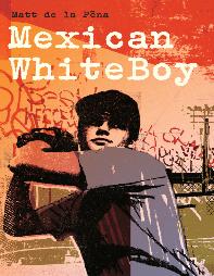
 "Anyway, the first time I saw the We Were Here cover I was like, Damn, man! Finally! I really liked it right away. Now, my first reaction to the hard cover version of Mexican WhiteBoy (above left) was a different situation. I believe I threatened to leap out of my editor's office window at Random House.
"I didn't have any say with the first book. I think I was so happy to have a book I didn't care what the hell the cover looked like. I don't even remember having an opinion (though I do like it). Now they're starting to send me drafts of the covers. They're running ideas by me. Which is really cool. It's fun to see the directions they go. I've seen about three versions of the cover of my book that comes out next year (I Will Save You). They're going in a very different direction. I really like it.
"The cover for We Were Here is about four photos sort of blended together. The guy who did it, Nick Haas, loves to overlap and blend and stick together. It comes out looking really different. The photos are from some shots he took in Chicago and LA.
"My favorite thing (and this probably doesn't mean anything to anybody else) is that you can vaguely see letters that spell out 'UNDO CITY' in the background. I thinks that's a really cool idea. This is a pretty urban novel and the main character, Miguel, has been sentenced by the system, which operates in the city, and maybe Miguel would like to 'undo' the system which would ultimately be undoing the 'city,' so if you think about it that little subliminal message is totally relevant to the story, even though it was unintended. Do you follow? Actually, I have no idea what I just said. But I do like that it says 'UNDO CITY.'
"In general I think my job as an author is to write as good a novel as I possibly can. I don't want to spend too much time thinking about covers or reviews or sales or potential groupies (well, maybe potential groupies). On the other hand, it's so incredibly cool to get that first look at your new cover. It makes you think, Holy crap! I wrote a damn book! I actually pulled it off!"
Thanks, Matt! I didn't notice UNDO CITY until you mentioned it. How cool! I also think the second cover for Mexican Whiteboy has so much more depth and color to it. I can't wait to read the rest of Matt's books.
What do you guys think of these covers?
PS-Here's the trailer for Ball Don't Lie, the movie based on Matt's book that comes out this summer. Awesome.
"Anyway, the first time I saw the We Were Here cover I was like, Damn, man! Finally! I really liked it right away. Now, my first reaction to the hard cover version of Mexican WhiteBoy (above left) was a different situation. I believe I threatened to leap out of my editor's office window at Random House.
"I didn't have any say with the first book. I think I was so happy to have a book I didn't care what the hell the cover looked like. I don't even remember having an opinion (though I do like it). Now they're starting to send me drafts of the covers. They're running ideas by me. Which is really cool. It's fun to see the directions they go. I've seen about three versions of the cover of my book that comes out next year (I Will Save You). They're going in a very different direction. I really like it.
"The cover for We Were Here is about four photos sort of blended together. The guy who did it, Nick Haas, loves to overlap and blend and stick together. It comes out looking really different. The photos are from some shots he took in Chicago and LA.
"My favorite thing (and this probably doesn't mean anything to anybody else) is that you can vaguely see letters that spell out 'UNDO CITY' in the background. I thinks that's a really cool idea. This is a pretty urban novel and the main character, Miguel, has been sentenced by the system, which operates in the city, and maybe Miguel would like to 'undo' the system which would ultimately be undoing the 'city,' so if you think about it that little subliminal message is totally relevant to the story, even though it was unintended. Do you follow? Actually, I have no idea what I just said. But I do like that it says 'UNDO CITY.'
"In general I think my job as an author is to write as good a novel as I possibly can. I don't want to spend too much time thinking about covers or reviews or sales or potential groupies (well, maybe potential groupies). On the other hand, it's so incredibly cool to get that first look at your new cover. It makes you think, Holy crap! I wrote a damn book! I actually pulled it off!"
Thanks, Matt! I didn't notice UNDO CITY until you mentioned it. How cool! I also think the second cover for Mexican Whiteboy has so much more depth and color to it. I can't wait to read the rest of Matt's books.
What do you guys think of these covers?
PS-Here's the trailer for Ball Don't Lie, the movie based on Matt's book that comes out this summer. Awesome.