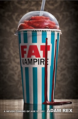
 Adam Rex's Fat Vampire cover appealed to me immediately. Plus, the tagline, "A never coming of age story," made me laugh out loud. I had to have Adam stop by to tell its tale. Here's Adam:"I had a lot of ideas for this book cover. I have a sketchbook filled with them. I'm an illustrator as well as an author, so I'm in the happy position of always assuming I'll have a lot of input regarding the cover image. Even in the case of Fat Vampire, which is my first book which contains no illustrations whatsoever.
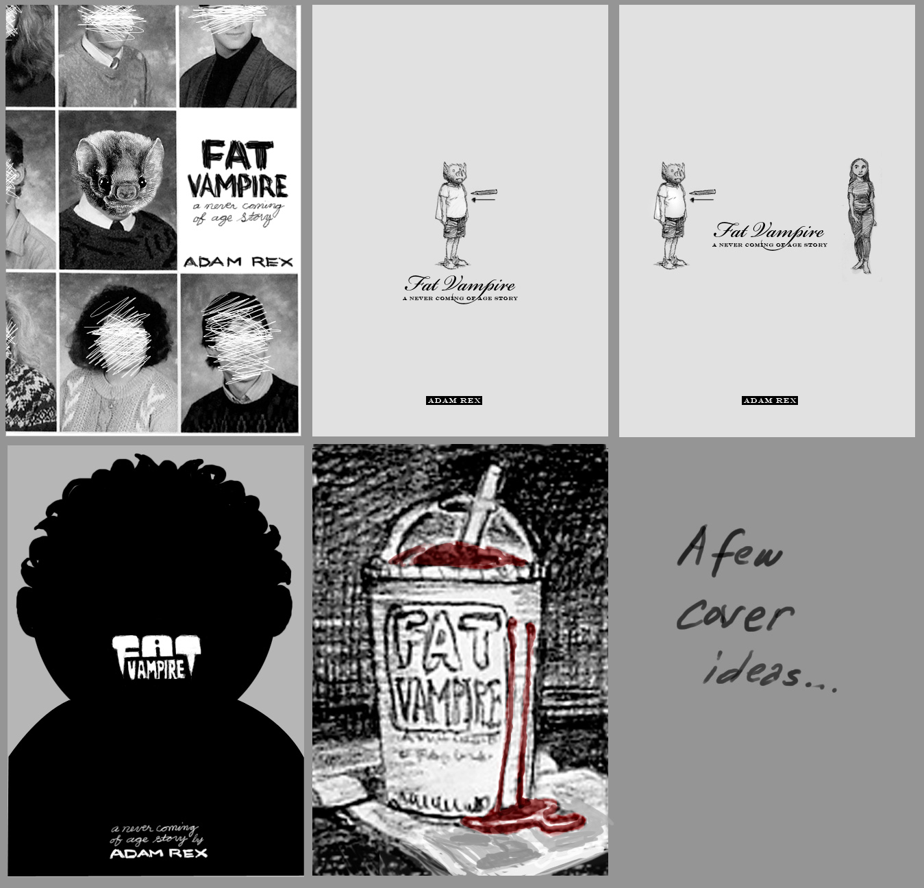
"So I have a few thumbnail sketches of the slushie cup option that are very similar to the finished cover. I also experimented with a couple silhouette designs, one of which I illustrated in a finished form that appears on the case, beneath the jacket. You can see this design at fatvampire.com. I have a couple designs that feature my main character, Doug, with a bat head. I have a couple ideas that would have featured model shoots with teen girls eating red popsicles, which are melting, blood-like, down their necks. In these Doug the vampire is leering from the background. Anyway, I had a lot of ideas, not all of them good.
Adam Rex's Fat Vampire cover appealed to me immediately. Plus, the tagline, "A never coming of age story," made me laugh out loud. I had to have Adam stop by to tell its tale. Here's Adam:"I had a lot of ideas for this book cover. I have a sketchbook filled with them. I'm an illustrator as well as an author, so I'm in the happy position of always assuming I'll have a lot of input regarding the cover image. Even in the case of Fat Vampire, which is my first book which contains no illustrations whatsoever.
"So I have a few thumbnail sketches of the slushie cup option that are very similar to the finished cover. I also experimented with a couple silhouette designs, one of which I illustrated in a finished form that appears on the case, beneath the jacket. You can see this design at fatvampire.com. I have a couple designs that feature my main character, Doug, with a bat head. I have a couple ideas that would have featured model shoots with teen girls eating red popsicles, which are melting, blood-like, down their necks. In these Doug the vampire is leering from the background. Anyway, I had a lot of ideas, not all of them good.
 "I think HarperCollins always assumed that I would come up with something for them. Maybe they even assumed I would paint or draw something for the cover, but in the end I think we all agreed that a photograph was the way to go. My previous novel was for a younger demographic, and I've been worried that Fat Vampire would be picked up by readers who are not emotionally ready for it. Illustrated covers are, for whatever reason, so much less common in the YA market, so a photo shoot seemed like a good way to alienate the middle school kids for a few years.
"I'll admit that the slushie cover was not my favorite at first. I really wanted that silhouette front and center. But everyone at my publisher favored the cup, so in time I had to acquiesce. I was my idea after all, and among those I'd pitched, so it was hard to argue later that I wouldn't be satisfied with it. I actually attempted to shoot the cover myself, even using it as an excuse to buy a new camera. So I designed a cup with an icy FAT VAMPIRE logo on the front, lit it moodily, and took a whole lot of photos. But I'm not a very knowledgeable photographer, so the photos didn't impress anybody.
"After all the back and forth and last minute changes, I was very, very happy, actually. I really got on board with it as the process spun out. I was shown several test cups, wallpaper patterns, tabletop surfaces, etc.; and I was given the opportunity to weigh in at every stage.
"The cover did change a bit. After my thumbnails and mock-up, all of which included the title of the book on the cup itself, Harper worried that readers might not understand that this logotype was indeed the name of the book. So a cup without any logo was shot. The cup's stripes, incidentally, were also red during the the photo shoot. Sort of a warm scarlet. Very different from the deep red of the blood/syrup, so I didn't expect it to be an issue.
"I think HarperCollins always assumed that I would come up with something for them. Maybe they even assumed I would paint or draw something for the cover, but in the end I think we all agreed that a photograph was the way to go. My previous novel was for a younger demographic, and I've been worried that Fat Vampire would be picked up by readers who are not emotionally ready for it. Illustrated covers are, for whatever reason, so much less common in the YA market, so a photo shoot seemed like a good way to alienate the middle school kids for a few years.
"I'll admit that the slushie cover was not my favorite at first. I really wanted that silhouette front and center. But everyone at my publisher favored the cup, so in time I had to acquiesce. I was my idea after all, and among those I'd pitched, so it was hard to argue later that I wouldn't be satisfied with it. I actually attempted to shoot the cover myself, even using it as an excuse to buy a new camera. So I designed a cup with an icy FAT VAMPIRE logo on the front, lit it moodily, and took a whole lot of photos. But I'm not a very knowledgeable photographer, so the photos didn't impress anybody.
"After all the back and forth and last minute changes, I was very, very happy, actually. I really got on board with it as the process spun out. I was shown several test cups, wallpaper patterns, tabletop surfaces, etc.; and I was given the opportunity to weigh in at every stage.
"The cover did change a bit. After my thumbnails and mock-up, all of which included the title of the book on the cup itself, Harper worried that readers might not understand that this logotype was indeed the name of the book. So a cup without any logo was shot. The cup's stripes, incidentally, were also red during the the photo shoot. Sort of a warm scarlet. Very different from the deep red of the blood/syrup, so I didn't expect it to be an issue.
 "Anyway, after the shoot we started talking about how to get the title on the cover, and I offered a number of choices (above). Nothing was really clicking, though. Eventually the art department decided that the real problem was that the title wasn't on the cup itself, so they photoshopped it on there and asked me what I thought. I liked it so much I don't think I even said 'I told you so.'
"They also decided late in the process that the stripes should be a different color, so we settled on that particular blue. They did an amazing job of Photoshopping all these changes in my opinion. Then I put together some type for the subtitle and byline and the cover was finished.
"The photographer, Dan Saelinger, was great to work with, by the way. Hope he doesn't mind all the changes we made. If someone hired me to paint them a cover and then they changed all the colors and photoshopped an elephant into the background I think I'd be cross.
"In the end, I'm really pleased, and it seems like people are reacting very well to it. It works on a very superficial level (syrupy sweet blood for an overweight vampire), but I also like the way the slushie acts as a symbol of immaturity, of arrested adolescence. It's meant to be a funny book, but this is a story about a fifteen-year-old who's never going to be allowed to grow up, and that's a tragedy. The somber tone and background of the still life convey that, I think."
Thanks, Adam! I love this cover--it really stands out to me, and I think it conveys the humor of the book really well. (It's hard to make a cover funny!) What do you guys think?
"Anyway, after the shoot we started talking about how to get the title on the cover, and I offered a number of choices (above). Nothing was really clicking, though. Eventually the art department decided that the real problem was that the title wasn't on the cup itself, so they photoshopped it on there and asked me what I thought. I liked it so much I don't think I even said 'I told you so.'
"They also decided late in the process that the stripes should be a different color, so we settled on that particular blue. They did an amazing job of Photoshopping all these changes in my opinion. Then I put together some type for the subtitle and byline and the cover was finished.
"The photographer, Dan Saelinger, was great to work with, by the way. Hope he doesn't mind all the changes we made. If someone hired me to paint them a cover and then they changed all the colors and photoshopped an elephant into the background I think I'd be cross.
"In the end, I'm really pleased, and it seems like people are reacting very well to it. It works on a very superficial level (syrupy sweet blood for an overweight vampire), but I also like the way the slushie acts as a symbol of immaturity, of arrested adolescence. It's meant to be a funny book, but this is a story about a fifteen-year-old who's never going to be allowed to grow up, and that's a tragedy. The somber tone and background of the still life convey that, I think."
Thanks, Adam! I love this cover--it really stands out to me, and I think it conveys the humor of the book really well. (It's hard to make a cover funny!) What do you guys think?