 Courtney Summers is awesome, as many of you guys know. She agreed to do a double Cover Story with me, so here's part one. It's about her debut, Cracked Up to Be. I loved this book, btw.Here's Courtney:
"When I found out St. Martin's was going to publish Cracked Up to Be, I was really eager to see what they'd make of the cover. I secretly wished that:
1) there would be a girl on it and her face would be obscured, because I like covers that leave character's faces to the imagination and
Courtney Summers is awesome, as many of you guys know. She agreed to do a double Cover Story with me, so here's part one. It's about her debut, Cracked Up to Be. I loved this book, btw.Here's Courtney:
"When I found out St. Martin's was going to publish Cracked Up to Be, I was really eager to see what they'd make of the cover. I secretly wished that:
1) there would be a girl on it and her face would be obscured, because I like covers that leave character's faces to the imagination and
 2) it would be awesome (what author doesn't want that, though!)
"When I got the first cover for Cracked Up to Be, I loved it. It had a faceless girl laying on some bleachers set against a field and I thought it was awesome, so I was 2 for 2! Unfortunately, *cue ominous music*, it was not meant to be. There was a hiccup with the stock image of the girl, so my cover was pulled (trivia: you can see the girl on the cover of Daniel Ehrenhaft's Dirty Laundry and Kimberly Brubaker Bradley's Leap of Faith--and she looks great on both!). I was a little bit bummed about this; no author is guaranteed a cover they'll love.
2) it would be awesome (what author doesn't want that, though!)
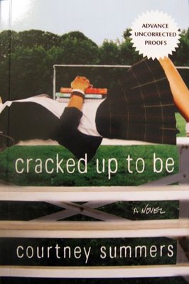
"When I got the first cover for Cracked Up to Be, I loved it. It had a faceless girl laying on some bleachers set against a field and I thought it was awesome, so I was 2 for 2! Unfortunately, *cue ominous music*, it was not meant to be. There was a hiccup with the stock image of the girl, so my cover was pulled (trivia: you can see the girl on the cover of Daniel Ehrenhaft's Dirty Laundry and Kimberly Brubaker Bradley's Leap of Faith--and she looks great on both!). I was a little bit bummed about this; no author is guaranteed a cover they'll love.  I really adored that cover and was slightly nervous the new version wouldn't capture my heart in the same way.
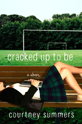
"St. Martin's ended up doing a photo shoot for the new cover, which was really exciting. They wanted to match it as closely to the original as possible. Pretty soon after, I got my new cover, which is as you see it today EXCEPT...
"The colours were different and I did not love them.
"I can't fully articulate why I didn't like them--I just knew that I didn't. I disliked the blue bench and found the red in the skirt very off-putting. A little too neon Christmas. My agent passed along my concerns and the art department and my editor were very receptive to them. The colours were changed to what you see now. When I saw the revision, I LOVED it without reservation. I think it's much stronger than the original. Green is my favourite colour, so it was neat that it was featured so prominently on my debut. (See both covers side by side):
I really adored that cover and was slightly nervous the new version wouldn't capture my heart in the same way.
"St. Martin's ended up doing a photo shoot for the new cover, which was really exciting. They wanted to match it as closely to the original as possible. Pretty soon after, I got my new cover, which is as you see it today EXCEPT...
"The colours were different and I did not love them.
"I can't fully articulate why I didn't like them--I just knew that I didn't. I disliked the blue bench and found the red in the skirt very off-putting. A little too neon Christmas. My agent passed along my concerns and the art department and my editor were very receptive to them. The colours were changed to what you see now. When I saw the revision, I LOVED it without reservation. I think it's much stronger than the original. Green is my favourite colour, so it was neat that it was featured so prominently on my debut. (See both covers side by side):
 "In hindsight, though I still heart Cracked Up to Be's cover muchly, some people commented that it didn't reflect the grittiness of the actual book, so when we started to work on my next book, Some Girls Are, my editor told me they were going to try for a gritty vibe and I was thrilled..."
UPDATE: the Cover Story for Some Girls Are is up on Barnes and Noble's Unabashedly Bookish blog.
Oh, and Alea did a great Lookalikes post on this cover (from which I grabbed the ARC photo -- thanks!).
Thanks, Courtney! I like the greens and the darker bench in the final cover, though I have to admit I didn't know this was a different photo shoot from the other books. I can see how readers would want the cover to be a little grittier, but I think it's lovely nonetheless... What do you guys think?
"In hindsight, though I still heart Cracked Up to Be's cover muchly, some people commented that it didn't reflect the grittiness of the actual book, so when we started to work on my next book, Some Girls Are, my editor told me they were going to try for a gritty vibe and I was thrilled..."
UPDATE: the Cover Story for Some Girls Are is up on Barnes and Noble's Unabashedly Bookish blog.
Oh, and Alea did a great Lookalikes post on this cover (from which I grabbed the ARC photo -- thanks!).
Thanks, Courtney! I like the greens and the darker bench in the final cover, though I have to admit I didn't know this was a different photo shoot from the other books. I can see how readers would want the cover to be a little grittier, but I think it's lovely nonetheless... What do you guys think?