Cover Stories: The Summer of Firsts and Lasts

Terra Elan McVoy is back with a new release that has a cover that's just as colorful and summery as her previous ones. Yay! Here she is with the Cover Story:

"I try never to think about my covers when I’m writing, mainly because I’m a writer, not a professional marketing person, and I know that these kinds of things are usually best left in the hands of people whose job it is to be good at this! I just hoped (and knew) that it would tie in well with the covers of Pure and After the Kiss [read those Cover Stories here] that everyone (including me) loves so much!

"I do remember having a conversation with my editor about the cover when the initial planning stages were going on. I was thinking there had to be some sort of yummy thing that involved three in some way. I was brainstorming--because The Summer of Firsts and Lasts is about camp—maybe a s’more? There’s marshmallow, chocolate and graham cracker: three ingredients, so I thought that might work. But it turns out there are some other books with s’mores on them and we wanted to go a different route. As soon as I saw ice cream I was like: Perfect!

"I swear, when I saw the design I just thought, 'I am so lucky.' The color was a surprise, because I think I was maybe picturing something green (like summer trees), but I just ADORE the hot pink. I wouldn’t have thought of it, and I love it. It pops so much and the three flavors of ice cream... perfect!

"We had to do a whole separate photo shoot for the ice cream, because the original images they were using just didn’t look real enough when they put them together. I have to say that I LOVE picturing an ice cream photo shoot just for my book, right?

"Ultimately, I just feel so lucky that there are such amazing, creative people in the Art Department at Simon Pulse. I think the attention to detail—making all my book covers tie together—is really incredible and just works so well. I love the simplicity of the ice cream cone in this book—it is so perfectly summer. And of course there are three flavors to represent the three different girls. I’m not sure though which flavor stands for which sister. I think the green is maybe Violet, but then I can’t decide whether it’s Calla or Daisy who is the strawberry. So maybe Daisy is the green? But then it depends on whether it’s mint or pistachio... I’m still not sure!"

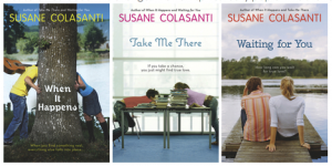
Thanks, Terra! How pretty do her covers look together, above? They are like a collage of summer itself. Also, I love the idea of an ice cream photo shoot and ice cream flavors/colors as character representations. Delicious.

What do you guys think?

Win-It Wednesday: Amy & Roger's Epic Detour

Last week's winner of Susane Colasanti's Something Like Fate is... Krystal! Send me your address, K.

This week, I'm celebrating the fact that Morgan Matson's road trip book just came out in paperback--it is beyond delightful. I spent all weekend consumed by it, feeling like I was on the open highway driving across America with an amazing boy and eating regional fast food while looking at quirky local sights. And, of course, simultaneously working out all of my emotional issues.

This book is seriously great, you guys! I wrote more about it (and two other great paperbacks) on I Heart Daily today. Have you read it?

In any case, now's your chance. I'm giving away one copy of the newly released paperback this week. Just share one road trip story below. It can be yours, a friend's, or just one you dream of experiencing.

Here's mine: I went to Graceland with my friend Ruthie, thinking that we'd spend a couple of hours and do the basic tour. Seven hours later, we emerged with Elvis magnets, Memphis post cards and a flashy TCB necklace. That place is MAGIC (and Morgan's characters know that too). Just saying.

Happy Wednesday!

Cover Stories: I'm Not Her

Janet Gurtler's original title was The Weight of Bones, and she had a very different cover at first, so I had to find out how it evolved from the initial version (below) to the final (left). Here's Janet: "I had no clue what the cover of this book would look like when I was writing it.  I never do. I mean I love imagining my work in progress as an actual book, but in my mind the cover is still pretty much blank. I’m just not a visual person in that way. I have zero artistic ability. As in none. I can barely draw a stick man. I’m happy that there are talented cover designers out there to come up with covers!

"The cover for I’m Not Her was presented to me as I was still digesting a title change. Originally the title of my book was The Weight of Bones. It really had a cover story all it’s own! The first cover presented to me was orange and yellows and kind of arty and eclectic. The designers had come out with some really beautiful but really different designs so they opened up a vote on the Teen Fire website.  You can see the old cover ideas here.

"Popular vote was for the black and white image but the consensus was that color was needed. I was given several colors to look at and as a team we chose this cover (right). I thought the cover selected was truly beautiful. It was eerie and dark and kind of broken, the way some of the characters in the book are. I really loved it.

"Ultimately though, my wise publisher thought the book didn’t convey the right tone. It looked more like a dark paranormal story or a truly dark story like Wintergirls and in the end, it probably wouldn’t have reached the right audience. (Publishers are wise like that). So in the end I sorrowfully let the title and cover go.

"Honestly I loved the old cover and old title so hard, it was a little tough to get my mind around the new title. But when I saw the cover that went with it, I was really, really happy. Within a day I was madly in love. The colors are beautiful. It’s so pretty and to me there is so much about the picture that the reader can interpret. Hopefully the cover does what it is supposed to do, and entices readers to pick up the book to take a look at it. And hopefully, from there, (deep cleansing breath) readers like what they read and purchase I’m Not Her!

"My editor is a wonderful woman and she did ask for my feedback on the cover. There were a couple of other covers presented at the same time, we all loved this one the best!

"When the final version of this cover was sent to me, they’d added the bubble over the title (see top image). To me, it finished off the look incredibly well. I was actually really impressed with the back cover of the book too when I got the ARC. The artist incorporated the bubble for the back cover copy in inverse colors and I think it looks FAB!

"Honestly? I am gushy in love with this cover. It wasn’t LOVE at first sight but I am head over heels now. The wilting ripped up flower has meaning, because the story isn’t a light happy one. I like how it’s contrasted with beautiful, hopeful colors though, because as tragic and heartwrenching as the story is, ultimately it is about finding your true self and learning how to become and love who you are.  So I think the bittersweetness portrayed in the cover suits the story."

Thanks, Janet! That is a huge visual and title shift to go through as an author, and I understand why it took you a while to get used to and love the new direction, but rest assured that it's lovely! (And I like the title font change from first to last version of the new cover, too.)

I snagged this publisher's description of the book, and I have to say that I think the final cover tells this story more than the first. What do you guys think?

Brainy Tess Smith is the younger sibling of the beautiful, popular, volleyball-scholarship-bound Kristina. When Kristina is diagnosed with bone cancer, it drastically changes both sisters' lives. Sometimes the things that annoy us the most about our siblings are the ones we'd miss the most if we lost them.

In this YA literary coming-of-age novel that will appeal to readers who love Jodi Picoult and Sarah Dessen, sisters Tess and Kristina discover not only who they are, but who they can become.

Photo Friday: Twitterhood of the Butt-Lifting Pajants

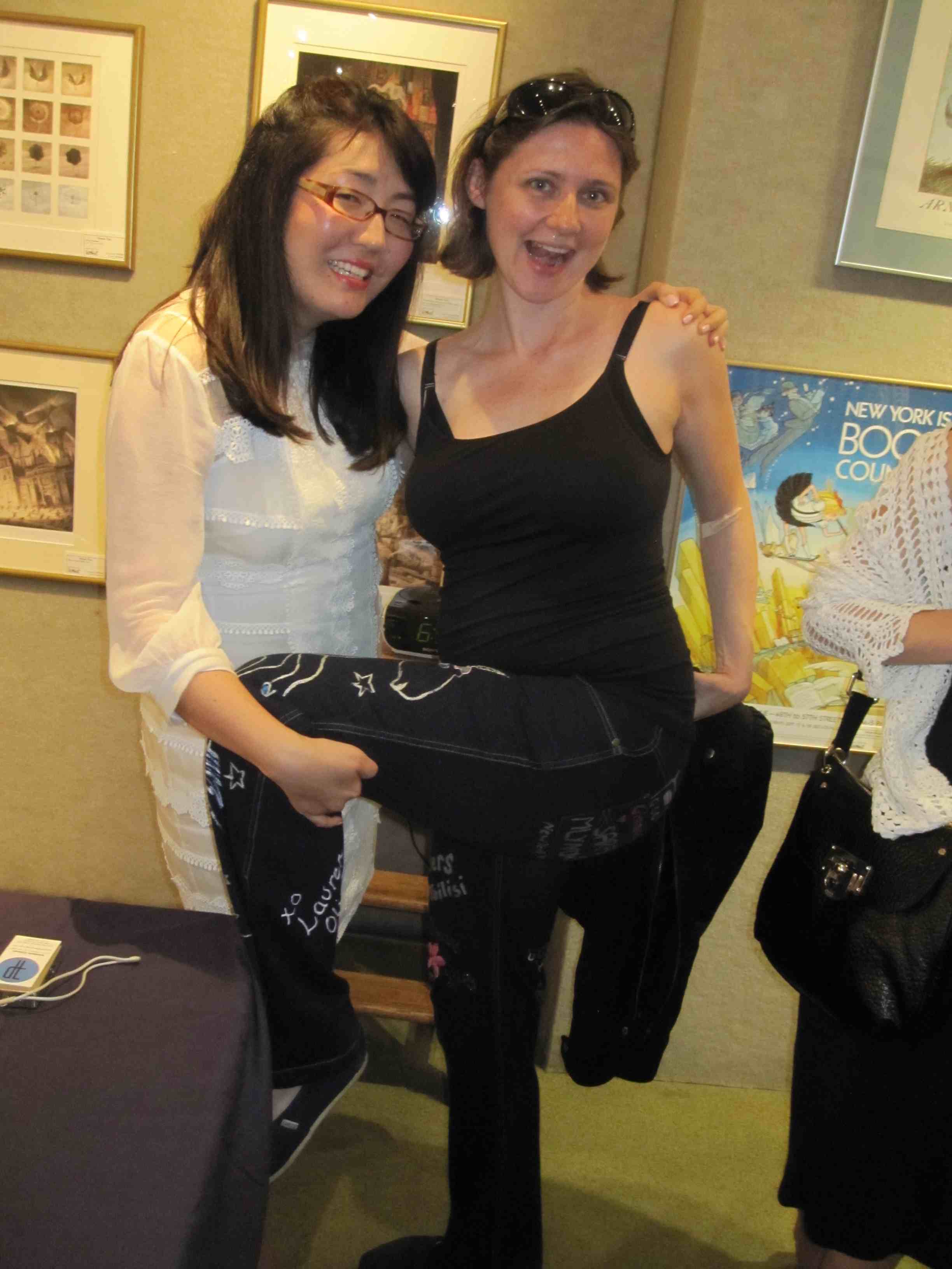
This week, I was lucky enough to join the Twitterhood of the Butt-Lifting Pajants (Facebook page here) after a handoff from the lovely E. Lockhart (who took them to the primates exhibit at the Natural History Museum and has a post on her blog that explains it all). I wore the colorful pajama jeans to Jenny Han's book release party for We'll Always Have Summer, which was quite a swank affair at Books of Wonder. At first I felt self-conscious:


But then the bride--erm, I mean author--herself posed with me:

And so did super author Coe Booth!

The pajants even tried to swipe a cupcake:

And, after all the excitement, I made my mark:

The pajants adventure continues with Tara Altebrando... stay tuned...

Happy Friday!

PS-I just want to say that I went a little crazy on twitter today with the Royal Wedding madness. Sorry. But there were so many fascinators that I blame sparkly-feather-eyed madness. Happy Wedding, Kate and Wills!


Cover Stories + Win-It Wednesday: So Much Closer by Susane Colasanti

Last week, I offered up a copy of Susane Colasanti's new book, So Much Closer to anyone who shared their most romantic city. Now, I'm itching to travel (sigh, but in a good, dreamy way). And the winner is... Yani! Send me your address, Y. This week, Susane stopped by to talk about the cover of her new book, and she's offering a brand-new paperback version of last year's release, Something Like Fate (remember that Cover Story?). Just leave a comment on this Cover Story and you're entered to win.

Now here's Susane with the tale of this so-NYC cover...

"You've probably heard that authors don't get to decide anything about their covers. We can't just imagine how we want the cover to look and then have it turn out like that. That never happens.

"But it happened anyway.

"My cover designer is amazing. I saw Jim a few months before this cover was designed and he asked me if I had any color ideas. It was so cool that he was asking me about the cover because I had been envisioning the exact cover I wanted for a while.  So Much Closer takes place right in my New York City neighborhood, the West Village. One place I’m infatuated with in my nabe is the High Line. It's this old section of elevated train tracks that was turned into a magical green space with lots of trees and flowers. Some key scenes in So Much Closer take place on the High Line. I really wanted the cover to show my characters on the High Line at sunset or at night. I told Jim about my idea.

"Then it was summer and I was wondering what the cover would look like. My books come out in May, which means their covers are done the previous summer. Even though I knew dream covers never happen, the hopeful part of me never stopped believing that it might be possible. That's me, always dreaming big even when something seems impossible! But I really wasn't expecting to get an email from my editor with an initial cover design.

"With my characters on the High Line at sunset.

"Dude. They actually did a photo shoot on the High Line. I was beyond ecstatic. [Below, the photographer talks to the models on set.]


"Early versions of the cover featured orange and pink sunsets. The first orange sunset involved some serious Photoshop action. Marketing thought it was too much. Jim toned down the sunset. I love this pink sunset version (right) even more than the final cover.

"My contracts allow me to have cover consultation, which means I can provide feedback about the initial designs and let my editor know what I’d like to see changed. That’s how we ended up with the pretty cursive font for the title.  The title had a really boring font at first. I fought to keep a bit of pink in the sky. I fought to keep the girl model in her white tee.

"But a lot of people are in charge of deciding how the cover will look. In the end, they went with a white sky. White backgrounds on covers have been hot for a few years now, so I guess I understand. What I don’t understand is why they went with the whole pink shirt/purple sweater combo. Um, hi, 1983 called? They want their clothes back.

"But of course I adore this cover.  How often do authors see their dream cover become reality?"

Thanks, Susane! I think it's amazing that you got a shoot on the High Line -- is this the first High Line book cover? Definitely the first YA High Line cover, I'd bet. Very cool. I have to admit that I thought of an 80s jeans ad when I saw this cover, but that was a good, fun thing in my opinion. And, I love how it keeps the "natural light" thing going (Susane mentioned that the last time we talked covers) -- what a great theme to have running through your cover designs!

What do you guys think of this cover? One commenter below will win the paperback of Something Like Fate (US only this week). I'll choose a winner next Wednesday.

Here are all of Susane's covers, by the way. Such a pretty set, right?

Susane is holding a big contest at her site, too--share your zen place and get a shot at a few of her books, signed and personalized!

Happy Wednesday!

Cover Stories: We'll Always Have Summer by Jenny Han

The final book in Jenny Han's delicious summer trilogy is here! She has shared the Cover Stories for Book 1 (The Summer I Turned Pretty) and Book 2 (It's Not Summer Without You), and now we have the scoop behind We'll Always Have Summer (out this week). Here's Jenny:

"A girl in a white dress is what always what I wanted for the final book. I had this in mind even before I knew what I wanted for the second book.

"I actually bought the dress the cover model is wearing. I spent two days trolling the city for the perfect flowy white dress, and let me tell you, this was no easy feat. It was September, when white dresses had already been whisked off the sales racks and there was only like, plaid and back-to-school corduroy everywhere. I found the dress in the last store I went to, the night before the shoot. And on sale, no less!

"Lucy Cummins, the ever-amazing book designer, also brought some white dresses to pick from, but we ended up going with mine because it was the fanciest. You can’t tell by the cover, but it’s floor-length, halter neck, and silk. And it’s currently stuffed in an envelope somewhere behind my filing cabinet.

"My editor has always been super supportive and generous about letting me in on this process. We actually did the covers for It’s Not Summer Without You and We’ll Always Have Summer at the same time -- it was a photo shoot at Rockaway Beach. I actually got to go, which was such a treat.

"The photographer shot a lot of different looks --her in her dress in the water, her walking along the sand, all really lovely. It was so hard to pick a favorite shot!

"The only input I gave at the shoot was that I wanted a shot of her against the grass. I loved the white and the green against each other. I had this image of her running her hands along the tops. I actually didn’t get to see them shoot the cover photo because I had to run off to school. But I was so glad when I saw the proofs, because this was the exact shot I envisioned!

"I love this cover. Really, really love it. To me, it’s wistful and romantic and the perfect end to the series-- I just hope the story itself is as satisfying for y’all!"

Thanks, Jenny! I love that this cover concept all started with a very cool inspiration board. Every time I see these covers I feel like letting out a satisfied summer sigh (not to mention that this trilogy has marked the start of summer for the past three years). Here are all of the Belly books together:

What do you guys think?

Photo Friday: Art Shows and Uncle Mike

Last night I went to an art show for my friend the amazing artist Pete Kephart, who lives near some of my family in West Virginia. His show was called Painting With Fire, and he does amazing stuff, like this one:

While at the show, there was a huge explosion outside on the street, which seemed like a publicity stunt (fire art?) but wasn't. I emailed the NY Times with a tip about it, and they came over to talk to Pete and ran this story today!

My Uncle Mike drove into the city from Massachusetts, and I got to hang out with him and his delightful friend Jeff and charming friend Dorothy. Seeing Uncle Mike is fun. I used to spend every summer visiting him, my Aunt Susan and my cousin Curry. Plus, he's my dad's brother -- he reminds me of my father. And I miss that guy a lot.

We posed normally, then my uncle and I compared bumps (he said, "I'm a little further along than you are."):

Speaking of bumps, I have a new blog over at zulily.com. It's called The Newbie, and it's all about the impending mom-hood (I will not subject you to that on this blog!). But if you're interested, or if you have mom-style advice for me, check it out.

Happy Friday!

Cover Stories: Huntress by Malinda Lo

Final cover

Malinda Lo stopped by to talk about her debut cover for the lovely Ash a while back, and she's here once again because her latest book, Huntress, just hit the shelves this month (find out how to get a signed bookplate for the book if you see this post by May 1st!).

Once again, Malinda has a stirring cover with a great back story. Here she is:

"While I was writing Huntress I truly didn't have any idea what the cover might look like, and I didn't even spend much time thinking about it. I absolutely adore the cover that my publisher created for Ash, and I would never have come up with that as a cover concept — I'm definitely a writer, not a designer! So I was excited to see what they came up with for Huntress.

"The first cover concept I saw was this one (right). I was immediately struck by the meditative quality of the image, which I thought reflected the book pretty well — and the snow! I loved the snow! A little known fact about me is that I'm kind of obsessed with the idea of ice. Most people want to vacation in Hawaii; I desperately want to take a trip to Antarctica. (Yes, I'm strange.)

"Anyway, a good part of Huntress involves the main characters crossing a giant glacier, and I was thrilled that this aspect of the book was reflected on the cover.

"I did have a few suggestions, though, because I felt that the girl on the cover didn't entirely reflect my vision of Kaede, the main character. Of course, I know that book covers are designed to sell books, not to look exactly the way an author sees her characters (and, you know, the girl on the cover of Ash doesn't really look like her, but I think it very nicely fits the mood and feel of the book).

"One of my main concerns in this case was that the girl looked a little too young, because Kaede is 18 in the book, and I wanted to make sure this looked like a YA title. I also thought that the weapon the girl was carrying needed to be modified. In the original cover concept, it's a wooden practice sword, but nobody ever uses that in the book. However, Kaede does use a Japanese-style bow, and I thought it might not be too hard to substitute that in over the wooden practice sword.

"I also suggested that the girl's eyes not be obscured. Personally, I don't like full-faced photos of girls on book covers, because I like to imagine the characters in my own head. And I knew why they put the title over the girl's eyes — because it mirrors the title configuration on the Ash cover, and it was important that this book be visually related to Ash.

"But, given all the discussion about race and representation on YA book covers, I also knew that this book cover would face a lot of scrutiny when it was released. I was super pleased that my publisher chose to feature an Asian girl on the cover, and I just didn't want that fact to be overshadowed by having a title hide the girl's eyes.

"So, I sent this feedback to my editor, and we talked it over. She also showed me a couple of earlier cover concepts that they had discarded, just to give me an idea of what they wanted to avoid.

"One of the earliest ideas was to go with a black-and-white photo to echo the feel of Ash, something along the lines of this stunning photo by Beth Moon (left). (Obviously we couldn't use that specific image because the girl was both white and too young-looking, but I love the photo!) Another concept (below, right) was pretty cool, but it lacked the meditative quality that really does exist in Huntress and looked a little too much like a kung fu movie. (Not that there's anything wrong with that, but that's not what Huntress is about.)

"Seeing these images made me realize that as much as I want to see diversity on book covers, it can be tough because designers usually have to work with stock photos. The fact is, not every book gets a cover shoot — hardly any books do. If you're designing a cover for a contemporary novel, it might be easier to use stock photos, but because Huntress is a fantasy, we couldn't use photos of Asian girls carrying cell phones or wearing t-shirts, for example.

"But what my publisher did was send the original cover I saw to a digital artist, who tweaked the photo and created the final cover. The girl on the cover is now holding a Japanese bow, and she does look like an 18-year-old. I love the way her hair is whipping in the wind, and yet the background retains that wintry, meditative feel.

"Also, having the girl look straight out at the reader creates a very strong image, and I think the juxtaposition of her strength against the wintry background is wonderful. I hope it does its job by making people stop and pick up the book!"

Thank you, Malinda! I love the snow, the font, the muted purple. I think the final cover is gorgeous, and along the way you had a lot of great options.

What do you guys think?

PS-If you're lucky you can catch Malinda on the Diversity in YA Tour in May (amazing lineups)!

Win-It Wednesday: So Much Closer by Susane Colasanti

I hope you guys like the new blog! It's not quite done but it's very close. I'm really into the new design, but I fear change so much. Please stick with me! This week, I'm giving away a signed ARC of So Much Closer by Susane Colasanti. It'll be out in two weeks, but here's your shot at an advance copy signed by Susane on our last cupcake date! Of course it's filled with romance and a huge nod to NYC -- the setting plays a big part of the story, which I love!

To enter to win, just comment below and let me know what city you think is the most romantic in the world... it can be one you've been to, or one you just dream about. I'm not even sure what city I'd pick--give me ideas!

Happy Wednesday!

Cover Stories: Kissed by an Angel and Evercrossed by Elizabeth Chandler

Elizabeth Chandler's bestselling Kissed by an Angel trilogy has been re-released with the cover you see at left, and her latest book, Evercrossed, matches that new style. I had to ask her how this cover evolution came about (it's a long way from the look of the first trilogy covers, below). Here's Elizabeth:

"For me, covers as well as titles are the last step in creating a book. I use working titles—very obvious and unimaginative ones—then usually beg for help from my editors. I just don’t have those marketing genes!  (I was also bad at titling school projects and research papers.)

"I am as clueless when it comes to imagining covers. My mind is full of images when writing a book, and I cut out and tape up all around my desk pictures of people, places, and things that somehow connect with my novel—these help me to live in the world of my story—but I don’t think about an image for a cover. To me, that feels as if I’m summarizing or crystallizing the story before I truly know it.  I need to let the story spin out through its words before I mentally pull it together enough to know what is right for a title or cover image.

"Kissed by an Angel has had three very different American covers. I didn’t have input on any of them, and as you now know, that was probably a good thing. When the trilogy was first published as three separate books, it had covers that appear to me to be photos of characters combined and reworked by an artist. I didn’t like the covers then, and I still don’t like them now. But they were right for that time period. When the trilogy first came out, all the publishers used photos, and the truth is, the publisher could have found the perfect models and I would not have liked them. I’ve never liked photographs or realistically drawn covers on novels—whether I write or read them.  I find them disappointing, perhaps because characters created by words are so real to me as to be almost larger than life, and those pictures make them look like little dolls.

"The second cover for the trilogy, when the three books were published as one 'Collector’s Edition' was incredibly romantic, the picture dominated by silhouette views of the hero and heroine’s faces, looking as if they were about to kiss (right). To me, they looked older than teens and the gauzy pink overlay made the book look like an adult romance. I liked it better than the first covers, but it looked like somebody else’s book, not the story I wrote.

"The current cover is my favorite—I love it!  Black, with the image of a single rose that has a bit of a supernatural feel because of its coloring and transparency, it is striking and romantic. It connects with the story: Tristan gives Ivy roses the night he dies, and identical roses come back as a sign to her in the sequel, Evercrossed. The newest book, Evercrossed has a similar cover, black with a single rose (left). They used the same font for both of these new covers, and I really like it. The lettering is elegant in a simple way, and that is what my heroine Ivy is like. She dislikes fluff and flounce, and if asked, would have chosen this font for her story."

Thanks, Elizabeth! I love how the original series covers reflect the time of their releases, and I think the current cover is luscious. Also: How cool is it to consider your character's taste in fonts?

What do you guys think?