Um, that was insanely awesome. Did you guys follow Rock the Drop yesterday? Check out the photos on the readergirlz blog and facebook page. EPIC. Here are the books I put down:


Phew! Happy Friday! Did you guys do the Drop?
Um, that was insanely awesome. Did you guys follow Rock the Drop yesterday? Check out the photos on the readergirlz blog and facebook page. EPIC. Here are the books I put down:
Phew! Happy Friday! Did you guys do the Drop?
The winning author photo is... Formal-ish! Thanks to the 250 people who voted. Total landslide:

 (The secret is that it's actually a photo from my wedding day, but you can't REALLY tell that... right? And I loved how AmandaSue said, "it just seems more you," which is what I'm going for overall.)
Anyway, the winner of Gayle Forman's Where She Went--chosen randomly from the comments--is... Julia, That Hapa Chick! And I realize I forgot to announce a winner for the week before last's giveaway for Ruta Sepetys's Between Shades of Gray... oops! That winner is Ariel! Send me your addresses, J and A.
 This week, I'm throwing Win-It Wednesday over to Readergirlz, where Figment and Readergirlz are encouraging everyone to Rock the Drop tomorrow (Thurs, 4/14) to support YALSA's Teen Lit Day! That means leaving a YA title or two out in a public place for someone else to find (you can get a bookplate to explain the donation here). If you do that, and then email a photo of your dropped book or share the story with readergirlz AT gmail.com, you're entered to win the full set of E. Lockhart's Ruby Oliver books, which make me so happy. They are seriously GREAT.
So pick a book to give away (you know your shelves are crowded anyway!) and let readergirlz know when you Rock the Drop!
I love this coming Thursday, when I'm going to sprinkle NYC with YA novels to celebrate YALSA's Support Teen Lit Day! Brooklyn, the West Village, midtown, and the subway in between. YES!
Join me in your own town? Here's more info from Readergirlz (including how you can win a set of E. Lockhart's Ruby Oliver books, shown above).
Oh, and a video by Crissa Chappell and her niece Corie, who are both geniuses:
I Rock The Drop from crissachappell on Vimeo.
Happy Tuesday!
 Bettina Restrepo's Illegal has a windswept but urban cover, which is an intriguing combination, I think. The book is about a girl whose father crossed the boarder from Mexico to the US three years ago. They've stopped hearing from him, so she and her mother make the hard decision to follow him into Texas and try to find him.
"For the cover, I imagined two trailer-truck doors with the title in graffiti. But, I also knew that the art directors they have at HarperCollins could design something beyond my expectations. I only have a silly picture I drew (below). This is why I don't even try to suggest art. I leave the art to the experts.
Bettina Restrepo's Illegal has a windswept but urban cover, which is an intriguing combination, I think. The book is about a girl whose father crossed the boarder from Mexico to the US three years ago. They've stopped hearing from him, so she and her mother make the hard decision to follow him into Texas and try to find him.
"For the cover, I imagined two trailer-truck doors with the title in graffiti. But, I also knew that the art directors they have at HarperCollins could design something beyond my expectations. I only have a silly picture I drew (below). This is why I don't even try to suggest art. I leave the art to the experts.
 "I received pictures of the shirt the model wore and they asked if it was okay (it was, I have one similar to it!). Then, when the font came out wonky and Frankensteinish (below) - they quickly agreed [with my objections] and came back with the beautiful barbed wire font.
 "They asked me if I like royal blue or the purple. Hands down - purple.
"When I saw the final cover, I cried and then hugged my laptop. My main character, Nora, only existed to me as someone in my head. I knew she had long hair and olive/Latina skin. But, to see her - she took my breath away. It's a model super imposed onto half of a burned out field, and half of the skyline of Houston (which is smudged up a bit with smog... just like the real city!)
"After the initial giddiness of seeing the cover, I noticed that Nora was wearing earrings. She wants pierced ears throughout the book, and doesn't get them done until the epilogue. I had to go back and give them to her earlier in the story - which I find kind of funny.
"I really love the cover because it conveys a sense of longing. It's wistful and shows movement. It was important NOT to see her face. Nora could be anyone... she could be you."
Thanks, Bettina! Yeah, I'm glad the art department got to do the final design (not that your illo isn't quite cute in that Book Report kinda way). And the font change is key -- I love the subtle barbed purple font (maybe inspired by your drawing?). Also: Those shirts like she's wearing are divine classics that never go out of style. I have one for summer! What do you guys think?
PS-Trailer!
I hate the word Babymoon, but let's call a spade a spade. It was divine. (We stayed at El Palacio de Playa Grande, through an amazing Jetsetter deal!) Some pics below.The view from above our private beach (seriously!):
 There were excellent fresh drinks (even a virgin Pina Colada tasted good):
 I got to get lost in some amazing books, including Tara Altebrando's Dreamland Social Club, which swept me away into whimsy-land!
 There were peacocks by the pool, naturally:
 Did I mention there were amazing drinks? (Remember I have a thing for coconut milk.)
 Oh yeah, Dave was there too, drinking large beers (the food on the beach = incredible!)
 And lastly, because it's been requested (eek), a bump shot. Beach bump, no less.
 Happy Friday!
 You guys know about this book, and you want to win it. That's all I really need to say, right? It's Gayle Forman's latest! Read the Cover Story to find out more about its aesthetic.To enter to win this gleaming new hardcover, you've gotta help me out. Small Town Sinners is ready to go to press, and I can't pick an author photo! I had decided on one, but it's starting to look too serious to me or something. So below are three options, and I'd really love it if you could weigh in with your favorite (vote in the poll, definitely, but leave a comment too because I'll choose a winner from the comments -- you can just say "I voted!" if you don't have more to add). One commenter will win Gayle's book. Merci!
Option 1: Formal-ish.
Option 2: Is the tiara too much?
You guys know about this book, and you want to win it. That's all I really need to say, right? It's Gayle Forman's latest! Read the Cover Story to find out more about its aesthetic.To enter to win this gleaming new hardcover, you've gotta help me out. Small Town Sinners is ready to go to press, and I can't pick an author photo! I had decided on one, but it's starting to look too serious to me or something. So below are three options, and I'd really love it if you could weigh in with your favorite (vote in the poll, definitely, but leave a comment too because I'll choose a winner from the comments -- you can just say "I voted!" if you don't have more to add). One commenter will win Gayle's book. Merci!
Option 1: Formal-ish.
Option 2: Is the tiara too much?
 Option 3: Casual stoop shot.

Thank you for your help! Seriously, so much. PS-Remember this boat name contest from last year? It's almost decided! I'm handing in revisions on this book very soon. (See how long this book-writing thing takes? Forever!)
 Where She Went, the sequel to Gayle Forman's lovely If I Stay (remember that Cover Story?), comes out tomorrow! Though it's told from Adam's point of view, that's Mia on the cover, obvs. Here's Gayle to share the story of how this book's cover came to be:
"The image that kept coming to mind as I wrote was the Brooklyn Bridge. It plays a pivotal role in the story and for some reason it just stuck because it's so strong both from both a visual and literary standpoint. I believe that Penguin did experiment with using the bridge initially but decided that it didn't work.
Where She Went, the sequel to Gayle Forman's lovely If I Stay (remember that Cover Story?), comes out tomorrow! Though it's told from Adam's point of view, that's Mia on the cover, obvs. Here's Gayle to share the story of how this book's cover came to be:
"The image that kept coming to mind as I wrote was the Brooklyn Bridge. It plays a pivotal role in the story and for some reason it just stuck because it's so strong both from both a visual and literary standpoint. I believe that Penguin did experiment with using the bridge initially but decided that it didn't work.
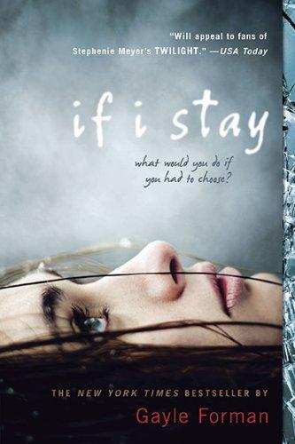 "The challenge for the US publication was marrying the US If I Stay paperback cover--the eerily half-dead-looking girl, right--with a new hardcover look. But I had to make it extra tricky because, unlike If I Stay, which is from Mia's perspective, Where She Went is in Adam's voice. So how to create a cover that seemed like a package with the paperback but was from a guy's perspective?
"We were obviously departing from the quieter US hardcover look, with the flower, tree and branches (below left), which I loved but would not work at all in terms of a new book about a rock and roll guy, so I'm so glad we had the paperback cover to use as a jumping-off point. 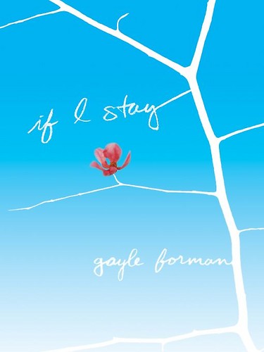
"In the end, in sort of a duh, why didn't we think of it sooner epiphany, we all realized that the US cover had to have another Mia. Because even though the book is from Adam's POV, it's still about Mia. It's about where she went. So the covers are meant to be bookends. One horizontal, one vertical, one passive, one more active. There's no Brooklyn Bridge, and yet the covers are, in my opinion, such a perfect bridge.
"My publisher asked for ideas, but honestly, I knew that I had thrown them such a huge challenge in finding a cover for Where She Went that would be both striking, true to the book, and of a piece with If I Stay that I kept my mouth shut. Because really, truly, I had no clue what to do. I was relieved that I was not in the design department. Had Where She Went been a stand-alone, I think there would've been so many directions to go in. But in a way, the design was limited by the If I Stay cover. So I just sat back and wondered what they were going to do and felt grateful that coming up with a cover concept was not my job.
"When I saw the first version of the cover, my response was: Everything but the girl. Because I loved the general concept, and the idea of having a girl--Mia--on the cover, seemed so right. But the original girl looked nothing like the Mia from the first cover. And the model from the first cover was no longer available, and, oddly, other photos we'd found of her, looked nothing like the girl from the If I Stay cover. Also, the girl in the Where She Went cover try, aside from not resembling the original Mia, looked rather sad and wistful. Mia needed to look more fierce.
"My editor was in total agreement with me, both about the Mia needing to look like the If I Stay Mia and about the wrongness of her expression--actually, she was the one who first raised the second point. So she took our case to the art department.
"I am sure the art department went through a period of not loving my editor or me. I think they thought we were asking for the moon: a twin of the initial Mia with a fierce expression on her face? They must've been like: How the hell are we going to find that? And then they went and pulled a rabbit out of a hat. Found the perfect image. The girl on Where She Went totally looks like the girl on the If I Stay cover. And what I love most is the look on her face. On If I Stay, the girl's look is haunting; it draws you in. On Where She Went, it's determined, which is fitting for who Mia has become, and also draws you in. Which is what a cover must do.
"Aside from the model swap, the background went from this sort of bright colored spots reminiscent of city lights--now on the inside flaps--to the smoky gray, which tied it more to the If I Stay cover. When you see the two covers together, they really are of a set. A lovely, striking set.
"The cover is a stock photo. I believe that they did do a photo shoot on the Brooklyn Bridge, but it just didn't capture the right feeling as well as this existing image did. Funnily enough, the bridge wound up becoming an element for some of the foreign covers, like the French and UK jackets (below). New York City is a strong selling point abroad, apparently. But it didn't work for the US cover.
"It's funny because back when I was trying to imagine how they would jacket Where She Went, I wouldn't have imagined this direction. And it was a bit of an evolution to get it totally right, so it wasn't that initial visceral YES! But when I saw the jacket on the ARC, it just felt so absolutely right, as though that were the way it was meant to be all along.
'There are two things that make the cover perfect to me: One is the look on the girl's face. It beckons you, or at least it beckons me. So yes, this is Adam's book, but if you read it, it will make sense to you that Mia is on the cover and this girl will make sense as Mia. And second, when I hold this book up against the paperback of If I Stay--which has become the dominant image now--they look stunning together. Yin and Yang. They complete each other."
Thanks, Gayle! I love the cloudy blue-gray ethereal feel that the covers have, and though I'm a fan of the original If I Stay cover, and I even like the way the Brooklyn Bridge looks on the UK version, I agree that this matched set is really lovely.
What do you guys think?
Saw this in The Atlantic and had to share! Penguin has teamed up with artist Jillian Tamaki to produce hand-sewn covers for three classic novels. I mean: So Cool. Here are the full jackets:


Aren't these the perfect book-lover birthday gift?
Happy Sunday!
Thanks, everyone, for sharing bullying tales with such bravery. The winner of Carrie Ryan's The Dark and Hollow Places, chosen at random, is... Amy! Send me your address, A.
 This week, I'm giving away a copy of Between Shades of Gray by Ruta Sepetys.
From the publisher: "In 1941, fifteen-year-old Lina is preparing for art school, first dates, and all that summer has to offer. But one night, the Soviet secret police barge violently into her home, deporting her along with her mother and younger brother. They are being sent to Siberia. Lina's father has been separated from the family and sentenced to death in a prison camp. All is lost."
I have to admit that I didn't know much about Stalin's victims in this time -- the focus of what I've learned is so much on Hitler. Lina's story is heartbreaking and riveting and uplifting -- I think you'll love it. (And how about that soft, understated cover. Lovely!)
To enter to win, share the the last book that made you cry in the comments (I know, I'm prying again--can't help it. So curious!). For me it was this one. Easy.
Good luck!
 Cynthia Lord's Touch Blue has a cover that is really unique, I think. House, ocean, rocks, Monopoly? I was intrigued. Here's the back story from Cynthia:
"The first time I saw the cover for Touch Blue it was slightly different than the final cover, but the design and all the elements were there: the house, the rocks, and the Monopoly tokens. I was a little apprehensive when the preliminary cover arrived in the mail, because I had no idea what to expect. I didn't know what direction my editor and art director were thinking, but I did know they had struggled with the cover.
Cynthia Lord's Touch Blue has a cover that is really unique, I think. House, ocean, rocks, Monopoly? I was intrigued. Here's the back story from Cynthia:
"The first time I saw the cover for Touch Blue it was slightly different than the final cover, but the design and all the elements were there: the house, the rocks, and the Monopoly tokens. I was a little apprehensive when the preliminary cover arrived in the mail, because I had no idea what to expect. I didn't know what direction my editor and art director were thinking, but I did know they had struggled with the cover.
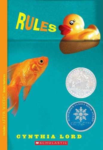 "Part of that struggle was due to my first novel, Rules (right). Rules has an amazing cover, and my audience for Rules was wide and diverse. It stretched from 3rd grade to 8th grade, and it included both boys and girls. It was important that the cover for Touch Blue didn't lose any of that audience, but that's a lot to expect from one cover.
"So when I opened the envelope and saw Touch Blue's cover, I was surprised and delighted. It kept my audience. The cover also went well with Rules' cover. And it showed something deeper about the story. Touch Blue takes places on a small island in Maine. The island school is in danger of being closed, because there aren't enough students to keep it open. So the islanders come up with a plan to adopt foster children to give those children good homes and to increase their school enrollment. Touch Blue is fiction, but it was inspired by a true event.
"Tess, my main character, has a little sister who loves to play Monopoly. A boy named Aaron comes to live with them through foster care, and they get off to a rocky start. The first time Tess feels like the three kids are finally becoming a family happens during a game of Monopoly. The tokens on the cover of Touch Blue are the ones the kids choose. Tess chooses the boat, her little sister chooses the dog, and Aaron chooses the car.
'When I looked at the cover, I could see how much thought my editor, Leslie Budnick, and art director, Marijka Kostiw, and David Saylor at Scholastic had put into the cover--not just showing the facts of the story in an appealing way, but also hinting at the deeper themes underneath it.
"My editor asked me what I thought. After saying how much I loved it, I brought up three small concerns. In the first version of the cover, there was a white walkway extending from the house over the ocean to the edge of the cover.
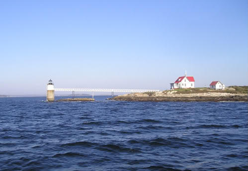 "I'm not sure where Marijka found the photo, but I recognized the house immediately. In a strange coincidence, I had done a research trip for Touch Blue back in 2008 and had taken a photo of that same house (left). It's actually a lighthouse keeper's cottage about an hour north of where I live, and the walkway leads to a small lighthouse. But without showing the lighthouse on the cover, the walkway looked like a bridge. In Touch Blue, it's important to the story that the island has no bridge. So I asked my editor if they would remove that walkway.
"The second issue was that the color of the water. The book is set in Maine, and the water looked Carribean. But my editor explained when they made the water darker and greener and grayer, as it would be in Maine, it changed the tone of the cover. The scene took on an omninous feel with that change. That would've been the wrong tone for the book. I actually love the blue of the cover, so I was glad to have a good reason to keep it.
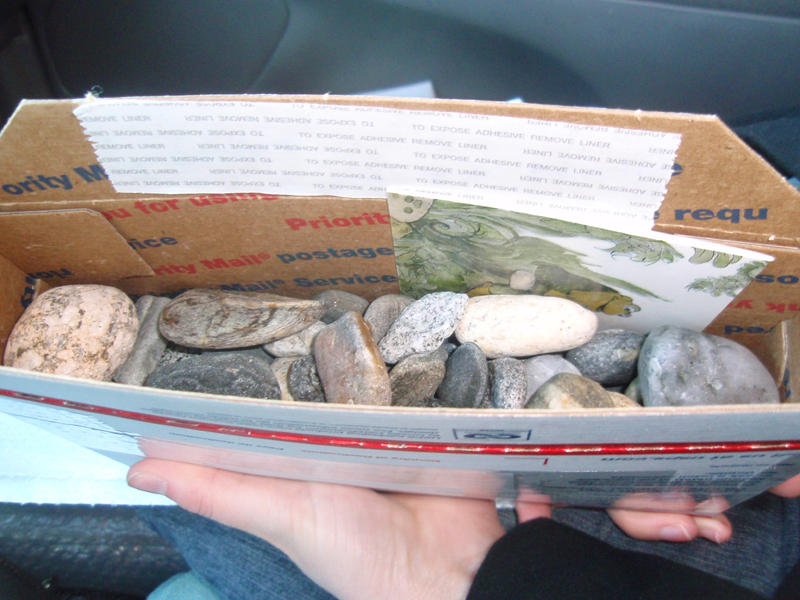
"The last issue was the rocks. Maine beach stones are mostly granite, and the original rocks looked like craft rocks--glossy black and tan. They just didn't look real to me. I live near the ocean, so I offered to send some Maine beach stones, knowing they might say no. And I would have let it go if they had. "But my editor came back and said the photographer agreed I could mail him some rocks! So my daughter and I drove down to the ocean and filled up one of those little 'If it fits, it ships!' boxes from the Post Office and sent off a whole box of Maine beach stones to New York City!

"So when I look at Touch Blue's cover, I see how much thought and care went into it. I see the talent of the people I'm lucky enough to work with. And I see some real rocks from Maine!"
Thanks, Cynthia! I love that you shipped a box of rocks! I also think the story sounds amazing, and it's so intriguing that it was inspired by real events.
What do you guys think of this cover? Have you read the book?

