 Lindsey Leavitt is a member of The Contemps (along with me) and her new book, Sean Griswold's Head, is a super fun read. Hear more about what I thought at The Contemps blog.
For now, we're gonna talk covers! Here's Lindsey:
Lindsey Leavitt is a member of The Contemps (along with me) and her new book, Sean Griswold's Head, is a super fun read. Hear more about what I thought at The Contemps blog.
For now, we're gonna talk covers! Here's Lindsey:
"It all started with a head.
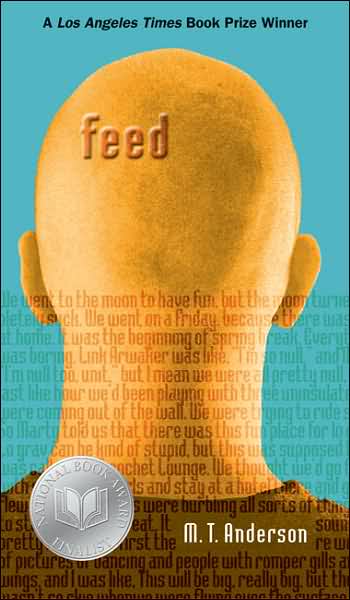
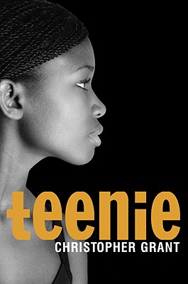
"Sean Griswold's Head, to be exact. When I started writing this book, I knew I wanted the story to be about that boy--the one who is always there, the one you know nothing about, except maybe that he wears the same shirt every Thursday, or peed his pants two days in a row in second grade. 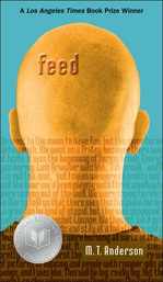 So I always pictured Sean's head when I thought of the cover. Kind of like Feed by MT Anderson (right), but with hair.
"I shared this with my editor when we first broached cover design, and she said, great! But we do want to play up the romance angle, so we'll think about it. I never considered the romance to be the focus of the story, but I figured... cool. Give him a HOT head then. Hot heads sell.
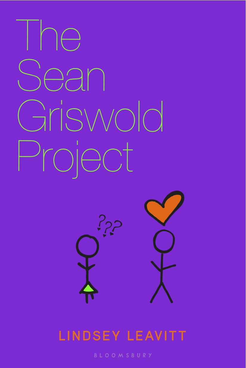
 "But then I got an email that sales wasn't sure the title would work. We went back and forth for a few months, brainstorming titles. It's an aggravating process--there were some possibilities I liked, but nothing felt right. At one point, my publisher was leaning toward THE SEAN GRISWOLD PROJECT. Here is one cover comp that design came up with that my editor just now sent me (left). I'm glad we didn't use this. I can say that now, right?
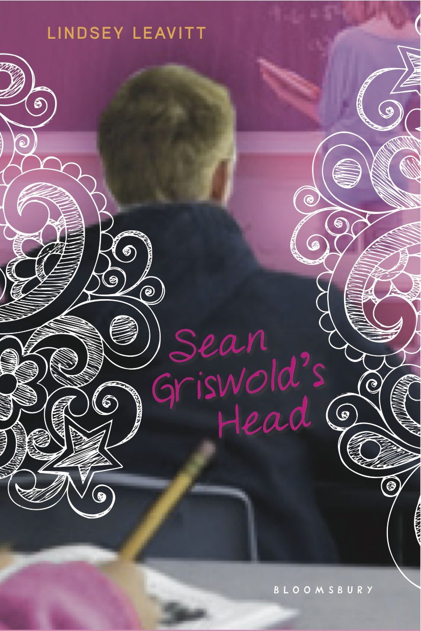
"I trusted my publisher, but I was still feeling down about the title madness. Then my editor sent me an email, saying there had been a meeting and they'd decided the title should be... SEAN GRISWOLD'S HEAD.  Sales had somehow warmed up to the idea, and they agreed I could keep the quirky title IF they could get the romance in there still. So we went back to the head. My editor and I talked and they decided to go with the boy-in-class approach with some doodles. A few weeks later, my editor sent an email explaining that this was a VERY ROUGH comp, a non-refined work-in-progress, and the designer was still toying with the idea. Which was a relief because it looked, you know, rough (right).
"I wasn't a fan of the purple. Or the boy. Or the doodles. Or the font.
Sales had somehow warmed up to the idea, and they agreed I could keep the quirky title IF they could get the romance in there still. So we went back to the head. My editor and I talked and they decided to go with the boy-in-class approach with some doodles. A few weeks later, my editor sent an email explaining that this was a VERY ROUGH comp, a non-refined work-in-progress, and the designer was still toying with the idea. Which was a relief because it looked, you know, rough (right).
"I wasn't a fan of the purple. Or the boy. Or the doodles. Or the font.
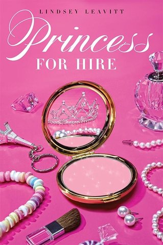
"Okay, so I wasn't a fan. And I felt bad, because Bloomsbury had listened to my input throughout the developmental process. I got to keep my title. They'd pretty much given me exactly what I asked for.  And I'd even decided not to say anything, but... the purple just did me in. My first book (PRINCESS FOR HIRE, left) had a girly cover, and I was really hoping to branch out with color schemes.
"My agent wrote with some notes, and I decided to just talk to my editor, who'd been wonderful every step of the way, and asked for my input. So I got over myself and wrote back with my thoughts. We decided that the doodles should tell more of a story, and that the color scheme and font should be quirkier, like Juno. I hung up the phone feeling really excited about the new direction.
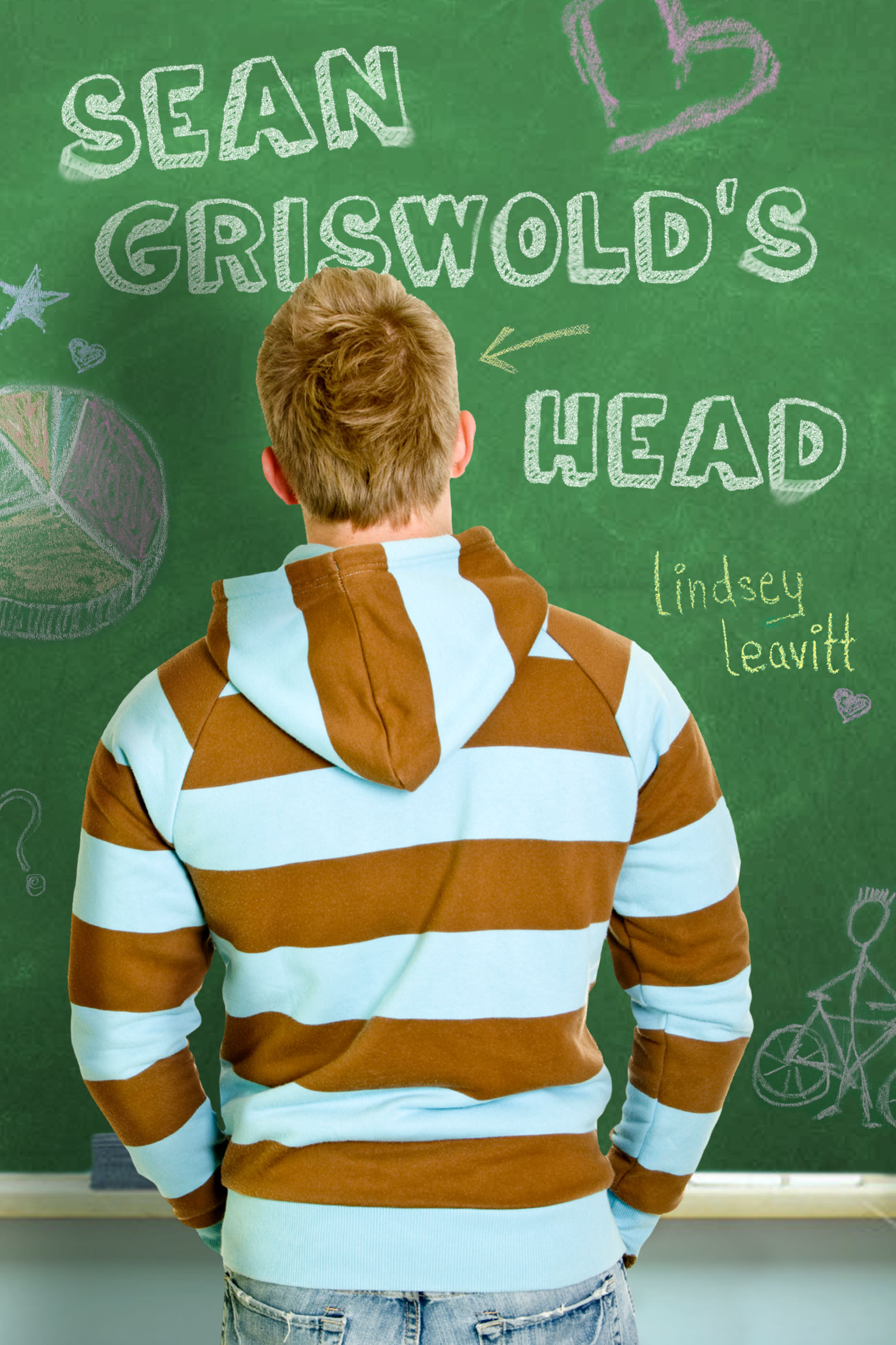
"And the next time I got a cover email, I screamed. I LOVED the font. I LOVED the chalkboard. I LOVED how hot Sean was without even seeing his face! And they'd even added a heart for the romance :) I called my editor right away and gushed and garbled. This was what I wanted, and I didn't know it until I saw it (below, left).

 "From there, the designer made a few more changes to the cover: the sweatshirt stripes, sharpened the colors, added the genius tag line, played with fonts, and slimmed Sean's build (he looked like a wrestler, when he's a tri-athlete). Which all led us to the final cover (above, right). I love the final product, love the stock image of Sean, and hope teens will open the cover to fall in love with the boy (and girl!) on the inside of the pages as well."
Thanks, Lindsey! I love the final cover--especially the chalkboard doodles--and the iconic head-in-front-of-you in class is such a fun idea. This concept evolved so much, and I'm so glad Bloomsbury made it just what it needed to be!
What do you guys think?
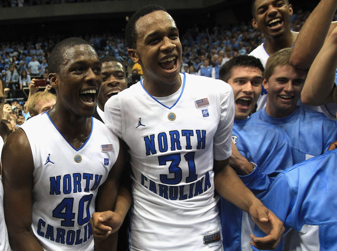
 And these are my boys this weekend (with apologies to my twitter followers). Go, Heels!
 Happy weekend!


