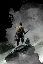
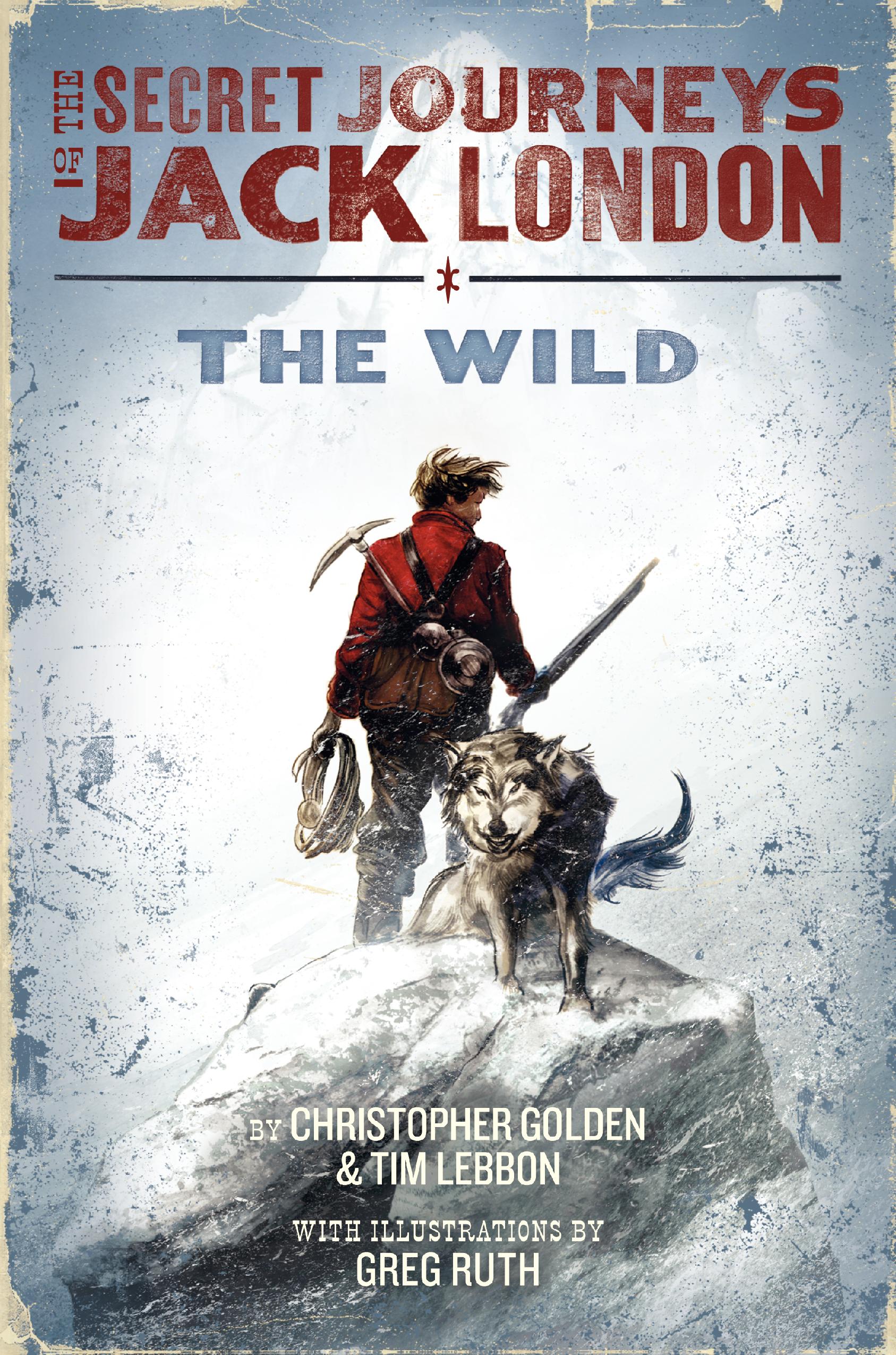
In a special treat of a Cover Story, there are three people weighing in today. Here are Tim Lebbon (TL) and Christopher Golden (CG), the authors, and Greg Ruth (GR), the illustrator who did the cover (actually, editor Jordan Brown weighs in too, so it's the first ever four-person Cover Story!).Did you have an idea in mind for your cover as you were writing the book?
TL: I think I always imagined the cover featuring Jack himself, probably in an action scene, although I'm always concerned at what a character might look in cases like this. Greg's final product exceeded my wildest expectation - there's so much power in that image, so much Wild, that it just took my breath away.
CG: I had been thinking of something almost antique and old-fashioned looking to go along with the Jack London era adventure tone. Greg managed to come up with something that served that desire while being totally contemporary and beautiful. We're lucky to have him on this. Despite warnings to the contrary, people often do judge books by their covers, and this one is a home run.
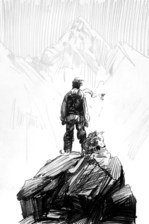
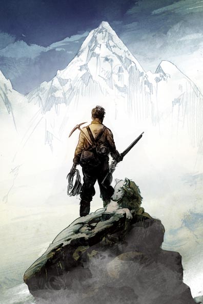
GR: I think the notion going in was to thread the needle between making a cover that was distinctly Jack London, but without actually showing Jack's face... which was of course the hard trick to manage. I needed then to make everything about the image a contributor to his character, and to that I did a number of initial sketches of him atop some snow ridge, either with his back to us, or facing us, but his face obscured by snow and light. We quickly settled on the former and worked it towards fulfilling the initial goal along those lines.
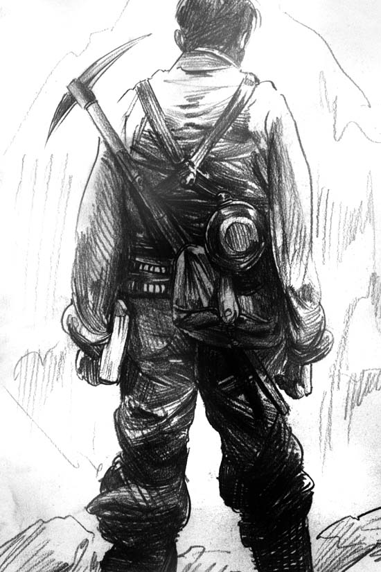
[Below, see two of Greg's eight intial sketches for the cover, at left, all very different ideas, these are the two to which we most gravitated. They loved the scale and the weight of the one with Jack looking out from the precipice, and also the intricate detail of the more close-up image of Jack's back. They asked if Greg could combine them a bit in a more refined sketch, and that one is on the far right:]
In a special treat of a Cover Story, there are three people weighing in today. Here are Tim Lebbon (TL) and Christopher Golden (CG), the authors, and Greg Ruth (GR), the illustrator who did the cover (actually, editor Jordan Brown weighs in too, so it's the first ever four-person Cover Story!).Did you have an idea in mind for your cover as you were writing the book?
TL: I think I always imagined the cover featuring Jack himself, probably in an action scene, although I'm always concerned at what a character might look in cases like this. Greg's final product exceeded my wildest expectation - there's so much power in that image, so much Wild, that it just took my breath away.
CG: I had been thinking of something almost antique and old-fashioned looking to go along with the Jack London era adventure tone. Greg managed to come up with something that served that desire while being totally contemporary and beautiful. We're lucky to have him on this. Despite warnings to the contrary, people often do judge books by their covers, and this one is a home run.
GR: I think the notion going in was to thread the needle between making a cover that was distinctly Jack London, but without actually showing Jack's face... which was of course the hard trick to manage. I needed then to make everything about the image a contributor to his character, and to that I did a number of initial sketches of him atop some snow ridge, either with his back to us, or facing us, but his face obscured by snow and light. We quickly settled on the former and worked it towards fulfilling the initial goal along those lines.
[Below, see two of Greg's eight intial sketches for the cover, at left, all very different ideas, these are the two to which we most gravitated. They loved the scale and the weight of the one with Jack looking out from the precipice, and also the intricate detail of the more close-up image of Jack's back. They asked if Greg could combine them a bit in a more refined sketch, and that one is on the far right:]

 Did your publisher ask for your input before the art dept started working?
TL: We talked generalities about book design, the feel we wanted for it. But we didn't impose any restrictions, because we all had faith that Greg would come up with something wonderful.
CG: We did talk about the desire to have something that set the tone, that was both contemporary and yet communicated the classic adventure tone. Our editor, Jordan Brown, is one of the most perceptive people I've ever met in publishing, and he knew exactly what would pull it all together, and that Greg was the artist for the job.
GR: Yeah it was great in that way--and unusual to be honest. I find we nearly always end up with the best cover when at this early stage I'm given the freedom to sort of pursue our initial course based on what in the book strikes me as a potent image. Typically as an artist on a cover job, you'll get a really heavy handed direction right off the bat, usually initiated by marketing to do essentially just draft an already decided upon image as if you were merely a glove waiting for a hand, rather than being allowed to do what you do that got you the job in the first place. This was absolutely not the case and I think everyone giving me a first crack at it got us where we wanted to go in a way the usual process would have otherwise prevented entirely.
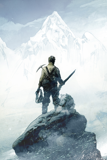
[Greg sent three color sketches, below, so they could decide on a direction for palette. Editor Jordan Brown says, "Although they were all interesting, we ended up going with something closest to the far left version. We loved the other two, actually--the second, which was a bit metaphysical, and the last, which felt a bit more like gritty taiga than frigid tundra--but the first one most caught our eye for the iciness, the swirling weather, and the way Jack stood out against all the snow around him. We asked Greg to see if he could make Jack pop a bit more, set him off against the indifferent and violent landscape around him in a way that is almost violent itself. We also asked if he might be able to make the wolf just a bit more active."]
Did your publisher ask for your input before the art dept started working?
TL: We talked generalities about book design, the feel we wanted for it. But we didn't impose any restrictions, because we all had faith that Greg would come up with something wonderful.
CG: We did talk about the desire to have something that set the tone, that was both contemporary and yet communicated the classic adventure tone. Our editor, Jordan Brown, is one of the most perceptive people I've ever met in publishing, and he knew exactly what would pull it all together, and that Greg was the artist for the job.
GR: Yeah it was great in that way--and unusual to be honest. I find we nearly always end up with the best cover when at this early stage I'm given the freedom to sort of pursue our initial course based on what in the book strikes me as a potent image. Typically as an artist on a cover job, you'll get a really heavy handed direction right off the bat, usually initiated by marketing to do essentially just draft an already decided upon image as if you were merely a glove waiting for a hand, rather than being allowed to do what you do that got you the job in the first place. This was absolutely not the case and I think everyone giving me a first crack at it got us where we wanted to go in a way the usual process would have otherwise prevented entirely.
[Greg sent three color sketches, below, so they could decide on a direction for palette. Editor Jordan Brown says, "Although they were all interesting, we ended up going with something closest to the far left version. We loved the other two, actually--the second, which was a bit metaphysical, and the last, which felt a bit more like gritty taiga than frigid tundra--but the first one most caught our eye for the iciness, the swirling weather, and the way Jack stood out against all the snow around him. We asked Greg to see if he could make Jack pop a bit more, set him off against the indifferent and violent landscape around him in a way that is almost violent itself. We also asked if he might be able to make the wolf just a bit more active."]

 What other tweaks happened along the way?
GR: If I recall correctly there were discussions back and forth about how to make the figure look more like Jack--since we weren't going to be relying on his face, the form he cut, his size, stance posture, etc... all had to carry that weight, so we did tweaks that a good deal. There was also some back and forth regarding the wolf especially--and of all the elements of the cover, the wolf went through the most changes simply because the burden of Jack's spirit was resting on his furry shoulders, and it was essential to get him right.
What other tweaks happened along the way?
GR: If I recall correctly there were discussions back and forth about how to make the figure look more like Jack--since we weren't going to be relying on his face, the form he cut, his size, stance posture, etc... all had to carry that weight, so we did tweaks that a good deal. There was also some back and forth regarding the wolf especially--and of all the elements of the cover, the wolf went through the most changes simply because the burden of Jack's spirit was resting on his furry shoulders, and it was essential to get him right.
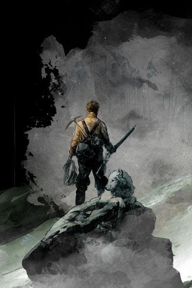
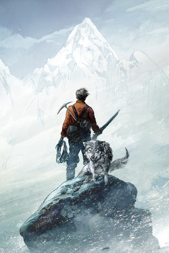
 [At right is the last sketch prior to final art. Editor Jordan says, "You can see that Greg took our somewhat vague direction and really ran with it: Jack's jacket hue has become more vivid, and the wolf is alive with movement. It was clear to us that we had the piece we wanted, and only asked for a few more tiny tweaks - we asked for a bit more deeper red in the jacket, and we wanted to see if Greg could turn Jack's face more toward the camera, in a slightly more heroic silhouette that reveals his age a bit more clearly as seventeen."]
How was the cover created, artistically?
GR: I guess this is mine to answer... umm I probably used portions of myself to get certain details right. If I'm having trouble getting a set of the shoulders right, or the way a hand twists a bit when it's arm is sitting in a certain way, I'll stop and take a picture of myself to get the basic architecture down. Otherwise I really just researched the period for garb, equipment tools, etc... I have this huge folder filled with that kind of stuff and will have that out and running while I'm sketching. While the initial thrust of the painting is what draws you in, it's those details that keep you there--or have you returning to it. As for the wolf, well I had in the recent past done a Conan graphic novel for Dark Horse, and a particular issue was devoted to young Conan fighting off a wolf attack bare handed... so I had a lot of foundation from which to draw upon to get the wolf sorted properly.
[At right is the last sketch prior to final art. Editor Jordan says, "You can see that Greg took our somewhat vague direction and really ran with it: Jack's jacket hue has become more vivid, and the wolf is alive with movement. It was clear to us that we had the piece we wanted, and only asked for a few more tiny tweaks - we asked for a bit more deeper red in the jacket, and we wanted to see if Greg could turn Jack's face more toward the camera, in a slightly more heroic silhouette that reveals his age a bit more clearly as seventeen."]
How was the cover created, artistically?
GR: I guess this is mine to answer... umm I probably used portions of myself to get certain details right. If I'm having trouble getting a set of the shoulders right, or the way a hand twists a bit when it's arm is sitting in a certain way, I'll stop and take a picture of myself to get the basic architecture down. Otherwise I really just researched the period for garb, equipment tools, etc... I have this huge folder filled with that kind of stuff and will have that out and running while I'm sketching. While the initial thrust of the painting is what draws you in, it's those details that keep you there--or have you returning to it. As for the wolf, well I had in the recent past done a Conan graphic novel for Dark Horse, and a particular issue was devoted to young Conan fighting off a wolf attack bare handed... so I had a lot of foundation from which to draw upon to get the wolf sorted properly.
 What did you think the first time you saw your cover? Truly! (Final cover at left again).
TL: Wonderful. It summed up so much about the book, and about Jack London, about whom I became fascinated whilst researching the book. He led a remarkable, short life, and he had such a free spirit, and this cover image exudes that sense of unhindered wildness.
CG: So damn lucky. I've had covers run the gamut from awful to wonderful, but with the combination of Greg's art and the amazing design work the folks at Harper have done, this one beats them all. It's such a great, iconic cover.
GR: While I refuse to toot my own horn about this, there are images that I draw or paint that are struggles, that never resolve, or are at best pyrrhic victories, and then there are those that rocket forth as if they're crafting themselves. The latter events are always both the most fun and make the image the most endearing to me personally--of which this assignment was truly and example of. Everything just clicked together. The design was indeed amazing--from the jacket, the more modern type on the cover even down to the binding and case embossing... a book that looks this good is only possible when it's being executed by seriously devoted book nerds, and it has been an absolute joy because of that.
How do you feel about your cover, in the end?
CG: Strangely enough, one of my favorite things on the cover is the mountain in the distance. Jack and the wolf are iconic, but it's the mountain that represents his calling, the lure of the wild and the unknown.
GR: Love Chris' comment about the mountain--while perhaps visually he's right it seems strange to go there first, narratively it's all that matters. Given the stance and set up for the image, this is all about the story of his yearning for the wilderness beyond where he is. He seeks what's over the horizon at every turn, and in the end if I can in any small way deliver that narrative aspect to the single image the cover requires, then I'm over the moon about that. To be honest I tend to really loathe looking at my work after I've done it--it's a terribly unpleasant experience for me, but occasionally a job overcomes that little ego-tantrum, stop focusing entirely upon all the little errors and failings of the piece, and I can look upon it and feel proud about it. This is one of those times. The interior drawings especially. There was just something about the themes, the excellent prose and pacing and the place this book lived that made hearing it's music easy and immediate. Now the only problem is doing it better for the next one!
Thank you, Tim, Christopher, Greg and Jordan! Wow, was that Cover Story epic or WHAT? Just like the book sounds, right? What do you guys think?
PS-This post is part of a huge blog tour, so here's the full schedule in case you want to learn more!
Monday, February 28th
Little Willow at Bildungsroman
Tuesday, March 1st
Kiba Rika (Kimberly Hirsh) of Lectitans
Wednesday, March 2nd
Kim Baccellia from Si, Se Puede! and Young Adults Book Central
Thursday, March 3rd
You're here!
Friday, March 4th
Justin from Little Shop of Stories
Monday, March 7th
Rebecca's Book Blog
Tuesday, March 8th
Martha Brockenbrough, author of Things That Make Us [Sic]
Download the electronic press kit for THE SECRET JOURNEYS OF JACK LONDON.
What did you think the first time you saw your cover? Truly! (Final cover at left again).
TL: Wonderful. It summed up so much about the book, and about Jack London, about whom I became fascinated whilst researching the book. He led a remarkable, short life, and he had such a free spirit, and this cover image exudes that sense of unhindered wildness.
CG: So damn lucky. I've had covers run the gamut from awful to wonderful, but with the combination of Greg's art and the amazing design work the folks at Harper have done, this one beats them all. It's such a great, iconic cover.
GR: While I refuse to toot my own horn about this, there are images that I draw or paint that are struggles, that never resolve, or are at best pyrrhic victories, and then there are those that rocket forth as if they're crafting themselves. The latter events are always both the most fun and make the image the most endearing to me personally--of which this assignment was truly and example of. Everything just clicked together. The design was indeed amazing--from the jacket, the more modern type on the cover even down to the binding and case embossing... a book that looks this good is only possible when it's being executed by seriously devoted book nerds, and it has been an absolute joy because of that.
How do you feel about your cover, in the end?
CG: Strangely enough, one of my favorite things on the cover is the mountain in the distance. Jack and the wolf are iconic, but it's the mountain that represents his calling, the lure of the wild and the unknown.
GR: Love Chris' comment about the mountain--while perhaps visually he's right it seems strange to go there first, narratively it's all that matters. Given the stance and set up for the image, this is all about the story of his yearning for the wilderness beyond where he is. He seeks what's over the horizon at every turn, and in the end if I can in any small way deliver that narrative aspect to the single image the cover requires, then I'm over the moon about that. To be honest I tend to really loathe looking at my work after I've done it--it's a terribly unpleasant experience for me, but occasionally a job overcomes that little ego-tantrum, stop focusing entirely upon all the little errors and failings of the piece, and I can look upon it and feel proud about it. This is one of those times. The interior drawings especially. There was just something about the themes, the excellent prose and pacing and the place this book lived that made hearing it's music easy and immediate. Now the only problem is doing it better for the next one!
Thank you, Tim, Christopher, Greg and Jordan! Wow, was that Cover Story epic or WHAT? Just like the book sounds, right? What do you guys think?
PS-This post is part of a huge blog tour, so here's the full schedule in case you want to learn more!
Monday, February 28th
Little Willow at Bildungsroman
Tuesday, March 1st
Kiba Rika (Kimberly Hirsh) of Lectitans
Wednesday, March 2nd
Kim Baccellia from Si, Se Puede! and Young Adults Book Central
Thursday, March 3rd
You're here!
Friday, March 4th
Justin from Little Shop of Stories
Monday, March 7th
Rebecca's Book Blog
Tuesday, March 8th
Martha Brockenbrough, author of Things That Make Us [Sic]
Download the electronic press kit for THE SECRET JOURNEYS OF JACK LONDON.
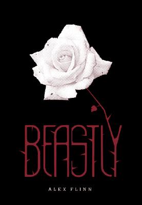 Alex Flinn, #1 New York Times bestselling author of Beastly (you may have heard of a little movie based upon this book, no?) is here to talk about the evolution of her cover. Take it away, Alex!
"I'm not a very visual person, and I knew the art department would do their thing. I've generally been pleased with my covers.
Alex Flinn, #1 New York Times bestselling author of Beastly (you may have heard of a little movie based upon this book, no?) is here to talk about the evolution of her cover. Take it away, Alex!
"I'm not a very visual person, and I knew the art department would do their thing. I've generally been pleased with my covers.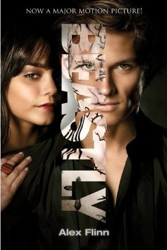 "Regarding the original cover, above, I was happy with it. I was a bit concerned about whether the rose would be a turn-off to my usual boy audience, but the black cover seems to make it less feminine. At least, plenty of boys read the book.
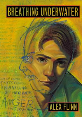 "I was really quite pleased with the Beastly cover and had no suggestions. The original cover is a drawing, and the movie tie-in cover is the movie art and features the actors (Vanessa Hudgens and Alex Pettyfer)."
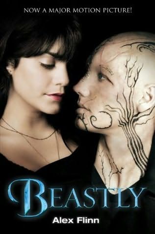 Thanks, Alex! Note: After we did this interview, the movie poster changed, and so did the tie-in cover. The actual cover on shelves is shown at right.


![everlasting[1].jpg](http://static.squarespace.com/static/53482f88e4b0b891fcd5a71e/5350081be4b048f0b406808a/5350135de4b048f0b408d6a4/1397756765899/everlasting%5B1%5D.jpg?format=original)