Cover Stories: The Language of Love by Deborah Reber

NewLangofLove.jpgHappy Valentine's Day! I knew exactly which book I wanted to feature today. Actually, it's two books. And Deborah Reber, author of The Language of Love (one of the books in this two-book set) is here to tell the story behind the cover of Love, Love, Love, which also includes a book by Caroline Goode. "If the cover story for my book Language of Love were to be made into a movie, it would have as many twists and turns as any good romantic comedy.

"It all started with this cover, below right, which I LOVED. This original cover was illustrated by Ann Zeak, who has designed covers for the more than two dozen Simon Pulse Romantic Comedies, the series to which Language of Love originally belonged.

lang of love original.jpg
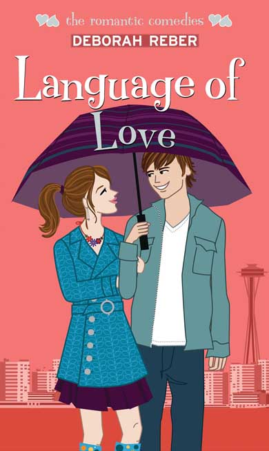
"In developing this cover, Simon Pulse asked for guidance regarding the physical description of my main characters Janna (Emma Waston pre-pixie haircut) and Julian (a scruffier version of a Zac Efron/Chace Crawford blend) and any insight I could provide on the setting for the book or a scene that might make for a good cover. And this is what they came back with, right.

"I absolutely love this cover, especially the color scheme, the adorable rain jacket and rain boots, and Seattle's landmark Space Needle in the background. The scene portrayed on the cover stems from the night that Janna and Julian fell in love. Awww...

"But then this cover went away.

"Simon Pulse made some changes with their Romantic Comedies series and decided to repackage them and create 2-book collections in a bigger size with a new, photographic cover treatment.

"To be honest, I was pretty bummed when I found out about this, partly because my book publication date got pushed from June to December, partly because I would rather my book have been a standalone as opposed to packaged with another story, and partly because I loved the original cover so very much.

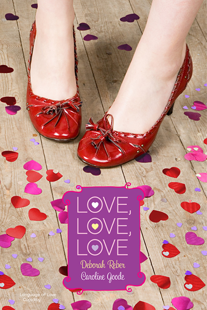
"So, I was pleasantly surprised when a few weeks later, I received an email from my editor with this image attached: NewLangofLove.jpg "As soon as I opened up the jpeg, I realized I could fall in love again.

"I didn't provide any input on this new cover - the publisher worked hard to create a cover that would tie together the two stories contained within without being specific to either one. To me, this cover is all about the mood it evokes - love, happiness, joy, frivolity, playfulness. And then there are those adorable shoes.

"I've gotten more comments on those little red shoes than almost anything else regarding the book. People have responded so favorably to this design, and that, along with the flat finish of the cover, the layout of the interior, and the bang for the buck (hey, you really can't beat 2 books in 1), makes for a pretty great package (IMHO).

"About those shoes...yes, they are too cute. And no, I don't own a pair. Although I am certainly keeping my eyes open."

EndlessSummercover.jpg
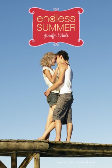
Thanks, Deborah! I adore the final cover -- I think the cartoon covers are cute, but sometimes I think they turn off older readers who might love the romance. This story reminds me of Jennifer Echols's tale about Endless Summer, which combined two of her Simon Pulse romantic comedies (left). You definitely can't beat two books in one, and romantic comedies are such bubbly, fun reads that this seems like the perfect book to pick up, oh, today?

What do you guys think of the cover, and of the change in the Simon Pulse romantic comedies line in general?

Photo Friday + Cover Story: Blessed by Cynthia Leitich Smith

MW and CLS.JPG This week, I got to meet the amazing Cynthia Leitich Smith at a super-fun event at the Brooklyn Public Library. She was incredible and dozens of kids were totally engaged as she spoke -- about 30 hands went up when she asked for questions. Loved it! That's us, above. BLESSED_hardcover_CP.jpgHer latest book, Blessed, came out in January, and the Cover Story is awesome. So here's Cynthia with a Photo Friday/Cover Story mix:

"I knew what I didn't want on the cover of Blessed: a sword. Not because I don't like swords (I do!*) or like them on covers (ditto!), but because the sword in the story is borrowed, and I wanted something that was more closely related to Quincie herself.

"Beyond that, I had no idea. Book one in the series, Tantalize (right), featured a profile of the protagonist. tantalize_paperback.jpgBook two, Eternal, featured a luminescent angel wing (below left). So there wasn't a standard pattern, and I felt great about that.

"This series isn't the story of one protagonist. It's the story of four. The books are coming out in both prose and graphic format. Some are told in a singular point of view, others in alternating. If I wasn't going to embrace a formula, why should the cover designer(s)?

"I had a lot of faith in Candlewick Press. One of the reasons I decided to first send Tantalize to the house was because of the wonderful art and production values of the books on its list.

eternal_paperback.jpg"When I first saw the cover, I was so surprised to see the dress! I don't know why. It's something symbolic of Quincie, which is exactly what I wanted, and it speaks to several themes of the novel.

"I did worry a bit that it would be off-putting to boys, especially because a couple of men in my life made a point of saying so. But I often hear from guy readers who weren't the least repelled by the photo of Quincie on the cover of Tantalize. So, I'm hopeful that, coupled with the other books in the series, it'll be clear that Blessed is for both genders.

"To the extent that girls tend to be the romance readers, there's plenty for them here. But my books aren't genre romances per se. They also feature strong elements of suspense, action, and mystery. So, readers--both male and female--looking for more will find it.

BLESSED_hardcover_CP.jpg"I'm crazy about the cover, and I think the white stands out on shelves. I didn't expect to see the rose petals, but the red provides a lovely Gothic juxtaposition as does the makeshift path.

"The gown is Quincie's late mother's wedding dress, and Quincie wears it into battle at the end of the story. Growing up, she felt a bit overshadowed by her mom and has been trying to fill her shoes at the family restaurant.

"More recently, the vampire chef Bradley, who cursed Quincie with his blood, had dressed her in a white nightgown on the night she rose undead. So, this is her way of both distracting him and facing him down on her own terms.

"What's more, a wedding is a sacrament (or at least it is to Quincie), and this is a novel wherein she is given a guardian angel, which reassures her that she's still a child of God. That her soul is still wholly hers.

"Finally, Quincie is fighting alongside her true love, the hybrid werewolf Kieren, which is romantic in its way, especially since they've been recently reunited after what could've been a permanent separation. "They're only seventeen with no plans of marriage at the moment, just reveling in being together and being in love. That said, Kieren's mother is a wedding planner, so you know, if the day ever comes...!

"*I like swords as decorative/art objects and in stories, but in real life, I wouldn't want one pointed at me or you."

Thanks, Cynthia! I think all of her covers are gorgeous, and I'm a sucker for an amazing dress shot. Super Valentiney, right? What do you guys think?

PS-The sky on my walk home from that library visit? So pretty/creepy it made me want to be listening to Cynthia's book on my iPod.

park sky.jpg

Oops! Winner!

ct_greetings_florida.jpgSorry I missed Win-It Wednesday yesterday! The winner of Michael Northrop's Trapped is... LiLi! Send me your address, L.I'm not sure if LiLi's living in Florida will make the book seem more like a fantasy novel than a contemporary one, but I sure wish I were in the Sunshine State. (And I'm going there next week--yay!) And, that said, I'm buried under work! Book stuff! So Win-It Wednesday is on pause until next week. Besides, it's Thursday anyway and I like the "W" thing of Win-It Wednesday so it just wouldn't work today. I'm justifying. Side note: Don't you love those old-timey post cards? Divine. PS-If you're in a win-it mood and I've disappointed, I direct you to readergirlz, where Megan Whalen Turner is giving away *twenty* copies of her awesome book The Thief. Go, go!

Cover Stories: The Space Between Trees by Katie Williams

space cover.jpgKatie Williams has one of the most jump-out-at-you covers I've seen in a while. It's got three dimensional cut-outs. Seriously! It's hard to do the cover of The Space Between Trees justice in this 2D format, but hopefully you've seen the book in person (if you haven't, definitely seek it out). Here's Katie with the Cover Story:

"I'm superstitious, so as I'm writing something, I try hard not to think about the will it? or won't it? of publication, and that includes dreaming up cover designs. I must be very strict with myself! In fact, I try to pretend that I have the demon hand from the Evil Dead movies; my left hand may be sending out stuff to editors or my agent, but the rest of me is writing away in an oblivious, artistic bubble.

"Once I found out that The Space Between Trees was accepted for publication, I suppose I may have entertained a cover daydream or two. I probably imagined we'd end up with the body part of a girl--so popular these days--but I never imagined anything as cool as what Chronicle did.

SpaceBtwnTrees_PubCover_02.jpg"Chronicle is so good to their authors! My editor asked my for input on the design. She had the idea of the cut-out branches and negative space, which came from the title (also, her idea). I suggested that the tree branches might form the outline of a girl's face, and the art team even mocked that up for us (right). In the end, though, it was too subtle an image for someone glancing at a bookshelf packed with enticing covers.

SpaceBtwnTrees_CatCover_03.jpg SpaceBtwnTrees_Cover01.jpg SpaceBtwnTrees_Cover02.jpg

"The cover of the ARC (advanced reader's copy, above) used a red, gray, and black color scheme and no girl outline. (It also has a typo; see if you can spot it!) But even though the novel isn't girlie, the two main characters are girls, and so Chronicle quite rightly wanted to appeal to that readership. To do this better, the designers added the girl outline and changed the color scheme to a very sharp metallic lavender, below:

SpaceBtwnTrees_Case_120209.jpg "Okay, I'm not lying here. When I first saw my cover, I genuinely thought, I hope readers judge my book by its cover. I couldn't believe how different it was, how gorgeous, how evocative.

"The cover design--tree branches with the title and image peeking through between them--comes from the title, which is, in turn, taken from a sentence toward the end of the novel. One of the themes explored in The Space Between Trees is that what is not there--a memory, an idea of someone, a lie--can sometimes have more power than what is present and true. The spaces between the trees can be more powerful than the trees themselves. The cut-out cover, which one can open and peer through, expresses this idea better than any flat image could. It truly is the perfect cover for my book."

Ahh. It's gorgeous and unique. Thanks, Katie! I can honestly say that I see hundreds of covers and this one is just, like, BAM!

Have you guys seen it in person? Let me know what you think.

PS-I just had to ask Katie where the typo was, and it's indeed on one of the covers shown here. Ack! So mad I didn't see it. Can you find it? I'll send a mystery gift package to the first person who comments with its location (click to enlarge the covers for a closer look).

Photo Friday: San Diego!

Sadly, I didn't get photos with Kara and Ruthie on the first part of my sunny SD trip, but rest assured that we had a blast. Here are some shots Erin took of Part 2:Now this is a BOAT! (Though, shoutout to my dad, I still prefer sailboats.) boat.jpg There was a lovely bar on the boat too: erin mel on boat.jpg The view from the water, and Erin on the back of the yacht: san diego from water.jpg erin on boat.jpg And hiking in Torrey Pines with Erin. So pretty. Sigh. mel erin tpines.jpg mel tpines.jpg Have great weekends!

Win-It Wednesday: Trapped by Michael Northrop

Last week's winner of Fall for Anything by Courtney Summers is... Travis! Send me your address, T.trapped.jpgThis week, I'm giving away an ARC of Trapped by Michael Northrop. I've joked with Michael that these massive snowstorms are probably the best promotional efforts by an author that I've ever seen. I'm only half kidding. I've raved about this book in other spots (like on The Contemps this week), so here, I'll just tell you that it's un-put-downable. For real. To enter to win, how about you just tell me where you are and what the weather's like there. It's all we New Yorkers can talk about: "Snow! Ice! Brrrrr!" So, what is the weather like? I'll chose a winner next week. PS-Here's Michael being hilarious as usual, just for fun:

Cover Stories: The Iron Witch by Karen Mahoney

The Iron Witch Final.jpgKaren Mahoney is here to tell the tale behind her amazingly gorgeous new cover. The Iron Witch is out this month!"My publisher asked for my input on the cover, which was awesome! (And unexpected.) I'm lucky that Flux are open to author input - although obviously there's no guarantee that what you say will be in any way 'followed' or slavishly adhered to. All I really wanted was to make sure that we didn't actually see Donna's face (I'm not so keen on that with covers, though there are always exceptions that I fall in love with), and that we get to see her iron tattoos. Other than that, I just left it up to the art department. "Truly, the very first time I saw the initial cover concept I fell in love. I can honestly say that the cover for The Iron Witch is perfect - every single part of it. I can't believe I was so lucky with my first ever book! I didn't have any need to ask for changes (even if they would have been considered) because there was simply nothing I wanted to change. I couldn't believe how well all the elements came together: Donna's pose shows how conflicted she is, and how angst-filled the decision she has to make; her tattoos are gorgeous and exactly how I imagined them; and she's even holding a vial of the Elixir of Life (which plays a big part in the story). The vial is beautiful, and Lisa Novak - the amazing designer - made the liquid inside it red, which is accurate to the story. I couldn't possibly ask for more. "I'll now pass you over to Lisa Novak from Flux to tell you more about how she actually put the cover together. It's so interesting to hear Lisa talk about the cover in this way. Everything she says about the presentation of the main character (Donna Underwood) and the general atmosphere of the cover - and, therefore, of the book - is just perfect: Lisa: "The image of the girl is stock photography. I don't know anything about what prompted the photographer to take the photo the way he did but I can tell you that it is titled 'Grief.' iron_witch_grief.jpgThe only part of the photo that had color in it when I found it was the girl's hair, the photographer had desaturated the rest of the photo to focus the viewer's eye on the hair, the highlights, the way it fell. Because that sort of photo treatment wouldn't work for our book I added the color back into her skin before adding the 'iron tattoo' (right). "When I'm putting together a cover like The Iron Witch I start by searching for the main element, which in this case was the girl. There are about half a dozen stock photo sites that I typically use and after entering some basic search words I end up sifting through hundreds of photos to find the one that speaks most strongly to the book. Sometimes this search can be over in an hour, other times it might take days. I think this one came to me somewhere around the 6 - 8 hour mark of scanning images. "Once I find an image that feels like it might be right I'll look at it and see what I can add or change to make it become the book even more. In this case, I knew I needed to add the iron tattoo to Donna's arm and hand. I wanted something delicate, but densely entwined, and ultimately strong looking in a feminine way. iron_witch_vial.jpg"Next came the vial (left). Because the rest of the cover is fairly stark I wanted the vial to be intricate and beautiful and something you couldn't take your eyes off of. After adding the red Elixir I thought it looked almost a little too out of place and richly colored so I pulled back the saturation a bit and ended up giving it a bit of a steampunky look in doing so. "And finally, to keep the image from floating away in space and to tie her to the title, I added the same iron filigree in the open area around Donna that is on her arm. I think it gives it an overcrowded feeling and helps heighten the tension going on with the angle of her arm and the fact that she's hiding her face from us. I think the cover makes people slightly uncomfortable, yet draws them in at the same time." iron_witch_2.jpg"You can see some alternate cover concepts on Lisa's website [one is on the right] but, really, everyone at Flux was in agreement that there was no competition and our chosen cover was The One." Thanks, Kaz and Lisa! This design is so intricate and lovely -- you can tell how much thought went into it at first glance. The colors are perfect, and the sparkle of the vial is completely intriguing. What do you guys think?

Photo Friday: Wedding in Larchmont

Our friends Jimmy and Becky got married in Larchmont, NY last weekend, and the reception was a full-on black tie affair at the Winged Foot Golf Club. I love wearing a gown! So here are some pics. A group of us, me in the center in my only floor-length gown (thanks, Erin!):

wedding reception.jpg Dave and me:

wedding.jpg And, of course, the gorgeous couple, mid dance, taken with my bad-iPhone camera. (They were soooo happy!)

jimbeckydance.jpg Happy Friday!

Cover Stories: Head Games by Keri Mikulski

Head.Games.jpgKeri Mikulski shared her Cover Story for Screwball here in 2009, and now she's back to talk about her new release, Head Games:"As I began writing HEAD GAMES, I definitely pictured a cover that consisted of a combination of boys and basketball. But when it came to the actual moment, I was so engrossed in writing and revising the book, I didn't even think about the cover. "When I first saw the cover, I was in love! Natalie Sousa, the fabulous designer at Penguin, truly captured Taylor Thomas, the main character. And she did a great job implementing the different features of the first two Pretty Tough Books - PRETTY TOUGH and PLAYING WITH THE BOYS (below). The smirk, the clothes, the beach court, the basketball, the feel of the cover - perfect! prettytough.jpg pwtb.jpg "The original version changed a bit. The basketball scene in the background was tweaked to make it more obvious it was a guys vs. girls game. "The final cover truly captures the essence of the book - from the basketball to the romance to the beach to the tension on and off the court - it's perfect!" Thanks, Keri! I love books about sporty girls who are also somewhat girly, and of course I'm totally intrigued by the runway/modeling angle! What do you guys think? PS-Here's the trailer:

Win-It Wednesday: Fall For Anything by Courtney Summers

The winner of last week's contest for Melissa Kantor's The Darlings Are Forever is... Kayte J, who loves Dum Dums! Send me your address, KJ.FallForAnything.jpgThis week, I'm giving away a copy of Fall For Anything by Courtney Summers. You've likely heard about this incredible book (if not, here's My Friend Amy's great review), and it lives up to all the stars and swoons. Courtney Summers gets it so right every time. Love her. To enter to win, tell me what your fictional obsession is. Brittany and Allie have a new blog category about their fictional obsessions (the first one is talking owls, which inspired B's owl collection). So be it from a book, movie, TV show, whatever--as long as you're obsessed, and the object of said obsession is fictional, it counts. Mine? His initials are T.R. and he is often found in dusky Texas sunlight, squinting, smiling ever so slightly and perhaps holding a beer. tim riggins.jpg Sigh.