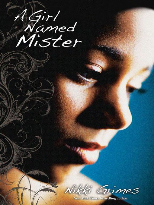
 A Girl Named Mister, by Nikki Grimes, came out last fall. Kirkus Reviews says, "This novel in poetry looks clearly at both teen pregnancy and struggles with faith. Mister is exceptionally well characterized...The language is intimate and immediate."The cover is one that I've stared at a bit in the bookstore, so I had to ask Nikki about the back story. Here she is:
"OMG, I am so in love with the current cover, I'd completely forgotten what it took to arrive at it! I had no musings on a cover when I wrote the text. I never do. But when it comes to covers, I definitely know what I do or don't like when I see it.
A Girl Named Mister, by Nikki Grimes, came out last fall. Kirkus Reviews says, "This novel in poetry looks clearly at both teen pregnancy and struggles with faith. Mister is exceptionally well characterized...The language is intimate and immediate."The cover is one that I've stared at a bit in the bookstore, so I had to ask Nikki about the back story. Here she is:
"OMG, I am so in love with the current cover, I'd completely forgotten what it took to arrive at it! I had no musings on a cover when I wrote the text. I never do. But when it comes to covers, I definitely know what I do or don't like when I see it.
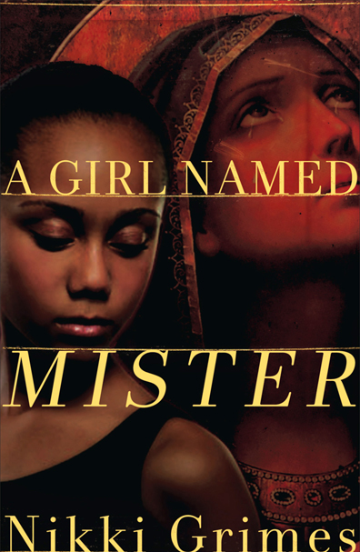 "I remember the original cover proposed to me (right), and I shudder. It featured a young girl who was too mature, and worldly-wise for Mister, and a very stilted image of Mary, which did not align with the fresh-faced young teenager I had in mind. In fact, I wrote Mary as though she and Mister were the same age, while the Mary they had first chosen appeared considerably older. I expressed my concerns to my editor, and the designer went back to work on a new comp. Boy, am I glad!
"If I remember correctly, the trailer and cover were both in production around the same time. I was asked to select one of three possible actresses for the trailer, and the young lady I chose was used for the cover profile, as well.
"When I saw the final cover, it took my breath away! It couldn't be more perfect.
"I remember the original cover proposed to me (right), and I shudder. It featured a young girl who was too mature, and worldly-wise for Mister, and a very stilted image of Mary, which did not align with the fresh-faced young teenager I had in mind. In fact, I wrote Mary as though she and Mister were the same age, while the Mary they had first chosen appeared considerably older. I expressed my concerns to my editor, and the designer went back to work on a new comp. Boy, am I glad!
"If I remember correctly, the trailer and cover were both in production around the same time. I was asked to select one of three possible actresses for the trailer, and the young lady I chose was used for the cover profile, as well.
"When I saw the final cover, it took my breath away! It couldn't be more perfect.
 "The young lady I chose for the trailer and, as it happens, the cover, had the perfect blend of innocence and maturity that matched my character. The flower design that overlays the left side of the photo suggests a blossoming which is on point, too. Mister grows and blossoms in important ways during the course of her story.
"One key feature that makes this cover work is the angle the girl was shot at. She appears to be stepping out of the darkness, into the light, which of course is what Mister does in the story. Brilliant!"
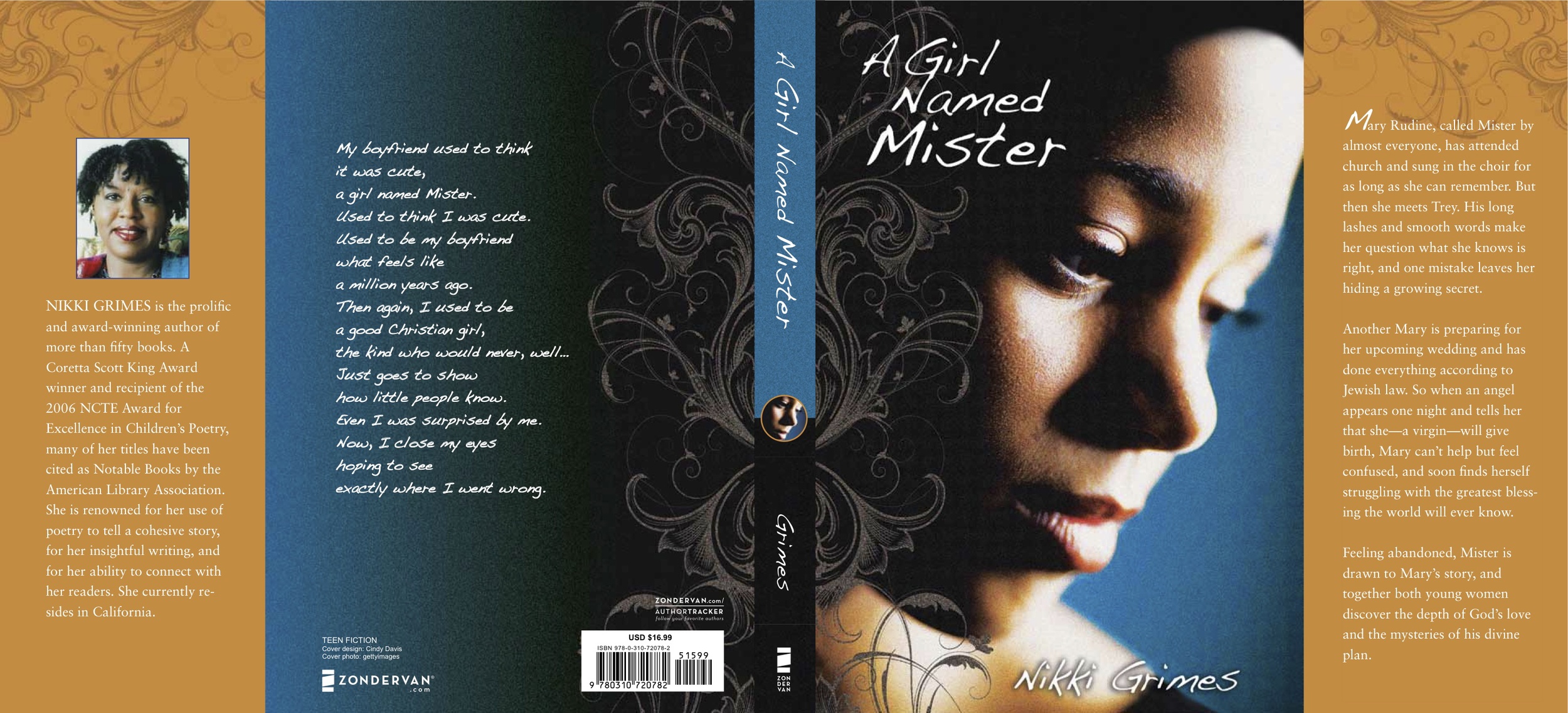
Thanks, Nikki! I think the cover conveys a lot of emotion, and looking at the full spread, I love effect of the illustrated edges and the blue and yellow combination.
What do you guys think?
PS-Watch the trailer, starring the cover model:
"The young lady I chose for the trailer and, as it happens, the cover, had the perfect blend of innocence and maturity that matched my character. The flower design that overlays the left side of the photo suggests a blossoming which is on point, too. Mister grows and blossoms in important ways during the course of her story.
"One key feature that makes this cover work is the angle the girl was shot at. She appears to be stepping out of the darkness, into the light, which of course is what Mister does in the story. Brilliant!"
Thanks, Nikki! I think the cover conveys a lot of emotion, and looking at the full spread, I love effect of the illustrated edges and the blue and yellow combination.
What do you guys think?
PS-Watch the trailer, starring the cover model:
Photo Friday: Book Cat
in Photo Friday
I got some ARCs of Small Town Sinners (those are galleys, or early copies, for the non-book-insidery among us). They're pretty and my cat Swayze loves them, as you can see. (Uh, or maybe he's just bewildered? Cats are tough to read).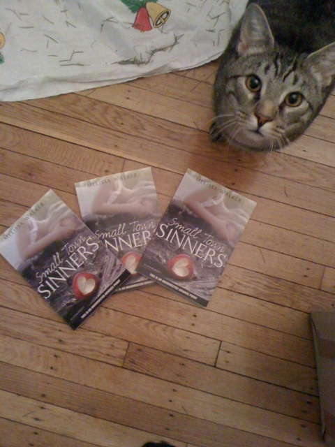 (Note to self: Clean up Christmas tree needles... argh.)
I promise to host a few contests this spring so you can have a chance to win a copy before the release. July 19th still feels far away!
Happy weekend!
PS-My letter to my teen self is up on the amazing site Dear Teen Me today! These letters are all fantastic, I feel honored to be in such company -- definitely go read them!
(Note to self: Clean up Christmas tree needles... argh.)
I promise to host a few contests this spring so you can have a chance to win a copy before the release. July 19th still feels far away!
Happy weekend!
PS-My letter to my teen self is up on the amazing site Dear Teen Me today! These letters are all fantastic, I feel honored to be in such company -- definitely go read them!
Win-It Wednesday: The Darlings Are Forever by Melissa Kantor
Last week's winner of Across the Universe by Beth Revis is... Avery! Send me your address, A. You saw the Cover Story for this book on Monday, yes? Well, now you have a chance to win a copy!
To enter to win, just tell me your... um... favorite snack! Yes, your favorite snack. Those Darling girls are picnicking, and that makes me think of... snacks. Mine, currently, is string cheese. Delicious and oh-so-portable. Your turn.
You saw the Cover Story for this book on Monday, yes? Well, now you have a chance to win a copy!
To enter to win, just tell me your... um... favorite snack! Yes, your favorite snack. Those Darling girls are picnicking, and that makes me think of... snacks. Mine, currently, is string cheese. Delicious and oh-so-portable. Your turn.
I'll choose a winner at random next week! Good luck.
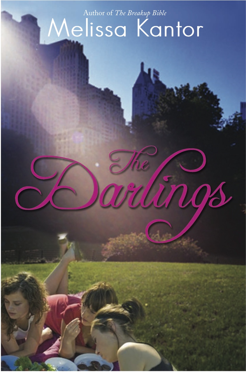
Cover Stories: The Darlings Are Forever by Melissa Kantor
The lovely Melissa Kantor's latest novel, The Darlings Are Forever, is out this month. She dropped by to talk about that oh-so-Central-Park cover:
"I'm not a very visual person, so it's rare for me to have a cover in mind for a book I'm writing. And I'm always amazed when my editor shows me a potential cover. It's like--wow, how'd you think of that? The only cover I ever came up with was the one for The Breakup Bible, right, and that's because it's kind of an inside joke. 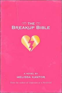 The book is named for a really unhelpful advice book that the main character gets, and my book has the same cover as the (imaginary) advice book.
"So I really had no idea what they should do for the cover of The Darlings Are Forever, and I was just as surprised when I saw it as I ever am!
"Hyperion is very nice about asking for input--and I never have any good ideas. I always say something like, 'What about a charm bracelet?' even though I've never written a book with a charm bracelet as an iconic item. And I often suggest a backpack spilling out its contents. Actually, that's my website, now that I think of it--a bag with everything being dumped out of it. I think because it's my worst fear (spilling out all my stuff in public). Hmm, maybe I'm over analyzing here.
"I always hate the covers the first time I see them. Really. Each time, I'm like, UGH! Why did you do that? Then it grows on me.
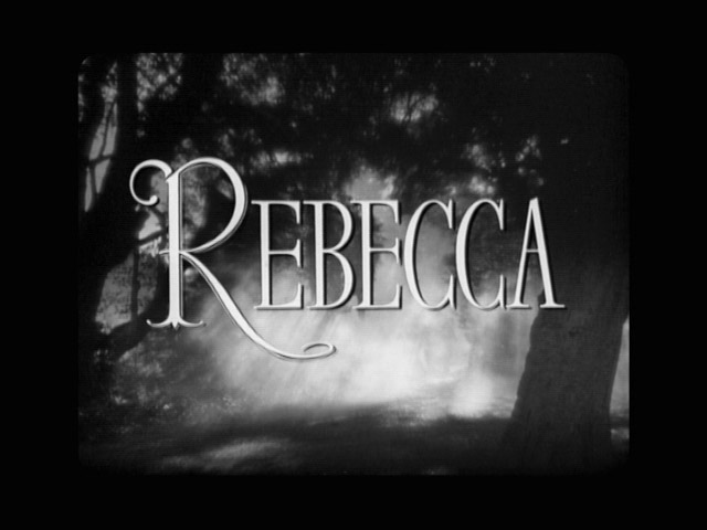
"I made a bunch of suggestions. I hated the first font for the title, and then I saw the movie Rebecca, and the title for that movie is in a really dramatic font that I absolutely loved. I actually googled a still of the title and then emailed it to my editor:
 "The basic concept remained what it was from the beginning, but I had a BUNCH of small changes I wanted made, everything from the girls' wardrobes to the way the light fell over the scene to Victoria's hair color. And they were really good about trying to integrate them. Everything big is pretty much the same, but everything small changed. I like the feel of it a lot better now. (See the initial cover, left, and the final cover, right, side by side, below):
 "They did a photo shoot, which I thought was really cool. They did one for my first book (Confessions of a Not It Girl, left) also. It's a picture of a girl's butt (the main character thinks her butt is way too big, and she kind of obsesses about it). The only problem was, at every event I did, someone always asked me if it was my butt on the cover (it's not).
"I've come to really like how the three girls are pictured. It's a moment that feels natural. They're having a picnic in Central Park, and it's such a New York City book and so much of their friendship is talking about their lives while they sit somewhere in Manhattan and eat. So the cover feels very true to the book and the Darlings."
Thanks, Melissa! I really appreciate the tweaks in the girls. You can see all of their faces now and they just look much more book-cover-worthy than the initial draft. Glad the Central Park setting didn't change -- it's gorgeous.
What do you guys think of this cover? PS-You can download Chapter 1 on Melissa's website!
Photo Friday: Moonlighting!
in Photo Friday
A few weeks ago I was talking to author Barry Lyga about his amazing new option deal for Boy Toy, when he indicated that I probably was too young to know the great show that Glenn Gordon Caron, the person who optioned Boy Toy, had created."What show was it?" I asked.
"Moonlighting," said Barry.
Um, that was only my favorite show when I was a kid! I even used to write spec scripts with my friend Ciji (I made her play Bruce's character -- I was bossy). I believe I went on and on about how much I loved the sparring between main characters David and Maddie, and I promised to dig up an old photo that I knew I had somewhere...
Well, here it is--proof of my fandom, complete with coffee-ring stain and pushpin holes in the corners.
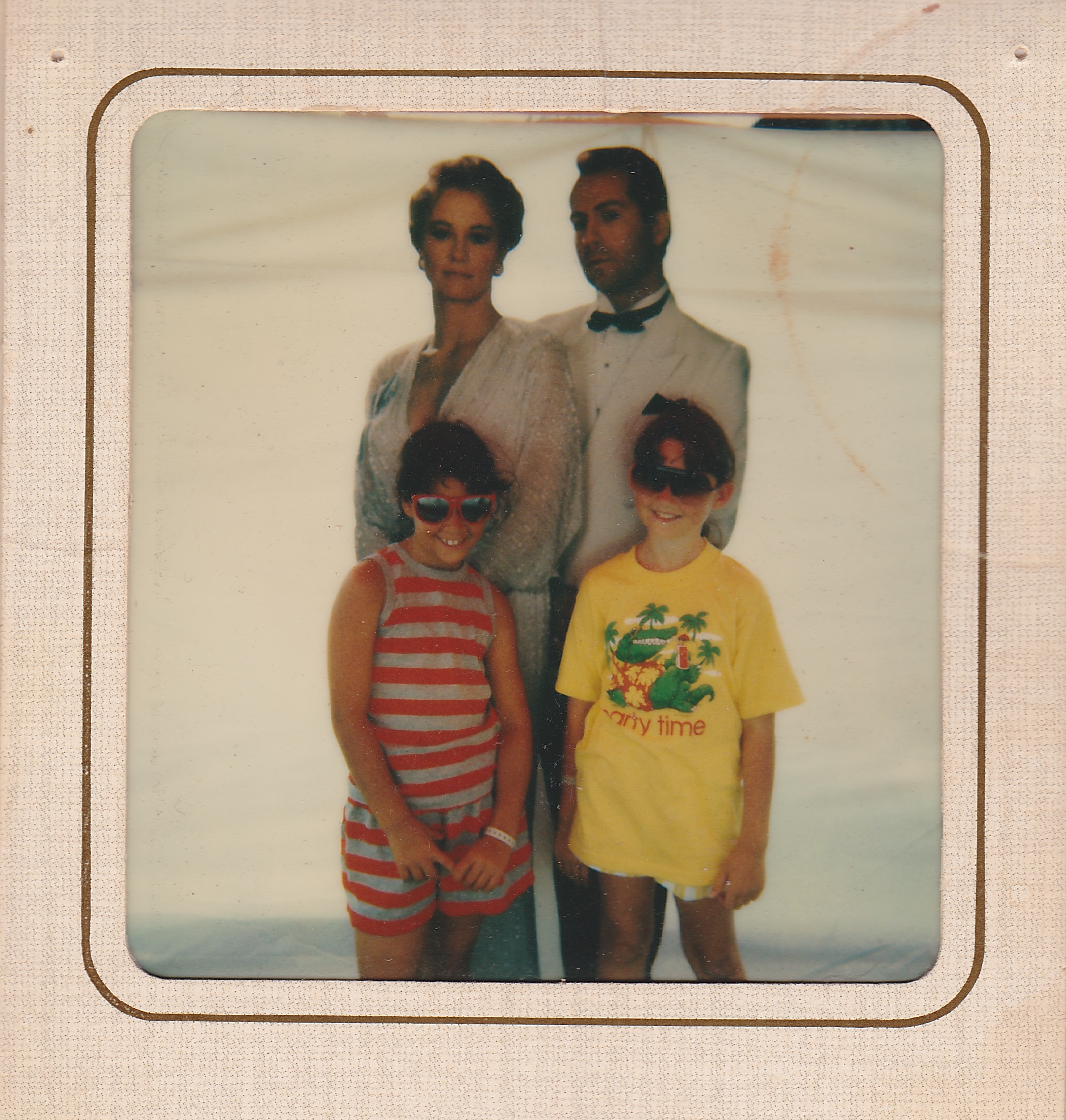 That's cardboard Cybill and Bruce (in formalwear), plus my friend Becky (in stripes) and me (in yellow "Party Time" alligator tee, naturally) hanging out at a county fair.
Congrats to Barry on the option, and Happy Friday! I leave you with the intro to an amazing 80s show (Shoulder pads! Mercedes! Bruce Willis with hair!):
That's cardboard Cybill and Bruce (in formalwear), plus my friend Becky (in stripes) and me (in yellow "Party Time" alligator tee, naturally) hanging out at a county fair.
Congrats to Barry on the option, and Happy Friday! I leave you with the intro to an amazing 80s show (Shoulder pads! Mercedes! Bruce Willis with hair!):
Come Back, Jena Malone!
in Other Stuff
Remember when Jena Malone was all cool and cute and in Saved! (great movie, btw)?
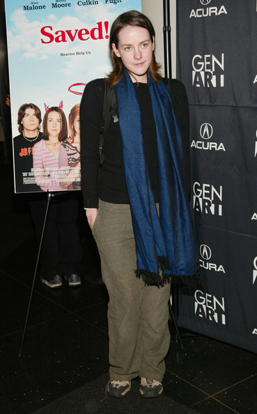 And now, she's like a skinny femme-bot. It's making me sad.
 I wonder if someone told her she had to lose weight to keep her career going, or if some internal pressure kicked in, or if she's just had the flu for like six months. But come on.
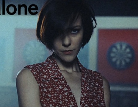 Come back to us, Jena!
Sorry, I had to get that off my chest. Share more cheery news here for a chance to win Across the Universe, and end this blog visit on a good note. Also, remember: love your real body. Being too skinny makes you look old (she's 26!).
Come back to us, Jena!
Sorry, I had to get that off my chest. Share more cheery news here for a chance to win Across the Universe, and end this blog visit on a good note. Also, remember: love your real body. Being too skinny makes you look old (she's 26!).
Win-It Wednesday: Across the Universe by Beth Revis
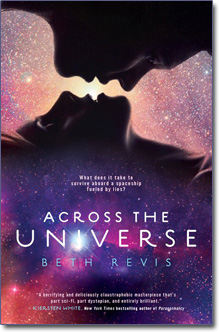 So, Across the Universe by Beth Revis has one of the best first chapters ever. Totally. Riveting. I got a PDF of said chapter in an email from Penguin; if you haven't seen it yet, say so in the comments and I'll email it to you.And to enter to win the ARC, tell me one thing that made you happy today. I'm in the mood for cheery comments. For me, it was this: The new book I'm writing? I started editing it and it's not as horrible as I imagined it was. I mean, it's not perfect--it needs work--but it's not, like, kitty litter liner.
Your turn!
PS-Oops! Forgot to name a winner for last week's Win-It Wednesday. The winner of Dana Reinhardt's The Things a Brother Knows (which was just named an ALA Best Fiction for Young Adults top 10 winner!) is... shabbygeek! Send me your address, S.
So, Across the Universe by Beth Revis has one of the best first chapters ever. Totally. Riveting. I got a PDF of said chapter in an email from Penguin; if you haven't seen it yet, say so in the comments and I'll email it to you.And to enter to win the ARC, tell me one thing that made you happy today. I'm in the mood for cheery comments. For me, it was this: The new book I'm writing? I started editing it and it's not as horrible as I imagined it was. I mean, it's not perfect--it needs work--but it's not, like, kitty litter liner.
Your turn!
PS-Oops! Forgot to name a winner for last week's Win-It Wednesday. The winner of Dana Reinhardt's The Things a Brother Knows (which was just named an ALA Best Fiction for Young Adults top 10 winner!) is... shabbygeek! Send me your address, S.
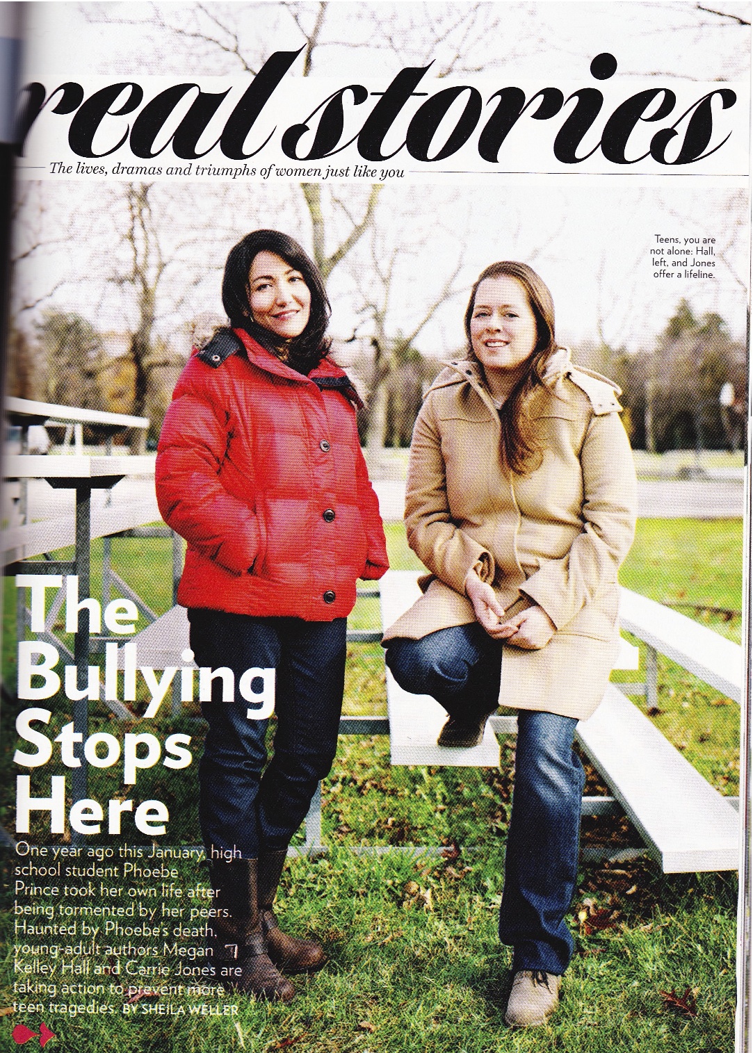
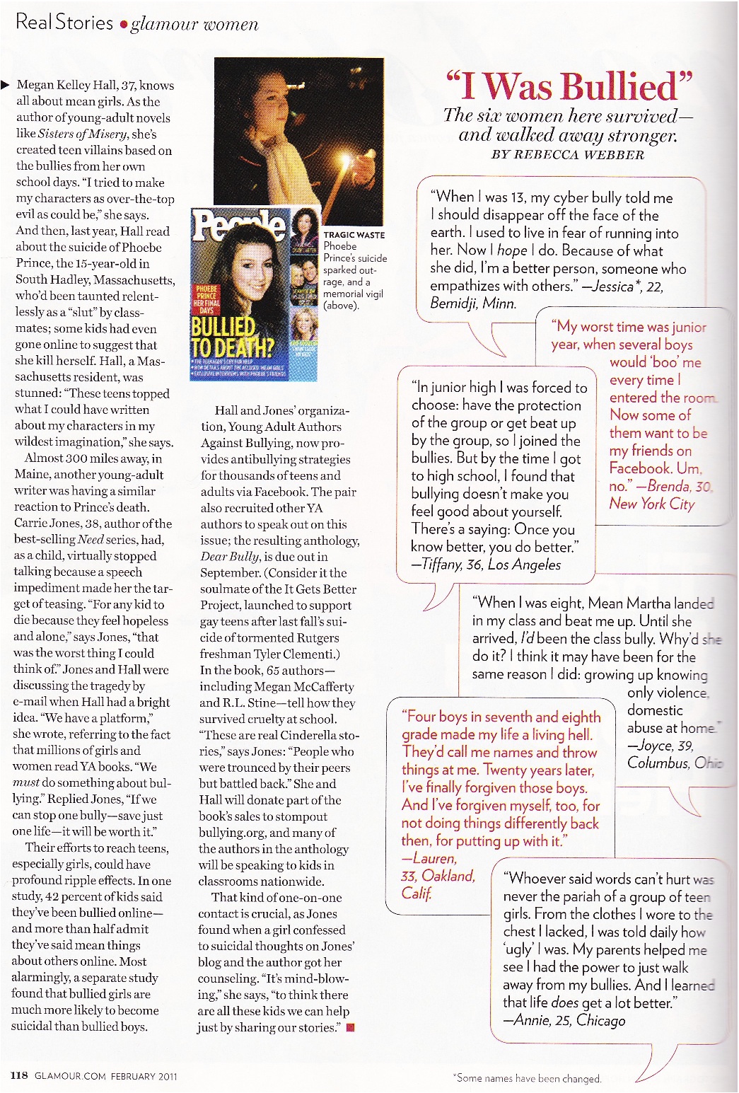
Dear Bully in Glamour Magazine!
in Other Stuff
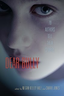 You guys may have heard about the upcoming fall anthology Dear Bully, edited by Megan Kelley Hall and Carrie Jones. (The cover's creepy, right? But effective.)I have an essay in the mix of incredible authors who shared their own stories, which makes me really proud, and the book's back story is in Glamour this month. I had to share the article! Join the Young Adult Authors Against Bullying page on Facebook, too, for stories and anti-bullying strategies. Because haven't we all confronted this in one way or another?
Click below to make the pages bigger/readable.
You guys may have heard about the upcoming fall anthology Dear Bully, edited by Megan Kelley Hall and Carrie Jones. (The cover's creepy, right? But effective.)I have an essay in the mix of incredible authors who shared their own stories, which makes me really proud, and the book's back story is in Glamour this month. I had to share the article! Join the Young Adult Authors Against Bullying page on Facebook, too, for stories and anti-bullying strategies. Because haven't we all confronted this in one way or another?
Click below to make the pages bigger/readable.
Cover Stories: Deadly Little Games by Laurie Faria Stolarz
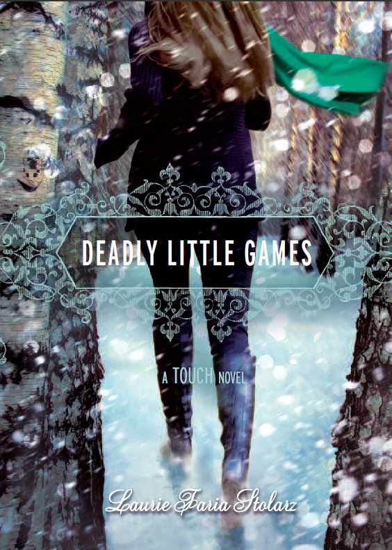 Laurie Faria Stolarz shared the story behind Deadly Little Secrets, the first book in her Touch series, and she's back to tell us about the cover of the third book, Deadly Little Games."Since it's the third book in the series, I had an idea of what they might do for the cover. The first two books show a female character (but not her face), in a dark outdoor setting (the woods). Since this book takes place in winter, I knew they'd incorporate snow in some way. I'm happy with the covers to these books. I like how beautiful they look together and the fonts the artist chose. I also like that we don't see Camelia's face. It's more mysterious and it doesn't overly influence how the reader will picture the character.
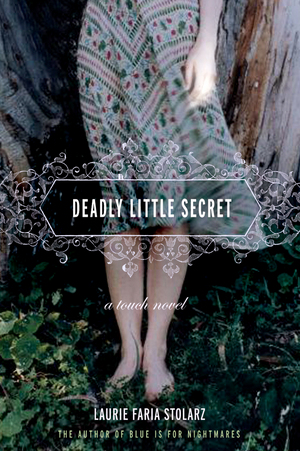
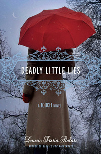 "I loved the Deadly Little Games cover right away. I haven't found any hidden meanings within the cover of this book, but with the first book in the Touch series (Deadly Little Secrets), the hand of the girl on the cover is slightly illuminated, hinting at the touch power that the characters have."
Thanks, Laurie! What I really love about this whole series of cover is the sense of movement they have. Also, I'm a sucker for covers that include weather, and I'm especially feeling the snow right now (there's something sparkling and magical about the flakes, right?)... What do you guys think?
PS-Watch the trailer (and enter the contest Laurie's hosting!)
"I loved the Deadly Little Games cover right away. I haven't found any hidden meanings within the cover of this book, but with the first book in the Touch series (Deadly Little Secrets), the hand of the girl on the cover is slightly illuminated, hinting at the touch power that the characters have."
Thanks, Laurie! What I really love about this whole series of cover is the sense of movement they have. Also, I'm a sucker for covers that include weather, and I'm especially feeling the snow right now (there's something sparkling and magical about the flakes, right?)... What do you guys think?
PS-Watch the trailer (and enter the contest Laurie's hosting!)
Video Friday: Snow Cats!
in Photo Friday
This is not super exciting, but it's kinda cute. Swayze and Winnie discover snow. As you can see, Swayze is way more adventurous. Winnie's still really shy.