I was going to do this on Monday but then I saw the cover on someone else's blog (and on amazon!) I realized you can't keep a new cover under wraps... yay! Cover Story coming soon. For now, have a glance: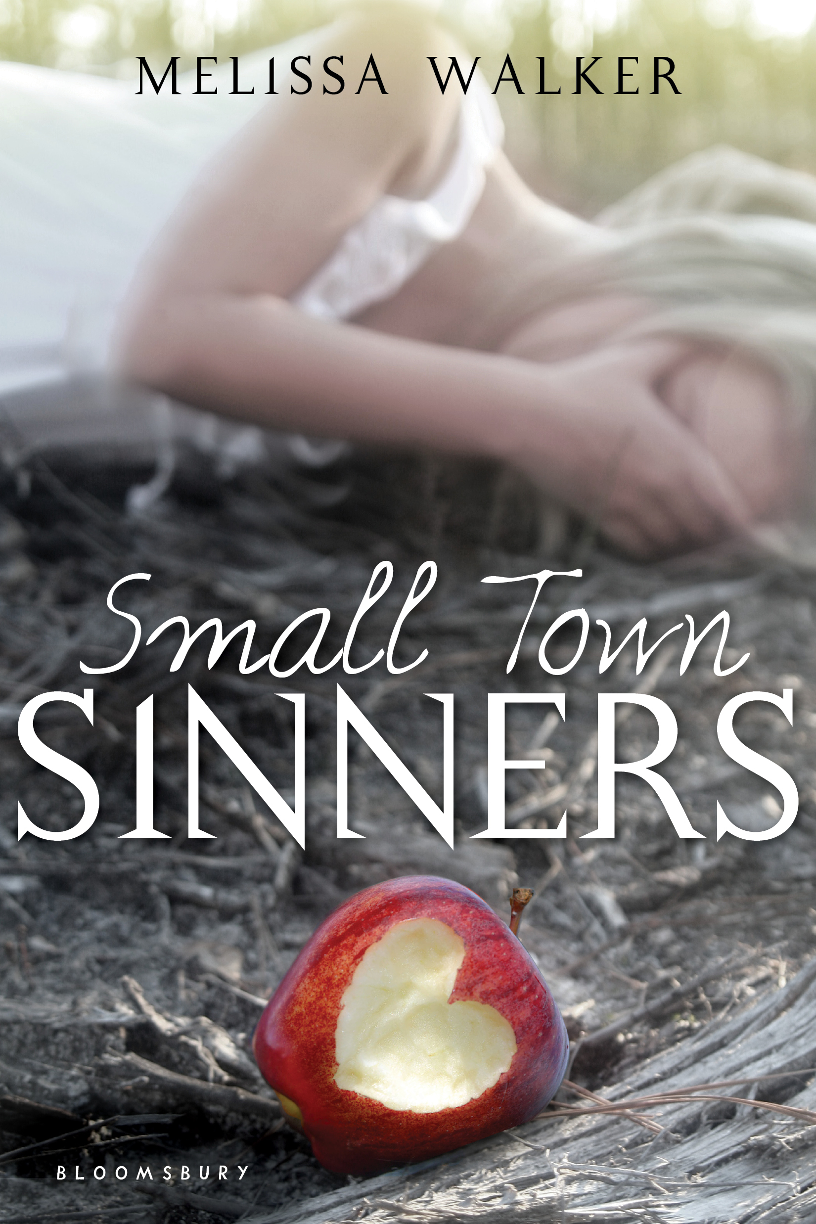 Here's the official description: Lacey Anne Byer is a perennial good girl and lifelong member of the House of Enlightenment, the Evangelical church in her small town. With her driver's license in hand and the chance to try out for a lead role in Hell House, her church's annual haunted house of sin, Lacey's junior year is looking promising. But when a cute new stranger comes to town, something begins to stir inside her. Ty Davis doesn't know the sweet, shy Lacey Anne Byer everyone else does. With Ty, Lacey could reinvent herself. As her feelings for him make Lacey test her boundaries, events surrounding Hell House make her question her religion. Does falling in love mean falling out of faith?
Win-It Wednesday + Cover Stories: Five Flavors of Dumb by Antony John
Last week's winner of I Was Jane Austen's Best Friend by Cora Harrison is... Genevieve! Send me your address, G. (BTW, the final vote count on US vs. UK cover was 22 to 5, with the UK's graphic design crushing the US's photo version!).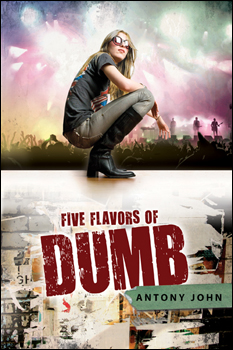 This week, Antony John (whose first novel, Busted: Confessions of an Accidental Player shares a cover model with Siobhan Vivian's second book) is here to talk about his upcoming release (next week!) Five Flavors of Dumb. It has an epic cover, as far as I'm concerned, and I'm also reading it and loooving the book. So, you know, you really want to win this one. Read the Cover Story and weigh in to enter.
Here's Antony!
"Believe it or not, as I was writing DUMB I didn't have a clue what the cover would look like. I'm sure that's quite unusual, but I simply couldn't imagine a design that would capture the essence and attitude of the novel without looking seriously weird. I mean, the book touches on everything from deafness to rock 'n' roll to family relationships to college funds to secret crushes to self-identity and, uh... chess. What cover could possibly hope to encompass all of that, right? So I just gave up thinking about it altogether. Looking back, it was kind of nice not to have to worry about the cover as well as every other aspect of the novel.
"Of course, the flip side of having ZERO input is that I had no clue what the finished cover would look like. My editor, Liz Waniewski, emailed it to me last November, just as friends were arriving, so I got to open it in front of them. Trust me: I wasn't the only one who used a really good expletive to describe it. Then I forwarded it to my wife (even though I wasn't supposed to; I just couldn't resist, you know?) and she wrote back within about seven seconds with a similarly giddy response. Seriously, it was just one of those 'THEY NAILED IT!' moments that you dream about as an author.
"My editor then asked if there were any changes I'd like (uh, no), or perhaps minor tweaks (uh... no), or alterations to the font style (uh, let me think about this...NO!). I really wanted to seem engaged and critical, but all I think was, 'Please don't change this cover.' Thankfully, all the sales and marketing people liked it too (as did booksellers), so the whole thing was wrapped up in record time. I owe the designer, Kristin Smith, big time!
"I have since discovered that Kristin's approach was similarly unconventional. Apparently, she usually prepares several different 'comps,' but with DUMB, she knew she wanted to evoke the grunge feel of the book through a split-image of band and narrator, so she went all-out on the one design. I know she spent days looking through stock photos until she found the photo of the girl, who conveys Piper's attitude and vibe perfectly. Thankfully, the art director, editor, and publisher all loved her original comp (see below left), and so she was able to dedicate more time to tweaking the lighting, colors, position of the band, font, poster effect, and so on until she arrived at the finished version (below right).
This week, Antony John (whose first novel, Busted: Confessions of an Accidental Player shares a cover model with Siobhan Vivian's second book) is here to talk about his upcoming release (next week!) Five Flavors of Dumb. It has an epic cover, as far as I'm concerned, and I'm also reading it and loooving the book. So, you know, you really want to win this one. Read the Cover Story and weigh in to enter.
Here's Antony!
"Believe it or not, as I was writing DUMB I didn't have a clue what the cover would look like. I'm sure that's quite unusual, but I simply couldn't imagine a design that would capture the essence and attitude of the novel without looking seriously weird. I mean, the book touches on everything from deafness to rock 'n' roll to family relationships to college funds to secret crushes to self-identity and, uh... chess. What cover could possibly hope to encompass all of that, right? So I just gave up thinking about it altogether. Looking back, it was kind of nice not to have to worry about the cover as well as every other aspect of the novel.
"Of course, the flip side of having ZERO input is that I had no clue what the finished cover would look like. My editor, Liz Waniewski, emailed it to me last November, just as friends were arriving, so I got to open it in front of them. Trust me: I wasn't the only one who used a really good expletive to describe it. Then I forwarded it to my wife (even though I wasn't supposed to; I just couldn't resist, you know?) and she wrote back within about seven seconds with a similarly giddy response. Seriously, it was just one of those 'THEY NAILED IT!' moments that you dream about as an author.
"My editor then asked if there were any changes I'd like (uh, no), or perhaps minor tweaks (uh... no), or alterations to the font style (uh, let me think about this...NO!). I really wanted to seem engaged and critical, but all I think was, 'Please don't change this cover.' Thankfully, all the sales and marketing people liked it too (as did booksellers), so the whole thing was wrapped up in record time. I owe the designer, Kristin Smith, big time!
"I have since discovered that Kristin's approach was similarly unconventional. Apparently, she usually prepares several different 'comps,' but with DUMB, she knew she wanted to evoke the grunge feel of the book through a split-image of band and narrator, so she went all-out on the one design. I know she spent days looking through stock photos until she found the photo of the girl, who conveys Piper's attitude and vibe perfectly. Thankfully, the art director, editor, and publisher all loved her original comp (see below left), and so she was able to dedicate more time to tweaking the lighting, colors, position of the band, font, poster effect, and so on until she arrived at the finished version (below right).
 "I've had almost a year to look at the cover now, and I still adore it. Piper looks so cool and in control--an anchor for all this chaos. Plus, on the finished cover, the title is debossed, which gives it the appearance of a stamp, as though you're about to enter a club. Finally, several people have commented that it looks like a movie poster; and let's be honest, who wouldn't want to have a movie poster on the front of their book? But most of all, I just love the cover's irresistible vibe."
Thanks, Antony! Movie poster: Yes. "Anchor for all this chaos": Yes. This cover RULES. I like the cover tweaks, too--from yellows/greens to pinks/grays. (And it's always good to make the author's name stand out more, which it does on the second version.) You can almost feel the light and the sound, but Piper sits cool and collected among it. L-O-V-E.
What do you guys think? Comment below to be entered to win a copy of the book!
PS-Everyone who "likes" Antony's new Facebook author page automatically gets entered into another contest to win not only a signed copy of DUMB, but also a copy of WILL GRAYSON, WILL GRAYSON signed by both John Green and David Levithan. So get liking!
"I've had almost a year to look at the cover now, and I still adore it. Piper looks so cool and in control--an anchor for all this chaos. Plus, on the finished cover, the title is debossed, which gives it the appearance of a stamp, as though you're about to enter a club. Finally, several people have commented that it looks like a movie poster; and let's be honest, who wouldn't want to have a movie poster on the front of their book? But most of all, I just love the cover's irresistible vibe."
Thanks, Antony! Movie poster: Yes. "Anchor for all this chaos": Yes. This cover RULES. I like the cover tweaks, too--from yellows/greens to pinks/grays. (And it's always good to make the author's name stand out more, which it does on the second version.) You can almost feel the light and the sound, but Piper sits cool and collected among it. L-O-V-E.
What do you guys think? Comment below to be entered to win a copy of the book!
PS-Everyone who "likes" Antony's new Facebook author page automatically gets entered into another contest to win not only a signed copy of DUMB, but also a copy of WILL GRAYSON, WILL GRAYSON signed by both John Green and David Levithan. So get liking!
Cover Stories: The Mockingbirds by Daisy Whitney
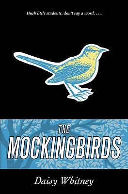 Daisy Whitney's The Mockingbirds is out this week, and she's here to tell the tale behind a cover that reminds me of a classic already!
First, a little about the book:
Themis Academy is a quiet boarding school with an exceptional student body that the administration trusts to always behave the honorable way-the Themis Way. 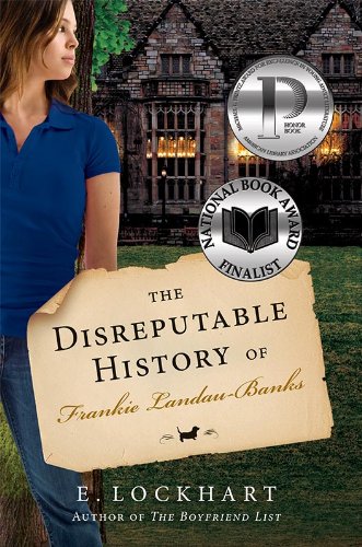 So when Alex is date raped during her junior year, she has two options: stay silent and hope someone helps her, or enlist the Mockingbirds-a secret society of students dedicated to righting the wrongs of their fellow peers.
And now here's Daisy:
So when Alex is date raped during her junior year, she has two options: stay silent and hope someone helps her, or enlist the Mockingbirds-a secret society of students dedicated to righting the wrongs of their fellow peers.
And now here's Daisy:
"As I was writing, I pictured a girl at boarding school ala The Disreputable History of Frankie Landau-Banks by E. Lockhart (left)!
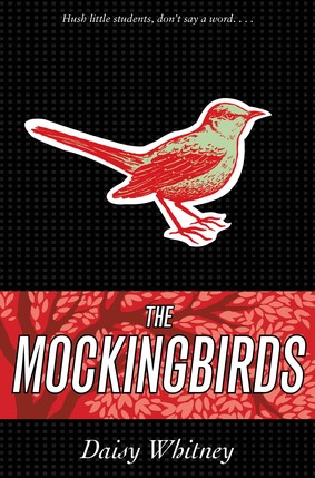 "Ah, but there's the myth that authors have any say over their covers! My editor showed me cover comps throughout the process and I was able to give feedback on the elements I liked. I had suggestions on elements of the bird and the trees and some of them were incorporated. The original cover was red and green (right) and the final is blue and yellow. I'm so happy with the blue version!
"My cover was illustrated by an artist. The final cover design features a blue and yellow bird and the blue matches all my blue shoes! Hurrah! In the end, I love it. I think it's unusual and stands out."
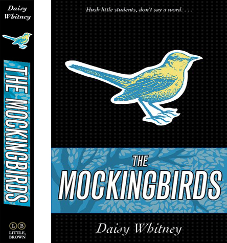 Thanks, Daisy! I just think something about this cover looks old-school lit in the best possible timeless way. It also has a great spine, right? (And how about that storyline--whoa! Love.)
What do you guys think?
Hark, An ARC! Small Town Sinners
in Other Stuff
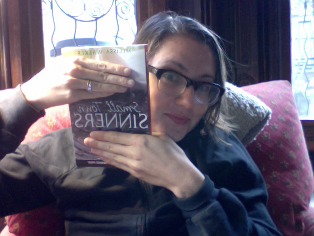 I can't show the cover yet (and yes, this is a PhotoBooth-on-the-laptop shot, hence the backwards turn o' photo), but I'll be running a Cover Story of my own during the week of November 8th for my next book, Small Town Sinners (out in July). Any bloggers who want to help me do a cover reveal? Email me and I'll send you a jpeg of the cover and let you know what date I'm posting it, if you'd like to post it too!
I'm excited. You know how into covers I am. Oh yeah.
PS-I heart my Warby Parker nerd glasses, and WP gives a pair to charity each for each pair bought. Bonus!
I can't show the cover yet (and yes, this is a PhotoBooth-on-the-laptop shot, hence the backwards turn o' photo), but I'll be running a Cover Story of my own during the week of November 8th for my next book, Small Town Sinners (out in July). Any bloggers who want to help me do a cover reveal? Email me and I'll send you a jpeg of the cover and let you know what date I'm posting it, if you'd like to post it too!
I'm excited. You know how into covers I am. Oh yeah.
PS-I heart my Warby Parker nerd glasses, and WP gives a pair to charity each for each pair bought. Bonus!
Photo Friday: Autumn & Aliens
in Photo Friday
Yesterday I saw this guy at my lunch spot (he's reading...). It was hard for me to get my word count done because, hello, there was a film crew taping an alien puppet right near me. If I were writing a different kind of book, this probably would have crept into the pages.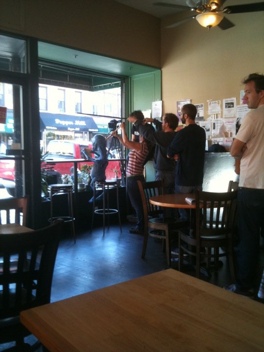 But really, I love autumn with aliens in Brooklyn.
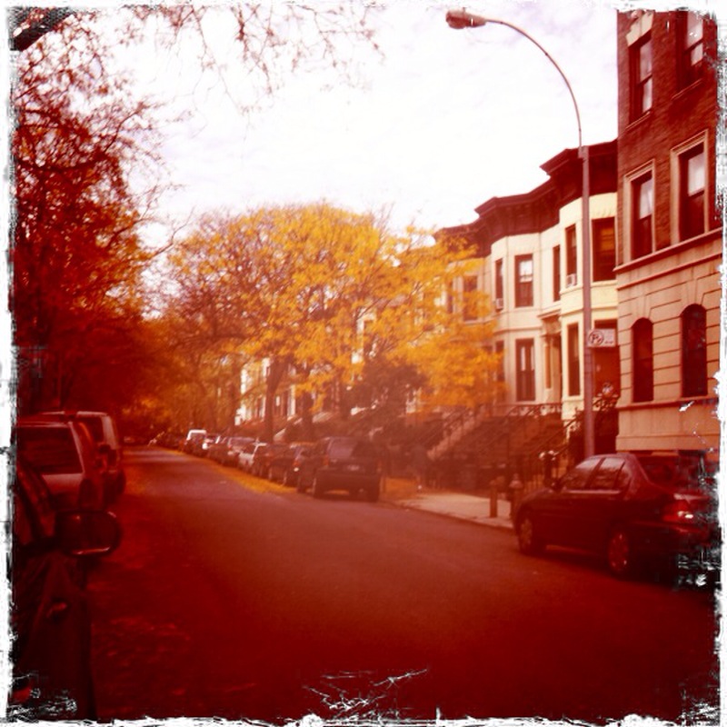 Happy Friday!
Cover Stories: Mostly Good Girls by Leila Sales
 The cover of Mostly Good Girls by Leila Sales is one of my fall favorites, and not just because I'm obsessed with tights. The book also sounds super-good.
Here's Leila to tell the tale:
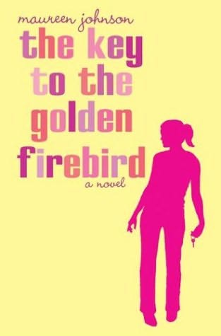
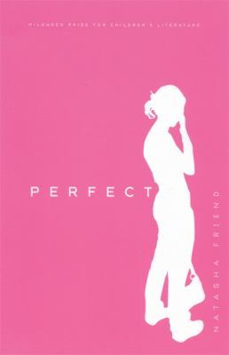 "I'm not a visual thinker, so I didn't have a specific vision for the cover. I told my editor that I like covers with a lot of white space and that I like covers with silhouettes (for example Maureen Johnson's THE KEY TO THE GOLDEN FIREBIRD or Natasha Friend's PERFECT). I also had an image in my mind of two girls running away from a school building together. But I had no real idea... There's a reason why I'm a writer and NOT a designer!
"I talked about what Violet and Katie would be wearing, if they were pictured on the cover. It was important to me that they not be wearing high heels because, as anyone at an all-girls school could tell you, students there just don't get that dressed up. Girls-school fashion is a lot of J.Crew jeans and Northface fleeces.
"So, actually, when S&S did the cover shoot, they used Kate Spade shoes with like three-inch heels--and then they photoshopped the heels out to make the shoes look like flats. I was going to buy a pair of to wear to book signings, but when I found out that a) they would cost me a few hundred dollars and b) I wouldn't be able to walk in them because I have no talent for heels, I decided against it.
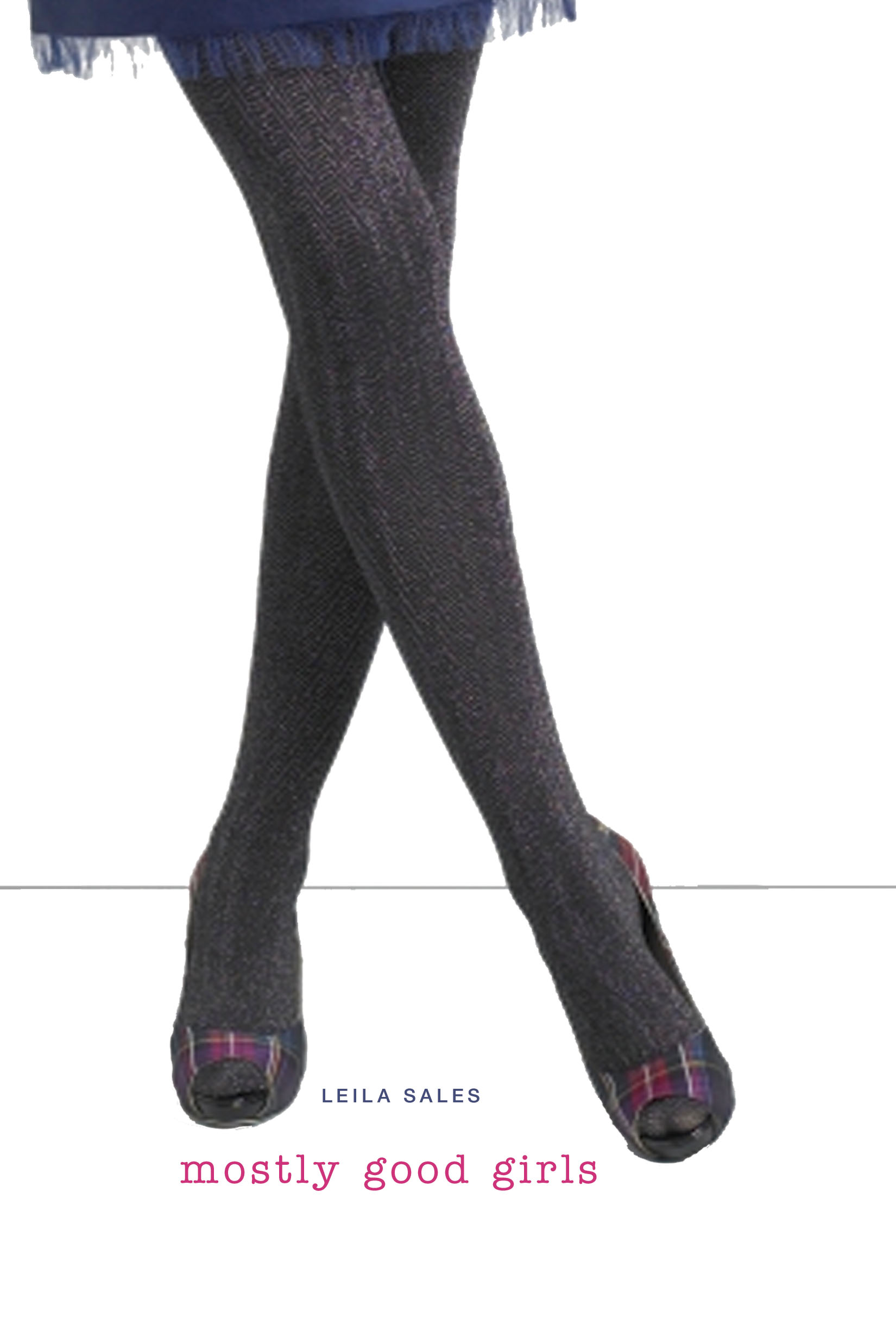 "The first time I saw the cover comp of a girl in cute tights with her legs crossed (that's the comp on the left), I was happy with it. Truly!
"But I had seen earlier cover comps that I was less thrilled with. There was one that was supposed to be a crumpled-up piece of paper against a white background, which was a great idea, but it was hard to make it actually look like paper. There was another concept that showed a Coach purse against a white background, and I had absolutely no patience for that. It made MOSTLY GOOD GIRLS look like a book about shopping, or THE DEVIL WEARS PRADA for teens. 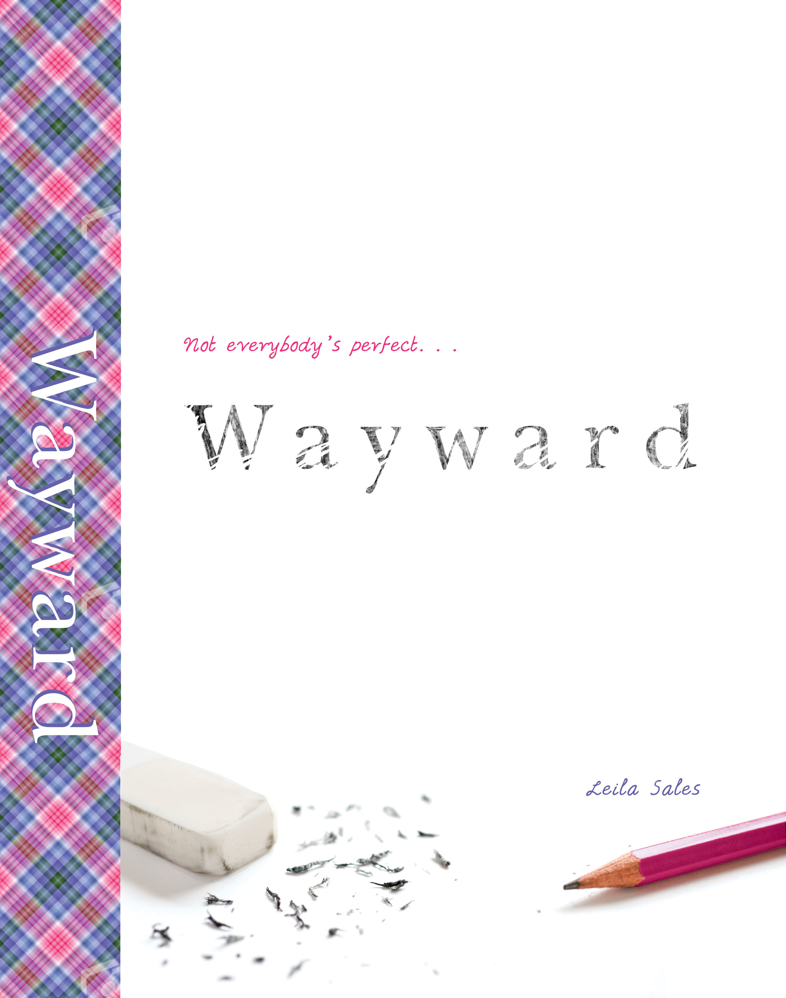 [That's another early comp idea, right, with a different title, Wayward.]
"We all agreed that we wanted a central, memorable image against a clean background, like the PREP cover; it just took a while to figure out what that central image should be.
"They did a photo shoot with a model. Well, she's sort of a model. She works in Simon & Schuster's sales department, actually. I forget, but I think she sells to Borders? This happens regularly in publishing, that a cover designer will approach one of his colleagues and be like, 'Hey, you have great hair/hands/legs/whatever. Will you model for this cover?' No one has ever asked me to do this, but I am holding out hope.
"S&S featured a blow-up of MOSTLY GOOD GIRL's cover at BEA, and all day people were going over to take pictures of it. My friends wanted photos because, you know, I wrote it, while the S&S sales rep's friends wanted photos because her legs are on it. I met the cover model at a BEA cocktail party, actually. I asked her to cross her legs so I could see if it looked just like my book cover or what. She seemed maybe creeped out by this.
"People keep asking me if I'm the cover model, which I take as a huge compliment. I do like wearing tights. But no, my legs are not that skinny.
"I have seen a few commenters on the Internet saying they thought the cover made this book seem like it was going to be about a bunch of slutty, materialistic girls, which of course it's not. But by and large the response has been that the book looks fun, funny, and fashionable, and that was the goal all along.
"I don't think the girl on the cover is necessarily Violet, or Katie, or any other particular character in MOSTLY GOOD GIRLS. I think the cover image is more evoking the feeling of this competitive all-girls prep school, and it does that so well. So I'm honestly pleased with how it turned out. Especially when I see it on display in a bookstore, on a table filled with dark YA covers-- it just pops!"
Thanks, Leila! I am so, so glad everyone kept working to come up with this concept (and especially that the Coach purse did not fly). The final cover creates a record-scratch moment. By that I mean: You stop and stare. Right?
What do you guys think?
Win-It Wednesday: I Was Jane Austen's Best Friend by Cora Harrison
It was so nice to read the comments about all that you guys are doing to make the world a better place -- it definitely put me in a "the world is mostly good" kinda mood, so thank you! The winner of last week's copy of Denise Jaden's Losing Faith is... Samantha R! Send me your address, S.This week, I have a lovely new hardback copy of Cora Harrison's I Was Jane Austen's Best Friend up for grabs. Can we ever get enough of Jane Austen's world? I think not.
 I have the US edition, shown on the right (click the image to see the full image in a larger format). My simple question is: US or UK cover? I'm usually opinionated about this type of thing, but I'm torn here. I like all the little illustrated doodads on the UK cover -- flowers, bird, hearts, bow -- but the US cover has that regency romance feel, which I'm starting to fall for.
What do you think? Comment below and you're entered! Happy Wednesday!
I have the US edition, shown on the right (click the image to see the full image in a larger format). My simple question is: US or UK cover? I'm usually opinionated about this type of thing, but I'm torn here. I like all the little illustrated doodads on the UK cover -- flowers, bird, hearts, bow -- but the US cover has that regency romance feel, which I'm starting to fall for.
What do you think? Comment below and you're entered! Happy Wednesday!
Cover Stories: Nightshade by Andrea Cremer
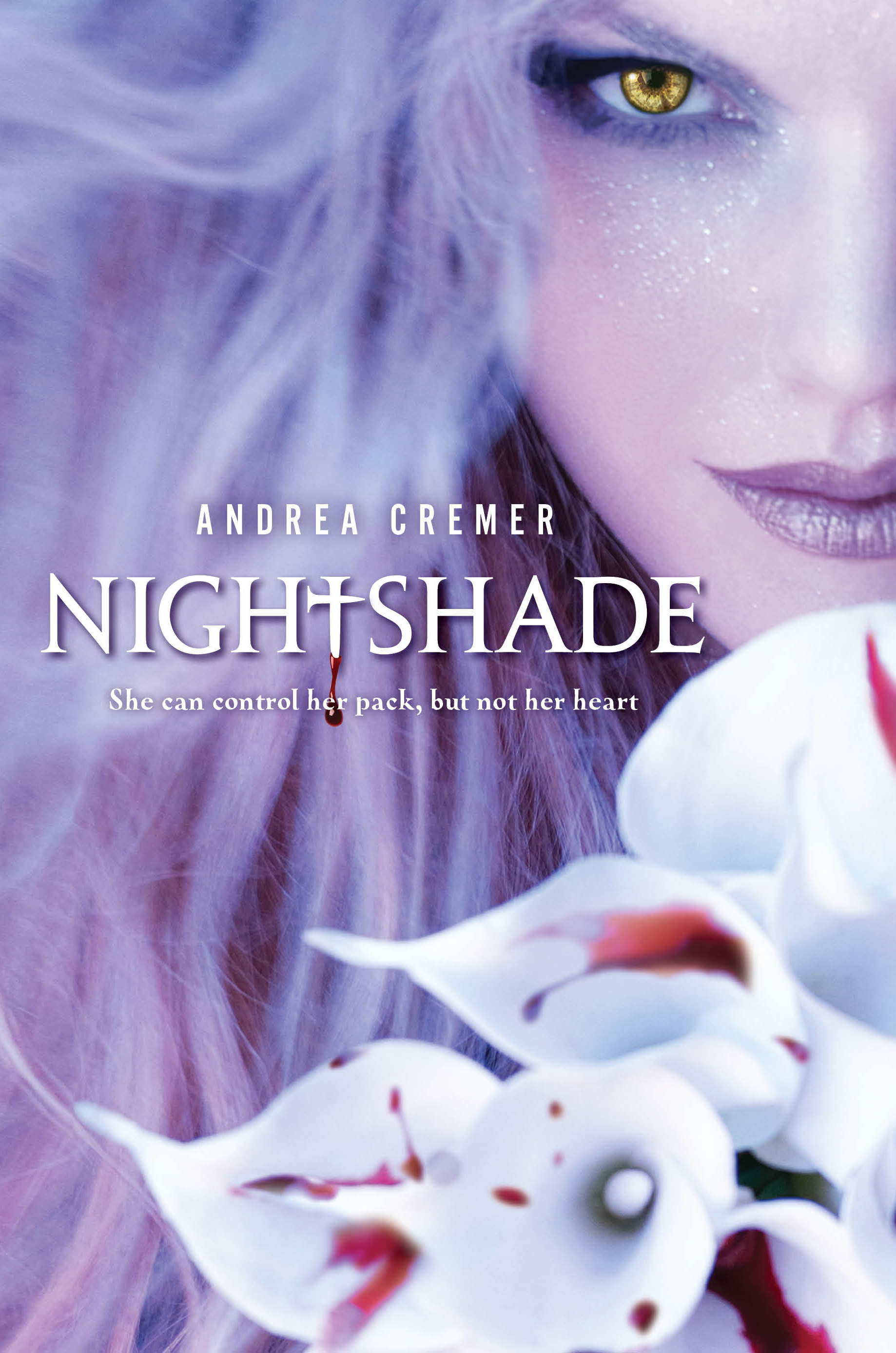 Everyone is raving about Andrea Cremer's Nightshade, and I need to read it! The cover is enchanting, so at least I've got the scoop on that. Here's Andrea:
"I had a couple of ideas for the cover--one involved wolves, shadows, and blood; the other was that it would feature the Elemental Cross, an image that plays an important role in the series. I envisioned a more abstract cover than the image we ended up with.
Everyone is raving about Andrea Cremer's Nightshade, and I need to read it! The cover is enchanting, so at least I've got the scoop on that. Here's Andrea:
"I had a couple of ideas for the cover--one involved wolves, shadows, and blood; the other was that it would feature the Elemental Cross, an image that plays an important role in the series. I envisioned a more abstract cover than the image we ended up with.
"My publisher did ask for input and at first we were going for the wolves, shadows, blood thing, but then they found Suza Scalora's art--she's the photographer who shot the cover--and we all loved it so we switched gears and focused on finding a model who could be transformed into Calla for the cover.
"I gasped when I saw the cover, as it was so, so beautiful. It was different then anything I'd imagined, but I couldn't love it more. To be honest I wasn't sure how I'd feel about having a face on the cover, but Suza and the art director at Penguin, Linda, absolutely nailed it. Plus I adore the bloody calla lilies. My editor got to drip the blood on the flowers herself!
"The cover didn't change much from the original version. The blood drop was a bit longer, we made sure the 't' in Nightshade resembled the tattoo on Shay's neck and Calla's eye went from green to gold.
"Suza Scalora did a photo shoot with a model. [Wolfsbane and Bloodrose, the next books in this series, will also be shot by Suza Scalora.]
"I couldn't be happier with the Nightshade cover. It fits the book perfectly--it's alluring, mysterious and dangerous. Calla's face is just as I imagined it; people sometimes ask me about the makeup she's wearing because Calla doesn't wear makeup. To me the cover offers an artistic rendering of a particular moment in the story--the makeup to me represents the twilight shadows cast on her face and the glitter is the sparkle of new snow on her cheeks. I don't take is as a literal depiction and I like it that way."
Thanks, Andrea! I love Suza Scalora's site and all the amazing beauty shots there--you guys should definitely scroll through. I think this cover is so soft and fresh looking on the one hand, and so deadly and evil on the other--such a cool balance. And sparkle. I love sparkle.
What do you guys think?
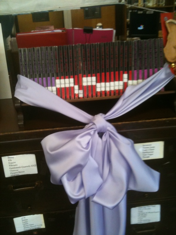
Photo Friday: Fashion High and Squash Soup
in Photo Friday
On Wednesday I put on a purple skirt and purple tights and headed to the High School of Fashion Industries in Manhattan... It was awe-some. And they're totally all on twitter.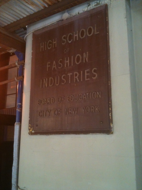 They've been so supportive of the Violet books, and they had this lovely display all set up in the library!
 In domestic news, I made Squash Soup (with homemade croutons!) this week. Here are the ingredients:
 And the final product:
 Swayze wanted more...
 Happy weekend!
Cover Stories: Girl's Best Friend by Leslie Margolis
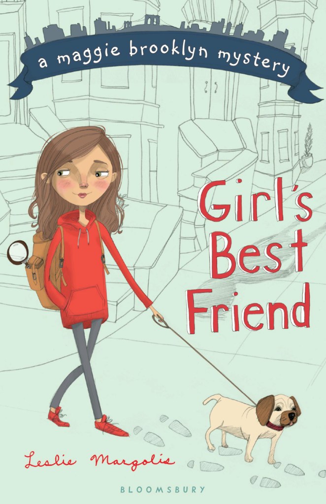 The Maggie Brooklyn Mystery series is set in my neighborhood, where author Leslie Margolis also lives! I used to adore mysteries when I was a Middle Grade reader, and the first book in the series -- which was just released this month -- is so adorable that I had to ask her how it happened (I love illustrated middle-grade covers). Here's Leslie:"Girl's Best Friend is the first book in the Maggie Brooklyn Mystery series, which revolves around a twelve-year-old, dog-walking detective. And I must confess - I've been obsessing over what the cover would look like ever since I came up with the idea.
"My editor did not ask for my input directly quite possibly because I never gave her the chance to. When she asked for physical descriptions of my main character and the dogs she walks, I sent those along with this additional note:
"'Brownstone Brooklyn features prominently in the book and it would be excellent to have that represented somehow... I don't want to be difficult at all, but I've been thinking about the look of the book a lot and wanted to send some links to some covers I really like. Here's hoping you find this helpful rather than annoying!'
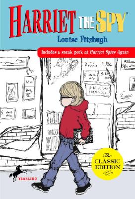
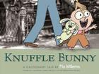
Harriet the Spy, When You Reach Me and Knuffle Bunny.
The Maggie Brooklyn Mystery series is set in my neighborhood, where author Leslie Margolis also lives! I used to adore mysteries when I was a Middle Grade reader, and the first book in the series -- which was just released this month -- is so adorable that I had to ask her how it happened (I love illustrated middle-grade covers). Here's Leslie:"Girl's Best Friend is the first book in the Maggie Brooklyn Mystery series, which revolves around a twelve-year-old, dog-walking detective. And I must confess - I've been obsessing over what the cover would look like ever since I came up with the idea.
"My editor did not ask for my input directly quite possibly because I never gave her the chance to. When she asked for physical descriptions of my main character and the dogs she walks, I sent those along with this additional note:
"'Brownstone Brooklyn features prominently in the book and it would be excellent to have that represented somehow... I don't want to be difficult at all, but I've been thinking about the look of the book a lot and wanted to send some links to some covers I really like. Here's hoping you find this helpful rather than annoying!'
Harriet the Spy, When You Reach Me and Knuffle Bunny.

 "Reading this again -- over a year later, I'm sure my email was annoying rather than helpful. And maybe I was difficult, too. But oh well. I had to get it out there.
"Harriet the Spy, Knuffle Bunny, and When You Reach Me are three of my favorite books. They are all city stories and they all have striking covers. And Knuffle Bunny actually takes place in Park Slope, Brooklyn, where Maggie lives.
"Maybe this technique worked, or maybe Bloomsbury was thinking along the same lines, anyway. All I know is that a few months passed with no word about the cover. And then one day my editor told me they were looking at an illustrator named Tuesday Mourning.
"I Googled 'Tuesday Morning' and found a website dedicated to discounted gifts and home accessories based in Dallas, Texas.
"I panicked.
"Then I checked my editor's email again and saw that the illustrator's last name is actually Mourning, with a 'u'.
"Reading this again -- over a year later, I'm sure my email was annoying rather than helpful. And maybe I was difficult, too. But oh well. I had to get it out there.
"Harriet the Spy, Knuffle Bunny, and When You Reach Me are three of my favorite books. They are all city stories and they all have striking covers. And Knuffle Bunny actually takes place in Park Slope, Brooklyn, where Maggie lives.
"Maybe this technique worked, or maybe Bloomsbury was thinking along the same lines, anyway. All I know is that a few months passed with no word about the cover. And then one day my editor told me they were looking at an illustrator named Tuesday Mourning.
"I Googled 'Tuesday Morning' and found a website dedicated to discounted gifts and home accessories based in Dallas, Texas.
"I panicked.
"Then I checked my editor's email again and saw that the illustrator's last name is actually Mourning, with a 'u'.
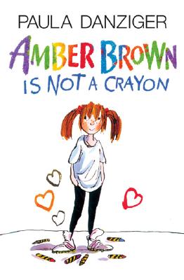 "I did another Google search, found her blog and fell in love with her work. That's before I even realized she'd done the Paula Danziger re-jackets (like the on on the right). I'm a huge Paula Danziger fan, which made Bloomsbury's choice of illustrator even more thrilling.
"Weeks later the first sketch came in (below, left). My editor sent it to me with the following concerns:
"'...I'm not sure about the clothes. A scarf in September feels wrong, and the hat -- though cute -- isn't really in keeping with the character. [Although] it does add mystery and style...
*Does Maggie look too old? I'm not sure, especially since the rendering is so stylized, maybe it's OK.
* I love her sideways glance, though I'd like to see just a smidge more of a smile, to make her more inviting.
* The dog looks pure pug, not puggle (or, of course, Irish Wolfhound). I'd like to see this be a puggle. I'd also like him to be actively pulling her, rather than posing.
Let me know what you think!'"
"I did another Google search, found her blog and fell in love with her work. That's before I even realized she'd done the Paula Danziger re-jackets (like the on on the right). I'm a huge Paula Danziger fan, which made Bloomsbury's choice of illustrator even more thrilling.
"Weeks later the first sketch came in (below, left). My editor sent it to me with the following concerns:
"'...I'm not sure about the clothes. A scarf in September feels wrong, and the hat -- though cute -- isn't really in keeping with the character. [Although] it does add mystery and style...
*Does Maggie look too old? I'm not sure, especially since the rendering is so stylized, maybe it's OK.
* I love her sideways glance, though I'd like to see just a smidge more of a smile, to make her more inviting.
* The dog looks pure pug, not puggle (or, of course, Irish Wolfhound). I'd like to see this be a puggle. I'd also like him to be actively pulling her, rather than posing.
Let me know what you think!'"
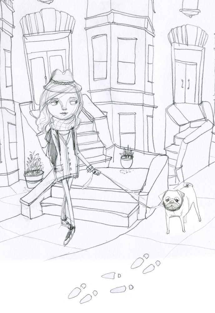 "I agreed, completely. Here's my response:
"'Thanks so much for sending this -- I absolutely love this look. Also -- I agree with you on all points. Maggie in Book One is more of an accidental detective so she wouldn't be wearing that hat -- and there are many times in the book where she comments that it's warm so no scarf, either. She looks a tad old but I think if she were smiling and if her clothes were different -- more casual and less sophisticated but still cute she'd look twelve like she's supposed to.
"'Regarding the puggle, here's how Maggie describes him: 'He's got that smushed-in pug face but a thinner body and longer legs.' So I agree -- the face seems close but the body type could change.
"'Also -- the brownstones in the background look fantastic!'
"A week or so later, my editor forwarded me the second sketch (below, right). As you can see, Maggie has lost her hat and scarf and her outfit is more casual. She's also smiling. And there's a shadow in the background to convey mystery, as well as a magnifying glass in Maggie's backpack to show that she's a detective.
"I agreed, completely. Here's my response:
"'Thanks so much for sending this -- I absolutely love this look. Also -- I agree with you on all points. Maggie in Book One is more of an accidental detective so she wouldn't be wearing that hat -- and there are many times in the book where she comments that it's warm so no scarf, either. She looks a tad old but I think if she were smiling and if her clothes were different -- more casual and less sophisticated but still cute she'd look twelve like she's supposed to.
"'Regarding the puggle, here's how Maggie describes him: 'He's got that smushed-in pug face but a thinner body and longer legs.' So I agree -- the face seems close but the body type could change.
"'Also -- the brownstones in the background look fantastic!'
"A week or so later, my editor forwarded me the second sketch (below, right). As you can see, Maggie has lost her hat and scarf and her outfit is more casual. She's also smiling. And there's a shadow in the background to convey mystery, as well as a magnifying glass in Maggie's backpack to show that she's a detective.
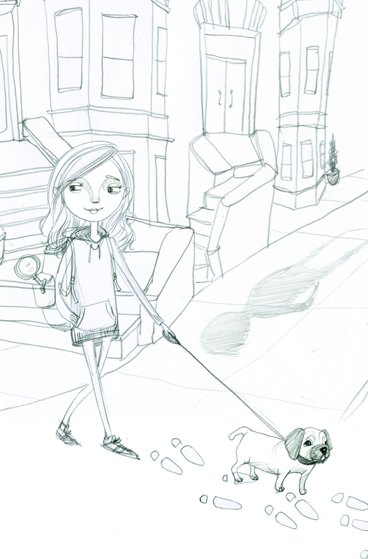 "The puggle is still pretty short, which bothered me at first. But that day, as I walked my own dog past a real, live puggle nearly identical to the one in the sketch, I felt as if the dog-universe was speaking to me and saying this: there are lots of short puggles in the world and why shouldn't they be represented, too? Let this one go!
"So I did.
"Oh, but I did have one other comment. I asked if the magnifying glass in Maggie's backpack could be replaced with a pair of binoculars because Maggie actually uses binoculars in the book. My editor said that binoculars don't say 'detective' in the same way as magnifying glasses. And she's totally right.
"From that second sketch, the artist went to final art.
"And then, I believe, the fabulous Bloomsbury design department took over the task of creating a series look.
"When I first saw the 'maggie brooklyn mystery' banner, it was white and lacked the Brooklyn skyline.
"The next time I saw the cover, it was finished and absolutely incredible.
"When I put Girl's Best Friend next to my worn out copy of Harriet the Spy, I can't help but think that, based on the covers, Maggie could easily be Harriet's long lost, distant third cousin -- one borough removed. Which is kind of how I think of the character, too.
"So all in all, I'm completely enchanted."
Thanks, Leslie! Okay, first, I looove the brownstones in the back -- they're perfect! I also think the first sketch makes Maggie look like a fashionable high schooler (cool, but not quite the character). And yes, the dog looks more pug than puggle.
But in sketch two, I love the hoodie/leggings outfit, the adorable puggle, and even the shadow of a (menacing?) stranger on the block. In the final, I think the colors are gorgeous and the title banner is awesome.
What do you guys think?
"The puggle is still pretty short, which bothered me at first. But that day, as I walked my own dog past a real, live puggle nearly identical to the one in the sketch, I felt as if the dog-universe was speaking to me and saying this: there are lots of short puggles in the world and why shouldn't they be represented, too? Let this one go!
"So I did.
"Oh, but I did have one other comment. I asked if the magnifying glass in Maggie's backpack could be replaced with a pair of binoculars because Maggie actually uses binoculars in the book. My editor said that binoculars don't say 'detective' in the same way as magnifying glasses. And she's totally right.
"From that second sketch, the artist went to final art.
"And then, I believe, the fabulous Bloomsbury design department took over the task of creating a series look.
"When I first saw the 'maggie brooklyn mystery' banner, it was white and lacked the Brooklyn skyline.
"The next time I saw the cover, it was finished and absolutely incredible.
"When I put Girl's Best Friend next to my worn out copy of Harriet the Spy, I can't help but think that, based on the covers, Maggie could easily be Harriet's long lost, distant third cousin -- one borough removed. Which is kind of how I think of the character, too.
"So all in all, I'm completely enchanted."
Thanks, Leslie! Okay, first, I looove the brownstones in the back -- they're perfect! I also think the first sketch makes Maggie look like a fashionable high schooler (cool, but not quite the character). And yes, the dog looks more pug than puggle.
But in sketch two, I love the hoodie/leggings outfit, the adorable puggle, and even the shadow of a (menacing?) stranger on the block. In the final, I think the colors are gorgeous and the title banner is awesome.
What do you guys think?