The winner of last week's contest for You Are Not Here by Samantha Schutz is... Mitzy! Send me your address, M. You'll love this book, even if it makes you weep. I featured Denise Jaden's Losing Faith Cover Story last month, and today she's offering up a copy of the book to one lucky commenter! The story deals with assumptions about people, outcasts, and the twisted mystery behind a sister's death. Read more on The Contemps!
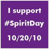
Losing Faith is the perfect purply book to show today since I'm wearing purple in support of Glaad's Spirit Day to honor the lives of the GLBT teens who've committed suicide. Go find some purple to wear! (And watch the incredible We Stop Hate video at I Heart Daily -- this organization is one to watch and to make your own video for, asap!).
I featured Denise Jaden's Losing Faith Cover Story last month, and today she's offering up a copy of the book to one lucky commenter! The story deals with assumptions about people, outcasts, and the twisted mystery behind a sister's death. Read more on The Contemps!
Losing Faith is the perfect purply book to show today since I'm wearing purple in support of Glaad's Spirit Day to honor the lives of the GLBT teens who've committed suicide. Go find some purple to wear! (And watch the incredible We Stop Hate video at I Heart Daily -- this organization is one to watch and to make your own video for, asap!).
 So how do you enter to win? Tell me one way that you're stopping hate in your corner of the world. You can say that you're wearing purple or you watched Alyx's amazing video or that you're spreading the word about We Stop Hate or that you stood up for someone recently -- everything counts and adds up to more love. (They're here on Facebook and Twitter.)
Happy Wednesday!
PS--Ooh, Jen's first comment made me remember that I so wanted to mention the "It Gets Better" project too -- amazing! Even Hilary made a video today. And if you haven't seen Fort Worth City Councilman Joe Burns and his incredible speech at a recent meeting, get out your tissue box and press play:
So how do you enter to win? Tell me one way that you're stopping hate in your corner of the world. You can say that you're wearing purple or you watched Alyx's amazing video or that you're spreading the word about We Stop Hate or that you stood up for someone recently -- everything counts and adds up to more love. (They're here on Facebook and Twitter.)
Happy Wednesday!
PS--Ooh, Jen's first comment made me remember that I so wanted to mention the "It Gets Better" project too -- amazing! Even Hilary made a video today. And if you haven't seen Fort Worth City Councilman Joe Burns and his incredible speech at a recent meeting, get out your tissue box and press play:
Cover Stories: The Good, the Bad and the Barbie by Tanya Lee Stone
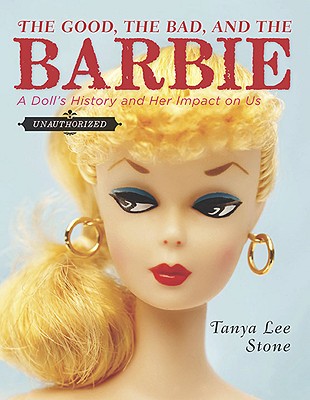 Tanya Lee Stone's latest book, The Good, the Bad and the Barbie: A Doll's History and Her Impact on Us, is earning raves like this one from Lauren Myracle: ""Holy belly buttons! This is no mere Barbie book. This is a how-to manual about being a girl: a strong, sparky, awesome girl, with Barbie in hand *or* Barbie in the nearest Dumpster!"Love that. Plus, it has a sly, iconic cover. I had to ask Tanya how it came about. Here she is:
"I didn't have a picture of the front cover in my head from the beginning, but once I started playing around with all of the dolls in Peter Harrigan's collection (which we used for the photo shoot), I started thinking about the BACK cover. I pictured a border of heads peering from the edge into the middle of the cover (kind of creepy). I fell in love with the Elphaba doll from Wicked, and thought the Twilight dolls were kind of cool (and again, kind of creepy). In the end, we used a great shot the photographer took of a bunch of the international dolls, in a pinwheel formation. I love it.
Tanya Lee Stone's latest book, The Good, the Bad and the Barbie: A Doll's History and Her Impact on Us, is earning raves like this one from Lauren Myracle: ""Holy belly buttons! This is no mere Barbie book. This is a how-to manual about being a girl: a strong, sparky, awesome girl, with Barbie in hand *or* Barbie in the nearest Dumpster!"Love that. Plus, it has a sly, iconic cover. I had to ask Tanya how it came about. Here she is:
"I didn't have a picture of the front cover in my head from the beginning, but once I started playing around with all of the dolls in Peter Harrigan's collection (which we used for the photo shoot), I started thinking about the BACK cover. I pictured a border of heads peering from the edge into the middle of the cover (kind of creepy). I fell in love with the Elphaba doll from Wicked, and thought the Twilight dolls were kind of cool (and again, kind of creepy). In the end, we used a great shot the photographer took of a bunch of the international dolls, in a pinwheel formation. I love it.
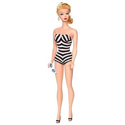 "My publisher did ask for my input. We talked about what image should go on the cover. Should it be a universal favorite (there really isn't one) or not? We all quickly and unanimously agreed it should be the classic 1959 original doll. [See the full original doll, right, with her striped bathing suit and signature white sunglasses in hand.]
"As soon as we knew what doll we wanted on the cover, Karen Pike, the photographer I hired to do a lot of the interior doll shots, talked with the designer about the cover concept. The team absolutely nailed it right away. I love the cover!
"The designer, who I thank on the dedication page, was fantastic throughout the whole process. She definitely took my comments to heart, even though she didn't always agree. And why would she? I'm not a designer!
"I think it's just about the most kick-ass cover I could have imagined for this book. I love the coy, sideways glance of the original Barbie. You can't tell what she's thinking--and I think that plays really well with the themes in the book. Love Barbie or hate her--which way will it go?"
Agreed! I think this cover is bewitching in the best possible way. Those pointed eyebrow arches, those wiley eyes, those pouf bangs. She's iconic.
What do you guys think?
"My publisher did ask for my input. We talked about what image should go on the cover. Should it be a universal favorite (there really isn't one) or not? We all quickly and unanimously agreed it should be the classic 1959 original doll. [See the full original doll, right, with her striped bathing suit and signature white sunglasses in hand.]
"As soon as we knew what doll we wanted on the cover, Karen Pike, the photographer I hired to do a lot of the interior doll shots, talked with the designer about the cover concept. The team absolutely nailed it right away. I love the cover!
"The designer, who I thank on the dedication page, was fantastic throughout the whole process. She definitely took my comments to heart, even though she didn't always agree. And why would she? I'm not a designer!
"I think it's just about the most kick-ass cover I could have imagined for this book. I love the coy, sideways glance of the original Barbie. You can't tell what she's thinking--and I think that plays really well with the themes in the book. Love Barbie or hate her--which way will it go?"
Agreed! I think this cover is bewitching in the best possible way. Those pointed eyebrow arches, those wiley eyes, those pouf bangs. She's iconic.
What do you guys think?
Photo Friday: Flowers and Brooklyn and A.S. King
in Photo Friday
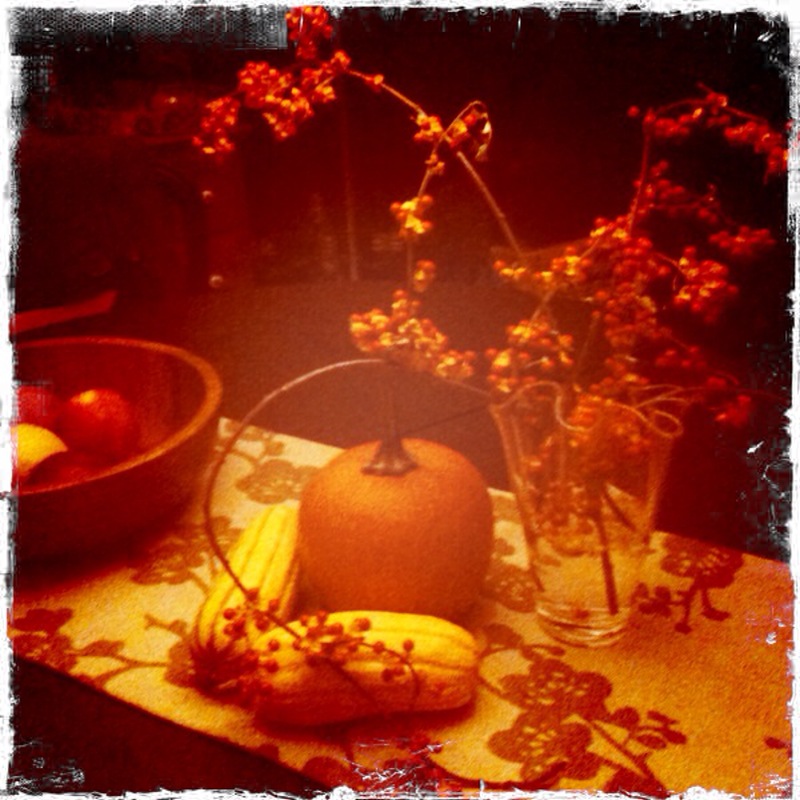
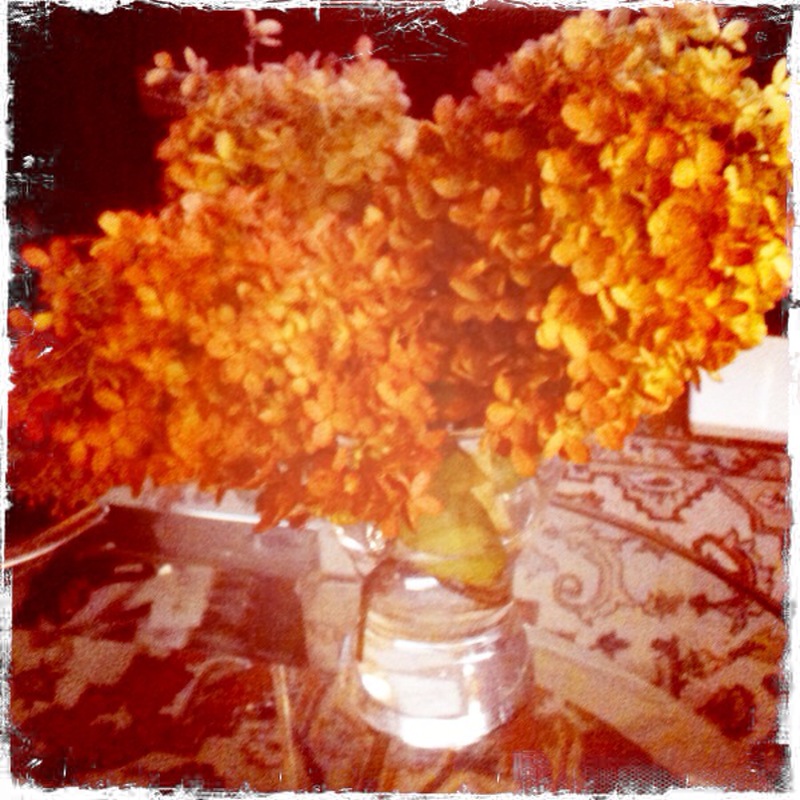
This week, I was a little bit Martha Stewart and a lot bit loving my city. Oh, and I read an awesome book, too. Here goes.A fall arrangement on the table, courtesy of gourds from the farmshare and winterberries from my aunt's house in Rhode Island:
 I got Hydrangeas in RI too:
 Plus, it's been gorgeous in Brooklyn! Love this door with morning glories:
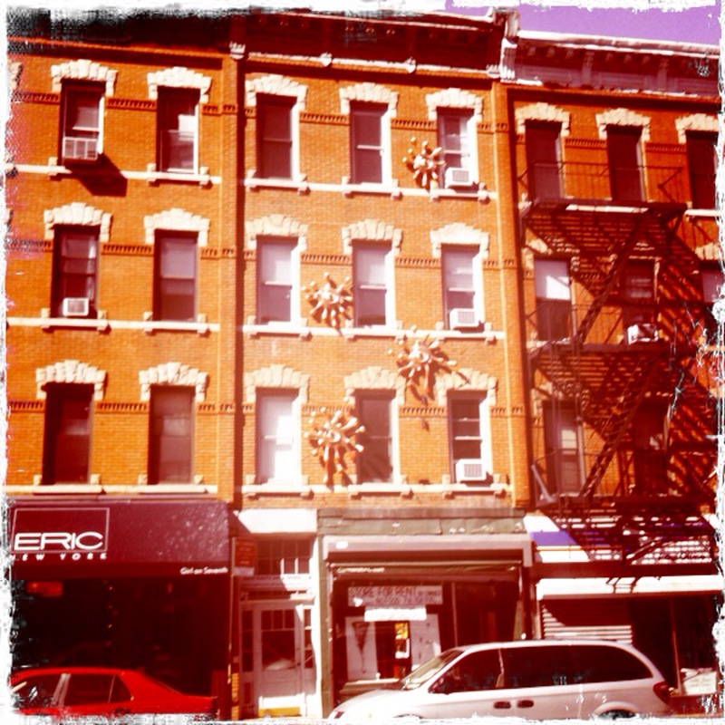
 And this building on 7th Avenue that always has some sort of sculptural goo on it. Love!
 Also on my Love List? Please Ignore Vera Dietz by A.S. King. This book is funny, painful, raw and real. You should read it! I wanted to pull off the road to finish it on the drive back from Rhode Island.
 Happy Friday! What was your week like?
Cover Stories: Trance by Linda Gerber
Linda Gerber has another pull-you-in title, Trance, out this month. You may remember her cinematic, action-filled Death By... series (remember the covers with the pop-art cut-out covers? LOVE!). She's back to share her new, hypnotizing Cover Story for Trance:"The cover gods at Puffin have been very good to me. Theresa Evangelista was the designer of the Death by Bikini Mysteries covers, and I knew she was the one working on this cover as well, so trusted it would be fabulous.
"When I first saw the cover, I was happy with it. I really liked Ashlyn's eyes and the trance-esque circles radiating from the title.
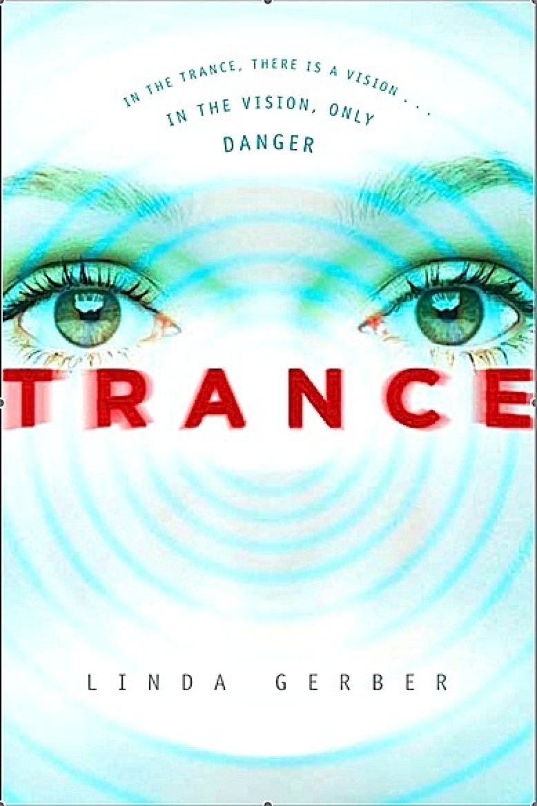 "In the end, there was just a subtle change, but it made a huge difference. After the first cover mock-up, they decided red would make the cover pop more than the blue. They were so right! I liked the cover in blue, but I love it in red. Plus, it has this cool, iridescent finish on the final version so that it catches the light. Pretty!
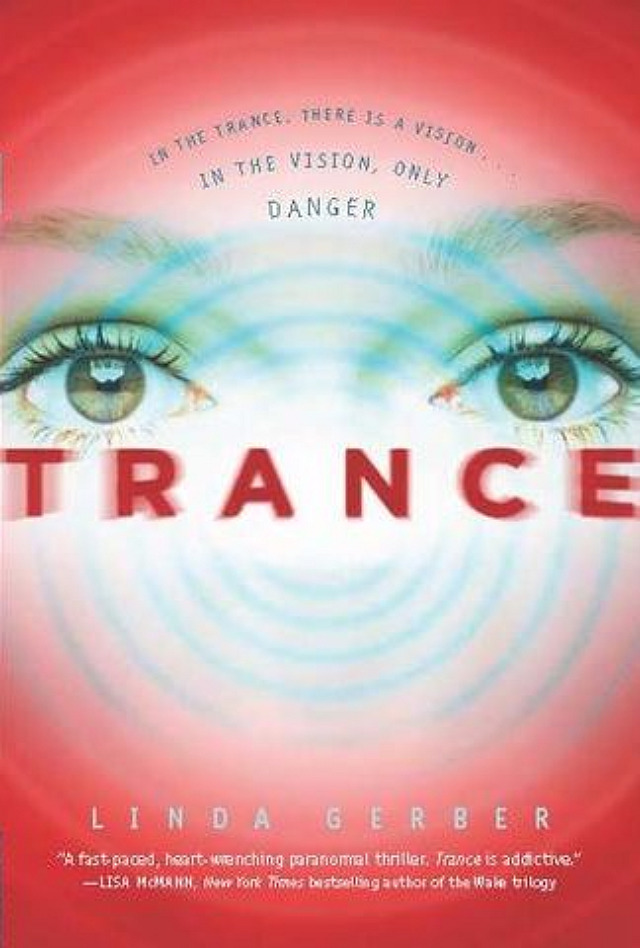 "Theresa has done it again. I absolutely love this cover."
Thank you, Linda! I agree on the color change. The first one feels colder somehow, but I prefer the warm, red, pulsating nature of the final. What do you guys think?
"Theresa has done it again. I absolutely love this cover."
Thank you, Linda! I agree on the color change. The first one feels colder somehow, but I prefer the warm, red, pulsating nature of the final. What do you guys think?
Win-It Wednesday: You Are Not Here by Samantha Schutz, Signed
Last week's winner of Her and Me and You by Lauren Strasnick is... Daniel Shelley! Send me your address, D.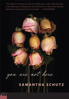 This week, I'm giving away a signed copy of You Are Not Here by Samantha Schutz. The summary: Annaleah and Brian had something special--Annaleah is sure of it. When they were together, they didn't need anyone else. It didn't matter that it was secret. All that mattered was what they shared. And then, suddenly, Brian dies. And while everyone else has their role in the grieving process, Annaleah finds herself living on the outside of it, unacknowledged and lonely. How can you recover from a loss no one will let you have?
This book is written in verse and it is lovely. And yes, it made me cry.
As for your comment task, it is this: Tell me about the last time you cried at a TV show or movie. Watching Teen Mom this week--when Caitlynn and Tyler finally saw Carly again--I was a blubbering mess. I cannot get enough of them, I just think they're so mature and so wonderful and I want them to stay together forever and have a fantastic family and rise above their circumstances. And I hope Caitlynn always keeps her rainbow eyeshadow. They are, as Siobhan Vivian once called them, Teen Angels.
So, your turn: What was the last movie or TV show that made your waterworks flow? I'll choose a winner randomly next week!
This week, I'm giving away a signed copy of You Are Not Here by Samantha Schutz. The summary: Annaleah and Brian had something special--Annaleah is sure of it. When they were together, they didn't need anyone else. It didn't matter that it was secret. All that mattered was what they shared. And then, suddenly, Brian dies. And while everyone else has their role in the grieving process, Annaleah finds herself living on the outside of it, unacknowledged and lonely. How can you recover from a loss no one will let you have?
This book is written in verse and it is lovely. And yes, it made me cry.
As for your comment task, it is this: Tell me about the last time you cried at a TV show or movie. Watching Teen Mom this week--when Caitlynn and Tyler finally saw Carly again--I was a blubbering mess. I cannot get enough of them, I just think they're so mature and so wonderful and I want them to stay together forever and have a fantastic family and rise above their circumstances. And I hope Caitlynn always keeps her rainbow eyeshadow. They are, as Siobhan Vivian once called them, Teen Angels.
So, your turn: What was the last movie or TV show that made your waterworks flow? I'll choose a winner randomly next week!
Cover Stories: The Kid Table by Andrea Seigel
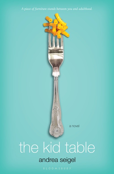 Andrea Seigel had some visual ups and downs with her novel The Kid Table, but she ended up with what I think is a really clean, funny, standout cover.
Here's how she got there:
Andrea Seigel had some visual ups and downs with her novel The Kid Table, but she ended up with what I think is a really clean, funny, standout cover.
Here's how she got there:
"I read your blog all the time, so I know a lot of authors say they're not visually oriented, but I always have covers in my head. In Kid Table one of the main characters tries to burn the table with a lighter, so probably the first image I pictured was of a magnified formal place card with the book's title in fancy lettering, but the place card destroyed with charred edges, chewed gum stuck to it, etc.
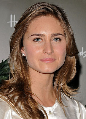
"Bloomsbury told me they were scheduling a photo shoot, so they asked what I thought Ingrid, the narrator, looked like and how she dressed. I started to get nervous at that point because I'd never pictured a cover with an actual person on it, but something more conceptual instead. I told my editor that Ingrid wasn't traditionally cute--in the book she says that she'll get called handsome a lot when she gets older--and I gave them actress Emily VanCamp and model Lauren Bush as examples. These were the pictures I sent. You know, strong nose:

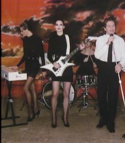 As for Ingrid's clothes, I said she dresses like one of the Robert Palmer video girls (right). In the first event of the book, her hair is slicked back with gel, and she's described as going for simple, sleek mini-dresses.
"When I saw the cover mockup (below left), I had a major meltdown. The emailed image came into my box minutes before I was leaving to drive out to the desert to teach a class, and I just thought, 'Nononononononono.' 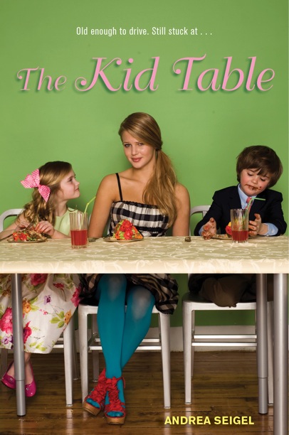 I called my boyfriend over to look at the laptop. He said, 'Oh. No.' I'm, uh, fairly emotional, so I immediately hit reply and basically told Bloomsbury that the cover was murdering me. And then seconds later an email showed up from my agent that was like, 'Maybe you should have slept on your response?' But during the three-hour drive out to the desert, I only got more worked up.
"I had a huge problem with the girl's styling. It was incredibly off for me. The girl wasn't right either. I took a print-out of the cover to the desert with me and showed it to a few people that day, and most everyone had comments like, 'Oh, you write a book on babysitting?' Or, 'This looks like something I might buy for my niece, who's in fourth-grade.' At that point I sent another email to Bloomsbury saying that I would reimburse them for the photo shoot if they'd let me have cover control. They didn't take me up on that, but they did agree to keep working on the cover. So then we went through a few rounds where they tried to work with the material from the photo shoot:
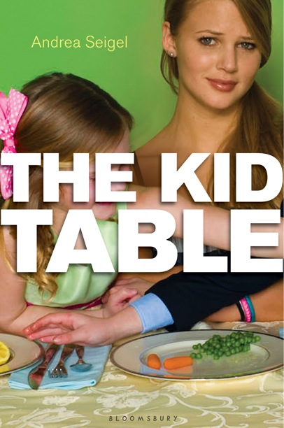


"But I just couldn't get past the girl. (Let me just clear things up here--the model herself is super cute. I'm sure everyone wants to date her at her school.) But those shoes, those tights, that dress--they were killlllllllling me. My agent, who was so great and supportive through all this, stood behind me and said, 'The girl's got to go.' I wasn't sure it would happen. I starting leaning toward the version with 'The Kid Table' in the big white letters because it blocked out as much of the photo as possible. And then a couple weeks later I was walking my dog and a completely new image showed up on my Blackberry.
"I kissed the top of my dog's head in relief.
"I'm not going to lie. I'm a pain in the ass, and I'm nitpicky. So I asked to see some more edgy combinations of objects/foods to intensify the contrast between adult and teen worlds (my mom served me Kraft on her good silverware, so the combo didn't shock me), but by that point, I think my publisher wanted me dead. So they politely said that the macaroni was staying put. Then I just asked that my name go in black and that we add 'a novel' so readers wouldn't think it was a cookbook. We also went back and forth a bunch of times over the final tag line because I felt the originals were too cutesy.
"And this is where we ended up:
"The new cover is a combination of two stock images, and it is such a clearer representation of the book, which is on the older spectrum of the YA age group and also pretty dark-humored--the narrator, Ingrid, is a maybe sociopath, but you would never get any sense of that angle from the original cover. The new one, though, it conveys a much wryer perspective; it's in keeping with the tone set by the narration. (I also have a longstanding fetish for anything on the seafoam/aqua spectrum because these were the colors of teenage bedroom (a strict marine-life decorating scheme), so I'm totally on board for the blue-green here.) It was so, so important to me that the cover reflect the material inside because I didn't want to sell the book on a false front. I feel like the cover is honest now.
"So in the end, I'm glad I was so vocal about the original because maybe if my reaction wasn't so strong, we wouldn't have gone through so many rounds until we got to the fork. I can almost get myself to cry about how relieved I am that this is the cover instead of the girl wearing the Wet Seal window, circa 2008. Hand to heart. I tear up."
Thanks, Andrea! I have to say that the earlier versions do feel way younger than the final cover. And I think it's important that the author is into the way their story is represented visually. Sadly, the cover is as important as the story inside because it's what gets the story read in the first place!
I think the final cover is sumptuous--the yellow-orange and green-blue play off each other perfectly, and it has a humorous sophistication to it, much like the tone of the book.
What do you guys think? Do you like any of the earlier covers?
Photo Friday: Farm Shares and Rainbow Nails
in Photo Friday
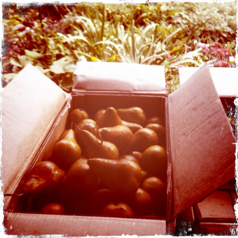
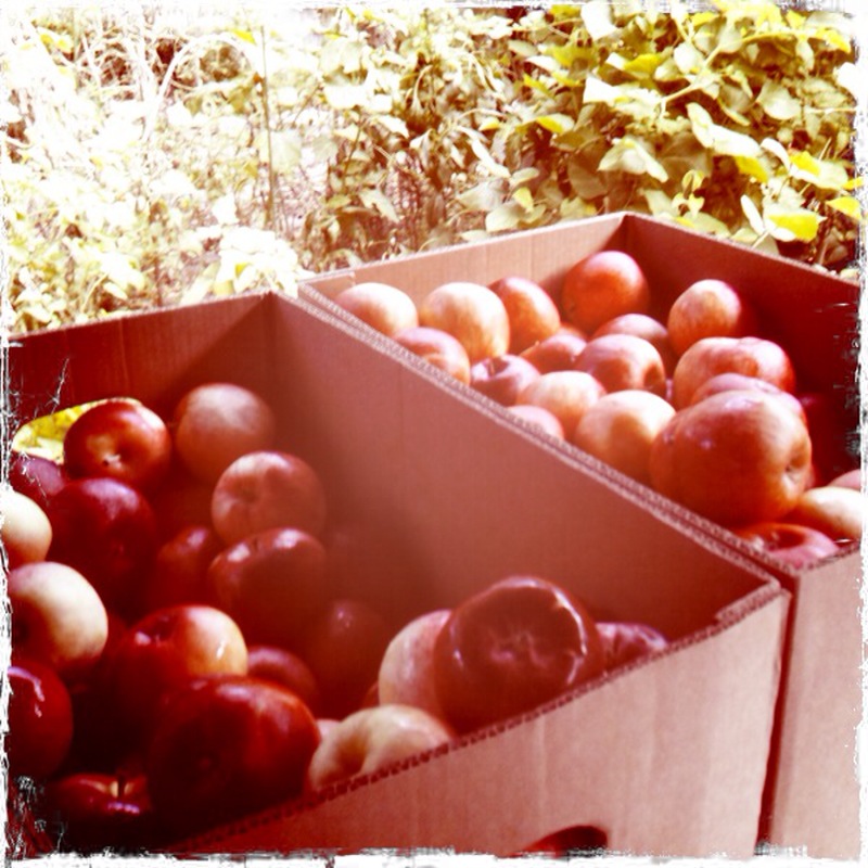
This week we got a huge farm share delivery, full of all this stuff: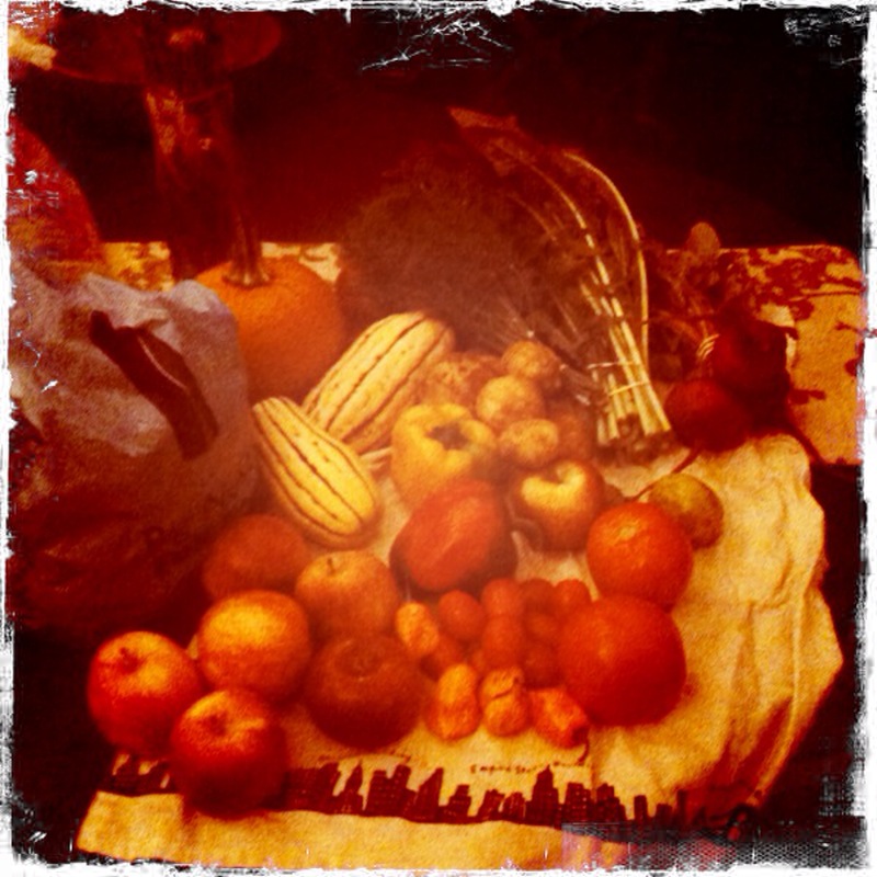 I worked at the garden this week, so I snapped a pic of the pears and apples we got, which are delish:
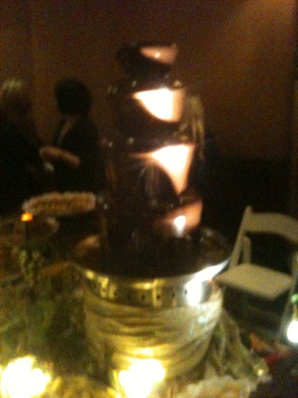
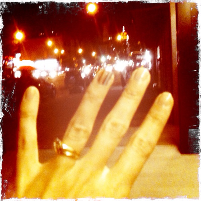
 And I went to the Spa Week event, where there was a chocolate fountain (missed you, Charles!) and I got my nails done so that the ring finger was a rainbow. It's a sticker trick, but it looks good, right (sorry so fuzzy)?
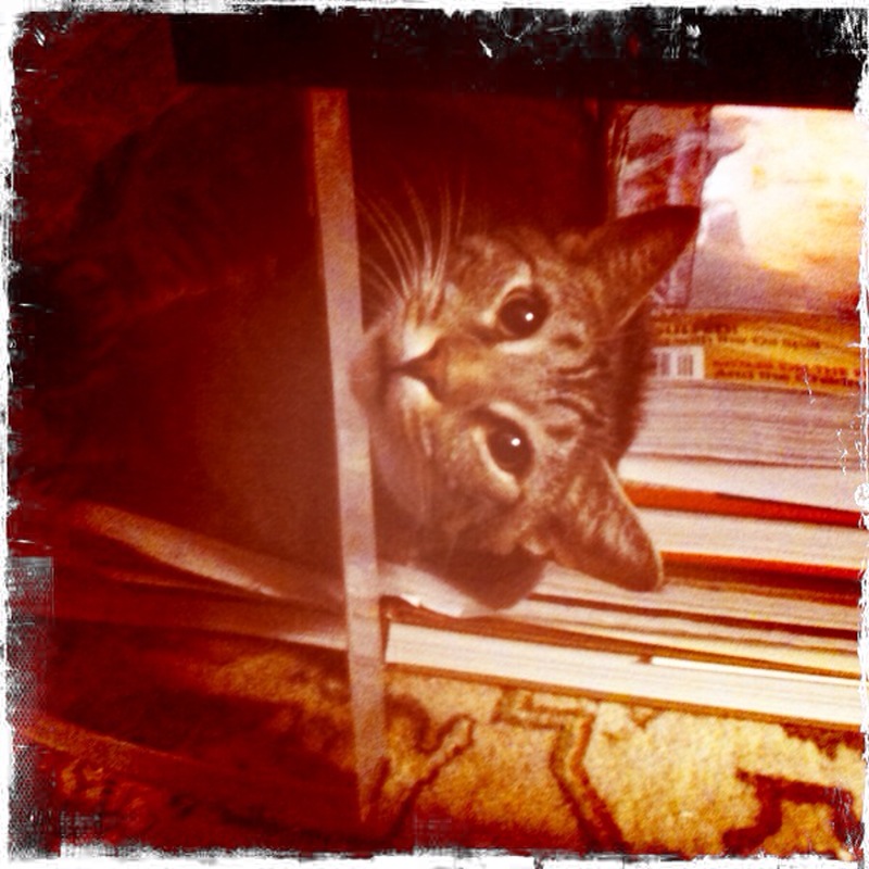
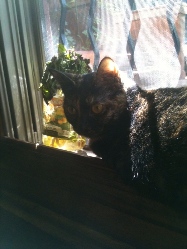
 And, finally, my cats are cute. That's Swayze squeezing himself into the corner of our clear coffee table sideways, and Winnie in the window, looking intense (and possibly evil) as usual.
 Happy Friday!
PS-Sarah Dessen shared the cover of her upcoming book today! Big news!
Happy Friday!
PS-Sarah Dessen shared the cover of her upcoming book today! Big news!
Cover Stories + Win-It Wednesday: Her and Me and You by Lauren Strasnick
The winner of last week's copy of hilarious-sounding fake vampire novel Bloodthirsty by Flynn Meaney is... Kristi! Send me your address, K.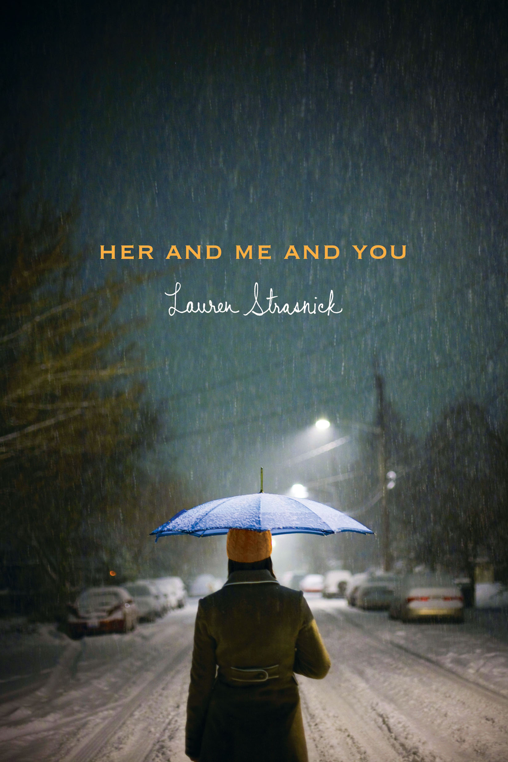 This week, Lauren Strasnick is here to talk about the cover of her latest book Her and Me and You. Kirkus says, "Strasnick's slim second offering packs a lot into its short chapters: divorce, broken friendships, crushes, the lines between love and sex and more. Characterization, scenes, dialogue and setting are seamlessly distilled into so few sharp, image-rich phrases that the novel reads almost as if it were written in verse... Complex and thought-provoking."
How good does that sound? Here's Lauren with the Cover Story (comment below to enter to win a copy of the book!):
"I didn't have any specific cover image in mind - but when I finally saw the finished design, I flipped. So gorgeous. It seriously exceeded my expectations.
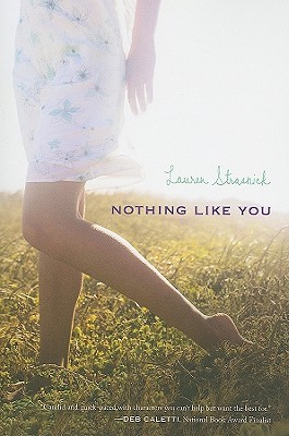
"I didn't give any input for Her and Me and You. I got to choose the shoes (Converse All Stars) that went on the spine of my first book, Nothing Like You. And I was asked for suggestions when S&S was trying to come up with an image for the paperback version of Nothing Like You (see the hardcover and paperback below).
This week, Lauren Strasnick is here to talk about the cover of her latest book Her and Me and You. Kirkus says, "Strasnick's slim second offering packs a lot into its short chapters: divorce, broken friendships, crushes, the lines between love and sex and more. Characterization, scenes, dialogue and setting are seamlessly distilled into so few sharp, image-rich phrases that the novel reads almost as if it were written in verse... Complex and thought-provoking."
How good does that sound? Here's Lauren with the Cover Story (comment below to enter to win a copy of the book!):
"I didn't have any specific cover image in mind - but when I finally saw the finished design, I flipped. So gorgeous. It seriously exceeded my expectations.
"I didn't give any input for Her and Me and You. I got to choose the shoes (Converse All Stars) that went on the spine of my first book, Nothing Like You. And I was asked for suggestions when S&S was trying to come up with an image for the paperback version of Nothing Like You (see the hardcover and paperback below).

 "Her and Me and You was born beautiful. It's a stock photo. Makes you want to stroll the snowy streets alone at night, right? Glorious."
Thanks, Lauren. I adore the cover! It actually makes me excited for winter days... which I've been dreading. But when I see that lamp-lit street and the snow falling softly, I'm ready!
I also am way into the paperback revised cover of Nothing Like You. I am a sucker for that late-day (or maybe early morning?) light.
What do you guys think? Comment for a chance to win Her and Me and You!
"Her and Me and You was born beautiful. It's a stock photo. Makes you want to stroll the snowy streets alone at night, right? Glorious."
Thanks, Lauren. I adore the cover! It actually makes me excited for winter days... which I've been dreading. But when I see that lamp-lit street and the snow falling softly, I'm ready!
I also am way into the paperback revised cover of Nothing Like You. I am a sucker for that late-day (or maybe early morning?) light.
What do you guys think? Comment for a chance to win Her and Me and You!
Cover Stories: Powder Necklace by Nana Ekua Brew-Hammond
 Nana Ekua Brew-Hammond's debut novel, Powder Necklace, follows London teenager Lila as she's sent to school in her native Ghana, then yanked back to London, and finally shipped off to New York -- all at her parents' whims. It's a book about dislocation and discovery, and Publishers Weekly says, "the beauty of the prose and the resilience of the heroine make this a winning debut." Plus, the book is gorgeous.Here's Nana to tell the story behind the cover:
"For the cover, I envisioned a tin of powder laying on either a blank space or girl's dresser with powder spilling from it -- Ghana has these cool-looking vintage-esque tins of powder that I remember marveling at when I was in school there. I was also thinking a photographic treatment would be cool, in particular, a more literal representation of the title featuring a close-up of a girl's neck dusted with powder.
Nana Ekua Brew-Hammond's debut novel, Powder Necklace, follows London teenager Lila as she's sent to school in her native Ghana, then yanked back to London, and finally shipped off to New York -- all at her parents' whims. It's a book about dislocation and discovery, and Publishers Weekly says, "the beauty of the prose and the resilience of the heroine make this a winning debut." Plus, the book is gorgeous.Here's Nana to tell the story behind the cover:
"For the cover, I envisioned a tin of powder laying on either a blank space or girl's dresser with powder spilling from it -- Ghana has these cool-looking vintage-esque tins of powder that I remember marveling at when I was in school there. I was also thinking a photographic treatment would be cool, in particular, a more literal representation of the title featuring a close-up of a girl's neck dusted with powder.
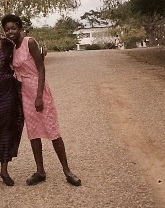 "My editor asked me what I was thinking in terms of the cover so I shared my ideas, which she was really into. I couldn't get her a good reference picture of the powder tin in time, but I did send her some images from my days in boarding school as a reference (that's Nana, right).
"I had a bit of anxiety when I got my cover. Seeing it made it real, and I had to ask myself if I could live with this image -- the cover of my first born book! -- FOREVA. The fashion girl in me wondered if I should go more 'editorial' with the cover, i.e. the powder tin, while the Poli Sci & Africana Studies major in me wanted to ensure the image was responsibly portraying Africa. I also recognized I'm a newbie and that the publisher had a far better reference than I did of what would sell on a shelf. I started googling the covers of my favorite authors to get a sense of what was out there and I decided I wanted the cover to clearly and elegantly communicate what the story was about -- and it did!
"My editor asked me what I was thinking in terms of the cover so I shared my ideas, which she was really into. I couldn't get her a good reference picture of the powder tin in time, but I did send her some images from my days in boarding school as a reference (that's Nana, right).
"I had a bit of anxiety when I got my cover. Seeing it made it real, and I had to ask myself if I could live with this image -- the cover of my first born book! -- FOREVA. The fashion girl in me wondered if I should go more 'editorial' with the cover, i.e. the powder tin, while the Poli Sci & Africana Studies major in me wanted to ensure the image was responsibly portraying Africa. I also recognized I'm a newbie and that the publisher had a far better reference than I did of what would sell on a shelf. I started googling the covers of my favorite authors to get a sense of what was out there and I decided I wanted the cover to clearly and elegantly communicate what the story was about -- and it did!
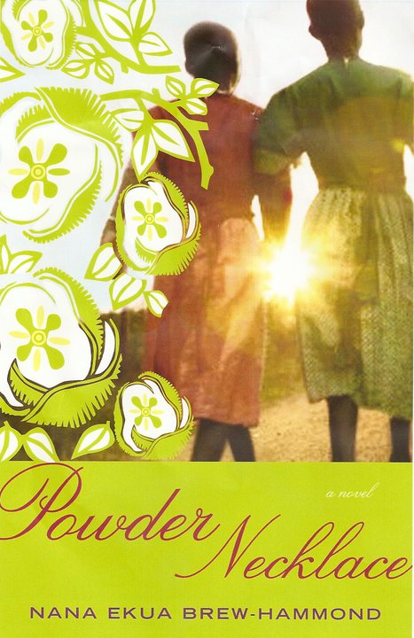 "I LOVE-love-LOVED the photograph. I don't know where they found it, but it was a spot-on evocation of the school in the book, the bonds the character makes with her schoolmates, and the journey she embarks on. I loved the little details too! The sun piercing through, strategically covering their holding hands; the red dirt on the ground; and the uniforms they were wearing. The uniform colors corresponded to the houses the girls lived in in the book. Again, I don't know where they found the shot or who took it, but I want to kiss him/her! I wanted to pump up the photograph and details, so the lime green and initial illustration did not work for me.
"I suggested we go with a flower that grew in the area and sent her some images I googled. I also wanted to go with red instead of green since the main character's house color was red. The color change and flower choice made a big difference to me. When she messengered over the final image I was like 'holla!' I would so buy this book."
Thanks, Nana! Agreed. This cover is gorgeous, and I love the photograph, the lighting and the flowers. For the record, I also liked the original illustrated treatment, but I think the colors on the final are stunning.
What do you guys think?
"I LOVE-love-LOVED the photograph. I don't know where they found it, but it was a spot-on evocation of the school in the book, the bonds the character makes with her schoolmates, and the journey she embarks on. I loved the little details too! The sun piercing through, strategically covering their holding hands; the red dirt on the ground; and the uniforms they were wearing. The uniform colors corresponded to the houses the girls lived in in the book. Again, I don't know where they found the shot or who took it, but I want to kiss him/her! I wanted to pump up the photograph and details, so the lime green and initial illustration did not work for me.
"I suggested we go with a flower that grew in the area and sent her some images I googled. I also wanted to go with red instead of green since the main character's house color was red. The color change and flower choice made a big difference to me. When she messengered over the final image I was like 'holla!' I would so buy this book."
Thanks, Nana! Agreed. This cover is gorgeous, and I love the photograph, the lighting and the flowers. For the record, I also liked the original illustrated treatment, but I think the colors on the final are stunning.
What do you guys think?
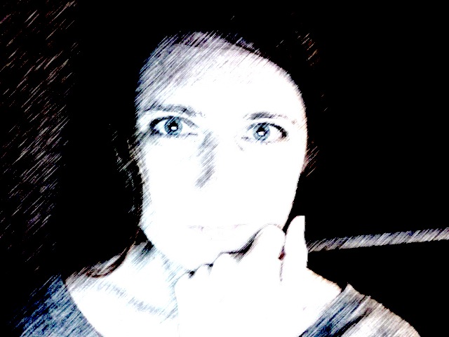
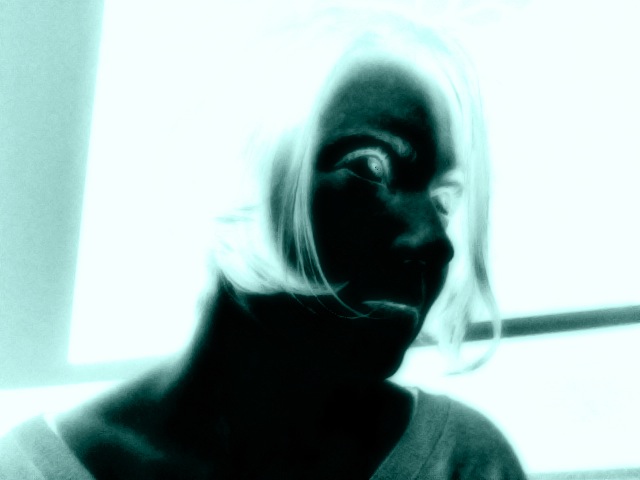
Photo Friday: Haircut!
in Photo Friday
I got another haircut. I think the seasons changing makes me want to snip some hair off my head. But I always get the same boring haircut, so I made things more exciting by photographing it in "heat sensor," "cartoon" and "x-ray" styles. Weird?
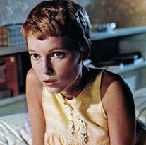 One day I'll be brave enough to go very short, a la Mia Farrow in Rosemary's Baby (left). That's my dream haircut, but I'm too chicken. Isn't it divine?
Happy Friday!
One day I'll be brave enough to go very short, a la Mia Farrow in Rosemary's Baby (left). That's my dream haircut, but I'm too chicken. Isn't it divine?
Happy Friday!