Last week's winner of Natalie Standiford's Confessions of the Sullivan Sisters is... Priya! Send me your address, P.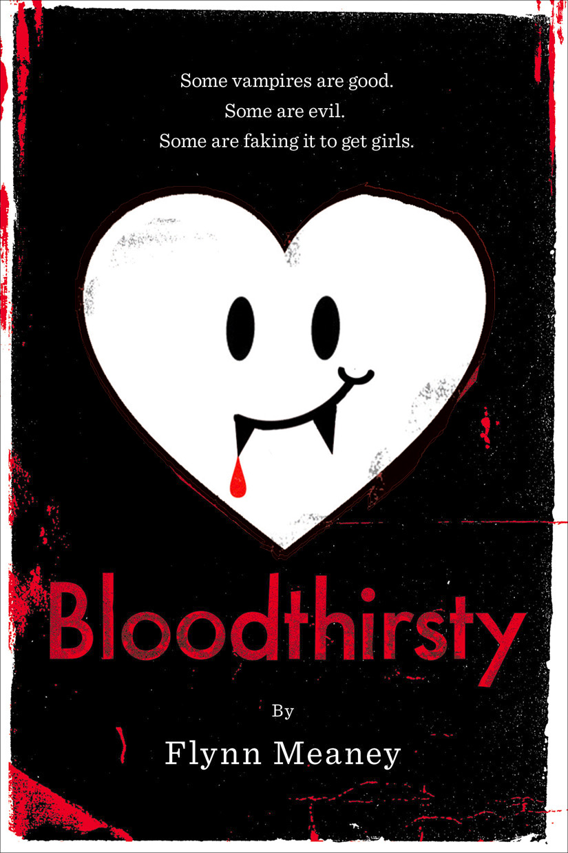 Flynn Meaney is here to talk about the cover of Bloodthirsty (out next week!), and how difficult it is to create an original vampire novel look these days. I love the idea of a guy faking vampire-dom to get girls -- hilarious, right? -- and Little, Brown is offering a chance for you to win the book (just comment to enter).
Take it away, Flynn!
'I didn't even think about the cover of Bloodthirsty, my debut YA novel, until the first version was emailed to me. I was still in a state of disbelief that my book, which tells the story of high school outcast named Finbar Frame who pretends to be a vampire to get some action, was really being published. There I was, four months out of college, being paid to do something I loved, be creative, reach out to geeky teens like the one I was, and--most importantly--sleep until noon. I was so damned grateful, I would have agreed to any cover.
"Except.... The first cover they sent me. My email from Little, Brown contained a photograph of a giant Slurpee. No vampire, no nerdy boy, not a drop of blood. Um, what?
"As my editor explained in her email, the publishers thought a Slurpee was emblematic of suburbia. My protagonist, Finbar, lives in suburban Westchester, New York, also where I grew up. Now this may be snobby, but, hey, I'm from Westchester, so it fits--we are not a Slurpee suburb. We are more of a Frappuccino suburb. Plus, my hero Finbar isn't much into junk food--whether it comes from 7-Eleven or Starbucks. In fact, he's a super scrawny dude.
"This cover wasn't going to work for me.
"But I wasn't going to push my luck--after all, I had a major publisher paying me a couple thousand Frappuccinos to write books. I had my dream career. If that career came with a giant Slurpee, so be it.
"Then fate, and a fat vampire, stepped in. My agent, Dan Lazar, found a similar book, Fat Vampire by Adam Rex, which had a Slurpee on the cover. [Remember the Cover Story for that one? --MW] And a Slurpee is definitely more appropriate for a fat vampire than for my undersized Finbar. Phew. I was safe.
"Unfortunately, we found that not only the Slurpee, but lots of other ideas were already taken. There are so many vampire-related stories out there that we couldn't touch blood, pale dudes, or--my suggestion--plastic vampire teeth, the type you wear for Halloween.
Flynn Meaney is here to talk about the cover of Bloodthirsty (out next week!), and how difficult it is to create an original vampire novel look these days. I love the idea of a guy faking vampire-dom to get girls -- hilarious, right? -- and Little, Brown is offering a chance for you to win the book (just comment to enter).
Take it away, Flynn!
'I didn't even think about the cover of Bloodthirsty, my debut YA novel, until the first version was emailed to me. I was still in a state of disbelief that my book, which tells the story of high school outcast named Finbar Frame who pretends to be a vampire to get some action, was really being published. There I was, four months out of college, being paid to do something I loved, be creative, reach out to geeky teens like the one I was, and--most importantly--sleep until noon. I was so damned grateful, I would have agreed to any cover.
"Except.... The first cover they sent me. My email from Little, Brown contained a photograph of a giant Slurpee. No vampire, no nerdy boy, not a drop of blood. Um, what?
"As my editor explained in her email, the publishers thought a Slurpee was emblematic of suburbia. My protagonist, Finbar, lives in suburban Westchester, New York, also where I grew up. Now this may be snobby, but, hey, I'm from Westchester, so it fits--we are not a Slurpee suburb. We are more of a Frappuccino suburb. Plus, my hero Finbar isn't much into junk food--whether it comes from 7-Eleven or Starbucks. In fact, he's a super scrawny dude.
"This cover wasn't going to work for me.
"But I wasn't going to push my luck--after all, I had a major publisher paying me a couple thousand Frappuccinos to write books. I had my dream career. If that career came with a giant Slurpee, so be it.
"Then fate, and a fat vampire, stepped in. My agent, Dan Lazar, found a similar book, Fat Vampire by Adam Rex, which had a Slurpee on the cover. [Remember the Cover Story for that one? --MW] And a Slurpee is definitely more appropriate for a fat vampire than for my undersized Finbar. Phew. I was safe.
"Unfortunately, we found that not only the Slurpee, but lots of other ideas were already taken. There are so many vampire-related stories out there that we couldn't touch blood, pale dudes, or--my suggestion--plastic vampire teeth, the type you wear for Halloween.
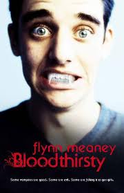 "Apparently designing a book cover is easier down under, because the Australian edition of my book features a pale dude with plastic vampire teeth (right). As much as I like the look of the Australian Bloodthirsty, that edition has a Finbar on it, and I wanted American readers to imagine their own Finbars as they read.
"Because so many vampire objects were taken, and the publisher and I agreed to stay away from a drawing or photo of Finbar, the art people at Little, Brown moved towards a more abstract design. That's how we got to the American cover of bloodthirsty--a cheeky smiley-face heart with decidedly non-menacing fangs.
"To me, the cover represents people's initial impressions of Bloodthirsty. It's 'just another vampire book,' with a black and red color scheme like the Twilight series. But then you notice that my book isn't pouting a la Kristen Stewart--it's grinning at you. I also think the fanged heart will grab the attention of bookstore browsers, who will have to look twice to figure out what they're looking at.
"My hope is that the cover--and the book--will appeal to both those who love vampire love stories, and those who mock them mercilessly."
Thanks, Flynn! Such a fun and interesting Cover Story, right?
What do you guys think? Commenters will have a shot at winning a copy of Bloodthirsty (US addresses only, sorry). Weigh in!
"Apparently designing a book cover is easier down under, because the Australian edition of my book features a pale dude with plastic vampire teeth (right). As much as I like the look of the Australian Bloodthirsty, that edition has a Finbar on it, and I wanted American readers to imagine their own Finbars as they read.
"Because so many vampire objects were taken, and the publisher and I agreed to stay away from a drawing or photo of Finbar, the art people at Little, Brown moved towards a more abstract design. That's how we got to the American cover of bloodthirsty--a cheeky smiley-face heart with decidedly non-menacing fangs.
"To me, the cover represents people's initial impressions of Bloodthirsty. It's 'just another vampire book,' with a black and red color scheme like the Twilight series. But then you notice that my book isn't pouting a la Kristen Stewart--it's grinning at you. I also think the fanged heart will grab the attention of bookstore browsers, who will have to look twice to figure out what they're looking at.
"My hope is that the cover--and the book--will appeal to both those who love vampire love stories, and those who mock them mercilessly."
Thanks, Flynn! Such a fun and interesting Cover Story, right?
What do you guys think? Commenters will have a shot at winning a copy of Bloodthirsty (US addresses only, sorry). Weigh in!
Kindle Questions
in Other Stuff
 Okay, so I got a Kindle. I read The Hunger Games on it, but that's the only book I've bought so far, and I kind of wish I owned the actual book so I could have the complete set on my shelf (I have hard copies of the other two).I purchased the Kindle mainly because sometimes I read author friends' books before they're published, and I like to download them to the Kindle so I don't have to read them on screen. I thought I'd be able to make notes on it -- and I can -- but then when I try to import the notes back to the computer, it won't do that. So any comments or edits I've made, I have to re-input. That is annoying.
Does anyone else have a Kindle? Are you liking it? I find myself still wanting to buy real books. As anyone who reads this blog knows, too, I cannot abide by the loss of the cover that happens when you get an e-book. Sad!
Thoughts? Oh, and anyone have an idea for a good Kindle case? I can't find one I like.
PS-Just read an essay on why paperbacks are better than e-readers, and I especially agree with the illustrations point. A children's book could never translate!
Okay, so I got a Kindle. I read The Hunger Games on it, but that's the only book I've bought so far, and I kind of wish I owned the actual book so I could have the complete set on my shelf (I have hard copies of the other two).I purchased the Kindle mainly because sometimes I read author friends' books before they're published, and I like to download them to the Kindle so I don't have to read them on screen. I thought I'd be able to make notes on it -- and I can -- but then when I try to import the notes back to the computer, it won't do that. So any comments or edits I've made, I have to re-input. That is annoying.
Does anyone else have a Kindle? Are you liking it? I find myself still wanting to buy real books. As anyone who reads this blog knows, too, I cannot abide by the loss of the cover that happens when you get an e-book. Sad!
Thoughts? Oh, and anyone have an idea for a good Kindle case? I can't find one I like.
PS-Just read an essay on why paperbacks are better than e-readers, and I especially agree with the illustrations point. A children's book could never translate!
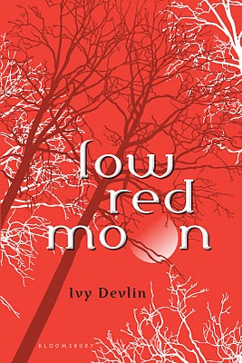
Cover Stories: Low Red Moon by Ivy Devlin
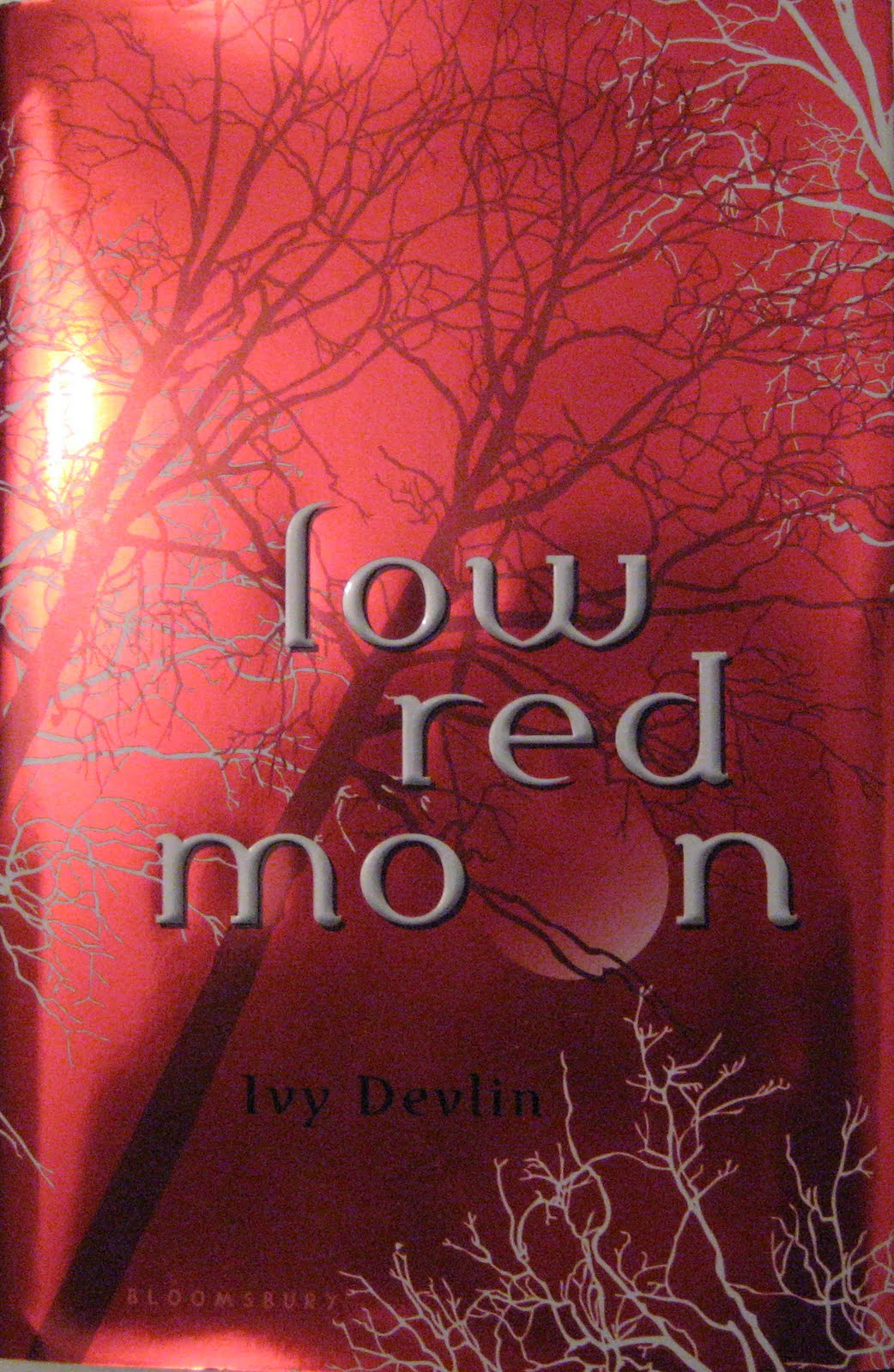 Ivy Devlin's Low Red Moon just shines on shelves. Partly because of the foil, and partly because of its gorgeous red and partly because of the amazing illustrations -- it comes together gorgeously.Here's Ivy to share her side of the story:
"The original title of the book was red, so as I was writing the book, I figured that, if I was lucky enough to have the stars align and have it sell, a cover with some red in it would be cool.
"We did talk a little about the cover, mostly because the title of the book changed. Everyone wanted red from the start, though, which was fun!
"When I first saw the cover, I pinched myself to make sure I wasn't dreaming, because it's a total dream cover! The red is amazing looking, and it's done in foil, so it shines, and then the title is embossed...I am the luckiest author ever, to have such a great cover!
"I actually talked to a lot of people at Bloomsbury about the cover, and the actual interior of the book as well. The cover is gorgeous, but the inside is really stunning because it's two-color, which is rare and really makes the book pop! The whole thing is so pretty I wouldn't mind framing it, if I could...
Ivy Devlin's Low Red Moon just shines on shelves. Partly because of the foil, and partly because of its gorgeous red and partly because of the amazing illustrations -- it comes together gorgeously.Here's Ivy to share her side of the story:
"The original title of the book was red, so as I was writing the book, I figured that, if I was lucky enough to have the stars align and have it sell, a cover with some red in it would be cool.
"We did talk a little about the cover, mostly because the title of the book changed. Everyone wanted red from the start, though, which was fun!
"When I first saw the cover, I pinched myself to make sure I wasn't dreaming, because it's a total dream cover! The red is amazing looking, and it's done in foil, so it shines, and then the title is embossed...I am the luckiest author ever, to have such a great cover!
"I actually talked to a lot of people at Bloomsbury about the cover, and the actual interior of the book as well. The cover is gorgeous, but the inside is really stunning because it's two-color, which is rare and really makes the book pop! The whole thing is so pretty I wouldn't mind framing it, if I could...
 "The ARCs were very different looking than the final book--much smaller font, just one page of two-color printing, and no fancy cover (right)--so yep, the cover--and the book! changed a lot from the ARC to the finished book.
"The designer for the cover of Low Red Moon created the entire thing! I'm not sure if any photos were used or not, but I know a lot of work went into creating the cover and the awesome little illustrations in the book, and I know I keep saying this but really, if I could frame the whole thing, I so would!
"In case it's not obvious (!), I LOVE my cover! And I'm so grateful to Bloomsbury for creating such an amazing looking book, not just the cover, but the inside as well. I couldn't ask for a more perfect looking book!"
Thanks, Ivy! And yay, Bloomsbury! (I will be sharing the Small-Town Sinners cover by their great art department soon!) I have seen this book up close and personal, and showing pics on a blog really doesn't do all the foil and amazing interior art justice. Pick it up off the shelf to appreciate it in real life. (The word "moon" is always printed in red -- super cool.)
What do you guys think of this cover? Has anyone seen it in person?
Watch the trailer here:
"The ARCs were very different looking than the final book--much smaller font, just one page of two-color printing, and no fancy cover (right)--so yep, the cover--and the book! changed a lot from the ARC to the finished book.
"The designer for the cover of Low Red Moon created the entire thing! I'm not sure if any photos were used or not, but I know a lot of work went into creating the cover and the awesome little illustrations in the book, and I know I keep saying this but really, if I could frame the whole thing, I so would!
"In case it's not obvious (!), I LOVE my cover! And I'm so grateful to Bloomsbury for creating such an amazing looking book, not just the cover, but the inside as well. I couldn't ask for a more perfect looking book!"
Thanks, Ivy! And yay, Bloomsbury! (I will be sharing the Small-Town Sinners cover by their great art department soon!) I have seen this book up close and personal, and showing pics on a blog really doesn't do all the foil and amazing interior art justice. Pick it up off the shelf to appreciate it in real life. (The word "moon" is always printed in red -- super cool.)
What do you guys think of this cover? Has anyone seen it in person?
Watch the trailer here:
Photo Friday: Allen and Son BBQ
in Photo Friday
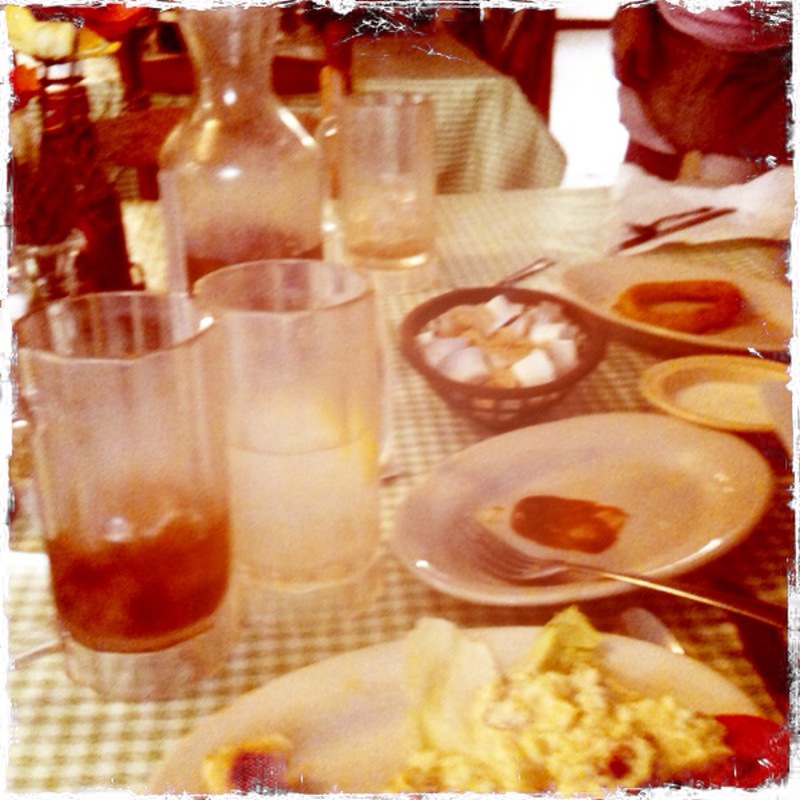
The Violet books mention Allen and Son, and it's still my favorite BBQ ever. If you're down in Chapel Hill, NC sometime, do stop in. Delish!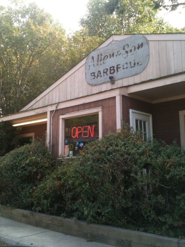 I forgot to take a picture of the food. I just remembered, um, after we ate. The wasteland of post-BBQ is here (look at that sweaty sweet tea jug--mmm!):
 Happy Friday!
Cover Stories: Firelight by Sophie Jordan
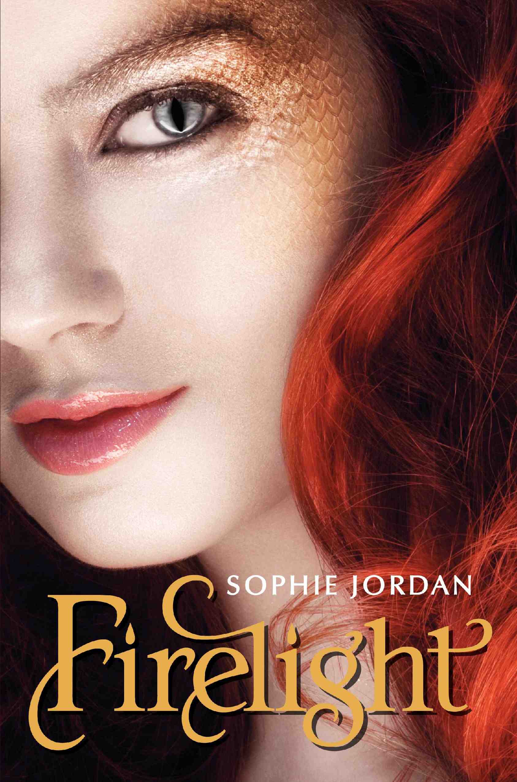 Sophie Jordan's Firelight is about a girl who can shift between human and dragon forms... which might have been quite a cover challenge!Here's Sophie to talk about the process:
"Early talks revolved around maybe a silhouette ... and my protagonist's striking red hair. We wanted something to hint to her 'dragon qualities, like wings, but we wanted to make certain no one saw the cover and thought 'angel' since she's not that!
"They kindly asked for my input, and I remember just being so excited about some of their thoughts (mentioned above) that I didn't have too much more to contribute. There never seemed to be any doubt it would be Jacinda, the protagonist, on the cover. We were in accord for so much of the cover concept that I knew Firelight was in good hands.
"I was shocked when I first saw the cover because it wasn't a silhouette at all but rather this amazing close-up. The red hair was there, of course! And she had this hint of cool, scaly skin around her eye... but I still thought something was missing. It was maybe too subtle, so I made a suggestion ...
"I persuaded them to try elongating her pupils into a vertical slit. My protagonist's eyes alter this way when she shape-shifts into a 'draki,' which are what dragons have evolved into over the millennia.
"The art department listened! I was so excited. They had reservations that the slit pupil on the protagonist might make the book appear sci-fi/fantasy, and I even worried about that, too, but I guess we all figured we could go back the other way if it wasn't the look we wanted.
"It's perfect now! They changed the eye to what you see now, and it just gave the cover that extra something I was looking for. I'm so lucky to have a publisher who actually listened and took my comments to heart.
"The cover was shot with a model. A rather extensive photo shoot, from all the accounts I've heard. Thousands of shots were taken, so they will have those to delve into for the second and third book of the Firelight series.
"The more I study my book cover, the more I see the magic and romance within it - and Firelight is all about magic and romance... and even suspense. I think there is something haunting about the cover model's face/expression that reflects what's in the pages of Firelight."
Thanks, Sophie! I think this cover is riveting, and I agree that it's the eyes that draw me in most. What do you guys think?
PS-Here's the trailer:
Sophie Jordan's Firelight is about a girl who can shift between human and dragon forms... which might have been quite a cover challenge!Here's Sophie to talk about the process:
"Early talks revolved around maybe a silhouette ... and my protagonist's striking red hair. We wanted something to hint to her 'dragon qualities, like wings, but we wanted to make certain no one saw the cover and thought 'angel' since she's not that!
"They kindly asked for my input, and I remember just being so excited about some of their thoughts (mentioned above) that I didn't have too much more to contribute. There never seemed to be any doubt it would be Jacinda, the protagonist, on the cover. We were in accord for so much of the cover concept that I knew Firelight was in good hands.
"I was shocked when I first saw the cover because it wasn't a silhouette at all but rather this amazing close-up. The red hair was there, of course! And she had this hint of cool, scaly skin around her eye... but I still thought something was missing. It was maybe too subtle, so I made a suggestion ...
"I persuaded them to try elongating her pupils into a vertical slit. My protagonist's eyes alter this way when she shape-shifts into a 'draki,' which are what dragons have evolved into over the millennia.
"The art department listened! I was so excited. They had reservations that the slit pupil on the protagonist might make the book appear sci-fi/fantasy, and I even worried about that, too, but I guess we all figured we could go back the other way if it wasn't the look we wanted.
"It's perfect now! They changed the eye to what you see now, and it just gave the cover that extra something I was looking for. I'm so lucky to have a publisher who actually listened and took my comments to heart.
"The cover was shot with a model. A rather extensive photo shoot, from all the accounts I've heard. Thousands of shots were taken, so they will have those to delve into for the second and third book of the Firelight series.
"The more I study my book cover, the more I see the magic and romance within it - and Firelight is all about magic and romance... and even suspense. I think there is something haunting about the cover model's face/expression that reflects what's in the pages of Firelight."
Thanks, Sophie! I think this cover is riveting, and I agree that it's the eyes that draw me in most. What do you guys think?
PS-Here's the trailer:
Win-It Wednesday: Confessions of the Sullivan Sisters by Natalie Standiford
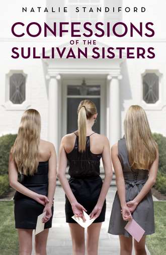 Thank you guys for your well wishes (and awesome ideas -- sleep, ginger tea, chicken soup, oh my!). I feel better today!The winner of Extraordinary by Nancy Werlin is... Stephanie M. Send me your address, S.
This week, you can enter to win an ARC of Natalie Standiford's Confessions of the Sullivan Sisters. This book is awesome -- totally compelling and intriguing, with unique voices and a charming cast of characters (all of whom might want a do-over with a certain aspect of their past year.)
To enter to win, watch this video from The Contemps, and then share the one day/moment from your life that you'd do over in the comments... as you can tell, my do-over day is in the video. Oh, and someone shared a comment on The Contemps doing over a happy day just to re-live it, which I thought was a pretty cool outlook on the whole "do over" thing!
Happy Wednesday!
Thank you guys for your well wishes (and awesome ideas -- sleep, ginger tea, chicken soup, oh my!). I feel better today!The winner of Extraordinary by Nancy Werlin is... Stephanie M. Send me your address, S.
This week, you can enter to win an ARC of Natalie Standiford's Confessions of the Sullivan Sisters. This book is awesome -- totally compelling and intriguing, with unique voices and a charming cast of characters (all of whom might want a do-over with a certain aspect of their past year.)
To enter to win, watch this video from The Contemps, and then share the one day/moment from your life that you'd do over in the comments... as you can tell, my do-over day is in the video. Oh, and someone shared a comment on The Contemps doing over a happy day just to re-live it, which I thought was a pretty cool outlook on the whole "do over" thing!
Happy Wednesday!
Cover Stories: 8 at Unabashedly Bookish
Over on the BN.com blog....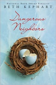 Dangerous Neighbors by Beth Kephart. "Once I saw the cover of this book, I knew that I could go anywhere, the book in hand, and read it to teens and adults alike, proud of the look of the book. It's such a gorgeous cover..." Read more...
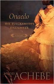 Onaedo, The Blacksmith's Daughter by Ngozi Achebe. "There are so many layers to the cover of Ngozi Achebe's Onaedo, The Blacksmith's Daughter--that gorgeous dress, the map of Africa that folds into the skirt, the ship in the distance, and the young girl looking up at the woman who is the focus. I see something new every time I study this cover." Read more...
 Husband and Wife by Leah Stewart. "Leah Stewart's first novel, The Myth of You and Me, about a friendship lost, is a favorite on my shelf that I've read more than once. Her latest, Husband and Wife, is one I'm greatly looking forward to reading. Here, she talks about the cover." Read more...
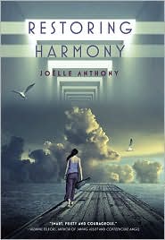 Restoring Harmony by Joelle Anthony. "I love that even though Molly's walking down a dock, it isn't clear where it is or where she's going or why she's walking down it. And then you have these sort of doorways of light framing the picture, so that gives you a hint that the book is set in the future. The thing I love most is it's perfect for the story, but doesn't give anything away." Read more...
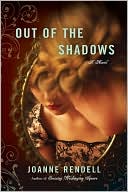 Out of the Shadows by Joanne Rendell. "I made no comments, except 'I love it. Please don't change a thing!' Thankfully, they barely changed it from the first draft, except to insert a blurb. Also, even more deliciously, they added pale blue foil lettering on the final copies!" Read more...
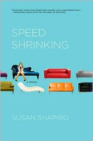 Speed Shrinking by Susan Shapiro. "When they sent me their cover design, I literally cried. I hate pink. I am so not a pink girl. And I hated the quote bubbles which made no sense to me. And she had white shoes! It's an autobiographical book and anyone who ever met me knows I wear black shoes. Not white shoes. I even took both covers to my shrink, who agreed with me." Read more...
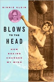 Blows to the Head: How Boxing Changed My Mind by Binnie Klein. "The original design my press sent me didn't move me, and I went into a panic. They said they had gotten the design from an award-winning cover designer. It was basically a stock photograph of hanging boxing gloves that one could find on the internet in thirty seconds. The designer inserted pink laces, and that was the, ahem, 'hook.'" Read more...
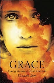 Grace by Elizabeth Scott. "I really had no idea what the cover would look like as I was writing. I mostly thought, 'girl raised to be suicide bomber who doesn't kill herself and goes on the run? Huh. Okay brain, let's do it!'" Read more...
Cover Stories: Losing Faith by Denise Jaden
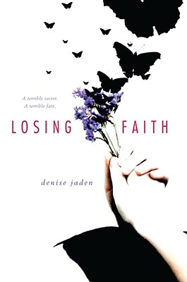 Last week on The Contemps, there was a spotlight on Denise Jaden's new novel, Losing Faith. Her cover is pretty unique, in that it doesn't have a model or one single iconic image on it.
Here she is to tell us how it came about:
Last week on The Contemps, there was a spotlight on Denise Jaden's new novel, Losing Faith. Her cover is pretty unique, in that it doesn't have a model or one single iconic image on it.
Here she is to tell us how it came about:
"I had a few ideas in mind for my cover after it had sold. I didn't really think about the artwork until then. Usually what I envisioned included a cliff of some kind and a girl with arms outstretched, but I admit, I'm not much of a visionary in this area.
"My editor let me know a few days before they would have a finalized cover design for Losing Faith. To be honest, I expected there would be more of a conversation about their plans or my expectations, but that's not how it went in my case.
"I was so incredibly impatient waiting to see my cover art for the first time. As soon as I knew it was coming, I didn't leave my computer all day! Then, would you believe, when the email did come, for some reason the attachment didn't come through. My agent wrote me immediately, wanting to know what I thought of the cover, and my reply was something like, 'What I think is that I want to see the flippin' thing. RIGHT NOW!' She emailed another copy off to me, and when it arrived, it was a very small jpg copy of the art, and because it was white, on the white background of my screen, it really was not very impressive at first. In fact, it kind of just looked like a smudge on my screen. I spoke with my agent and she suggested I print it out. Best suggestion ever. In full size, and away from the computer screen, I fell in love, and have been in love ever since.
"I did make a few comments to my editor about the vague nature of the image at the bottom of the cover. She explained that this vagueness was purposeful, as they did not want the image to seem too morbid. That made perfect sense to me. "The only changes from the original version I saw, were the addition of a tagline reading, 'A terrible secret. A terrible fate.' And with the finished copies, the spine includes purple and butterflies (a winning combination in my opinion!)
"My cover was created strictly with stock photos. I've always been drawn to covers with real-life models, and I had hoped for that, but as I said, I really do love the finished version of my cover.
"There are lots of hidden meanings and underlying messages in the cover, at least in my opinion. But I think the Losing Faith cover is one that everyone may take something a little different from, and that's okay with me. The figure at the bottom was not apparent to me at first, and it took a lot of staring and contemplating to figure out exactly what it was supposed to be. I'd rather not explain it, as I think it's better if it's one of those things that people take what they see from it."
I'm still trying to find the figure! Thanks, Denise! Here's a look at the spine, which I think stands out with the butterflies.

What do you guys think of this cover?
Sunday Writing Stuff
in Other Stuff
 Two videos where I talk about writing got posted this week. There's one for the Complete You Draft 2010 Challenge, over at Lesley's blog (it's a super-quick writing tip).And there's a longer interview with Molly Horan, where I blather on for a little while as she asks me questions (she interviews lots of authors on her youtube channel -- Lauren Oliver, Rachel Cohn and Barry Lyga, to name a few!).
Happy Sunday. (I'm still sick, but almost better!)
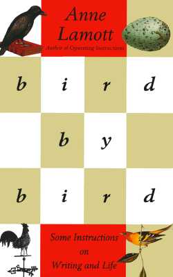
PS-The pic? That's my very favorite writing advice book, Bird by Bird, By Anne LaMott.
Two videos where I talk about writing got posted this week. There's one for the Complete You Draft 2010 Challenge, over at Lesley's blog (it's a super-quick writing tip).And there's a longer interview with Molly Horan, where I blather on for a little while as she asks me questions (she interviews lots of authors on her youtube channel -- Lauren Oliver, Rachel Cohn and Barry Lyga, to name a few!).
Happy Sunday. (I'm still sick, but almost better!)
PS-The pic? That's my very favorite writing advice book, Bird by Bird, By Anne LaMott.
Photo Friday: Food and a Tornado
in Photo Friday
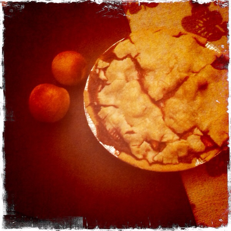
Just some photos from the last week to share. Most are food. I am really into food.I made a peach-and-raspberry pie! It came out really well. (I didn't make the crust. Baby steps.):
 My friend Anne and I had drinks at the Soho House roofdeck. My friend Jolene served us and recommended the Pepper Margarita (which was delish). As I sipped it, I watched models walk around the pool. It was such a SCENE up there.
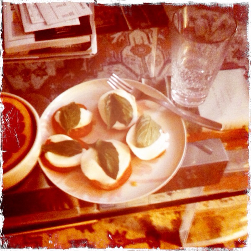
 All week, I was enamored of the tomatoes in my farmshare (yes, I know how lame that sounds). I made Caprese salads every day (tomato, basil, mozzarella, eat!):
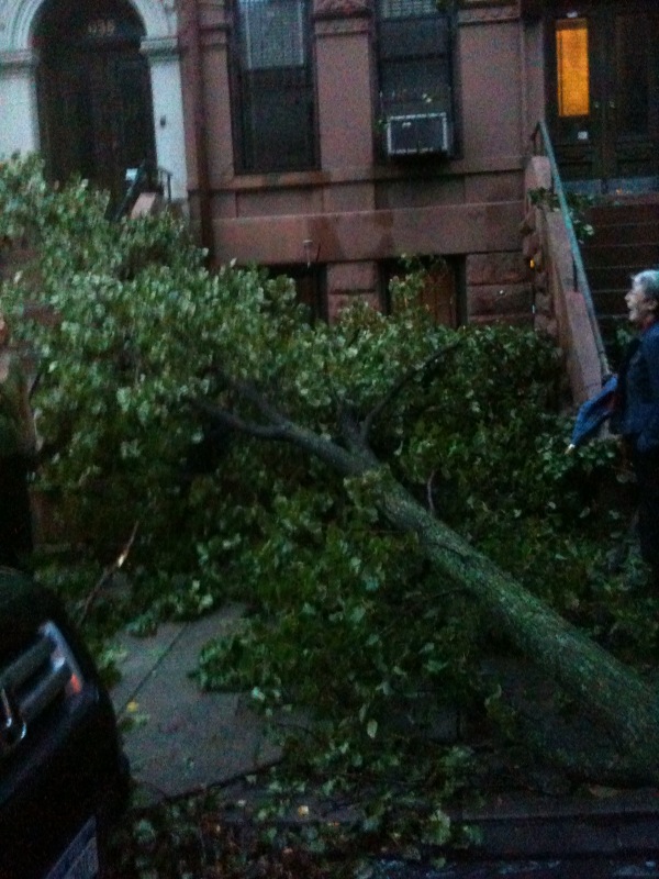
 Last night, a tornado blew through NYC. It hit my neighborhood pretty hard, and here's the pic I snapped on my way home -- this is my block. (The NY Times has a lot of photos that are better in this really fascinating series.)
 Happy Friday, everyone!