 When I saw the cover for L.K. Madigan's October release, The Mermaid's Mirror, I had to find out how such a windswept, atmospheric image came about.Here's L.K. to tell the tale:
"Sadly, I have no eye for design. I can envision scene after scene in my mind as I write them ... but I can't come up with an iconic image to represent the book.
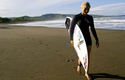
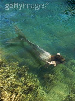
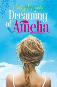
Since the book is about a girl surfer who finds a mermaid, I thought the cover might show ... um, a girl surfer... or a mermaid.
When I saw the cover for L.K. Madigan's October release, The Mermaid's Mirror, I had to find out how such a windswept, atmospheric image came about.Here's L.K. to tell the tale:
"Sadly, I have no eye for design. I can envision scene after scene in my mind as I write them ... but I can't come up with an iconic image to represent the book.
Since the book is about a girl surfer who finds a mermaid, I thought the cover might show ... um, a girl surfer... or a mermaid.
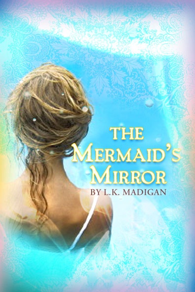 "Which is why I'm a writer, not a designer. The first cover design my publisher sent me was very pretty (right). I loved the girl's hair, and the water droplets effect, but the blue graphic didn't really convey anything about the story. Only the word 'mermaid' in the title hinted that it might be a fantasy. My agent and I talked about it, and decided to ask the art director to consider incorporating the ocean into the design.
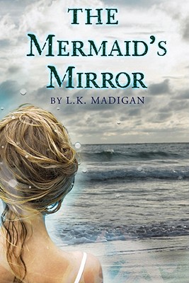
"The final cover is what she came up with - I LOVE it. So beautiful and moody, and it definitely makes me think 'northern California,' which is the setting of the book.
"Which is why I'm a writer, not a designer. The first cover design my publisher sent me was very pretty (right). I loved the girl's hair, and the water droplets effect, but the blue graphic didn't really convey anything about the story. Only the word 'mermaid' in the title hinted that it might be a fantasy. My agent and I talked about it, and decided to ask the art director to consider incorporating the ocean into the design.
"The final cover is what she came up with - I LOVE it. So beautiful and moody, and it definitely makes me think 'northern California,' which is the setting of the book.
 "After the cover was approved, we found out that a Jaclyn Moriarty book showed the same stock photo (right). But that book was a U.K. edition; it will be interesting to see if they release the book in the U.S., and whether they keep that same cover.
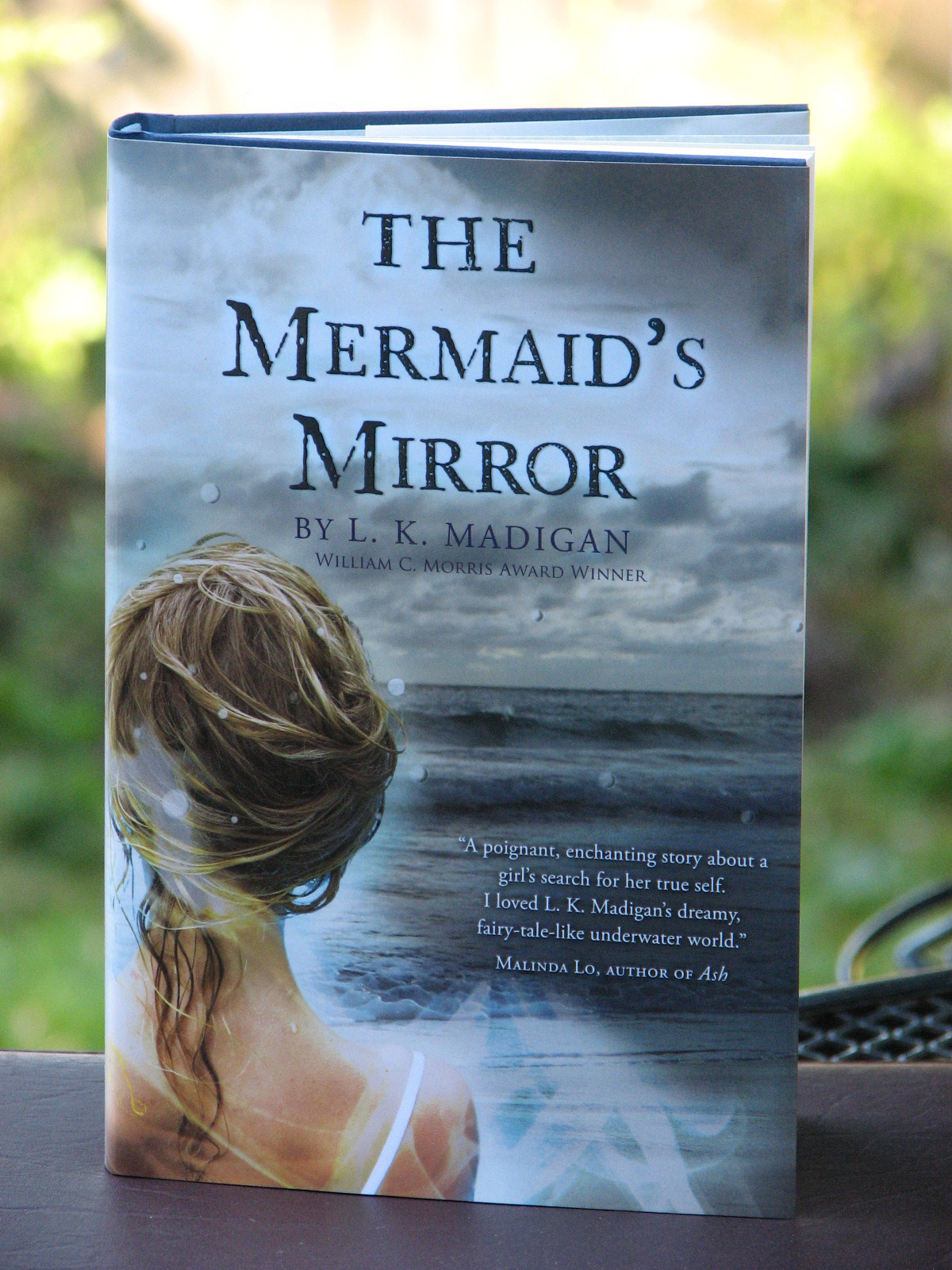 "I just received my author's copies of the book a couple of days ago. I thought it would be interesting to include photos of the REAL LIFE cover. As you can see, it's a little darker than the previous image ... and there's more ocean on the back cover. More moodiness!
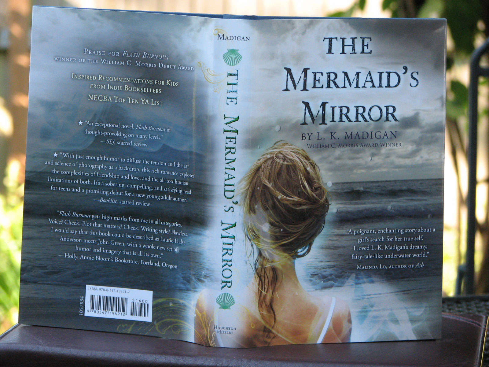 "It's so pretty and layered. I love the lighting around the girl - Lena - and the misty blue swirling effect. I even love the little green shell detail on the spine. Carol Chu is the art director at Houghton Mifflin, and I've been lucky enough to have her design both my book covers."
Thanks, L.K.! I adore this cover and I wish I could messily swirl my hair so perfectly into that mermaid bun. Sigh. Also, Alea noticed the cover twin in her awesome lookalike series earlier this year (along with some others--love this blog series).
You can win a copy of the book here on Jaclyn Dolamore's blog if you enter by Friday.
So what do you guys think of the cover?
"It's so pretty and layered. I love the lighting around the girl - Lena - and the misty blue swirling effect. I even love the little green shell detail on the spine. Carol Chu is the art director at Houghton Mifflin, and I've been lucky enough to have her design both my book covers."
Thanks, L.K.! I adore this cover and I wish I could messily swirl my hair so perfectly into that mermaid bun. Sigh. Also, Alea noticed the cover twin in her awesome lookalike series earlier this year (along with some others--love this blog series).
You can win a copy of the book here on Jaclyn Dolamore's blog if you enter by Friday.
So what do you guys think of the cover?
Win-It Wednesday: Extraordinary by Nancy Werlin
Last week's winner of Not That Kind of Girl by Siobhan Vivian is... KristanC! Send me your address, K.
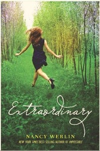 This week, I'm sick. Wah! So give me your best home remedies for colds in the comments below (or just offer me sympathy at my pity party) and you're entered to win an Advanced Reader Copy of Extraordinary by Nancy Werlin (which has an AMAZING cover and a great Cover Story that Nancy shared on PW's Shelf Talker blog). I'm reading this book right now and loving it so much that it might heal me.
Happy Wednesday! *cough*
Cover Stories: The Eternal Ones by Kirsten Miller
 I love a bright red cover. Sleek and striking, Kirsten Miller's new release, The Eternal Ones, caught my eye instantly. Here she is to tell the tale:"I had an idea for the cover: I thought of two hands reaching for each other across the cover. The female hand was flesh and blood, while the masculine hand appeared ghostly--almost translucent. It was a rather literal nod to the plot. (The book is about reincarnation.) But I also knew going into the process that there are people who are MUCH better at this sort of thing than I am, so I wasn't going to ram my idea down anyone's gullet.
"I know I discussed the design a great deal with my editor, but I'm not sure if mentioned 'my cover' or not. He had some pretty cool ideas of his own that I thought would be interesting to pursue.
I love a bright red cover. Sleek and striking, Kirsten Miller's new release, The Eternal Ones, caught my eye instantly. Here she is to tell the tale:"I had an idea for the cover: I thought of two hands reaching for each other across the cover. The female hand was flesh and blood, while the masculine hand appeared ghostly--almost translucent. It was a rather literal nod to the plot. (The book is about reincarnation.) But I also knew going into the process that there are people who are MUCH better at this sort of thing than I am, so I wasn't going to ram my idea down anyone's gullet.
"I know I discussed the design a great deal with my editor, but I'm not sure if mentioned 'my cover' or not. He had some pretty cool ideas of his own that I thought would be interesting to pursue.
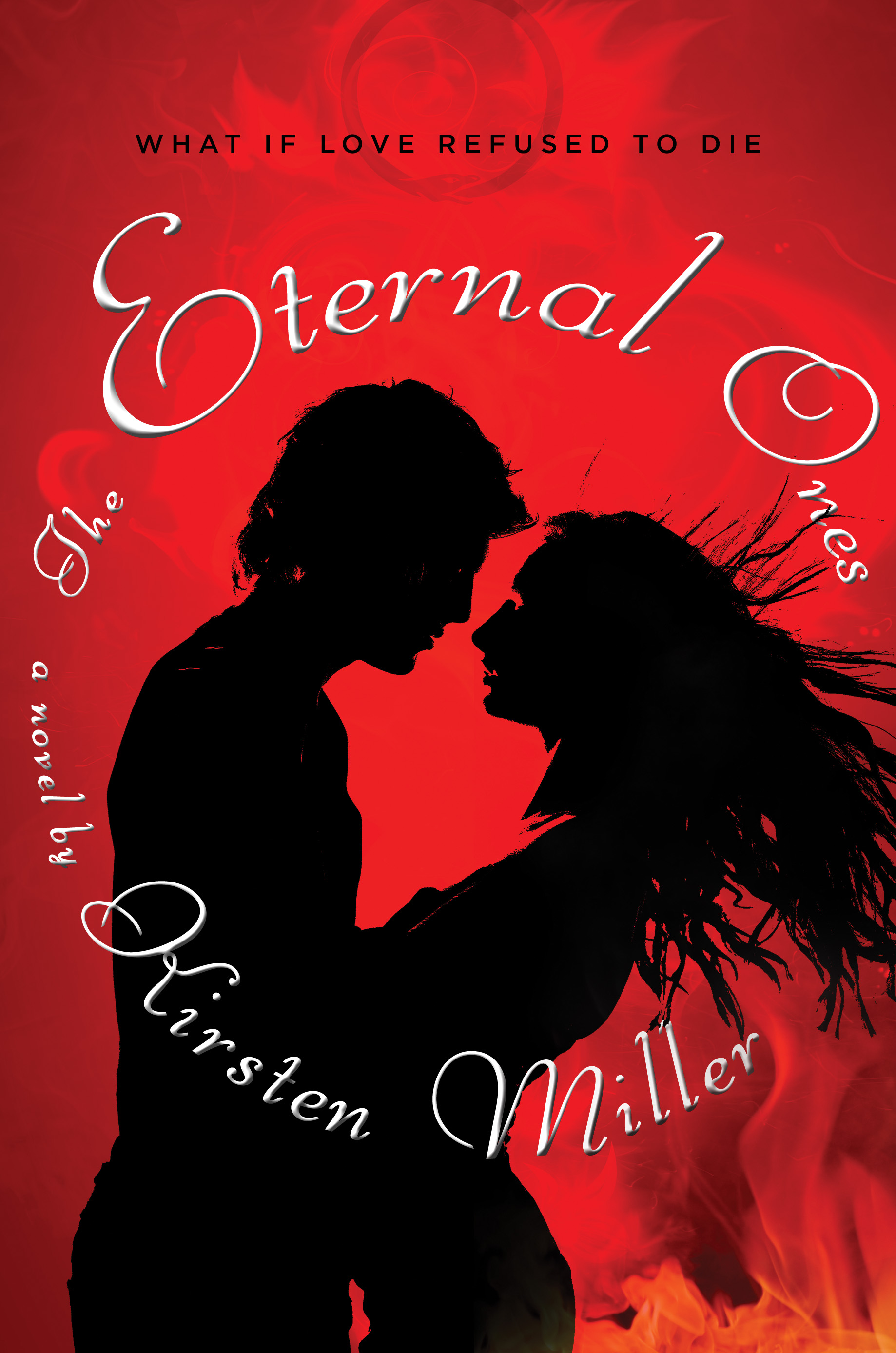 "The cover went through at least five phases which bore no resemblance to each other. There was the action cover, the bodice-ripping cover (which graced the original ARC, right), the spiritual cover, the lost in space cover, and the final cover.
"I recently found out that they had something close to the final cover all along! But I'm happy they explored so many options. This way we all know we ended up in the right place.
"I saw the final cover for the first time on my blackberry. As tiny as it appeared on the screen, I knew it was perfect the moment I opened the attachment. It's sleek, beautiful, and a little bit sinister. Exactly the combination I wanted.
"A lot of authors don't get a chance to put in their two cents, but I did. If my comments were good, they were taken to heart. If they weren't so great, they were often ignored. (Which is just as it should be.) The secret is making only the suggestions that truly need to be made and not overwhelming the designers with minutiae. These people are artists and professionals, too. You have to let them do their job. (And while you wait to see the results, I recommend lots of prayer. Ha.)
"I knew that I did not have the final say. But I was in good hands, so I was confident that we'd eventually land on something I loved. (One of the reasons I was so happy to go with Razorbill in the first place was the quality of their covers.)
"I believe the silver ouroboros (snake swallowing it's tail) on the cover was created by a designer at Penguin. It was a real challenge to create an image that was both sinister and beautiful.
"I love it. When you take it out into the sunshine it sparkles quite alluringly. And it certainly stands out in the bookstore. (Particularly since most books seem to be dark and gothic these days.) Having an iconic image to work with doesn't hurt, either. It lends itself to all sorts of stuff--tattoos, rings, etc. So in the end, I really couldn't be more pleased.
"In The Eternal Ones, the ouroboros is the logo of the Ouroboros Society, a mysterious private club in Manhattan whose members all believe they've led multiple lives. The snake swallowing its own tail has long been a symbol of eternity, so it works perfectly with the story.
"The final cover looks so much prettier in person!"
Hear that? I think we all need to pick it up. It's #9 on the NY Times Bestseller list this week, so I think a lot of people are following that advice. Awesome!
What do you guys think of this cover?
PS-Kirsten also has a spectacular blog where you can submit a photo and have a past life revealed. She did one for me and I swoon whenever I read it. Gorgeous.
"The cover went through at least five phases which bore no resemblance to each other. There was the action cover, the bodice-ripping cover (which graced the original ARC, right), the spiritual cover, the lost in space cover, and the final cover.
"I recently found out that they had something close to the final cover all along! But I'm happy they explored so many options. This way we all know we ended up in the right place.
"I saw the final cover for the first time on my blackberry. As tiny as it appeared on the screen, I knew it was perfect the moment I opened the attachment. It's sleek, beautiful, and a little bit sinister. Exactly the combination I wanted.
"A lot of authors don't get a chance to put in their two cents, but I did. If my comments were good, they were taken to heart. If they weren't so great, they were often ignored. (Which is just as it should be.) The secret is making only the suggestions that truly need to be made and not overwhelming the designers with minutiae. These people are artists and professionals, too. You have to let them do their job. (And while you wait to see the results, I recommend lots of prayer. Ha.)
"I knew that I did not have the final say. But I was in good hands, so I was confident that we'd eventually land on something I loved. (One of the reasons I was so happy to go with Razorbill in the first place was the quality of their covers.)
"I believe the silver ouroboros (snake swallowing it's tail) on the cover was created by a designer at Penguin. It was a real challenge to create an image that was both sinister and beautiful.
"I love it. When you take it out into the sunshine it sparkles quite alluringly. And it certainly stands out in the bookstore. (Particularly since most books seem to be dark and gothic these days.) Having an iconic image to work with doesn't hurt, either. It lends itself to all sorts of stuff--tattoos, rings, etc. So in the end, I really couldn't be more pleased.
"In The Eternal Ones, the ouroboros is the logo of the Ouroboros Society, a mysterious private club in Manhattan whose members all believe they've led multiple lives. The snake swallowing its own tail has long been a symbol of eternity, so it works perfectly with the story.
"The final cover looks so much prettier in person!"
Hear that? I think we all need to pick it up. It's #9 on the NY Times Bestseller list this week, so I think a lot of people are following that advice. Awesome!
What do you guys think of this cover?
PS-Kirsten also has a spectacular blog where you can submit a photo and have a past life revealed. She did one for me and I swoon whenever I read it. Gorgeous.
Diary: 9/11/01
in Other Stuff
I made this video last year for Stephanie Kuehnert's Ballads of Suburbia release party. Seemed a good day to post it again. xx PS-If you want an amazing what-it-was-like-in-NYC-that-day read, try this one.
Photo Friday: Sammy Davis Vintage!
in Photo Friday
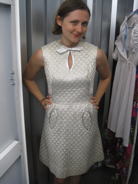
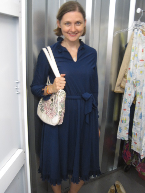
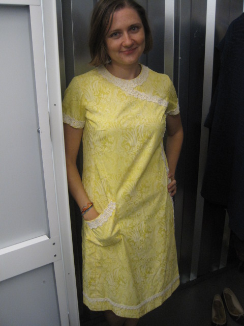
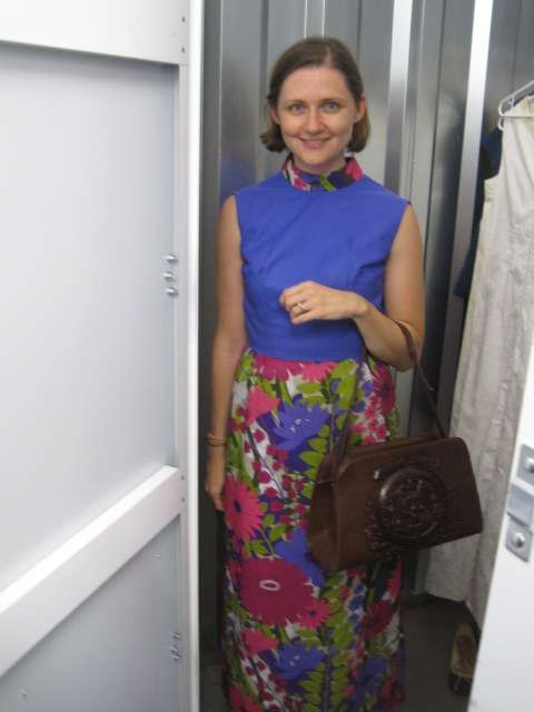
Fashion Week just started in NYC, and coincidentally, I just had a vintage shopping spree that filled my closet. I went over to Sammy Davis Vintage (currently housed in an ingeniously positioned storage locker with changing room and racks and racks of amazing clothes). We had a total try-on fashion show of our own. I got this perfect fall number, which is actually a one-piece dress that looks like separates (and it totally reminds me of Love Story and Ali McGraw), and I got this 60s navy dress with matching coat (I've never had a matching coat-and-dress ensemble before--exciting!):

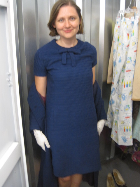
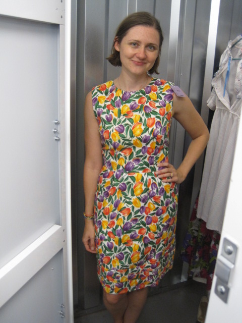
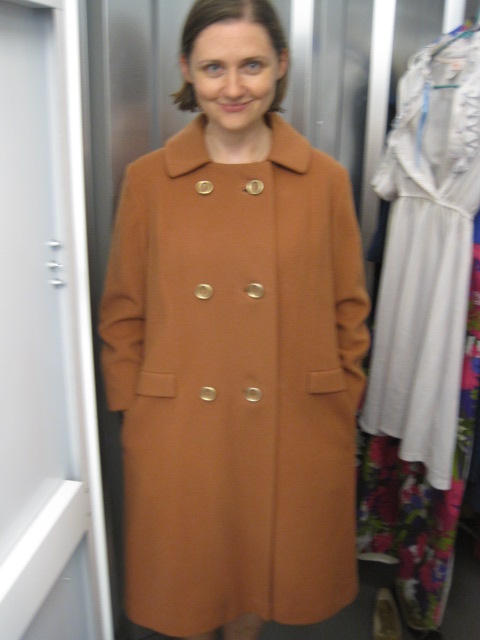
I also picked up this perfect-for-baby-shower spring tulip dress, and this fall-to-winter coat, which was such a great shade of orange camel that I couldn't resist.
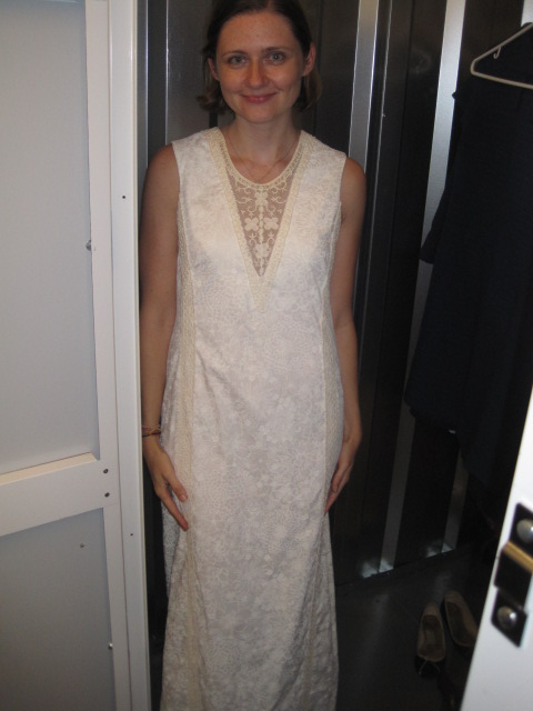
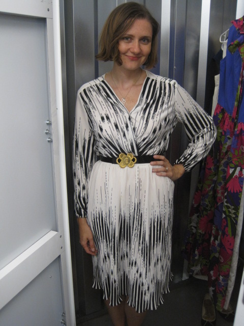
Here are a few that I let go... I couldn't buy everything! Left to right: Amazing silver Jetsons dress, total beach-wedding-60s Lilly Pulitzer, a navy 70s dress that I loved but that really needed heels (which I hardly ever wear):
And I also didn't get this swingy black-and-white number or this yellow Lilly Pulitzer gardening dress from the 60s (with perfect shovel pocket). The purple 70s wonder didn't actually fit--it wouldn't zip up in the back but we snapped a pic anyway.
Okay, I think that's enough photos of me for a year. (And can you believe this is edited--I tried on way more!).
Love vintage--thanks, Sammy D. Happy Friday!
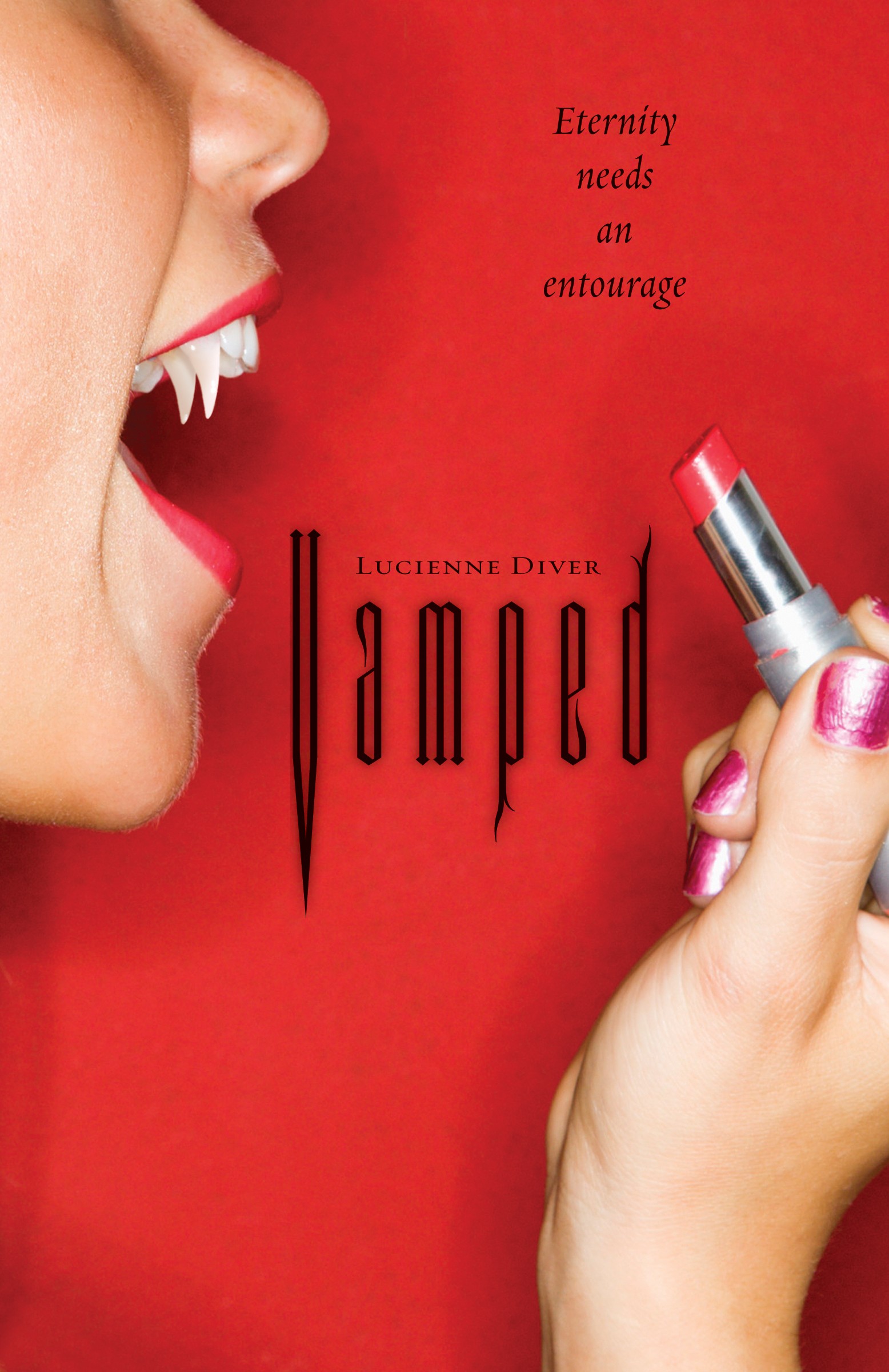
Cover Stories: ReVamped by Lucienne Diver
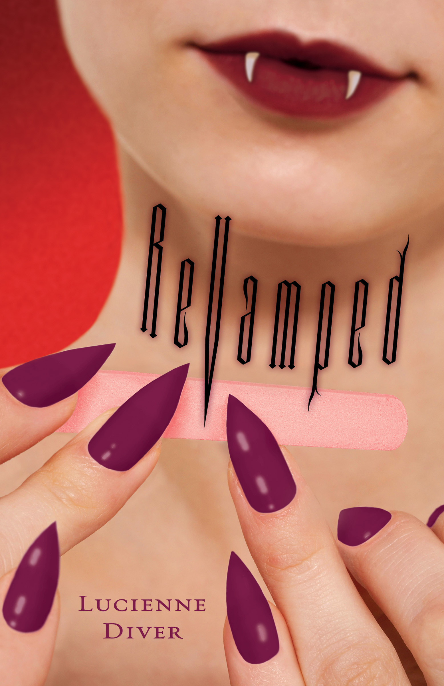 Lucienne Diver is here to share the story behind the second gorgeous cover in her Vamped series (remember the tale behind Vamped?). Here she is:
"Flux did such a fantastic job with the cover for my first novel, Vamped, that I wasn't at all worried about what they'd do with ReVamped. When my editor wrote to say they'd come up with the concept of my heroine, Gina, filing her nails to sharp points, I think the only comment I had was to suggest the color of polish. I was sure I couldn't love any cover as much as the first (below right), but apparently, I'm fallible. Who knew?
Lucienne Diver is here to share the story behind the second gorgeous cover in her Vamped series (remember the tale behind Vamped?). Here she is:
"Flux did such a fantastic job with the cover for my first novel, Vamped, that I wasn't at all worried about what they'd do with ReVamped. When my editor wrote to say they'd come up with the concept of my heroine, Gina, filing her nails to sharp points, I think the only comment I had was to suggest the color of polish. I was sure I couldn't love any cover as much as the first (below right), but apparently, I'm fallible. Who knew?
 "The first time I saw the ReVamped cover the nail file didn't yet look like a nail file. It was just a preliminary, so I didn't actually love it right away, but after tweaking...it's beauteous! It's a stock photograph that the art department modified. I'm amazed they found something that captured the feel of the book so well. I kind of prostrate myself before the Flux art department in homage.
"I could literally stare at my cover all day. I can't wait to see what they come up for Fangtastic, which is the next book in the series (and Fangtabulous, the one after that)!"
OMG, I'm loving the beauty vibe these covers have -- lipstick, nails, teeth, oh my. What do you guys think of the cover?
Win-It Wednesday: Not That Kind of Girl by Siobhan Vivian
Last week's winners of The Aristobrats include... RivkaBelle, Amanda and Cass! Send me you addresses, ladies!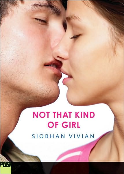 This week I'm giving away my copy of the awesome Not That Kind of Girl by Siobhan Vivian. This book manages to cover school politics, feminism, self doubt, love and lust all in one page-turning package. You will love it!
To enter to win a copy, you can either leave a comment about the cover on the Cover Story or tell me right here what your favorite part of starting a new school year is (or was).
For me, it was the possibility of change. I always wanted the summer makeover, the chance to be a funnier, more outgoing (and okay, prettier) girl in the new year. I don't think I ever got that magic transformation going, but the possibility of it was enough.
Happy Wednesday!
This week I'm giving away my copy of the awesome Not That Kind of Girl by Siobhan Vivian. This book manages to cover school politics, feminism, self doubt, love and lust all in one page-turning package. You will love it!
To enter to win a copy, you can either leave a comment about the cover on the Cover Story or tell me right here what your favorite part of starting a new school year is (or was).
For me, it was the possibility of change. I always wanted the summer makeover, the chance to be a funnier, more outgoing (and okay, prettier) girl in the new year. I don't think I ever got that magic transformation going, but the possibility of it was enough.
Happy Wednesday!
Cover Stories: Not That Kind of Girl by Siobhan Vivian
Siobhan Vivian's Not That Kind of Girl is full of heart and hurt and love and kissing and feminism and awesome relationships. It's the perfect, perfect fall read. You will cheer and swoon. I can't say enough good stuff. Now, here's Siobhan with the story behind that hot cover:
"I started out pitching my editor, David Levithan, the idea of two girls standing next to each other, each wearing a private school uniform. One girl would be very buttoned-up and proper, while the other would trick out her uniform to make it look as sexy as possible. But David said that Girl-In-Uniform covers hadn't worked so well for them in the past, so he wanted to go in another direction.
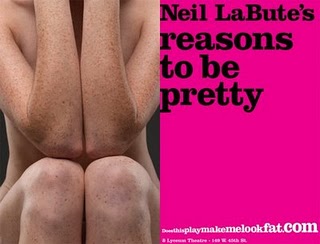
"Then, when I was riding the subway, I saw the poster for the Neil LaBute play, REASONS TO BE PRETTY (right). I loved the vulnerability of that girl, and felt it very much in sync with my main character, Natalie. But I knew I couldn't have a naked girl on the cover, and I wasn't sure if the image would work as well with her in her underwear. Also, it maybe gave off the sense of someone being violated, which was not something I wanted my cover to convey.

xmastree.jpg
"Finally, I came up with the idea of a boy and a girl running into the woods together, as Natalie and Connor spend their nights fooling around on his family's Christmas Tree Farm. Something like this stock photo (left). That idea was shot down, too. I forget why. But I think it did lead us to the cover we have now, a photo that featured the love story of Natalie and Connor, rather than the story of Natalie and her friends.
"I really really appreciated their asking for my input. I got to pick Natalie and Connor from several beautiful girls and very adorable boys. Hardest part of the job. ; )
"I was definitely happy with the cover, but I did worry that it maybe looked a little too romantic. My book certainly has that element to it, but it is also very much about the relationship between three friends. That said, I was really impressed with the emotion captured by the photo. There was tangible heat behind that almost kiss!
"Here's a funny side note: David told me that both of my models were in relationships with other people, and that they REFUSED to actually make out for the shoot, even when the photographer told them to. Hello! What would Tyra say about that?!? I'm actually glad though. I think the second-before-a-make-out is way hotter than seeing actual tongue wrestling.
"The original concept for the photo shoot had been that we'd get a picture of a boy and a girl kissing, and then have the design department put a black censorship bar over their mouths. That was supposed to represent how Natalie fears how people might judge what she does with Connor.

almostcoverntkog.jpg
"But when the design department mocked the cover up that way (right), it became clear that the bar covered up all that emotion and longing and tentativeness and romance. It had to go! Nothing could get in the way of that kiss!"
Thanks, Siobhan! I totally agree that the black bar blocks the heat of the cover. So glad it went away. I love the just-before-kiss moment!
What do you guys think?
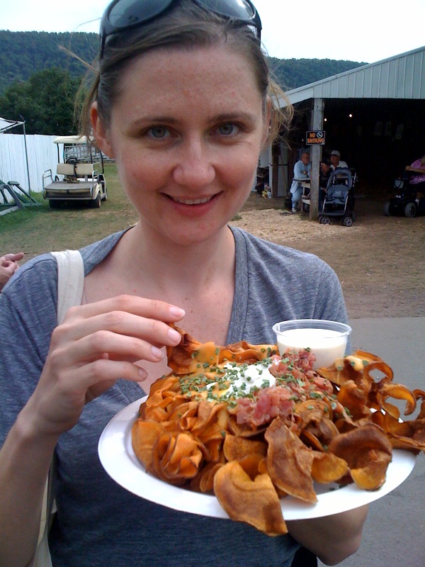
Photo Friday: Delaware County Fair!
in Photo Friday
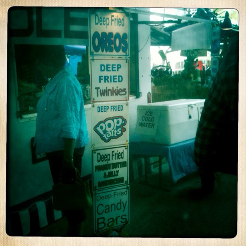
A couple of weeks ago, I got to go to the Delaware County Fair. Here, a photo essay (which may as well be called a food essay, but whatever). Dreamy!Me + plate of sweet potato chips with meat toppings = big smile.
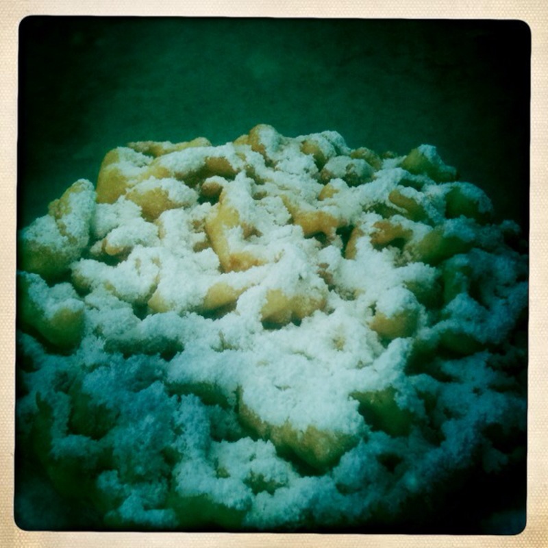
 Funnel Cake!
 Fried Oreos are as delicious as they sound.
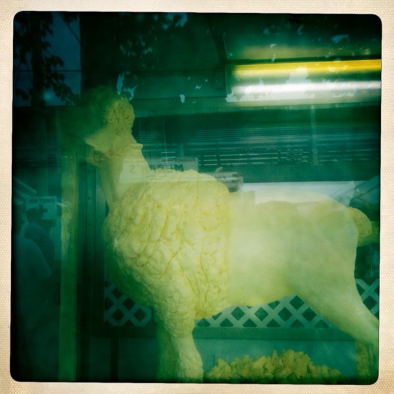
 What? Have you never seen a sheep carved out of butter before?
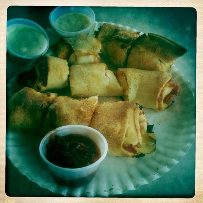
 Chicken Zingys are fried chicken rolled up in pizza dough with bbq and ranch dressing. YUM.
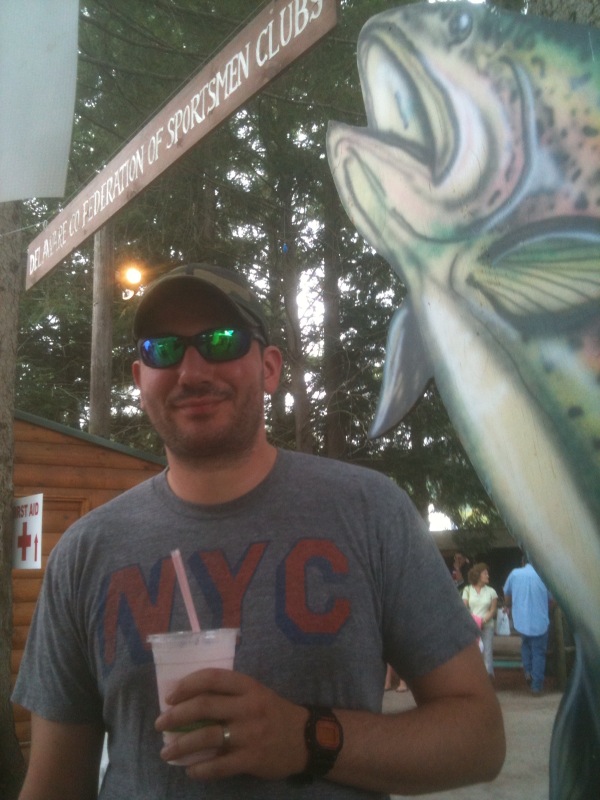
 Dave washes it all down with a milkshake.
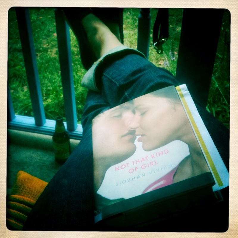
 And later I relax with my favorite new book, Not That Type of Girl by Siobhan Vivian! (So good.)
 This weekend there will be less food and more books! Happy Labor Day Weekend!
Cover Stories: My Fake Boyfriend is Better Than Yours by Kristina Springer
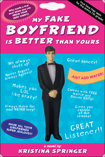 Kristina Springer's My Fake Boyfriend is Better Than Yours is out this week, and she's touring with the Girlfriends Cyber Circuit. (Also, she has a hi-larious cover.)
Here's Kristina, sharing her short and sweet Cover Story:
Kristina Springer's My Fake Boyfriend is Better Than Yours is out this week, and she's touring with the Girlfriends Cyber Circuit. (Also, she has a hi-larious cover.)
Here's Kristina, sharing her short and sweet Cover Story:
"I didn't have any cover ideas at all! I couldn't even begin to think of what would fit my book so I pretty much think the FSG art department is full of geniuses because my cover turned out way cute.
"When I first saw my cover, I loved, loved, loved it! They asked for comments, but I think I pretty much just said 'OMG, I love it!'
"The cover changed such a tiny bit that I never even noticed. My husband pointed out to me that one of the phrases on the cover of an early image wasn't on the final book.
"Overall, I love it so much--I think it's cute and fun and fits the book perfectly."
Thanks, Kristina! I love how the cover is actually like packaging that would be hanging in a store--just noticed that. It's a cover that makes you want to keep looking at it for new hilarity. See the sides, flaps and back cover at Kristina's blog.
What do you guys think?