First, last week's winners: Kasey won Stealing Death by Janet Lee Carey, and Latisha won Delacroix Academy by Inara Scott! Send me addresses, K and L...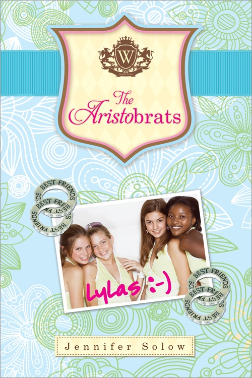 This week, Jennifer Solow is here with her new novel, The Aristobrats, out next week. It's got a perfectly preppy cover with gorgeous blues, greens and a grosgrain ribbon!
A lot of thought went into this cover, so here's Jennifer to share the story (comment for a chance to win the book -- three winners will be chosen next week!):
"It starts something like this: The email arrives in your Inbox. The subject line: The Cover. I love it! What do you think? There's a PDF attachment. You try and breathe, practice mindful meditation, give up all unrealistic expectations, keep an open mind. You say to yourself, I will be positive. I will not react like a crazy person. I will not do the Diva Dance (clutch phone, march around living room, wave color printouts in air, sweat).
"Needless to say, I never listen to my own advice!
"The best book covers I think look effortless, like they just sort of burst out from the story and landed there on the bookshelf. I adore the cover of this book and its breezy, effortless look. Diva Dance notwithstanding, I was amazed and delighted at how dedicated my publisher was to getting to a solution we all loved. Effortless? Don't think so. Worth it? Absolutely.
"The Aristobrats is about four close friends who've been waiting their whole lives for eighth grade. It's finally their big year and they're determined to set a good example for the underpopular. With main characters who are undyingly loyal and, hello...nice, it's a kind of anti-Clique book in my mind. (Mean girls are so two-thousand-and-late!) The uber-preppy world of their story was inspired by my own experience at prep school: Madras plaid, Tiffany lockets, grosgrain ribbon watchbands, L.L. Bean Blucher moccasins, wool duffel coats. I felt like there was something in that world of preppiness that would make for a unique and appealing cover.
"Getting the style pitch-perfect was as crucial to the cover as it was to the characters in the story. But while these details were part of my own DNA, they were practically impossible for anyone else to truly understand. I knew it was my responsibility to show the cover design team what I meant. I needed to create a visual vocabulary.
This week, Jennifer Solow is here with her new novel, The Aristobrats, out next week. It's got a perfectly preppy cover with gorgeous blues, greens and a grosgrain ribbon!
A lot of thought went into this cover, so here's Jennifer to share the story (comment for a chance to win the book -- three winners will be chosen next week!):
"It starts something like this: The email arrives in your Inbox. The subject line: The Cover. I love it! What do you think? There's a PDF attachment. You try and breathe, practice mindful meditation, give up all unrealistic expectations, keep an open mind. You say to yourself, I will be positive. I will not react like a crazy person. I will not do the Diva Dance (clutch phone, march around living room, wave color printouts in air, sweat).
"Needless to say, I never listen to my own advice!
"The best book covers I think look effortless, like they just sort of burst out from the story and landed there on the bookshelf. I adore the cover of this book and its breezy, effortless look. Diva Dance notwithstanding, I was amazed and delighted at how dedicated my publisher was to getting to a solution we all loved. Effortless? Don't think so. Worth it? Absolutely.
"The Aristobrats is about four close friends who've been waiting their whole lives for eighth grade. It's finally their big year and they're determined to set a good example for the underpopular. With main characters who are undyingly loyal and, hello...nice, it's a kind of anti-Clique book in my mind. (Mean girls are so two-thousand-and-late!) The uber-preppy world of their story was inspired by my own experience at prep school: Madras plaid, Tiffany lockets, grosgrain ribbon watchbands, L.L. Bean Blucher moccasins, wool duffel coats. I felt like there was something in that world of preppiness that would make for a unique and appealing cover.
"Getting the style pitch-perfect was as crucial to the cover as it was to the characters in the story. But while these details were part of my own DNA, they were practically impossible for anyone else to truly understand. I knew it was my responsibility to show the cover design team what I meant. I needed to create a visual vocabulary.


 "I pulled images from everywhere. Colors. Patterns. People. I used Polyvore to make collages and reached out to the prep-experts like Jill from Tickled Pink and Green and The Preppy Princess for ideas. I sent the designers all the preppiness I could find. Soon things started coming together.
 "One of the things I love about the final cover is that it has a classic, timeless style without feeling like a prep cliche. I also love that the book itself, with the ribbon around it, seems like a wrapped gift or one of those pretty writing journals I always pick up in line at the bookstore as an impulse-buy. I was delighted when the 2011 Lilly Pulitzer notepads (left) came out a few weeks ago. I felt like we were spot-on.
"Now how are we feeling about the photos of the girls? Breathe, Jennifer. Breathe."
Thanks, Jennifer! I am a huge fan of inspiration boards, and you totally did it up! (Jenny Han had a great one for The Summer I Turned Pretty, too.) I also am a fan of the girls on the cover. Nice picks! What do you guys think of this cover?
Take the Quiz (Which Aristobrat Are You?), find Jennifer on Facebook, and watch the trailer:
"One of the things I love about the final cover is that it has a classic, timeless style without feeling like a prep cliche. I also love that the book itself, with the ribbon around it, seems like a wrapped gift or one of those pretty writing journals I always pick up in line at the bookstore as an impulse-buy. I was delighted when the 2011 Lilly Pulitzer notepads (left) came out a few weeks ago. I felt like we were spot-on.
"Now how are we feeling about the photos of the girls? Breathe, Jennifer. Breathe."
Thanks, Jennifer! I am a huge fan of inspiration boards, and you totally did it up! (Jenny Han had a great one for The Summer I Turned Pretty, too.) I also am a fan of the girls on the cover. Nice picks! What do you guys think of this cover?
Take the Quiz (Which Aristobrat Are You?), find Jennifer on Facebook, and watch the trailer:
Cover Stories: The Dark Days of Hamburger Halpin by Josh Berk
 The hilarious Josh Berk is here to share his Cover Story for The Dark Days of Hamburger Halpin, which is a cartoon right now but will soon be a real boy...
Take it away, Josh!
The hilarious Josh Berk is here to share his Cover Story for The Dark Days of Hamburger Halpin, which is a cartoon right now but will soon be a real boy...
Take it away, Josh!
"I'm not at all good at what you would call the visual arts. I can't draw or paint and I don't have a good eye for color. For example, one time my wife asked me to name the color of the walls in our apartment (we were not in the apartment at the time, but we were living there) and I simply could not do it. I had no idea! Turns out they were bright green and I had been living there for two years and never really noticed.
"You see my point.
"Anyway, so when people asked me if I gave input on the cover of my book or had ideas about the cover or anything like that, I always say 'none whatsoever, and that's a good thing.' I literally had no ideas and I literally gave no input. I figured I'd let the professional cover artists and jacket designers and so forth do their thing, free of input from an author who doesn't even know the colors of his own walls.
"So the first thing that happened once we got to 'cover time' was that my editor sent me an email stating that the artist had been chosen, and it was Philippe Petit-Roulet. 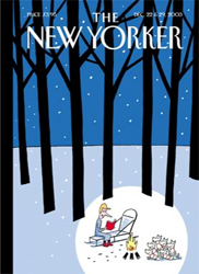 I had no idea who that was, other than that it sounded very French and thus impressive. I googled Monsieur Petit-Roulet and indeed he is quite impressive! The first thing I saw was that he did a bunch of New Yorker covers (like the one on the right), which sort of blew my mind. I also saw that he did some work in comics, which made me happy. My editor explained that they were going for a comic-book-ish feel with the cover, which was cool by me (even though the book itself is not illustrated or about comics or anything). My editor explained to me that the cover would show the characters cruising around as if they're on a mission and I said 'Sounds great!' That was all my input the whole time. 'Sounds great!'
"Then she wrote back to me after a while (even a few days is 'a while' when you're waiting for something exciting like seeing your first cover for the first time) and said it was going back to the art department because some other people (in editorial or marketing, I forget which ) said it looked 'too young.' I said 'sounds good to me!'
"Then I saw the cover for the first time a few weeks later and my first thought was 'Oh wow, Ebony will be so happy she made the cover!' I thought this because I am a crazy person. Ebony, Will's girlfriend in the book, is clearly not a real person. But she started out as a minor character (actually she started out as non-existent if you count the first draft) and gradually became more and more a part of the book until I really loved her. And there she was on the cover! And Will looked like Will and Devon (his sidekick) looked like Devon. He had the little ponytail and was carrying a TOP SECRET dossier just like he does in the book.
 "Oh, and it's worth looking under the cover sometimes, because they did a really cool thing on my spine! (left).
"I thought the cover looked quite cool and I was happy with it. It has caused a bit of consternation since the book has come out because it still might give off a 'too young' vibe to some people. It's definitely a YA book (as in there's some swears & an act of violence and other PG-13-ish content) and not for younger audiences. So for the paperback we're going to use a photo cover to hopefully convey 'this book is for teens.' When that comes out I'll come back for 'Berk's Cover Story, The Sequel.' Haha. I'm so pushy. Thanks for having me!"
Thanks, Josh! I would love to have you back anytime. This is a great Cover Story. Scoring a New Yorker cover artist is incredibly cool, and I'm into the color and energy of this cover. I see how it might read a little young, but it's so great I also see why it was chosen. Excited to see the paperback!
What do you guys think?
Photo Friday: An Interview + Blog Star
in Photo Friday
This month I got to interview someone I'd always wanted to meet: He was witty and smart and we even got to laugh together in between the serious stuff! And here's the resulting piece. You guys should absolutely watch his new Gulf Coast/New Orleans documentary if you can. I was tearing up before the title screen even came on.
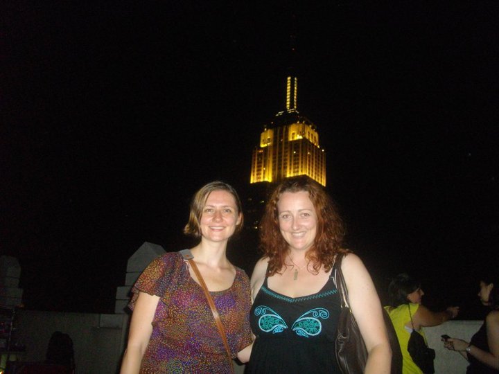
That same day, I got to meet another superstar: Adele of Persnickety Snark (who was also funny and smart and made me laugh). We had an awesome time hearing Charlotte Sometimes play on the rooftop of the Atlas, where there was an Empire-sized view:
He was witty and smart and we even got to laugh together in between the serious stuff! And here's the resulting piece. You guys should absolutely watch his new Gulf Coast/New Orleans documentary if you can. I was tearing up before the title screen even came on.
That same day, I got to meet another superstar: Adele of Persnickety Snark (who was also funny and smart and made me laugh). We had an awesome time hearing Charlotte Sometimes play on the rooftop of the Atlas, where there was an Empire-sized view:
 Happy Friday!
Win-It Wednesday: Delacroix Academy by Inara Scott
The winner of last week's April, May & June Robin Benway contest is... Toreyy! Send me your address, T!
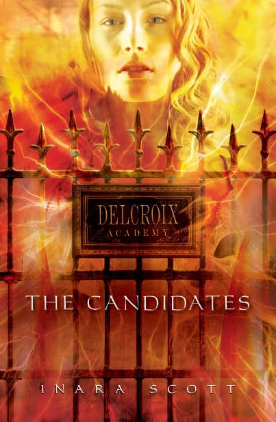 This week, I have a Cover Story + Contest combo (must like yesterday's -- enter Janet Lee Carey's contest too!) Today, Inara Scott is here to tell us about the cover of her new book, Delacroix Academy (and she's giving away a copy of the book!).
Here's Inara:
"I dreamed, as all authors do, of having the perfect cover. But I really didn't know what that might be. I knew it had to have gates on it -- the Delcroix gates play a significant role in the book, and they have a high creepy factor. ;-) So I definitely hoped they would make an appearance. Other than that, I didn't know exactly what I wanted. I did know I didn't want a couple of stock models kissing. Especially not stock models without heads. Or faces. (shudder)
"I seem to recall them asking if I had any ideas, and I pretty much said exactly what I said above -- I'm hoping you come up with something amazing and cool, but I have no idea what that might be. LOL.
"When I first saw the cover, I ADORED it. Still do. I absolutely love love love it. Am I gushing? Let me gush some more. It's perfect. I love the colors, the power it suggests, the gates, the danger, and Dancia's face is awesome. I did get to see three different takes on the cover with slightly different gate styles and color palettes. But I didn't have a strong opinion. They all looked gorgeous.
"The style on the gate became more square and less ornate, but that was the only change. I know they used a model just for this shoot, because I heard recently that the same model isn't available for book 2, which had them scratching their heads a bit. I'm not sure who they're going to use for the new cover.
"I think this cover tells you a lot about the book. You can see that this is a paranormal story with a strong, powerful heroine and a certain level of suspense or danger. The lack of a couple kissing on the front should also let you know that there may be romance in the book, but it's much more than just a romance."
Thanks, Inara! I certainly think this cover is powerful. It makes me think of the gates to hell or something. Anyone else? Oh, and here's the trailer (sooo creepy awesome!)! Leave a comment about the cover or the trailer, and you're entered to win a copy of the book (US and Canada only--sorry! But any address here works, so if you have a friend who can receive the book for you, you can win!).
Cover Stories: Stealing Death by Janet Lee Carey (+ Giveaway!)
 Janet Lee Carey's Stealing Death is newly out in paperback! In a starred review, School Library Journal called the book "fantasy at its best--original, beautiful, amazing, and deeply moving." (And you have a chance to win it!)Here's Janet to talk about the two different covers:
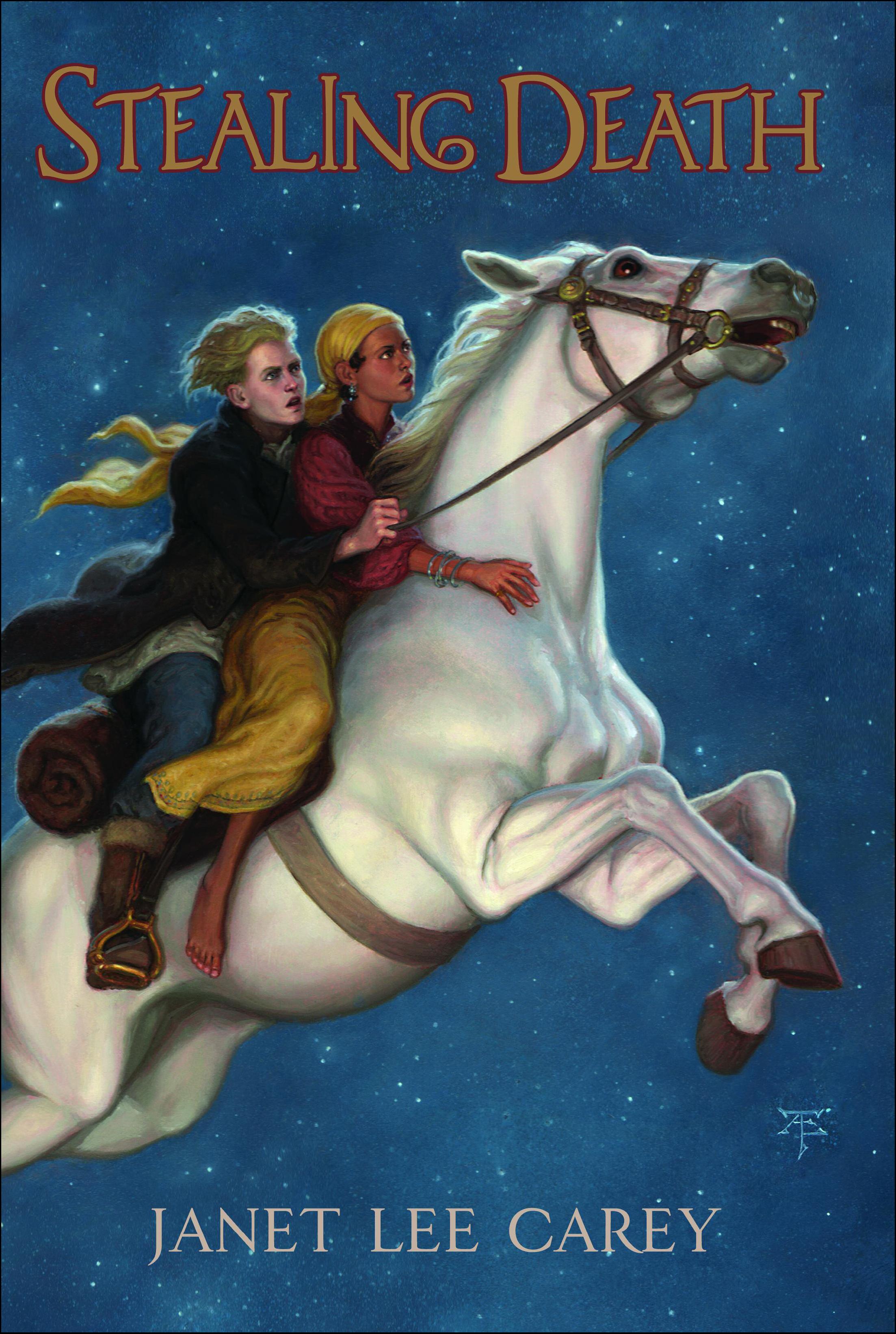
"I had some ideas for the STEALING DEATH hardback (left); Kipp standing in front of his burning house with his arms out to prevent the Death Catcher from taking his family, or just a hand stealing a black sack (the Death Catcher's soul sack). I'm glad now the artists didn't go with either of those images. Both the HB and the PB covers focused on the characters and the ghost mare, ChChka, Kipp steals to make his getaway.
"The artists for the HB and the PB wanted to capture the right Zolyan clothing for Kipp who starts the story as a farm laborer, and for Zalika who goes from a high class landlord's daughter to escaped prisoner in nomadic dress.
"When queried about their clothing for the PB, I sent links like this one Ethiopian Women focusing on the pics with more traditional dress from the site.
"The Zolyan landscape was modeled on the arid climate in Sub-Saharan Africa. I looked to the more traditional clothing in pics of men and women living in drought conditions. Images speak. The desperate living conditions I saw in the photos spurred me on to get involved with PlayPumps now a part of Water For People. I also challenged readers to get involved on the 'giving back' page on my website.
"My first response to the HB cover = Magical! The night flight on ChChka captured the adventurous aspect of novel, as well as the romance between Kipp and Zalika. It didn't evoke the darker elements of the novel. Later feedback said the image appealed more to younger teens than older teens.
 "First response to the PB (right) = Riveting! The paperback cover heightens the sense of danger that drives the novel. I think it will appeal to readers who are ready to take Kipp's perilous journey that unmasks our old cultural taboos about death. We all see violence and death plastered across the media. We grow up consuming this stuff. What if we stop camera, zoom in the shot. STEALING DEATH isn't about easy answers. It is about looking at death and not turning our backs.
"I was thrilled to see Zalika on both covers. Publishing has come a long way since Ursula K. Le Guin's The Wizard of Earthsea came out. Ursula fought for years to get different ethnicities on her Earthsea series covers. 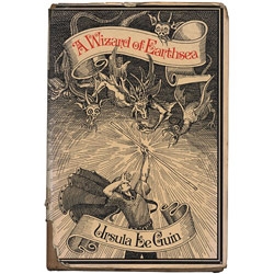 The main characters in her Earthsea books are brown skinned. She found it very frustrating that the covers didn't reflect this (left).
"In a Guardian UK interview Ursula said, 'I see Ged as dark brownish-red, and all the other people in the book (except the Kargs and Serret) as brown or brown-red, to very dark or black (Vetch). In other words, in the Archipelago 'people of color' are the norm, white people are an anomaly... what drives me up the wall is cover illustrators - trying to get them not to make everybody white, white, white.'
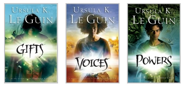
"Read the rest of the post . . . I have to say it was not just illustrators who were working within the restricted cultural blindness of their time, but change is afoot and publishing is listening. The covers of Ursula's new YA books are good examples (below). Still we have a long way to go. I enjoyed reading author Elizabeth Bluemle's article on race in children's literature in a recent Publisher's Weekly post.
 "In the end, for my covers, I love the terrifying image of Kipp and Zalika approaching ChChka engulfed in flame. The flaming horse is not burning to death, but alive within the inferno. For me the image evokes the sense of life and death existing together in the eternal now, something essential and mysterious touched on in STEALING DEATH.
"Can we stop death? What would happen if we did? The question took me on Kipp's amazing quest."
Thanks, Janet! I agree that the hardcover is magical, but that it does have a younger-reader feel to it. The paperback cover has a heightened danger to it--and the fire horse is pretty riveting. I'm also glad that the cultures in the book have some place in the covers. Kudos to Egmont.
What do you guys think? One lucky commenter will win a copy of the paperback version of Stealing Death!
PS-Check out Janet's DreamWalks blog here.
Photo Friday: NY Times Styles
in Photo Friday
 I forgot to post this when it ran a few weeks ago, but it was super-exciting. Bill Cunningham is a legendary New York Times photographer--he's in his 80s now--and he shoots for the Styles section, among other venues. I always thought his party photos were all socialites, but now we have proof that they're not! I'm sitting in the top-right corner with my friend Natalie (and my friend white wine).
Mr. Cunningham approached us at a party and we wrote down our names "in all capital letters" on his flip-top reporter's pad. He still shoots with real film. Such fun!
I forgot to post this when it ran a few weeks ago, but it was super-exciting. Bill Cunningham is a legendary New York Times photographer--he's in his 80s now--and he shoots for the Styles section, among other venues. I always thought his party photos were all socialites, but now we have proof that they're not! I'm sitting in the top-right corner with my friend Natalie (and my friend white wine).
Mr. Cunningham approached us at a party and we wrote down our names "in all capital letters" on his flip-top reporter's pad. He still shoots with real film. Such fun!
Happy Friday!
Win-It Wednesday: The Extraordinary Secrets of April, May & June by Robin Benway
 Last week's winner of The DUFF galley is... Raelena! Email me with your address, R.This week, Robin Benway is giving away a signed galley copy of her newest release, The Extraordinary Secrets of April, May & June. Robin shared her Cover Story with me last week, and she sent along some photos she had that matched the characters in her mind. Do you guys do that? Dream up characters in your head?
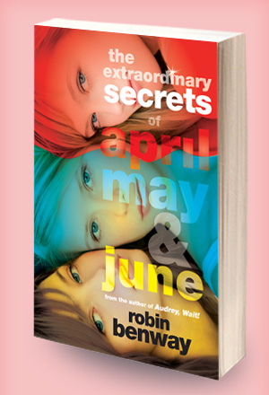
I want to hear about the best covers-matching-characters that you've seen. I actually think the paperback of Audrey, Wait! is a really spot-on character match. What covers can you think of?
Comment below and you're entered to win (sorry, this one's U.S. only, but if you have any address in the U.S. you can win and Robin will send there).
Last week's winner of The DUFF galley is... Raelena! Email me with your address, R.This week, Robin Benway is giving away a signed galley copy of her newest release, The Extraordinary Secrets of April, May & June. Robin shared her Cover Story with me last week, and she sent along some photos she had that matched the characters in her mind. Do you guys do that? Dream up characters in your head?
I want to hear about the best covers-matching-characters that you've seen. I actually think the paperback of Audrey, Wait! is a really spot-on character match. What covers can you think of?
Comment below and you're entered to win (sorry, this one's U.S. only, but if you have any address in the U.S. you can win and Robin will send there).
The Contemps!
in Other Stuff
I've teamed up with a group of 21 YA authors who have contemporary fiction releasing in 2011: The Contemps!Readers who read 18 of our 21 releases over the year are eligible for a prize package full of great stuff. Check it out:
 Can I just show the list of the company I'm in (which makes me swoon)?
* April Henry
* Brent Crawford
* Courtney Summers
* Daisy Whitney
* Denise Jaden
* Elizabeth Scott
* Emily Wing Smith
* Hannah Harrington
* Jo Knowles
* Kirsten Hubbard
* Kody Keplinger
* Kristen Tracy
* Lindsey Leavitt
* Lisa Schroeder
* Melissa Walker
* Michael Northrop
* Micol Ostow
* Mindi Scott
* Sara Bennett Wealer
* Sarah Darer Littman
* Sarah Ockler
PS-We're on twitter at @YAContemps, and on Facebook here. Join the party, people.
Can I just show the list of the company I'm in (which makes me swoon)?
* April Henry
* Brent Crawford
* Courtney Summers
* Daisy Whitney
* Denise Jaden
* Elizabeth Scott
* Emily Wing Smith
* Hannah Harrington
* Jo Knowles
* Kirsten Hubbard
* Kody Keplinger
* Kristen Tracy
* Lindsey Leavitt
* Lisa Schroeder
* Melissa Walker
* Michael Northrop
* Micol Ostow
* Mindi Scott
* Sara Bennett Wealer
* Sarah Darer Littman
* Sarah Ockler
PS-We're on twitter at @YAContemps, and on Facebook here. Join the party, people.
Cover Stories: Fat Vampire by Adam Rex
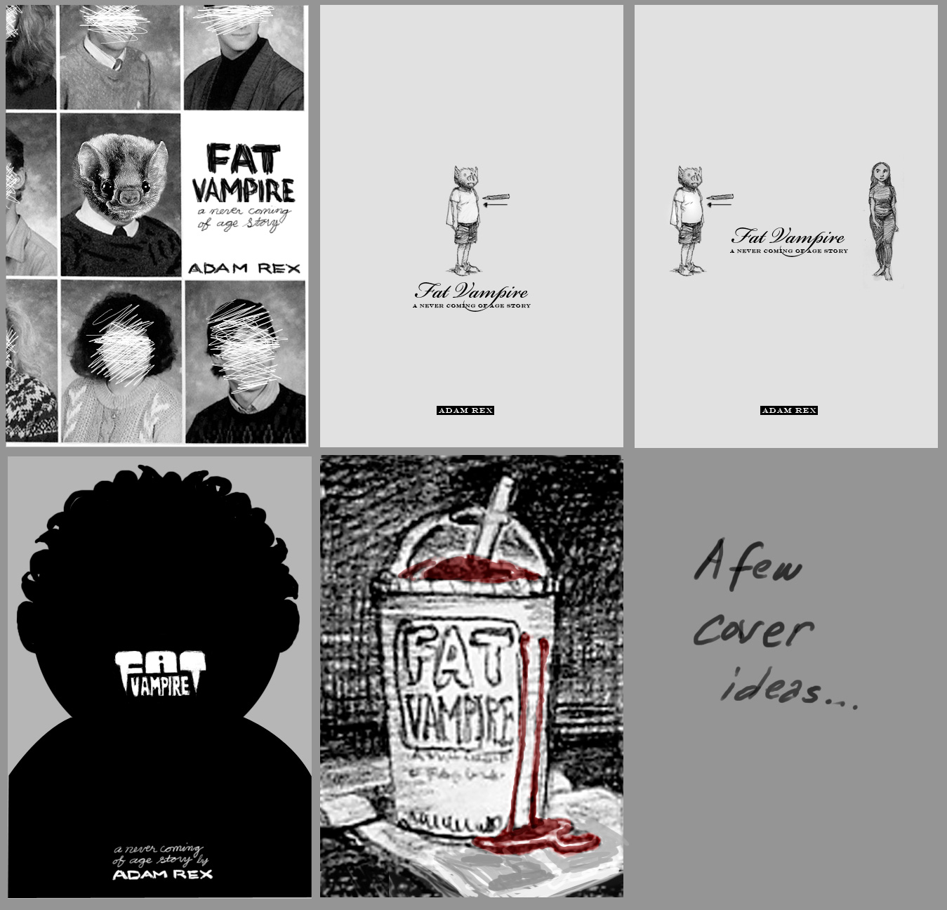
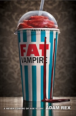 Adam Rex's Fat Vampire cover appealed to me immediately. Plus, the tagline, "A never coming of age story," made me laugh out loud. I had to have Adam stop by to tell its tale. Here's Adam:"I had a lot of ideas for this book cover. I have a sketchbook filled with them. I'm an illustrator as well as an author, so I'm in the happy position of always assuming I'll have a lot of input regarding the cover image. Even in the case of Fat Vampire, which is my first book which contains no illustrations whatsoever.
"So I have a few thumbnail sketches of the slushie cup option that are very similar to the finished cover. I also experimented with a couple silhouette designs, one of which I illustrated in a finished form that appears on the case, beneath the jacket. You can see this design at fatvampire.com. I have a couple designs that feature my main character, Doug, with a bat head. I have a couple ideas that would have featured model shoots with teen girls eating red popsicles, which are melting, blood-like, down their necks. In these Doug the vampire is leering from the background. Anyway, I had a lot of ideas, not all of them good.
Adam Rex's Fat Vampire cover appealed to me immediately. Plus, the tagline, "A never coming of age story," made me laugh out loud. I had to have Adam stop by to tell its tale. Here's Adam:"I had a lot of ideas for this book cover. I have a sketchbook filled with them. I'm an illustrator as well as an author, so I'm in the happy position of always assuming I'll have a lot of input regarding the cover image. Even in the case of Fat Vampire, which is my first book which contains no illustrations whatsoever.
"So I have a few thumbnail sketches of the slushie cup option that are very similar to the finished cover. I also experimented with a couple silhouette designs, one of which I illustrated in a finished form that appears on the case, beneath the jacket. You can see this design at fatvampire.com. I have a couple designs that feature my main character, Doug, with a bat head. I have a couple ideas that would have featured model shoots with teen girls eating red popsicles, which are melting, blood-like, down their necks. In these Doug the vampire is leering from the background. Anyway, I had a lot of ideas, not all of them good.
 "I think HarperCollins always assumed that I would come up with something for them. Maybe they even assumed I would paint or draw something for the cover, but in the end I think we all agreed that a photograph was the way to go. My previous novel was for a younger demographic, and I've been worried that Fat Vampire would be picked up by readers who are not emotionally ready for it. Illustrated covers are, for whatever reason, so much less common in the YA market, so a photo shoot seemed like a good way to alienate the middle school kids for a few years.
"I'll admit that the slushie cover was not my favorite at first. I really wanted that silhouette front and center. But everyone at my publisher favored the cup, so in time I had to acquiesce. I was my idea after all, and among those I'd pitched, so it was hard to argue later that I wouldn't be satisfied with it. I actually attempted to shoot the cover myself, even using it as an excuse to buy a new camera. So I designed a cup with an icy FAT VAMPIRE logo on the front, lit it moodily, and took a whole lot of photos. But I'm not a very knowledgeable photographer, so the photos didn't impress anybody.
"After all the back and forth and last minute changes, I was very, very happy, actually. I really got on board with it as the process spun out. I was shown several test cups, wallpaper patterns, tabletop surfaces, etc.; and I was given the opportunity to weigh in at every stage.
"The cover did change a bit. After my thumbnails and mock-up, all of which included the title of the book on the cup itself, Harper worried that readers might not understand that this logotype was indeed the name of the book. So a cup without any logo was shot. The cup's stripes, incidentally, were also red during the the photo shoot. Sort of a warm scarlet. Very different from the deep red of the blood/syrup, so I didn't expect it to be an issue.
"I think HarperCollins always assumed that I would come up with something for them. Maybe they even assumed I would paint or draw something for the cover, but in the end I think we all agreed that a photograph was the way to go. My previous novel was for a younger demographic, and I've been worried that Fat Vampire would be picked up by readers who are not emotionally ready for it. Illustrated covers are, for whatever reason, so much less common in the YA market, so a photo shoot seemed like a good way to alienate the middle school kids for a few years.
"I'll admit that the slushie cover was not my favorite at first. I really wanted that silhouette front and center. But everyone at my publisher favored the cup, so in time I had to acquiesce. I was my idea after all, and among those I'd pitched, so it was hard to argue later that I wouldn't be satisfied with it. I actually attempted to shoot the cover myself, even using it as an excuse to buy a new camera. So I designed a cup with an icy FAT VAMPIRE logo on the front, lit it moodily, and took a whole lot of photos. But I'm not a very knowledgeable photographer, so the photos didn't impress anybody.
"After all the back and forth and last minute changes, I was very, very happy, actually. I really got on board with it as the process spun out. I was shown several test cups, wallpaper patterns, tabletop surfaces, etc.; and I was given the opportunity to weigh in at every stage.
"The cover did change a bit. After my thumbnails and mock-up, all of which included the title of the book on the cup itself, Harper worried that readers might not understand that this logotype was indeed the name of the book. So a cup without any logo was shot. The cup's stripes, incidentally, were also red during the the photo shoot. Sort of a warm scarlet. Very different from the deep red of the blood/syrup, so I didn't expect it to be an issue.
 "Anyway, after the shoot we started talking about how to get the title on the cover, and I offered a number of choices (above). Nothing was really clicking, though. Eventually the art department decided that the real problem was that the title wasn't on the cup itself, so they photoshopped it on there and asked me what I thought. I liked it so much I don't think I even said 'I told you so.'
"They also decided late in the process that the stripes should be a different color, so we settled on that particular blue. They did an amazing job of Photoshopping all these changes in my opinion. Then I put together some type for the subtitle and byline and the cover was finished.
"The photographer, Dan Saelinger, was great to work with, by the way. Hope he doesn't mind all the changes we made. If someone hired me to paint them a cover and then they changed all the colors and photoshopped an elephant into the background I think I'd be cross.
"In the end, I'm really pleased, and it seems like people are reacting very well to it. It works on a very superficial level (syrupy sweet blood for an overweight vampire), but I also like the way the slushie acts as a symbol of immaturity, of arrested adolescence. It's meant to be a funny book, but this is a story about a fifteen-year-old who's never going to be allowed to grow up, and that's a tragedy. The somber tone and background of the still life convey that, I think."
Thanks, Adam! I love this cover--it really stands out to me, and I think it conveys the humor of the book really well. (It's hard to make a cover funny!) What do you guys think?
"Anyway, after the shoot we started talking about how to get the title on the cover, and I offered a number of choices (above). Nothing was really clicking, though. Eventually the art department decided that the real problem was that the title wasn't on the cup itself, so they photoshopped it on there and asked me what I thought. I liked it so much I don't think I even said 'I told you so.'
"They also decided late in the process that the stripes should be a different color, so we settled on that particular blue. They did an amazing job of Photoshopping all these changes in my opinion. Then I put together some type for the subtitle and byline and the cover was finished.
"The photographer, Dan Saelinger, was great to work with, by the way. Hope he doesn't mind all the changes we made. If someone hired me to paint them a cover and then they changed all the colors and photoshopped an elephant into the background I think I'd be cross.
"In the end, I'm really pleased, and it seems like people are reacting very well to it. It works on a very superficial level (syrupy sweet blood for an overweight vampire), but I also like the way the slushie acts as a symbol of immaturity, of arrested adolescence. It's meant to be a funny book, but this is a story about a fifteen-year-old who's never going to be allowed to grow up, and that's a tragedy. The somber tone and background of the still life convey that, I think."
Thanks, Adam! I love this cover--it really stands out to me, and I think it conveys the humor of the book really well. (It's hard to make a cover funny!) What do you guys think?
Photo Friday: The Book That's Following Me
in Photo Friday
I'm reading The Girl that Kicked the Hornet's Nest, which is rare for me since it's marketed to adults, which I tend not to be. This trilogy has been my summer delight (along with, ahem, The Hunger Games).I'm reading it at the country house with peach pie:
 And while Dave and Swayze play with a shoestring:
 Next, I'll be so ready for Mockingjay (a box arrived at Seventeen this week, and we all screamed and fought over t-shirts and stickers and bookmarks). Twitpic here.
Happy Friday! What are you reading?
Next, I'll be so ready for Mockingjay (a box arrived at Seventeen this week, and we all screamed and fought over t-shirts and stickers and bookmarks). Twitpic here.
Happy Friday! What are you reading?