Just a heads up on a few Cover Stories that have been published over at Unabashedly Bookish for Barnes and Noble.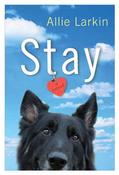 Stay by Allie Larkin (that's Allie's dog on the cover!). Joe, the dog in the book, was inspired by my dog, Argo. I offered to take some pictures of Argo, to see if we could get anything usable. I took over 1,000 pictures of Argo in our backyard on a Sunday afternoon, and sent the best ones along to Dutton to choose from. Read more...
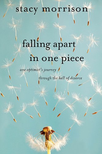 Falling Apart in One Piece by Stacy Morrison. "They came back to me with three cover concepts, and I remember opening the email and just holding my breath. It's crazy how in love with your book you are at the end, and how seeing the cover for the first time is just SCARY. I opened the first image and... my heart sank." Read more...
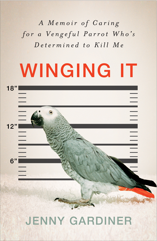 Winging It by Jenny Gardiner. "When I first saw the cover I loved it! I liked the starkness of it, loved the humor in it--itty bitty parrot mug shot LOL." Read more...
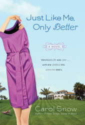 Just Like Me, Only Better by Carol Snow. "When I saw my cover, I thought, 'Oh, my God! Another woman with something stuck on her head!' This is three in a row." Read more...
Happy Tuesday!
PS-I recently did a fun interview with Hannah at Book Wonderland, and you can win a copy of Lovestruck Summer + one other book over at her blog.
Just Like Me, Only Better by Carol Snow. "When I saw my cover, I thought, 'Oh, my God! Another woman with something stuck on her head!' This is three in a row." Read more...
Happy Tuesday!
PS-I recently did a fun interview with Hannah at Book Wonderland, and you can win a copy of Lovestruck Summer + one other book over at her blog.
Cover Stories: Kiss It by Erin Downing
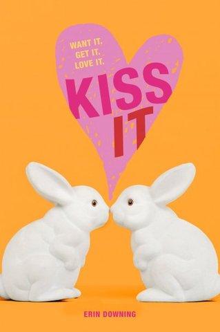 Erin Downing has written a bunch of fun romantic comedies, and now she's edging into a new space. KISS IT, which is out tomorrow, is a story about True Lust. Sign me up!Here's Erin to talk about how the Cover inspired the story. Crazy, love it.
"The strange thing about KISS IT is that the book's cover image was in place long before a single page of the book had been written. I had just finished writing my third Simon Pulse Romantic Comedy (Drive Me Crazy, below right), and my editor, Anica, and I began talking about what I was going to write next. I was pretty dead-set on getting away from light, 'fluffy' romantic comedies and really wanted to write something totally different from my first few books.
Erin Downing has written a bunch of fun romantic comedies, and now she's edging into a new space. KISS IT, which is out tomorrow, is a story about True Lust. Sign me up!Here's Erin to talk about how the Cover inspired the story. Crazy, love it.
"The strange thing about KISS IT is that the book's cover image was in place long before a single page of the book had been written. I had just finished writing my third Simon Pulse Romantic Comedy (Drive Me Crazy, below right), and my editor, Anica, and I began talking about what I was going to write next. I was pretty dead-set on getting away from light, 'fluffy' romantic comedies and really wanted to write something totally different from my first few books. 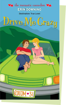 Anica randomly told me there was this image that she and one of Simon Pulse's designers, Cara, had been in love with for a while--but they hadn't found the right book to use it on yet. She thought maybe I would be the writer who would know what to do with it. That seemed a little backward to me, but Anica has a good gut for this kind of thing, and I was really intrigued by what had them gushing about some random stock photo.
"So she sent me the image (below, right)--two creepy white ceramic/porcelain (I don't even know) bunnies kissing on this sugary pink background. I remember Anica commenting about how funny she thought it would be to have this sweet image wrapped around a very not-sweet book. The image immediately cracked me up, and I sat down that night and wrote the prologue for what would eventually turn into KISS IT (the prologue content involves bunnies mating...so I definitely ran with the irony).
Anica randomly told me there was this image that she and one of Simon Pulse's designers, Cara, had been in love with for a while--but they hadn't found the right book to use it on yet. She thought maybe I would be the writer who would know what to do with it. That seemed a little backward to me, but Anica has a good gut for this kind of thing, and I was really intrigued by what had them gushing about some random stock photo.
"So she sent me the image (below, right)--two creepy white ceramic/porcelain (I don't even know) bunnies kissing on this sugary pink background. I remember Anica commenting about how funny she thought it would be to have this sweet image wrapped around a very not-sweet book. The image immediately cracked me up, and I sat down that night and wrote the prologue for what would eventually turn into KISS IT (the prologue content involves bunnies mating...so I definitely ran with the irony). 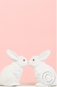 From that prologue my main character just jumped to life and I knew it was going to be a very in-your-face sort of book about female sexuality. How I got that from porcelain bunnies kissing, I don't know, but somehow it seems perfect.
"While I was writing the rest of the book, my editor and designer were vetting the cover through sales and marketing. We were all a little worried that it might get nixed for a photo-real teen girl cover, since that was really what was selling in the genre. I will admit that part of me--the cautious part--hoped a little bit deep down that maybe sales would vote no on the bunny cover. It's scary publishing a book that looks so different from everything else in the market. You always want your book to sell, and would this weird cover doom KISS IT to failure? But the reality is, the book itself is pretty risky in its content, so when it did get a big thumbs-up from the powers-that-be at Simon Pulse, I knew everyone was on board with a risk and it helped me push the content inside the book even further.
"When I eventually saw the first real design of the cover, the pink background was gone. They ultimately felt like the pink and the bunnies together made the book feel way *too* sweet, and the orange background edged it up a bit. Apparently, they'd tried a million different ways to design the cover, but the version they finally showed me is what we ended up going with--though I did ask them to make my name just a weensy bit bigger than it was in the first pass. I had also asked them to try making the heart more symmetrical on the cover (I'm kind of tidy, and crooked hearts sort of bug me), but they told me it would look even more like a little kid book then. They were totally right...it had to be a little imperfect in order to keep it aged up and fit with the story.
"I've been really happy with the cover since before I even started writing the book--a simple image inspired a story and a character I didn't know I had in me. My only concern is that I've seen some comments on blogs that people feel like KISS IT looks like a middle-grade book! That worries me, since the content inside is intended for readers 14 (or even 16) and up! Hopefully, the copy helps make it clear to readers that it's not a sweet little animal story or something!"
Thanks, Erin! I actually think that at very first glance it looks young, but then immediately you can see it's a quirky-cool cover with those bunnies and the tagline. I think it's a unique cover that will stand out in a sea of real-girls.
Any thoughts, guys? Does the cover look young to you, or unique, or awesome, or silly?
Happy Monday!
From that prologue my main character just jumped to life and I knew it was going to be a very in-your-face sort of book about female sexuality. How I got that from porcelain bunnies kissing, I don't know, but somehow it seems perfect.
"While I was writing the rest of the book, my editor and designer were vetting the cover through sales and marketing. We were all a little worried that it might get nixed for a photo-real teen girl cover, since that was really what was selling in the genre. I will admit that part of me--the cautious part--hoped a little bit deep down that maybe sales would vote no on the bunny cover. It's scary publishing a book that looks so different from everything else in the market. You always want your book to sell, and would this weird cover doom KISS IT to failure? But the reality is, the book itself is pretty risky in its content, so when it did get a big thumbs-up from the powers-that-be at Simon Pulse, I knew everyone was on board with a risk and it helped me push the content inside the book even further.
"When I eventually saw the first real design of the cover, the pink background was gone. They ultimately felt like the pink and the bunnies together made the book feel way *too* sweet, and the orange background edged it up a bit. Apparently, they'd tried a million different ways to design the cover, but the version they finally showed me is what we ended up going with--though I did ask them to make my name just a weensy bit bigger than it was in the first pass. I had also asked them to try making the heart more symmetrical on the cover (I'm kind of tidy, and crooked hearts sort of bug me), but they told me it would look even more like a little kid book then. They were totally right...it had to be a little imperfect in order to keep it aged up and fit with the story.
"I've been really happy with the cover since before I even started writing the book--a simple image inspired a story and a character I didn't know I had in me. My only concern is that I've seen some comments on blogs that people feel like KISS IT looks like a middle-grade book! That worries me, since the content inside is intended for readers 14 (or even 16) and up! Hopefully, the copy helps make it clear to readers that it's not a sweet little animal story or something!"
Thanks, Erin! I actually think that at very first glance it looks young, but then immediately you can see it's a quirky-cool cover with those bunnies and the tagline. I think it's a unique cover that will stand out in a sea of real-girls.
Any thoughts, guys? Does the cover look young to you, or unique, or awesome, or silly?
Happy Monday!
Photo Friday: In My Mind, I'm Gone to Carolina...
in Photo Friday
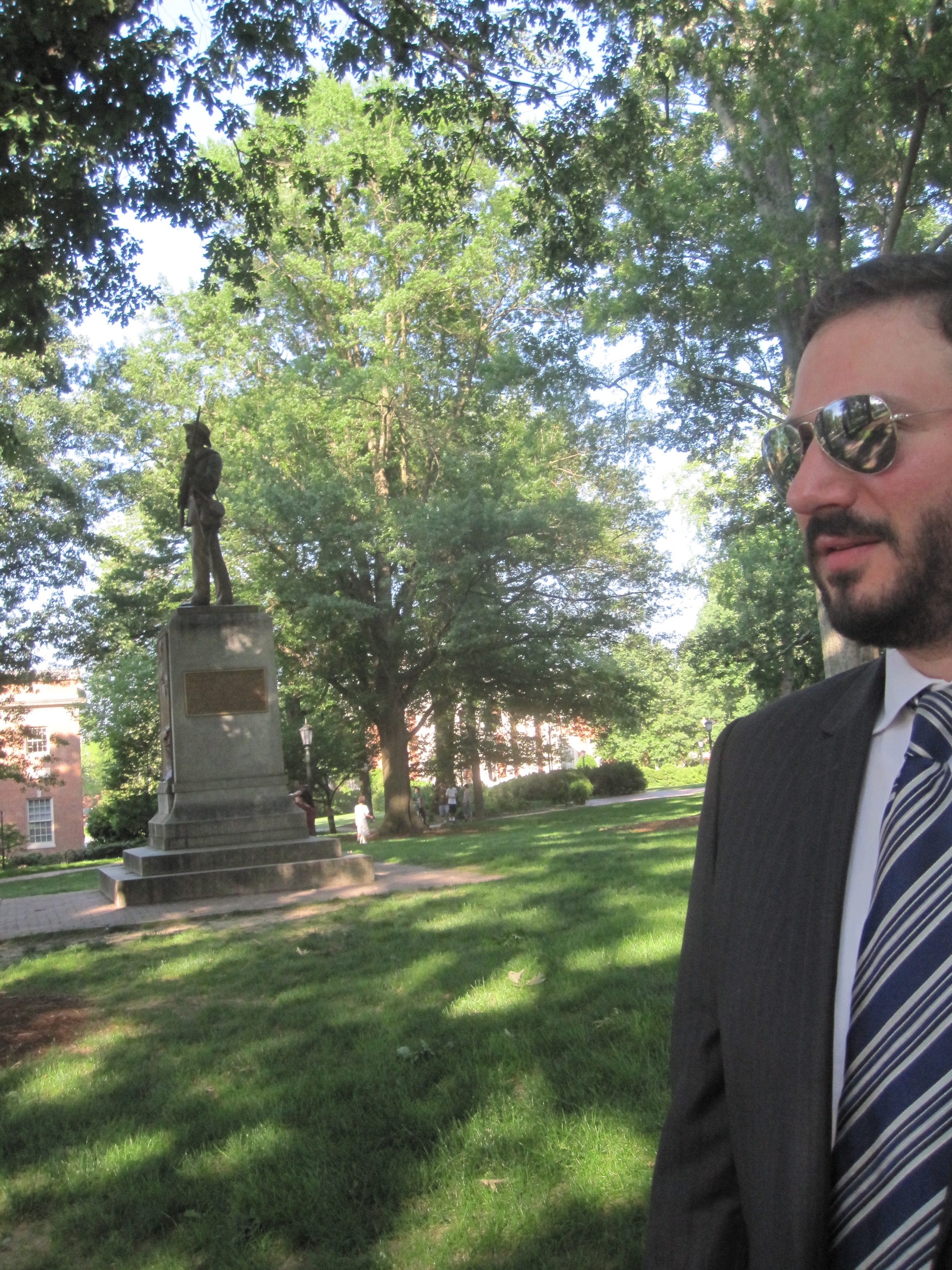
My friend Jeff from high school got married over Memorial Day weekend in gorgeous, sunny Chapel Hill. In true Jeff style, the ceremony was at the Old Well -- a central campus landmark. It was beautiful, Stephanie his bride looked gorgeous (and she's smart and funny too!), and the whole thing just gave me a warm, fuzzy feeling. Aw, I love high school friends. Nipsy, you did well. Hipstomatic vows shot:
 Bride and Groom!
 Dave and Silent Sam. Man, I love this campus. (Go Heels!)
 Old Well cake!
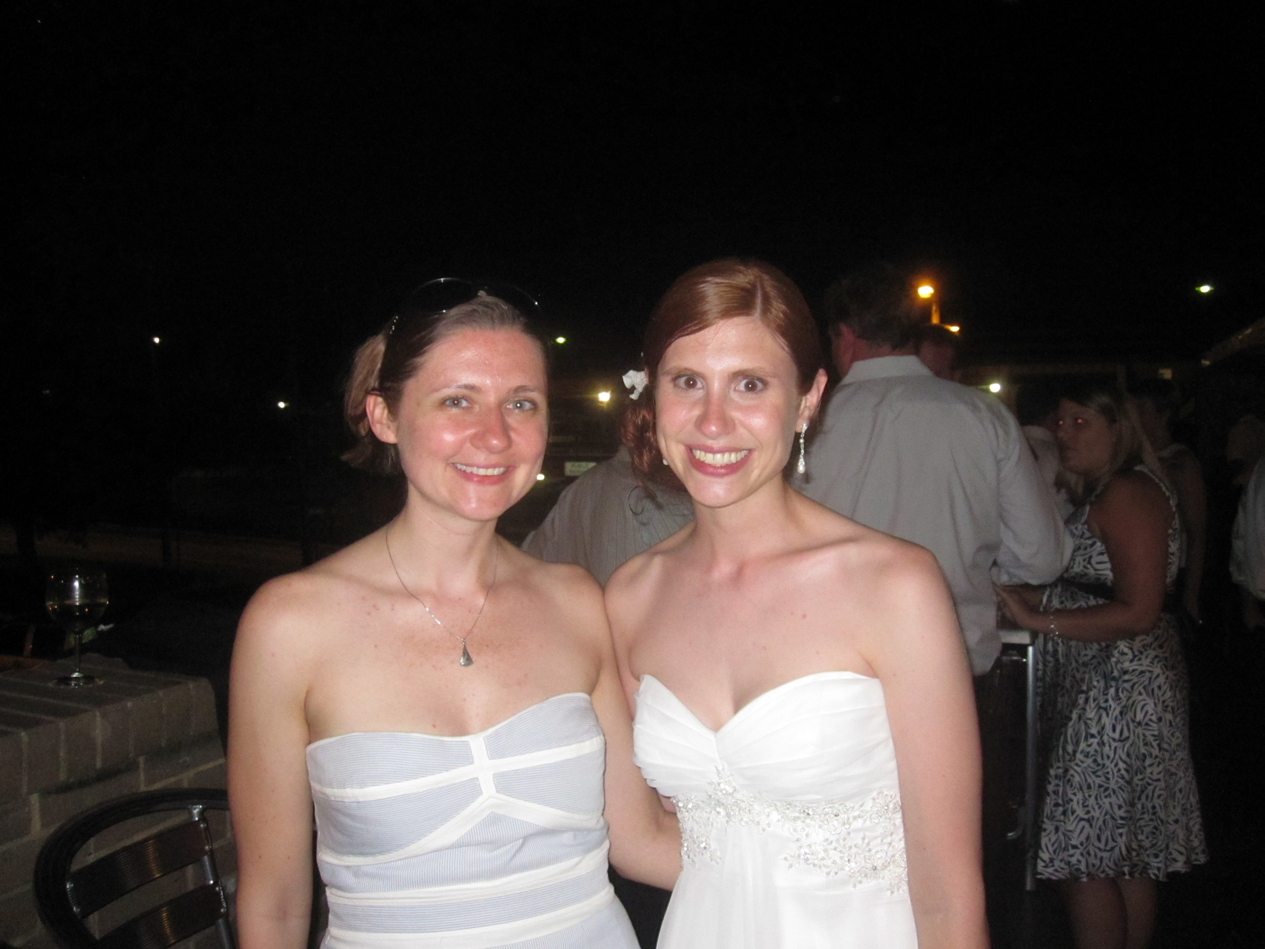
 Me with Stephanie (is her hair the best you've ever seen or what?):
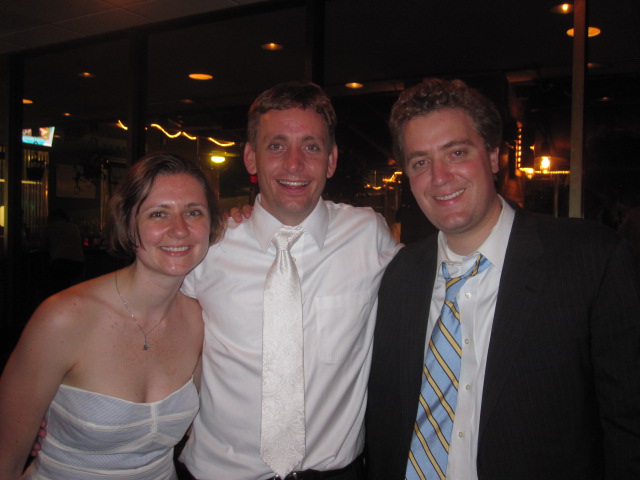
 Two of my best high school friends, Jeff (the groom) and Jed. See, those friendships totally last!
Happy weekend!
Win-It Wednesday: Box o' Books Continues
I'm loving the list of sailboat name ideas for my next novel. This contest will run through June and the prize is a box full of books! Enter as often as you think of a cool name. I'm listening! Here's the contest. Happy Wednesday!
PS-Jessica at A Fanatics Book Blog is giving away a copy of Lovestruck Summer (and her review made me giddy). Go enter!
Here's the contest. Happy Wednesday!
PS-Jessica at A Fanatics Book Blog is giving away a copy of Lovestruck Summer (and her review made me giddy). Go enter!
Before You Were Hot
in Other Stuff
I've been meaning to tell you guys about the new site I created with my I Heart Daily co-founder Anne Ichikawa, and here's the perfect opportunity. We were on The Early Show on CBS this morning for Before You Were Hot, so check it out:
Watch CBS News Videos Online
The site is really about going from the awkward years to feeling comfortable with yourself. Take a peek, enjoy and submit! (Yes, I put my own pic up...it's only fair.)
PS-Behind the scenes I was soooo nervous! My legs were shaking and my tongue was dry, but the anchors were really nice and Anne helped me get through it. Phew!
Cover Stories: Faithful by Janet Fox
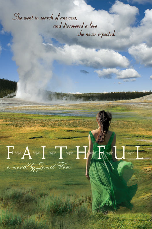 Janet Fox is here today to talk about the cover for her new book Faithful, which I can't stop ogling. It's almost like a Vogue photo shoot -- the greens, the blues, the spirit of adventure in the air. And, oh, that dress.
Here's Janet to tell us more:
Janet Fox is here today to talk about the cover for her new book Faithful, which I can't stop ogling. It's almost like a Vogue photo shoot -- the greens, the blues, the spirit of adventure in the air. And, oh, that dress.
Here's Janet to tell us more:
"While I was writing in the early stages, I had no idea about a cover; but as I revised I began to have a vision of it, and most of the images that came to my mind reflected my research. I loved the vintage photographs of Yellowstone and carried around in my mind an image of a girl looking at Old Faithful geyser, but with a vintage feel.
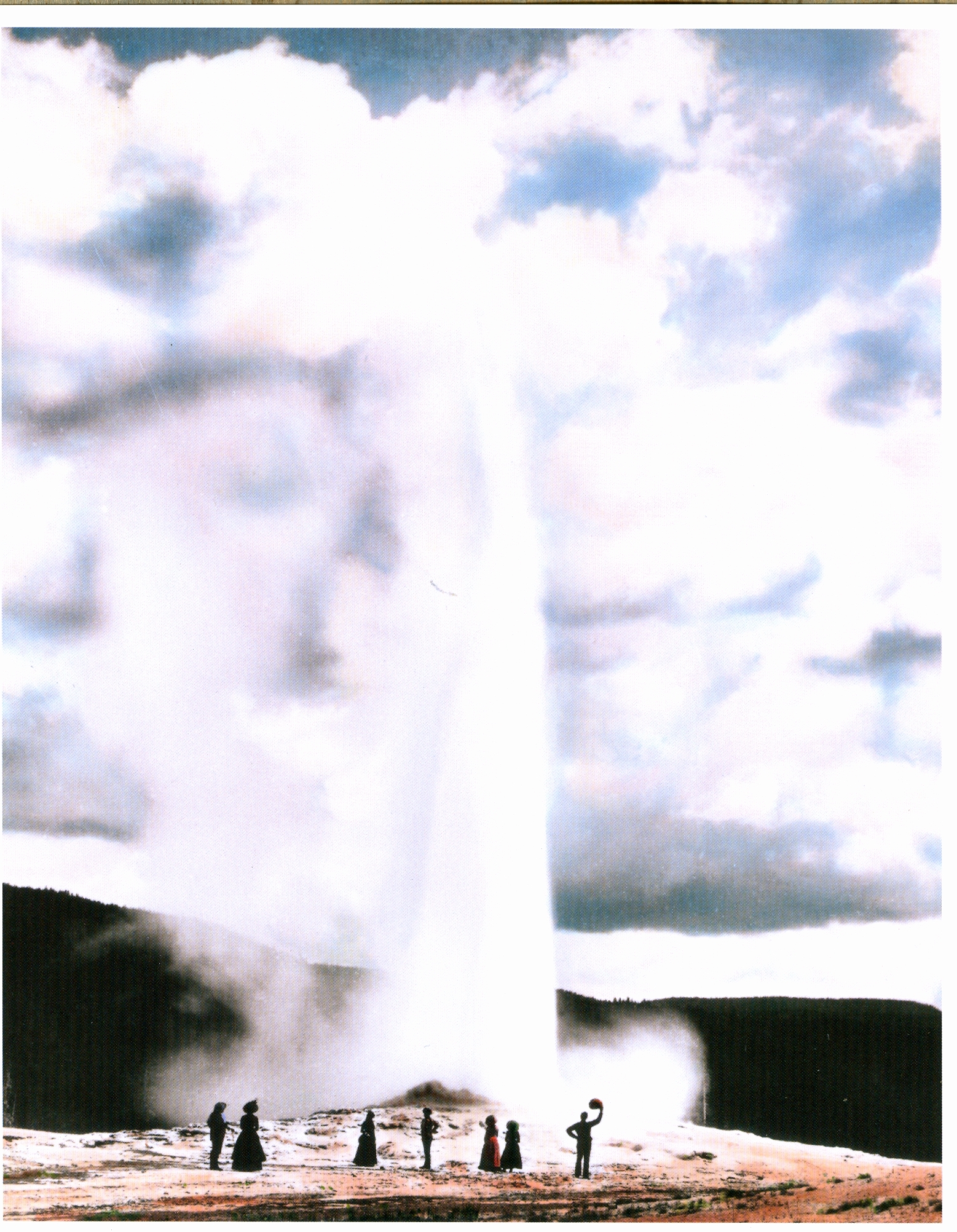
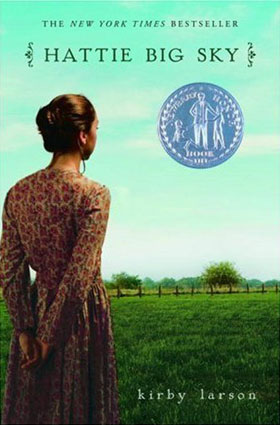 "My editor asked me for advice! I was pleased and surprised. I don't know that it's common to ask. She wanted me to send her some of the photos I'd collected, especially photos with clothing details of the period and photos of girls I thought looked like Maggie (my protagonist.) And she asked me what I thought the cover should look like, so I wrote a narrative paragraph. I mentioned the cover of HATTIE BIG SKY (by Kirby Larson), which is close to the same period although a different social set, and I sent along a vintage photo taken at Old Faithful (below).
 "When I first saw the cover, I was stunned. It was so beautiful I was speechless. I couldn't believe how closely the designer represented what was in my head, and yet how different in subtle ways - and those differences made it work. I'd been thinking vintage (sepia tones) but the colors and contemporary photo are arresting and much more appropriate for the audience. Really, the cover is completely beautiful. And I want to add, the designer's name is Jeanine Henderson, and I hope some day to meet her and thank her in person.
"I had only one comment, and that was about the nature of the dress that Maggie wears on the cover. I thought it seemed a little bare for the period and for her position - she probably would wear something similar to a ball, but not out in public in the daytime.
"They took my comments to heart, and we had a very cordial discussion about the dress but in the end everyone felt that putting sleeves on the dress or a shawl over her shoulders, for example, took something away from the beauty and simplicity of the moment, or made the cover feel too young or too old. I bowed to the greater wisdom of the art department - and I'm glad I did, for it's truly a winner.
"I believe that it's a combination of stock photos and modifications made by Jeanine. For example, the color of the dress - that green - figures in the book, and I think she colored the dress and the girl's hair to match Maggie's.
"I love it. Really and truly. I think it enhances the story; it sets the story; I think it sets the period, even though the dress is a tad modern; I think it sets the romance, the longing, and it describes in a subtle way both the loneliness of my character and her growth into herself.
"Oh, and I (along with many other people who've commented) really want that dress! I'm thinking that I might just have that dress made..."
Thanks, Janet! Let me just join the crowd and say: I want that dress! This is a gorgeous cover. What do you guys think?
PS-Here's the trailer. Can't wait to read this one.
Photo Friday: Book Week + Birthday Love!
in Photo Friday
I am so lame that I didn't have a camera for any BEA or Teen Author Carnival or Books of Wonder events. But I had fun! And here are some pics I stole from other people (hope they don't mind).First, here's part of the "Real Life" panel I was on at the Teen Author Carnival (which was super fun--thanks, Devyn, Mitali and Korianne!). That's, L to R, Jon Skovron, Stephanie Kuehnert, Barry Lyga, Ned Vizzini and Me! (Other fabulous authors not pictured here who were also on the panel: Sarah Mlynowski, Sarah Darer Littman, Lauren Oliver, Amy Brecount White and Courtney Sheinmel. Yay!)
 Just before the carnival, I got to have lunch with Kristi The Story Siren and Cat from Beyond Elsewhere! There was lots of book talk and bistro food. Yay!
 I promise next year I'll have a new book to sign!
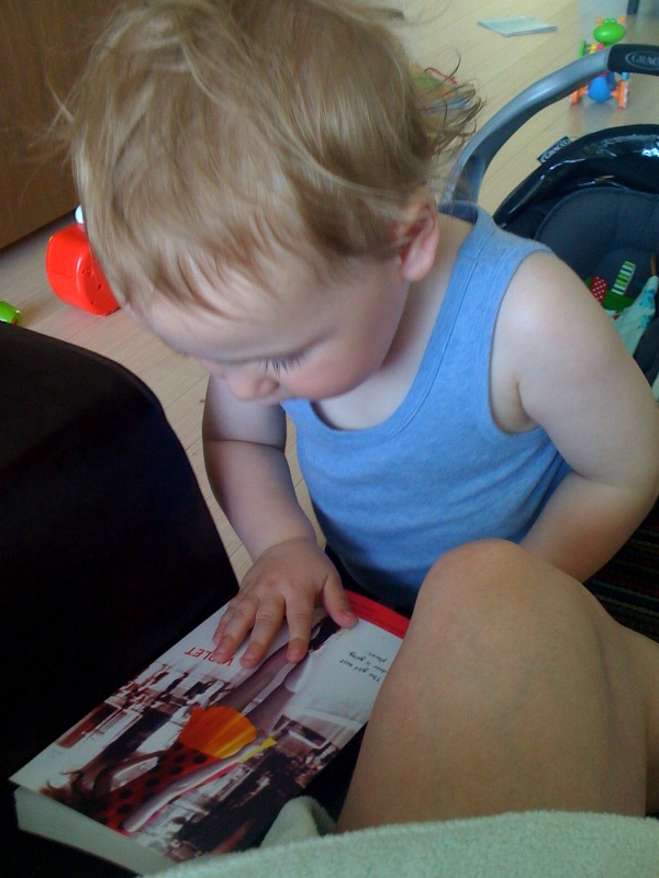
 Also, I think I found my youngest fan. Theo picked Violet by Design off the shelf and asked his mom to read it to him. Maybe it's Violet's short skirt?
 Happy weekend!
PS-It's my birthday. Thanks for all the twitter and facebook love! Lurkers, if you want to give me a present, say hi here. I always wonder who's reading this blog. xoxo
PPS-Adele! Thank you! I love being the wardrobe and the tornado!
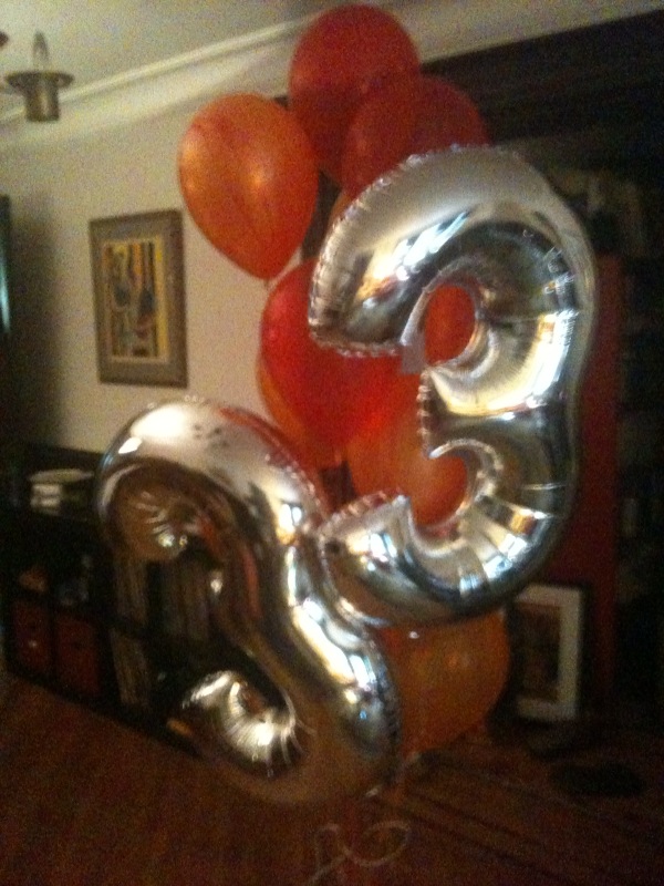
PPS-Breaking news. My friend Charles really knows how to make a girl feel special. (That would be with a balloon bouquet that spells out my age... love it!) Thanks, CT!!
Happy weekend!
PS-It's my birthday. Thanks for all the twitter and facebook love! Lurkers, if you want to give me a present, say hi here. I always wonder who's reading this blog. xoxo
PPS-Adele! Thank you! I love being the wardrobe and the tornado!
PPS-Breaking news. My friend Charles really knows how to make a girl feel special. (That would be with a balloon bouquet that spells out my age... love it!) Thanks, CT!!
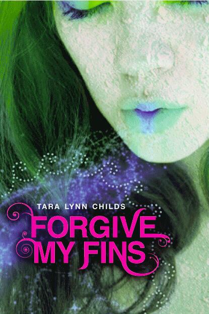
Cover Stories: Forgive My Fins by Tera Lynn Childs
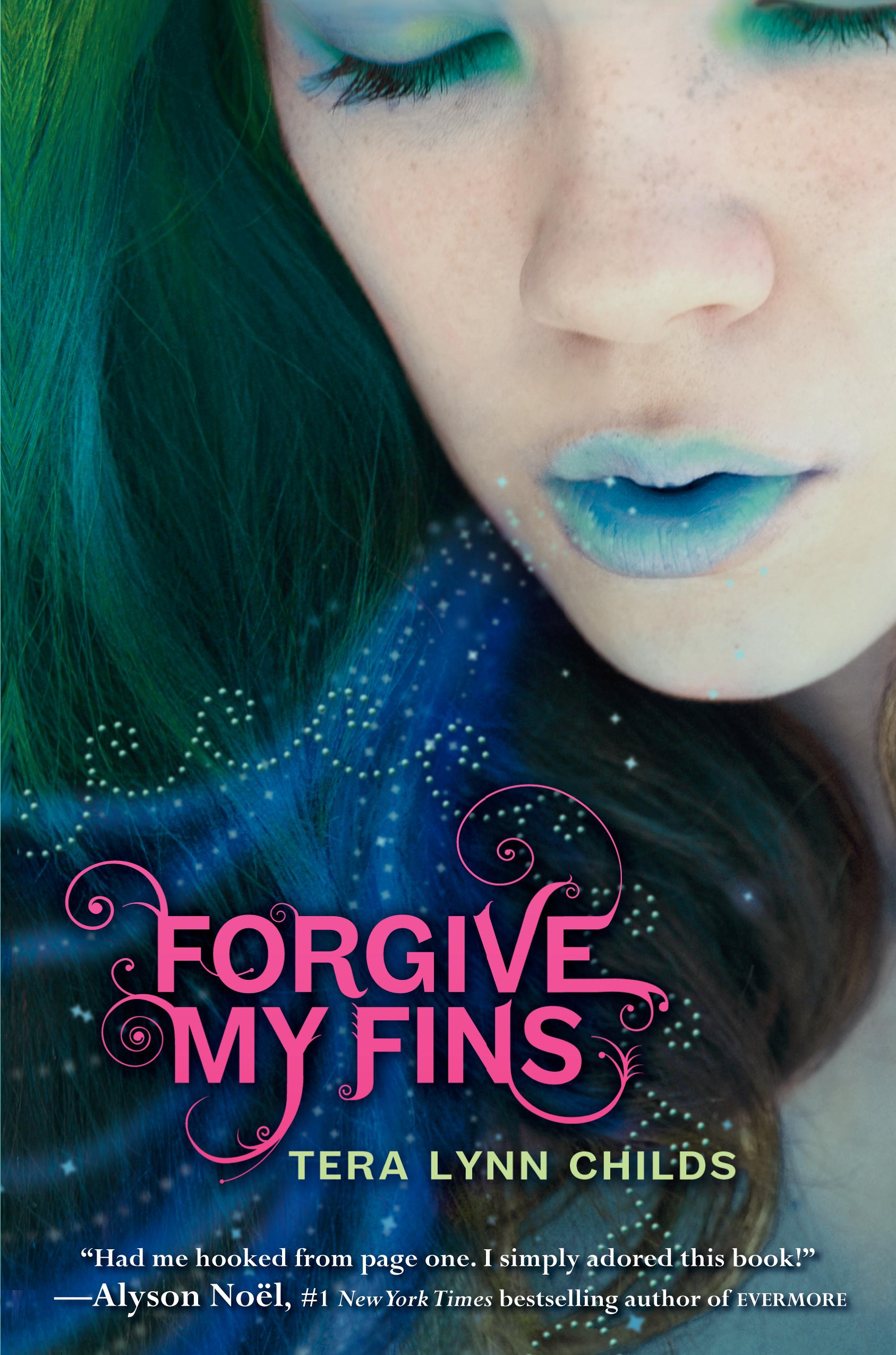 Tera Lynn Childs, who shared the scandalous Cover Story for her Oh. My. Gods. books, is back with an awesome, colorful cover and the story behind it. Take it away, Tera!"I had no cover in mind as I wrote Forgive My Fins. Which is weird, because I'm a very visual person and I usually make a mock cover for every book. But I was completely blank.
"My editor asked if I had any great ideas (which, as I said above, I didn't).
Tera Lynn Childs, who shared the scandalous Cover Story for her Oh. My. Gods. books, is back with an awesome, colorful cover and the story behind it. Take it away, Tera!"I had no cover in mind as I wrote Forgive My Fins. Which is weird, because I'm a very visual person and I usually make a mock cover for every book. But I was completely blank.
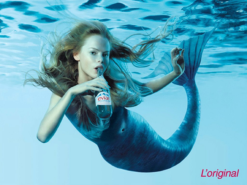
"My editor asked if I had any great ideas (which, as I said above, I didn't). 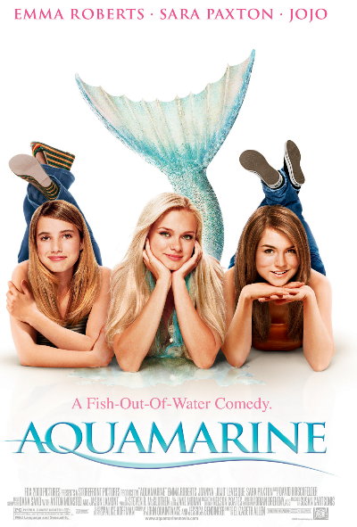 I gathered together a collection of images that resonated with me, especially the movie poster for Aquamarine (right) and the Evian mermaid ad (below). I only knew that I wanted a realistic cover, with a real girl. A real Lily Sanderson. Mermaids are fictional enough already, I didn't want a cartoon to make my characters seem even more so.
 "When I first saw the original cover (right), I had mixed emotions. I thought the design was gorgeous, and I absolutely adored the girl and the colors and even the font. But in the first draft there was some sort of texture applied to Lily's skin that made it look, well, like it was flaking off. In the book her skin is very fair and freckled, so I really hoped that would change. (Note: the draft I've attached is a version before the one I saw, and you can see my name is spelled wrong! They fixed that quickly.)
"After the semi-debacle of my Oh. My. Gods. cover (some bookstores didn't carry it because of the "naked dude" on the cover) I was hyperaware of every detail. I sent it immediately to my friends at Blue Willow Bookshop for their bookseller perspective and then sent on their suggestions with mine. The art department at Harper absolutely took those suggestions to heart. They were extremely committed to making the cover as perfect as possible and worked on every little detail.
"The basic design stayed the same, but details changed. The weird flaky skin disappeared, leaving only beautiful fair, freckled skin on a girl who looks exactly like I picture Lily. They added more curlicues on the title font, tweaked the magic bubbles/sparkles flowing from Lily's lips, and adjusted the overall colors a bit. And, once we got the amazing quote from Alyson Noel, they nudged things around a bit to get a piece of it on the cover. As far as I know the cover was shot with a model, but it was contracted out to a photographer. (I may be making that up, but I think that's true.)
"In the end, I. Ah. Dore. It. I think it captures the essence of the story, of Lily's character and the magic of the mer world. My favorite part is the dotted circle of waves in the bottom left of the cover. The mer folk in my world all have a mer mark, a special tattoo at the base of their neck, that identifies them as mer. I describe it as a circle of waves around a stylized kelp flower. I love that they put the circle of waves on the cover! It makes it all the more magical."
Thanks, Tera! I die for this cover, as Rachel Zoe would say. From the minute I saw it, I've wanted blue lipstick. The book is out this week, so pick it up and let it face out on your bookshelf!
What do you guys think?
"When I first saw the original cover (right), I had mixed emotions. I thought the design was gorgeous, and I absolutely adored the girl and the colors and even the font. But in the first draft there was some sort of texture applied to Lily's skin that made it look, well, like it was flaking off. In the book her skin is very fair and freckled, so I really hoped that would change. (Note: the draft I've attached is a version before the one I saw, and you can see my name is spelled wrong! They fixed that quickly.)
"After the semi-debacle of my Oh. My. Gods. cover (some bookstores didn't carry it because of the "naked dude" on the cover) I was hyperaware of every detail. I sent it immediately to my friends at Blue Willow Bookshop for their bookseller perspective and then sent on their suggestions with mine. The art department at Harper absolutely took those suggestions to heart. They were extremely committed to making the cover as perfect as possible and worked on every little detail.
"The basic design stayed the same, but details changed. The weird flaky skin disappeared, leaving only beautiful fair, freckled skin on a girl who looks exactly like I picture Lily. They added more curlicues on the title font, tweaked the magic bubbles/sparkles flowing from Lily's lips, and adjusted the overall colors a bit. And, once we got the amazing quote from Alyson Noel, they nudged things around a bit to get a piece of it on the cover. As far as I know the cover was shot with a model, but it was contracted out to a photographer. (I may be making that up, but I think that's true.)
"In the end, I. Ah. Dore. It. I think it captures the essence of the story, of Lily's character and the magic of the mer world. My favorite part is the dotted circle of waves in the bottom left of the cover. The mer folk in my world all have a mer mark, a special tattoo at the base of their neck, that identifies them as mer. I describe it as a circle of waves around a stylized kelp flower. I love that they put the circle of waves on the cover! It makes it all the more magical."
Thanks, Tera! I die for this cover, as Rachel Zoe would say. From the minute I saw it, I've wanted blue lipstick. The book is out this week, so pick it up and let it face out on your bookshelf!
What do you guys think?
Win-It Wednesday: The Box of Books Awaits
Still taking sailboat name ideas. Your reward is a box of books! Enter here. Doesn't it just sparkle like diamonds? Sigh.
Happy Wednesday!
Doesn't it just sparkle like diamonds? Sigh.
Happy Wednesday!
Cover Stories: Sleepless and The Unspoken, both by Thomas Fahy
 This Cover Story is by request from Travis of Inked Books! If you've got a request, just let me know and I'll do my best to dig up the story behind the cover.Thomas Fahy's on Sleepless has a creepy cover, to be sure. Here's the premise: Emma Montgomery has been having trouble sleeping. Whenever she closes her eyes, all she can see are horrible nightmares ... nightmares of gruesome murder. And she's not alone. All of the students in Dr. Beecher's secret society have been having terrible dreams and sleepwalking. Now, as their classmates start turning up dead, Emma and her friends race against the clock to keep themselves awake and find out what is causing them to kill in their sleep--before the next victim dies.
And here's Thomas to talk about the cover:
"Unlike some of my other books (where I had plenty of time to think about possible cover art), the cover for Sleepless is the first thing that my publisher decided on when I presented them with my book idea. My editor told me that when the staff at Simon & Schuster was discussing my book proposal someone in the room came up with the idea for the cover--a young girl wearing a sleep mask with blood oozing out beneath it.
"Apparently, everyone loved this visual image. By the time my editor called to ask me to write Sleepless, the press was set on that cover (which he described to me on the phone that day). I have to admit, I really liked the idea. It suggests one of the scariest aspects of the book for me--the epidemic of sleepwalking that causes a group of teens to do terrible things in their sleep. They only come to realize the things they've done through horrifying dreams ... snapshots of what happened while they were sleeping.
"Whenever friends see this book in my living room, they pick it up and say, 'Wow, you wrote that? Looks scary!' I guess the cover does a good job of selling the book!
This Cover Story is by request from Travis of Inked Books! If you've got a request, just let me know and I'll do my best to dig up the story behind the cover.Thomas Fahy's on Sleepless has a creepy cover, to be sure. Here's the premise: Emma Montgomery has been having trouble sleeping. Whenever she closes her eyes, all she can see are horrible nightmares ... nightmares of gruesome murder. And she's not alone. All of the students in Dr. Beecher's secret society have been having terrible dreams and sleepwalking. Now, as their classmates start turning up dead, Emma and her friends race against the clock to keep themselves awake and find out what is causing them to kill in their sleep--before the next victim dies.
And here's Thomas to talk about the cover:
"Unlike some of my other books (where I had plenty of time to think about possible cover art), the cover for Sleepless is the first thing that my publisher decided on when I presented them with my book idea. My editor told me that when the staff at Simon & Schuster was discussing my book proposal someone in the room came up with the idea for the cover--a young girl wearing a sleep mask with blood oozing out beneath it.
"Apparently, everyone loved this visual image. By the time my editor called to ask me to write Sleepless, the press was set on that cover (which he described to me on the phone that day). I have to admit, I really liked the idea. It suggests one of the scariest aspects of the book for me--the epidemic of sleepwalking that causes a group of teens to do terrible things in their sleep. They only come to realize the things they've done through horrifying dreams ... snapshots of what happened while they were sleeping.
"Whenever friends see this book in my living room, they pick it up and say, 'Wow, you wrote that? Looks scary!' I guess the cover does a good job of selling the book!
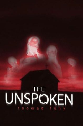 "In my experience, presses don't really want an author's opinion on cover design. They feel that their marketing department knows best. I've been very happy with the artwork on the covers for both my teen books. My previous teen book, The Unspoken, actually has two covers. The cover for the hardback edition shows a church with five creepy ghosts above it (right). The book is about several teens that are haunted by their childhood memories of growing up in a cult and the prophecy that they will die from their worst fear in five years. I thought this was a good, scary cover.
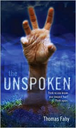 "Then the press changed it for the paperback (left), which I didn't realize would happen. The new cover shows a hand clawing through the ground. I like this cover as well. Literally, it shows someone who has been buried alive and is clawing to the surface (which does happen in the book). Since the book is also about buried secrets and the things we're afraid will surface, I think this cover works great for that, too."
Thanks, Thomas! All the covers totally creep me out, which is a very good thing for the stories. The Sleepless cover is so arresting, I think. I would have to turn it over to sleep at night! What about you guys?
"Then the press changed it for the paperback (left), which I didn't realize would happen. The new cover shows a hand clawing through the ground. I like this cover as well. Literally, it shows someone who has been buried alive and is clawing to the surface (which does happen in the book). Since the book is also about buried secrets and the things we're afraid will surface, I think this cover works great for that, too."
Thanks, Thomas! All the covers totally creep me out, which is a very good thing for the stories. The Sleepless cover is so arresting, I think. I would have to turn it over to sleep at night! What about you guys?