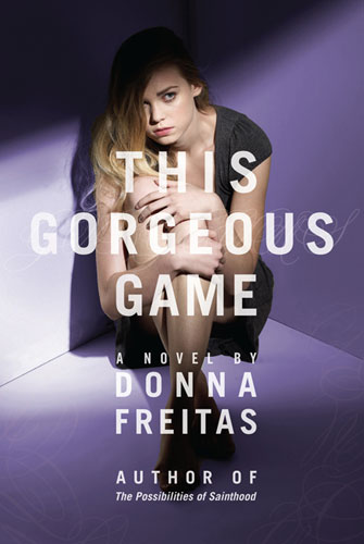
I read an early copy of This Gorgeous Game by Donna Freitas (it comes out tomorrow!) and I highly, highly recommend it (so does Little Willow). It's a disturbing page-turner with so much heart, warmth and depth. You'll be hearing a lot about this book this summer -- read it now so you can join in the conversation.Also, it's got a great cover. Here's Donna with more on that:
"Because This Gorgeous Game is both so dark and so personal, at first I was at a complete loss as to what image might represent it -- I almost wouldn't let my mind go there. But when I did, because eventually of course I would, there were two images I kept thinking about. The cover would be of a girl and only a girl -- even though This Gorgeous Game is about a girl who is stalked, I absolutely, positively did not want any hint of the stalker on the cover, I cannot express that strongly enough.
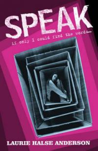
"The first image idea was of a girl walking down the street looking over her shoulder, almost looking behind her, but also at the reader, and the would seem anxious. The other image idea was a photo of a girl who looks trapped -- which I know is kind of vague. But I'd seen a photo on Getty of a girl who is curled up in a ball and she is literally inside a series of boxes -- a box inside a box inside a box, etc., and inside the smallest box at the center is the girl. It is a very disturbing photo, haunting and unforgettable. I knew it was a bit too much for the actual cover, but the idea was as close to the feeling I was going for as it gets.
"[My publisher] FSG and the designers at Macmillan were so unbelievably sensitive with regard to consulting my opinion on the cover. They not only invited me to submit photo concepts that I saw on Getty, but they spent so much time on the phone and even had me into the office several times for conversations. It was incredible and kind of them.
"I gave them the basic input I discussed above, but the biggest thing I begged was: No Stalker Man on the Cover, please. I wanted the cover image to be my protagonist, Olivia Peter's and hers alone. The idea of featuring the man who stalks her was unbearable to me, and the designers at Macmillan, my editor, and everyone there were so amazing about listening to that need of mine.
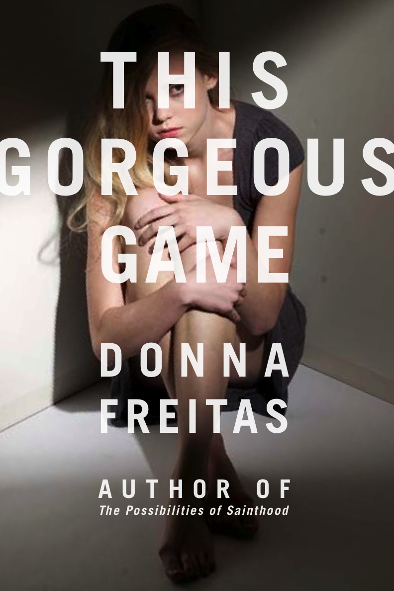
"I couldn't imagine a more perfect cover, honestly. It is inspired. I think it is truly a beautiful photograph, the purple in the background is stunning on the final book, the model is perfect, and ohmigosh, the way she is posed -- curled up and cowering in the corner, or is it that's she's glaring? I love how one minute you look at her and think she might be frightened, the other, angry and glaring. Maybe she is looking up and out at you, the reader, or perhaps at her stalker. Or maybe she's not cowering, but getting ready to spring and fight back.
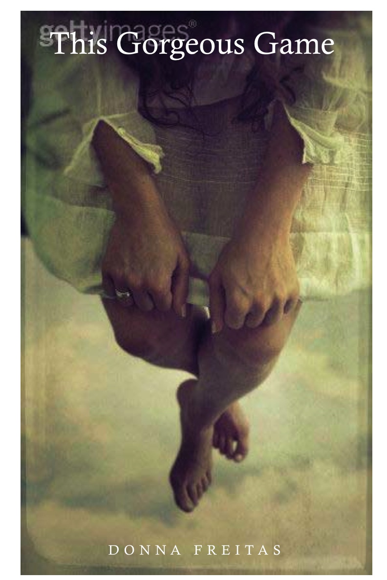
"Macmillan went through so many versions. Let's see -- there were five total. The first two were extraordinarily different from the final version. The very first cover they did was really early on and even the title of the book was different back then -- my working title was originally Confessions. The second cover, after the title changed to This Gorgeous Game was also very different from the final one still: a photo from the waist down of a girl dangling, almost perched on an invisible swing in the sky, her arms and legs bare. I thought the second cover was pretty wonderful.
I read an early copy of This Gorgeous Game by Donna Freitas (it comes out tomorrow!) and I highly, highly recommend it (so does Little Willow). It's a disturbing page-turner with so much heart, warmth and depth. You'll be hearing a lot about this book this summer -- read it now so you can join in the conversation.Also, it's got a great cover. Here's Donna with more on that:
"Because This Gorgeous Game is both so dark and so personal, at first I was at a complete loss as to what image might represent it -- I almost wouldn't let my mind go there. But when I did, because eventually of course I would, there were two images I kept thinking about. The cover would be of a girl and only a girl -- even though This Gorgeous Game is about a girl who is stalked, I absolutely, positively did not want any hint of the stalker on the cover, I cannot express that strongly enough.
"The first image idea was of a girl walking down the street looking over her shoulder, almost looking behind her, but also at the reader, and the would seem anxious. The other image idea was a photo of a girl who looks trapped -- which I know is kind of vague. But I'd seen a photo on Getty of a girl who is curled up in a ball and she is literally inside a series of boxes -- a box inside a box inside a box, etc., and inside the smallest box at the center is the girl. It is a very disturbing photo, haunting and unforgettable. I knew it was a bit too much for the actual cover, but the idea was as close to the feeling I was going for as it gets.
"[My publisher] FSG and the designers at Macmillan were so unbelievably sensitive with regard to consulting my opinion on the cover. They not only invited me to submit photo concepts that I saw on Getty, but they spent so much time on the phone and even had me into the office several times for conversations. It was incredible and kind of them.
"I gave them the basic input I discussed above, but the biggest thing I begged was: No Stalker Man on the Cover, please. I wanted the cover image to be my protagonist, Olivia Peter's and hers alone. The idea of featuring the man who stalks her was unbearable to me, and the designers at Macmillan, my editor, and everyone there were so amazing about listening to that need of mine.
"I couldn't imagine a more perfect cover, honestly. It is inspired. I think it is truly a beautiful photograph, the purple in the background is stunning on the final book, the model is perfect, and ohmigosh, the way she is posed -- curled up and cowering in the corner, or is it that's she's glaring? I love how one minute you look at her and think she might be frightened, the other, angry and glaring. Maybe she is looking up and out at you, the reader, or perhaps at her stalker. Or maybe she's not cowering, but getting ready to spring and fight back.
"Macmillan went through so many versions. Let's see -- there were five total. The first two were extraordinarily different from the final version. The very first cover they did was really early on and even the title of the book was different back then -- my working title was originally Confessions. The second cover, after the title changed to This Gorgeous Game was also very different from the final one still: a photo from the waist down of a girl dangling, almost perched on an invisible swing in the sky, her arms and legs bare. I thought the second cover was pretty wonderful.


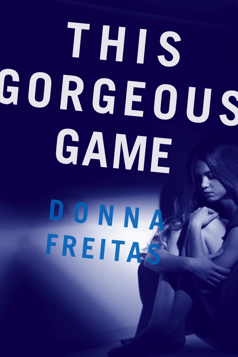
 "Then they did the photo shoot and the possible covers they showed me from the shoot totally blew me away -- including a very film noir one that I love because it's cool, even though it doesn't really work for the book (right) . The designer let me pick my favorite of all of them, and from that photo they did three different covers, each a bit different, trying to get it right. The third cover they did is on the first version of the galley (left).
  Then they redid galleys with the fifth and final cover, so there were actually two different covers circulating on the galleys for This Gorgeous Game.
"For the first two versions they did of the cover they were going to use stock photos, but then, for the final cover you see they decided to do a photo shoot and they let me pick the model. It was really cool. The girl you see on the cover was my first choice for Olivia -- they had me pick several models and rank them.
"I love the cover, I can't overstate this. And there is definitely hidden meaning -- lots of it, too. Look what they did to the type. See how the word "Gorgeous" goes straight across the girl's body, like it's labeling her as gorgeous, which Olivia is supposed to be. Then the title of the book itself has multiple meanings -- "This Gorgeous Game" -- which is taken from the book's epigraph, a quote from the famous writer-Trappist monk Thomas Merton -- the way the placed the entire title across her body, as if she is marked, as a hunter would mark her as his "game." Lastly regarding the type: do you see how it forms a cross? It's subtle, but once you see it there you can't un-see it. Olivia's stalker is a Catholic priest, and so it's as if she's penned in by the cross.
"The cover the designers came up with is so symbolic and true to the story I wrote. I think the image evokes so much of the feelings embedded in the story and Olivia's voice, the way it makes her feel to be pursued, how haunted she becomes, how tiny and curled up, but also how angry and defiant. I am grateful to them for their vision."
Thanks, Donna! It's so much fun to see all the images. And I LOVE the hidden meanings. I hadn't seen the cross in the text, and now -- you're right -- I can't stop seeing it. I also think the myriad of emotions on her face are very effective -- anger, fear, sadness, impatience. I think the final is definitely the strongest choice.
What do you guys think of the final cover and the other incarnations it had along the way?
Then they redid galleys with the fifth and final cover, so there were actually two different covers circulating on the galleys for This Gorgeous Game.
"For the first two versions they did of the cover they were going to use stock photos, but then, for the final cover you see they decided to do a photo shoot and they let me pick the model. It was really cool. The girl you see on the cover was my first choice for Olivia -- they had me pick several models and rank them.
"I love the cover, I can't overstate this. And there is definitely hidden meaning -- lots of it, too. Look what they did to the type. See how the word "Gorgeous" goes straight across the girl's body, like it's labeling her as gorgeous, which Olivia is supposed to be. Then the title of the book itself has multiple meanings -- "This Gorgeous Game" -- which is taken from the book's epigraph, a quote from the famous writer-Trappist monk Thomas Merton -- the way the placed the entire title across her body, as if she is marked, as a hunter would mark her as his "game." Lastly regarding the type: do you see how it forms a cross? It's subtle, but once you see it there you can't un-see it. Olivia's stalker is a Catholic priest, and so it's as if she's penned in by the cross.
"The cover the designers came up with is so symbolic and true to the story I wrote. I think the image evokes so much of the feelings embedded in the story and Olivia's voice, the way it makes her feel to be pursued, how haunted she becomes, how tiny and curled up, but also how angry and defiant. I am grateful to them for their vision."
Thanks, Donna! It's so much fun to see all the images. And I LOVE the hidden meanings. I hadn't seen the cross in the text, and now -- you're right -- I can't stop seeing it. I also think the myriad of emotions on her face are very effective -- anger, fear, sadness, impatience. I think the final is definitely the strongest choice.
What do you guys think of the final cover and the other incarnations it had along the way?
 PS-Update from Tamar! She put this image below in the comments and says, "I think I know the image Donna talks about when she says 'a photo of a girl who looks trapped' with the boxes. I found it on the UK version of Laurie Halse Anderson's SPEAK (left)." Thanks, Tamar!
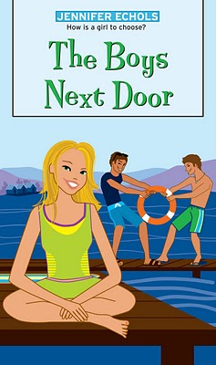
 The lovely Jennifer Echols is here as part of her Girlfriend Cyber Circuit tour! Her book, Endless Summer, is a repackaging of two previous books -- The Boys Next Door and Endless Summer. Look for a sweet and hot love triangle with the Vader Brothers next door during Lori's summer at the lake.
Here's Jenn, and she's got a whopper of a cover change to show!
The lovely Jennifer Echols is here as part of her Girlfriend Cyber Circuit tour! Her book, Endless Summer, is a repackaging of two previous books -- The Boys Next Door and Endless Summer. Look for a sweet and hot love triangle with the Vader Brothers next door during Lori's summer at the lake.
Here's Jenn, and she's got a whopper of a cover change to show!