Cover Stories: The Karma Club by Jessica Brody

KarmaClub - Medium.jpgJessica Brody runs Free-Book Friday, of which I am (naturally) a fan! Her debut YA novel, The Karma Club, came out this week, and I invited her over for a little cover talk as a stop on her Girlfriends Cyber Circuit tour. Here's Jessica:

"When I first saw the cover: Oh my God, I fell in love with it...instantly! They actually showed me two different ones and my editor told me beforehand that this one was her favorite of the two and I couldn't have agreed more! I am pretty bad at envisioning covers so I really didn't know what to expect. I just wanted something fun and colorful because I think that represents the book and that's exactly what I got! It's my favorite cover thus far!

"The only suggestion I made was that they separate the "R" and "M" in Karma because when blended together, I was worried it would look too much like The Karina Club. They agreed and it was quickly changed. "This was actually a stock photo from Getty Images! My editor later told me that they did do a photoshoot with a model but she didn't think it came out right so they set off to look for a stock photo instead. I never actually saw the original cover, although I am very curious!"

So am I! I have seen this photo because it's a favorite avatar of book maven Little Willow! I adore the image, and I also like the idea of karma messing back with someone. What do you guys think?

Oh, and here's the trailer for the book, so you'll know more about it!

Win-It Wednesday: Something Like Fate by Susane Colasanti

The winner of last week's Gimme a Call contest is... Melissa of YA Book Shelf! Send me your address, M. Oh, and Random House is having a contest where you can win a phone and a call from author Sarah Mlynowski, so enter that here.fatecoverblog.jpgThis week's contest is the one I posted on Monday (the Cover Story for Something Like Fate by Susane Colasanti). So head over to Monday's post and leave an honest comment about the cover--what you like or don't (seriously, it's good market research for everyone!), and then you're entered. I'll choose a winner next week. Oh, and here are three more books I gave some love to today in I Heart Daily. Have you guys read these yet? Also: Is anyone else super upset about Jill and Bethenny's friend fight on Real Housewives of NYC? I am almost crying with each episode now. As NY Mag says, it is harming my soul. Sad, I know, but I want them to patch things up! Happy Wednesday!

Cover Stories: 3 at Unabashedly Bookish

I've been posting some Cover Stories over at Barnes and Noble's Unabashedly Bookish blog, so I wanted to shout them out here, with excerpts:suckstobeme.jpgSucks to be Me by Kimberly Pauley. "For the first book, Sucks to be Me, I actually made a cover mock up with one of those old-school notebooks and a goofy-looking fanged bat. It was really silly. I'm glad they did what they did instead!" 8th-grade-superzero.jpg8th Grade Superzero by Olugbemisola Rhuday-Perkovich. "The original title for a long while was LONG TIME NO ME, and I had a lot of thoughts of black/dark blue cover, lower case text, very sparse, very not kid-friendly..." handbook.jpgThe Handbook for Lightning Strike Survivors by Michele Young-Stone. "I figured my best bet was to leave all cover ideas to the professionals. I write books and they sell them. Then, the first two covers arrived wrapped around other books -- so I'd get a sense of the jackets. I did NOT like either one, and I was supposed to choose which one I liked best. I didn't know what to do..." Like these covers? I do! (Especially note the sneakers on 8th Grade Superzero -- genius!) Click the titles to read the full Cover Stories. PS-Today is the last day to enter the Gimme a Call contest... go!

Cover Stories: Something Like Fate by Susane Colasanti (+ Contest!)

fatecoverblog.jpg 
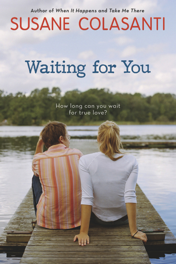
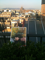
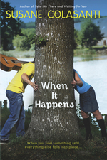
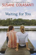
Last year, Susane Colasanti shared the Cover Story for her Dawson's Creek-esque image on Waiting For You, and now she's back with a new release--Something Like Fate (a book I dropped in Madrid for Operation Teen Book Drop!). Also, I have an extra ARC of this book so one lucky commenter will win that, too. Just comment below and leave your cover thoughts before May 5th.

Take it away, Susane!

"Before Something Like Fate, my book covers shared a similar theme. They all featured a boy on the left and a girl on the right with their faces hidden in some way. Plus, they all had a sweet natural lighting effect. Right before Waiting for You came out in paperback, shiny new editions of my other paperbacks were released. The goal was for all of my books to share a uniform look by branding them with new stripy watercolor patterns on the spines. I was so exited about this change! The new spines really pop on the shelves.

happensnewfb.jpg takenewfb.jpg waitingnewfb.jpg "My publisher wanted the cover of Something Like Fate to look a bit different. Instead of the usual boy/girl image, she felt strongly that one boy and two girls should be featured on the cover to emphasize the lovers' triangle. I think a stock photo was originally found, but didn't seem quite right. So they had a photo shoot for the cover. It was held at a studio in Chelsea with models from Ford Models. The girls were in high school (their moms were there) and the boy was a few years older. My editor was there, which is how I know some of the behind-the-scenes details.

"The setting is supposed to be an old-school ice cream parlor from the book. At first, they were going to use real ice cream in the photo. They went out and got all of this ice cream, but it ended up melting because it wasn't used. They tried some poses at a counter with the models sitting on stools. Between the models' legs and the chair legs, the image looked too busy. The couch was already there in the studio (although I think my cover designer changed its color to purple), and it was clear that by using the couch as a backdrop for the finger touch, readers would get an immediate sense of what the story's about.

"When I first saw the cover...well, I was less than thrilled. It seemed a bit Gossip Girl to me. Not to dis Gossip Girl - love that show! - I just didn't think it quite matched the tone of my book. It was a shock to see two girls when I was used to just one. I didn't get what a plush couch was doing in an ice cream parlor. Isn't that a recipe for disaster? And the couch seemed huge to me. It was taking up almost half the cover!

fatecoverblog.jpg 
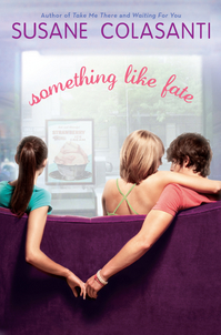
"I loved the fonts and colors, though. I'd requested a pink/purple color scheme, which came out really well. I liked everyone's clothes and the boy's bracelets - those are his actual bracelets he came in wearing. I also liked the big window because it offered an opportunity for natural light. But the initial cover had a much harsher lighting effect that looked fake to me. I asked for the lighting to be softened, which it was. I also asked for the ice cream poster that's hanging in the window to be changed. The original poster was really cheesy - I wanted something with a more vintage look. My contract says that I get a cover consultation, so my feedback was accepted and those changes were made.

"The only change my designer couldn't make was that I wanted to see more of the models and less of the couch. But now I realize that the back of the couch needs to be that high to draw your eye towards that perfect finger touch, which was really hard for the photographer to capture. The models tried all sorts of different poses before nailing that one. They tried holding hands at first. That didn't look right. And if the girl on the left were any closer to the others, it would have changed the tone. I appreciate how difficult it was to create that one awesome shot.

"The response to the cover has been amazing. I've definitely come to love it. I think I just needed some time to get used to the different look. And seeing the cover before the final manuscript changes were made helped because I was able to write that purple couch into the ice cream parlor scene. Now everyone will know that the couch is legit!"

Thanks, Susane! I really do think the cover perfectly conveys the love triangle in the book, and that finger touch is just so lovely. Plus, I hadn't thought about the "natural light" theme in all these covers, but seeing them together definitely highlights that. Pretty!

What do you guys think?

PS-Visit Susane on her website, blog, Facebook, MySpace and Twitter.
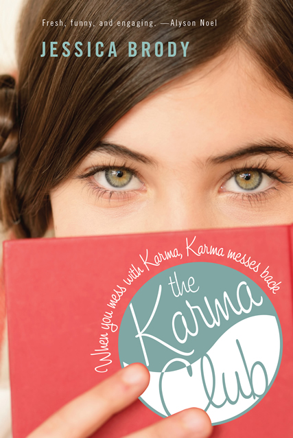
Asian Americans in the Fashion Industry

This awesome event is happening tomorrow (Sunday) in NYC. Go if you can!APAAM press version.jpg It's organized by Miss Couturable herself, Noel Duan, who says: "This is a mega-panel discussion with top Asian American figures in the fashion industry in order to promote the education and discussion of fashion and careers in fashion. In accordance to this year's theme, 'Deeper,' we hope to dive deeper into exploring the different ways in which Asian Americans have made revolutionary contributions. Our confirmed panelists are: SuChin Pak, MTV Correspondent (Moderator) Humberto Leon, Creative Director and Co-Founder of Opening Ceremony Carol Lim, CEO and Co-Founder of Opening Ceremony Joe Zee, Creative Director of ELLE Tina Chai, Stylist & Columbia College alumna Phillip Lim, Fashion Designer Patrick Li, Creative Director of Li, Inc Ujjwala Raut, Supermodel EJ Samson, Online Editor of Teen Vogue Arabelle Sicardi, Fashion Blogger Aya T. Kanai, Stylist "A portion of the ticket proceeds (it's only $5/ticket!) will be donated to Tibetan Village Project to help the victims of the recent Yushu earthquake in China. "Tickets can be purchased online and the Facebook Event is here." Happy Saturday!

Photo Friday: Spain (In Food + Books!)

I am going to have to devote a few Photo Fridays to Spain. I just must! This first one? It's about food and books, naturally.First: This was my very favorite thing! Fried lemon leaves at a street fair in Murcia (where the next day they had a festival and everyone wore traditional Spanish clothing--so cool!): friedlemonleaf.jpg murciadress.jpg There were amazing little beers in Spain, called canas (with a ~ that my blog won't accept--lame). Here's Becky with her first cana, and the beach where we stayed in Nerja: beckycana.jpg nerja.jpg And, on our balcony in Nerja, Andalucia, I ate Corn Flakes with excellent fresh strawberries. And I read The Exile of Gigi Lane by Adrienne Maria Vrettos (total fun!): cereal.jpg gigi.jpg The Tostada Andaluz (a Southern Spain breakfast of toasted bread with crushed tomatoes, olive oil and salt) made me swoon, and I fell back in love with jars of Sangria, which Becky and I drank on "The Balcony of Europe" (a lovely plaza over the Mediterranean Sea in Nerja): toastandaluz.jpg sangria.jpg The Alhambra is a seriously amazing Muslim palace. Oh, and the fried eggplant in Granada? Me gusta: alhambra.jpg eggplant.jpg We took a ferry to Tangiers, Morocco (my first step in Africa!) and had this really awesome mint tea. On the right is the door to a mosque in Tangiers, the MEN'S door (women enter through the back). The color green means peace, our guide told us. I told him "I think it'd be more peaceful if women could enter through the front door too." Just saying. minttea.jpg tangiers.jpg In Valencia, Becky and I sat in a the Plaza de la Virgen in the morning and I had cafe con leche (you know it's a favorite). Then I saw an article in the paper about ELLE France doing an issue totally full of "plus" (read: normal) sized women. It made me happy! cafe.jpg ellexl.jpg Plus, Valencia had this amazing market with food that would make Michael Pollan proud! Mushrooms and fruit! Veggies and ham! mushroommarket.jpg oranges.jpg veggies.jpg jamones.jpg Also in Valencia, the City of Arts and Science was incredible. We got smoothies there. scimus.jpg melbecksmoothies.jpg Plus, I read The Perks of Being a Wallflower by Stephen Chbosky (FINALLY! SO GOOD!). Oh, and I made Becky dance in the central plaza in Valencia, because it looked like an outdoor ballroom to me! perks.jpg valencia.jpg When we got to Barcelona, we were hungry for tapas, and quickly polished off a plate of pimientos (delicious!): pimientos before.jpg pimientos after.jpg The next day we had a tasting menu at Moo (thanks, Phil!). Barcelona has some of the best food in the world. For dessert, honey and flowers! Then a trip to Gaudi's Parque Guell: honey and flowers.jpg guellpark.jpg Later, a rooftop rest (Dave joined us in Barcelona. See La Sagrada Familia, Gaudi's cathedral, behind us) and I read For Keeps by Natasha Friend, which was really sweet (read The Compulsive Reader's review): barcelonarooftop.jpg forkeepsonroof.jpg We headed to San Sebastian next, where the Playa de la Concha provided amazing seafood tapas, called pinxtos in Basque country (it all put me in a good mood): sansebpinxatas.jpg sanseb.jpg And then: Madrid! This place holds such a piece of my heart because I spent a semester abroad here when I was a junior in college. If you have the chance to study abroad, do it! It was hard and fun and lonely and amazing and bittersweet and wonderful and confusing and the best time ever. First, lunch near the Palacio Real and then dessert near my old apartment on Calle de Goya (the same gelato place was still there!): eggspalace.jpg palazzo.jpg Finally, a pose with el Oso (the symbol of Madrid) and a paella dinner: oso.jpg madrid paella.jpg If you guys got this far, gracias! I know this is probably like looking through a gajillion of your old relative's vacation photos, but I was soooo excited to be on this trip! There'll be more next week, so bear with me. And seriously, Spain? Te amo. Happy Friday!

Cover Stories: The Cinderella Society by Kay Cassidy

Kay Cassidy has been having a huge launch party (including prizes galore!) for her debut novel, The Cinderella Society, so of course I had to invite her over for cover talk... here she is:princessdiaries.jpg"I envisioned the cover of The Cinderella Society in the vein of the Princess Diaries boxed set (volumes 1-3) with the cute pillow and tiara. Although with slightly stronger colors so the glass slipper would really pop. I liked the feminine feel, though I figured mine would probably be in the purple spectrum since lavender is the color of The Cinderella Society. "My cover was kind of funny because I actually saw it on the Advanced Reader Copy (ARC) when it was just a filler! I thought my ARCs were going to have plain covers because they couldn't find a cover comp they really liked, so I was thrilled when the ARCs arrived with the pink boxes and glass slipper mockup. The edges of the boxes were rough and unrefined, but I thought the design was very striking, especially with all the dark covers dominating bookstore shelves. "In the meantime, my editor kept having the designer go back to the drawing board on the cover. But after several weeks of them having the ARCs in their office and having people see it and immediately pick it up with an 'Ooo,' my publisher decided that maybe they'd already found the winner. My editor asked if I would be comfortable using a version of that as my final cover, and I was delighted. "I think it's a mix of stock photo and a shoot. The glass slipper was a stock photo (which was great because I was able to buy it so my marketing materials were an exact match) but I think the boxes part was created by the designer herself. "But actually... now that I think about it, I had looked for a glass slipper graphic a few months earlier on one of the big stock photo sites and couldn't find one. But after my cover came, I went there again and found one that was an exact match. So maybe it was the designer who created it and made it available as a stock photo. I wonder! "I'm still very happy with it. I haven't noticed anything that I wish had been changed, so it's been wonderful. I think every new author freaks out about their cover (I had nightmares mine was a cartoon), so it's a HUGE relief to have a cover I love." Ooh, as someone with a cartoon cover that has been hotly debated, I hear you! Thanks so much, Kay! I think this cover is fairy tale perfection. You guys?

Win-It Wednesday: Gimme a Call by Sarah Mlynowski

The winner of the 4-book set from last time is... Janet! Thanks for all the tweets and blog posts and even a youtube video about the contest--you guys rule.gac-189x300.jpg Okay, I'm reading this book right now and it's awesome. Signature Sarah Mlynowski brilliance with a major plot twist: Devi finds a cell phone on which she can call her older self. So it's told from two perspectives: Freshman Devi and Senior Devi. How will Sarah pull this off? I can't wait to finish it. And after I do... you can win it! I'll send a lovely hardcover copy to one randomly chosen commenter below who answers this question: "If you could call your high school self, what would you tell him or her?" Yes, that's the question that Sarah put out to twitter! I'll add my answer soon, but if you want to tweet your answer too, do it! Use this hashtag: #gimmeacall (and find me on twitter here!). Good luck, everyone! I'll pick a winner next Wednesday.

Cover Stories: Mia the Magnificent by Eileen Boggess

miamagnificent3.jpgI usually feature Young Adult books in the Cover Stories slot, but today I have Middle Grade author Eileen Boggess talking about her Mia trilogy.Here's a little about the latest book, Mia the Magnificent: "Mia Fullerton's life so far has been a series of misadventures, sometimes exciting, sometimes mortifying, and always hilarious (to anyone but Mia). But having already battled her shyness in Mia the Meek and acquired new confidence in Mia the Melodramatic, Mia has to face her greatest challenge yet--independence--in Mia the Magnificent. Take it away, Eileen! "I have absolutely no artisitic talent, so I had no idea how my cover should look. Fortunately, my editor, Bruce Bortz, hired Tammy Grimes to design the cover for Mia the Meek and I loved it! I have been happy with the covers ever since. "For Mia the Meek, Tammy designed three covers and Bruce asked which one I liked best. Both of us agreed that we liked the same cover, so it was easy. miamelodramatic cover revised 112907 at 1600.jpg"For Mia the Melodramatic, there was a little more input. At first, I thought the cover should have Mia dressed as a clown. But when I saw the design, I thought it was a little scary and too childish for middle grade readers. Plus, I discovered there are a lot of people who are scared of clowns, which isn't a good thing when you are trying to sell a book! So, after a lot of revisions, Tammy came up with a cover that truly showed Mia's growth as a character (right). "The only input I gave for the cover of Mia the Magnificent was that Mia has brown eyes, not blue. I have been very fortunate that Bruce lets me have input on my cover designs. I have heard from many authors that they have had no say on their covers. "Only the cover for Mia the Melodramatic changed drastically. The rest were great from the start! "The covers were drawn specifically for my books. "I like how the covers show Mia's growth as a character. In Mia the Meek, Mia's face is hidden and she is reaching for a flower (which to me represents Mia reaching for greatness). In Mia the Melodramatic, Mia's face is partially shown and she is holding the flower, but it is limp (which represents that Mia is not quite there, yet). In Mia the Magnificent, Mia's face is fully shown and she is holding a perfectly healthy flower (which to me represents she made it!). I also like the lights in the Mia the Magnificent cover, which can be interpreted as headlights or spotlights." Here's the trio together: miameekhires.jpg miamelodramatic cover revised 112907 at 1600.jpg miamagnificent3.jpg Thanks, Eileen! I love the colors and the almost comic-book pop of these covers. I think Mia the Meek is my favorite--her hair hanging down is really touching somehow. Also, I'm glad Eileen piped up about the clowns. Totally scary to me too! What do you guys think?

PAYA Library Auction! (And: Home!)

I got one of the last flights out of Madrid. The volcanic ash cloud didn't stop me from coming home, and I feel so lucky. Phew!spring is here pack.jpgNow that I'm back, I have to tell you that Harmony is doing an awesome auction to benefit PA libraries, and I'm offering up this selection of goods at left. That's the new OK GO cd, some bright and fun Sugarpill eyeshadow, and a signed copy of Lovestruck Summer. All I Heart Daily approved, of course. Go bid! All the proceeds go to PA libraries... win, win, win to infinity! Happy Sunday. It's sooooo good to be home (but Spain was awesome and I'll be writing about it for the next few weeks I'm sure--bear with me!).