 How great is this title (any Ryan Adams fans out there?)? How great is this cover?
Especially because I'm still in Spain (for one more day! Ahhh!) and this is muy flamenca, I had to share the image. Barb (Caridad) wrote her own Cover Story on her blog, and here's an excerpt:
"I don't know why I gravitated to so many of the back-facing portraits. Generally, I'm not a huge fan, but I think it's because even with their backs to the viewer, the models have such life and movement. It's as if I'm breathlessly waiting for them to whirl around, in a blur, and execute a series of lightening fast steps. I can almost hear the clicking of their heels and the sharp clapping of their hands."
Awesome. Go here to read it all!
How great is this title (any Ryan Adams fans out there?)? How great is this cover?
Especially because I'm still in Spain (for one more day! Ahhh!) and this is muy flamenca, I had to share the image. Barb (Caridad) wrote her own Cover Story on her blog, and here's an excerpt:
"I don't know why I gravitated to so many of the back-facing portraits. Generally, I'm not a huge fan, but I think it's because even with their backs to the viewer, the models have such life and movement. It's as if I'm breathlessly waiting for them to whirl around, in a blur, and execute a series of lightening fast steps. I can almost hear the clicking of their heels and the sharp clapping of their hands."
Awesome. Go here to read it all!
Operation Teen Book Drop Day!
in Other Stuff
 What's today? It's Operation Teen Book Drop day!This is the third year readergirlz has helped lead the effort, and this year they'll be delivering 10,000 new books to teens on Native reservations and tribal lands. To learn more about the effort and rgz partners, check out the Operation TBD page. Many thanks to GuysLitWire, YALSA and If I Can Read I Can Do Anything!
All you have to do is leave a book in a public space for some lucky reader to find. Viola! You've rocked the drop. (Grab an official bookplate and extras here!)
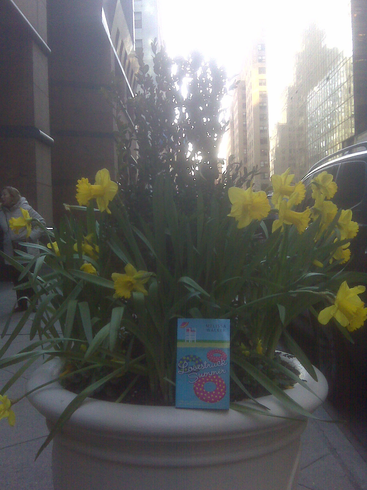
I'm rocking the drop in Spain--photos soon! (Remember last year when I left books all over and Lovestruck Summer was in a daffodil planter?)
What's today? It's Operation Teen Book Drop day!This is the third year readergirlz has helped lead the effort, and this year they'll be delivering 10,000 new books to teens on Native reservations and tribal lands. To learn more about the effort and rgz partners, check out the Operation TBD page. Many thanks to GuysLitWire, YALSA and If I Can Read I Can Do Anything!
All you have to do is leave a book in a public space for some lucky reader to find. Viola! You've rocked the drop. (Grab an official bookplate and extras here!)
I'm rocking the drop in Spain--photos soon! (Remember last year when I left books all over and Lovestruck Summer was in a daffodil planter?)
 Libros, libros, libros! Let's spread them all over the world, okay? Who's in?!
Win-It Wednesday! (Last Reminder)
You can still enter to....

 Just go here.
(I'm back next week!)
Just go here.
(I'm back next week!)
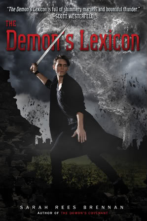
Cover Stories: The Demon's Lexicon by Sarah Rees Brennan*
 Sarah Rees Brennan cracks me up. Read her Cover Story for the paperback version of The Demon's Lexicon (which is out later this month) and you'll love her too. (Oh, and here's a review of the book by Kate of Read This Book!, in case you want to know what's on the inside... and she used the UK cover so there's one more visual to take in).
Here's Sarah:
Sarah Rees Brennan cracks me up. Read her Cover Story for the paperback version of The Demon's Lexicon (which is out later this month) and you'll love her too. (Oh, and here's a review of the book by Kate of Read This Book!, in case you want to know what's on the inside... and she used the UK cover so there's one more visual to take in).
Here's Sarah:
"You know, I didn't have an idea for the cover! I'm really not visual at all. When people started suggesting ideas, I kept saying 'Oh, that sounds lovely!' in a dazzled way, like a kid in a really exciting museum. 'Ooooh, yes, that! Ooooh, yes, that!' 'Sarah, you can't have twenty different covers.' 'Oh.'
"My publisher just said 'We've got James Porto to do your cover!' and I said 'Oh my gosh, THANK YOU' and they said 'Hang on till we show you something' and then I waited... and waited... for seeeeveral months. On my fainting couch. When the cover came, I was so nervous I shoved my computer towards my housemate, and asked her if she'd look at it first!
"Well... the initial version was a little different from this current one, and I will say that I went 'Oh please could we change some stuff please' BUT... I asked for some things I thought would make all the difference to the cover: something more active, in which the guy really seemed like he was doing something interesting.
"The art department responded to my suggestions. Boy did they! As you can see, the guy is hella doing something now. And the tornado, which was always part of the cover, is interacting with him in a whole new way, which I never expected and was wowed by.
"The (gorgeous) colour palette is the same, and the storm and rocks that frame the picture, but they used a different shot of the model and added the urban buildings in the background to show the book's set in London. And my friend Saundra Mitchell suggested that the title be cut by his sword, which I thought was so brilliant I feared even to hope that suggestion would be taken! But it was. I was so thrilled!
"I know the guy on the cover was a model. Sadly I do not know things I think it vital for me as an author to know, like 'his name', 'his address' or 'his phone number...' I like how he looks both angry and haunted, though. Angry and haunted about me not knowing his phone number.
"I'm thrilled it represents the book so well: that it looks like there is action, and danger (and dangerous actions!) and I love how, when you look at the storm closely, it could be a flock of sinister birds or buildings disintegrating in the wind. Which fits into the book pretty neatly...
 "I don't know if I'm allowed share the earlier version, but inspiration images, I can totally do! Here's Ed Westwick, who will soon be playing Heathcliff (the role he was born to play!) and Toby Stephens in the latest version of Rochester. I think that the dangerous, more-edgy-than-knives heroes - currently often vampire, werecreature or other supernatural beautiful beast - which are so popular today owe a lot to these villainous heroes of literature.
"Since we always see these characters from other characters' perspectives, I wanted to get into the head of a villainous hero, and so I thought back to the good old... morally ambiguous old days, and tried to take apart mad, bad and dangerous to know from the inside out. And now here he is coming out swinging!"
So much fun, Sarah! Thank you! I love the action of this cover, and I have to say I really liked the stillness (and, um, the cheekbones) of the hardcover version as well, left. So what do you guys think of these covers?
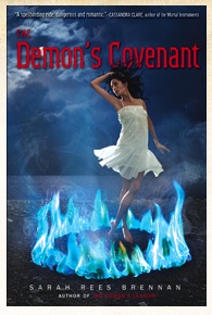
Oh, and here's the cover of the sequel, out in May.
*Pre-posted! I'm in Spain!
Photo Friday: Cafe Con Leche
in Photo Friday
More soon, but here's an iPhone shot of my daily morning bebida--cafe con leche. There is something way more amazing than just "coffee with milk" going on here. Spain is maravillosa!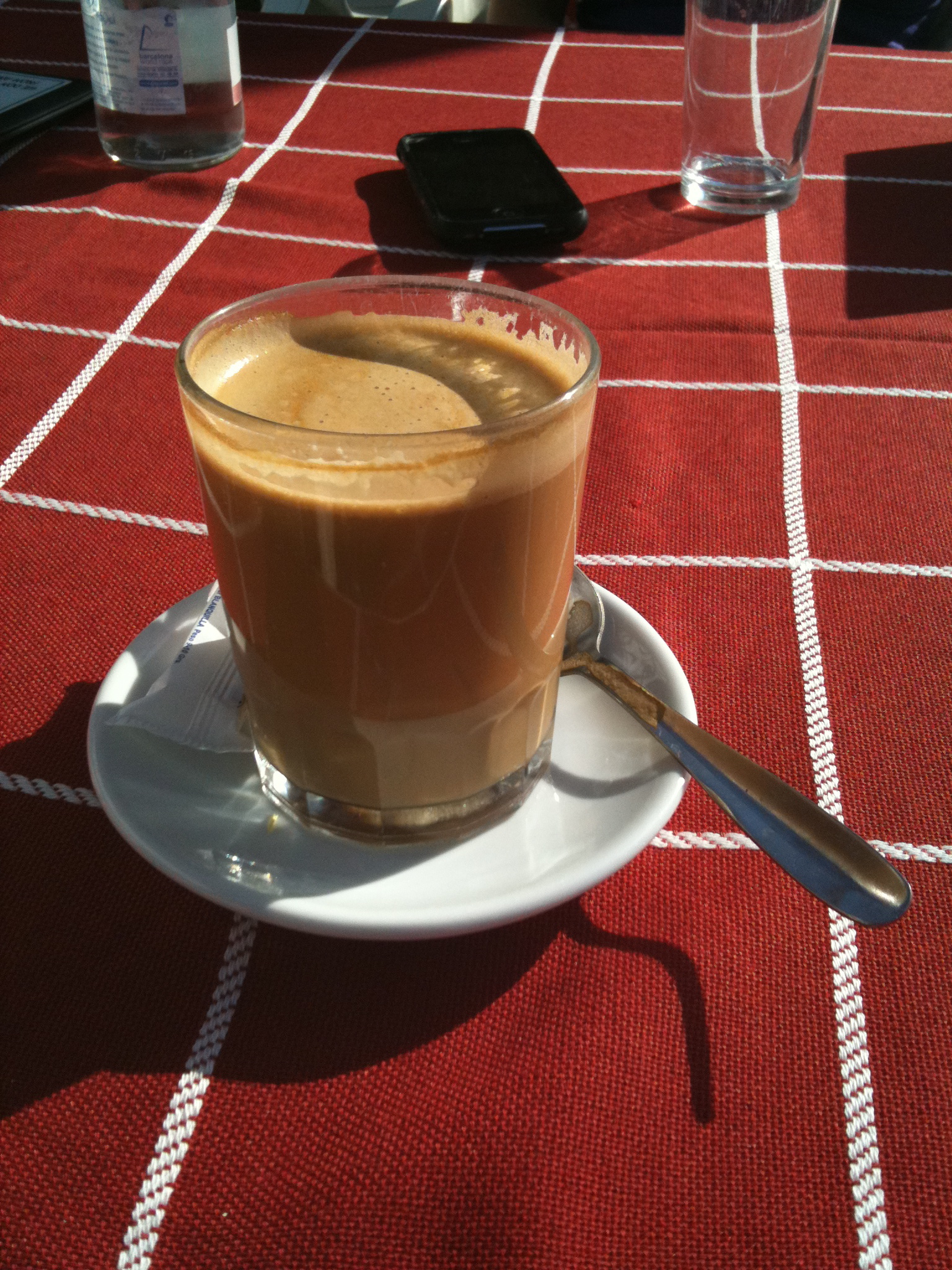 PS-Wdebo at The Electrical Book Cafe has a new interview with me up, just in case you miss me.
Win-It Wednesday: Reminder
You can still enter to....

 Just go here.
(I've been partial to red sparkles since my first ruby slipper sighting.)
Just go here.
(I've been partial to red sparkles since my first ruby slipper sighting.)
Cover Stories: Crimes of the Sarahs by Kristen Tracy*
 Kristen Tracy is a fun person with a totally great Cover Story for one of her many books, Crimes of the Sarahs. Here goes:"I wasn't sure about a cover image. I LOVED my first cover for Lost It (right). In it, my main character loses her virginity underneath an unseaworthy canoe, and the cover attempted to capture a literal depiction of this--sloppily patched canoe with both boy and girl legs poking out suggestively.
 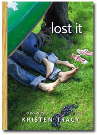 For Crimes of the Sarahs, I wasn't sure how to depict a group of four girl criminals.
"At some point my editor asked me if I had any cover image ideas, and the only thing I could think of was a group of girls with their heads stuffed inside nylons, possibly robbing something. But my editor had actually stuffed her head inside a nylon once in high school with a friend and they'd taken pictures of this and she assured me that it doesn't look so hot, especially not for a book cover.
For Crimes of the Sarahs, I wasn't sure how to depict a group of four girl criminals.
"At some point my editor asked me if I had any cover image ideas, and the only thing I could think of was a group of girls with their heads stuffed inside nylons, possibly robbing something. But my editor had actually stuffed her head inside a nylon once in high school with a friend and they'd taken pictures of this and she assured me that it doesn't look so hot, especially not for a book cover.
 "I really liked the cover right away. They'd told me it was going to be inspired by the movie poster for Usual Suspects and I thought that sounded pretty cool. I remember they sent me pictures of the models and asked me what I thought. I really liked them. And I even forwarded some of the photos to a friend of mine at work to see what he thought and he wrote me back right away and told me that if I was going to send him pictures of 14-year-olds wearing bikinis that I needed to put that in the subject line so he didn't open them at work. I thought he made a good point. I don't know why some of them were wearing bikinis. No crimes were committed in my book by bikini-clad teens. I'm certain.
"My editor wanted me to be happy. And I thought the cover was wonderful, so I was happy. We were all happy. I think even the models were happy. Though I am wildly projecting when I say that, because I have no first-hand knowledge of any of the models' emotional states.
"The only limitations I placed on the designers were the physical descriptions of the four girl criminals in my book. Sarah A (the ringleader) was blonde. Sarah B wore a Detroit Tiger's ball cap and chewed a lot of gum. Sarah C was a redhead, and not particularly fashion-forward. Sarah T (the narrator) had brown hair. The art department and my editors used my character descriptions to build a very accurate cover of my girl criminals. Even their heights are correct.
"We used models--gorgeous girly ones with attitude and obscene amounts of teen hair and four sets of handcuffs. (To be honest, it was sort of like looking at four different versions of my high-school self, except not at all.)
"I really liked the cover right away. They'd told me it was going to be inspired by the movie poster for Usual Suspects and I thought that sounded pretty cool. I remember they sent me pictures of the models and asked me what I thought. I really liked them. And I even forwarded some of the photos to a friend of mine at work to see what he thought and he wrote me back right away and told me that if I was going to send him pictures of 14-year-olds wearing bikinis that I needed to put that in the subject line so he didn't open them at work. I thought he made a good point. I don't know why some of them were wearing bikinis. No crimes were committed in my book by bikini-clad teens. I'm certain.
"My editor wanted me to be happy. And I thought the cover was wonderful, so I was happy. We were all happy. I think even the models were happy. Though I am wildly projecting when I say that, because I have no first-hand knowledge of any of the models' emotional states.
"The only limitations I placed on the designers were the physical descriptions of the four girl criminals in my book. Sarah A (the ringleader) was blonde. Sarah B wore a Detroit Tiger's ball cap and chewed a lot of gum. Sarah C was a redhead, and not particularly fashion-forward. Sarah T (the narrator) had brown hair. The art department and my editors used my character descriptions to build a very accurate cover of my girl criminals. Even their heights are correct.
"We used models--gorgeous girly ones with attitude and obscene amounts of teen hair and four sets of handcuffs. (To be honest, it was sort of like looking at four different versions of my high-school self, except not at all.)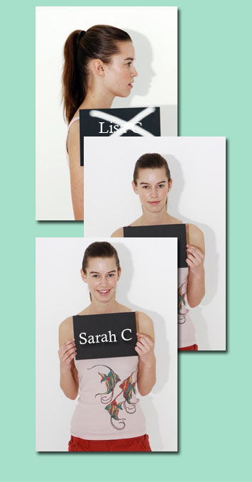 "The cover didn't really change. They nailed it. And we all cheered.
"I find hidden meaning all the time. But I can't say that I've found any in the cover of Crimes of the Sarahs. The one image that feels loaded with symbolic meaning that I've been unable to unpack is the tank top worn by Sarah C (right). It has three fish on it. Two are headed in one direction and one is headed in the other. What's going on with that third fish? Does it know something? Is it fighting with the other two? I know it has a story. I know it's not just a random image of three fish. That third fish is up to something. . . but what? It's a mystery--a big, wet, swimmy one.
"The cover didn't really change. They nailed it. And we all cheered.
"I find hidden meaning all the time. But I can't say that I've found any in the cover of Crimes of the Sarahs. The one image that feels loaded with symbolic meaning that I've been unable to unpack is the tank top worn by Sarah C (right). It has three fish on it. Two are headed in one direction and one is headed in the other. What's going on with that third fish? Does it know something? Is it fighting with the other two? I know it has a story. I know it's not just a random image of three fish. That third fish is up to something. . . but what? It's a mystery--a big, wet, swimmy one.
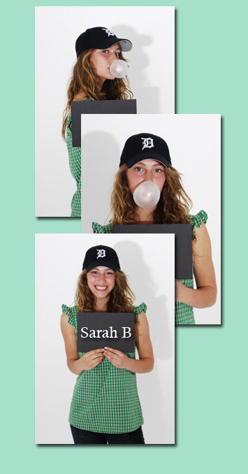 "At the website www.crimesofthesarahs.com there are a ton of model shots that we culled through to pick the cover. The models look so adorable in the handcuffs (like Sarah B., left). I don't understand all the different scenes they shot, but they made me laugh. The models make the funniest faces. And change clothes. It was so fun to watch my story come to life and watch these four girls interpret my characters. It was a great experience. And my web designer Little Willow did an amazing job building the Sarahs' website."
Thanks, Kristen! I love this story and all the outtakes with the models (you guys should definitely click through to see them all.) I love that each character is truly represented on this cover--we all know that sometimes doesn't happen--and it has a really fun vibe.
What do you guys think?
*Pre-posted: I'm in Spain!
"At the website www.crimesofthesarahs.com there are a ton of model shots that we culled through to pick the cover. The models look so adorable in the handcuffs (like Sarah B., left). I don't understand all the different scenes they shot, but they made me laugh. The models make the funniest faces. And change clothes. It was so fun to watch my story come to life and watch these four girls interpret my characters. It was a great experience. And my web designer Little Willow did an amazing job building the Sarahs' website."
Thanks, Kristen! I love this story and all the outtakes with the models (you guys should definitely click through to see them all.) I love that each character is truly represented on this cover--we all know that sometimes doesn't happen--and it has a really fun vibe.
What do you guys think?
*Pre-posted: I'm in Spain!
Win-It Wednesday!
You can still enter to.... (Just kidding about the shoes part. It's BOOKS of course!)
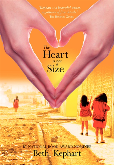
Cover Stories: The Heart is Not a Size by Beth Kephart
 Beth Kephart is a master storyteller. Her words are poetic. I've said this 1000 times, and it's true in each book.
Here she is with the Cover Story for her latest work of art, The Heart is Not a SIze:
Beth Kephart is a master storyteller. Her words are poetic. I've said this 1000 times, and it's true in each book.
Here she is with the Cover Story for her latest work of art, The Heart is Not a SIze:
"Because my fourth young adult novel, The Heart is Not a Size, was inspired by a trip that I took to a squatters' village in Juarez, I had a strong visual sense of the country and the people I hoped the book's cover might portray. Georgia, my narrator, is, like me, a photographer. She has her new digital camera perpetually hanging from her neck. It was my hope, originally, to have one of Georgia's photographs grace the cover of the book--a portrait of the gorgeous children Georgia meets perhaps, or a study of shadows and contrast during a raging dust storm.
"But such absolute realism, Marketing worried, could suggest--to a bookstore browser--that Heart was a work of nonfiction, and so a different route was pursued. "Initial designs for the cover featured a Caucasian girl in a cute, short T-shirt; the photo was cropped tightly, revealing the model's mid-section and nothing more. It was a bright cover--eye-catching and commercially appealing--and I knew that Harper had given the look much care and concerted effort. But I worried that Juarez wasn't there, nor Georgia (who is hardly fashion forward). Harper graciously took another look and produced the cover that was ultimately selected.
"The photograph is not one I took, and it is, from what I understand, a careful montage. It suggests a story that takes place far away, in a country about which we do not know nearly enough--a country that now broadcasts itself to us in extremely painful headlines. 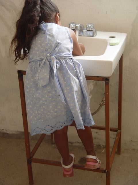 Drug wars, murders, assassinations. That is the Juarez we've come to know. But there is so much more to that place.
"When I was in Juarez, in 2005, I met people who were gorgeous inside and out--children and parents whose fates I wonder about every day. If only I could safeguard them with my love for them, I think. All I can do--all I have--is the book that they inspired."
Thank you, Beth. Now, watch a video with many of Beth's Juarez images (like the gorgeous one at right), and an excerpt read by Beth herself:
What does this cover say to you guys?
The Library-Loving Blog Challenge!
in Other Stuff
Thanks to everyone who commented and helped in the quest to give back to the Brooklyn Public Library! I'll be donating 50 new books and $150, which is so much less than libraries have given to me over the years. I mean, look at this gorgeous place: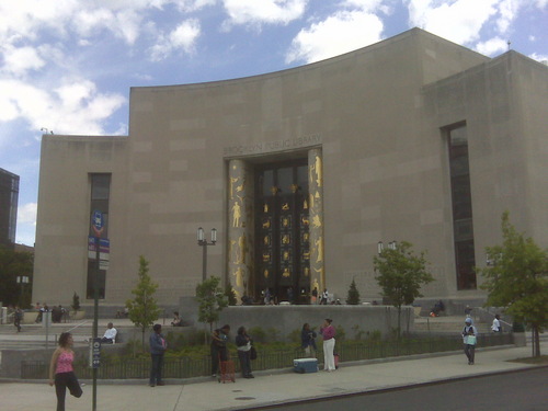 Thank you, libraries and librarians all over the world! And thank you, Jenn Hubbard, for starting this amazing challenge! Jenn has posted more ways to help libraries, too.
Happy Sunday!
Thank you, libraries and librarians all over the world! And thank you, Jenn Hubbard, for starting this amazing challenge! Jenn has posted more ways to help libraries, too.
Happy Sunday!