I signed up for Ari's Reading in Color Holiday Book Exchange, and I just got my gift from the lovely Kelsey (The Book Scout). It's a copy of Debbie Rigaud's PERFECT SHOT (for which I just posted the Cover Story earlier this month!). Ari's site is fantastic because it explores diversity in YA books, and she writes great reviews (check out her holiday gift guide).Thanks, Kelsey and Ari. I love book exchanges, and I can't wait to read this one!
Cover Stories: Beautiful Creatures by Kami Garcia and Margaret Stohl
I have two amazing authors here today, Kami Garcia and Margaret Stohl. Since they're both talking, I'm going to Q&A this Cover Story. Their book is the very-buzzed-about Beautiful Creatures. I haven't read it yet, but I can't wait!Here's the story behind that gorgeous cover:
MW: Did you have an idea in mind for your cover as you were proposing/writing the book?
Margie: We did. My sister-in-law, who is a graphic designer, even mocked it up. It was a black and white image of an enormous moon, with iridescent green lettering that said Sixteen Moons. I had nearly forgotten about that.
Kami: We had pretty much forgotten about that by the time we got to Little, Brown. We were so overwhelmed that the book was being published, we didn't think much about it.
MW: Did your publisher ask for your input on the cover design before the art dept started working?
Margie: I don't remember if they did, but we were all so excited that Dave Caplan was going to be our designer, because we loved everything he had done, that we had a lot of faith in Little, Brown to get it right. And actually, Amazon has just nominated the Beautiful Creatures cover as one of the six best in Children's and Teen fiction of the year, so we were right to trust him! (Go vote on it at Amazon until December 17th!)
Kami: They told us Dave was the designer, and that he would show us a concept when he came up with something. The "something" was the BC cover. That was his first try.
MW: What did you think the first time you saw your cover? Truly!
Margie: We flipped out. When we saw the image of the tree, with the lettering and the foil, we just freaked. We know how important the cover is for a YA debut novel, and we've felt so lucky Beautiful Creatures turned out to be such a, well, beautiful creature!
Kami: I couldn't believe how dead-on it was. The trees look exactly the way we envisioned the road leading to Ravenwood, and we LOVED the purple. The hand lettering is what we refer to as "the sparkly font."
MW: Did the cover change much from the original version you saw?
Margie: Not that I remember. We saw it once without the wonderful font, and then finally with the font and the color and the foil all mocked up. It was stupendous, even then.
Kami: Dave tweaked the purple a little before printing, but that was it.
MW: Do you know if your cover was from a photo shoot or still life, or if it is a stock photo that the art department found that could capture the feeling of the book?
Margie: I don't know where Dave found the central image of the tree on the front. I'd love to find out.
Kami: I have no idea. I know the tile was hand lettered by Si Scott.
MW: How do you feel about your cover, in the end? Have you found any hidden meaning in it or anything you didn't notice at first glance?
Margie: I still love it. I love the way the road opens to draw the reader into the world of Gatlin. It's perfect for our book.
Kami: It is so amazing -- from the way it captures the feel of the book to its graphic and artistic qualities. As far as I'm concerned, Dave Caplan is the rock star of cover design!
I'm with Kami and Margie. Love this cover. It's almost like the negative of a photograph, no? And that font is like liquid text--lovely! Plus, the reviews are raaaaaving. (Check out Hope's Bookshelf, The Compulsive Reader and The Story Siren.)
What do you guys think of the cover?
Why a Book?
Love this indiebound campaign that Nicole pointed out to me. It's true, right? And some great paperbacks cost as little as $6 NEW! *cough* Lovestruck Summer *cough*I said this in my newsletter, but I'll repeat it here: If you're buying any of my books as gifts this holiday season, email me your address and I'll send you a signed bookplate--dedicated to whomever you wish, even yourself--in the mail. Signed books are extra special. I have a whole shelf of them that I completely treasure!
Happy Sunday.
PS-Raschel's Reads has a fun Holiday Wishlist Contest going--you could win a PC + Kristin Cast book. Go enter!
Photo Friday: LA
A quick trip to LA where I forgot to take pictures with my other fabulous friends Kara, Katherine, Shay, Taffy and the famous Alexa Young (you guys know her, right?). Anyway, I had fun. And here are some shots I did get, with the boys (and the blowfish):The blowfish over the table at the oldest restaurant in Santa Monica...
Charles on the flying trapeze. He's getting really good! (I didn't do it... scaredy cat.)
Dave overseeing Rod's name-writing on the (cold, windy) Malibu beach. But hey, Beach!
Charles and me--college BFFs--on the sand.
Happy weekend!
Win-It Wednesday: Hotel Hiatus
I loved hearing about the time periods you like to read about--so fun! Now, at random, the winner of Sarah MacLean's fabulous The Season is... Beth! Send me your address, B.I am traveling this week (in cold but sunny LA!). I just had breakfast with the awesome producer who is working hard on Violet-for-TV (fingers crossed 1,000x). There's a farmer's market outside my hotel where I got strawberries and chocolate milk to snack on as I finish up my draft of Small Town Sinners. (See messy hotel room pic -- I love having good snacks!)
This is all to say that Win-It Wednesday is on a pause this week, but I'll be back next week with a massive holiday contest that involves books and beauty products and other fun and exciting prizes. Promise.
Happy Wednesday!
Cover Stories: What I Wore to Save the World by Maryrose Wood
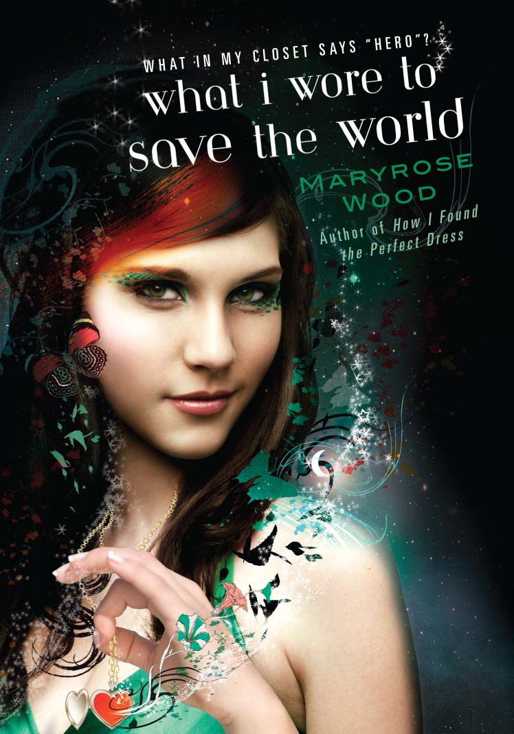
The lovely Maryrose Wood is here to share the stories behind the beyond-amazing covers of her Morgan series (you guys must have read/seen these magical books, yes?). The third title, WHAT I WORE TO SAVE THE WORLD, was just released, so now seems the perfect time for Maryrose's Cover Story. Here goes:
"I didn't have an idea for the cover. I love the visual arts and find them a great source of inspiration and creative rejuvenation (perhaps because they force my hyper-verbal brain to think on the other side), but I don't ever imagine book covers as I'm writing. It's hard enough thinking of titles!
"At some point while I was finishing up WHY I LET MY HAIR GROW OUT, the first book in the series, I got an e-mail from my editor that said: 'The art department wants to know what color Morgan's hair is.' Morgan is the main character of the book. 
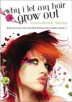
So I tried to explain: 'Well, it was originally strawberry blonde, but she died it black, then cut it off, and the stubble is now streaked orange, so your guess is as good as mine...' I had no idea why they wanted to know until they sent me the finished cover to look at.
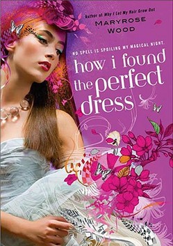
"For the second book, HOW I FOUND THE PERFECT DRESS, I recall that there was more discussion because they were suggesting titles for the book, and we were simultaneously trying to come up with an image to match the title. The word 'wish' was suggested at one point, and the image of a candle, but I just couldn't make it work (it is Morgan's birthday in that book, but to me the birthday candle/wish thing seemed both too on-the-nose and not quite what the book was about).I was glad that we ended up with HOW I FOUND THE PERFECT DRESS, which I thought was concrete and fun, and the ironically pink prom dress Morgan wears in that book is an important part of the plot. The cover used lots of pink and a very magical-looking dress.
"WHAT I WORE TO SAVE THE WORLD was also a title that was late in coming, but the art department knew all along that there should be a dark, nighttime feeling to the background and that Morgan's locket would be featured. Both choices are perfect for the book.
"With the first book I was knocked out by the cover, I thought it was just gorgeous. I had had no idea what they were planning to do, so it was a happy surprise. I was also a little nervous, because it looked quite different from any other YA covers I had seen. Of course, as soon as the readers saw it we heard nothing but raves. I still get tons of compliments from readers on all three covers. A lot of them say WHAT I WORE TO SAVE THE WORLD is their favorite, though!
"My editor was always open to comments from me and from my agent, but honestly, all three Morgan covers came out of the art department pretty much the way you now see them. Our comments were mostly along the lines of, 'Wow, you guys did it again.' On the third book I did make some minor comments about the type treatment. Some little adjustments were made for the final version, which I think looks fabulous.
"The three covers you see look very much the way the looked when I first saw them. I should point out that this could be considered unusual. Many of my author pals angst terribly over covers and get deeply involved with the design process if the publisher doesn't come up with something spectacular right away. With the Morgan books I was lucky!
"I knew that artist Sarah Howell created the illustration. Starting with a real photo and adding fanciful computer illustration is typical of her work; you can see many gorgeous examples on her website (MW note: So cool! Definitely click that link!). But I didn't know where the original photo came from until I received an email from a very nice woman who said, 'You don't know me, but I wanted to tell you that my daughter is on the cover of your book!' I was gobsmacked! She was the one who told me the story. Her daughter had taken a modeling class, and the test shots from the class were sold as stock photos. The daughter had no idea the photo had been used on a book cover until a friend of hers saw WHY I LET MY HAIR GROW OUT in a bookstore and called her cell phone, screaming.
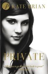
"The thing about stock photos is that keep turning up. I recently learned (from those eagle-eyed readers!) that the photo used as the basis for the WHAT I WORE TO SAVE THE WORLD illustration also appears on the UK cover of PRIVATE. It's fun to see what the photo looked like before Sarah Howell got hold of it. Of course, I prefer my cover!
"I love all three covers. They're distinctive--you know it's a series right away--as well as being beautiful. Best of all, they capture the essence of the books, which combine the real life and faerie-world adventures of a teen girl with a strong, vivid personality. Morgan Rawlinson, the main character in the series, is a sassy, sarcastic, lovably bad-ass kind of teen girl, with relatable feelings of being cranky and insecure and rebellious and all that. I love that the girl on each cover is not merely pretty, but also intriguing and unique-looking. I think all three show a little spunk beneath the faery glitter!"
I have long admired Maryrose's covers, and I think all three are just gorgeous. Honestly, I think I like WHY I LET MY HAIR GROW OUT, the first, best. I was enchanted at first glance. You guys?
Photo Friday: Flea Market Find
My friend Marie found this photo at a flea market and decided this woman had to be a long-lost relative of mine.
I love her! And I'm flattered, mostly because she looks like a really happy person, and I'm glad Marie sees me that way too. Also because I love her style.
I also adore old photos--my family, other families, anyone really! Aren't those sepia tones cool?
Happy Friday!
PS-Watch my guest vlog about the holidays over at Reading is Bliss and enter to win a signed copy of Lovestruck Summer. And don't forget to keep bidding for the marked-up copy at Leave a Mark (it's for charity!).
Bonus Cover Stories: Perfect Shot by Debbie Rigaud
Debbie Rigaud is part of the Girlfriends Cyber Circuit, and she's also the proud author of a new Simon Pulse Romantic Comedy, Perfect Shot. It's about a volleyball star who enters an online modeling competition to get closer to her crush. Soon, this tomboy finds herself off the volleyball court and the middle of the fashion world... and she wants to win. I like this plot (surprise)--lots of models actually did play volleyball at some point because it's a tall girl's game! Here's Debbie:
"The Simon Pulse Romantic Comedies series are all awesomely illustrated by Amy Saidens, so I had a general idea of what the cover would look like. But since PERFECT SHOT is the first in the series to feature an African-American protagonist, I was extra curious to see Amy's rendering of the characters.
"I was asked to give a short description of the main characters, including their personal style. I described love interest Brent as a clean-cut version of a teenaged Lenny Kravitz. Swoon!
"When I first saw my cover, I was excited! I own a number of Simon Pulse Ro-Com books, plus over the years I've spotted them at libraries and bookstores, so contributing my own characters to this popular series is a thrill.
"My editor Michael del Rosario was the coolest. He invited me to make comments/suggestions and took my feedback to the art department. PERFECT SHOT is my first solo book, so getting a glimpse into the cover process in this way was an education for me.
"I was happy to see that the art department made the minor adjustments I'd suggested. Everything seemed to go smoothly, so that put my mind to ease. As you can imagine, with this being the first cover featuring Black characters, the art is especially significant to me.
"Based on the suggestions I made, the characters look more distinctly ethnic in the African-American sense. The most obvious change is that London (the main character) got a haircut. In the original her hair flowed down her back (right), but they obliged my request for a shoulder-length coif.
"Amy and the art department hooked me up. They did a fabulous job. From the general look of the characters to the smallest detail (like volleyball insignia on London's jersey), I couldn't be happier with it!"
I love that Debbie got to make some changes--looks like London's skin got a shade darker--and I agree that her haircut is way cuter short. What do you guys think?
PS-Leave a Mark is auctioning off a marked-up copy of Lovestruck Summer today (where I wrote all through the margins about the back story of writing the book, character names, inspirations, etc). It's all for charity! Please go bid if you can.
Win-It Wednesday: The Season by Sarah MacLean
Last week's thankful-for-coffee winner of The Possibilities of Sainthood by Donna Freitas is... Jamie! Send me your address, J.This week, I'm giving away a copy of Sarah MacLean's The Season. Some of you may have read this one already, but if you haven't, you should know that it's a treat! Think the London Season (i.e. social debut time) in Regency England, three whip-smart girls who are BFFs, dashing suitors and a murder. Love, mystery, friendship, witty banter... what more is there in life? The Season is a bubbly ride from beginning to end. I could hear the accents in my head as I read. Such fun!
Also, Sarah does these great interviews on her blog called "Inside the Characters' Studio" where she interviews book characters. The lastest is Paris Pan from Cynthea Liu's Paris Pan Takes the Dare.
To enter to win, let me know in the comments which era you best love reading or writing about. For me, I'm all contemporary in the writing--and I mostly read contemporary novels too--but I think it's really fun to dip into historical fiction like The Season, and even futuristic novels (Scott Westerfeld's Uglies series is one of my favorites). You guys?
I'll announce a winner and a new contest next Wednesday, as usual. Good luck!
Readergirlz December Author: Tamora Pierce (+ Cute Kitten Alert)
Trickster's Choice and Trickster's Queen: These books are good! If you've read them or wanted to, or you just want to join in and talk to Tamora in (virtual) person, come by the readergirlz blog.
Also, because I can't stop watching it and want you to join me in overwhelming cuteness: