Lyn Miller-Lachmann's latest novel, Gringolandia, is a coming-of-age story about a son trying to reconnect with his father, who's been detained tortured at the hands of the Chilean government for five years. The father has come returned to the family's new home in Wisconsin, broken and beaten down. Yeah, big stuff.The cover is dark for a YA novel, but I adore its sense of movement, and I asked her to share the story behind it. Here's Lyn:
 "For the cover, I thought about having a newspaper or a Chilean flag in the background. In the foreground I wanted a photo of Daniel, the main character, or one with Daniel and his girlfriend, Courtney. I even searched through a database of stock photos and found one of a young man playing a guitar who looked a lot like the way I imagined Daniel to look.
"The marketing director asked me for ideas, and I showed her the stock photo I'd picked out as well as my idea for what should be in the background. I lost interest in the flag, though, when I saw another book with a photo in the foreground and the flag in the background. It seemed clichéd.
"For the cover, I thought about having a newspaper or a Chilean flag in the background. In the foreground I wanted a photo of Daniel, the main character, or one with Daniel and his girlfriend, Courtney. I even searched through a database of stock photos and found one of a young man playing a guitar who looked a lot like the way I imagined Daniel to look.
"The marketing director asked me for ideas, and I showed her the stock photo I'd picked out as well as my idea for what should be in the background. I lost interest in the flag, though, when I saw another book with a photo in the foreground and the flag in the background. It seemed clichéd.
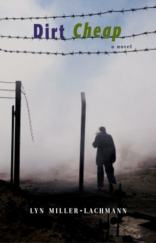 "As a small publisher, Curbstone Press had no in-house art department. All their work was done by freelancers. Then my editor, Alexander (Sandy) Taylor, passed away right as the book was going into production. Along with his wife, he founded Curbstone Press in 1975. When he died suddenly, everything was thrown into disarray. His widow, who was the production editor, asked for my help in locating a freelance cover designer. Curbstone used one designer regularly, and I liked her work. She designed a nice cover for my adult novel, Dirt Cheap (right). But in the case of Gringolandia, I wanted a designer who came from Chile and who understood the history and culture.
"I knew of Guillermo Prado from his work with Oyate, an organization that evaluates children's books about American Indians; he designed Oyate's catalogs, their web site, and the award-winning bibliography A Broken Flute (AltaMira Press, 2005, left).
"As a small publisher, Curbstone Press had no in-house art department. All their work was done by freelancers. Then my editor, Alexander (Sandy) Taylor, passed away right as the book was going into production. Along with his wife, he founded Curbstone Press in 1975. When he died suddenly, everything was thrown into disarray. His widow, who was the production editor, asked for my help in locating a freelance cover designer. Curbstone used one designer regularly, and I liked her work. She designed a nice cover for my adult novel, Dirt Cheap (right). But in the case of Gringolandia, I wanted a designer who came from Chile and who understood the history and culture.
"I knew of Guillermo Prado from his work with Oyate, an organization that evaluates children's books about American Indians; he designed Oyate's catalogs, their web site, and the award-winning bibliography A Broken Flute (AltaMira Press, 2005, left). 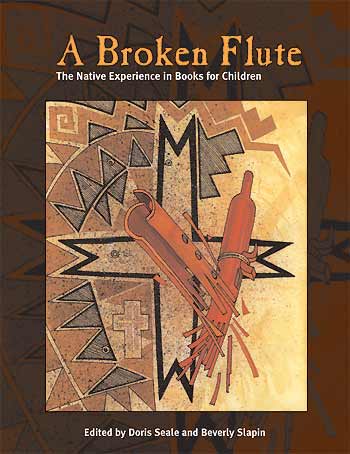 Like Daniel's father in Gringolandia, Guillermo had been a political prisoner under the Pinochet dictatorship in Chile and had endured much of what Daniel's father in the novel went through.
"When I first saw my cover I was surprised and amazed. It was completely different from what I'd expected, or what most YA covers look like. First of all, both the Chilean flag and the U.S. flag are red, white, and blue, so I thought those would be the dominant colors for a novel about a Chilean immigrant to the United States. But the dominant color of this cover was green. And there were no people at all. Just a bird that looks like a pigeon flying out of the abandoned swimming pool, and another bird at the bottom of the pool, the one that remained behind.
"This is an authentic cover--it's as real as any I've ever seen. The abandoned swimming pool was from a former conference center in Santiago, Chile called Villa Grimaldi that after the 1973 military coup was turned into a prison for the regime's opponents. The pool was used for a torture called 'el submarino,' mentioned briefly in the novel--at one point, Daniel's father contracts pneumonia, which causes him to have flashbacks of this simulated drowning technique that's a cousin of waterboarding.
"At that point, there was no editor. I had no complaints about the artwork, but I'm not sure the Advisory Board members who took over the operation of Curbstone Press after Sandy Taylor's death liked the cover as much as I did. But it was getting close to the time the ARCs needed to be printed, so they went with what they had, and asked for changes later.
"The basic concept didn't change, though elements were rearranged. Originally, the bird and the pool were at the top, and there was no tag line or blurb. After the ARCs were printed, the designer moved the pool and the bird to the lower half of the cover, added the tag line, 'When history calls your name, how will you answer?' above it, and added Deborah Ellis's blurb at the bottom edge. I came up with the tag line during a test reading and Q&A I gave at an alternative school near where I live, after the original cover had been designed.
"Guillermo Prado took the cover photo himself on a visit to Chile several years ago. Since the return of democracy in 1990, the former torture center of Villa Grimaldi has been turned into a peace park and human rights museum. In the waning days of the dictatorship, the military tried to destroy as much as possible of this terrible place to cover up what they did, but the abandoned swimming pool remained and has been preserved to remind people of those dark days so that they never happen again.
"I feel privileged and honored to have worked with Guillermo Prado, that he shared his experience, as difficult as it must have been, through his art to bring home the story of Gringolandia. Beyond the significance of the pool used to torture prisoners, the bird flying toward freedom has layers of meaning. In Chile, the Spanish word for pigeon, paloma, is the same as for dove, as pigeons and doves are biologically similar. Throughout the world, doves are symbols of peace and hope. And while the pigeon is seen as a nuisance bird, a 'rat with wings,' pigeons have served to carry messages in wartime, as Daniel's father did as an underground journalist during the darkest years of the dictatorship. Finally, the idea that a bird considered ugly and disgusting can also symbolize peace and hope ties in with the challenge Daniel faces--to find the father he once knew within the damaged person who returns to him from prison.
"It's fitting that the public face of my novel is itself so unique and realistic. Teens have commented that Gringolandia 'is like no book that I have read,' in the words of Readergirlz Street Team member Sarah. And the reviewer for School Library Journal commented on the unity of image and story, concluding her review, 'From the stark cover image of an empty pool used to torture victims to the intensely poignant essay that concludes the novel, this is a rare reading experience that both touches the heart and opens the mind.' I didn't want a clichéd image on the cover, and I'll admit that my involvement in the design process was a bit more hands-on than most--though not atypical for small-press published books. But writing about the legacy of torture is a bold, risky thing to do in the first place, and I wanted everything about it to be done right."
I love all the symbolism in the cover, and the authenticity. I would say this cover is less commercial and more true to the story than most. What do you guys think?
Like Daniel's father in Gringolandia, Guillermo had been a political prisoner under the Pinochet dictatorship in Chile and had endured much of what Daniel's father in the novel went through.
"When I first saw my cover I was surprised and amazed. It was completely different from what I'd expected, or what most YA covers look like. First of all, both the Chilean flag and the U.S. flag are red, white, and blue, so I thought those would be the dominant colors for a novel about a Chilean immigrant to the United States. But the dominant color of this cover was green. And there were no people at all. Just a bird that looks like a pigeon flying out of the abandoned swimming pool, and another bird at the bottom of the pool, the one that remained behind.
"This is an authentic cover--it's as real as any I've ever seen. The abandoned swimming pool was from a former conference center in Santiago, Chile called Villa Grimaldi that after the 1973 military coup was turned into a prison for the regime's opponents. The pool was used for a torture called 'el submarino,' mentioned briefly in the novel--at one point, Daniel's father contracts pneumonia, which causes him to have flashbacks of this simulated drowning technique that's a cousin of waterboarding.
"At that point, there was no editor. I had no complaints about the artwork, but I'm not sure the Advisory Board members who took over the operation of Curbstone Press after Sandy Taylor's death liked the cover as much as I did. But it was getting close to the time the ARCs needed to be printed, so they went with what they had, and asked for changes later.
"The basic concept didn't change, though elements were rearranged. Originally, the bird and the pool were at the top, and there was no tag line or blurb. After the ARCs were printed, the designer moved the pool and the bird to the lower half of the cover, added the tag line, 'When history calls your name, how will you answer?' above it, and added Deborah Ellis's blurb at the bottom edge. I came up with the tag line during a test reading and Q&A I gave at an alternative school near where I live, after the original cover had been designed.
"Guillermo Prado took the cover photo himself on a visit to Chile several years ago. Since the return of democracy in 1990, the former torture center of Villa Grimaldi has been turned into a peace park and human rights museum. In the waning days of the dictatorship, the military tried to destroy as much as possible of this terrible place to cover up what they did, but the abandoned swimming pool remained and has been preserved to remind people of those dark days so that they never happen again.
"I feel privileged and honored to have worked with Guillermo Prado, that he shared his experience, as difficult as it must have been, through his art to bring home the story of Gringolandia. Beyond the significance of the pool used to torture prisoners, the bird flying toward freedom has layers of meaning. In Chile, the Spanish word for pigeon, paloma, is the same as for dove, as pigeons and doves are biologically similar. Throughout the world, doves are symbols of peace and hope. And while the pigeon is seen as a nuisance bird, a 'rat with wings,' pigeons have served to carry messages in wartime, as Daniel's father did as an underground journalist during the darkest years of the dictatorship. Finally, the idea that a bird considered ugly and disgusting can also symbolize peace and hope ties in with the challenge Daniel faces--to find the father he once knew within the damaged person who returns to him from prison.
"It's fitting that the public face of my novel is itself so unique and realistic. Teens have commented that Gringolandia 'is like no book that I have read,' in the words of Readergirlz Street Team member Sarah. And the reviewer for School Library Journal commented on the unity of image and story, concluding her review, 'From the stark cover image of an empty pool used to torture victims to the intensely poignant essay that concludes the novel, this is a rare reading experience that both touches the heart and opens the mind.' I didn't want a clichéd image on the cover, and I'll admit that my involvement in the design process was a bit more hands-on than most--though not atypical for small-press published books. But writing about the legacy of torture is a bold, risky thing to do in the first place, and I wanted everything about it to be done right."
I love all the symbolism in the cover, and the authenticity. I would say this cover is less commercial and more true to the story than most. What do you guys think?
Photo Friday: Brooklyn Thanksgiving!
in Photo Friday
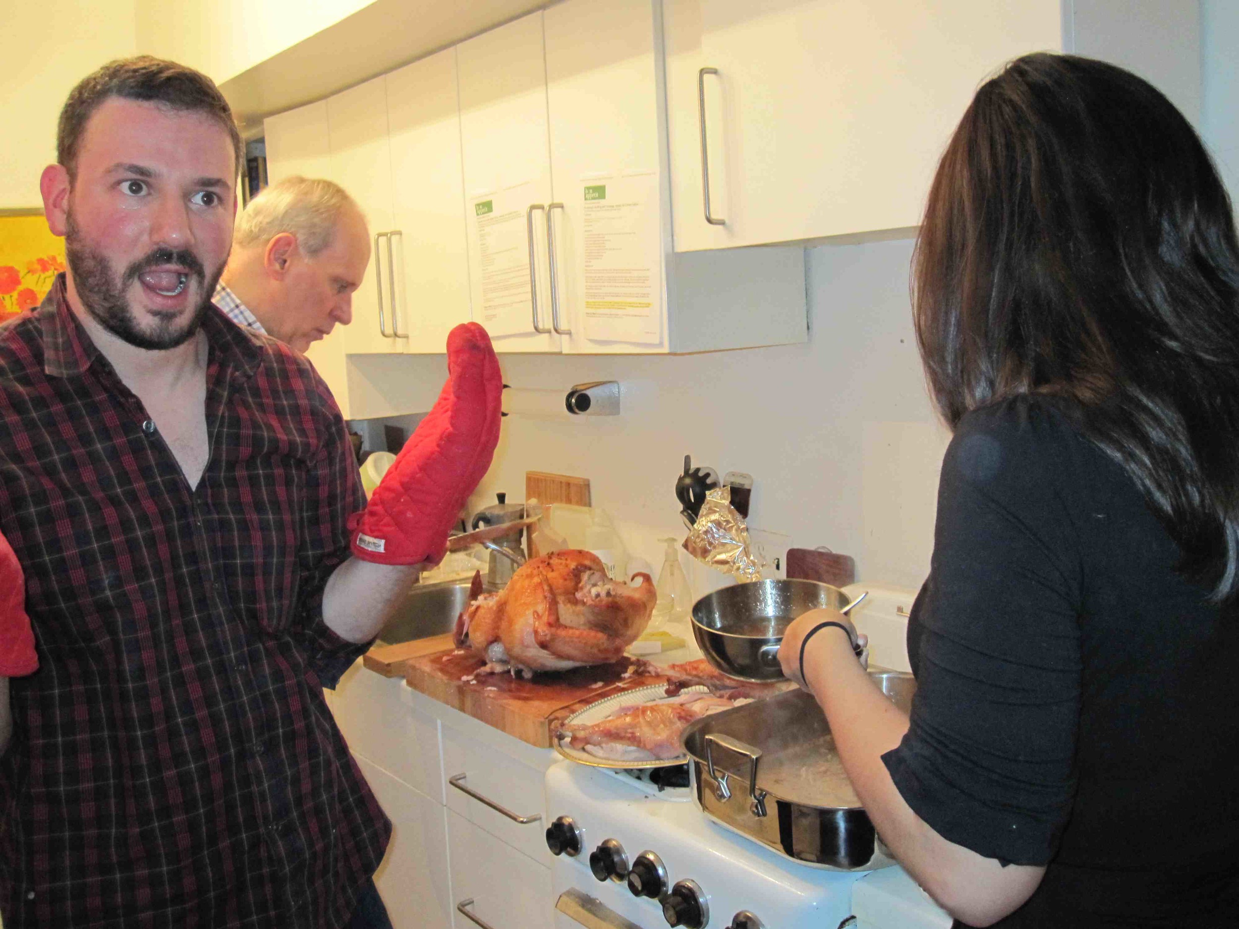
Thanksgiving in a tiny apartment is (mostly) fun. Here goes.Swayze tries to help:
 The kitchen gets crowded:
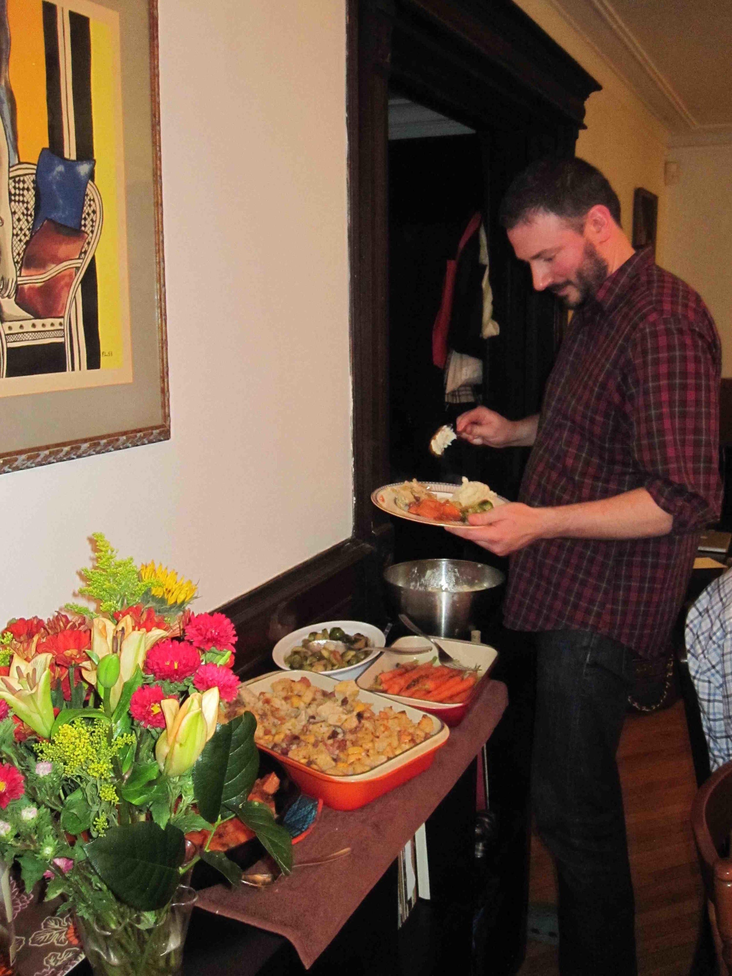
 We have a ton of colorful side dishes...
 And Dave's Grandma Myrtle is a fine head-of-the-table:
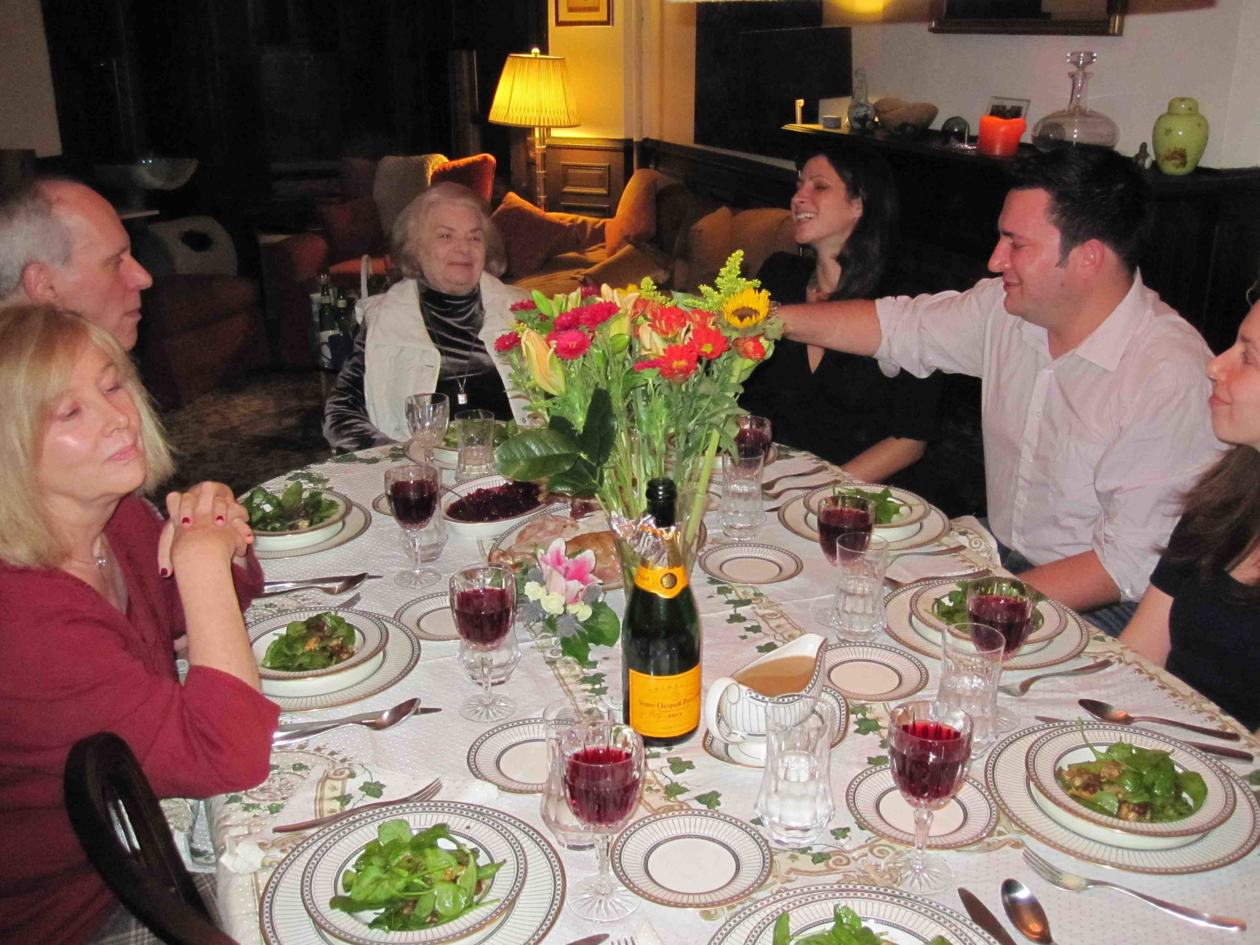 We also got Grandma on film doing her supercilious eyebrow move, which she says she studied in old movies when she was younger and then taught herself to do in the mirror (I will master this move by 2010. Watch me!).
Happy Thanksgiving weekend, everyone!
We also got Grandma on film doing her supercilious eyebrow move, which she says she studied in old movies when she was younger and then taught herself to do in the mirror (I will master this move by 2010. Watch me!).
Happy Thanksgiving weekend, everyone!
Win-It Wednesday: The Possibilities of Sainthood by Donna Freitas
The winner of Elizabeth Scott's Perfect You is... Sue Mickelson! Send me your address, Sue. Thanks for all the talk of great fictional friendships -- I have a ton of new books on my to-read list now... eek.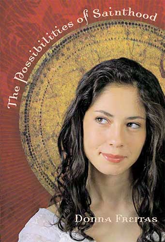 This week, I'm giving away a book that I just flew through. It's a completely gleeful read thanks to the funny/smart voice of its heroine. Author Donna Freitas summarized her book in a great interview with Cynthia Leitich Smith thusly: "The Possibilities of Sainthood is the story of Antonia Lucia Labella, a 15-year-old Italian girl from an immigrant family, living in Rhode Island. She has two main desires: 1) to become the first ever official living saint in Catholic history (and she's been writing the Pope in Rome once a month, every month since she was seven, proposing new saint ideas and herself as the ideal candidate); and 2) to land her first kiss."
Ahhhhh! I just want to sigh thinking of it. So sweet! (And it got like 1000+ starred reviews.) Anyway, I bet you can guess what I'm going to ask this week... to enter to win, just comment below and let me know (drumroll, please...) what you're thankful for right this instant!
Me? I'm thankful Onion Rye Bread, because I just ate that with my breakfast and it was seriously the most delicious thing ever. (And family and books and my home and all that, too, of course, but in this instant? Onion Rye Bread!). You?
This week, I'm giving away a book that I just flew through. It's a completely gleeful read thanks to the funny/smart voice of its heroine. Author Donna Freitas summarized her book in a great interview with Cynthia Leitich Smith thusly: "The Possibilities of Sainthood is the story of Antonia Lucia Labella, a 15-year-old Italian girl from an immigrant family, living in Rhode Island. She has two main desires: 1) to become the first ever official living saint in Catholic history (and she's been writing the Pope in Rome once a month, every month since she was seven, proposing new saint ideas and herself as the ideal candidate); and 2) to land her first kiss."
Ahhhhh! I just want to sigh thinking of it. So sweet! (And it got like 1000+ starred reviews.) Anyway, I bet you can guess what I'm going to ask this week... to enter to win, just comment below and let me know (drumroll, please...) what you're thankful for right this instant!
Me? I'm thankful Onion Rye Bread, because I just ate that with my breakfast and it was seriously the most delicious thing ever. (And family and books and my home and all that, too, of course, but in this instant? Onion Rye Bread!). You?
Cover Stories: Eternal by Cynthia Leitich Smith
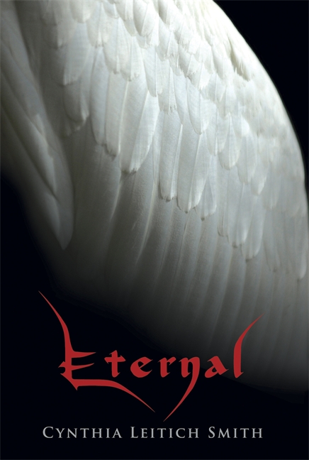 The prolific and fabulous Cynthia Leitich Smith, whose book blog Cynsations is a must-read, is here today to share the Cover Story behind ETERNAL, her second YA Gothic fantasy novel (TANTALIZE was the first). This one comes by special request from Ari of Reading in Color (another fantastic blog).
Here's Cynthia!
The prolific and fabulous Cynthia Leitich Smith, whose book blog Cynsations is a must-read, is here today to share the Cover Story behind ETERNAL, her second YA Gothic fantasy novel (TANTALIZE was the first). This one comes by special request from Ari of Reading in Color (another fantastic blog).
Here's Cynthia!
"I had trouble imagining what the cover of ETERNAL (Candlewick, 2009) might look like. It's set in the same universe as my previous YA Gothic fantasy novel, TANTALIZE (Candlewick, 2007, right), 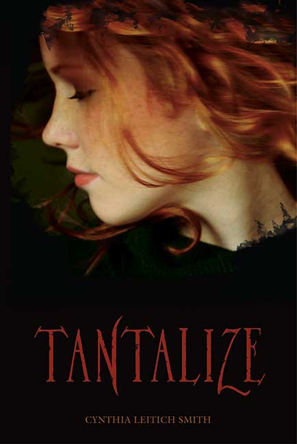 so I sort of expected the books to have a somewhat similar cover design style.
"Only problem? Where TANTALIZE is told from one point of view, that of Quincie (who's 'pictured' on the cover), ETERNAL is told in alternating points of view by two characters, the guardian angel Zachary and the vampire princess Miranda.
"I couldn't figure out how the designers would incorporate two similarly laid-out profiles, unless one was on the front and one on the back, but then, how would they pick which would go where? I was also vaguely worried about them finding the right stock image of a girl to represent Miranda. She's Chinese-Scottish, and I've noticed that at least some mixed-race characters on book covers don't seem to reflect their full heritage (with the obvious caveat that biracial kids in general turn out looking a very wide variety of ways; the text made it clear that Miranda's facial features reflected both sides of her heritage).
"On a related note, here's how Miranda describes Zachary: 'This one is a heavenly looking young man. He's tall and muscled like a swimmer or a statue by Michelangelo. No, not a statue; nothing so mundane, so common, as a mere masterpiece. More like its inspiration. His shoulder-length, gently curled hair falls like feathers. It's a golden brown, a shade lighter than his skin. His eyes are a shocking green--not emerald, warmer than that, more vibrant and fringed with dark gold lashes. He looks like he's been ripped from Eden, and he's gazing at me as if mesmerized, as if he loves me, and as if I'm the most geeky hell spawn in history.'
 "How do you cast that? I wondered. Heavenly is a high standard.
"The irony? That the author writing this nonlinear series from multiple points of view and in both prose and graphic-novel formats would expect the design team to hem themselves in.
"How do you cast that? I wondered. Heavenly is a high standard.
"The irony? That the author writing this nonlinear series from multiple points of view and in both prose and graphic-novel formats would expect the design team to hem themselves in.
"They went with a symbolic cover instead, juxtaposing Zachary's luminescent white wing against a dark background, showing heaven's light at the top and then becoming more shadowy as the eye descends to the Gothic, devilish red lettering that represents  Miranda. I've also included the Walker UK cover (12/7/09 release, above), which emphasizes the concept more (vampire princess, guardian angel) with jazzier type while still using the same image and the Walker Australia and New Zealand cover (12/01/09 release, right), which offers the angel himself instead."
I've always admired Cynthia's covers. I think TANTALIZE is breathtaking, and I like the version of ETERNAL with just the wing--it has an ethereal feel that hints at lightness and darkness. I'm into the subtlety. What do you guys think?
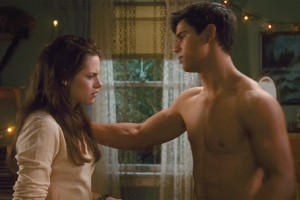
My New Moon Style
in Other Stuff
Okay, so last year I realized that Edward Cullen and I have the same vertical bookshelf, which was pretty cool.And now, during New Moon, I recognized my bedroom lamp in Bella's bedroom! Seriously, I am starting to feel really good about my design choices. Here it is ($20 at Ikea):
 And yes, I did adore the movie. I'm 100% Team Jacob (honestly, I just do not get the appeal of Edward, especially in the face of gorgeous, warm, caring, puppy-dog Jacob).
 That is all.
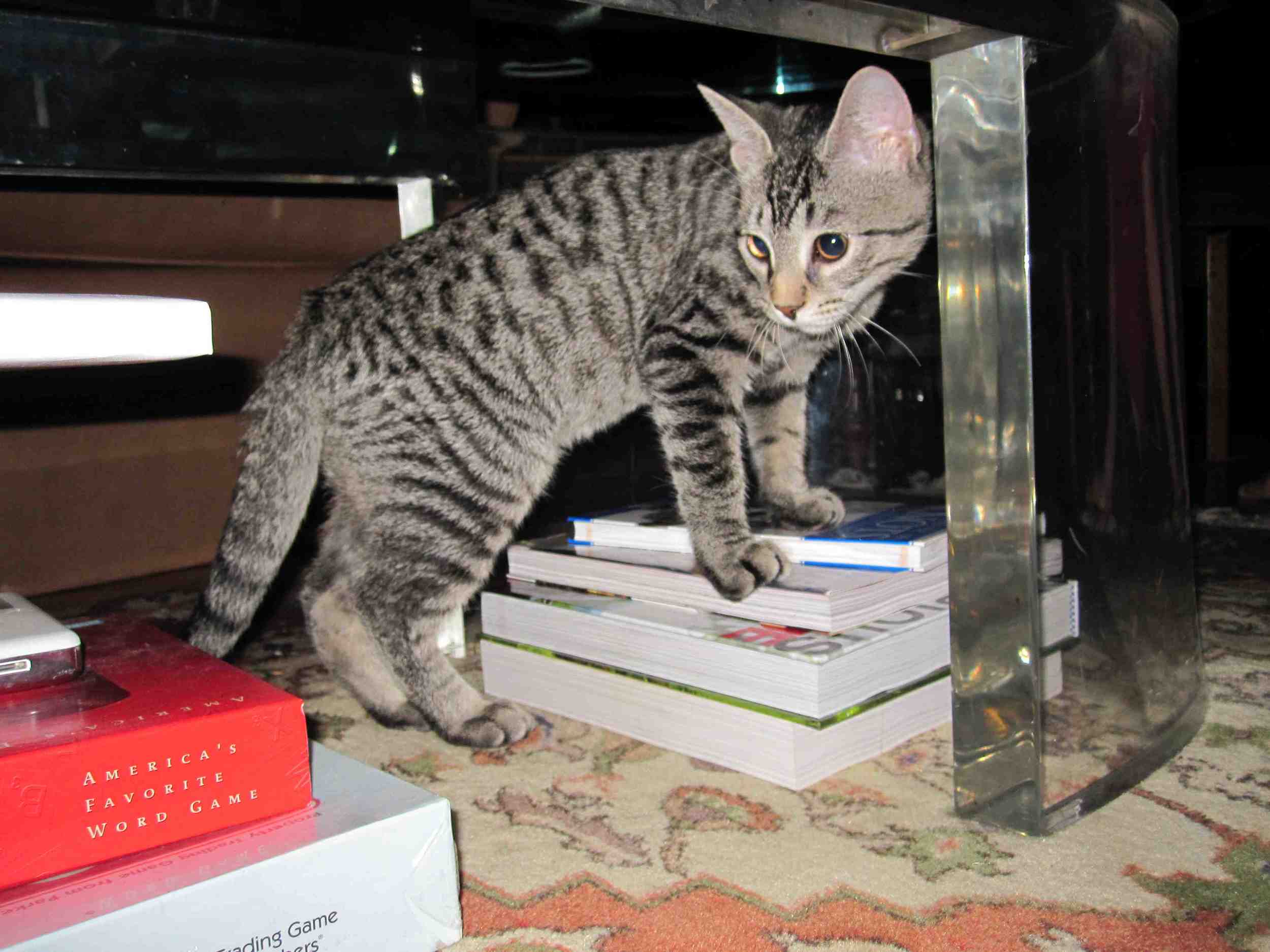
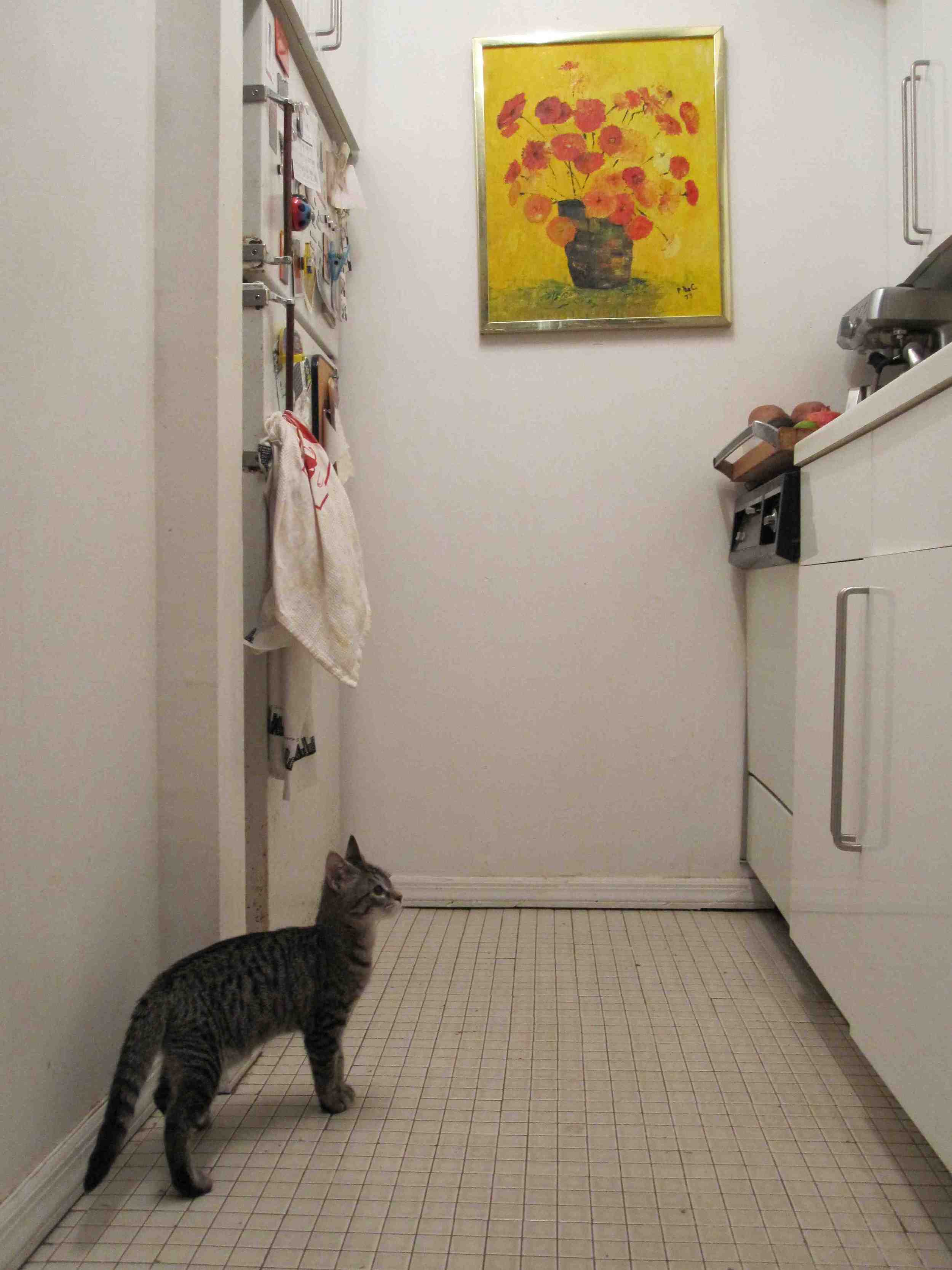
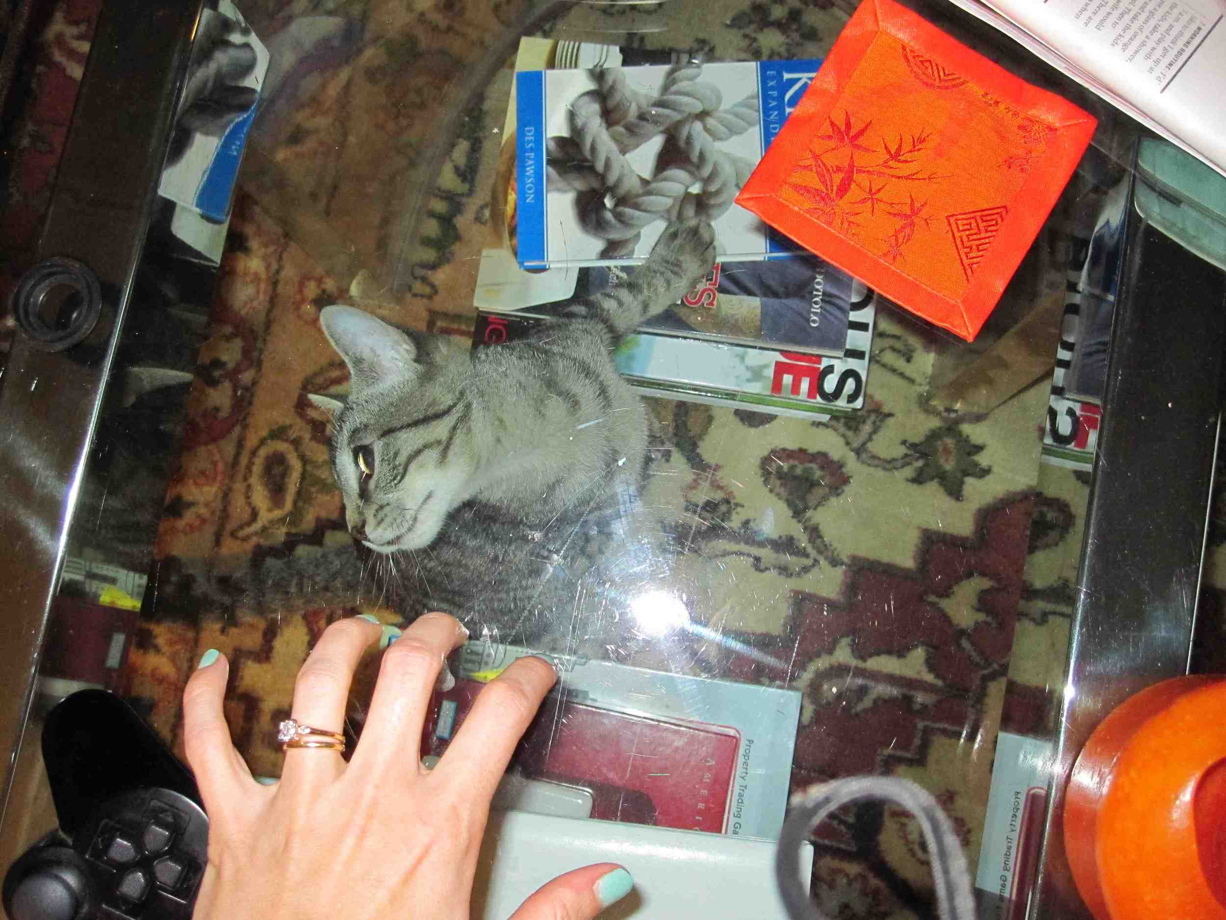
Photo Friday: I Got a Cat!
in Photo Friday
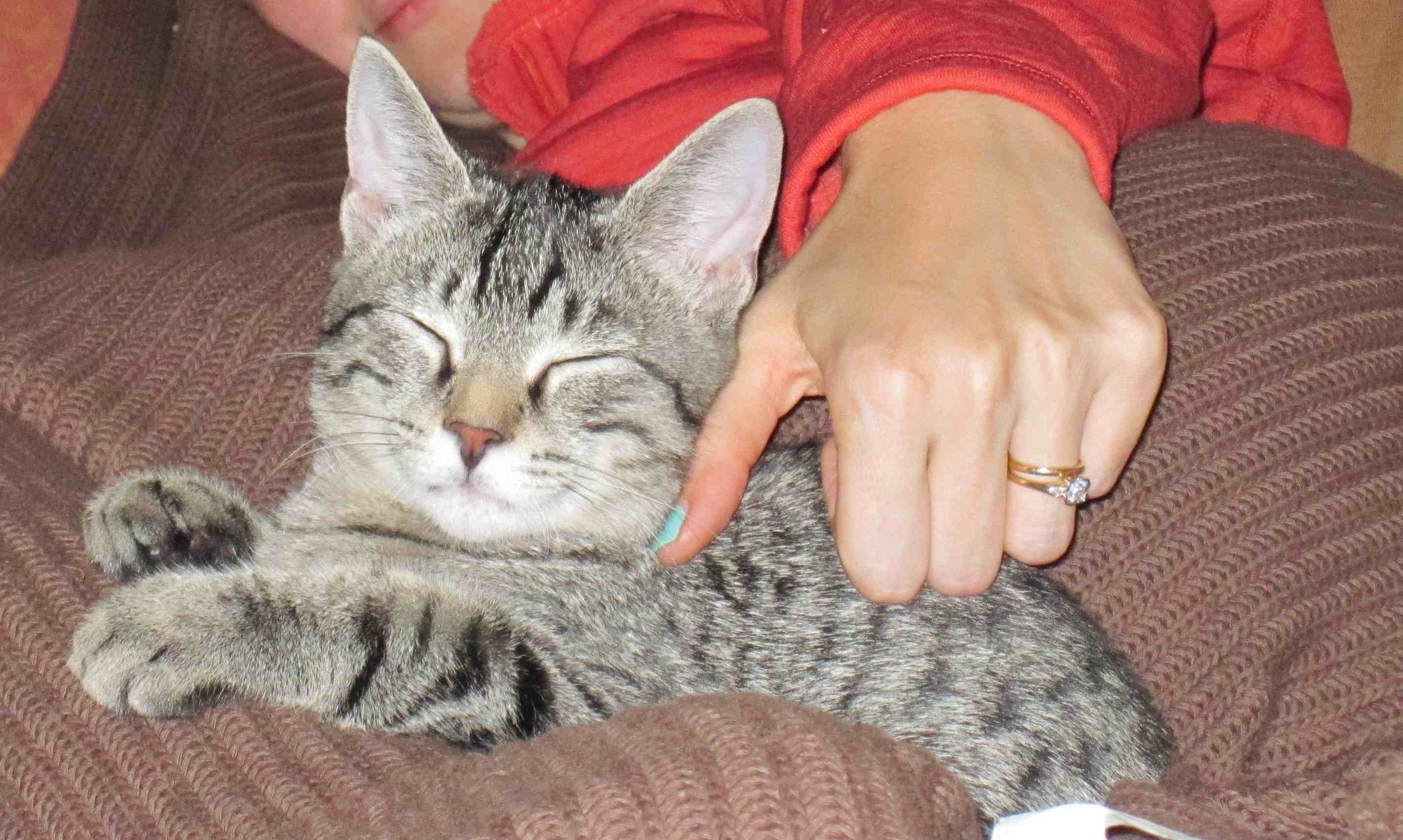
I won't go crazy posting photos (um, after today) but I had to introduce my new cat Swayze. Yes, he's named after the dearly departed Dirty Dancer.See, he loves books already!
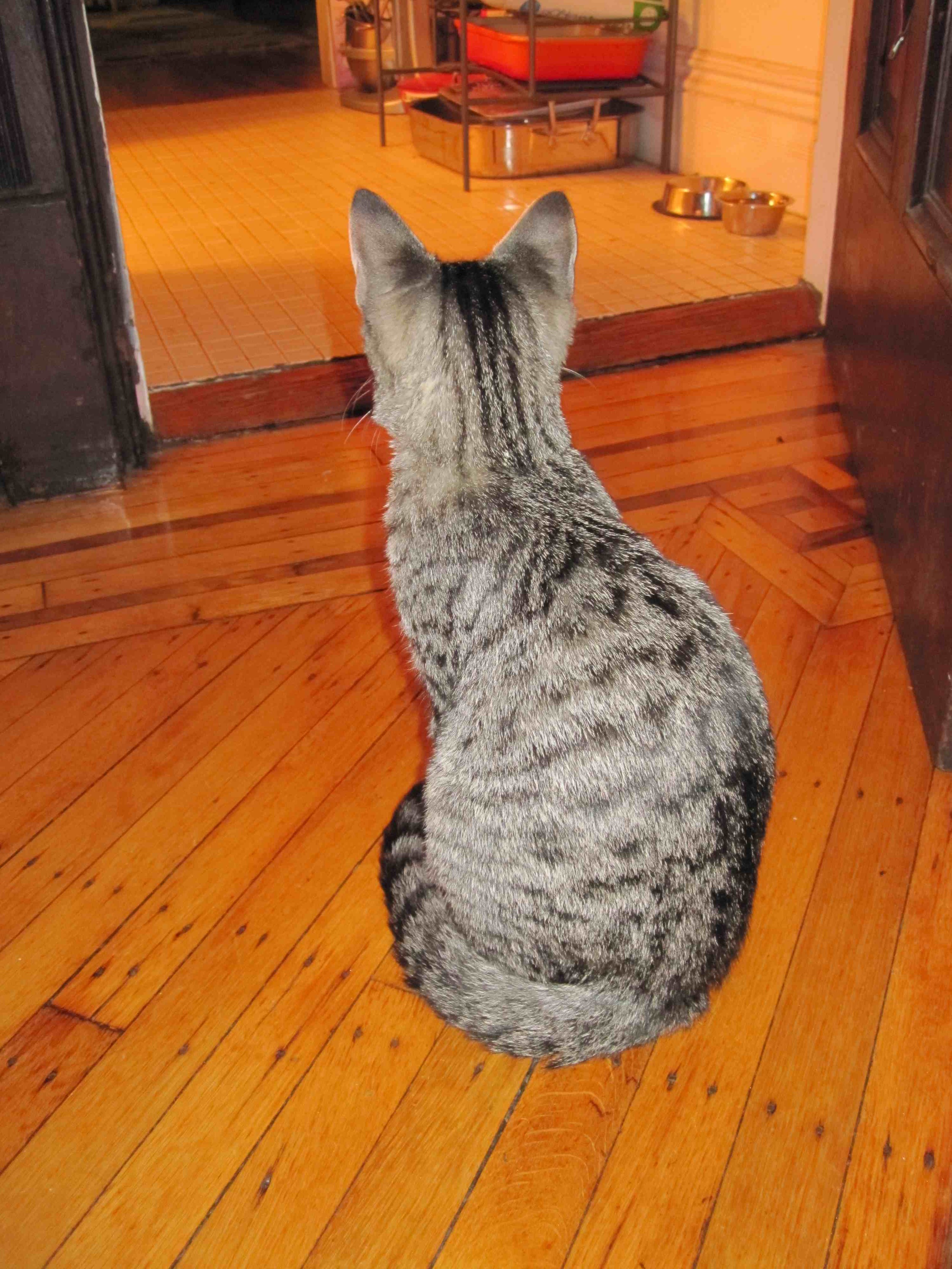
 And he really likes the kitchen.
 The glass coffee table is a source of confusion.
 He sits and waits for Dave to come out of the bedroom.
 And he sleeps cutely too!
 So, question for you cat owners out there: Should we get another one? We're thinking about two, so they'll have company when we go away for a weekend. And also because Swayze is totally crazy and energetic, and it might be fun for him to have another cat. Thoughts?
Bonus Cover Stories: Black is for Beginnings by Laurie Faria Stolarz
Laurie Faria Stolarz is on her Girlfriend Cyber Circuit tour this week, and she stopped by to share a short-and-sweet Cover Story: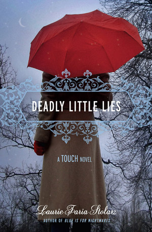 "I loved the cover for DEADLY LITTLE LIES. I love the pop of red in the umbrella, and I love the barren tree and the sliver of moon in the background.
[MW interruption: I love this cover too! I am really into umbrellas for some reason... Also, remember the Cover Story behind Laurie's DEADLY LITTLE SECRET? It's good!]
"For BLACK IS FOR BEGINNINGS, seeing my work illustrated, in general, was such a thrill. I loved having the opportunity to work with an illustrator to see my characters come to life.
"I loved the cover for DEADLY LITTLE LIES. I love the pop of red in the umbrella, and I love the barren tree and the sliver of moon in the background.
[MW interruption: I love this cover too! I am really into umbrellas for some reason... Also, remember the Cover Story behind Laurie's DEADLY LITTLE SECRET? It's good!]
"For BLACK IS FOR BEGINNINGS, seeing my work illustrated, in general, was such a thrill. I loved having the opportunity to work with an illustrator to see my characters come to life. 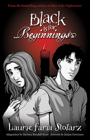 My editor and I viewed the samples of so many different artists as we were picking the illustrator for BLACK IS FOR BEGINNINGS. As soon as I saw Janina Gorrissen's work, I knew she was the perfect person to illustrate my book."
Thanks, Laurie! Obviously these books are in different series and they have different feels. Having your characters illustrated must be a thrill (Black is for Beginnings is the first one in the Blue is for Nightmares series that is a graphic novel, which is why it looks so different)! Here are the other four books in that series:
My editor and I viewed the samples of so many different artists as we were picking the illustrator for BLACK IS FOR BEGINNINGS. As soon as I saw Janina Gorrissen's work, I knew she was the perfect person to illustrate my book."
Thanks, Laurie! Obviously these books are in different series and they have different feels. Having your characters illustrated must be a thrill (Black is for Beginnings is the first one in the Blue is for Nightmares series that is a graphic novel, which is why it looks so different)! Here are the other four books in that series:
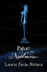


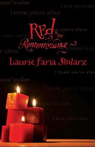 I see a candle theme... One that they kept in the graphic cover. What do you guys think of the covers?
Win-It Wednesday: Perfect You by Elizabeth Scott
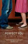
So the winner of Alyson Noel's just-released Shadowland is... Raschel! She wrote like 100 6-word memories (as did a few of you guys!) and I had to do a ton of random-number math to pick a winner, but there you go. Send me your address, R. Yay! This week, I'm giving away a book that came out a while ago but is one of my favorites -- Perfect You by Elizabeth Scott. Elizabeth does love stories like no one else, and this book also has some best-friend drama that rang true and reminded me of some of my own experiences. Sigh. Really great.
Anyway, to enter to win this book, just comment below and tell me about the last book you read where you really liked a friendship angle. Lots of books include love (which is awesome) but I'm especially a fan of writers who get friendship right.
Good luck!
This week, I'm giving away a book that came out a while ago but is one of my favorites -- Perfect You by Elizabeth Scott. Elizabeth does love stories like no one else, and this book also has some best-friend drama that rang true and reminded me of some of my own experiences. Sigh. Really great.
Anyway, to enter to win this book, just comment below and tell me about the last book you read where you really liked a friendship angle. Lots of books include love (which is awesome) but I'm especially a fan of writers who get friendship right.
Good luck!
Shop Indie Bookstores
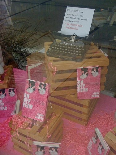
Cover Stories: An Off Year by Claire Zulkey
 So you guys know that I loved Claire Zulkey's An Off Year. Totally. And her Cover Story pretty much kicks ass too.
Here goes:
So you guys know that I loved Claire Zulkey's An Off Year. Totally. And her Cover Story pretty much kicks ass too.
Here goes:
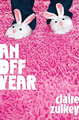
"I had no cover ideas, but I did hope that it was a little off the beaten path in some way but I didn't know how. 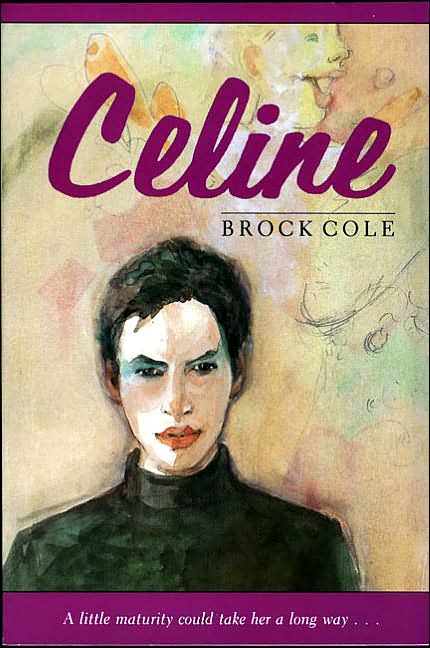 My favorite YA book of all time, Celine, has an illustration of the narrator on the cover created the author but I don't think that was the path for my book (also I can't draw anything but boxes and horses). At one conversation I told my editor, 'This idea might suck but how about the dri-erase board that you see in the very first scene of the book?' and she said 'Hold on a second' and sent me an email she had already drafted proposing the exact same thing, so I felt bad suggesting that that idea might suck somehow.
 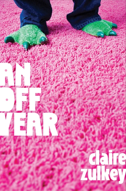 But then a little while later I received the following email from her about the early version that you see here with the lizard feet:
"'Here are the things that will strike you instantly: * this is not the idea we talked about * there is no description in the manuscript matching this image
"'BUT -- it feels perfect to me, I have to say. The 'slippers' you're seeing here are a found image/placeholder and the goal would be to get the same legs/vantage point and the same color contrast but something instantly recognizable as funny bedroom slippers, not like a costume. And I think it would be simple enough to mention the slippers. Same goes for the pink shag . . . which is unexpected but it very visually striking and has the right feel to me. I think it hits the audience you're looking for -- comfortably 20-something crossover.'
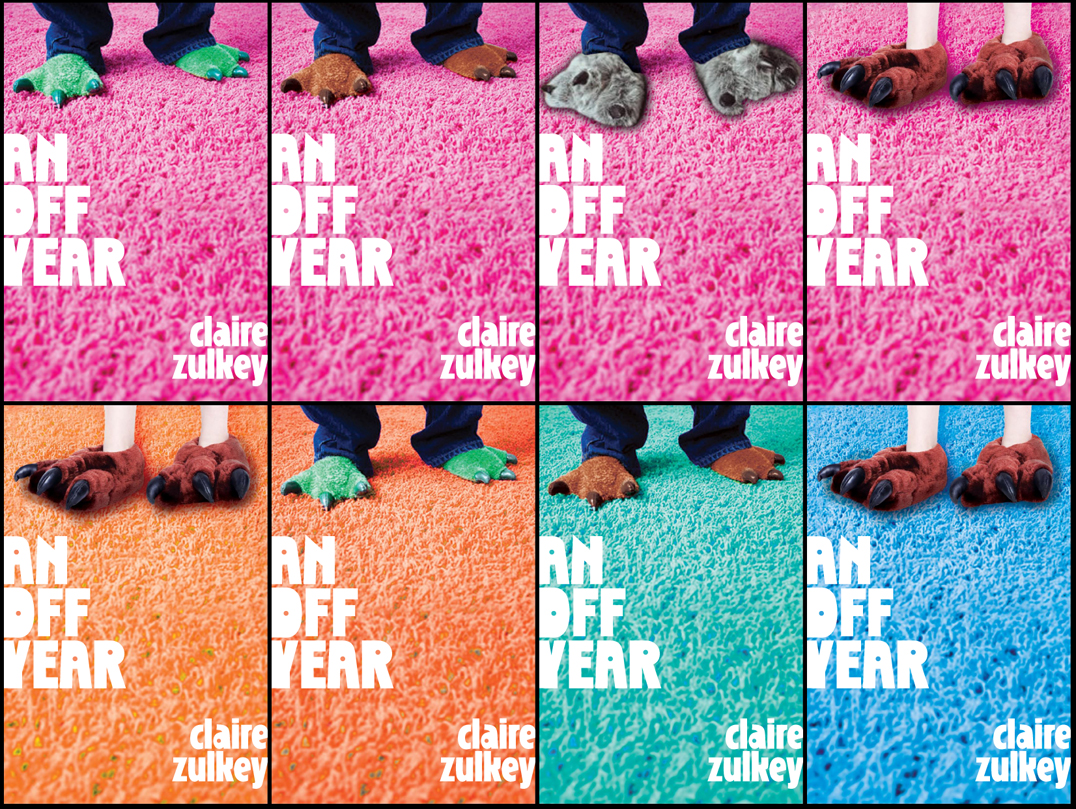
"She really sold it and it definitely was off the beaten path, as I had hoped for! My editor wasn't sold on the dragon feet (which I kind of loved--the contrast between these lizard slippers and the pink carpet) so I went searching online for funny slippers. It was a pretty fun task:
"I always loved the dragon feet but Julie (my editor) told me the art department went berserk for the bunny as you see it and I thought, 'OK they've been doing this longer than I have--they know what they're talking about!' and it worked out great.
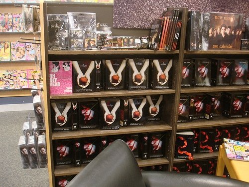 "Truly at first I couldn't believe how PINK it was, since I don't think it's a very 'pink' book--it's about a girl, but it's not a very girly book. But I grew to love it especially since the font I think is a little off-kilter which shows that it's not a super feminine book, plus when I go to bookstores and subtly stick it up next to copies of Twilight (see photo) it really pops!
"Here was my editor's email on the lizard/bunny debate: 'Everyone loved the direction and the contrast but sales had concerns about the ambiguity of the dragon/dino slippers we originally comped (even though they thought it was cute). The requested a more immediately recognizable slipper--and so we have arrived back at bunnies. I do quite like these, because while they are wholly traditional bunny slippers, they are also a little silly and fun. Sales and marketing saw this morning and were very happy with it.'
"If they were 'very happy' with it then so was I.
"The cover didn't change much: my original mockup is almost exactly the way you see it except for the slippers (the lizard version was just a proposed comp, since Dutton never purchased the rights to use that image, which was a stock photo.) And John Green's blurb on the cover too was a late edition I'm quite happy about.
"I believe it was a model on the cover because apparently the art director now owns a gigantic pink shag rug.
 "I love my cover--I think it's eye-catching and fun. I went to a signing at River Lights 2nd Edition in Dubuque and the owner had done a lot of cute stuff to welcome me like put out pink cupcakes and gave me some pink flowers so the undercover girly side of me was very touched by all that. I would like to tell guys that if you take the jacket off it's just a white book with (metallic!) pink writing on the spine so it won't look as feminine although being freaked out by the color pink is so lame anyway."
I love this story. I triple-love the mockups with all the slippers! I also adore Claire's Twilight antics. And yes, the book is hilarious.
In the end, I think sales & marketing were right to go pink-carpet-with-bunnies. What do you guys think?
Also, this is definitely a non-pink book in content, whatever that means. Kinda like another very pink-covered book I admired this year: Natalie Standiford's How to Say Goodbye in Robot.
Photo Friday: Martha!
in Photo Friday
So last week I got to attend a Martha Stewart taping. I highly recommend this. Some pics:Me and my friend Caroline in the studio. Lights! Cameras! Actions!
 Martha from afar on Anne's iPhone:
 The glorious SWAG bag (Jamie Oliver book! Wii game! Chocolate! Glitter crafting supplies! Heaven.):
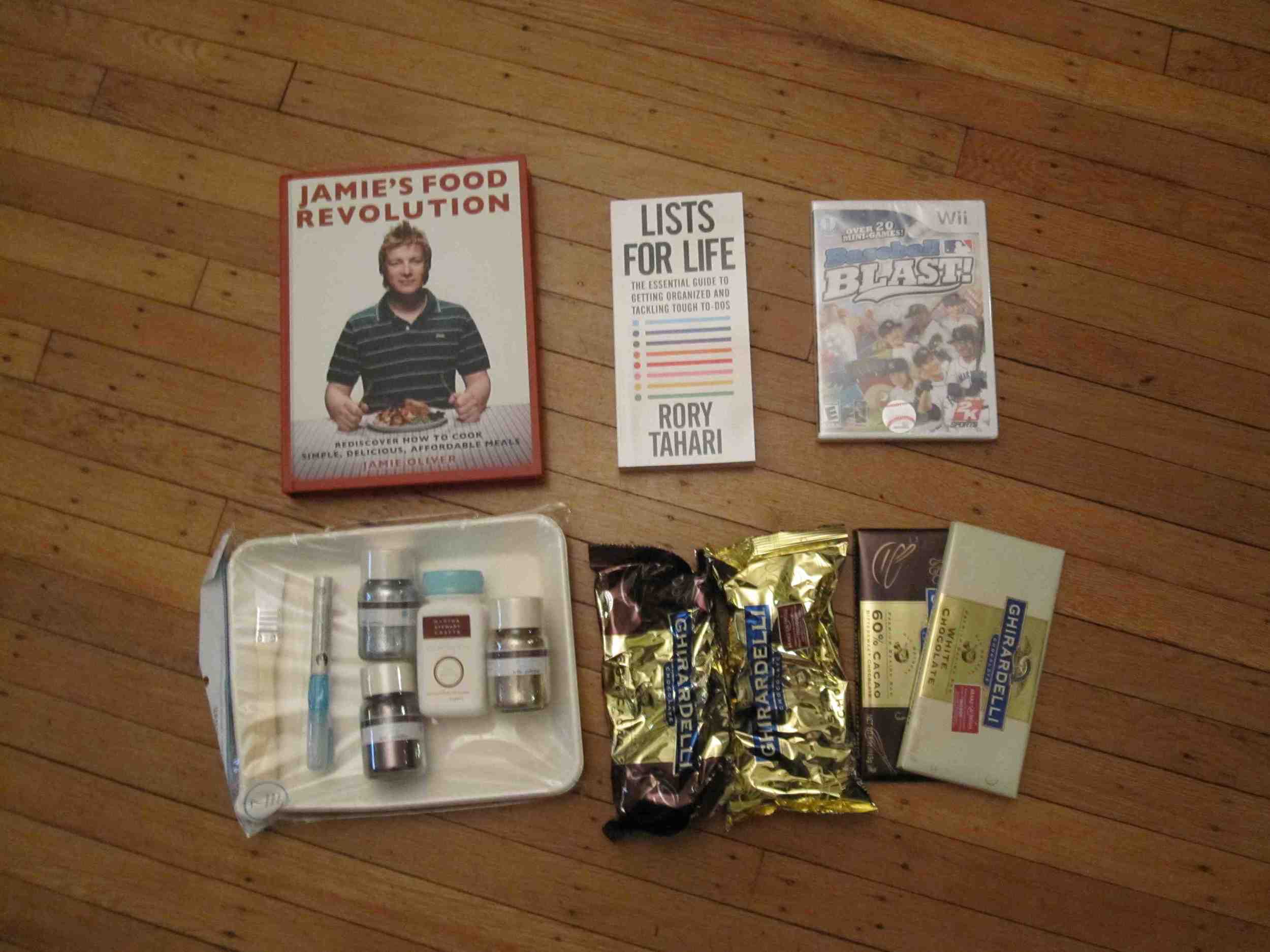 And Martha's influence on me, with my unglam crazy hair and apron. I tried to make a lemon meringue pie. The meringue turned out quite lovely, but the filling was a bit too liquid. Oh well, next time. (I am so not a kitchen person. Sigh.)
 We also got to see Martha interview Sir Ian McKellen (aka Gandolf!) and Naked Chef Jamie Oliver (who is totally hot and also doing some good stuff with his School Dinners program).
Happy Friday!
PS-Anyone can get Martha tickets. Go here!
We also got to see Martha interview Sir Ian McKellen (aka Gandolf!) and Naked Chef Jamie Oliver (who is totally hot and also doing some good stuff with his School Dinners program).
Happy Friday!
PS-Anyone can get Martha tickets. Go here!