The winner of a Blood Coven book by Mari Mancusi is... Donna S! Donna, email me your address and let me know which book you'd like (new or old cover!). This week, I'm giving away of the highly anticipated third book in Alyson Noel's bestselling Immortals series (right after I read it!). You guys probably know about this series, and if you don't, where have you been?! Just kidding--go here to find out more. (Oh, and read the first two books' Cover Stories here and here.)
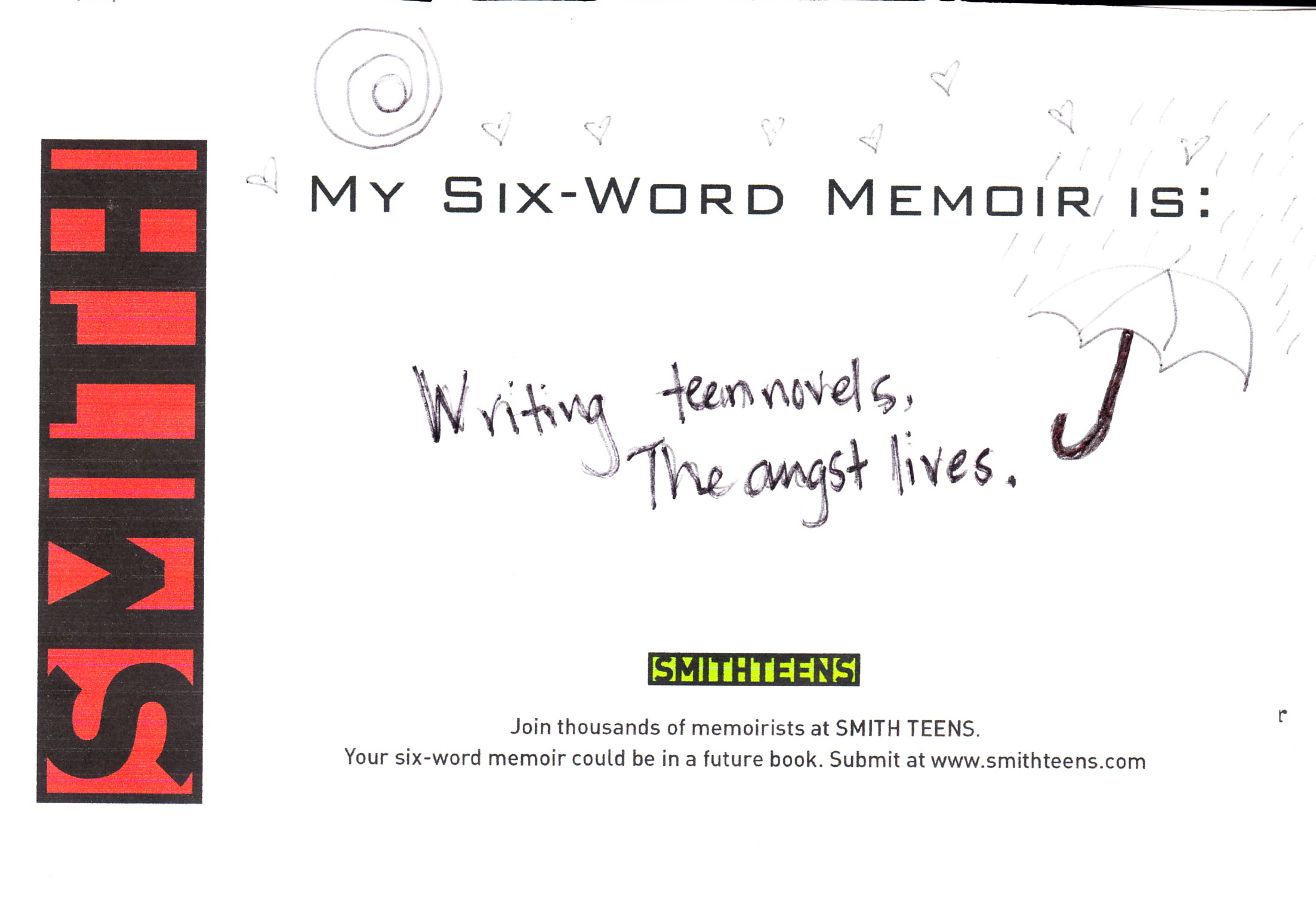
Now, for your challenge. I know I've talked about SMITHTEENS and the Six-Word Memoir books before, but I went to an amazing reading last night for this book and it refueled my love for Six-Word Memoirs. I even shared mine while I was there:
So today, for your chance to win a copy of Shadowland, share your six-word memoir. Each one you share is an entry, so go nuts if you want multiple entries, and feel free to comment more than once. I'm nosy, so hearing about your lives is fascinating to me.
Here's a video to inspire you. You should also hit up SMITHTEENS and explore if you haven't--there is some amazing writing over there.
Enter away! I'll pick a winner next Wednesday.
I saw This is It, I cried twice. I cried again when I just listened to "Man in the Mirror." MJ was on top of his game:
Forgive me for being emotional but Michael was the world's best talent, I think. Sigh. I'm not over this yet.
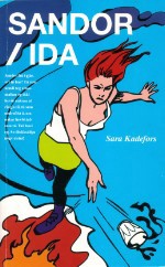
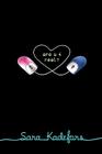
I really enjoyed Are U 4 Real? by Sara Kadefors. Sara lives in Stockholm, Sweden, where this book was an award-winning bestseller. To be honest, I thought the meeting-online premise sounded a little stale (it came out in Sweden in 2001, and just this year in the US), but the story really drew me in. It's about Kyla, a beautiful and popular LA socialite with an absent father and a deeply depressed mother, and Alex, a shy ballet dancer from outside San Francisco who tries to avoid bullies and has trouble talking to girls. They meet in a chat room and share their deepest feelings of isolation. It was a really sweet and romantic read with genuine angst and realistic situations, I thought.Anyway, I'm rambling. Here's Sara, talking about the US cover and the Swedish cover:
"The only thing I thought about my cover was that I wanted it to be modern. The first cover was something new in Sweden (right), it looked almost like a comic with a young girl throwing a glass with something inside. All books for young people had foggy faces on the cover at that time. The cover on the American version of the book is simple and nice, and not childish at all, which I like.
"The American publisher didn't ask me, which was okay, because I don't know anything about how books look like in USA. But I was very much involved with the Swedish creator.
"I didn't make any changes. I think my job is to write the book. And as for the cover, I like it. At first I thought it was a bit boring. But I liked it more and more because of its simplicity."
This seems like it would be a tough cover to design. I'm not sure how I feel about it, honestly. I think it's growing on me. The two covers are so different though! What do you guys think?
Shop Indie Bookstores
Have you guys checked out The Amanda Project yet? It's pretty cool, and this video explains it better than I could (so does the website).
Happy Sunday!
Say what you will about West Virginia--I love it! My dad's side of the family goes waaay back in those hills, so sometimes I have to stop by and visit. Here are pics from the October trip:I got a fishing rod. Yes!
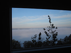
This is the view from "The Viewhouse," which was known as "The Blue House" when I was younger (and before it was renovated to get this amazing in-the-clouds feel). We rented it for the weekend and loved it.
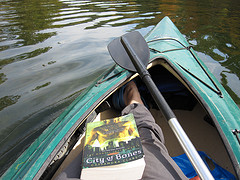
We also got to go kayaking and fishing with our friend Pete, a gentleman artist fisherman. I read for part of the time... Cassie Clare's books rule!
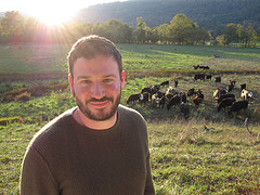
Little did we know that these cows, so calmly posing for a photo with Dave, would break out of their fence during dinner at my cousin Molly Moss's house and we'd have to impromptu herd them! F-U-N.
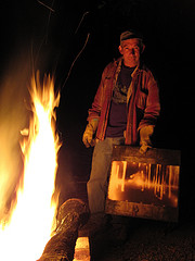
Our friend Pete, mentioned above, is an amazing artist who's been making fire paintings. He's having a show in NYC in December, so come if you can! How cool is this?
Happy Weekend, everyone!
The winner of last week's The Sweetgrass Basket contest is... Kelsey! K, email me your address. Thanks, you guys, for all the gaming ideas -- I have a want list now!
Today, the effervescent Mari Mancusi is here to share the story of the repacking of her Blood Coven series -- so we'll see old and new covers, and you'll have a chance to win a copy of one of the books!
Here's Mari:
"It was the phone call I'd been praying for. Berkley finally decided to buy BAD BLOOD, the fourth book in my Blood Coven Vampire series. But they also had another surprise for me. Thanks to the success of series like Twilight, House of Night and Vampire Academy, they had decided to repackage and re-release the first three books in my series. They told me Boys that Bite, Stake That, and Girls that Growl would be getting new covers and be back in stores.
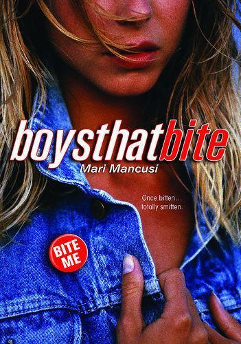
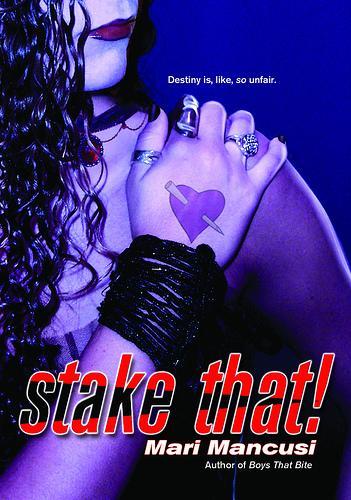
[The old covers]:
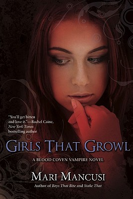
"I was thrilled, to say the least, and began dreaming of what the new covers would look like. While I always liked the first three covers, especially Girls that Growl, there were a few things that bugged me about them. One, the girl in Boys that Bite wore a jean jacket - which just looks straight out of the eighties if you ask me. And, besides the title, it doesn't even hint that it's a vampire book! The Stake That cover, on the other hand, goes too far in the other direction. It's too gothy. Now I'm all about the goth scene and so is Rayne, my main character, but I believe a cover should be accessible to the largest audience possible. After all, you don't have to be a hardcore goth to enjoy this book. Girls that Growl, on the other hand, is pretty awesome - really captures the feel of the book - where the goth girl becomes a cheerleader.
"But the thing that bugged me most was that the old covers were all different and didn't have a cohesive feel. Looking at them, you might not even know they were a series. They also felt a bit outdated now -- with the cut off head motif that used to be so popular in YA or chick lit books. Now most paranormal books feature the model's entire face.
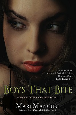
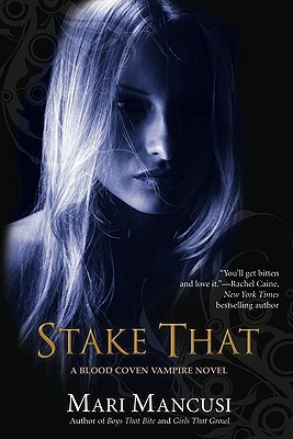
"For the new covers, the publisher wanted to make them less humorous and more like House of Night covers. (Which people always compare them to now, so I guess they succeeded.) They even changed the original jokey back cover copy to something darker and more mysterious to emphasize the angsty romance in the books, rather than the humor.
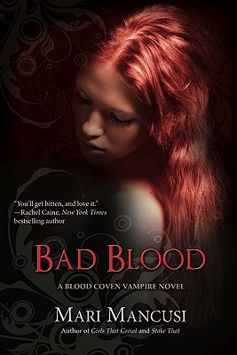
"I have to say, overall, I really do love the new covers. The girls they chose, the colors -- all gorgeous. And best of all, they look like a set. They now say 'A Blood Coven Vampire Novel' on the cover to indicate they're part of a series. They're dark and mysterious and very striking. I love them quite a bit, especially looking at them side by side (Bad Blood is at the top):
"That said, some people have criticized, saying the new covers are more generic and don't capture the feel of the books as well as the old ones did. I definitely see their point; for example, you know exactly what Girls that Growl is about by looking at the old cover. Not so much with the new one. Also, some criticize saying the new covers look too much like all the other paranormal books out there and aren't as original. Also true, but, to be honest, I think that will actually make them appeal to a greater number of readers. Perhaps those who never picked them up the first time around.
"And in the end, more readers means more sales, which means me being able to write more books in the series. Which, I think, is a win for all readers -- no matter which covers they prefer.
"My question to commenters is: Which covers do you prefer and do you have a favorite out of the new covers? My favorite is Stake That, but I think I'm in the minority so far. Bad Blood is also beautiful.
"Comment for a chance to win a copy of the newly repackaged Boys that Bite. OR one of the old ones if you prefer!"
Thanks, Mari, for this double feature Win-It Wednesday + Cover Story. I love this success tale of a series being repacked for new readers, and I think the new covers are really striking. I have to admit that I love the camp nature of the old covers, especially Girls That Growl in all it's cheerleading awesomeness. Among the new ones, I like Bad Blood the best -- it's gorgeous.
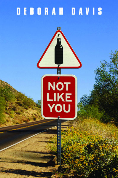
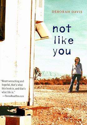
Deborah Davis' Not Like You is the story of Kayla, a teenage girl who must decide whether taking care of herself means no longer taking care of her alcoholic mother. Sounds like a tough one for which to design a cover, no?I asked Deborah about the process:
"I didn't have an image in mind for my cover except for picturing some of the warm red, orange, and brown tones of the northern New Mexico landscape. Kayla's story is an emotional one, so I wanted warm, lively colors.
"Unfortunately, I was not asked for input. Authors rarely are! Both covers -- hardback and paperback -- were designed from stock photos.
"The first time I saw the hardback cover (left), my heart sank right through the floor. The image -- a road in a dry landscape with a prominent road sign displaying a beer bottle -- seemed cold to me, not at all like the raw, emotional tone of the book. On the other hand, when I saw the paperback cover (below), I thought, 'That's it! That captures Kayla's yearning and loneliness perfectly.'
"My editor encouraged me to offer feedback and suggestions about the hardback cover, which she passed along to art and marketing. She had already protested vehemently against an earlier cover, which I didn't see, and she thought this new one was a great improvement. But she wanted me to be happy, and it was hard on her that I wasn't.
"I believe my comments were considered, but both the art and marketing departments thought they'd created a powerful, compelling cover that would appeal to readers, so in the end they kept it the way it was.
"In retrospect, I think the first cover was unique, and it certainly stood out among the plethora of young adult novel covers featuring body parts that are prevalent. I'm not sure, however, that it compelled book browsers to pick it up. On the other hand, I still love the paperback cover. Every time I look at it, my heart aches, because it so exactly reflects Kayla's feelings as she struggles with her feelings toward her unreliable mother, her questionable older boyfriend and, ultimately, herself."
I agree with Deborah -- I much prefer the paperback cover. I love the dryness on the ground, the gray hopelessness of the cement blocks, but the mountains in the distance, which seem to symbolize some hope. Am I getting too deep here? You guys?
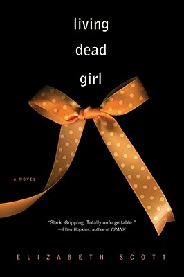
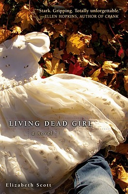
Elizabeth Scott was here last year, sharing the story behind the very eerie hardcover for her disturbing and chilling novel, Living Dead Girl. This fall, the paperback came out, and it always makes me think of Halloween!I asked Elizabeth if she'd return to discuss the cover change, and here she is:
"I knew Simon Pulse wanted a new cover for the paperback version of Living Dead Girl and my editor said she would send me one of the shots they'd done for it so I could take a look at it.
"Well, it came and I downloaded and looked at it and--I swear this is true--said, "I HAVE to buy that book!....Oh, wait. It is my book! Wow, what a cover!"
"And then I sent my editor and the photographer, Russell Gordon, gushing emails because I think the paperback cover is even better than the hardcover--and I never thought that could be topped!
How the cover came about is pretty simple--Russell, who is a genius, btw--wanted to do something very stark and simple, but also very eye-catching. So he took a picture of the bow, and then put it on a black background, but instead of making the black shiny (which is what usually happens), he made it matte, and made the ribbon shine. The result--a cover that looks like you can actually reach into it! Every time I see it, I think 'Wow.'
"It's interesting how something as simple as taking the opposite approach to the cover background (going matte instead of shiny) can do so much, but it really can!"
I am just drawn to this cover, too. You guys? I'd love to hear what you think. And here's the hardcover, for comparison:
If you haven't yet read this book, you must. It's riveting and important. (Elizabeth says the main character Alice came to her in a dream that recurred until she wrote it--now that's a sign!).
Happy Halloween, everyone!
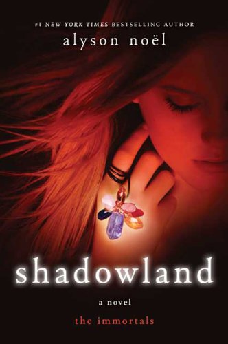 This week, I'm giving away of the highly anticipated third book in Alyson Noel's bestselling Immortals series (right after I read it!). You guys probably know about this series, and if you don't, where have you been?! Just kidding--go here to find out more. (Oh, and read the first two books' Cover Stories here and here.)
Now, for your challenge. I know I've talked about SMITHTEENS and the Six-Word Memoir books before, but I went to an amazing reading last night for this book and it refueled my love for Six-Word Memoirs. I even shared mine while I was there:
This week, I'm giving away of the highly anticipated third book in Alyson Noel's bestselling Immortals series (right after I read it!). You guys probably know about this series, and if you don't, where have you been?! Just kidding--go here to find out more. (Oh, and read the first two books' Cover Stories here and here.)
Now, for your challenge. I know I've talked about SMITHTEENS and the Six-Word Memoir books before, but I went to an amazing reading last night for this book and it refueled my love for Six-Word Memoirs. I even shared mine while I was there:
 So today, for your chance to win a copy of Shadowland, share your six-word memoir. Each one you share is an entry, so go nuts if you want multiple entries, and feel free to comment more than once. I'm nosy, so hearing about your lives is fascinating to me.
Here's a video to inspire you. You should also hit up SMITHTEENS and explore if you haven't--there is some amazing writing over there.
Enter away! I'll pick a winner next Wednesday.
So today, for your chance to win a copy of Shadowland, share your six-word memoir. Each one you share is an entry, so go nuts if you want multiple entries, and feel free to comment more than once. I'm nosy, so hearing about your lives is fascinating to me.
Here's a video to inspire you. You should also hit up SMITHTEENS and explore if you haven't--there is some amazing writing over there.
Enter away! I'll pick a winner next Wednesday.