Starting tomorrow, readergirlz is having an entire week of FABULOUS LIVE CHATS with a cluster of Teens' Top Ten Choice Nominees and readergirlz divas!See the full schedule on the poster below or the press release:
 How great is this lineup? Mark your calendars, and come hang out, starting tomorrow night at 9pm EST/ 6pm PST when Justina Chen Headley hosts awesome authors Alyson Noel and Zoe Marriott.
Happy Sunday!
Photo Friday: Honeymoon Part II
I'm going to post a few more Honeymoon photos (yes, I've done this before) and then I won't talk about it again. But we finally got these uploaded, so I had to share. Nova Scotia, people. It's awesome.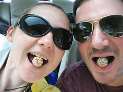 We like candy, especially when it's in the form of a rainbow ball.
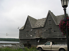 This crazy, Hitchcock-esque house was near the first cafe we saw outside of Yarmouth.
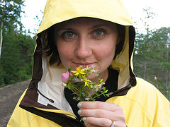 Dave made me a mini-bouquet.
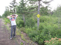 And then he continued his grooming (see the sign--this was my idea of hi-larious).
 We camped out one night, and Dave was obsessed with his choice of beans.
 We found a hermit crab on the beach!
 We made big messes in the cabin where we stayed in Inverness.
 I got tired of picture-taking in Baddeck.
 But everything was so darn scenic that we had to. Dave with his giant camera in Cape Breton.
Sigh. It was FUN.
Happy weekend!
Bonus Cover Stories: The Indigo Notebook by Laura Resau
Superawesome Author Laura Resau is here to talk about her newest cover in fascinating detail! Here she is:
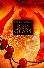 "The Indigo Notebook is the first book in my new travel-adventure-romance series. Each of the three novels is set in a different country (and as in all of my books, there's a bit of mystical/magical stuff in there, too...). As I was writing this book, I imagined the cover being similar to my most recent novel, Red Glass (right, illustrated by Steve Rawlings and designed by Vikki Sheatsley).
The cover of Red Glass takes my breath away. Many people of all ages--both guys and girls--have told me that they were immediately drawn to it. I thought that since each book in this new series is named for a different color--The Indigo Notebook, The Ruby Notebook, and The Jade Notebook--the artist could do some really cool things with color and imagery. For this first book, I imagined a purple-blue light-saturated cover with images of a waterfall, crystals, candles, the Andes, a snake, and a close up of a girl's and guy's interlocked hands. When I told my editor at Delacorte my ideas, she said that they'd already decided on a different designer and cover look because they wanted to set this apart from my other books to signify a new series. This seemed reasonable to me (but I'm still holding out the hope that some future book of mine will have a similar look to Red Glass!)
 "I was excited to find out that Marci Senders, the designer of the infamous Sisterhood of the Traveling Pants covers, would be creating my series covers. The first cover they ran by me (below) was pretty, but it didn't evoke travel in Ecuador (which is where the book is set.)
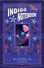 "Another problem was that it featured a girl with a a fair complexion holding a fair-skinned guy's hand. In my book the main character, Zeeta, and her love interest both have dark skin and hair (features which are essential to the storyline). I thought the girl's expression was intriguing, but she looked too polished, sitting at the café table in an elegant black outfit. To me, she didn't quite capture the spirit of Zeeta's personality or give the sense of movement and flight in her story. Zeeta has lived all over the world with her whimsical, hippie-ish mother, and her style reflects her upbringing--for example, her wardrobe has come from markets in Southeast Asia and Latin America.
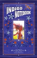 "My editor was very receptive to my comments, and asked me to send some pictures of how I envisioned Zeeta. I searched through hundreds of stock photos looking for the right match. It was frustrating! I couldn't find the perfect picture, but I settled on one that gave a sense of windswept flight. The girl's skin and hair are still lighter than I wanted, but it was the best I could find. Marci tried out this photo in the cover (left)...
 "I was happier with the second version, and thankful to Delacorte for incorporating my feedback, but part of me still wished for a cover that clearly suggested travel and adventure in the Andes. Luckily, the sales team wasn't crazy about the cover either, and asked for another one.
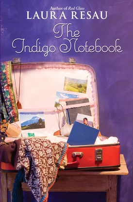 "In the end, my editor and Marci decided on covers that featured a vintage suitcase filled with things that suggested each book's setting. I was thrilled about the idea--and even more thrilled to hear that they planned on doing a photo shoot of all three covers. Here's the coolest part: they asked me to send them some items to include in the suitcase! The photos tucked in the suitcase are ones I took in Ecuador, including the picture of Zeeta's love interest, Wendell. The guy in the photo is actually my good friend, Maria's, brother (an indigenous Otavaleño Ecuadorian). This is perfect--my character Wendell shares his ethnic heritage (although he was adopted by an American couple when he was a baby). The crystal and the white embroidered shirt are also mine (and the toothpaste happens to be the same brand and flavor I use!).
"I'm very happy with this final cover. It's definitely a book I'd pick up in a bookstore. I love the rich indigo background and the vivid colors and interesting patterns and textures in the suitcase. I hope potential readers find the cover as enticing as I do!"
I love this story and the lengths everyone went to to get it right. Read more about the book, and enter for a chance to win a copy, at readergirlz.
Meantime, what do you guys think of the cover?
Win-It Wednesday: An Off Year by Claire Zulkey
Last week's winner of Paper Towns is... Katie H! I know you really wanted this one, so remind me of your address and it'll be on its way. This week, I'm giving away a book that I found raucously hilarious. It's an ARC of An Off Year, by debut author Claire Zulkey. Claire used to write for me at ELLEgirl, so i couldn't wait to see how her novel turned out. And it rules. Seriously, you will laugh all the way through it. I wrote about it for I Heart Daily, so you can find out more there.
To enter to win, just tell me what you'd do with an off year, or, as the Brits say, a gap year. Sometimes I wish I'd taken time between high school and college to travel or write or maybe just wait tables. Do some real world stuff. What would you do with your year?
Cover Stories: Intertwined by Gena Showalter
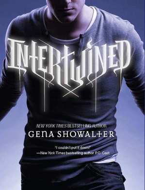 Gena Showalter writes some seriously romantic books. And she's here to talk about Intertwined, a story about a boy with four human souls living inside him who meets a girl who quiets their voices and brings him some peace. He's a loner who attracts the paranormal; she's a social butterfly who repels it. But somehow... they're coming together.Here's Gena:
"I love brainstorming cover ideas, but this one stumped me. I could see ribbons winding together, as well as a boy with his arms around a girl. But the first told nothing about the story and the second was perhaps a bit too suggestive with a title like Intertwined.
"I was asked to toss out any ideas I had. But truth be told, I didn't give my publisher much. I think I told them about my ribbon idea, though I wasn't sure if that kind of cover would intrigue readers.
"They used a real model for the Intertwined cover. In fact, they did a casting call (and I sooo would have loved to be there). Then they sent me several different pictures of the models; the guys stood against a white wall and each held a number. Boy number 15 won all our hearts. He had a very Rob Pattinson feel, and as I have a cougar crush on Mr. Pattinson, well, there was just no other way for me to vote.
"When I first saw the cover, I loved it and couldn't have been happier! No ribbons. A cute boy. And the title was on his shirt, which fit a scene in the book. By the time I saw the cover, it was pretty much a done deal. My only suggestion at that point was a darker, more paranormalish background. But a darker background would have distracted from the boy and the title, so we didn't end up going that route.
"They played with showing more of the boy's face, but in the end they opted to show just his mouth and chin. And I am absolutely, utterly satisfied."
Thanks, Gena! I have to admit that I think there's something sexy about that peek of undershirt on the cover, right? What do you guys think?
I'd love your comments here, but also head over to readergirlz, where you can post your thoughts and enter to win some prizes from Harlequin Teen.
Photo Friday: Violet in ELLE!
Calling All Bloggers!
As you may have heard, in conjunction with the author chats, readergirlz will be hosting a Teen Read Week Tribute. Anyone who loves YALSA's Teen Read Week is encouraged to let it out on their blog through a post or vlog, then send the link to readergirlz AT gmail.com (subject line: entrant's name, TRW Tribute). readergirlz will collect all contributions and post them at the rgz blog in a tribute that will run October 23.Watch the rgz Teen Read Week trailer and get psyched. Then, send in your links by October 21!
Win-It Wednesday: Paper Towns
The winner of the Louder Than Words series is... Taylor Cullen! Send me your address, T. Chapel Hill--woohoo! This week, I'm giving away a hardcover copy of Paper Towns by John Green. (It's sad Margo, the blue cover). I finally got a chance to read it and love it, as I'm sure lots of you guys have. I was so impressed by how Q grew through the book. I mean, Margo was the catalyst but it was really all about him, you know. And the awesome friendships plus a bit of mystery didn't hurt. It's a great read! So, in case you don't own Paper Towns yet, here's your shot.
Just comment below and tell me what your best "get it done" tip is. You know, for when you have something to do but you're sort of procrastinating. I've been having a shaky writing week (see yesterday's post) so I need lots of ideas on how to keep going until I finish this book! I will do it!
Then, you're entered. I'll choose a winner next week. International is cool too.
Happy Wednesday!
Shop Indie Bookstores
The Writing: How It's Going
I don't usually share much about my own writing process, beyond the fact that when I'm on deadline I like to write 1,000 words a day and I don't let myself eat lunch until that's written. I'm pretty strict. Anyway, last week while working on Small Town Sinners, I got stuck! I wasn't sure what was supposed to happen next, or if the scenes I had were in the right order, or if I could handle the complexity of this book, or... ack! Basically, I got scared. (If you get scared writing, check out Editorial Ass's Fear of Failure post--it's great. Thanks, Elizabeth Scott!)
To break the scaredy-cat paralysis, I made this:
It's a leaf of our dining room table, and it's covered with post-its--each one has a description of a chapter on it. I moved them around until their order made sense, and it totally helped! I'd heard other authors talk about storyboarding with notecards, and this is my version of that. It made me feel crafty and clever, and I didn't pressure myself to write while I made it.
Today, I wrote 1,000 words by 11am. That is a good feeling!
(Don't judge my messy living room! I'm in the midst of creativity here! Haha. Also, I had to scribble out the post-its because it would give away the whole book to let you read them!)
Anyone have any other writing tips to share? I love this book but it's kicking my ass a little.
Cover Stories: Once Was Lost by Sara Zarr
 The very cool Sara Zarr is here to talk about the cover of her latest book, Once Was Lost, and I couldn't be more excited to read it. In case you can't tell by these stories, I'm sort of a judger-of-books-by-their-covers, but I try to fight it... here, it works, because this cover is beyond gorgeous.And here's Sara:
 "Once Was Lost is set in this very small, rural town, and there was a point during the writing process when I was reading Sinclair Lewis' MAIN STREET and found this cover I loved (left).
"I became somewhat obsessed with it and imagined a similar cover--the silhouette of the main character, Sam, looking at a small town main street, kind of separate from it, and observing. I send this picture to the designer, Alison Impey, not to try to tell her what to do but just throw some inspiration out there. Other than that, I really had no clue what would work or what to expect. I'm definitely a word person and not a design person.
"Obviously there is nothing of the Sinclair Lewis cover in the final cover for Once Was Lost. I think they tried that direction but decided the end results didn't look YA enough. My publisher sent me the two concepts they'd narrowed it to:

 "My initial reaction to the one with the vase was that I didn't like it at all, at least for the story. It was a little too pretty, maybe? And didn't hint at the content in any meaningful way, I thought. I loved the second one, with the flower and the very stark background. My only comment at this part of the process other than that was that my most enthusiastic fan mail came from readers who loved Sweethearts, and I felt we needed to have the Sweethearts title on the cover, not just Story of a Girl.
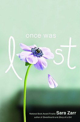 "When I saw the final version (right), they had kind of blended the image of the single flower with the more layered, gauzy look of the vase photo, and tweaked the color scheme. At first, I was all about keeping the starkness and eliminating the soft focus, but everyone at Little, Brown overwhelmingly liked the one with more depth. And, they are professionals, so I trusted them!
"I love it. When you see the whole thing put together, in hard cover, in your hand, it's so much more powerful than just seeing an image on the screen. The background is matte and the title and flower are glossy. They were so right about the depth of the photo, because even that fuzzy table in the background tells you there is a home here, a family.
"And, the book is so much about decay and brokenness, and also unexpected life, so the flower with the dropping petal is perfect. I also like that it's consistent with the Sweethearts cover in a way--a central image that is of a pleasant thing (a cookie! a flower!) but there's something off and missing. That works for my books! Also I love the color palette and what Alison did with the back, spine, and inside flaps. You'll just have to go get a copy to see what I'm talking about!"
I need a copy right now! I love this cover unabashedly and I think the combination of the photos is just right. What about you guys?
Shop Indie Bookstores


