 Rachel Vincent, author of My Soul to Take (August 2009), My Soul to Save (January 2010), My Soul to Keep (June 2010), and My Soul to Lose (free e-book prequel here) stopped by to chat about the Soul Screamers covers:"I think the coolest thing about the cover process for the Soul Screamers books is that all three of the covers were designed at the same time, so the continuity between the titles is flawless. In other words, they match each other perfectly. ;-)
"For each Harlequin title, the author is asked to fill out an online art fact sheet, which is a form full of questions about every possible aspect of the novel. Plot, characters, setting, clothing, themes, physical characteristics, title meanings, etc... But for the Soul Screamers books, among the very first of Harlequin's young adult covers, we went a bit beyond the art fact sheet.
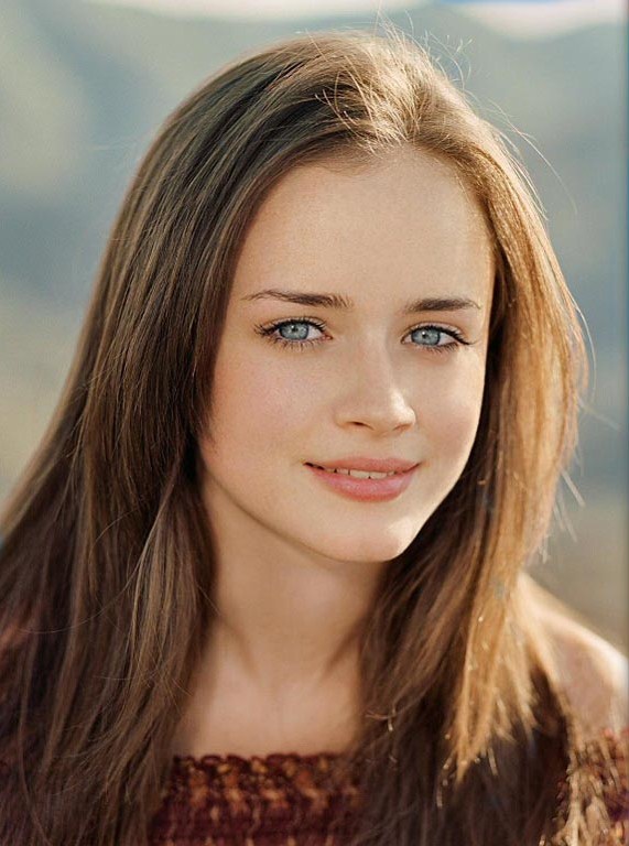
"In addition to the forms I filled out, my editor asked me to send in pictures that best reflected Kaylee (my main character) physically, as well as other images that captured the tone of the novel. I sent in these images of Danielle Panabaker and Alexis Bledel, who both have that every-girl look I was going for:
Rachel Vincent, author of My Soul to Take (August 2009), My Soul to Save (January 2010), My Soul to Keep (June 2010), and My Soul to Lose (free e-book prequel here) stopped by to chat about the Soul Screamers covers:"I think the coolest thing about the cover process for the Soul Screamers books is that all three of the covers were designed at the same time, so the continuity between the titles is flawless. In other words, they match each other perfectly. ;-)
"For each Harlequin title, the author is asked to fill out an online art fact sheet, which is a form full of questions about every possible aspect of the novel. Plot, characters, setting, clothing, themes, physical characteristics, title meanings, etc... But for the Soul Screamers books, among the very first of Harlequin's young adult covers, we went a bit beyond the art fact sheet.
"In addition to the forms I filled out, my editor asked me to send in pictures that best reflected Kaylee (my main character) physically, as well as other images that captured the tone of the novel. I sent in these images of Danielle Panabaker and Alexis Bledel, who both have that every-girl look I was going for:
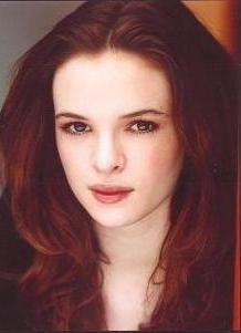 "Pretty, but in an average-teenager kind of way. I also sent in about a dozen different creepy images to represent the eerie feel of the Netherworld (which we'll see a lot of in the second and third books).
"Personally, in the beginning, I pictured an ensemble cast shot (similar to what I later saw on the cover for Another Faust), with some creepy Netherworld imagery around them, but the art department decided pretty early on to focus on just Kaylee, which I think works, because she's the only viewpoint character.
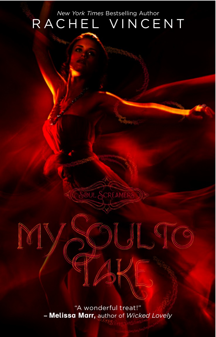
"For a while, there was talk about a close-up of just her face, with some color swirls in her irises, but in the end, they decided to go with a full body shot. Once they'd chosen a design, my editor sent me images of all three cover concepts (mockups). Each showed 'Kaylee' in a different pose, wearing a different dress, on a different colored background. Red for My Soul To Take, blue-green for My Soul to Save, and purple for My Soul to Keep. For these mockups, they used stock images, and approximations of the final fonts.
"My favorite part of the concepts was the 'word ribbon' (see the final cover, top). On each mockup, the title was repeated over and over, winding around Kaylee's body in a continuous stream. I loved that! I'd never seen it done anywhere else.
"Pretty, but in an average-teenager kind of way. I also sent in about a dozen different creepy images to represent the eerie feel of the Netherworld (which we'll see a lot of in the second and third books).
"Personally, in the beginning, I pictured an ensemble cast shot (similar to what I later saw on the cover for Another Faust), with some creepy Netherworld imagery around them, but the art department decided pretty early on to focus on just Kaylee, which I think works, because she's the only viewpoint character.
"For a while, there was talk about a close-up of just her face, with some color swirls in her irises, but in the end, they decided to go with a full body shot. Once they'd chosen a design, my editor sent me images of all three cover concepts (mockups). Each showed 'Kaylee' in a different pose, wearing a different dress, on a different colored background. Red for My Soul To Take, blue-green for My Soul to Save, and purple for My Soul to Keep. For these mockups, they used stock images, and approximations of the final fonts.
"My favorite part of the concepts was the 'word ribbon' (see the final cover, top). On each mockup, the title was repeated over and over, winding around Kaylee's body in a continuous stream. I loved that! I'd never seen it done anywhere else.
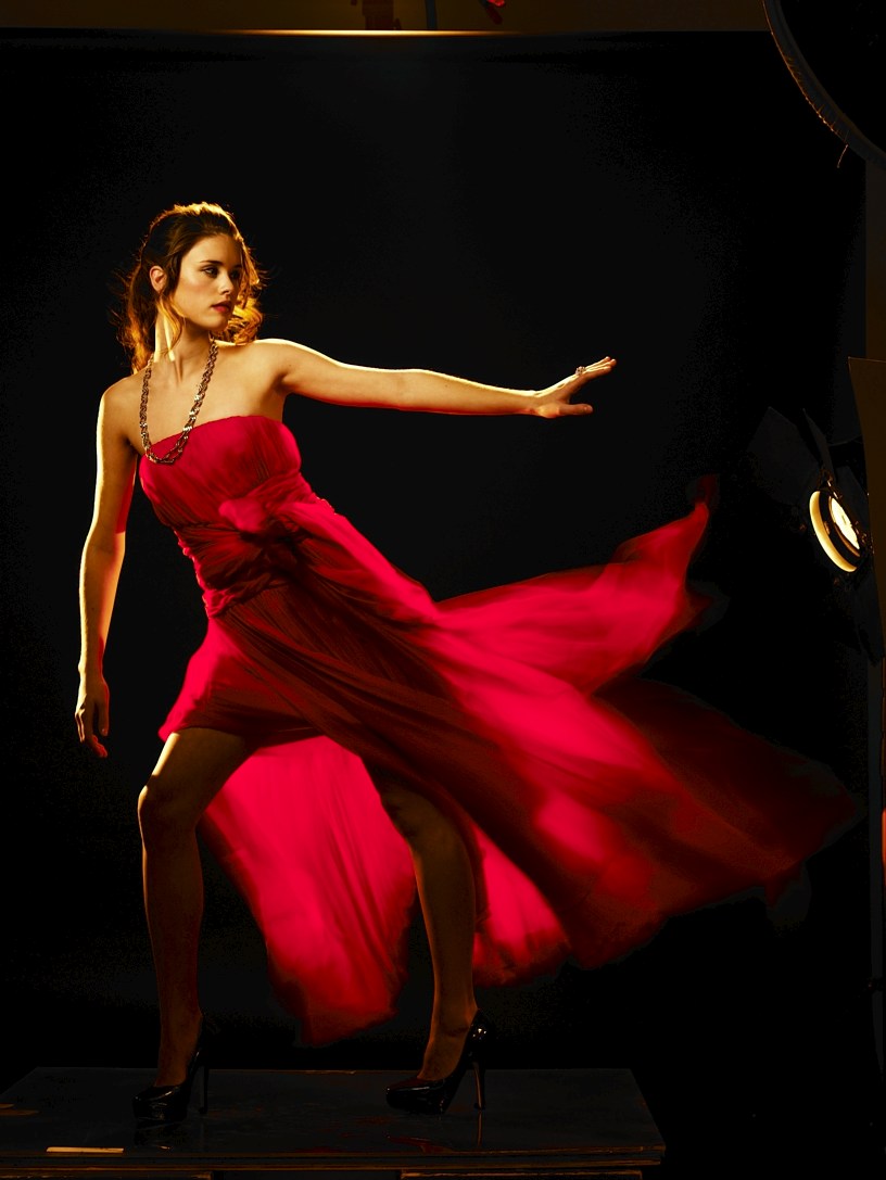
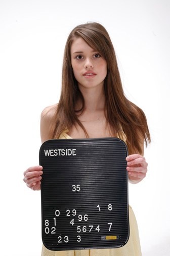 "Once they'd scheduled the cover shoot, my editor sent me pictures of the two models they were considering for Kaylee, and they were both perfect for the part (see the chosen one, left). And since the art department already had concepts in place for all three titles, they were able to take pictures for all three covers during that one cover shoot. For me, that was a big relief, because with my adult series, we're on our third cover model, after having lost the previous two mid-series.
[Here are the three poses for My Soul to Take:]
"Once they'd scheduled the cover shoot, my editor sent me pictures of the two models they were considering for Kaylee, and they were both perfect for the part (see the chosen one, left). And since the art department already had concepts in place for all three titles, they were able to take pictures for all three covers during that one cover shoot. For me, that was a big relief, because with my adult series, we're on our third cover model, after having lost the previous two mid-series.
[Here are the three poses for My Soul to Take:]

 [And here's the retouched image of the chosen cover image:]

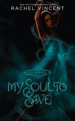 "Unfortunately, doing the word ribbon on the actual cover proved more difficult than on the mockup, so the review copies went out with different, regular swirlies. But I was thrilled to see that the word ribbon made it onto the final cover of My Soul to Take, and that it's even more prominent on My Soul to Save (right). And soon, we should have the final cover for My Soul to Keep! I can't wait to see it!"
I love all this insider info and the shots! Thanks, Rachel! What do you guys think of the covers in the series so far?
PS-Comment over on the readergirlz blog for a chance to win a book! (But leave your thoughts here too if you like!)
"Unfortunately, doing the word ribbon on the actual cover proved more difficult than on the mockup, so the review copies went out with different, regular swirlies. But I was thrilled to see that the word ribbon made it onto the final cover of My Soul to Take, and that it's even more prominent on My Soul to Save (right). And soon, we should have the final cover for My Soul to Keep! I can't wait to see it!"
I love all this insider info and the shots! Thanks, Rachel! What do you guys think of the covers in the series so far?
PS-Comment over on the readergirlz blog for a chance to win a book! (But leave your thoughts here too if you like!)
Photo Friday: Vancouver Boat Trip!
in Photo Friday
So you know how I was in Desolation Sound near Vancouver a few weeks ago? Here are some pics from the trip:
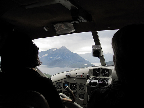 We took a little floatplane from Seattle to Vancouver (cute dog not included). It was SO. FUN! It landed right next to our friend Tom's father's boat in Desolation Sound...
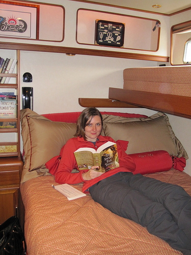 where I promptly settled into my cabin to avoid the rain and read the readergirlz pick for October--The Sweet Far Thing by Libba Bray!
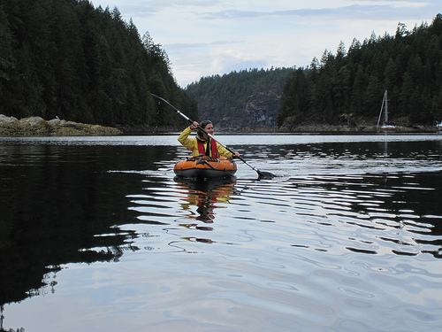 Later, we went kayaking.

 And then... fishing! First I caught an octopus and a sea anemone (do not ask me how...). Yes, I let both go, of course!
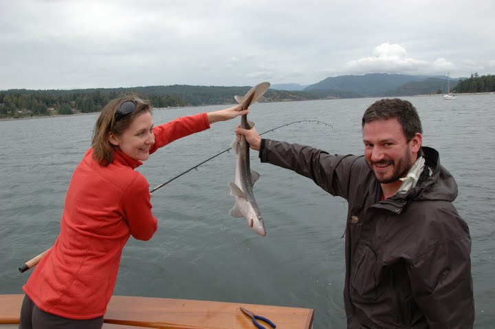 And then I caught a Dogfish Shark! I actually caught a couple of them, but I like this shot of me and Dave (I made him unhook and release the shark. I'm not getting near those teeth!).

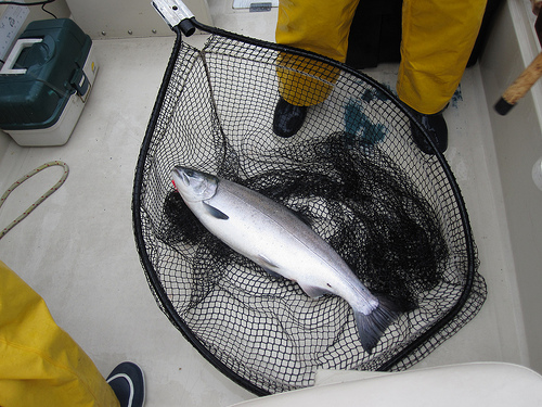 Later, Natalie and I went fishing in big yellow raingear, and we caught major salmon. We ate a fish dinner and then Natalie made gravlox for breakfast! We had a very cool female fishing guide, and the guys called our boat the S.S. Estrogen--we caught the most fish by far. Ha!
This was kind of a once-in-a-lifetime trip--it ruled! Hope you guys had some fun travels this summer too. Yes?
And Happy Fall!
Later, Natalie and I went fishing in big yellow raingear, and we caught major salmon. We ate a fish dinner and then Natalie made gravlox for breakfast! We had a very cool female fishing guide, and the guys called our boat the S.S. Estrogen--we caught the most fish by far. Ha!
This was kind of a once-in-a-lifetime trip--it ruled! Hope you guys had some fun travels this summer too. Yes?
And Happy Fall!
Cover Stories: What Happens Here by Tara Altebrando
 Tara Altebrando's What Happens here has rave reviews from many sources, including ellegirl.com and author Sara Zarr, who calls it, "A compulsively readable tale of complicated friendships, life-changing loss, and the search for authentic experience in a world full of artifice."
Why have I not read this one yet? Because I'm lame and buried under books. But I will get there! Anyway, the book also has a cool Cover Story. So here's Tara!
Tara Altebrando's What Happens here has rave reviews from many sources, including ellegirl.com and author Sara Zarr, who calls it, "A compulsively readable tale of complicated friendships, life-changing loss, and the search for authentic experience in a world full of artifice."
Why have I not read this one yet? Because I'm lame and buried under books. But I will get there! Anyway, the book also has a cool Cover Story. So here's Tara!
"One of the four pictures on the cover of What Happens Here wasn't actually there on the original version. Can you guess which one?
"Well, I'll tell you.
"But first, a little back-story: After a few title changes, we all finally decided on What Happens Here and my publisher felt strongly that she wanted the art to get the Vegas setting implied by the title across more directly. I did my usual obsessive searching on Getty Images and found a few cool imagines of two teen girls in Vegas-y settings (since two lifelong friends are at the center of the story) and sent those in to my editor for inspiration.
"Then the first version of the cover arrived in my inbox featuring none of those photos (of course!) and I took one look at it and thought, 'Okay. Me likey. Sort of.'
"Usually the first time I see cover art, I cry, so this was progress.
"I thought the tone was right. Dramatic. Dark. I liked the big white space at top that would eventually allow Sara Zarr to blurb the heck out of the book. I liked the fact that the surveillance camera aspect of the plot had been used to interesting effect.
"But there was one image among the four that didn't sit right with me at all. See that blonde girl in the top right photo? The bottom left photo was another angle on her and she had what I could only think to call a 'come hither' look in her eyes. She looked about 25 to me. And way too sexy. Like working girl sexy. So I said so and asked that the image be changed.
"'To what?' my editor asked. We talked for a while about putting in the Eiffel Tower since the book also has a lot of scenes set in Europe and also in the casinos in Vegas inspired by Paris, Venice, etc. But everyone thought that would be too confusing. Finally, I suggested a roulette wheel since the narrator is more than a little obsessed with odds and the gambles we all take in life. And they went for it. And once the come hither shot went away I felt like the model no longer looked too old and sexy but just old and sexy enough. Because the book also rubs up against some issues surrounding teen girls dressing sexy/looking older/drinking while underage.
"Ultimately I think the bottom right image--the dark alley--is the one that makes the cover the most effective. I hope people look at that alley and want to know what happens there."
Did you guess the right photo? I was thinking it was probably the alley that was added. Wrong! Anyway, I'm into the film-strip look of this cover, and the colors definitely convey the darkness of loss. I like the way the pink title pops, too. What do you guys think?
 Shop Indie Bookstores
Win-It Wednesday: A Set of Three Books by Teens
 The winner of last week's copy of Liar is... Nicole [ZBZ]! Send me your address, N. Everyone else, don't wait--you'll read a spoiler soon, so get Liar while you can experience it on your own.
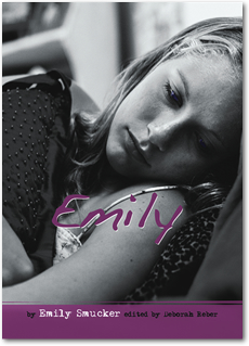
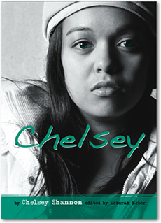 This week, I'm giving away three books. They're nonfiction, truly moving, written by teens and edited by Deborah Reber. I wrote about them for I Heart Daily today, and I also mentioned that Deborah is looking for her next group of teen authors, so if you're interested in that, go here and find out more.
 To enter to win all three books (so far) in the Louder Than Words series, just tell me what you're working on, creatively, in your own life. You don't have to give away the plot of your screenplay or reveal a secret knitting project (though you can if you want to!), but just tell me what's up in your creative world.
I'll choose a winner--international or US--next week with my trusty random number generator. Works every time!
To enter to win all three books (so far) in the Louder Than Words series, just tell me what you're working on, creatively, in your own life. You don't have to give away the plot of your screenplay or reveal a secret knitting project (though you can if you want to!), but just tell me what's up in your creative world.
I'll choose a winner--international or US--next week with my trusty random number generator. Works every time!
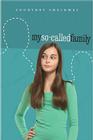
Cover Stories: My So-Called Family by Courtney Sheinmel
 Courtney Sheinmel is back to share the Cover Story behind her first novel, My So-Called Family (read yesterday's Cover Story about Courtney's latest release, Positively).My So-Called Family is the tale of a 13-year-old girl named Leah who finds out that she was conceived through artificial insemination. So her father is "Donor 730," and though she has a stepfather and younger brother and a loving mom, she wants to know more. So when she finds out that Donor 730 has another daughter around her age, she intends to meet her half-sister!
That sounds like a great book and a tough cover to design. Here's Courtney with the story:
"MY SO-CALLED FAMILY, went through a few different covers before the final version. About a year before the publication date, my editor emailed over a sketch from the cover artist depicting the concept for the cover - a girl, her mother, and the dotted outlines of her unknown father and siblings.
Courtney Sheinmel is back to share the Cover Story behind her first novel, My So-Called Family (read yesterday's Cover Story about Courtney's latest release, Positively).My So-Called Family is the tale of a 13-year-old girl named Leah who finds out that she was conceived through artificial insemination. So her father is "Donor 730," and though she has a stepfather and younger brother and a loving mom, she wants to know more. So when she finds out that Donor 730 has another daughter around her age, she intends to meet her half-sister!
That sounds like a great book and a tough cover to design. Here's Courtney with the story:
"MY SO-CALLED FAMILY, went through a few different covers before the final version. About a year before the publication date, my editor emailed over a sketch from the cover artist depicting the concept for the cover - a girl, her mother, and the dotted outlines of her unknown father and siblings. 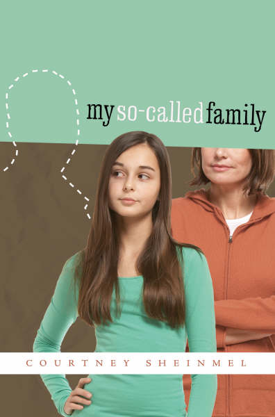 I liked the concept and they scheduled a photo shoot. But then when my editor emailed me a few weeks later with the actual cover, it was not at all what I expected. I thought the colors were too jarring, the font seemed off, and I didn't like the expression on the girl's face. They kept the concept, but changed the colors, font and picture, and I really liked the second version. It was the version that ended up on the galleys (left), and I showed them off to everyone I knew.
"Sometime later I found out that the design had changed for a third time: same concept, same girl, but the colors were different and the mom was taking off the front cover and moved to the back. The final version pops out more (above right), and I'm really happy with it.
I liked the concept and they scheduled a photo shoot. But then when my editor emailed me a few weeks later with the actual cover, it was not at all what I expected. I thought the colors were too jarring, the font seemed off, and I didn't like the expression on the girl's face. They kept the concept, but changed the colors, font and picture, and I really liked the second version. It was the version that ended up on the galleys (left), and I showed them off to everyone I knew.
"Sometime later I found out that the design had changed for a third time: same concept, same girl, but the colors were different and the mom was taking off the front cover and moved to the back. The final version pops out more (above right), and I'm really happy with it.
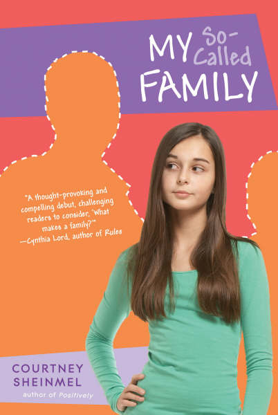 "The paperback cover of MY SO-CALLED FAMILY is different than the hardcover - the colors and fonts have changed again (right). It came out September 15th, the same day as POSITIVELY!"
I like the way the cover ended up, and I think the colors on the paperback pop a little more than the blue-green of the hardcover (plus the title stands out more on the paperback). However, I think I like the hardcover better overall. What do you guys think?
"The paperback cover of MY SO-CALLED FAMILY is different than the hardcover - the colors and fonts have changed again (right). It came out September 15th, the same day as POSITIVELY!"
I like the way the cover ended up, and I think the colors on the paperback pop a little more than the blue-green of the hardcover (plus the title stands out more on the paperback). However, I think I like the hardcover better overall. What do you guys think?
Shop Indie Bookstores
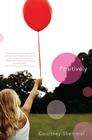
Cover Stories: Positively by Courtney Sheinmel
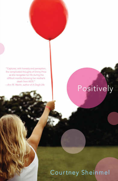 The awesome Courtney Sheinmiel is here to share the Cover Story behind the recently released Positively. The book is about Emerson Price, who was four-years-old when she and her mom were diagnosed as HIV-positive. Now she is thirteen and her mother is dead. Emmy moves in with her father and stepmother, but she feels completely alone. When they send her to a camp for HIV-positive girls, Emmy is certain she's going to hate it. But soon she realizes that she's not so alone after all -- and that sometimes letting other people in can make all the difference in the world.Here's Courtney:
"While I was writing my second book, POSITIVELY, I kept thinking of the cover of Jenny Downham's wonderful book, BEFORE I DIE (below). The image is so haunting and powerful - a black and white photo of a teenage girl. The expression on her face just seemed to me to be a lot like Emerson, the thirteen-year-old narrator of POSITIVELY. A writer friend suggested that I send my editor the BEFORE I DIE cover, which I did. He emailed back not to worry; they would come up with something perfect for POSITIVELY.
The awesome Courtney Sheinmiel is here to share the Cover Story behind the recently released Positively. The book is about Emerson Price, who was four-years-old when she and her mom were diagnosed as HIV-positive. Now she is thirteen and her mother is dead. Emmy moves in with her father and stepmother, but she feels completely alone. When they send her to a camp for HIV-positive girls, Emmy is certain she's going to hate it. But soon she realizes that she's not so alone after all -- and that sometimes letting other people in can make all the difference in the world.Here's Courtney:
"While I was writing my second book, POSITIVELY, I kept thinking of the cover of Jenny Downham's wonderful book, BEFORE I DIE (below). The image is so haunting and powerful - a black and white photo of a teenage girl. The expression on her face just seemed to me to be a lot like Emerson, the thirteen-year-old narrator of POSITIVELY. A writer friend suggested that I send my editor the BEFORE I DIE cover, which I did. He emailed back not to worry; they would come up with something perfect for POSITIVELY.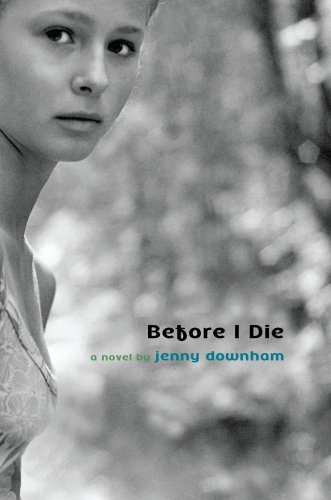 "A couple months later, my editor emailed me the POSITIVELY cover. It looks nothing like BEFORE I DIE. For one thing, it is full of color. It is so hopeful and it captures the book better than anything I ever imagined. There is a pivotal scene in the book when Emerson and her family release balloons, which is depicted on the cover. I love the way the balloon in Emerson's hand has a red ribbon. As far as I know, the picture was a stock photo and not a model shoot - hard to believe because it's just so perfect. The one thing I was surprised about was the girl's blond hair; I always pictured Emerson with darker hair. But I am absolutely thrilled with the cover, and now I think of her as a blonde."
I'm so glad the cover got that bright treatment (though I love Jenny Downham's cover too). I just think the feel of it, like a photograph taken in the sun, is so warm and hopeful. What do you guys think?
PS-Courtney will share the Cover Story for her first book, My So-Called Family, tomorrow!
PPS-Courtney is donating a portion of her proceeds from this book to the Elizabeth Glaser Pediatric AIDS Foundation. Very cool.
"A couple months later, my editor emailed me the POSITIVELY cover. It looks nothing like BEFORE I DIE. For one thing, it is full of color. It is so hopeful and it captures the book better than anything I ever imagined. There is a pivotal scene in the book when Emerson and her family release balloons, which is depicted on the cover. I love the way the balloon in Emerson's hand has a red ribbon. As far as I know, the picture was a stock photo and not a model shoot - hard to believe because it's just so perfect. The one thing I was surprised about was the girl's blond hair; I always pictured Emerson with darker hair. But I am absolutely thrilled with the cover, and now I think of her as a blonde."
I'm so glad the cover got that bright treatment (though I love Jenny Downham's cover too). I just think the feel of it, like a photograph taken in the sun, is so warm and hopeful. What do you guys think?
PS-Courtney will share the Cover Story for her first book, My So-Called Family, tomorrow!
PPS-Courtney is donating a portion of her proceeds from this book to the Elizabeth Glaser Pediatric AIDS Foundation. Very cool.
Shop Indie Bookstores
Photo Friday: Chapel Hill Magazine...
in Photo Friday
did a really nice page on my wedding.See those bridesmaids? High school friends forever!
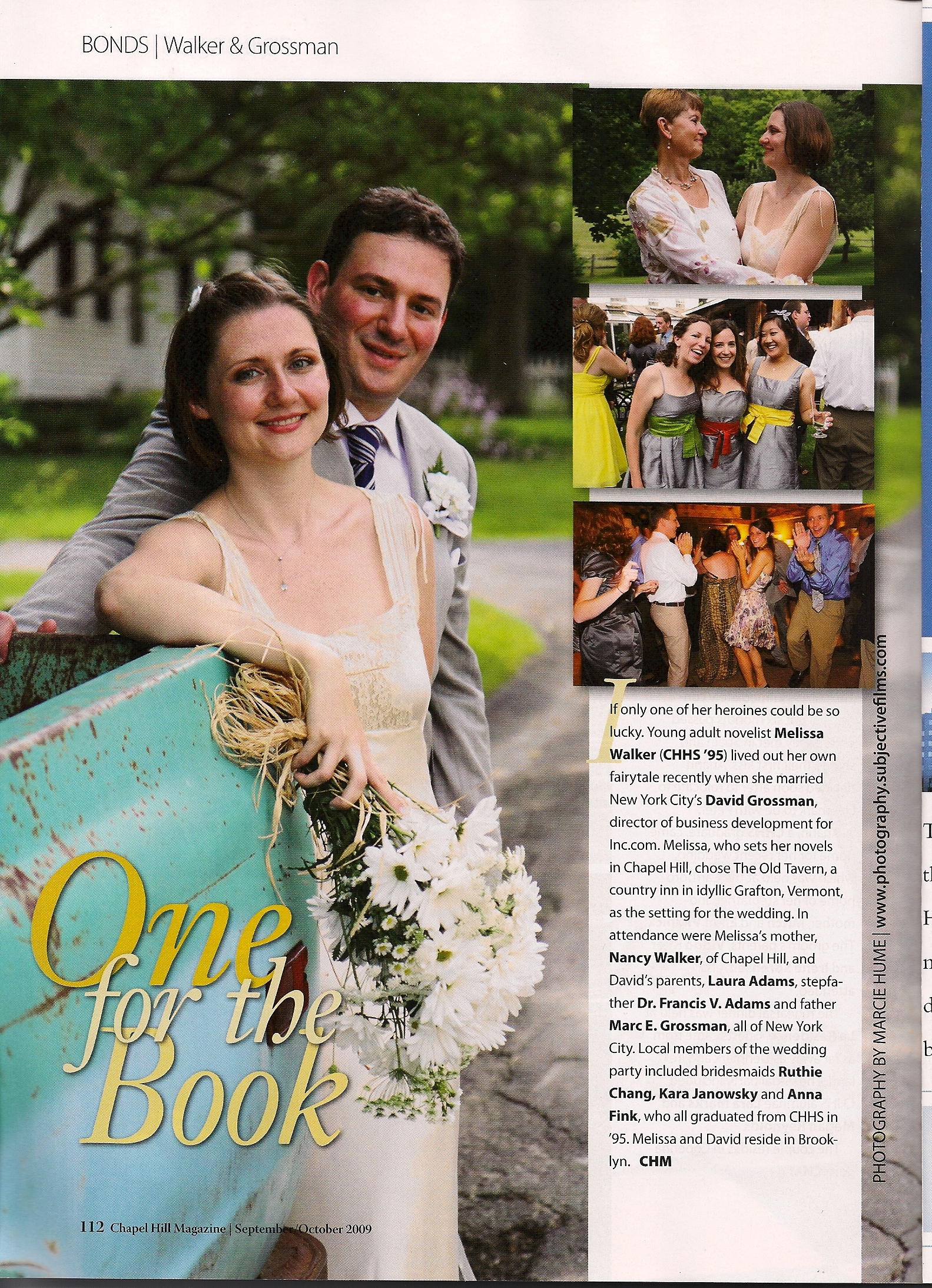 This might be as exciting as when Sarah Dessen and I were on the cover... almost.
Happy Friday!
This might be as exciting as when Sarah Dessen and I were on the cover... almost.
Happy Friday!
Cover Stories: Crazy Beautiful
The prolific Lauren Baratz Logsted's new novel, Crazy Beautiful, is getting major buzz. Just check out these reviews from Angieville, The Compulsive Reader and GreenBeanTeenQueen. Raves!
 And the cover is dark and compelling, so of course, I had to ask for a Cover Story. So here's Lauren:
"When I thought about the cover, I knew I wanted there to be a hook on it, since Lucius Wolfe has prosthetic hooks in place of hands.
"It came up during a visit my family paid to Houghton Mifflin Harcourt in Boston to discuss The Sisters 8 series for young readers [read that Cover Story here!]. I said I wanted a hook and my editor agreed there should be one.
"When I first saw the cover, I was overwhelmed. I'd envisioned a realistic hook, not the wispy, smoky hook that you can barely see for what it is, but I absolutely loved it. HMH does great covers.
"My editor is wonderful. With each cover, she says something like, 'Sales loves this, but the most important thing to me is: What do you think?' Who knows? She may just be the world's greatest politician, but she always makes me feel like my point of view matters.
"However, no further comments or suggestions were needed from me, other than: 'I love it - you people rock!'
"The photo of the couple is by Harry Vorsteher, the photo of the hook is by Sean McHugh, and the jacket design is by HMH's own Carol Chu.
"I just think they did an amazing job and the reaction to the cover by the YA blogosphere has been phenomenal, nothing like anything I've ever experienced before. One thing I hadn't noticed before I started answering these questions for you: At the bottom of the inside back jacket flap there's a much more pronounced hook. Neat. I'm so unobservant. Oh, and I like how when you remove the mostly black jacket the book underneath is hot pink with silver lettering."
Ooh, cool! I have an ARC that doesn't have that hot pink interior, so I'll have to find that in a bookstore. What do you guys think of this cover? (I also love the hint of pink in the title font... gorgeous.)
Win-It Wednesday: Liar by Justine Larbalestier
Last week's winner of the 6-word memoir contest is Rachel, who wrote: "When does everything begin to matter?" Love that! Send me your address, R, and I'll send you I Can't Keep My Own Secrets (such a fun, original book!).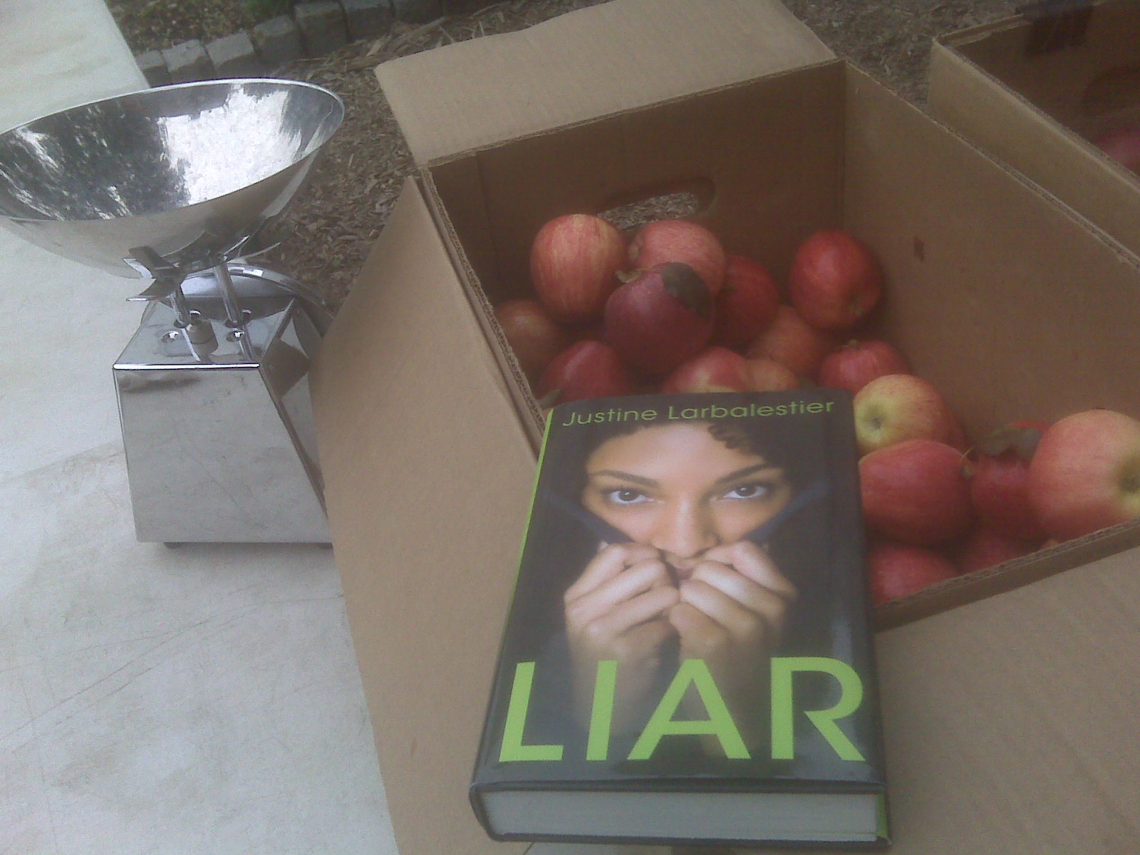 This week, the prize is Justine Larbalestier's new book, Liar. I finished it yesterday while volunteering at my local farmshare, where I picked up deliciously perfect Snow White-looking apples, hence the photo. I'm into on-location book photos lately.
I don't want to say too much about the book, just that I thoroughly enjoyed the ride of this story, which is complete with twists and turns and tangible confusion for the reader, the narrator and everyone involved. Liar threw me off balance while I was reading--in a very good way!
There is tons of fun info on the book at Justine's engaging blog, so go there to dig up more info.
In the meantime, for a chance to win my hardcover copy, just comment below and tell me about a one-word-title book you've enjoyed. Yes, I'm getting random with these questions, but bear with me. I'm curious.
Mine? LIAR, of course! (I also adore Lisa McMann's WAKE and FADE).
This week, the prize is Justine Larbalestier's new book, Liar. I finished it yesterday while volunteering at my local farmshare, where I picked up deliciously perfect Snow White-looking apples, hence the photo. I'm into on-location book photos lately.
I don't want to say too much about the book, just that I thoroughly enjoyed the ride of this story, which is complete with twists and turns and tangible confusion for the reader, the narrator and everyone involved. Liar threw me off balance while I was reading--in a very good way!
There is tons of fun info on the book at Justine's engaging blog, so go there to dig up more info.
In the meantime, for a chance to win my hardcover copy, just comment below and tell me about a one-word-title book you've enjoyed. Yes, I'm getting random with these questions, but bear with me. I'm curious.
Mine? LIAR, of course! (I also adore Lisa McMann's WAKE and FADE).

Shop Indie Bookstores
Looking forward to October...
in Other Stuff
 Is that an amazing lineup of author chats or WHAT? Feel free to grab that video and spread the news: the readergirlz Teen Read Week celebration will be awesome.
Thanks to Freezepop for the music, and to Holly Cupala for creating the visuals and video. Yay!
Is that an amazing lineup of author chats or WHAT? Feel free to grab that video and spread the news: the readergirlz Teen Read Week celebration will be awesome.
Thanks to Freezepop for the music, and to Holly Cupala for creating the visuals and video. Yay!