Cover Stories: The Del Rio Bay Series by Paula Chase

The lovely Paula Chase Hyman, a co-founder of the awesome Brown Bookshelf, is here to talk about the covers for her five Del Rio Bay novels... the latest of which is Flipping the Script. Read on for her story, and a chance to win a full set of the books! "What a great and timely period to be talking cover art!! I'm sinking my teeth into this topic like it's a big ol' juicy steak. When the first book in my series was acquired I had soooo many ideas for the cover, but the most important thing was I wanted it to be inclusive. My main character is African American with a White best friend and their circle of friends is also diverse, so I wanted a cover that complemented the cast. Even before the book was acquired, it's all I thought about. "My editor at the time asked for my thoughts and I regurgitated all the ideas and feelings and vibes and messages that had lived in my head for the two years before the book sold. I said things like "funky fonts, teen friendly, colorful, inclusive." And somehow the cover of So Not The Drama came back with the perfect vibe (left). How the art department was able to turn my ramblings into an actual cover, I'll never know! But here's where the story changes course...the covers for the first two books were graphic covers. But by book three my current editor broke the news to me that they wanted to go with photo covers because the graphic covers were not reaching the primary audience - African American teens. "My last three covers were all photo covers, shot with models. I was still allowed input regarding the look of the models and the type of clothing they'd wear. I was glad to have the input...but, honestly, by the time we got to this point I was pretty disappointed that my grand experiment to be inclusive had basically failed when it came to sales. It's sort of ironic that the furor over Liar was that a brown face wouldn't sell books when the flip side of that argument is many brown readers pass by books without brown faces.

"Although I wrote my books to appeal to a broad teen reader base, in the end a book has to have at least one particular audience and the reality when marketing to African American readers - publishers want the reader to know the book features a Black protagonist. So my books were in a weird limbo because of the marketing dynamic of publishing.

"When I first saw my graphic covers, I loved them! When I first saw my photo covers I didn't hate them. How's that for honesty? It's nothing personal, but I've never been a fan of photo covers. I'm the type of reader who wants to imagine what the character looks like. I don't want to be force fed an image via a model/photograph. I've had people come up to me and say (about the photo cover) 'Oh my goodness, this is exactly how I pictured Mina.'Funny, because none of the models on my covers look like the characters in my head.

"I actually really like the covers for That's What's Up! and Who You Wit'? because they evoke a level of teen sassiness that my characters embody. However, the cover for Flipping The Script, the final book in the series, is far too generic. It's of three smiling girls. Well, first of all, the book focuses primarily on the male characters of the cast and two, ***spoiler alert*** the ending isn't all that happy. At first, it really bothered me that the cover didn't match the inside. But no readers have complained. So if they like it, I love it!"

It's so interesting how they changed from graphic to photo covers. I think I'm more into the graphic ones, as well, but finding readers is definitely important! What do you guys think?

One lucky commenter who shares an opinion on the readergirlz blog (not here, though I'd love to hear here too!) will win a full set of Paula's series, courtesy of Kensington. Good luck!

NPR: 3 Books on Fashion

nprlogo_138x46.gifThis was kind of a big week for me. I checked off two big items on my Life Dream list!First, I got to see Oprah (I believe I may have talked about that enough). fashion_200.jpgSecond, I recorded a radio story for NPR. It was one I wrote about three books I love that have to do with fashion, and how ingenuity and innovation always rule over riches, even in the world of runways and supermodels. vintagela_200.jpgWalking into the NPR building on 42nd Street was exciting! It was 8am, and I was told by the producer to drink a lot of water. I did! But not enough. My voice was still raspy on the first couple of runthroughs. Finally, it cleared a little, and I was told to slow down, take deep breaths, relish the words I'd written as I spoke. dv_200.jpgMan, it was hard! The radio tech was awesome--very encouraging and kind. She told me that she'd once been to Diana Vreeland's apartment to tape a show with the legendary fashion editor. And she was very encouraging and kind as I recorded my piece. As I walked back to the subway, I was giddy. NPR! Me! Dream come true. I hope you guys can take a read or listen to the show, which aired on All Things Considered on Thursday night. If you like it, recommend it or comment? Also, thanks to Amber, who wrote about Violet on the Runway last year for NPR, and inadvertently opened the door for this opportunity!

Photo Friday: OPRAH!!!

four of us.JPGOkay, so I know I twittered about the show all morning, but I just have to put up some photos from Oprah Live in NYC, which I was lucky enough to attend today with (l to r): Erin Meanley, me, Alison Lewis and Anne Ichikawa!!! Alison got the good news that we were IN after we all signed up for a chance to get seats last week. We felt like we'd won a Golden Ticket! This is a BIG check mark on the Life Dream List for me. First, after waking up at 5am and waiting in line to be seated for three hours, Erin and I are PSYCHED for the show to start: IMG_7235.JPG The ladies next to us got creative to get noticed! nyheartsoprah.jpg Regis and Kelly! (Adorable, and between takes, Kelly and Oprah talked shoes, and Kelly said, "You have a cobbler in the back who custom makes shoes for you, right?" Oprah said, "I haven't gone that far!") regis and kelly.JPG Here's Mariah with some superfans on stage. Later, Nick Cannon came to chat, and he and Mariah seemed genuinely in love--she was his celebrity crush. And Mariah hit her famous high C while performing "I Wanna Know What Love Is" (a Foreigner remake)! mariahfans.JPG The Book Club pick was Say You're One of Them, short stories by Uwem Akpan. book club pick.JPG Read Erin's recap of the day on glamour.com! After the taping, Oprah told all of us in the audience that we honored her with our presence. She was gracious and kind and funny the whole time. I found myself screaming when she first walked out, like you always see people in the audience doing. It's easy to mock that behavior from your couch, but let me tell you: It is hard not to scream when you see Oprah and her gold microphone! Have a great weekend!
Shop Indie Bookstores

Win-It Wednesday: I Can't Keep My Own Secrets

The winner of Graceling (the readergirlz pick of the month--we're chatting live with author Kristin Cashore TONIGHT at 9pm EST, so join us!) is... Amanda, who's reading Poems of New York for school and Shiver for fun.I Can't Keep My Own Secrets.jpgThis week, I'm going to give away a copy (it's an ARC) of Smith Mag's latest 6-word memoir book, I Can't Keep My Own Secrets. It's an amazing collection of 6-word memoirs by teenagers. I'm going to open to one page and just write down a sampling of what I find there: "I thought you said you'd call." --Jennifer G. "Two cheerleading sisters. I chose acting." --Maggie M. "Always listening, but never really heard." --Agnes T. And those are just a few! There are guys in here too, of course. Every page is shining genius! Can't you tell already?? So, this contest will take a tiny bit of skill. What's your six-word memoir? Write it in the comments below, and you should also post it on SmithTeens.com, where you'll find thousands of six-word memoirs to inspire you. Oh, and follow them on twitter for an update each day (follow me too if you like!). Mine? Here goes: "Writing teen novels. The angst lives." --Melissa W. See, it's fun! GO.

Cover Stories: Ash by Malinda Lo

The Possibilities of Sainthood author Donna Freitas asked me to dig up the Cover Story behind Malinda Lo's new release, Ash (a lesbian retelling of Cinderella), and I was happy to oblige (um, because look at that cover)! Here's Malinda:

ash_malindalo_500.jpg"I had no idea of what the cover would look like -- absolutely none. I clearly do not think like an artist!

"My publisher didn't ask for my input, and I didn't offer any. I only knew that a cover designer had been assigned and that she was working on it. My editor told me she thought the designer really 'got it.'

"It's a stock photo that the book designer, Alison Impey, had found before she worked on Ash and had saved on her computer. When Ash came to her desk, she did search for other images, but ultimately chose that image she had found earlier.

"When I first saw the cover, I was totally floored. I think I probably gasped out loud. I thought it was stunning. I would never have come up with that cover idea -- I'm a writer, not a designer! And yet it fit the mood of the book perfectly. I felt so lucky to have this as the cover of my debut novel.

"My editor did ask for comments, and my only comments were about the font. The first version of the cover that I saw had my name in a script font like the one used for the title, but I thought that made my name a bit hard to read. I have a very short last name that looked a little confusing in the script font, and my first name has an unusual spelling, so I wanted to make sure it was readable (and easily alphabetizable).

impeybookcovers3.jpg"They changed the font of my name so that it's very clear to read, and they even tweaked the letter "S" in the title so that it was clear it was an "S" and not an "A" (which it had sort of looked like in the earlier version).

"In the end, I love love love it. Every time I show it to someone, they love it, too! I think it's so striking and unique. It's just wonderful. Alison Impey is a genius!"

I agree, and I love this cover! It's stunning. Malinda interviewed her designer Alison Impey, who has also designed the covers of Sara Zarr's Sweethearts, Wendy Maas' Every Soul a Star, Simon Holt's The Devouring, Suzanne Phillips' Burn, and Prophecy of the Sisters by Michelle Zink (all right), so check out that interview here for more on Alison's take.

Thanks to Donna for pointing me Malinda's way. If you guys have covers you want to hear about, let me know. Meanwhile, what do you think of Ash?

ashuk.jpgPS-Just found the UK cover for Ash (left). While it's also very pretty, I prefer the starker US version. Thoughts?

Cover Stories: The Comeback by Marlene Perez

I'm traveling but here's a Cover Story to last you all week--such a gorgeous one from Marlene Perez about her August release, The Comeback.THE COMEBACK cover(5).jpg"THE COMEBACK's main character is Sophie Donnelly. I knew exactly what she looked like in my mind, but I didn't think I wanted a face on the cover, because I knew it probably wouldn't match my imagination. I was thrilled that they used a model, but that we don't see her face. Other than that, I didn't have any cover in mind, but the result is pretty much a dream cover. "The book sold on a partial, so my editor did ask for a description of the main character, which I really appreciated. It always puzzles me when the cover features a person and the person doesn't look anything like the character described in the novel. But other than that, I didn't give any input, because I loved the cover! "I know the designer is Yaffa Jaskoll and she's brilliant! You can see more of her work here. "I fell in love with the cover the minute I saw it. The rich colors, the fact that you can't see the model's face as she's peering out into the audience, everything about it. unexpecteddevelopment.jpg"I didn't have any feedback for this cover, but I have been able to make suggestions on other covers. A cover can really make or break a book. I had a difficult experience with the cover of my first book, UNEXPECTED DEVELOPMENT. It's a great cover, but perhaps edgier than the actual book was, and that created issues with stocking the novel. Some stores didn't want to carry it because of the edgy cover. "Every time I look at that cover of THE COMEBACK, though, I think how lucky I am. I think it just invites someone to pick it up and open the book. comebackbackcover.jpg"And I got a great surprise when I received my author's copies. The back copy is as equally as cool as the front. The roses at her feet ROCK!" I agree! Love the back cover, and the front makes me want to peek backstage and wear that dress and touch those curtains! Amazing colors and I love the shimmer of the spotlight. (And I have to admit that I think the Unexpected Development cover misses the mark a little....) What do you guys think?

Bonus Cover Stories: The Hunchback Assignments by Arthur Slade

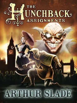
Arthur Slade has two covers--one US and one Canadian--to share today. His new steampunk book, The Hunchback Assignments, is full of action, adventure and a mad scientist, for good measure.Here's Art: "Covers! I've always had a difficult time trying to picture the perfect cover for any of my books. So far, out of all 13 of my books, my idea has not made it on the front once. And that tradition continued with The Hunchback Assignments, my steampunkish series. Because I have both a Canadian publisher (HarperCollins) and an America publisher (Wendy Lamb Books), I had two different experiences with the covers. hunchbackblue.jpg"Wendy (from Wendy Lamb Books) and I spoke about the cover and I just had general ideas like 'don't show the hunchback's face' and 'don't give away any plot points' (see how helpful I can be). Since Modo spends a lot of time swinging from rooftop to rooftop in London, Wendy liked the idea of him being above the city and looking down. You can see the artist, Chris McGrath liked that idea, too (it also echoes a scene in the book). When I first saw the cover there was no title and none of the 'clockwork' images, so my very first impression was that it was a very beautiful cover and something that would stand out. It had a general otherworldliness to it that suggested this wasn't quite the 'real' word. Then I started to have 'authorial' doubts like 'does this convey the steampunk nature?' and does the 'action' in the book come across? The addition of the 'gears' and the 'clockface' helped position the book more in a fantasy/steampunk world (one of the evil organizations is called The Clockwork Guild). There is another version of the cover on his website that Chris had to tone down to make it more YA/Kidlit friendly. hunchback.jpg"I was much more involved in the Canadian cover. A friend of mine, Christopher Steininger, is also represented by my agent, so he was able to put together his own ideas on the cover, which eventually became the Canadian version. Because I know Chris, I was involved from the beginning and he would send a few sketches and mock ups and ask for more descriptions of the characters. He chose to go a more dramatic route and included three of the characters from the book and have the "altered" street urchins in the background. So with this cover I was able to watch it mutate into the form you see now. I like that this cover portrays the "action" of the book and Dr. Hyde's eyepiece suggests the steampunk world these characters inhabit. And Octavia is one of my favorite characters, so I was pleased to see her come to life. Plus she has an umbrella. An umbrella on the cover means big book sales, right! "Which cover is better? I have no idea. One is bluish and foggy and the other is goldish and orangy. Which color will sell more? I have long since given up on trying to figure out how marketing departments at various publishers come up with their reasons for choosing different covers (I think it has something to do with auguring sheep guts, but I'm not sure). I know that the American cover really captures the gothic/romantic feel of the books. I assume it will appeal to girl readers and to my eye it skews to an older reader than the Canadian cover. The Canadian cover is more comic bookish. Will that mean more sales? In some ways I feel as though I have the best of both worlds as the covers seem to cover different bases. I guess the readers (as always) will decide." I've looked at these covers for a while, and I think I'd be first drawn to the brighter one, and I do like seeing more characters. But I somehow prefer the blue one--I like it's dark tone and the way London looks below Modo. So what do you guys think, as future readers--which cover do you like better? The book drops September 22.

Win-It Wednesday: Graceling by Kristin Cashore

I forgot to choose a winner for Bennett Madison's The Blonde of the Joke! It's Caitlin Usignol. And the dream-sharing winner of And Then Everything Unraveled is... Myra! Send me your addresses, C and M.rgz ad Sept 2009.jpg This week's giveaway is for a copy of Kristin Cashore's Graceling, which is the featured book on readergirlz this month. I have to admit that I'm not a huge fantasy reader, but this book had such adventure and romance and kick-assness that it drew me right in. If you've read it, come join in the book talk on readergirlz! If you haven't, enter to win it below by telling me what book you're reading right now, and how you're liking it... even if it's one for school. I'm interested. Me? I'm reading a few, but the one by my bedside is How to Say Goodbye in Robot by Natalie Standiford. More on that soon--it is fantastic. PS-I'll choose a winner in two weeks because I'm out of town next week and away from the internets! PPS-Nina Malkin, author of Swoon, is holding a huge Fall Reading Lust contest over at her blog... in case you're in a contest-entering mood.