Another brother-sister author team, Daniel and Dina Nayeri, is here to tell the tale of their cover, this time for the debut novel Another Faust. This cover has enchanted me from first glance, so I couldn't wait to interview them. Here are Daniel and Dina: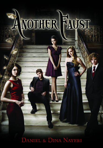 "We had so many brainstorms over this between the two of us and with friends and our publisher. We talked at length about the concept of 'things that aren't what they seem,' because that is a huge theme in the book. Beauty that isn't real, accolades that aren't accomplishments, talents that are illusions. Even the Faust children's house is a trick of the eye.
"On the cover, we wanted to show five teens who seem one way when you first glance at them, and then when you really take the time to look, seem entirely different. So we played around with the idea of a hologram, and then with the idea of having a half-photographic, half illustrated cover. In the end, the objective is accomplished through the faces of the models and their surroundings. When you first look at the cover, you see five beautiful young adults who are just mesmerizing. But when you really look, you can see how sad they are, you wonder about the moths floating around them, and the general darkness of the space they're inhabiting, and you think, 'Something isn't right here.' It becomes very eerie when you think that these are supposed to be 15-year-olds-- because where's the joy?
"Candlewick involved us in most steps of the process (even when they didn't have to). We brainstormed with our editor and the marketing department and looked at several photographers before choosing a style. The idea of showing the children in a state that says 'all is not as well as it seems' was the product of one of these brainstorms. And then, the creative team at Candlewick translated the concept to a visual medium by working with the photographer.
"We had so many brainstorms over this between the two of us and with friends and our publisher. We talked at length about the concept of 'things that aren't what they seem,' because that is a huge theme in the book. Beauty that isn't real, accolades that aren't accomplishments, talents that are illusions. Even the Faust children's house is a trick of the eye.
"On the cover, we wanted to show five teens who seem one way when you first glance at them, and then when you really take the time to look, seem entirely different. So we played around with the idea of a hologram, and then with the idea of having a half-photographic, half illustrated cover. In the end, the objective is accomplished through the faces of the models and their surroundings. When you first look at the cover, you see five beautiful young adults who are just mesmerizing. But when you really look, you can see how sad they are, you wonder about the moths floating around them, and the general darkness of the space they're inhabiting, and you think, 'Something isn't right here.' It becomes very eerie when you think that these are supposed to be 15-year-olds-- because where's the joy?
"Candlewick involved us in most steps of the process (even when they didn't have to). We brainstormed with our editor and the marketing department and looked at several photographers before choosing a style. The idea of showing the children in a state that says 'all is not as well as it seems' was the product of one of these brainstorms. And then, the creative team at Candlewick translated the concept to a visual medium by working with the photographer.
 "The cover involved a photo shoot with models hired specifically to be our characters [MW note: those are two of the models, left and right... sweet]. We were very lucky to have this special treatment for our cover and the result has been amazing! Candlewick chose 3-4 models for each character and we got to give our opinion on which we liked best.
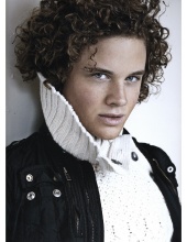
  We were particularly impressed when we saw the final result and realized that they had even chosen the accessories of the models to match our characters!! Victoria for example, is wearing a "V" pendant that was described in the book. We couldn't believe that someone actually went out and bought that necklace to use in the photo shoot! Of course, the models' hair and clothes were all styled based on the characters as well. And each character is posing in a way that perfectly matches their personality. For example, in the book we talk about how Valentin (the boy with curly hair) always has his hands in his pockets, and how Bice (the girl at the top of the page) feels shy and withdrawn from the rest. You can see more from the photo shoot in the official trailer.
"When we first saw the cover, we were blown away. You should see the email we each sent to our publisher. I don't think either one of us has used that many exclamation points in any communication... ever. :)
"In terms of comments, we pointed out that Belle should be blonder and that Christian (the boy seated) was a red-head. Just a few small things. The cover didn't change much, just some hair color adjustment, and they made the background a lot more eerie and dark, to match the tone of the book.
"We love the cover. It's creepy and thought-provoking and still sexy and interesting. We think it really captures the dark, creepy tone of the book, while still showing the glamorous illusion that the children in the novel are striving to achieve. We hope that potential readers don't just think of it as a sexy cover, but really look to see the dark tone beneath it all, because Another Faust is not a lighthearted NYC teen romp.... It's a pretty creepy Faustian tale with a lot of layers that we hope provide intellectual challenge!
Here are a few bonus visuals.
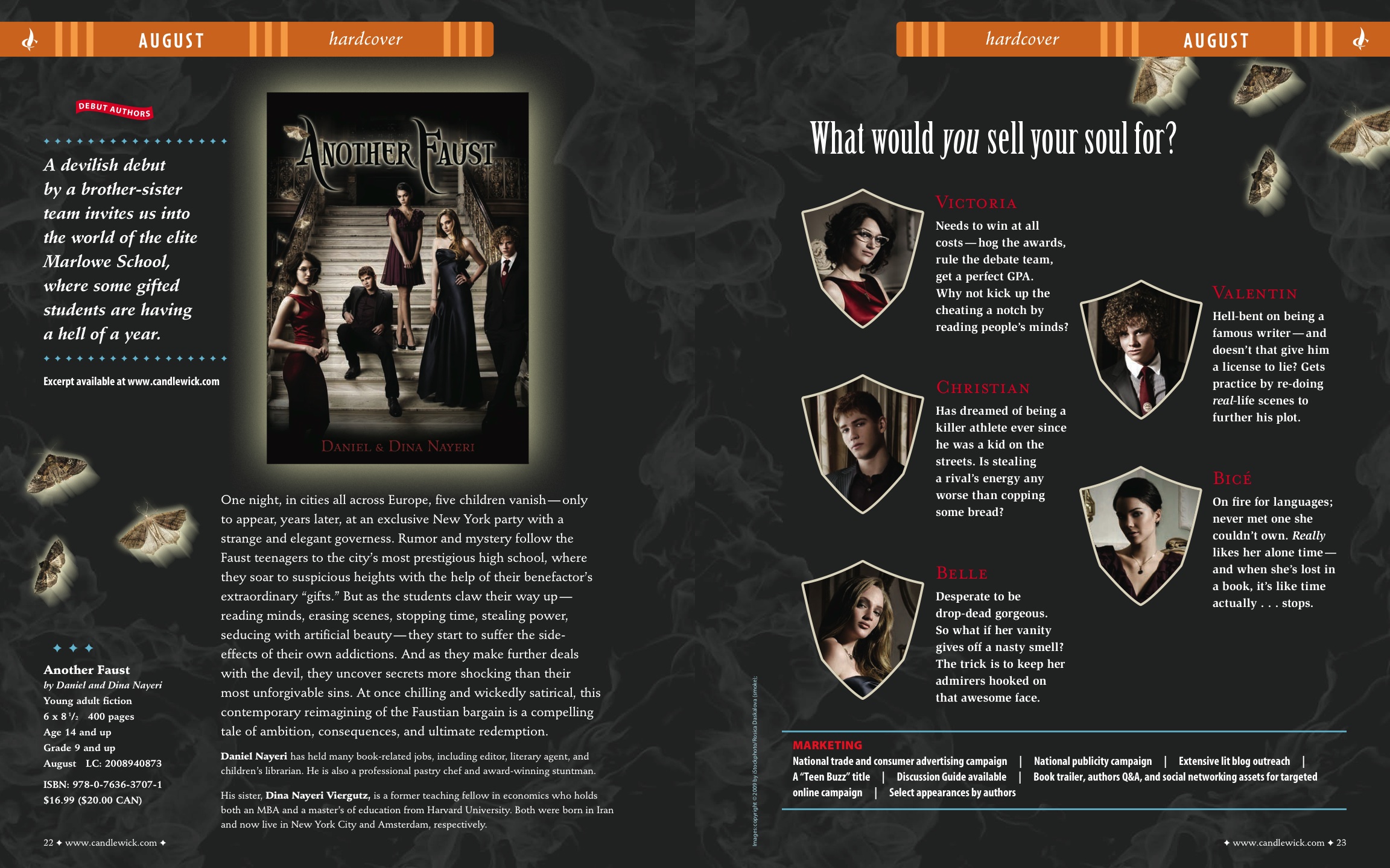
The catalogue page:
We were particularly impressed when we saw the final result and realized that they had even chosen the accessories of the models to match our characters!! Victoria for example, is wearing a "V" pendant that was described in the book. We couldn't believe that someone actually went out and bought that necklace to use in the photo shoot! Of course, the models' hair and clothes were all styled based on the characters as well. And each character is posing in a way that perfectly matches their personality. For example, in the book we talk about how Valentin (the boy with curly hair) always has his hands in his pockets, and how Bice (the girl at the top of the page) feels shy and withdrawn from the rest. You can see more from the photo shoot in the official trailer.
"When we first saw the cover, we were blown away. You should see the email we each sent to our publisher. I don't think either one of us has used that many exclamation points in any communication... ever. :)
"In terms of comments, we pointed out that Belle should be blonder and that Christian (the boy seated) was a red-head. Just a few small things. The cover didn't change much, just some hair color adjustment, and they made the background a lot more eerie and dark, to match the tone of the book.
"We love the cover. It's creepy and thought-provoking and still sexy and interesting. We think it really captures the dark, creepy tone of the book, while still showing the glamorous illusion that the children in the novel are striving to achieve. We hope that potential readers don't just think of it as a sexy cover, but really look to see the dark tone beneath it all, because Another Faust is not a lighthearted NYC teen romp.... It's a pretty creepy Faustian tale with a lot of layers that we hope provide intellectual challenge!
Here are a few bonus visuals.
The catalogue page:
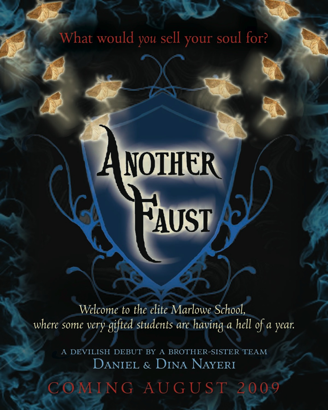
 An early flier:
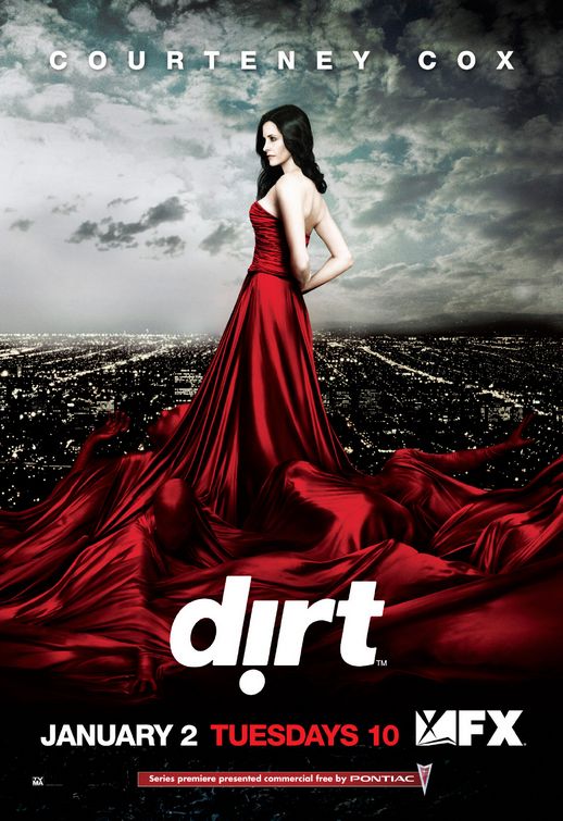 "Finally, here's an extra tidbit. When we were first deciding what should be on the cover, we had a big discussion over whether the cover should present Madame Vileroy (the devil governess) or the five children who bargain their souls. In the end, we chose the children because they are the 'Fausts' of this novel and their decisions drive the story. But back when we were considering having Madame Vileroy on the cover, we used this photo of the TV show 'Dirt' as inspiration for the kind of woman we wanted to portray: a beautiful, tempting, and ultimately evil villainess who has indirect power over those around her. And we loved the image of the writhing souls beneath her skirt. But in the end, we much preferred placing the teens center-stage."
Great story! Hot models. Fantastic inspiration photo (souls writing under skirts rule). This cover totally draws me in, and I'm really looking forward to reading the book. What do you guys think?
"Finally, here's an extra tidbit. When we were first deciding what should be on the cover, we had a big discussion over whether the cover should present Madame Vileroy (the devil governess) or the five children who bargain their souls. In the end, we chose the children because they are the 'Fausts' of this novel and their decisions drive the story. But back when we were considering having Madame Vileroy on the cover, we used this photo of the TV show 'Dirt' as inspiration for the kind of woman we wanted to portray: a beautiful, tempting, and ultimately evil villainess who has indirect power over those around her. And we loved the image of the writhing souls beneath her skirt. But in the end, we much preferred placing the teens center-stage."
Great story! Hot models. Fantastic inspiration photo (souls writing under skirts rule). This cover totally draws me in, and I'm really looking forward to reading the book. What do you guys think?
Photo Friday: Fashion Illustrator + Classic Literature
in Photo Friday
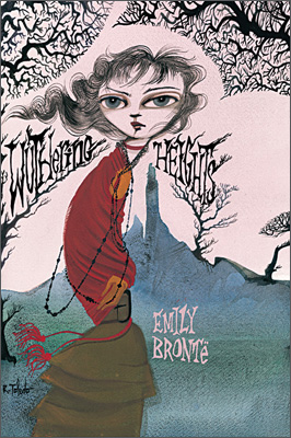
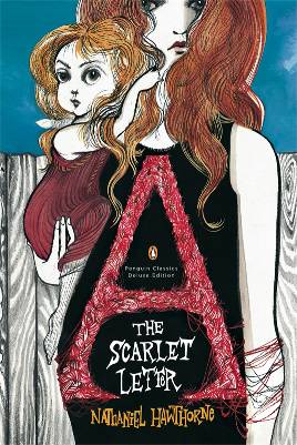
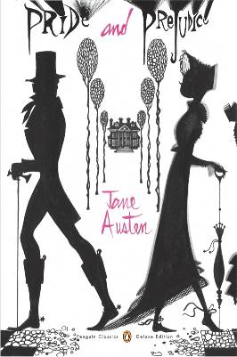
Have you guys seen these classic titles, redesigned by fashion illustrator Ruben Toledo? He's drawn for Vogue and Harper's Bazaar, and now he's tackling Jane Austen, among others.I like these. They're kinda weird, but in the good sense, I think. Way to think outside the box, Penguin! What do you guys think?
 Oh, and if you missed one of these on your bookshelves, I highly recommend all three. Major angst in those first two.
Happy weekend!
Oh, and if you missed one of these on your bookshelves, I highly recommend all three. Major angst in those first two.
Happy weekend!
Bonus Cover Stories: So Punk Rock by Micol Ostow, with art by David Ostow
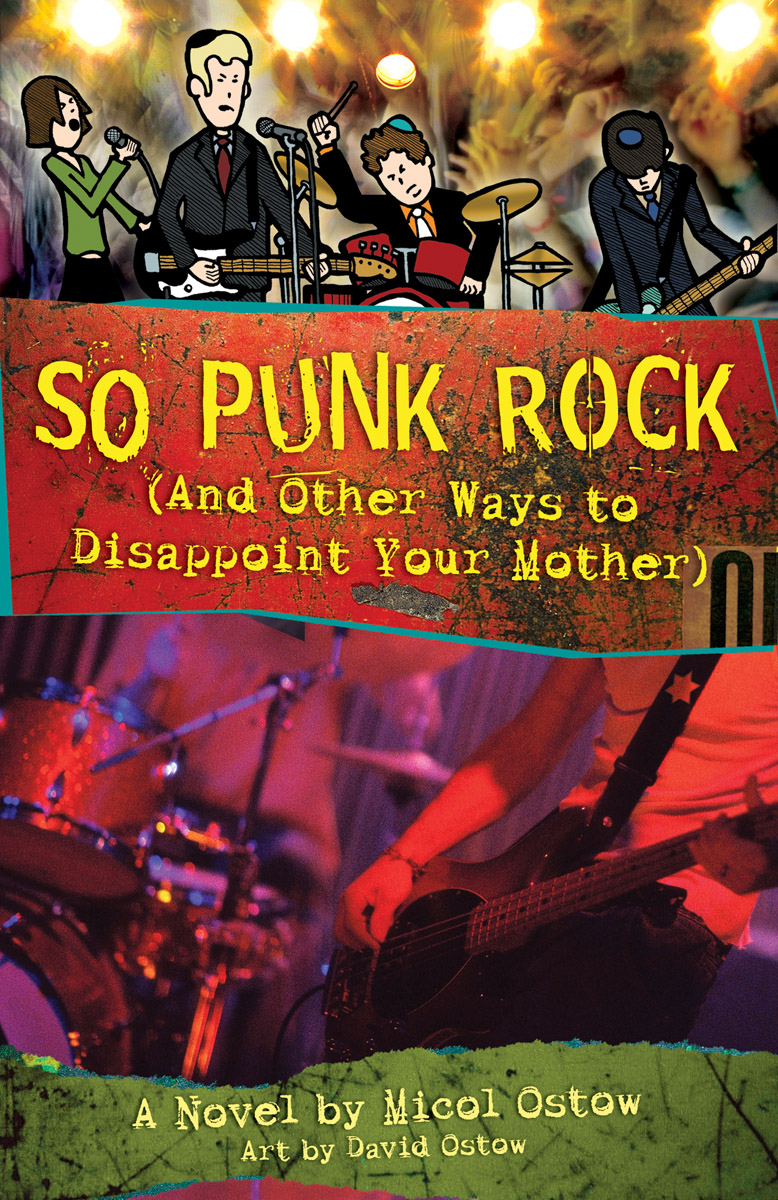 Micol and David Ostow are siblings who teamed up to work on So Punk Rock. I heard them read this summer, and I laughed about 10 times in five minutes. Now that's a good book!Here's Micol with their Cover Story:
"So Punk Rock is a hybrid graphic novel, i.e.: a regular novel with little comic interstitials throughout, the conceit being that the drawings are taken from the main character Ari's notebook, which he initially bought to use for his music (turns out he's much better at sketching than songwriting). So we'd looked at a lot of the illustrated books that had been coming out at that time like Wimpy Kid and the Minx line from DC, where the cover art was directly indicative of the illustrations inside. In my head I had this thought that it was going to look like a marbled composition notebook, with a drawing sort of "scotch-taped" on that was something Ari had done.
"We talked it over with our editor, Andrew Karre (who has since left Flux to take over the young adult imprint at Carol Rhoda), who was kind enough to listen to my (shockingly specific) suggestions. Considering how many novels I've published, I don't know that my input had been solicited on cover art in the past, and clearly I was jumping on the opportunity to have my voice heard.
"Thankfully, Andrew is patient. Also thankfully, he ultimately went with his design team's much more professional concept. What can I say? I'm a word person, not a picture person.
"After that first conversation, we didn't hear from the art team again until they had an almost-final comp ready, which was almost exactly the cover as it appears on the book. It may have been a product of the flux (no pun intended) of the changing of the editorial guard (Andrew was replaced by the equally awesome Brian Farrey), or maybe they were simply afraid of hearing more of my lousy ideas, but what they showed us was what the sales team had approved, which I knew as a former editor meant that barring any unexpected author meltdowns, it was essentially a done deal.
"I suppose if we had HATED it, they would have been willing to reconsider. But fortunately, that wasn't the case.
"I think our only feedback at the time was that David's credit (which started out saying "illustrated by" and ended up as "art by") wasn't quite bold enough. So they beefed up the font for us so that Dave could have his props.
"Obviously the art was David's, taken from the interior. But our amazing designer Lisa Novak, had some good information about how the rest of it came about, so I'll give the floor to her:
"Andrew Karre, your initial editor, had a rough idea of what he was looking for. He told me that he wanted a cover with multiple bands of imagery. He said that I should put David's drawings on the cover along with photos of something indicating music in some way (a guitar, drums, etc). Other than that the rest was up to me.
Micol and David Ostow are siblings who teamed up to work on So Punk Rock. I heard them read this summer, and I laughed about 10 times in five minutes. Now that's a good book!Here's Micol with their Cover Story:
"So Punk Rock is a hybrid graphic novel, i.e.: a regular novel with little comic interstitials throughout, the conceit being that the drawings are taken from the main character Ari's notebook, which he initially bought to use for his music (turns out he's much better at sketching than songwriting). So we'd looked at a lot of the illustrated books that had been coming out at that time like Wimpy Kid and the Minx line from DC, where the cover art was directly indicative of the illustrations inside. In my head I had this thought that it was going to look like a marbled composition notebook, with a drawing sort of "scotch-taped" on that was something Ari had done.
"We talked it over with our editor, Andrew Karre (who has since left Flux to take over the young adult imprint at Carol Rhoda), who was kind enough to listen to my (shockingly specific) suggestions. Considering how many novels I've published, I don't know that my input had been solicited on cover art in the past, and clearly I was jumping on the opportunity to have my voice heard.
"Thankfully, Andrew is patient. Also thankfully, he ultimately went with his design team's much more professional concept. What can I say? I'm a word person, not a picture person.
"After that first conversation, we didn't hear from the art team again until they had an almost-final comp ready, which was almost exactly the cover as it appears on the book. It may have been a product of the flux (no pun intended) of the changing of the editorial guard (Andrew was replaced by the equally awesome Brian Farrey), or maybe they were simply afraid of hearing more of my lousy ideas, but what they showed us was what the sales team had approved, which I knew as a former editor meant that barring any unexpected author meltdowns, it was essentially a done deal.
"I suppose if we had HATED it, they would have been willing to reconsider. But fortunately, that wasn't the case.
"I think our only feedback at the time was that David's credit (which started out saying "illustrated by" and ended up as "art by") wasn't quite bold enough. So they beefed up the font for us so that Dave could have his props.
"Obviously the art was David's, taken from the interior. But our amazing designer Lisa Novak, had some good information about how the rest of it came about, so I'll give the floor to her:
"Andrew Karre, your initial editor, had a rough idea of what he was looking for. He told me that he wanted a cover with multiple bands of imagery. He said that I should put David's drawings on the cover along with photos of something indicating music in some way (a guitar, drums, etc). Other than that the rest was up to me.
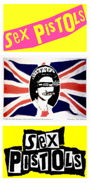 "I thought about what punk rock means to me and what that genre looks like in my mind. I'm going to date myself here, but to me punk rock is the Sex Pistols so I went immediately to the look they had on their posters and album covers and used that as a jumping off point. To me punk rock is loud and messy and fast with bodies everywhere jumping around and bright lights. It's fun and there's a lot going on all at the same time and I wanted that to come through on the cover.
"I decided the horizontal bands for the title and author name is where I could pay homage to the Pistols design so I ripped some paper and scanned it in and overlaid those pieces with some distressed metal images. For the fonts I wanted those to play to the Pistols design as well so I chose some grungy, messy fonts. In the 2 alternate covers that weren't chosen I actually used about 6 or 7 different fonts to make up the title.
"The cover that was chosen uses one of David's illustrations of the whole band at the top. I looked at his drawing and imagined what the band sounded like and then mixed a couple stock images together of a crowd dancing and some bright spot lights to get a psychedelic background to give the feeling of the loud, fast music. To tie the cover together I knew I wanted a photo of what the band would look like in real life, like the kids reading the story might imagine. I found this photo of a guitarist and drummer on a stock photo site and thought, sure, this could be Ari and Yossi jamming at a bar mitzvah. I added the Star of David to Ari's guitar strap to give a little clue about what makes this band special, and I had the cover as you see it now.
"I thought about what punk rock means to me and what that genre looks like in my mind. I'm going to date myself here, but to me punk rock is the Sex Pistols so I went immediately to the look they had on their posters and album covers and used that as a jumping off point. To me punk rock is loud and messy and fast with bodies everywhere jumping around and bright lights. It's fun and there's a lot going on all at the same time and I wanted that to come through on the cover.
"I decided the horizontal bands for the title and author name is where I could pay homage to the Pistols design so I ripped some paper and scanned it in and overlaid those pieces with some distressed metal images. For the fonts I wanted those to play to the Pistols design as well so I chose some grungy, messy fonts. In the 2 alternate covers that weren't chosen I actually used about 6 or 7 different fonts to make up the title.
"The cover that was chosen uses one of David's illustrations of the whole band at the top. I looked at his drawing and imagined what the band sounded like and then mixed a couple stock images together of a crowd dancing and some bright spot lights to get a psychedelic background to give the feeling of the loud, fast music. To tie the cover together I knew I wanted a photo of what the band would look like in real life, like the kids reading the story might imagine. I found this photo of a guitarist and drummer on a stock photo site and thought, sure, this could be Ari and Yossi jamming at a bar mitzvah. I added the Star of David to Ari's guitar strap to give a little clue about what makes this band special, and I had the cover as you see it now.
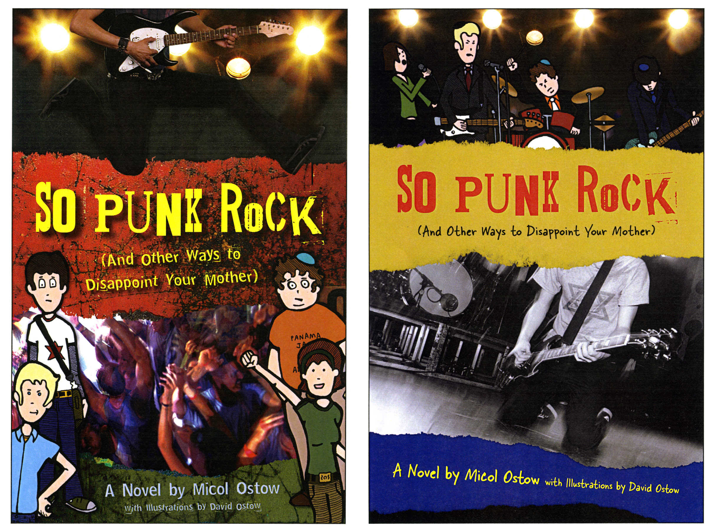 "The two alternate covers I designed used the same basic idea that was laid out by Andrew and the same thoughts I had about punk rock. The committee who chose the cover was torn and it took them a while to decide on the final cover because in essence, all 3 covers are very similar in their feel and look with slight variations in the imagery. But I think all 3 covers project that feeling of fast music and punk rock in their own way."
"Personally, I love all three covers, and the Star of David is a great touch. The Sex Pistols is the perfect reference, in my opinion. The one real surprise to me was the colored-in version of the band--frankly, I had no idea Jonas was blond. But I love it!
"If we're going for 100% honesty, it's not actually a cover I would necessarily have picked up myself if I were browsing in a bookstore. It's definitely very "boy"--much more so than any of my previous books/covers, like Emily Goldberg Learns to Salsa, for example
"The two alternate covers I designed used the same basic idea that was laid out by Andrew and the same thoughts I had about punk rock. The committee who chose the cover was torn and it took them a while to decide on the final cover because in essence, all 3 covers are very similar in their feel and look with slight variations in the imagery. But I think all 3 covers project that feeling of fast music and punk rock in their own way."
"Personally, I love all three covers, and the Star of David is a great touch. The Sex Pistols is the perfect reference, in my opinion. The one real surprise to me was the colored-in version of the band--frankly, I had no idea Jonas was blond. But I love it!
"If we're going for 100% honesty, it's not actually a cover I would necessarily have picked up myself if I were browsing in a bookstore. It's definitely very "boy"--much more so than any of my previous books/covers, like Emily Goldberg Learns to Salsa, for example  (which makes sense, because it's the most "boy" story I've ever written, not the least because it's told from a male POV). BUT I did think it was eye-catching, and very true to the sensibility of the story, so I was happy. I know that it appeals to the book's target audience, and we get lots of compliments on the cover, too, so I have plenty of positive reinforcement. Lisa and the rest of the Flux team were dead-on in creating something that really captured the "punk rock" spirit of the story, and communicated about the characters, too."
I love this story and the inspiration images--the Sex Pistols influence is so clear now that Lisa mentions it! Thanks to Micol, David and Lisa for the story.
What do you guys think of the cover?
Here's the trailer for the book, which will make you want it even more:
(which makes sense, because it's the most "boy" story I've ever written, not the least because it's told from a male POV). BUT I did think it was eye-catching, and very true to the sensibility of the story, so I was happy. I know that it appeals to the book's target audience, and we get lots of compliments on the cover, too, so I have plenty of positive reinforcement. Lisa and the rest of the Flux team were dead-on in creating something that really captured the "punk rock" spirit of the story, and communicated about the characters, too."
I love this story and the inspiration images--the Sex Pistols influence is so clear now that Lisa mentions it! Thanks to Micol, David and Lisa for the story.
What do you guys think of the cover?
Here's the trailer for the book, which will make you want it even more:
Win-It Wednesday: And Then Everything Unraveled by Jennifer Sturman
Last week's winner of Amor and Summer Secrets is... Jess! Send me your address, J. This week, I'm giving away a signed ARC of And Then Everything Unraveled by Jennifer Sturman. I did a reading with Jennifer earlier this month, and she's delightful and funny and energetic, just like her book. If you don't believe me, just read this great review by Steph Su.
To enter, just tell me about the last dream you remember having. Like, nighttime dream, not big life dream, though come to think of it, I'm curious about that too.
Happy Wednesday!
This week, I'm giving away a signed ARC of And Then Everything Unraveled by Jennifer Sturman. I did a reading with Jennifer earlier this month, and she's delightful and funny and energetic, just like her book. If you don't believe me, just read this great review by Steph Su.
To enter, just tell me about the last dream you remember having. Like, nighttime dream, not big life dream, though come to think of it, I'm curious about that too.
Happy Wednesday!
Cover Stories: Mexican High by Liza Monroy, Part 2: The Paperback
Yesterday, Liza told the tale of her hardcover design. Today, she's here to share what went on behind the scenes of the paperback!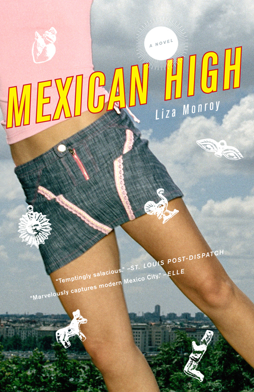 "The paperback, which came out this month, took a different direction. Again, the first one I saw (left), I hated -- that miniskirt! That disembodied-girl flying over a city that might not even be in Mexico! And again, my wonderful publishers were willing to listen. My favorite cover of all was born: the milagros remained, but instead of a torso, it has a quarter of a beautiful, pensive face with a thoughtful look in her eye -- I could see this as Mila, with dyed hair. Now, I love the cover and am proud of the way it looks:
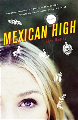
 "But, the funny thing is, even though both the hardcover and paperback are out, I still continue to play around with imagery in my head! In the end, my ultimate vision for the Mexican High cover that will never exist is this: an off-white, unfinished, texured paper background, with a colorful, embossed Virgen de Guadalupe in the center, and cursive, lowercase text for the title above it. The Virgen de Guadalupe might be Mexico's most iconic image, and if I ever write another book set in Mexico, maybe I'll get to use it!"
I thought the hardcover was cool, but I adore the paperback cover. Just the right lightness and magic. (And that first version--eek, glad it wasn't chosen.) What do you guys think?
PS-Alea has the Hardcover vs. Paperback post on this book up today! Theme Week!
"But, the funny thing is, even though both the hardcover and paperback are out, I still continue to play around with imagery in my head! In the end, my ultimate vision for the Mexican High cover that will never exist is this: an off-white, unfinished, texured paper background, with a colorful, embossed Virgen de Guadalupe in the center, and cursive, lowercase text for the title above it. The Virgen de Guadalupe might be Mexico's most iconic image, and if I ever write another book set in Mexico, maybe I'll get to use it!"
I thought the hardcover was cool, but I adore the paperback cover. Just the right lightness and magic. (And that first version--eek, glad it wasn't chosen.) What do you guys think?
PS-Alea has the Hardcover vs. Paperback post on this book up today! Theme Week!
Cover Stories: Mexican High by Liza Monroy, Part 1: The Hardcover
I professed my love for Liza Monroy's Mexican High on I Heart Daily, and now she's here to share her Cover Story. Today I'm posting the hardcover tale--tomorrow, the very different paperback saga! Here's Liza: "Mexico City (left) is such a visual place, colorful, vibrant, gritty, and full of life, and I definitely wanted the cover of Mexican High to capture that. Of course, capturing the spirit of one of the world's largest metropolises on an 8-by-5-inch book jacket is no easy feat! While I was thinking big (city-scale big), my publisher, Spiegel & Grau, were more inclined toward the character-level -- the book, after all, centers on seventeen-year-old protagonist Mila (Milagro) Marquez, who moves to Mexico City for her senior year of high school with her U.S. diplomat mom, and her coming-of-age misadventures in the city.
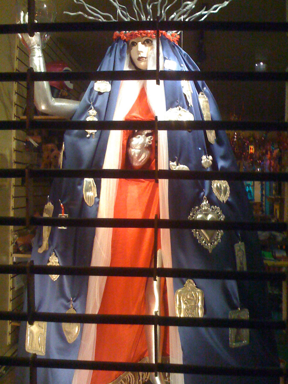 "Milagros--Mexican charms said to bring good fortune in different areas such as love, work, and health--play an important role in the story. Milagro takes her name from them, since her mother wasn't supposed to be able to have kids; she was a miracle, and surprise. In Spanish the word means both things. They come into play both symbolically and then physically in a major plot-twist, so I definitely knew that milagros had to play a central role in the book's design.
 "Initially, I imagined a large-sized heart milagro, el Sagrado Corazon, sacred heart, in the center of the cover. You can see this one in the photo I took in a church in Puebla, Mexico (left). To me, it represented my main goal for my novel, that it have heart.
But the very first cover (for the hardcover)
"Initially, I imagined a large-sized heart milagro, el Sagrado Corazon, sacred heart, in the center of the cover. You can see this one in the photo I took in a church in Puebla, Mexico (left). To me, it represented my main goal for my novel, that it have heart.
But the very first cover (for the hardcover)  my publisher showed me wasn't Mexican at all. It's pink and the model is blond, which echoes Gossip Girl -- and while Mexican High does showcase the Gossip Girl-types of Mexico City, I felt it did need to portray a cultural aspect. Mexico City is totally different from Southern California or Manhattan so I felt it was important that the cover show that. I'll admit it -- I hated that first cover! Not for what it was, I think it would be perfect for a book that was set in SoCal, I just felt it was wrong for this novel.
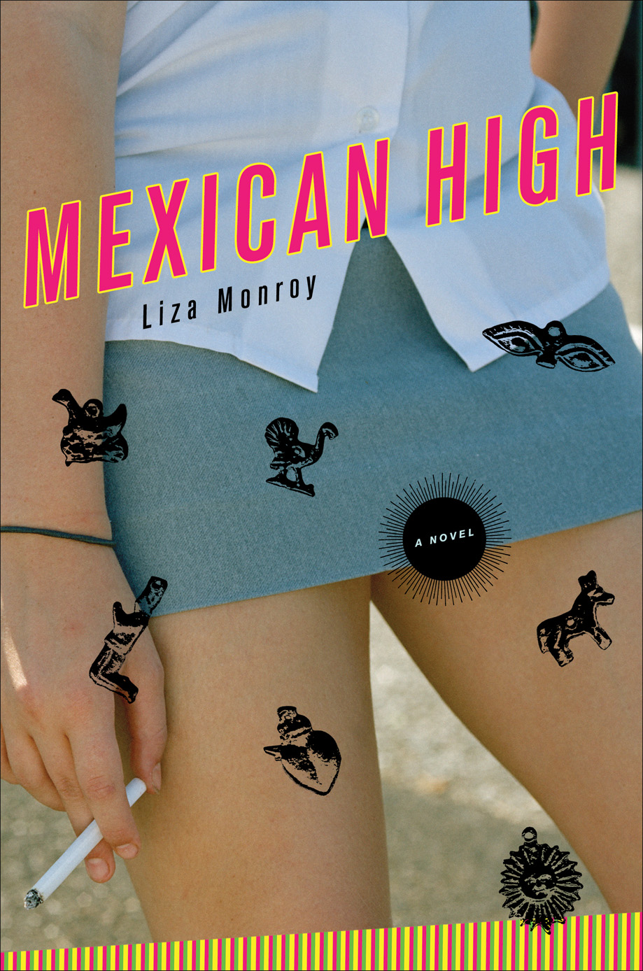 "My publisher was very understanding and soon I saw another version - this one with milagros! The length of the skirt scandalized me (left), so they pulled it down a little (see final cover). We liked the edginess of the cigarette, and I always thought it ironic that smoking rates were so high in the already very-polluted Ciudad de Mexico, which Mila points out. But what everybody involved in the design, myself included, missed was that teen magazines and parents might mistake it for encouragement! And so the paperback is very different..."
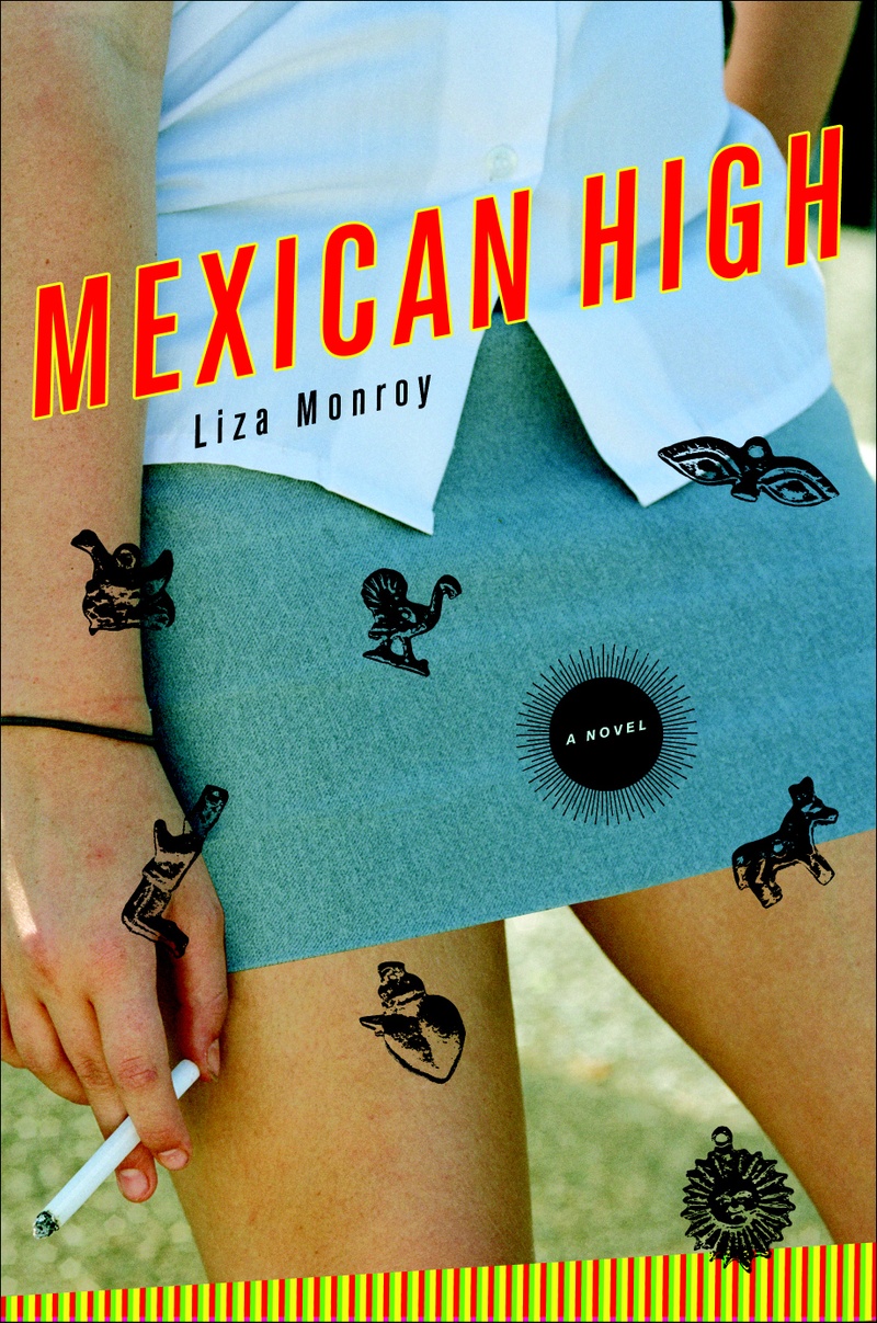 I like the hardcover, but I have to admit I was surprised to see the cigarette on a YA cover. Still, it prepared me for a gritty read, and that was cool. What do you guys think?
Ooh, wait till you see the paperback tomorrow! Yes, you can just google it, but what's the fun in that?
I like the hardcover, but I have to admit I was surprised to see the cigarette on a YA cover. Still, it prepared me for a gritty read, and that was cool. What do you guys think?
Ooh, wait till you see the paperback tomorrow! Yes, you can just google it, but what's the fun in that?
Photo Friday: New York, Paris I Love You
in Photo Friday
Just some quick-and-DIY city shots:A phone photo from the East Village of NYC. I love the Mosaic Man, who decorates lampposts. The garbage just made it such a New York view for me--artistic beauty and hot trash bags.
 And a shot that my friend Joomi sent me from Paris, where she lives now because she's all chic like that. She thought of me and Violet!
 These may be my two favorite cities, though I have to give props to London and Madrid, and of course I haven't been nearly everywhere! I dream of Argentina and Uruguay, and hopefully Australia too one day. Where do you guys want to go?
Happy Friday!
PS-Remember, two contests this week: One for Amor and Summer Secrets and one for The Blonde of the Joke. Good luck!
These may be my two favorite cities, though I have to give props to London and Madrid, and of course I haven't been nearly everywhere! I dream of Argentina and Uruguay, and hopefully Australia too one day. Where do you guys want to go?
Happy Friday!
PS-Remember, two contests this week: One for Amor and Summer Secrets and one for The Blonde of the Joke. Good luck!
Cover Stories + Contest: The Blonde of the Joke by Bennett Madison
 Bennett Madison's The Blonde of the Joke is a really great book. I missed a subway stop while reading it last summer, which is a high compliment. It's funny and dark and sad and light and sparkly all at the same time.And the reason I read it last summer but it's just coming out now has everything to do with the cover. So Bennett's here to share that story (and you can enter to win an ARC of the book, with the original cover, by weighing in):
"I definitely had an idea of what my ideal cover would look like when I was writing the book. I even drew a picture of it when I was at a writing impasse. Everyone does this, right? I never mentioned it to my publisher though, cause I know that although I am a good drawer, I don't know anything about designing a book cover. And I know that people who are good at what they do get annoyed when you try to do their job for them. So I try to stay out of it.
"I will spare you the details of what my imaginary cover looked like, except that it involved cigarettes, a map of the shopping mall and nudity, because all of my favorite book covers involve nudity.
"My publisher didn't really ask me for input until the art department had come up with something. I used to be a publishing intern and there was one very famous author who would clog up the fax machine with terrible cover ideas all day and night, so I can see why they try to discourage writers from getting too involved. Anyway, if they'd asked my opinion I probably would have just asked for some kind of nudity, or at least lots of skin. Because nudity suggests glamour and sophistication.
"This gets kind of complicated, but basically what happened with my book was that it was supposed to come out last year--in September '08. They had the cover all finished and were about print it all up and everything, and then at the last minute decided that the cover they had just wasn't going to work. I think the basic feeling was that it just wasn't commercial enough. I can understand that--I thought the original cover was super-hip and reflected the tone of the book really well, but hip and weird doesn't always sell books. And I want to sell lots of books and be as rich as Danielle Steel.
Bennett Madison's The Blonde of the Joke is a really great book. I missed a subway stop while reading it last summer, which is a high compliment. It's funny and dark and sad and light and sparkly all at the same time.And the reason I read it last summer but it's just coming out now has everything to do with the cover. So Bennett's here to share that story (and you can enter to win an ARC of the book, with the original cover, by weighing in):
"I definitely had an idea of what my ideal cover would look like when I was writing the book. I even drew a picture of it when I was at a writing impasse. Everyone does this, right? I never mentioned it to my publisher though, cause I know that although I am a good drawer, I don't know anything about designing a book cover. And I know that people who are good at what they do get annoyed when you try to do their job for them. So I try to stay out of it.
"I will spare you the details of what my imaginary cover looked like, except that it involved cigarettes, a map of the shopping mall and nudity, because all of my favorite book covers involve nudity.
"My publisher didn't really ask me for input until the art department had come up with something. I used to be a publishing intern and there was one very famous author who would clog up the fax machine with terrible cover ideas all day and night, so I can see why they try to discourage writers from getting too involved. Anyway, if they'd asked my opinion I probably would have just asked for some kind of nudity, or at least lots of skin. Because nudity suggests glamour and sophistication.
"This gets kind of complicated, but basically what happened with my book was that it was supposed to come out last year--in September '08. They had the cover all finished and were about print it all up and everything, and then at the last minute decided that the cover they had just wasn't going to work. I think the basic feeling was that it just wasn't commercial enough. I can understand that--I thought the original cover was super-hip and reflected the tone of the book really well, but hip and weird doesn't always sell books. And I want to sell lots of books and be as rich as Danielle Steel.
 "That first unreleased cover changed significantly. The first version they showed me was dummied up with a stock photo and then they shot a real photo and also changed the typeface and added some pink (pink is apparently an important element of any book cover), and all kinds of things like that (right).
"The very very original version was very gritty and almost creepy-- my boyfriend said it looked like something out of some weird/kinky German porno. The final version of the original cover was quite different in the details, but was totally the same in concept. It was just a lot slicker, which also meant it was less unsettling. Honestly I never had a problem with the kinky German porno look in the first place, but I thought it got better and better with every new version.
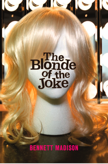
"Anyway, they pushed the book by a year so they could do a new cover. Now it's finally finally finally coming out, and it looks completely different.
"For the first version of the cover they shot an original photo. For the new version, I'm pretty sure the image is stock. I do hope it doesn't show up in an Activia ad or anything. Although I would be interested to know what the rest of that girl's face is like.
"The second cover--the one which is going to actually be on the shelves--changed very, very little from the iteration I first saw. It might not have changed at all, actually. They might have fooled around with the typeface some.
"Both covers had to grow on me. I think that's normal. I think when you write a book you spend ages fantasizing about what the cover is going to look like, and nothing can live up to that fantasy. So when you first see it you're kind of like, 'Oh, well, that's it?' Then you spend hours staring at it and you fall in love. At least I did.
"In the end I have come to love both of my covers--old and new--but it's kind of like loving two different children. They're so different. Sometimes I get cross with one or the other. I think I'm going to get the original final cover framed, because it really was a great cover and I think it deserves its propers.
"That first unreleased cover changed significantly. The first version they showed me was dummied up with a stock photo and then they shot a real photo and also changed the typeface and added some pink (pink is apparently an important element of any book cover), and all kinds of things like that (right).
"The very very original version was very gritty and almost creepy-- my boyfriend said it looked like something out of some weird/kinky German porno. The final version of the original cover was quite different in the details, but was totally the same in concept. It was just a lot slicker, which also meant it was less unsettling. Honestly I never had a problem with the kinky German porno look in the first place, but I thought it got better and better with every new version.
"Anyway, they pushed the book by a year so they could do a new cover. Now it's finally finally finally coming out, and it looks completely different.
"For the first version of the cover they shot an original photo. For the new version, I'm pretty sure the image is stock. I do hope it doesn't show up in an Activia ad or anything. Although I would be interested to know what the rest of that girl's face is like.
"The second cover--the one which is going to actually be on the shelves--changed very, very little from the iteration I first saw. It might not have changed at all, actually. They might have fooled around with the typeface some.
"Both covers had to grow on me. I think that's normal. I think when you write a book you spend ages fantasizing about what the cover is going to look like, and nothing can live up to that fantasy. So when you first see it you're kind of like, 'Oh, well, that's it?' Then you spend hours staring at it and you fall in love. At least I did.
"In the end I have come to love both of my covers--old and new--but it's kind of like loving two different children. They're so different. Sometimes I get cross with one or the other. I think I'm going to get the original final cover framed, because it really was a great cover and I think it deserves its propers.
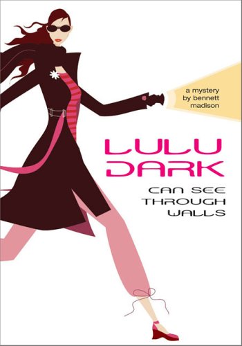 "I'm happy with the final cover. There are a few things I might change if I had the chance, but that's unavoidable. I like it 20 million times more than I ever liked the covers of either of my previous books, which looked like clip-art (MW note: see Lulu Dark Can See Through Walls, left, also a really great book!).
"The final cover is very pink and sparkly and girly, which I think took me by surprise at first. But it also has a real moodiness and a sense of humor that I love. I love the visual irony of the trashy typeface bling juxtaposed with this very mysterious and pensive image. The book is all about artifice versus reality and why it's funny, so I think it works.
"Basically I think the new cover is funny in the exact same way the book is funny. (It may be a kind of funny that only I get, but OH WELL.) And maybe sad in the same way the book is sad too. So many books have covers that don't reflect their tone at all, and I've had two that reflect the tone perfectly in different ways, so I guess I'm lucky."
And here's that final cover again:
This is rare! Having your book pushed back a year for cover redesign doesn't happen often. But I'm glad everyone wound up with a cover that works. I like both covers--I know the wig is weirdish, but I adored its originality. And I see how #2 works, as well.
To enter to win an arc of this book, complete with wig cover, just comment below. And don't forget to pick up this book in September--it is truly great.
"I'm happy with the final cover. There are a few things I might change if I had the chance, but that's unavoidable. I like it 20 million times more than I ever liked the covers of either of my previous books, which looked like clip-art (MW note: see Lulu Dark Can See Through Walls, left, also a really great book!).
"The final cover is very pink and sparkly and girly, which I think took me by surprise at first. But it also has a real moodiness and a sense of humor that I love. I love the visual irony of the trashy typeface bling juxtaposed with this very mysterious and pensive image. The book is all about artifice versus reality and why it's funny, so I think it works.
"Basically I think the new cover is funny in the exact same way the book is funny. (It may be a kind of funny that only I get, but OH WELL.) And maybe sad in the same way the book is sad too. So many books have covers that don't reflect their tone at all, and I've had two that reflect the tone perfectly in different ways, so I guess I'm lucky."
And here's that final cover again:
This is rare! Having your book pushed back a year for cover redesign doesn't happen often. But I'm glad everyone wound up with a cover that works. I like both covers--I know the wig is weirdish, but I adored its originality. And I see how #2 works, as well.
To enter to win an arc of this book, complete with wig cover, just comment below. And don't forget to pick up this book in September--it is truly great.
Win-It Wednesday: Amor and Summer Secrets
in Other Stuff
The winner of Looks by Madeleine George is... Llehn! Congratulations, and send me your address, L. Diana Rodriguez Wallach was here to share her Cover Story a while ago, and now--before summer's over--you have a chance to win a signed copy of her first novel, Amor and Summer Secrets.
The description has me needing to read this before August is over:
Fifteen-year-old Mariana Ruiz has no desire to step foot outside her affluent Philadelphia suburb. BUT she may not have a choice. With total disregard to the high-glam Sweet 16 her best friend is hosting, Mariana's father ships her off to a tiny mountain town in Puerto Rico to stay with family she's never met. The heat is merciless, the food is spicy, and only one of her relatives--her distant cousin Lilly--speaks English. Her consolation prize is Lilly's homespun Puerto Rican Quinceãnera. Only the riotously festive party exposes Mariana to more than just her culture. She uncovers new friends, her first love, and a family secret that's been buried on the island for more than 30 years.
Sounds pretty awesome, right? So, to enter to win, just comment below and tell me about the best thing you've done this summer--could be eating ice cream or going on a boat or working a summer job or kissing (I need kissing stories!). Whatever. Just tell me below and fulfill my need for summer tales.
Oh, and +1 extra entry if you visit/comment on my recent posts at Teen Fiction Cafe (about my first love) or on The Book Girl Reviews (about weddings. Yes, I know I'm obsessed lately.)
Happy Wednesday!
Diana Rodriguez Wallach was here to share her Cover Story a while ago, and now--before summer's over--you have a chance to win a signed copy of her first novel, Amor and Summer Secrets.
The description has me needing to read this before August is over:
Fifteen-year-old Mariana Ruiz has no desire to step foot outside her affluent Philadelphia suburb. BUT she may not have a choice. With total disregard to the high-glam Sweet 16 her best friend is hosting, Mariana's father ships her off to a tiny mountain town in Puerto Rico to stay with family she's never met. The heat is merciless, the food is spicy, and only one of her relatives--her distant cousin Lilly--speaks English. Her consolation prize is Lilly's homespun Puerto Rican Quinceãnera. Only the riotously festive party exposes Mariana to more than just her culture. She uncovers new friends, her first love, and a family secret that's been buried on the island for more than 30 years.
Sounds pretty awesome, right? So, to enter to win, just comment below and tell me about the best thing you've done this summer--could be eating ice cream or going on a boat or working a summer job or kissing (I need kissing stories!). Whatever. Just tell me below and fulfill my need for summer tales.
Oh, and +1 extra entry if you visit/comment on my recent posts at Teen Fiction Cafe (about my first love) or on The Book Girl Reviews (about weddings. Yes, I know I'm obsessed lately.)
Happy Wednesday!
Book News, Romeo & Juliet, Charlotte Sometimes
in Other Stuff
 1. That sparkly heart indicates a new book deal! Yay! Hope you guys will wait... it'll probably be out in early 2011... I am sooo excited.
The official report from Publisher's Marketplace:
"Melissa Walker's SMALL TOWN SINNERS, the story of a small town girl who is excited to star in Hell House, her church's annual haunted house of sin, until a childhood friend reappears and makes her question her faith, to Caroline Abbey at Bloomsbury Children's, at auction, in a two-book deal, by Douglas Stewart at Sterling Lord Literistic (NA)."
2. Okay, so this wasn't created for the lip syncing contest I had, but it is particularly excellent. And it makes me happy on this hot summer day (I think I've watched it like 10 times).
I give you Ralph Ippolito of the NYC Ballet corps, singing Taylor Swift (thanks to Michael Northrop for pointing me this way):
I really need a fan for my next singing video. And ballerinas, of course.
3. I saw Charlotte Sometimes perform last night and she ruled, as usual. If you don't have her album yet, I highly recommend it. LOVE.
Happy Tuesday!
1. That sparkly heart indicates a new book deal! Yay! Hope you guys will wait... it'll probably be out in early 2011... I am sooo excited.
The official report from Publisher's Marketplace:
"Melissa Walker's SMALL TOWN SINNERS, the story of a small town girl who is excited to star in Hell House, her church's annual haunted house of sin, until a childhood friend reappears and makes her question her faith, to Caroline Abbey at Bloomsbury Children's, at auction, in a two-book deal, by Douglas Stewart at Sterling Lord Literistic (NA)."
2. Okay, so this wasn't created for the lip syncing contest I had, but it is particularly excellent. And it makes me happy on this hot summer day (I think I've watched it like 10 times).
I give you Ralph Ippolito of the NYC Ballet corps, singing Taylor Swift (thanks to Michael Northrop for pointing me this way):
I really need a fan for my next singing video. And ballerinas, of course.
3. I saw Charlotte Sometimes perform last night and she ruled, as usual. If you don't have her album yet, I highly recommend it. LOVE.
Happy Tuesday!